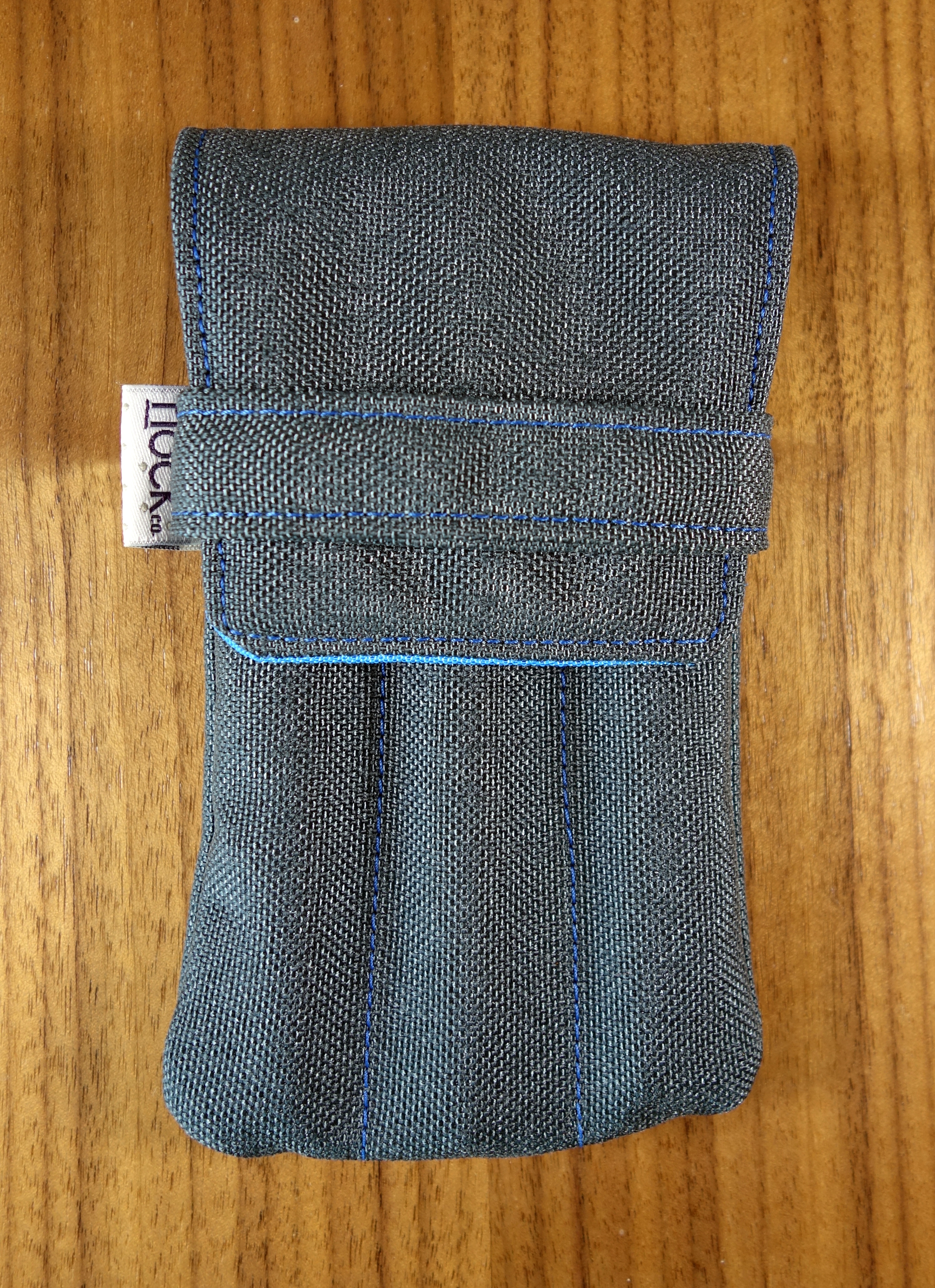
I finally got my hands on some Nock Co cases and while I haven’t had a chance to use all of them yet I have been carrying around the Lookout case the last few days.
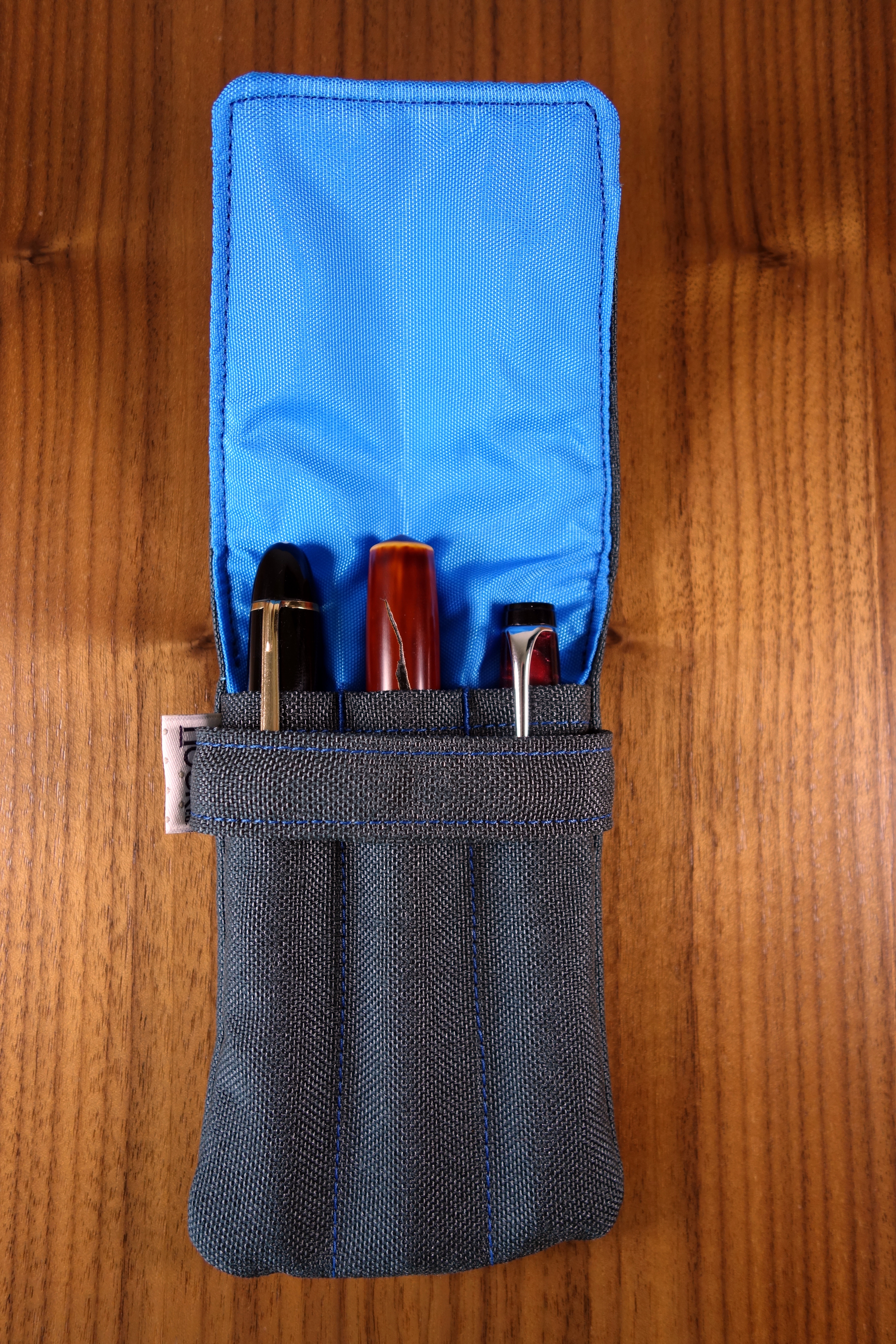
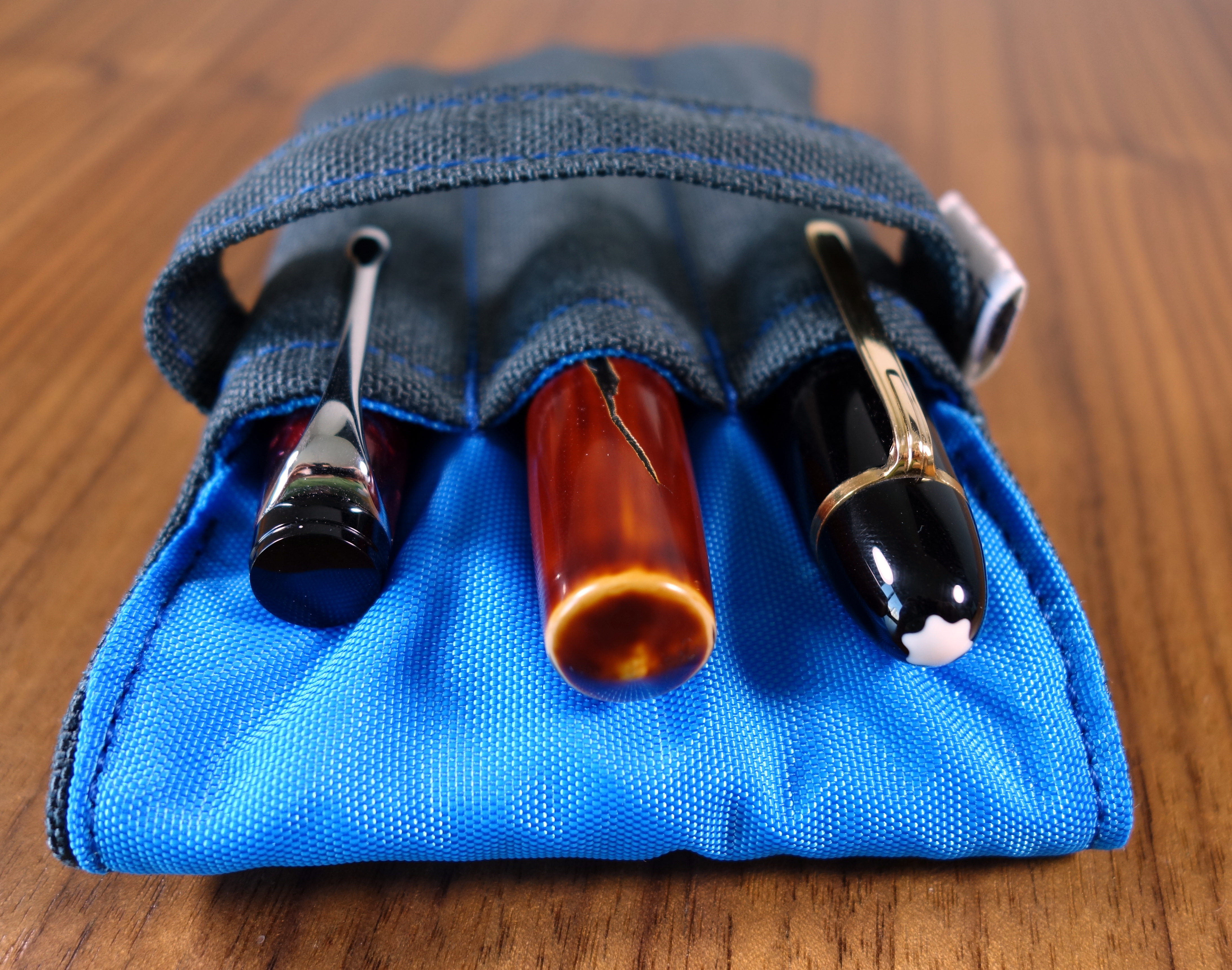
The Lookout is a 3 pen case made out of a soft but heavy duty nylon exterior and a smooth pack cloth interior. I choose the steel exterior and the blue jay interior. The color combo looks great; I especially love the blue stitching on the grey exterior.
Left to right: Montblanc 149, Nakaya Naka-ai Negoro, Aurora Optima
The exterior nylon feels somewhat similar to a Cordura nylon, that is to say it is a textured nylon which gives it a more organic and less technical feel. The interior packcloth actually reminds me of the nylon material on Nakaya’s Kimono cases.
When I backed the Nock Co Kickstarter I was not certain that I would want to use the cases with some of my more expensive pens. After handling the cases I believe them to be pretty safe. Being a soft case the Lookout may not provide as much external protection as the Pelikan 3 slot pen case, which has a more rigid structure; that said, the Lookout separates the pens better so I am much less worried about my pens coming in contact with each other.
Unlike the Pelikan case, the Lookout can hold three large pens comfortably. I was able to fit my Nakaya Naka-ai, Montblanc 149 and OMAS Paragon into the lookout without problem.
So how is the build quality? The Lookout, like all Nock Co cases, are made by hand in Georgia, USA. The stitching is tight; I measured a consistent 9 stitches per inch which means the seams should be very strong. I noticed that the band that holds the flap isn’t perfectly aligned; the right side seems to be a bit lower. The stitching while, tight is not perfectly straight in some areas but being a handmade item there is always going to be a bit of variation and that’s part of the charm.
I am not certain what the price will be when the Lookout becomes available for sale on the Nock Co website but in the $15-$25 range, this pen case is a great buy.
Here are some great reviews of the Lookout:
(I have no affiliation with the sites linked below)
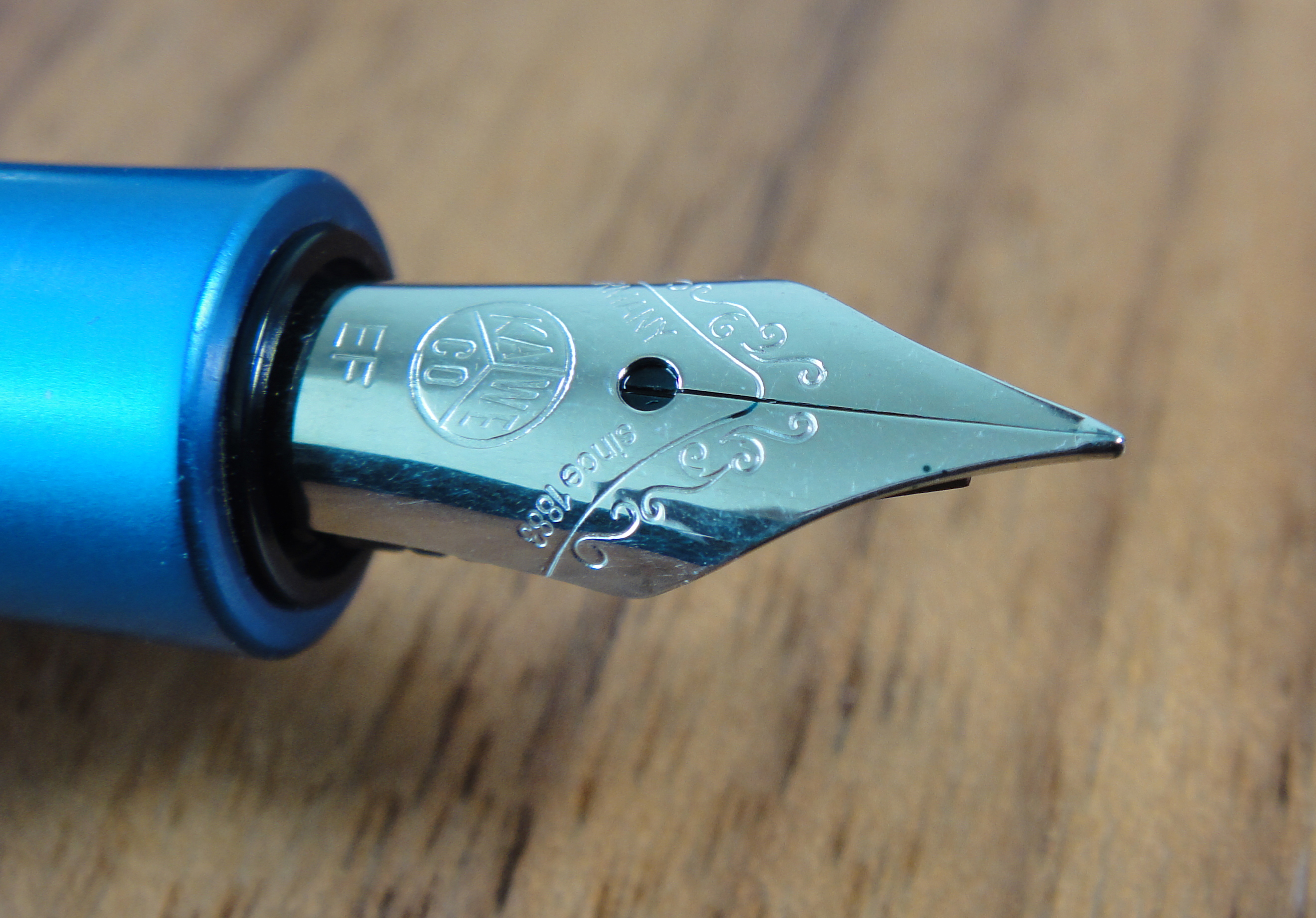
At the moment there is only one pen in Kaweco’s current line up that I truly do not like the looks of and it’s the Allrounder. Kaweco draws upon its history to recreate past pens and this works quite well most of the time.
The Allrounder comes from a 1950’s design that is “modernized” with a matte aluminum body. For me it doesn’t work. The body is swollen and plain. The more classic looking Kaweco DIA2 features the same body shape in plastic but features more embellishments that give the pen a much more elegant and polished look.
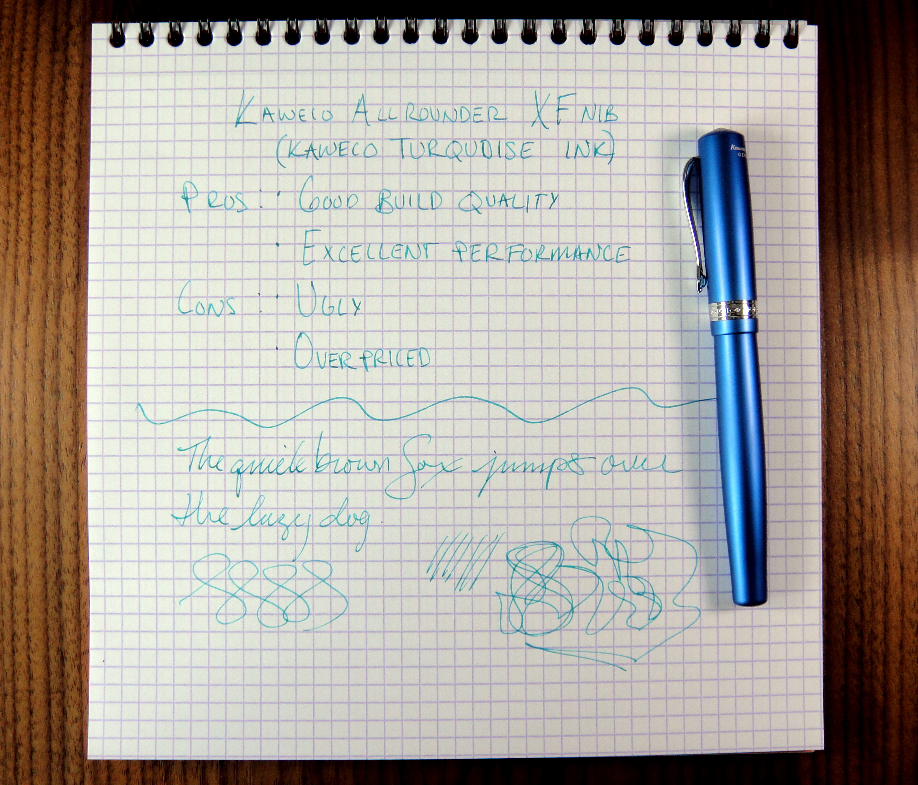
Kaweco uses the same sized Bock nib you get on a Kaweco Sport on the Allrounder and it proportionally looks too small for the body. The performance of the extra fine nib was excellent. No skipping or hard starting to speak of.
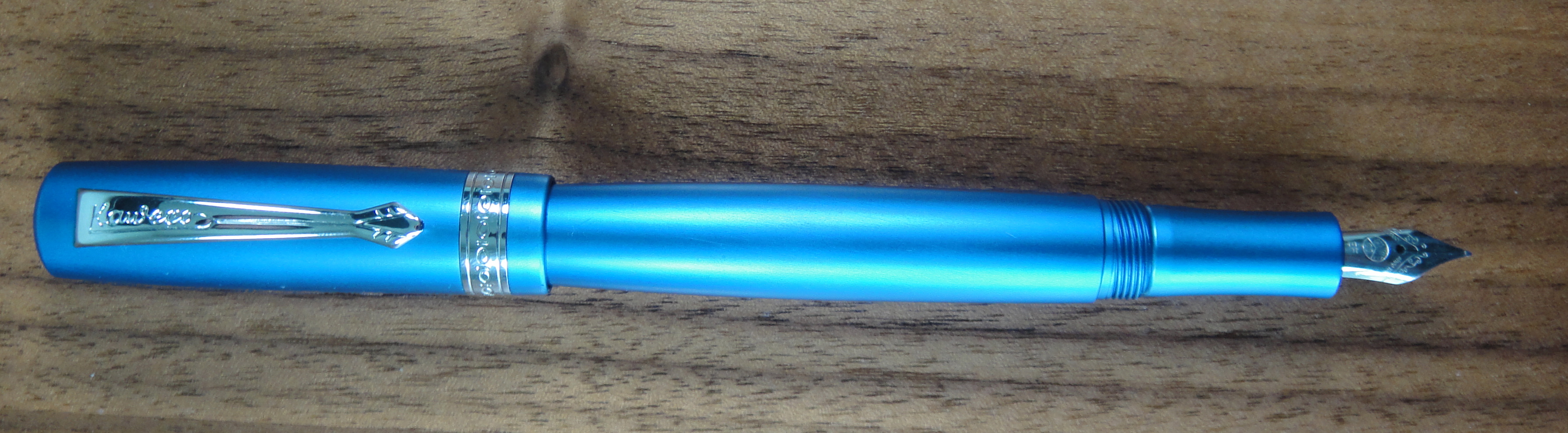
The overall construction of the Allrounder is very good. No issues in build quality.
The pen is comfortable to write with uncapped as it has a nice long grip section. With the pen posted the balance is pretty top heavy, so I wouldn’t recommend posting this pen. The Allrounder weighs approximately 32 grams and feels solid in hand. Capped the pen measures about 5.25″, 4.75″ uncapped about a bout 6.25″ posted.
The Allrounder comes with a converter and a nicer box than a basic Kaweco Sport but is it really worth its $100+ price tag? The answer for me is no. All you materially gain over the Sport is an ugly aluminum body and some cheap accessories. If Kaweco had given the Allrounder an upgraded nib or added a piston filler there would be more to talk about here.
Bottom-line: Ugly body aside, the Allrounder delivers too little to justify its $106 price tag.
Please note: this product was provided to me at no charge by Kaweco for review purposes.
Here are some great reviews of the Allrounder:
(I have no affiliations with any of the sites linked below)
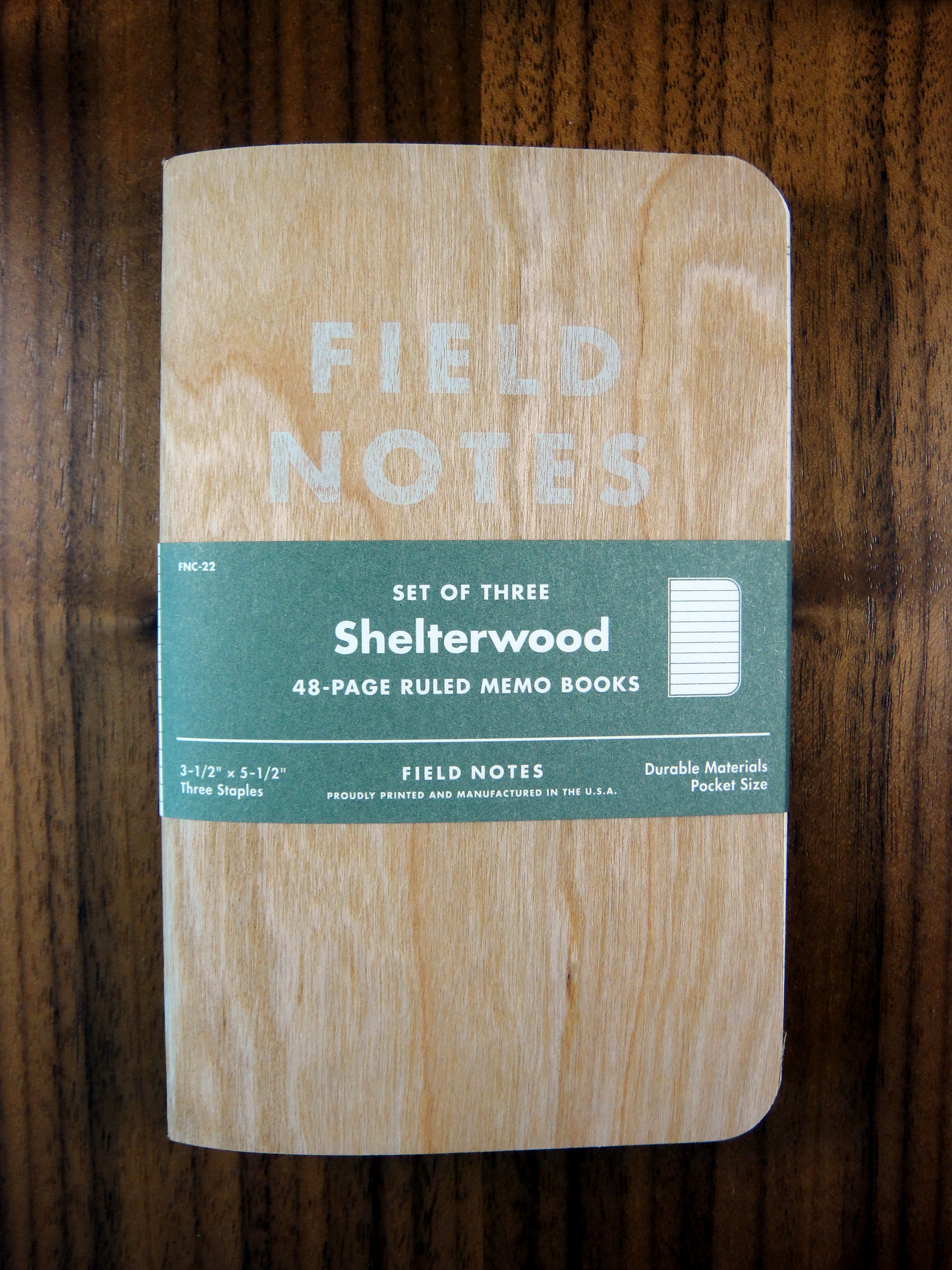
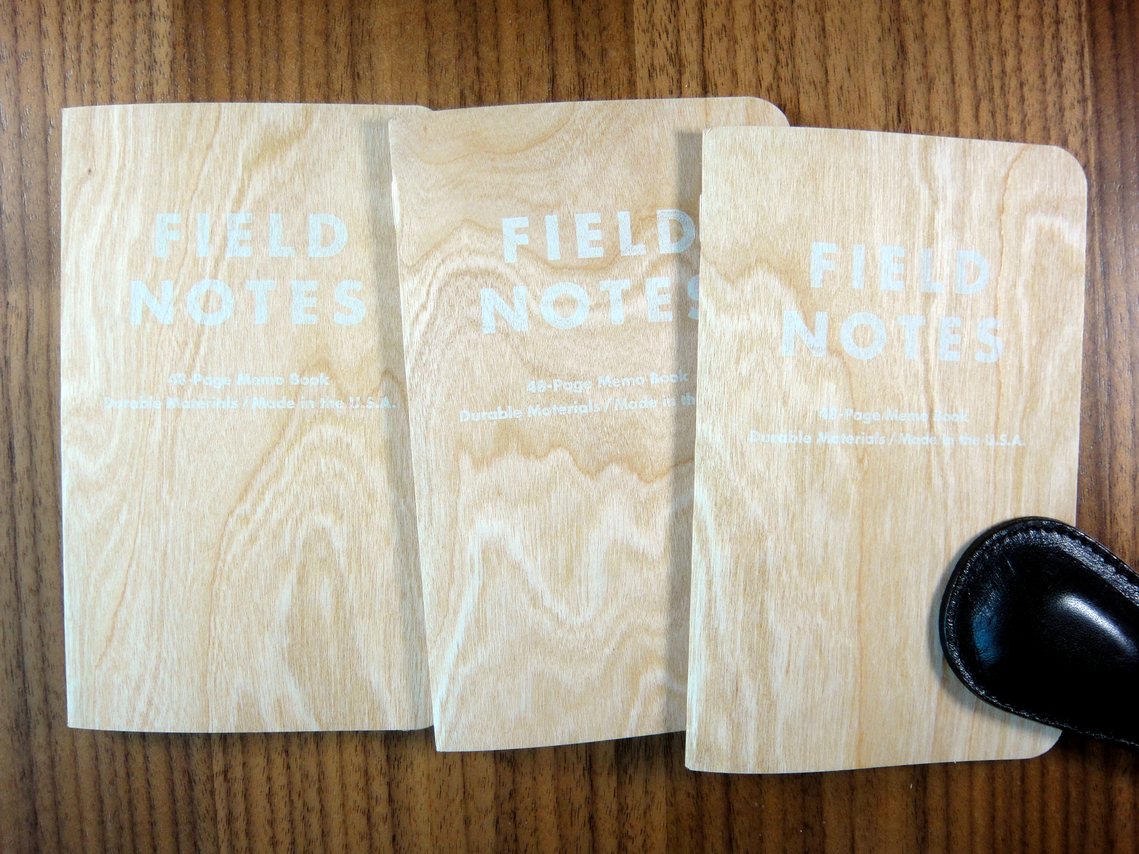
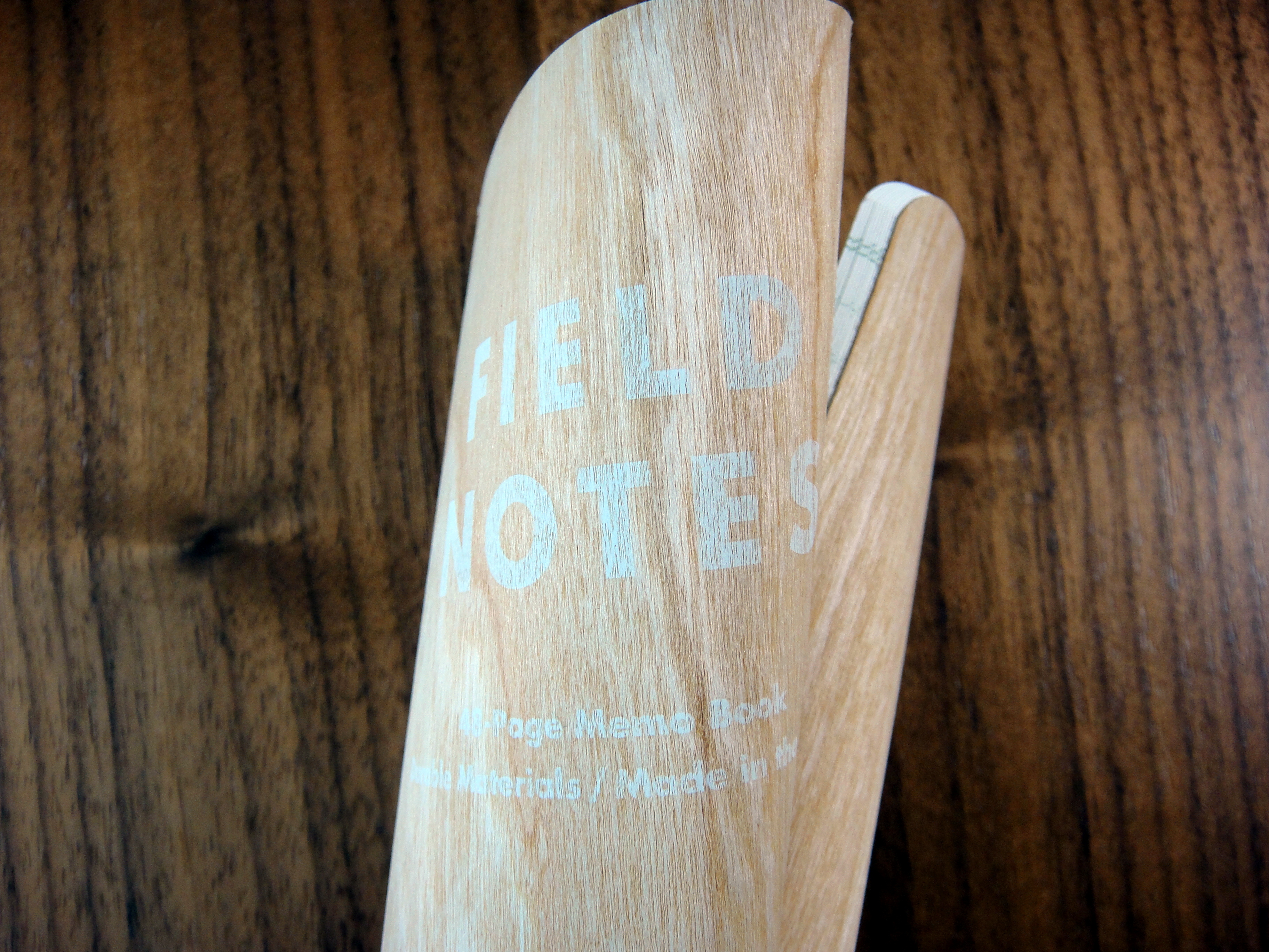
The Field Notes Shelterwood Edition has the most unique cover I have seen so far. It features a cherry wood veneer on a brown kraft paper and it looks awesome. The feel of the cover was initially off putting, it felt like badly sanded wood. As I used the notebook more it felt less and less rough. I did not see quite the variation in color and grain as Field Notes shows on their website but each of the covers is noticeably different.
The cover is surprisingly strong, I have used it in my back pocket for a few days now and I have not seen any splintering.
I suspect as these covers get older, they will become more brittle.
The paper is the same lined paper as you got in the America the Beautiful Edition, which is by far the most fountain pen friendly Field Notes paper I have come across.
Minor bleed and little ghosting.
This is definitely one of the best limited edition Field Notes I have seen. I can’t wait to see what they come up with next!
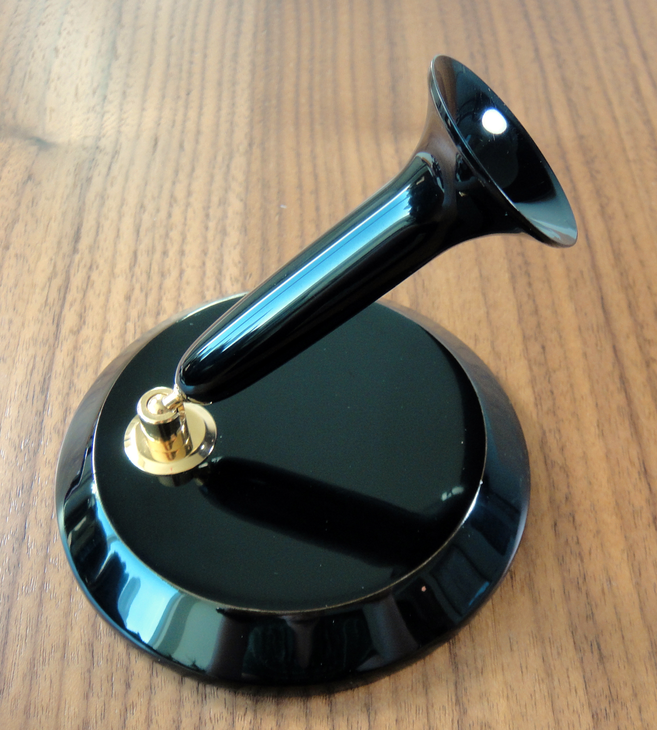
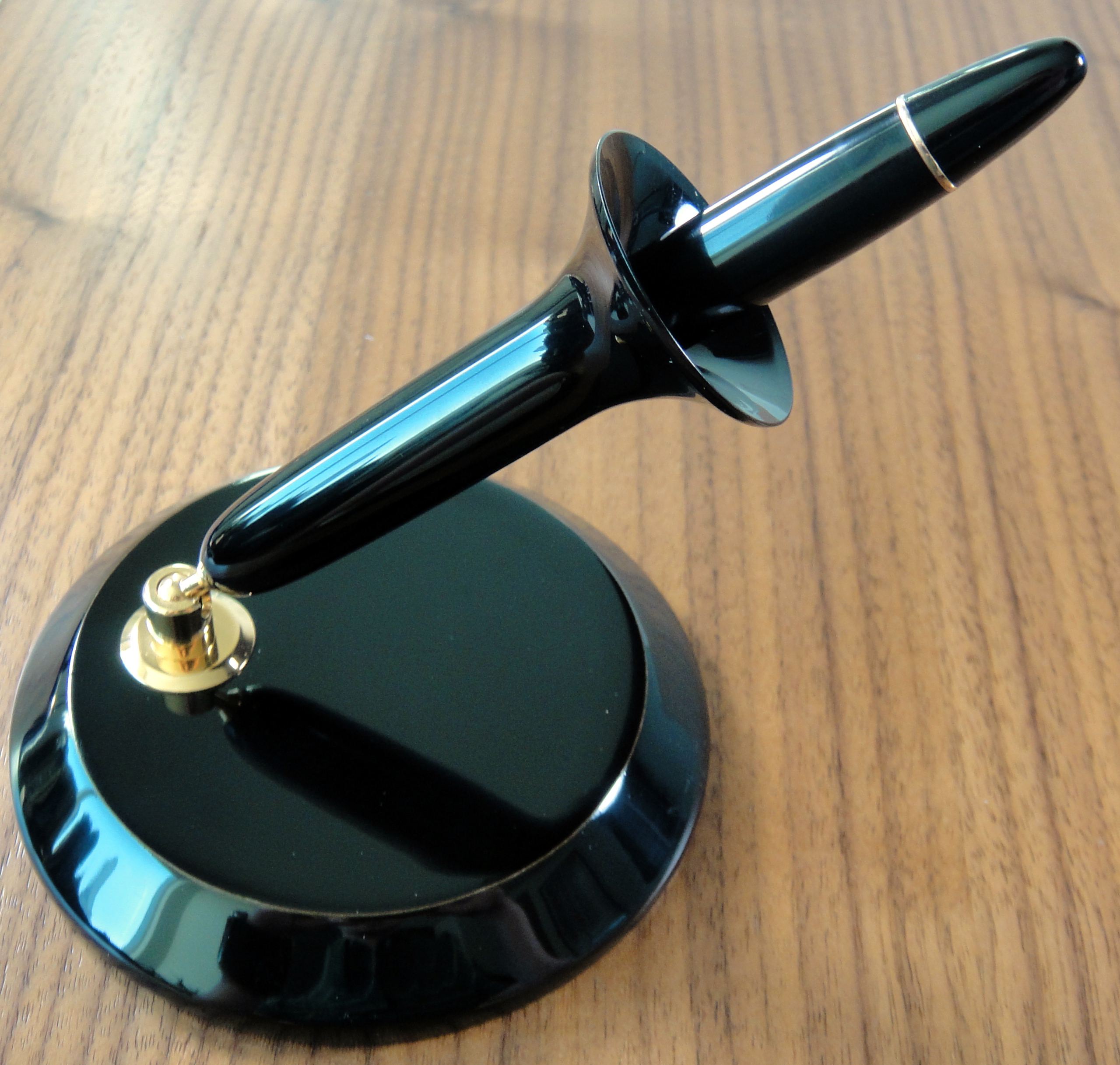
Nakaya Desk Pen Stand with Nakaya Naka-ai Cigar Negoro Shiro-tamenuri
Last year I purchased my first Nakaya, a Naka-ai Cigar Negoro in Shiro-tameuri. I tried using the Naka-ai at work and found that it was a complete pain to use for a number of reasons. Being a cigar model it has no clip; I would have to use the pen with a Nakaya pillow so that it wouldn’t roll off the desk. That was annoying. The second issue is the threading on the Naka-ai; because this pen is designed to be finished with complex paintings and designs there is a lot of threading so that you cannot accidentally misalign the artwork (or in the case of the Negoro model, the scars).
These two “annoyances” make the Naka-ai unusable for quick notes. To remedy this issue I purchased a Nakaya desk pen stand and now my Naka-ai is a pleasure to use at work.
I had read that Nakaya desk pen stand is compatible with a lot of other common non-Nakaya pens so I opted for the basic plain black Urushi lacquer finish with gold trim as I thought this would work well with more of my pens.
with 1950s Montblanc 146with OMAS Paragon
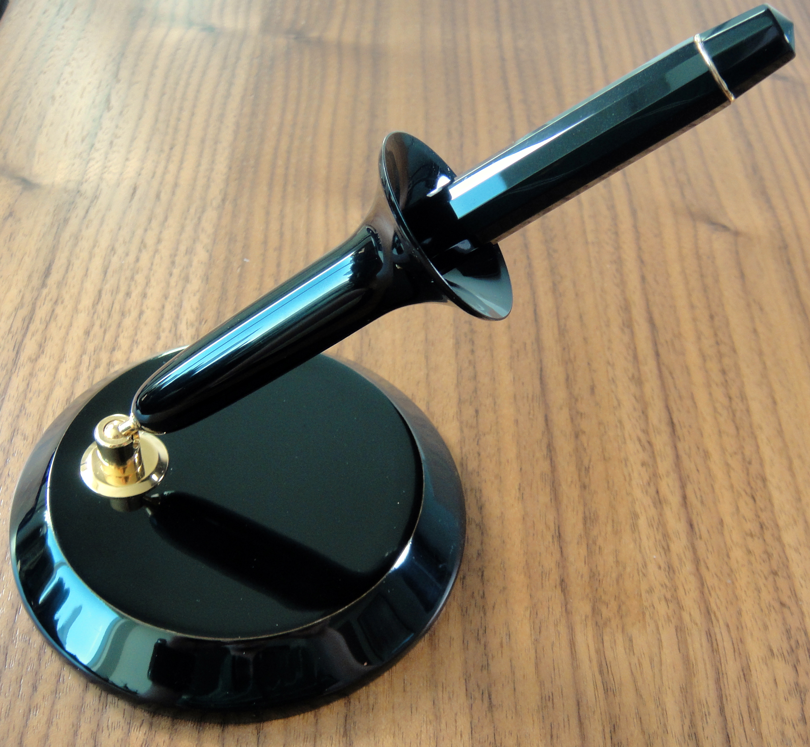
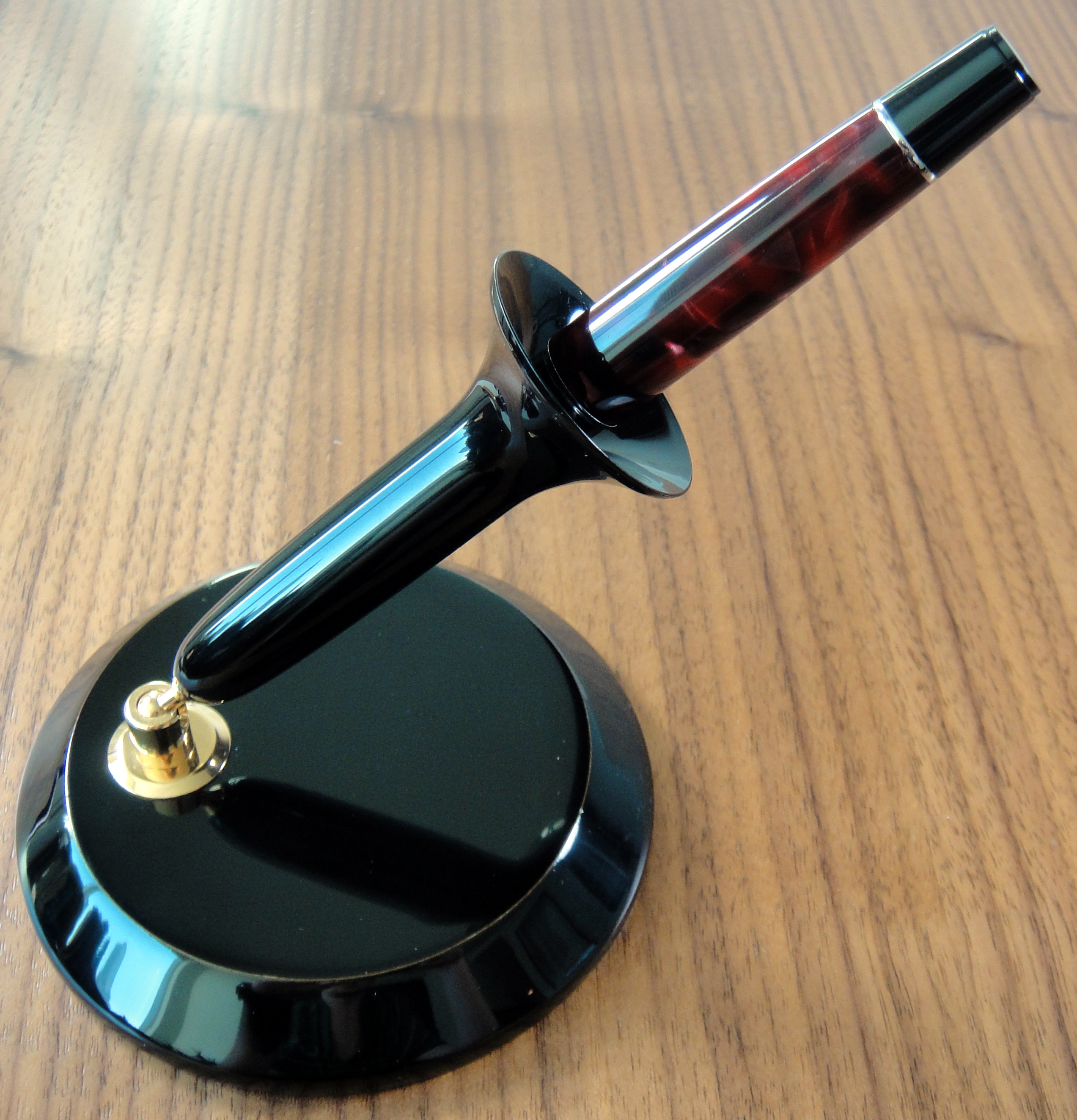
I have found that the stand works very well with my Montblanc 146, my Aurora Optima, my OMAS Paragon, my OMAS Ogiva, and my Visconti Van Gogh (original model with the K locking cap. It may not work with the smaller more recent models). Nibs.com (no affiliation) lists many more compatible pens that I have not had the chance to try with the stand. Sadly it does not fit a Montblanc 149.
with Aurora Optimawith Visconti Van Gogh
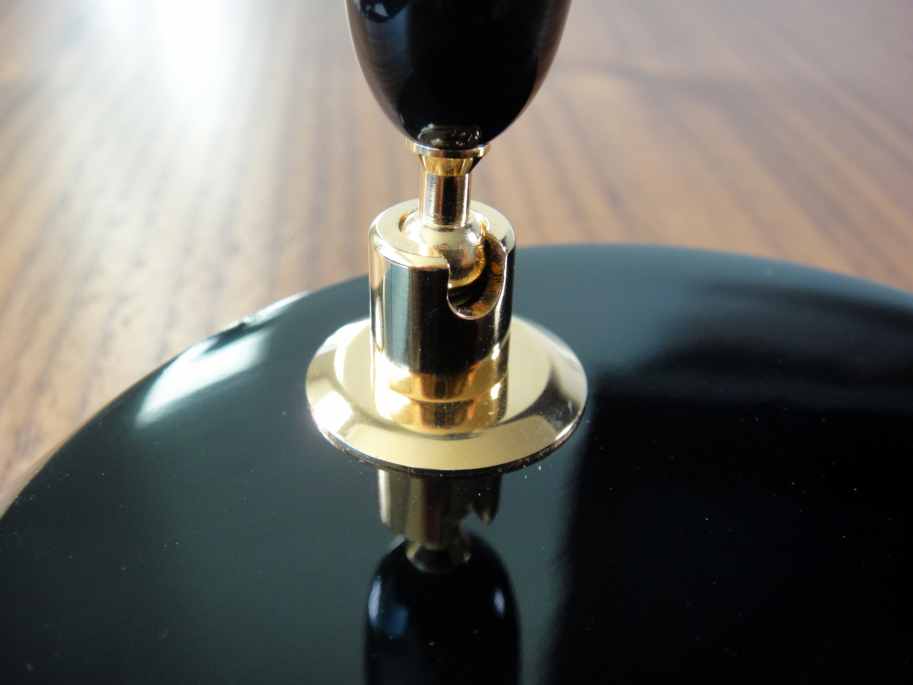
The fit and finish is as good as any other Nakaya product. The lacquer is gorgeous. The stand is sturdy and will hold your pen at any angle you choose.
The base is made of wood and the bottom is not finished in lacquer as the top is; this prevents the base from sliding around.
Overall, I am really happy with the desk stand as it has made a number of my favorite pens more usable. The utility it provides makes the $140 price tag well worth it for me. I definitely recommend this stand to Nakaya Cigar owners as well as anyone that gets tried of uncapping their pens.
The Sport is easily Kaweco’s most famous model. Its ability to expand into a full sized pen is very appealing and as such I have been using one for several years now and I love it.
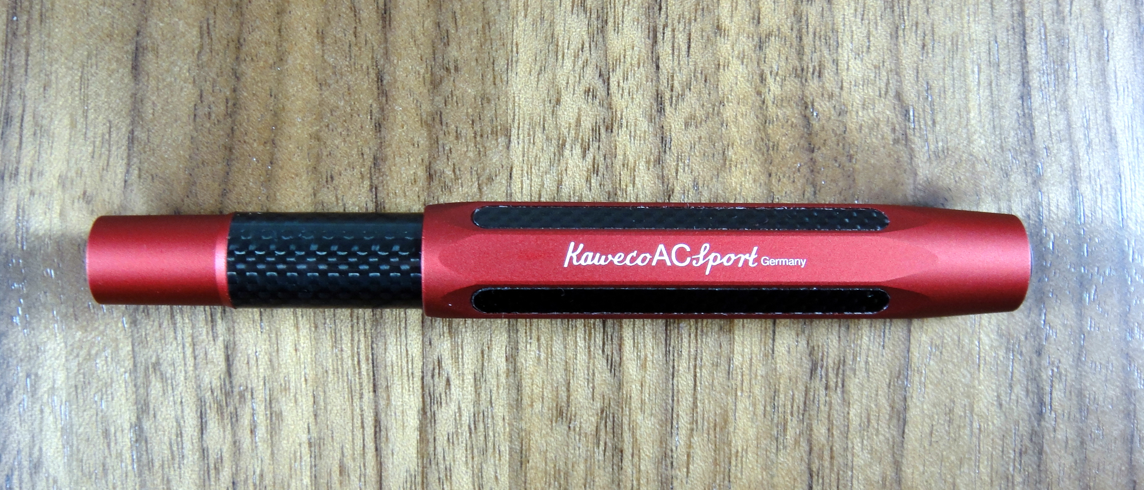
The AC Sport is one of the higher end models, featuring a gorgeous aluminum and carbon fiber body. Can the AC Sport really be worth five times the price of the standard Sport? Let’s find out.
Appearance
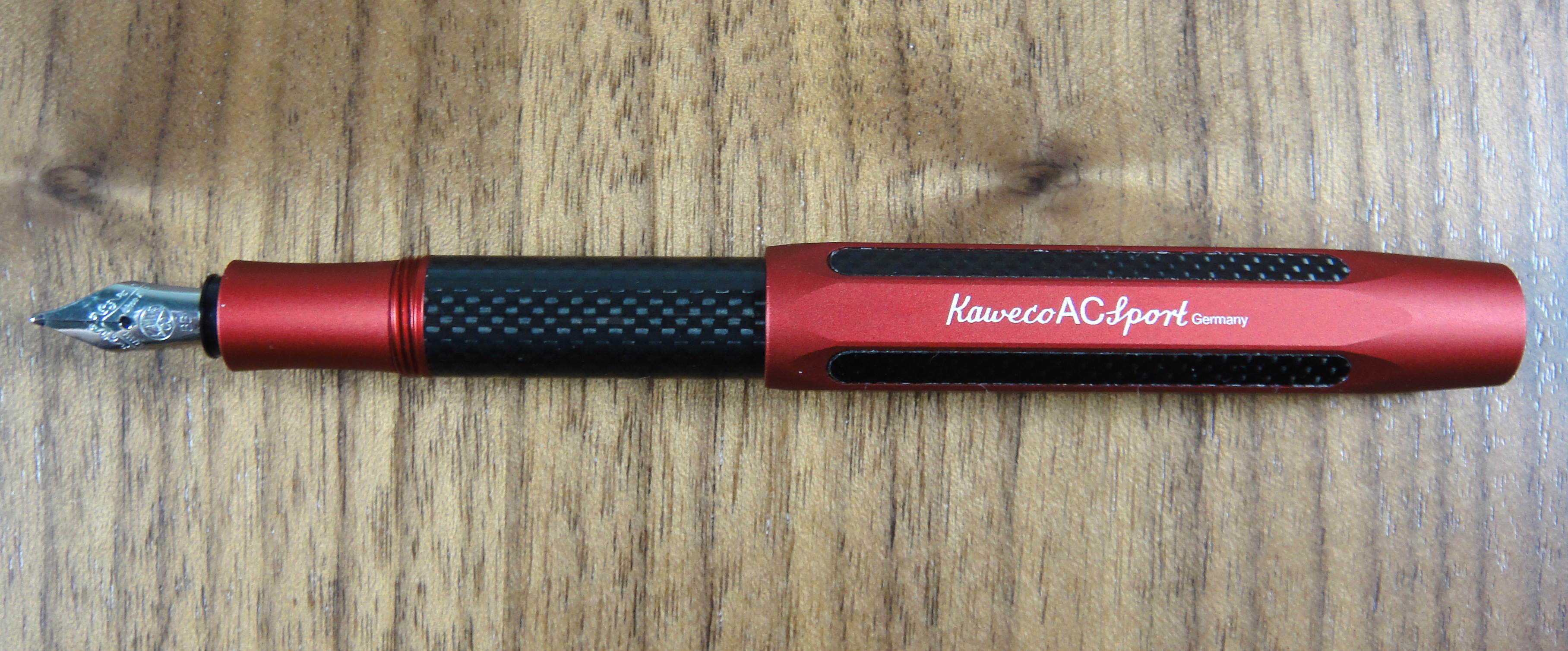
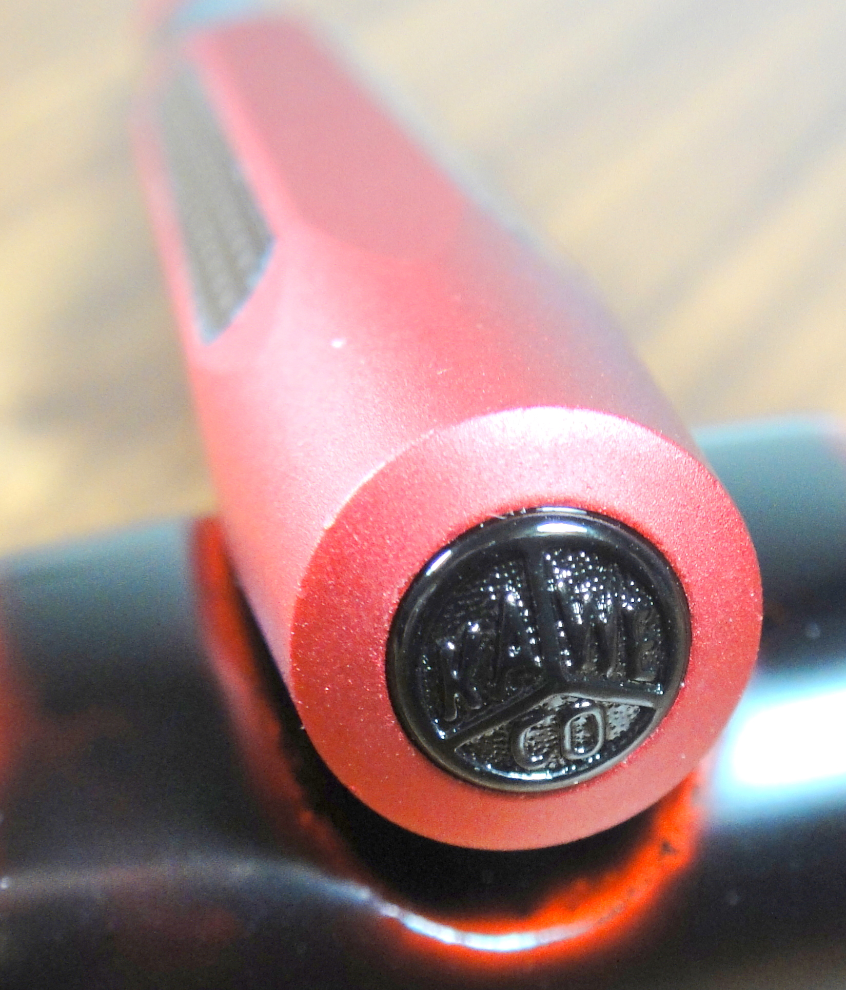
Kaweco was kind enough to send me several pens to review and the AC Sport immediately caught my eye. The red aluminum against the black carbon fiber is striking. I would have never picked this color combo but it’s fabulous.
The Kaweco Sport has a unique pocket friendly design. The cap is disproportionately large and because it is faceted it won’t roll off the desk. The small silver nib fits this pen well and the black Kaweco logo on the top of the cap is a nice touch. The carbon inside the facets though doesn’t look as clean as it could (more on this below). On the surface the AC Sport is beautiful pen.
Score: 4/5
Build Quality
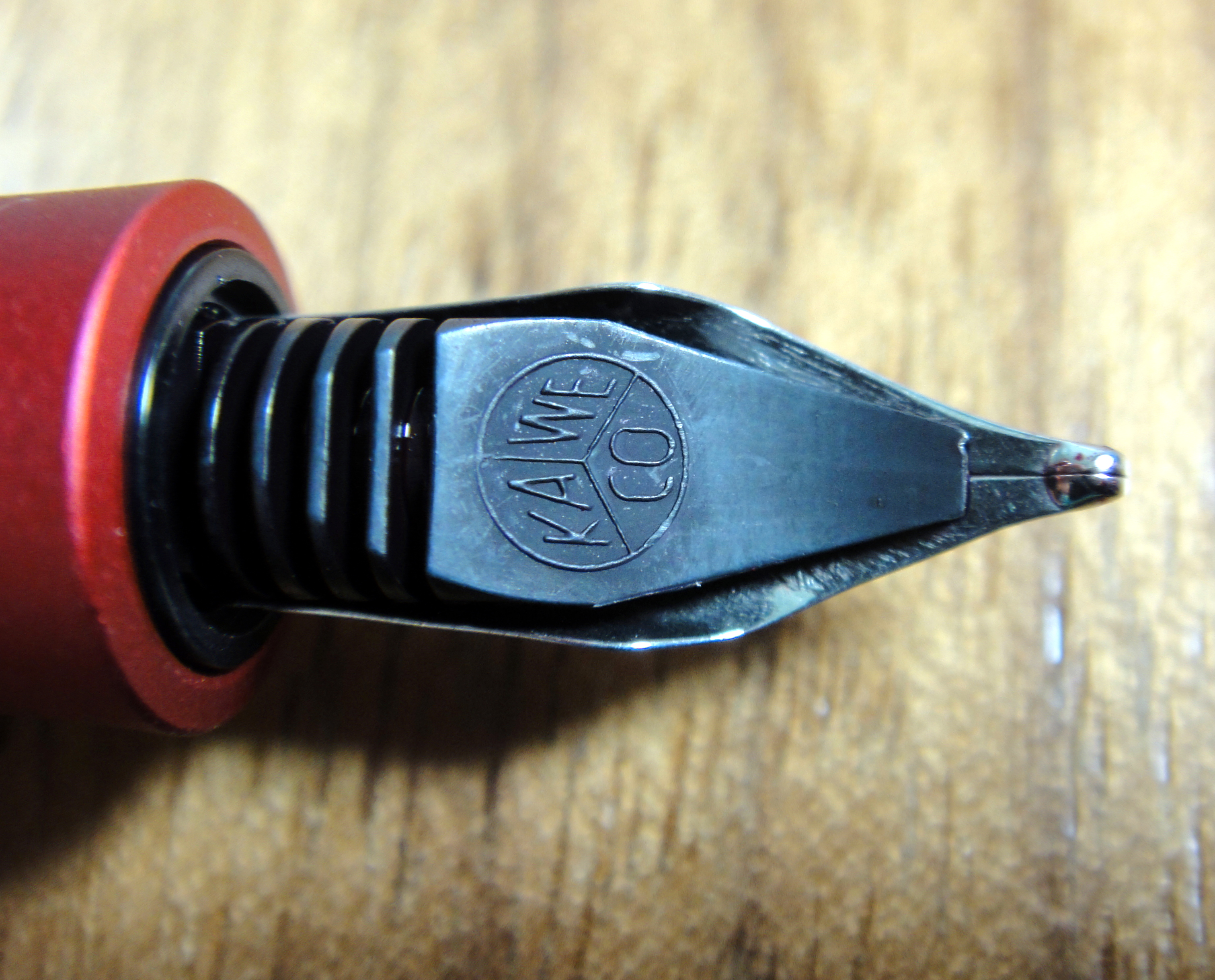
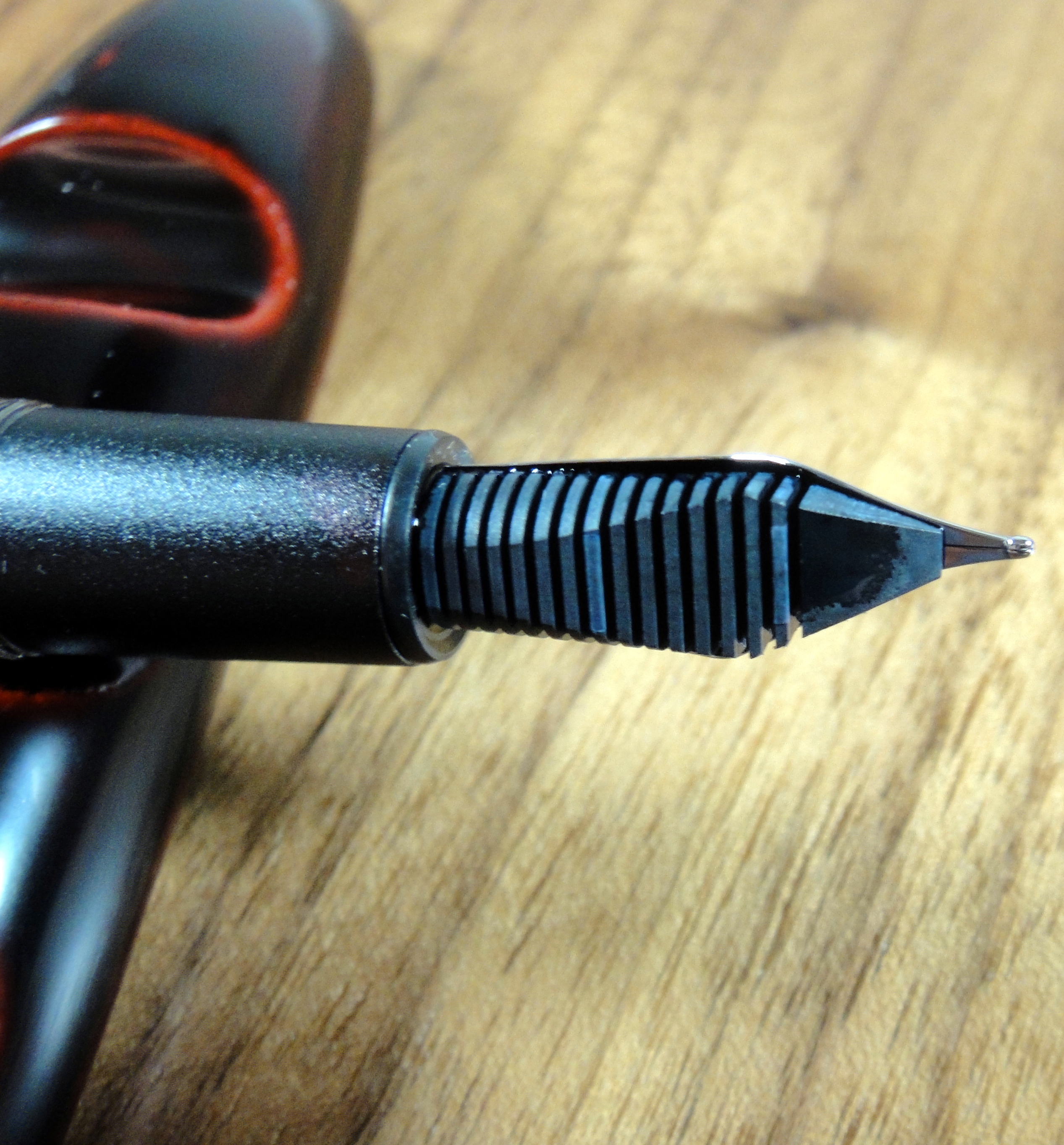
Most Kaweco new nibs require a bit of breaking in, and after a lot of use and cleaning, I finally gave up and examined the nib under a loupe. I found that the AC’s double broad nib has a misshapen point that has been causing the pen to skip on upstrokes.
This is something that can be fixed by a nibmeister but in all honestly, I would have a hard time shelling out the dough to fix a cheap steel Bock nib. Bad nib? Check, now on the body.
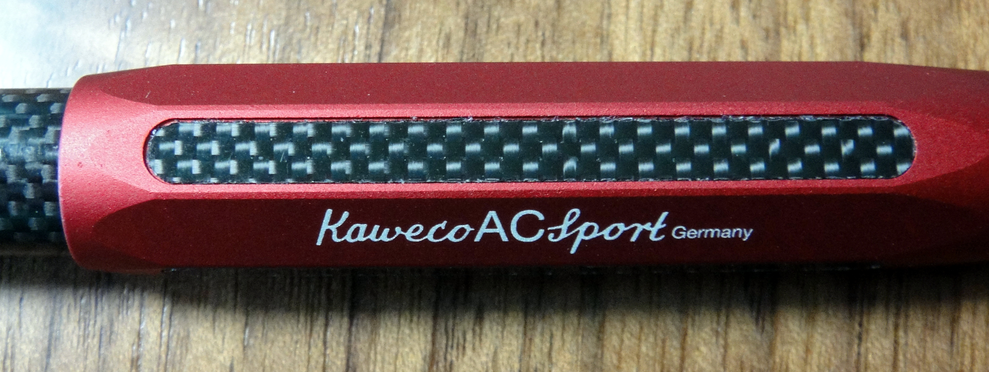
It should certainly be noted that carbon fiber is an expensive and difficult material to work with, that said, I found some issues with the carbon that sits in facets of the AC. Some of the carbon pieces did not fit perfectly into their slots and I also noticed that all of the carbon pieces on the cap has some rough almost frayed edges (see below).
If you look closely you will see that the edges of the carbon fiver looks fuzzy.
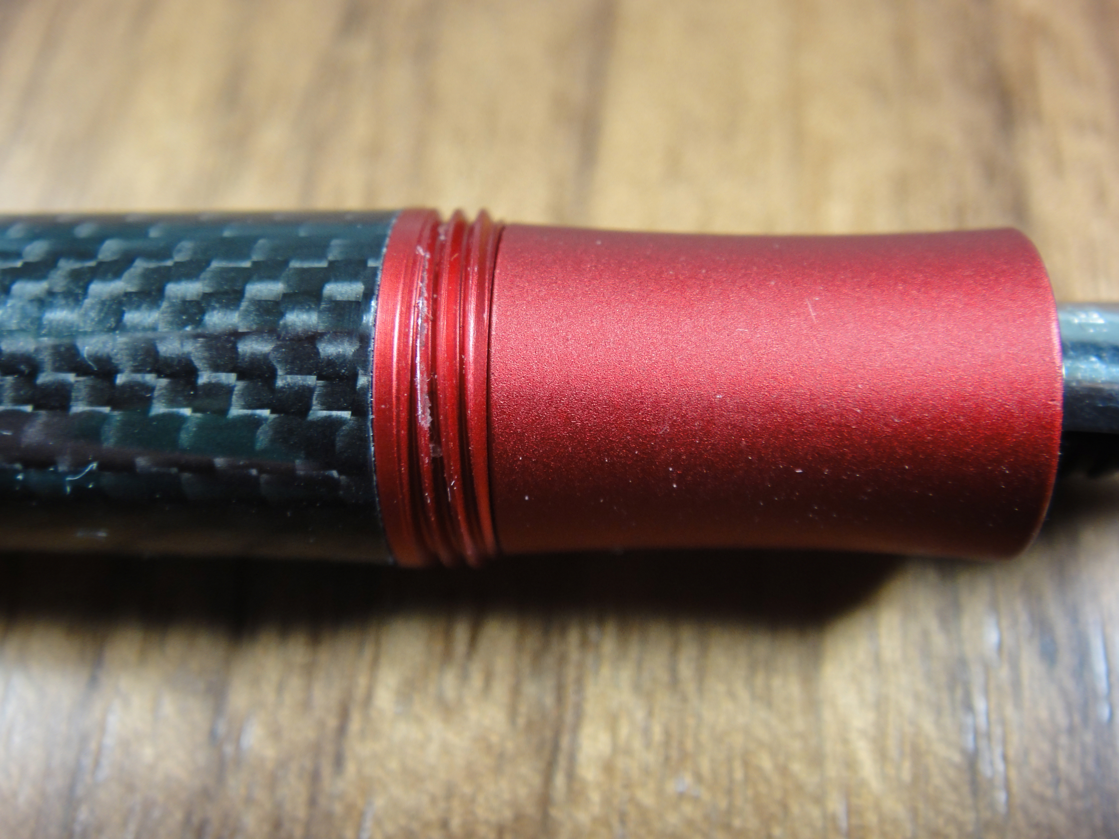
The fit and finish of the rest of the pen is good. It is worth mentioning that with use the red aluminum will scratch.
After about a weeks worth of use I noticed that the threading had scratched. Not a big deal but you need to be careful if you want to keep the finish perfect.
The black Kaweco logo on the cap isn’t the most defined and that made it a bit tricky to photograph.
The issues with the carbon are minor and forgivable for a $120 pen but for me a misshapen nib is not. This is not a cheap pen and there really should be more quality control. I flushed the pen before I used it and the water came out completely clear, normally I would expect to see a bit of ink; this is a likely indication that the pen was not tested before leaving Kaweco.
Score: 2/5
Size & Weight
The Sport’s most prominent feature is its ability to transform from a mere 4.1” capped to 5.3” posted. The AC Sport weighs in at 22.5 grams and the standard plastic bodied Sport weighs less the half of that at 10.5 grams. The AC Sport is by no means a heavy pen but it does have enough weight to feel solid in hand.
My hands are on the smaller size and I find that I can use the pen unposted without any issue though people with larger hands will definitely need to use the cap as the body measures only 4”.
The small grip section is made from aluminum and has a medium sized diameter of about 0.6”. It feels a bit constrained, as there are not a lot of choices in where you can place your fingers.
I find the AC Sport to be fairly comfortable for long writing session but those with bigger hands may not.
Score: 3/5
Performance
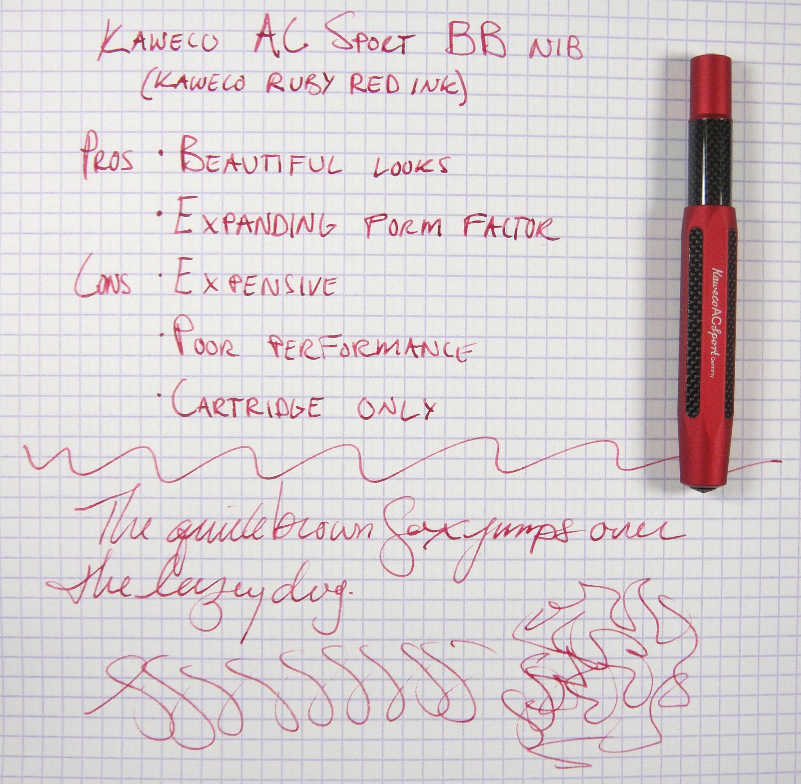
The nib being a double broad is buttery smooth; it feels wonderful on paper but unfortunately due to the misshapen nib it doesn’t work all that well. The nib regularly skips on upstrokes.
I also had issues with ink flow. I normally store my fountain pens nib up but for this AC Sport I found that it can take a while to get the ink flowing properly; I was able to solve this problem for the most part by storing the pen nib down.
Notice the skipping in the figure 8s at the bottom.
Score: 1/5
Filling System
We have arrived at the major downside of the Sport’s size, its filling system. Because the body is so short this pen only accepts short international cartridges. A converter is too long to fit.
On the plus side, the Sport accepts a standard sized cartridge which will give you lots of choice when it comes to ink, but if you love bottled ink like me, you may find your self needing a syringe to fill empty cartridges with your favorite ink.
Score: 2/5
Value:
Considering that this pen uses the exact same Bock nib as you get on the standard $23 Sport, it is hard to argue that the AC Sport is a good value at $123. For the same sort money you could have the Pilot Vanishing Point with an 18k gold nib or the excellent Pelikan M205.
Would I recommend the AC Sport? Nope…but in the spirit of full disclosure, the moment I saw the AC in person, I knew wanted it for my collection; it really looks that good. If the nib wasn’t such a disappointment, I would have gladly paid the full $123 for this pen.
Score: 2/5
Bottom Line: This fantastic looking pocket pen is ultimately let down by its high price and poor quality control.
Final Score 14/30
Please note: this product was provided to me at no charge by Kaweco for review purposes.
Here are some great reviews of the Kaweco AC Sport:
(I have no affiliation with the sites linked below)
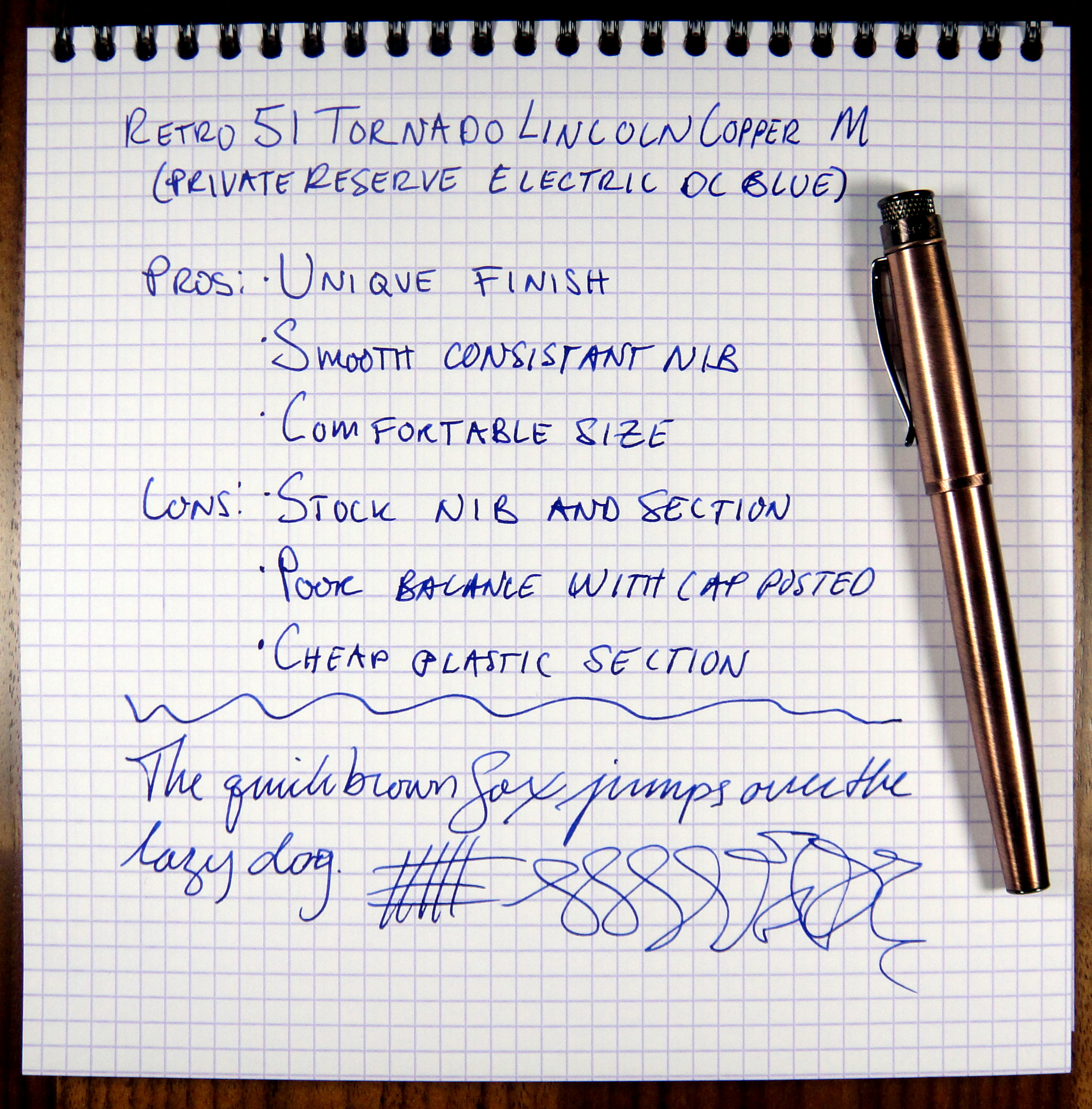
Confession: Retro 51 is not the sort of pen company that I like. I strangely and perhaps misguidedly want an emotional attachment to my pens and this requires one of the following a) manufacturer with a romantic or storied history, b) a detailed account of how the pen is made and c) who made that pen. You get none of that with Retro 51; the company makes a few pen models with tons of designs; there is no about page and very little company info on the Retro 51 website.
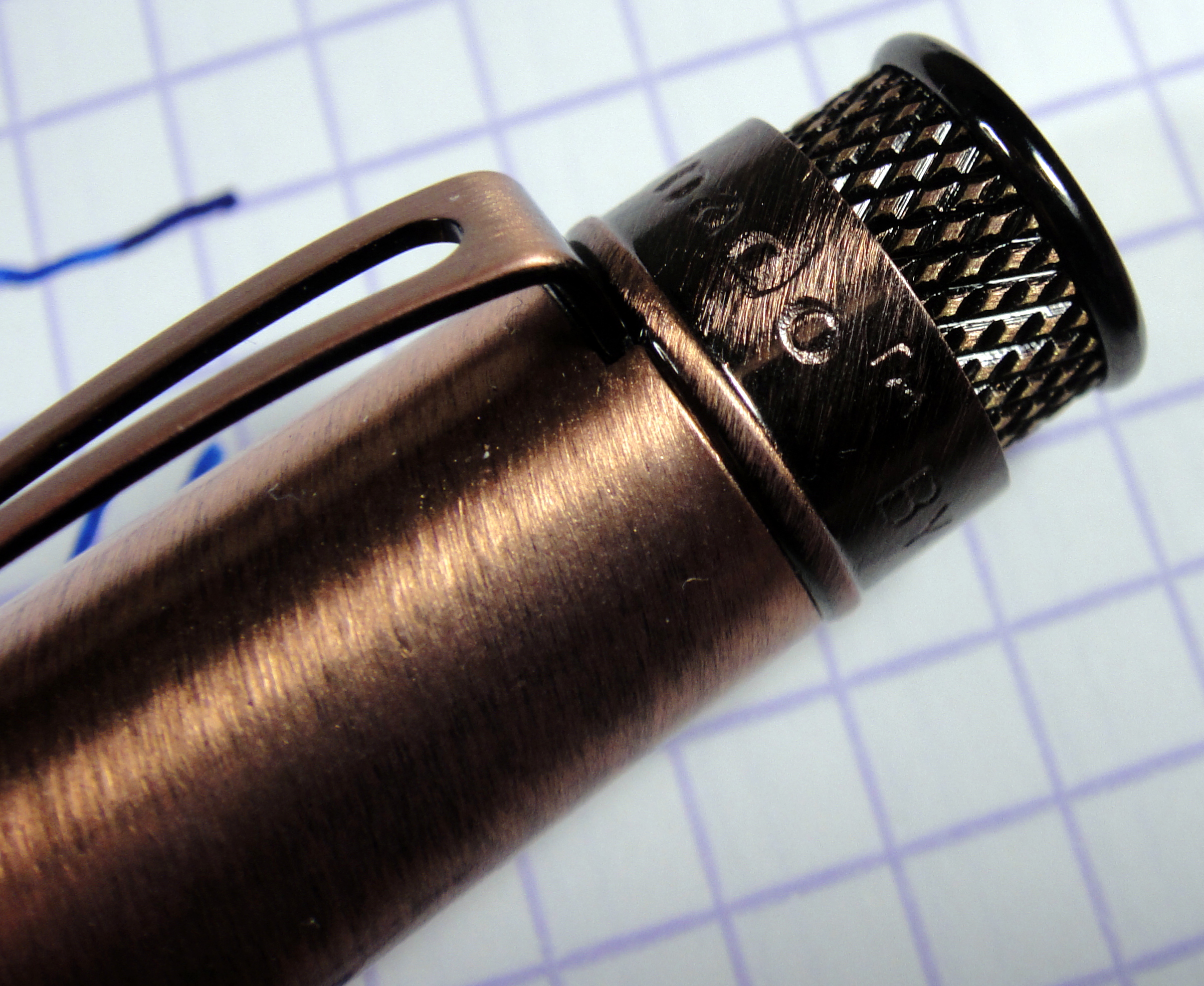
The Tornado is Retro 51s most popular model and comes in many different designs; they come in lacquer, leather, various metals, and crossword designs and so on. The one I will be reviewing is the Lincoln Copper EXT version which features an antique brushed copper finish.
Appearance
When I first saw this pen I immediately wanted to touch it. The antique bushed copper finish looks fanatic, similar to that of an old penny. I cannot think of another pen with a similar finish. The cap features the knurling at the top, which is the Tornado’s signature feature. The copper is brushed at an angle and is consistent on the cap and barrel. At the top (just under the knurling) and bottom of the cap is a darker bushed copper, which is bused at a slightly sharper angle. Despite its thin appearance the clip feels very strong.
Under the cap is a big stainless Schmidt nib and a matte black plastic section. I would have loved to see an ancient copper colored nib with a Retro 51 logo but at this price point it’s not a huge deal.
Overall, I like the Tornado’s appearance; it is very casual looking but in a good way. If you are looking for a pen a diplomat would use, this isn’t it.
Score: 3/5
Build Quality
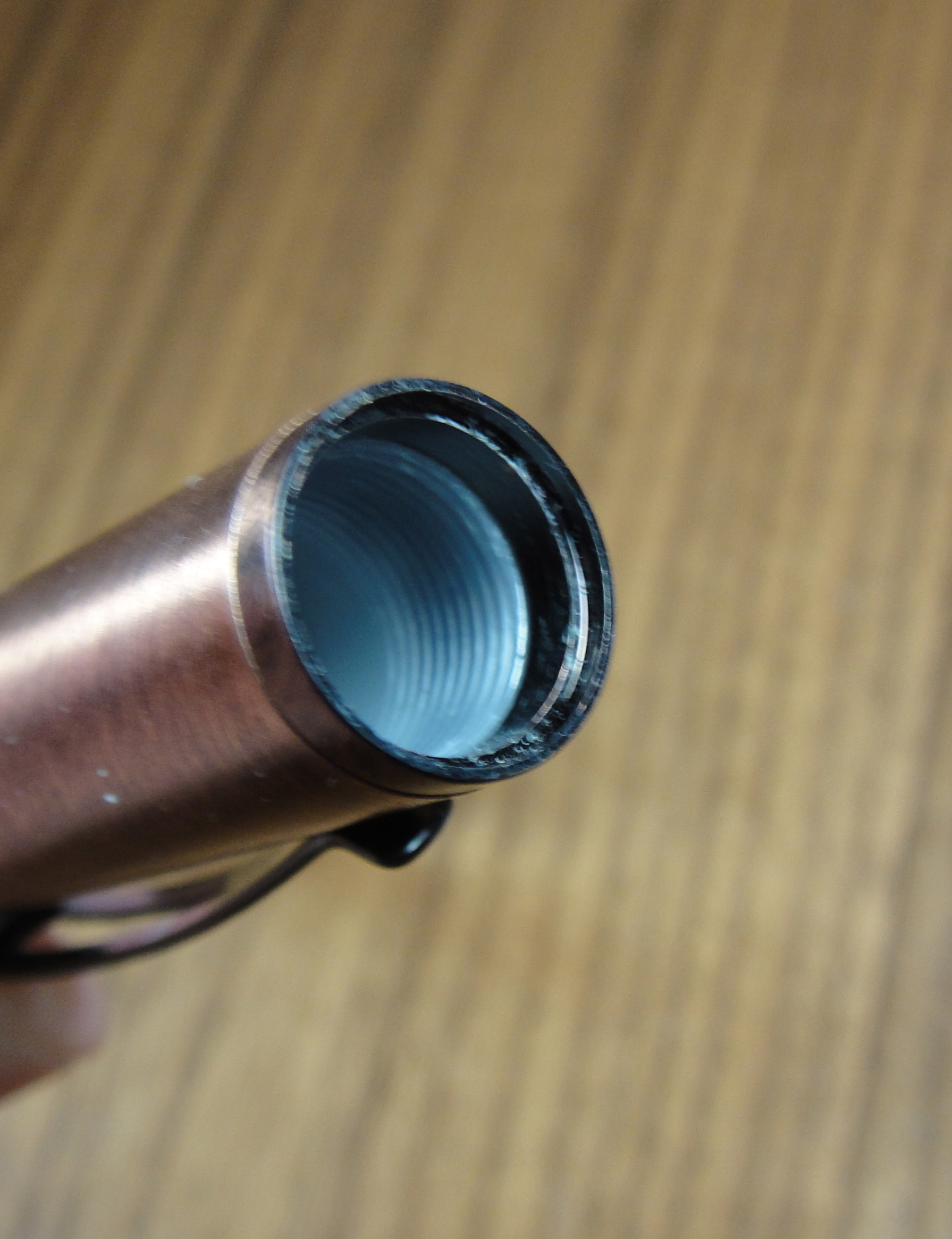
Plastic threading in the cap.
The weight of the metal body gives the pen a nice feel in hand. The threading on the barrel is metal and the threading on the inside of the cap is plastic. The twisting the cap on isn’t the smoothest but I haven’t found it to be distracting. The section threads are poorer and don’t feel nice in use. The nib and section look to be completely unmodified Schmidt components which is an indication that they didn’t put a lot of thought (or money) into making this pen a fountain pen. The matte plastic nib section looks cheap but feels fine to the touch and has no seams that I can see. The Schmidt nib has a plastic feed and is a bit out of alignment. While there clearly isn’t much handiwork used to produce the Tornado, I cannot really fault it too much at this price point. Are the best materials used? no, and while plastic section really doesn’t belong, everything on the pen is decently made.
Score: 3/5
Size & Weight
The Tornado measures approximately 5.5″ capped, 6.5″ posted and 5″ uncapped. It weighs just under 33 grams with an empty converter. The cap weighs about about 15 grams with most of its weight at the top of the cap and unfortunately this results in a poorly balanced pen when posted. I believe that its size, uncapped, will be comfortable for most people. The cap does post nicely but I do not recommend doing so other than to jot down some quick notes.
Score: 2/5
Performance
My Tornado came with a medium point Schmidt nib and it writes quite well. The nib is smooth and the flow is ample. I have had no issues with skipping or hard starting and I have left the ink in the pen for over a month. The feed is a bit out of alignment but I found no performance issues. The grip section is big and comfortable making this pen a good candidate for long writing sessions. The nib isn’t a nail but it is stiff and like most nibs in this price range, does not have a ton of character.
Score: 3/5
Filling System
The Tornado uses a converter/converter filling system. It was nice to see that a Schmidt converter was included with Tornado. I used the Schmidt converter in my tests and it works well and holds a good amount of ink for a converter but it isn’t a show piece; it is all plastic and its body isn’t as crystal clear as other convertors I have used. The plastic feed is large and was surprised by the mileage I got from dipping the pen. I can almost fill an entire A4 page before it ran out of ink.
Score: 3/5
Value
The Tornado in Lincoln Copper costs about $50 and in the $15-75 price range it is really about looks…when you start getting up to the $100 mark some pens will have more distinctive features like gold nibs, or piston fillers and so on. Retro 51 didn’t modify the Schmidt nib and section and while that isn’t a deal breaker, it definitely does not make the $50 price tag easier to swallow. The Copper finish is unique and if you love the look I could see shelling out the dough for this pen. I definitely recommend the Lamy Al-Star/Safari or Pilot Metropolitan over the Tornado as a starter pen because they give you more value for your money and have nibs that are easy and cheap to swap.
Score: 2.5/5
Bottom Line
The Tornado is a great pen but you really have to love its looks to justify the price tag. Final Score: 16.5/30
Please note: this product was provided to me at no charge by Retro 51 for review purposes.
Here are some great reviews of the Tornado:
(I have no affiliation with the sites linked below)
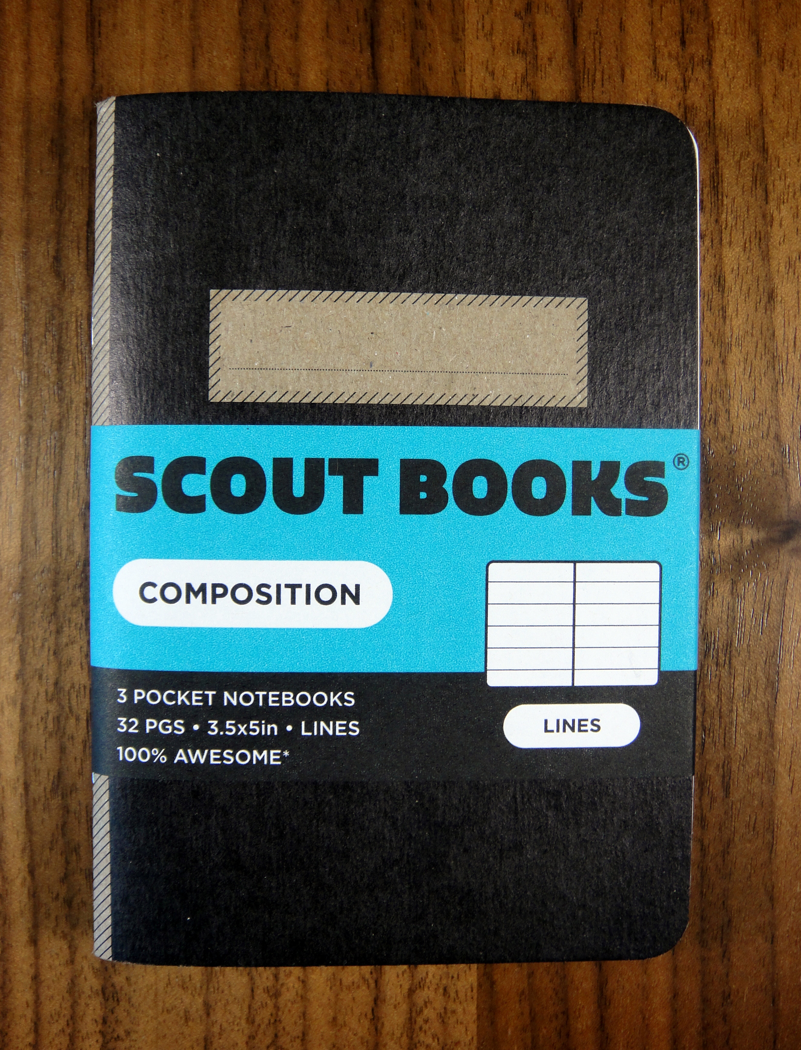
The Scout Books Black Composition notebook is a pocket sized journal that is made in Portland, Oregon and measures 3.5″x 5″ (half an inch shorter than Field Notes). Each Composition notebook contains 32 6mm ruled pages. The paper is recycled and is noticeably thicker than the standard Field Notes paper. In using the Scout Books side by side with a Field Notes I noticed that Field Notes lays much flatter than the Scout Books notebook.
The cover features a simple black design that looks like a composition notebook (imagine that). I like that there is no branding on the front cover. The design is quite good but I have to say that I prefer the look of Field Notes.
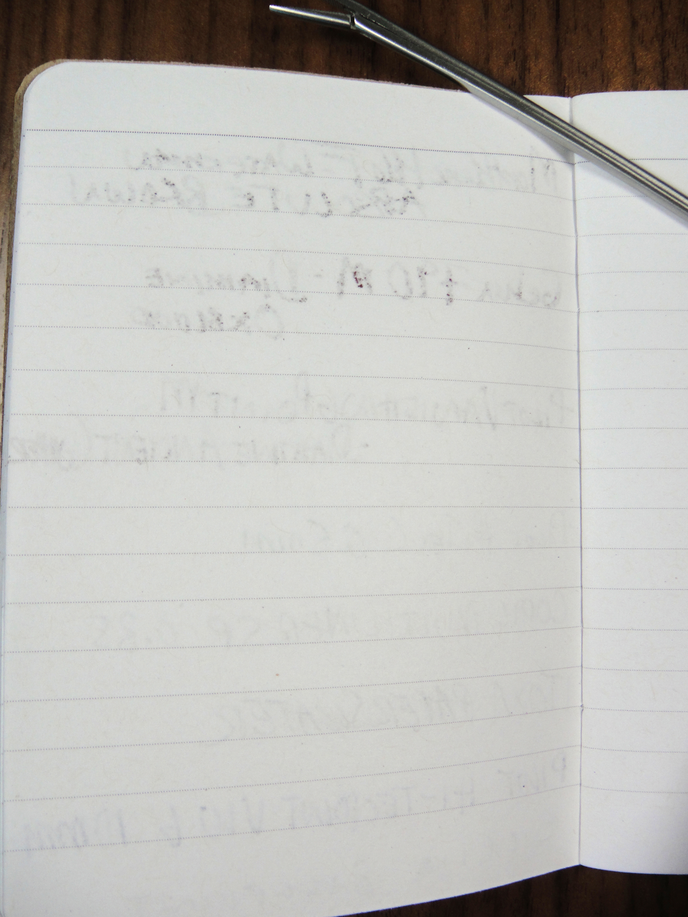
Although the paper is rather thick, it did not handle fountain pen ink all that well. There is some bleeding and feathering much like you get with a standard Field Notes.
The Scout Books Black Composition notebook sells in packs of 3 for $10. While I do like these little notebooks, I prefer Field Notes as you get get similar performance, more pages, and a better design for the same price.
Please note: This product was provided to me at no charge by Scout Books for review purposes.
Here are some great reviews of Scout Books:
(I have no affiliation with the sites linked below)
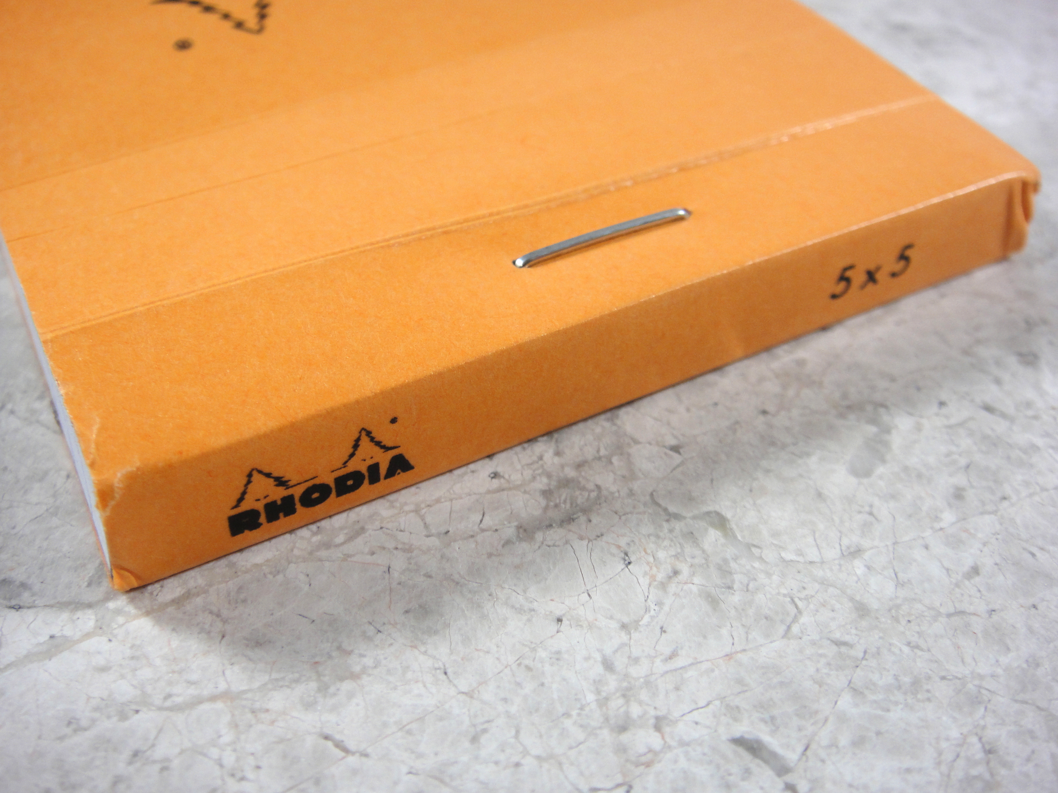
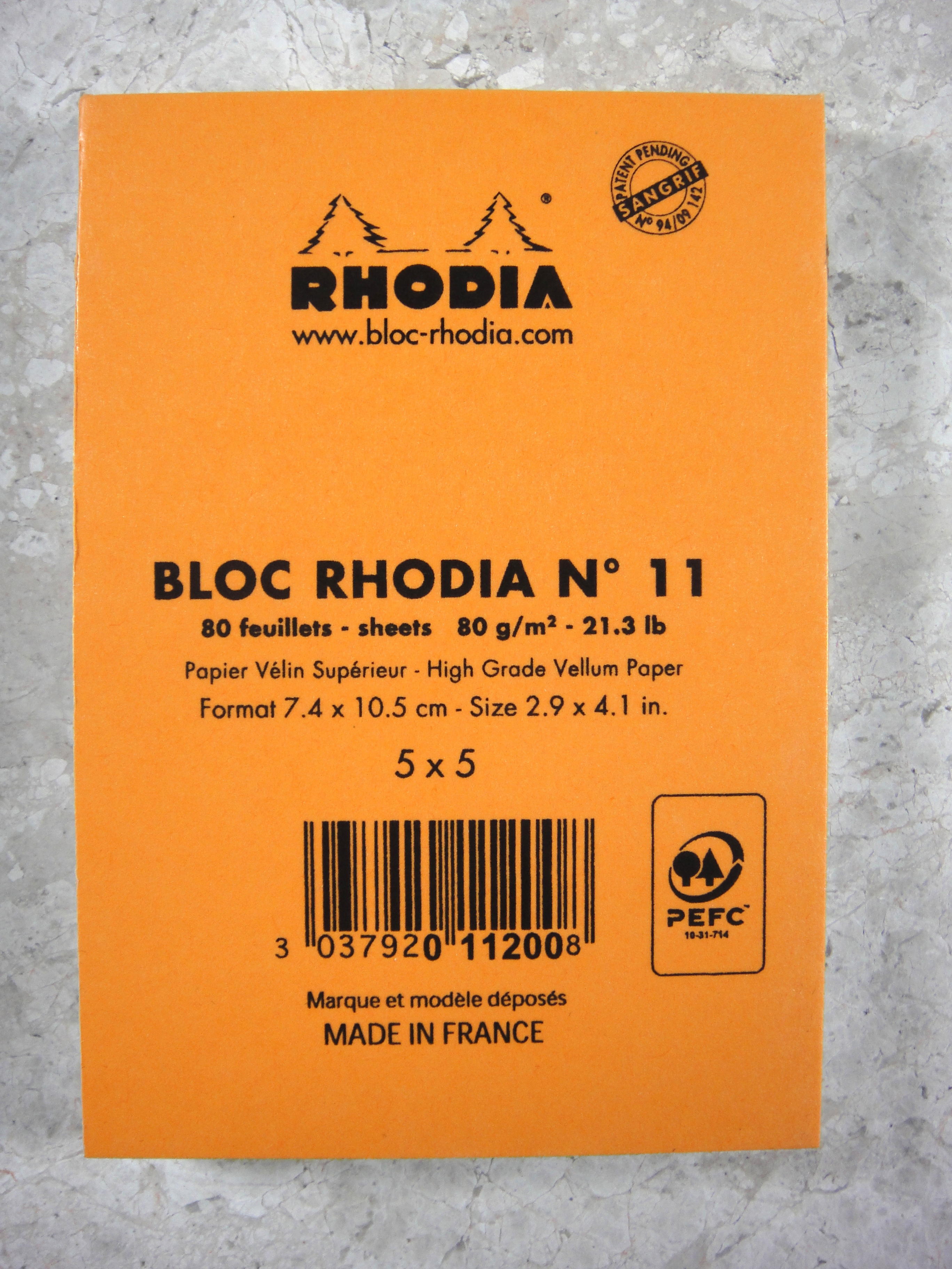
I love Rhodia paper products because they are both affordable and fountain pen friendly. They come in dozens of formats and I have tried almost all of them and only two have remained staples in my notebook collection: the Rhodia Reverse Book (review to come) and the Rhodia Bloc Pad No 11.
The No 11 is small notepad that measures 2.9″ x 4.1″ and contains 80 sheets of Rhodia’s standard 80g paper in lined and graph formats (I prefer the graph). The No 11 comes in black and classic Rhodia orange covers. Like the vast majority of Rhodia products, there is a lot of branding; all three sides of this tiny pad have the Rhodia logo. The sheets are micro perforated and if you are careful the sheets come out pretty easily. Because the sheets are bound only with one centered staple it is important pull the paper up off the pad to get the perforations to work. If you pull straight the paper will detach at the staple.
The No 11 is great for short lists and notes. I prefer them to using sticky notes.
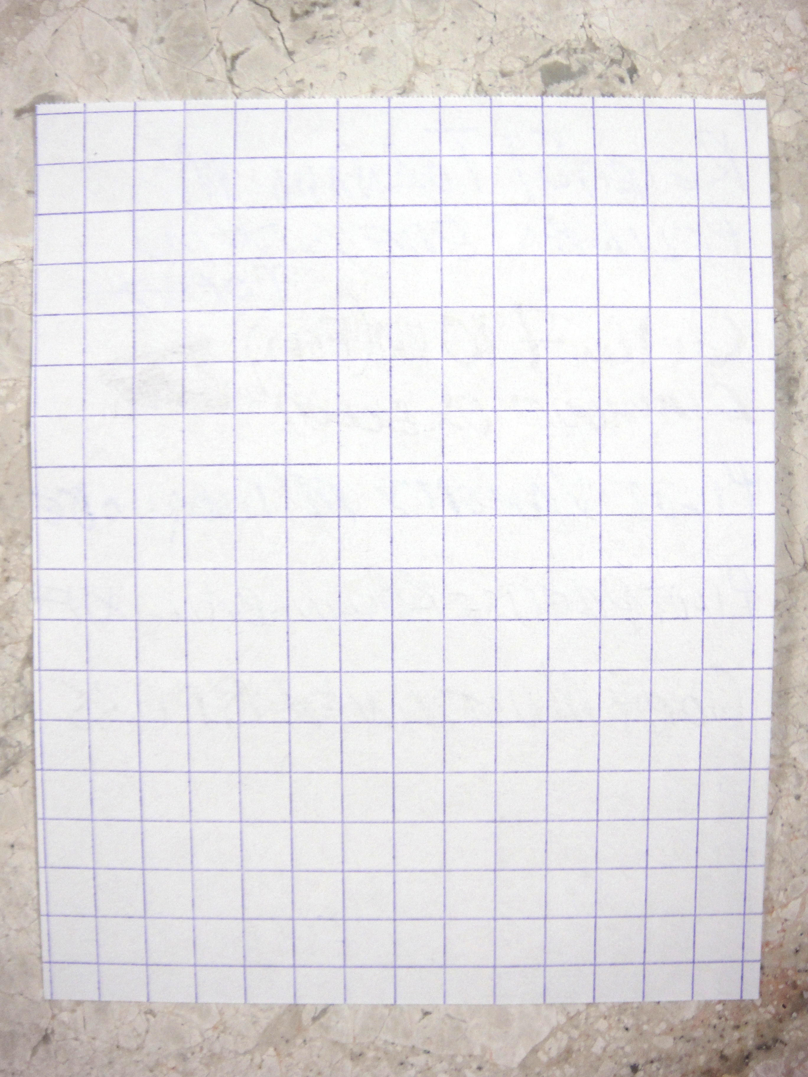
As you can see there are no issues with feathering or bleeding. Rhoida (and sister brand Clairefontaine) are the gold standard when it comes to fountain pen friendly paper and it is easy to see why.
Virtually no ghosting to speak of.
At $2 a pad it’s pretty hard to go wrong. I believe the No 11 would be useful to almost everyone; I highly recommend it.
Please note: this product was provided to me at no charge by JetPens for review purposes.
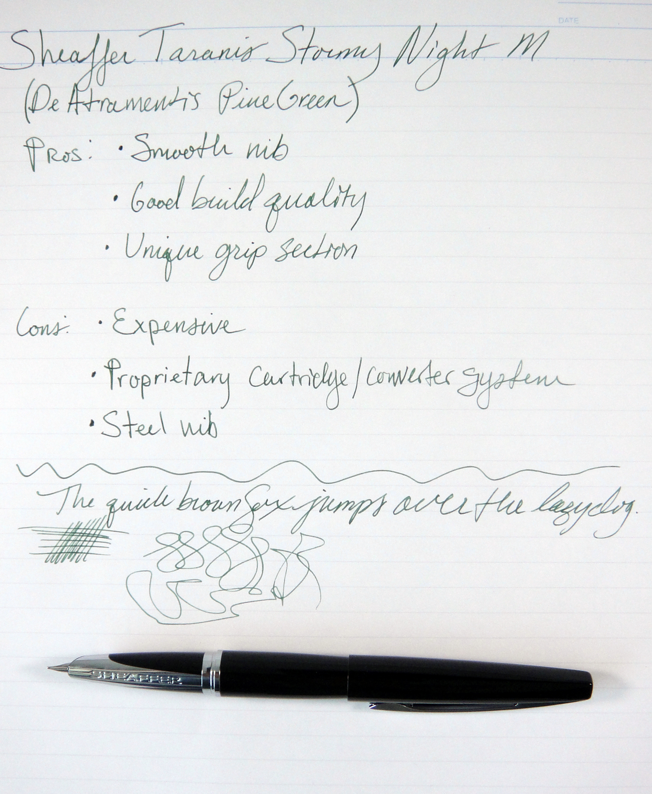
The Sheaffer Taranis is the first modern Sheaffer fountain pen I have used in a long time. As with the Parker 51, it has been argued that Sheaffer’s vintage fountain pens are so plentiful (and consequently affordable) because in their day they were the best in the world. Take the Sheaffer Snorkel for example, these pens had one of the most complicated filling systems which allowed the user to fill the pen without dipping the nib in ink. I know us Montblanc lovers rave about the telescopic filling system used in the 1950s and earlier but on engineering merits alone the Snorkel goes far and beyond. I bought my Snorkel dirt cheap and it performs beautifully.
Sheaffer Taranis and Sheaffer Snorkel
Sheaffer has dubbed the Taranis “groundbreaking” so let’s see how the it measures up.
Appearance:
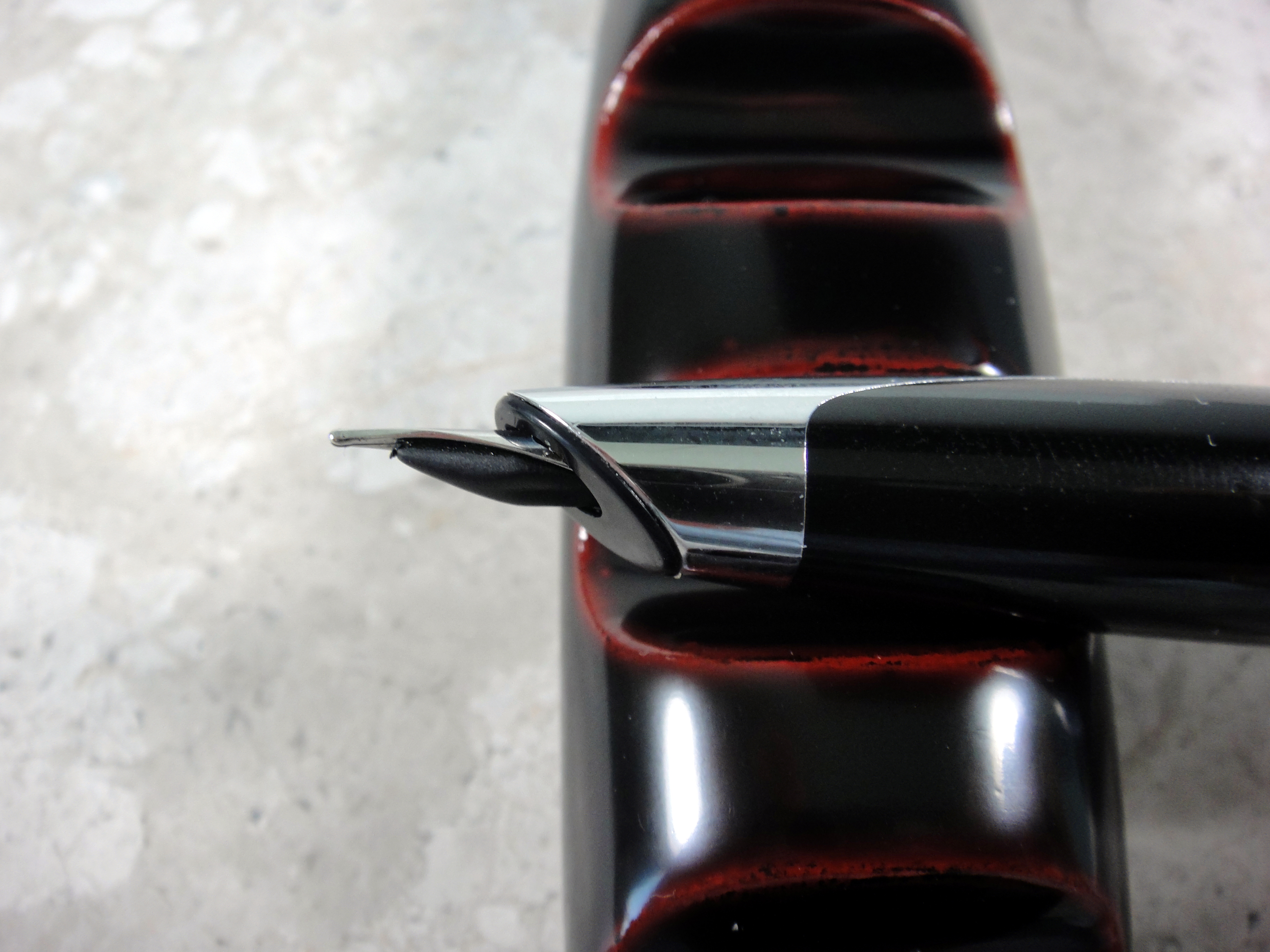
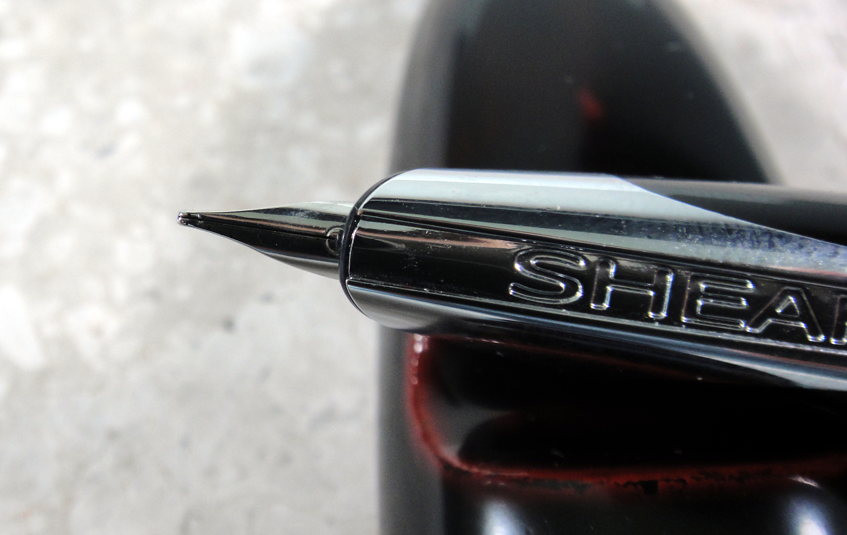
The Taranis gets its name from the Celtic god of thunder and as far as appearances go I don’t see a connection. Designed by architect Charles Debbas, the Taranis’ main feature is the patent pending grip section and semi-hooded nib. The idea behind the grip is that your fingers touch the resin parts, while the metal remains exposed such that you can see the Sheaffer name running down the section.
I like the design, however I have a few problems with the looks of the nib; viewed from the side, you can see that the nib really isn’t flush with the section which would be fine if the nib didn’t stick out so far, but it does. I think an inlaid nib would have looked better. The second issue I have (and perhaps this is just my problem and not the pen’s) is keeping the point in the correct position on the paper. I find that I am rotating the point away from its sweet spot and at quick glance it is not obvious; as a result, I find I am spending more brain cycles than normal trying to right its position.
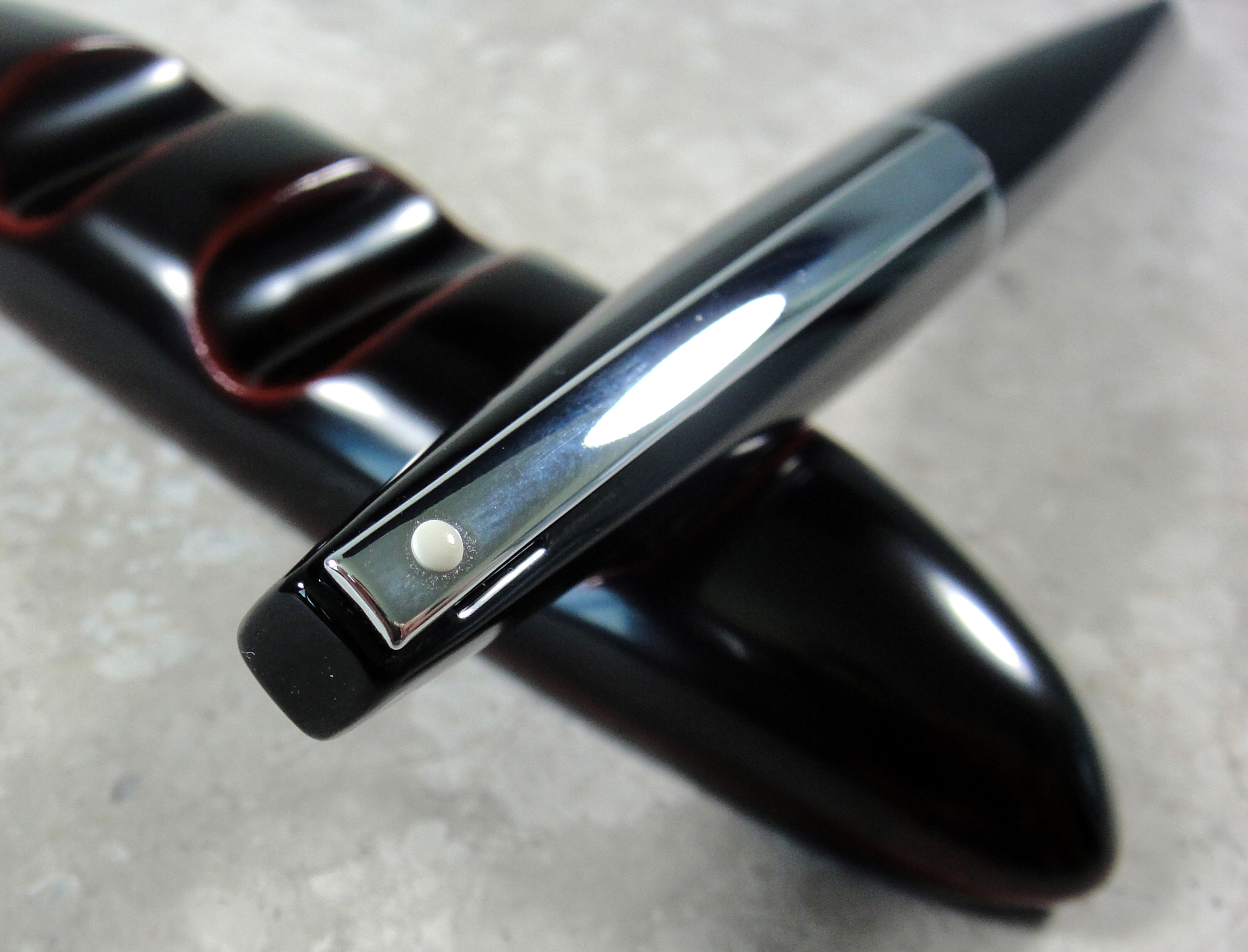
Overall I am a fan of the tapered black resin body and the elongated clip with the classic white dot. It is a nice clean simple and balanced design. The Taranis comes in several colors; the black resin model that I am reviewing is referred to as “Stormy Night”. You can see from the pictures this pen is fingerprint prone. Score: 2.5/5
Build Quality:
The Taranis feels high quality and for $145 (retail), it really should. The bottom of the barrel has a nice brass lining and the cap is lined with plastic. The resin body has no seams and feels quite nice to the touch. The cap clicks securely on to the barrel and requires little effort to remove. The clip when viewed from the side looks a little cheap as it is hollow and thin looking but it does feel strong and tight. I was a little disappointed when I found out that the Taranis is made in China; I do not think that this necessarily is a negative on the quality front but I do think it should be pointed out. The Taranis is on par quality-wise with the majority of its competitors. Many pens in this price range have gold nibs and I would have definitely liked to have seen that on the Taranis. Score: 3/5
Size and Weight:
The Taranis weighs approximately 35 grams which is a comfortable weight, though a bit heavier than I normally like. The pen is well balanced such that it does not cause any comfort issues for me. Being that the brass lining is only in the bottom part of the barrel the pen has about the same balance capped and uncapped which is a rare quality that I quite like. Capped the pen measures 5.5″ and uncapped about 4.75″. At its widest point the Taranis is 0.5″ thick. This is a average-sized pen very similar in size and weight to a Pilot Vanishing Point. Score: 4/5
Sheaffer Taranis next to Pilot Vanishing Point
Performance:
The Taranis I tested has a steel medium point nib. The nib is quite smooth to write with but it is one of the narrowest medium nibs I have used. I would compare it to the medium on a Platinum or Sailor; the medium nib on my Pilot Vanishing Point was noticeably wider and juicier. The nib on the Taranis is definitely a nail and out of the box it had no character; as the nib broke in more, the character improved but it’s definitely not a lively or fun nib. I tried a couple of different inks in the Taranis and I found that the flow was a bit drier than I prefer but I have had no issues with skipping or hard starting. Score: 2.5/5
Filling System:
While a cartridge/converter filling system is not the most interesting, it is becoming my favorite as it’s the most easy to deal with on a daily basis. The Taranis uses Sheaffer’s proprietary cartridges and converters; this is a big drawback if you like to use cartridges, as you will be stuck with Sheaffer inks. On the plus side the converter that comes with the Taranis is nicely made and holds a decent amount of ink. Score: 2/5
Value:
With chrome trim the Taranis is $145 and with gold plated trim the Taranis is $195. I cannot say that this pen is a value. For $140 you can buy a Pilot Vanishing Point with an 18kt gold nib. The price for me is way to high to be compelling. There are so many great pens at this price point and by comparison the Taranis falls short. I really wanted to love this pen but sadly it just didn’t happen for me. Score: 2/5
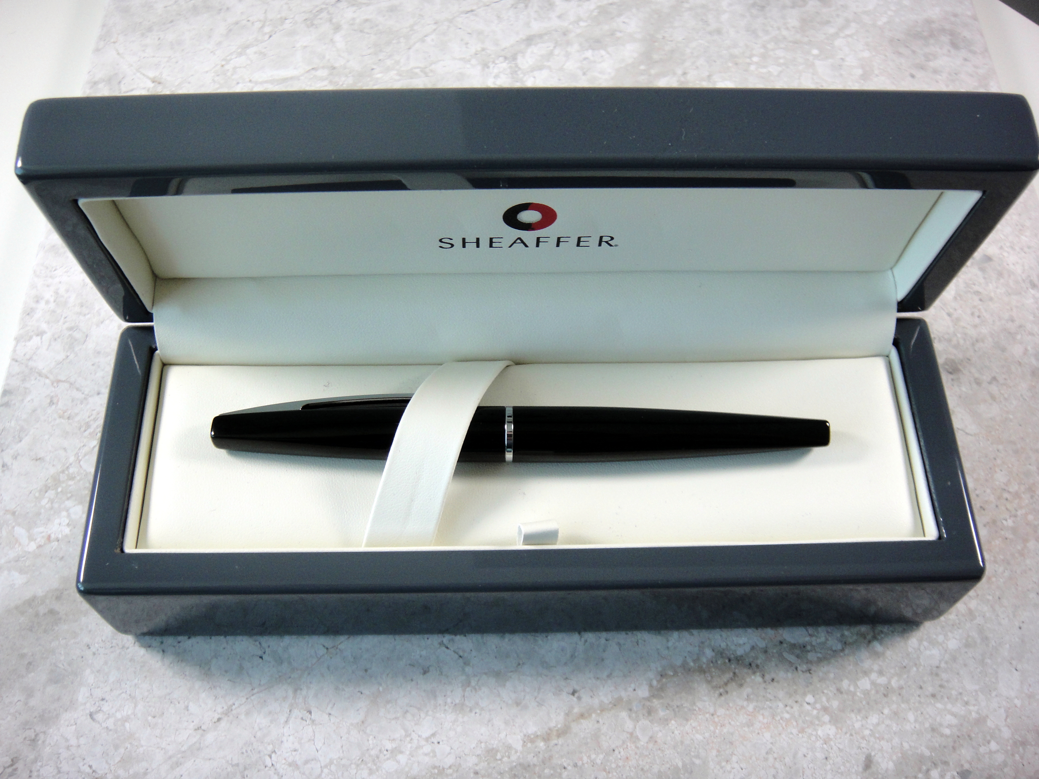
Comes with a large nicely branded box.
Bottom Line:
The Taranis is a good pen with an interesting design but at this price point it just doesn’t make sense. Final Score: 16/30
Please note: this product was provided to me at no charge by Sheaffer for review purposes.
Here are some great reviews of the Sheaffer Taranis:
Writing sample on Maruman Smooth To Write loose leaf paper
I have improved my review format for the writing sample to make it more informative. I am now including a rating system for four key areas; the ratings are from one to five (five being the best). Please let me know what you think.
I love red/orange brown inks and Diamine Ancient Copper is my new favorite. My two other (now former) favorites in this category are Montblanc Red Chalk and Noodler’s Antietam. Unlike Noodler’s Antietam, there are no issues with feathering and long dry times (on the papers I have tested) and unlike Montblanc Red Chalk, the flow is generous. Ancient Copper shows excellent shading; it doesn’t get much better. Dry time on this ink is on the faster side and it is not waterproof.
This ink changes quite a bit with different nib sizes; if you look at the writing sample you will see that with the Italix (1.3mm nib) the color is lighter and more orange, then compare to the Pilot (M nib) it looks darker and more red.
Overall, Ancient Copper is a beautiful, well behaved ink. I highly recommend it.
Please note: this product was provided to me at no charge by JetPens for review purposes.
Here are some great reviews of Diamine Ancient Copper:
(I have no affiliation with the sites linked below)