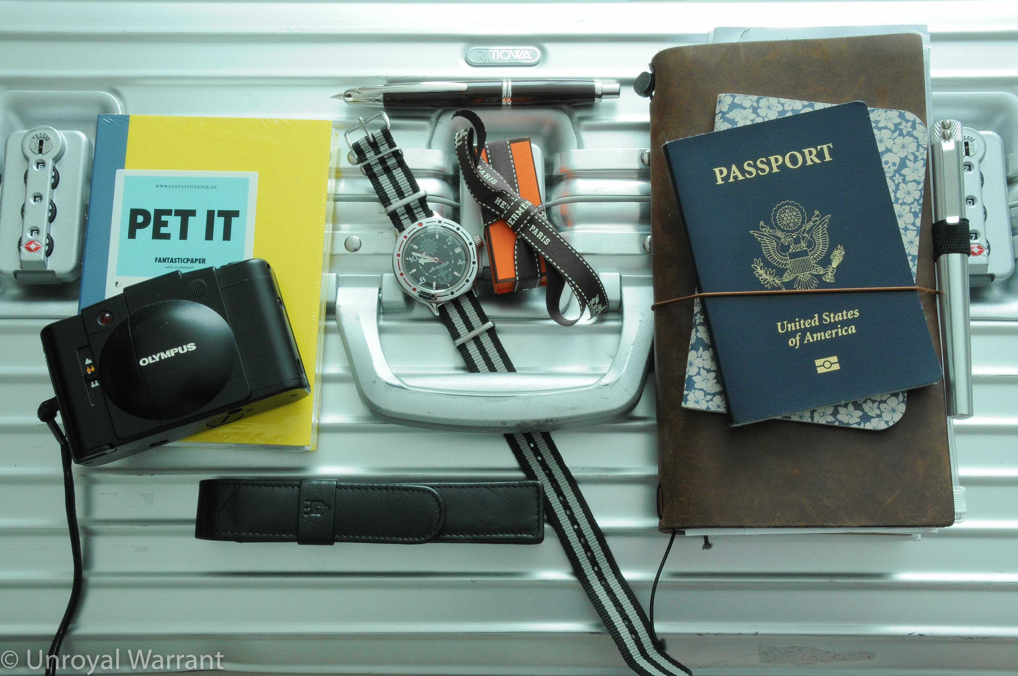
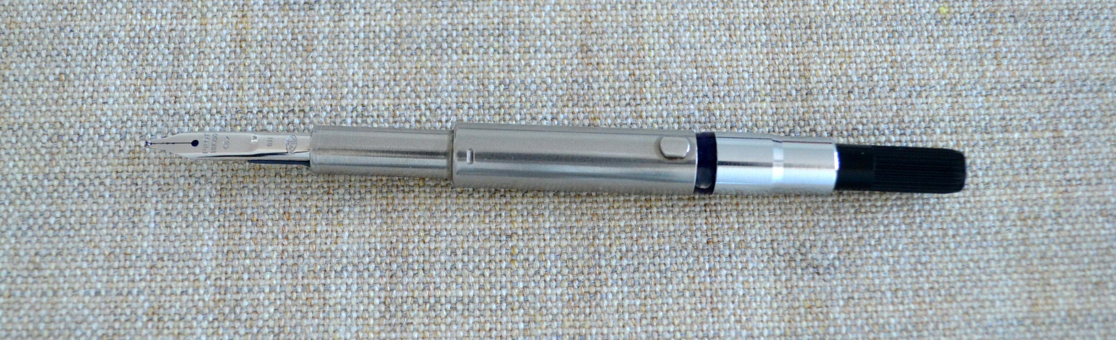
In a few days I am heading out for a three week trip to South America. I am still keeping it relatively light by bringing just one fountain pen, a Chocolate Brown Pilot Vanishing Point with an “ItaliFine” nib by Richard Binder. The ItaliFine gives you two points on one nib, a regular fine and a 0.9mm italic. I am also bringing Hermes’ new Ebony (brown) ink cartridges. The color is exclusive to Hermes; made for use with their (Pilot-produced) Nautilus fountain pen, and luckily these cartridges are compatible with the Vanishing Point. I am carrying the Vanishing Point in a black leather Kingsley pen pouch.
My primary notebook is going to be a #12 FantasticPaper Color notebook from Germany (review to come). I have my pack list and travel checklist in a blue floral Word. Notebook and I am carrying my travel documents in a Midori Traverler’s Notebook. I have a Karas Kustoms Render K with a Pilot G2 refill in TN pen loop.
Finally, the three non-pen-related items are a Vostok Amphibian automatic watch, a 35mm Olympus XA2 camera and a Rimowa Topas Sport Trunk.
I am planning to continue posting about once a week. I have some interesting reviews coming up so please stay tuned.
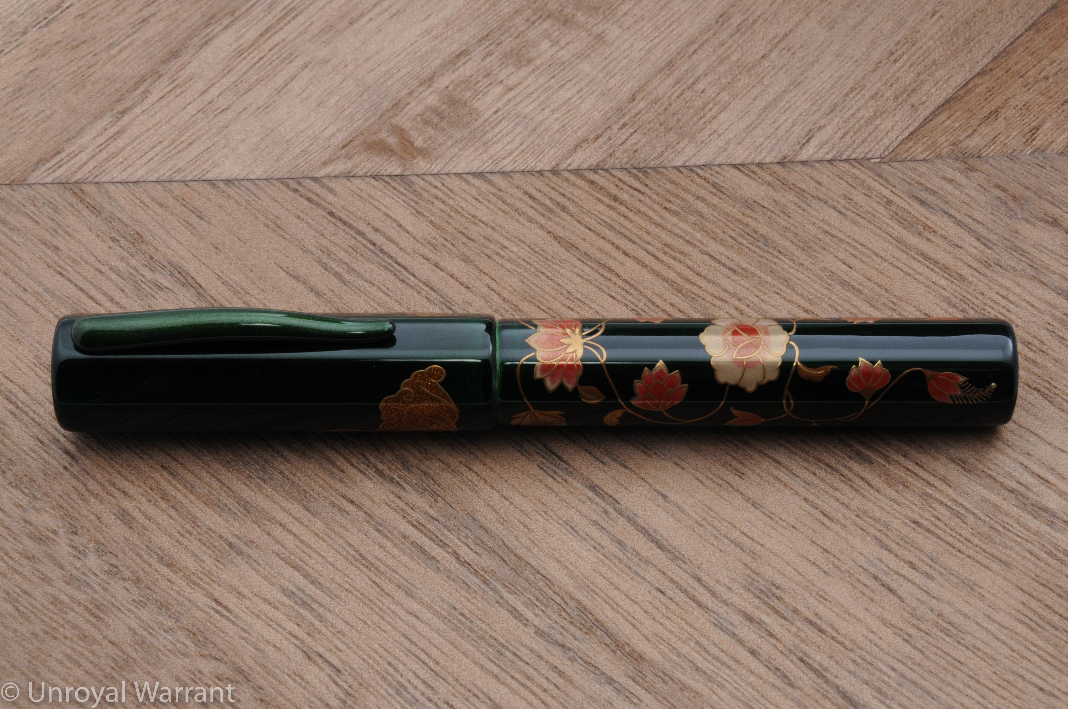
Danitrio HakkakuHard Rubber OhashidoOld style faceted Namiki VP with a Pendleton Brown Butter Line Stub nib
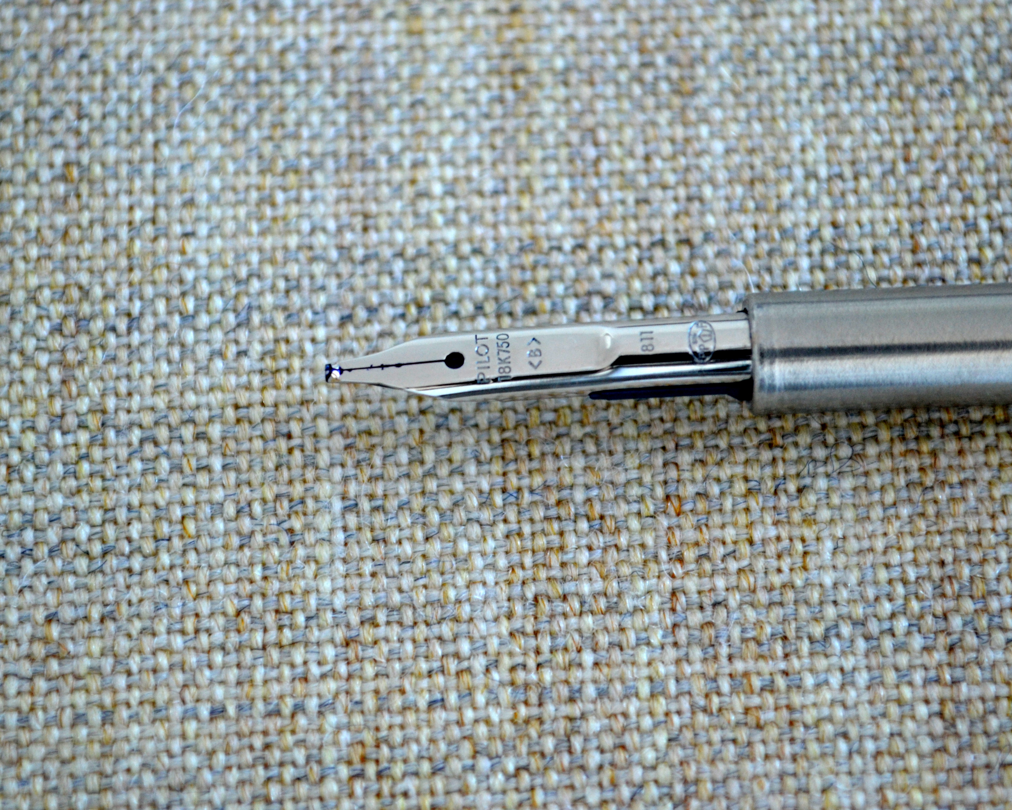
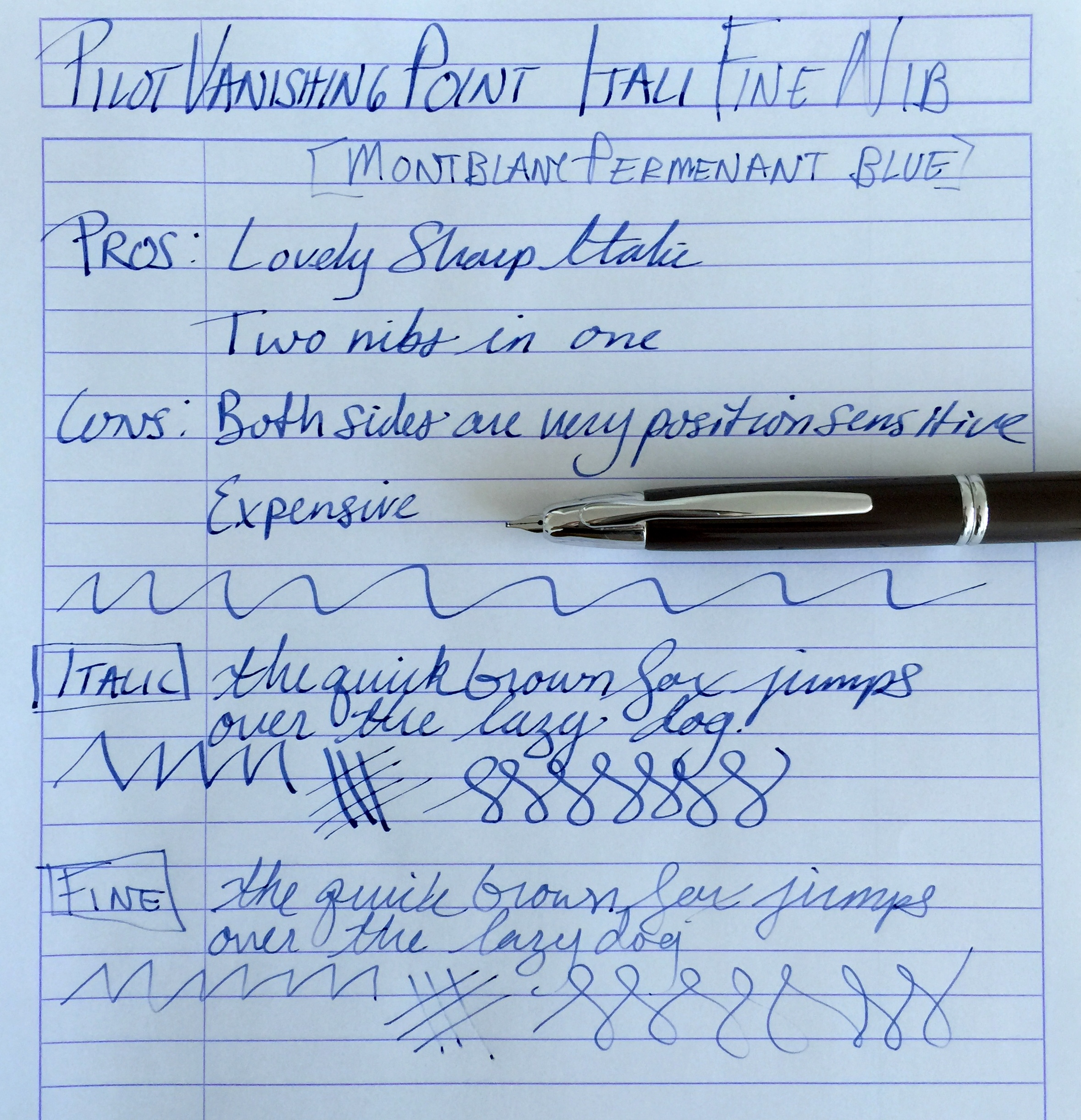
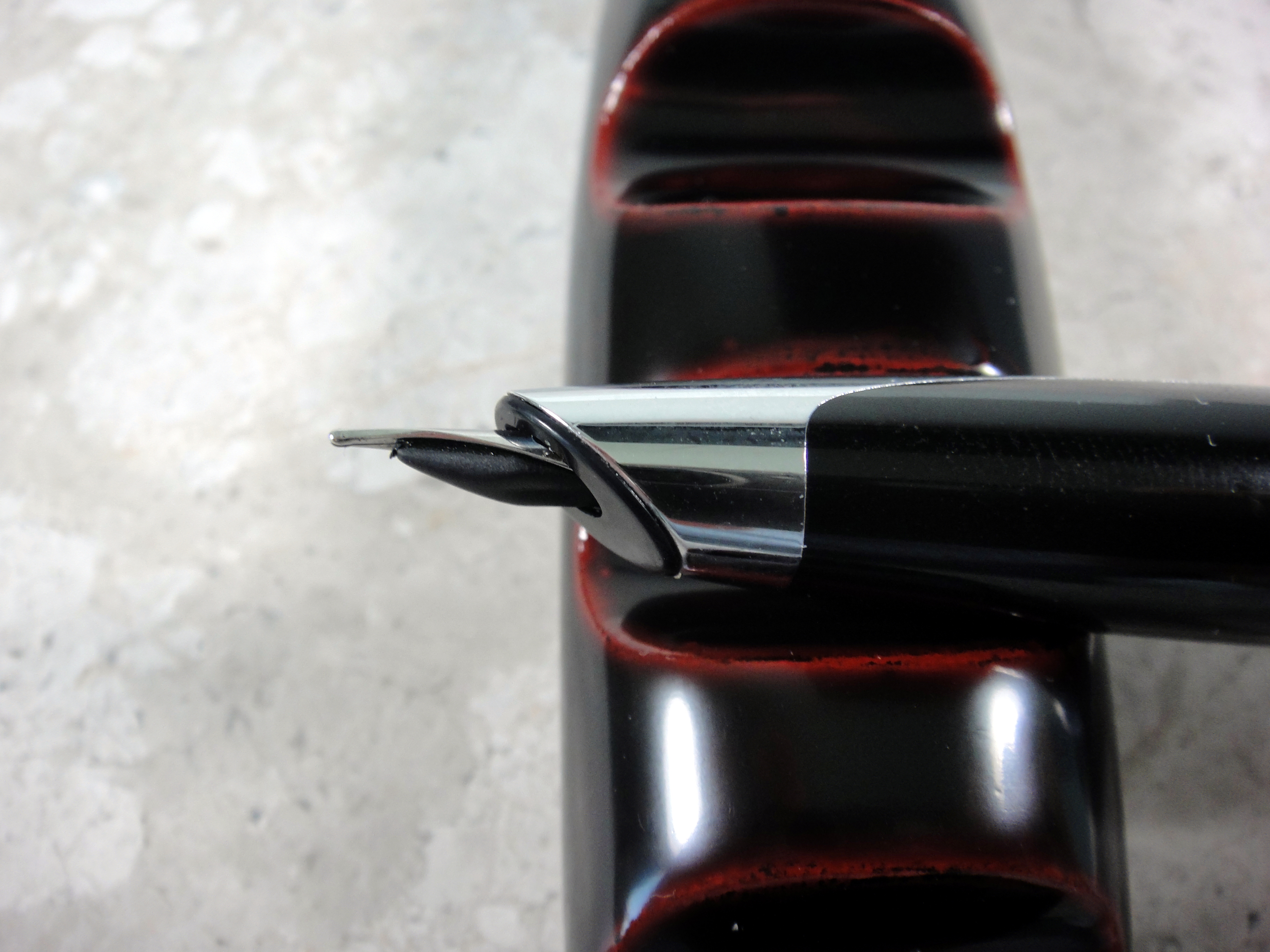
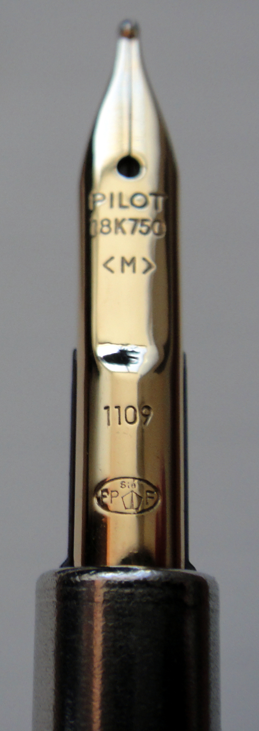
When I heard that Richard Binder was winding down his retail business I knew it was finally time to give one of his “ItaliFine” nibs a go. For those of you who do not know, an ItaliFine nib is a combination nib that offers an italic point on one side and a fine point on the other.
As you can see from the pictures this nib started life as a standard 18kt gold broad nib which Mr. Binder customized into an ItaliFine.
With the nib right side up the nib writes with an italic point. This nib is a true 0.9mm italic and as such is quite sharp and offers a good deal of line variation.
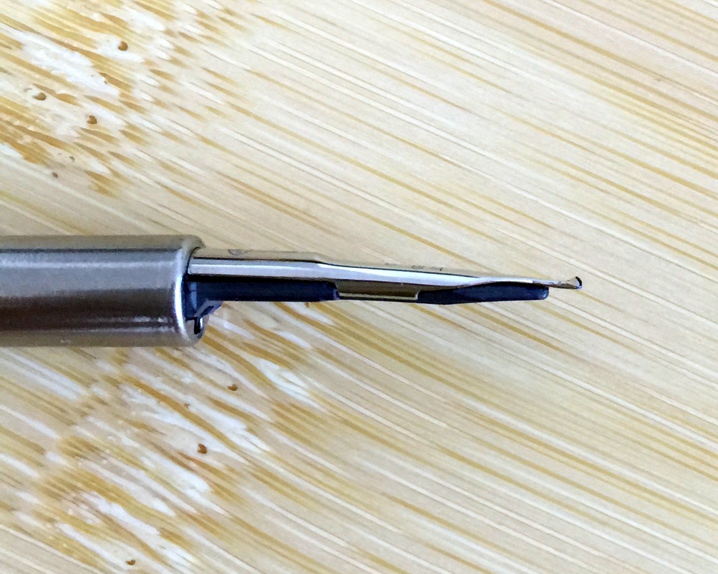
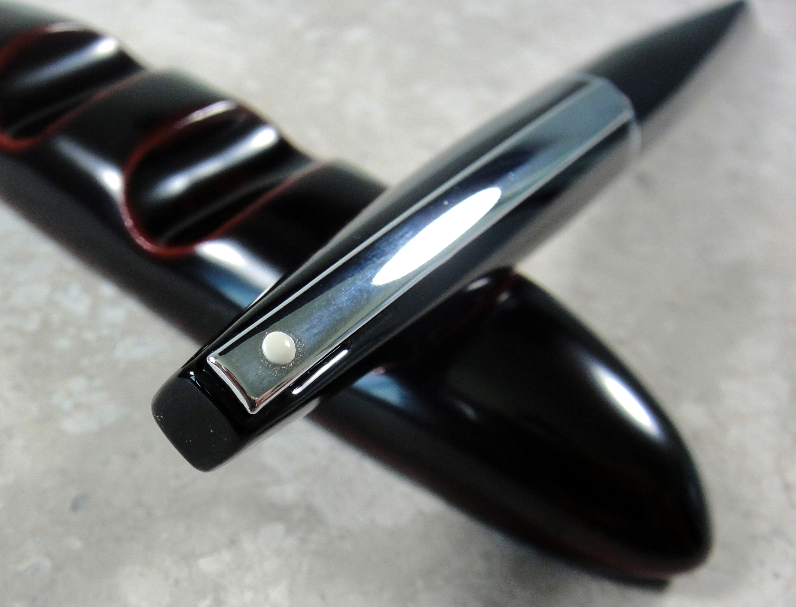
With the nib upside down the nib writes with a fine point. I have found the fine side to be a bit more tricky than the italic. The fine side does not like pressure and will skip with anything but the lightest pressure.
Also the fine side of this nib is position sensitive as its opposite side is fatter and straight cut. For me there was a short learning curve with this nib and now that I have it down, it is a wonderful nib that has transformed my Pilot Vanishing Point into a pen that is now a joy to use. The cost of this nib while still available is $125 and that is expensive for a VP nib but it really works as two nibs that you can use in the same pen on the fly…it’s worth it.
Side Note: Some of you may have noticed that I have been gone for a little while. I have been in the process of moving and I am still working on getting my office (The Unroyal Warrant HQ) set up but as of today I am mostly operational, a new computer and some new furniture is on its way but I will be able to provide regular content 1-3 times a week going forward.
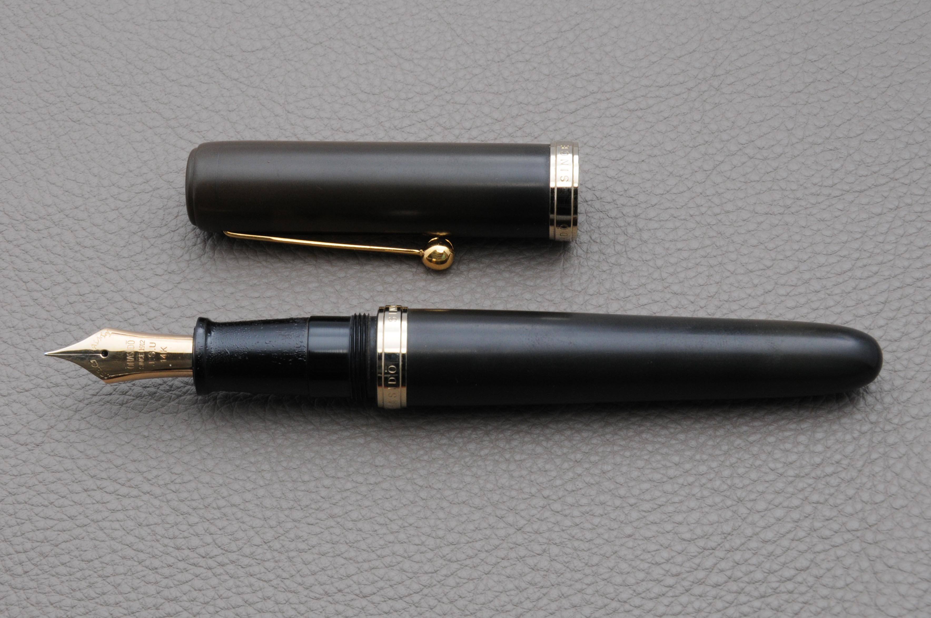
The Sheaffer Taranis is the first modern Sheaffer fountain pen I have used in a long time. As with the Parker 51, it has been argued that Sheaffer’s vintage fountain pens are so plentiful (and consequently affordable) because in their day they were the best in the world. Take the Sheaffer Snorkel for example, these pens had one of the most complicated filling systems which allowed the user to fill the pen without dipping the nib in ink. I know us Montblanc lovers rave about the telescopic filling system used in the 1950s and earlier but on engineering merits alone the Snorkel goes far and beyond. I bought my Snorkel dirt cheap and it performs beautifully.
Sheaffer Taranis and Sheaffer Snorkel
Sheaffer has dubbed the Taranis “groundbreaking” so let’s see how the it measures up.
Appearance:
The Taranis gets its name from the Celtic god of thunder and as far as appearances go I don’t see a connection. Designed by architect Charles Debbas, the Taranis’ main feature is the patent pending grip section and semi-hooded nib. The idea behind the grip is that your fingers touch the resin parts, while the metal remains exposed such that you can see the Sheaffer name running down the section.
I like the design, however I have a few problems with the looks of the nib; viewed from the side, you can see that the nib really isn’t flush with the section which would be fine if the nib didn’t stick out so far, but it does. I think an inlaid nib would have looked better. The second issue I have (and perhaps this is just my problem and not the pen’s) is keeping the point in the correct position on the paper. I find that I am rotating the point away from its sweet spot and at quick glance it is not obvious; as a result, I find I am spending more brain cycles than normal trying to right its position.
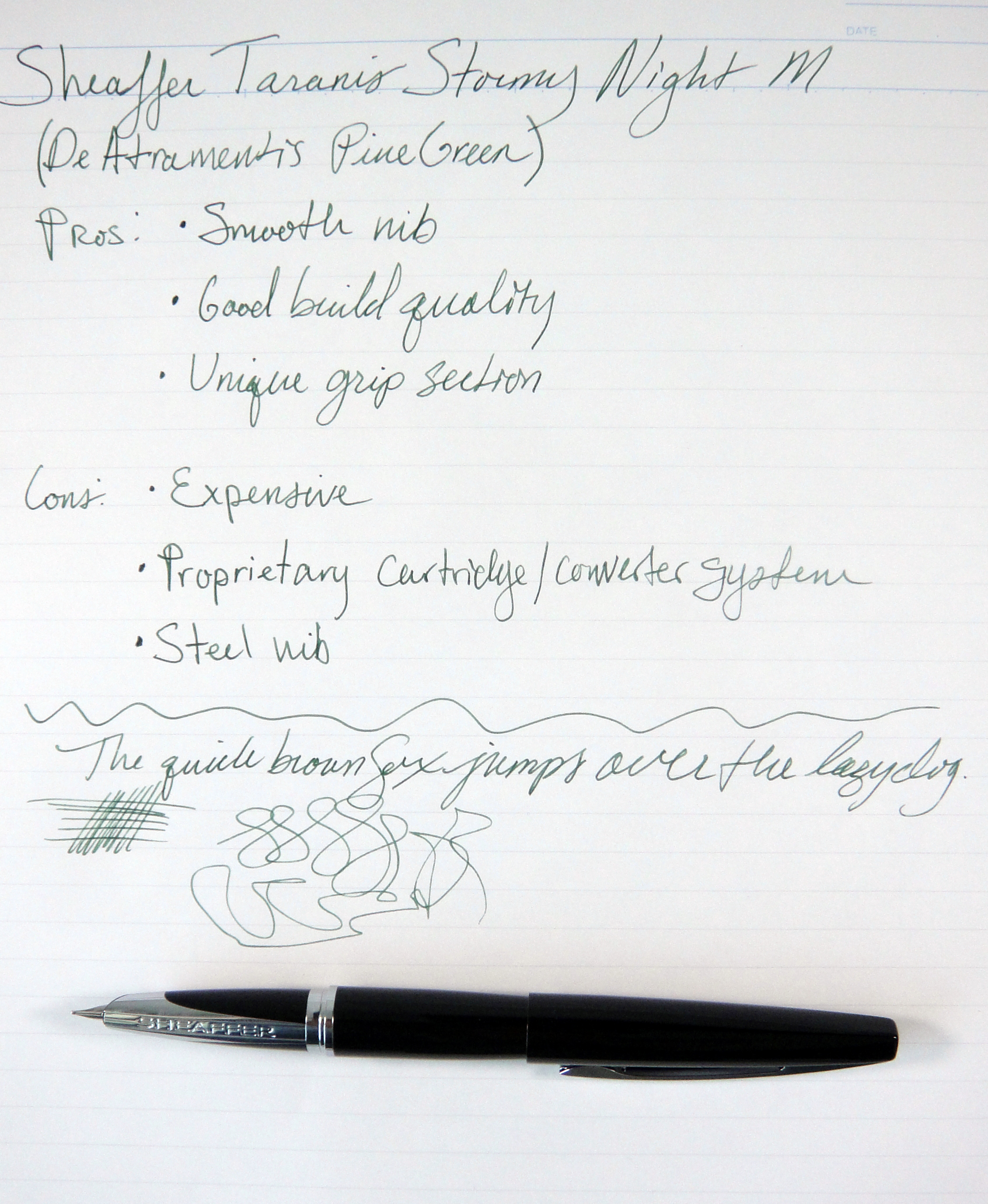
Overall I am a fan of the tapered black resin body and the elongated clip with the classic white dot. It is a nice clean simple and balanced design. The Taranis comes in several colors; the black resin model that I am reviewing is referred to as “Stormy Night”. You can see from the pictures this pen is fingerprint prone. Score: 2.5/5
Build Quality:
The Taranis feels high quality and for $145 (retail), it really should. The bottom of the barrel has a nice brass lining and the cap is lined with plastic. The resin body has no seams and feels quite nice to the touch. The cap clicks securely on to the barrel and requires little effort to remove. The clip when viewed from the side looks a little cheap as it is hollow and thin looking but it does feel strong and tight. I was a little disappointed when I found out that the Taranis is made in China; I do not think that this necessarily is a negative on the quality front but I do think it should be pointed out. The Taranis is on par quality-wise with the majority of its competitors. Many pens in this price range have gold nibs and I would have definitely liked to have seen that on the Taranis. Score: 3/5
Size and Weight:
The Taranis weighs approximately 35 grams which is a comfortable weight, though a bit heavier than I normally like. The pen is well balanced such that it does not cause any comfort issues for me. Being that the brass lining is only in the bottom part of the barrel the pen has about the same balance capped and uncapped which is a rare quality that I quite like. Capped the pen measures 5.5″ and uncapped about 4.75″. At its widest point the Taranis is 0.5″ thick. This is a average-sized pen very similar in size and weight to a Pilot Vanishing Point. Score: 4/5
Sheaffer Taranis next to Pilot Vanishing Point
Performance:
The Taranis I tested has a steel medium point nib. The nib is quite smooth to write with but it is one of the narrowest medium nibs I have used. I would compare it to the medium on a Platinum or Sailor; the medium nib on my Pilot Vanishing Point was noticeably wider and juicier. The nib on the Taranis is definitely a nail and out of the box it had no character; as the nib broke in more, the character improved but it’s definitely not a lively or fun nib. I tried a couple of different inks in the Taranis and I found that the flow was a bit drier than I prefer but I have had no issues with skipping or hard starting. Score: 2.5/5
Filling System:
While a cartridge/converter filling system is not the most interesting, it is becoming my favorite as it’s the most easy to deal with on a daily basis. The Taranis uses Sheaffer’s proprietary cartridges and converters; this is a big drawback if you like to use cartridges, as you will be stuck with Sheaffer inks. On the plus side the converter that comes with the Taranis is nicely made and holds a decent amount of ink. Score: 2/5
Value:
With chrome trim the Taranis is $145 and with gold plated trim the Taranis is $195. I cannot say that this pen is a value. For $140 you can buy a Pilot Vanishing Point with an 18kt gold nib. The price for me is way to high to be compelling. There are so many great pens at this price point and by comparison the Taranis falls short. I really wanted to love this pen but sadly it just didn’t happen for me. Score: 2/5
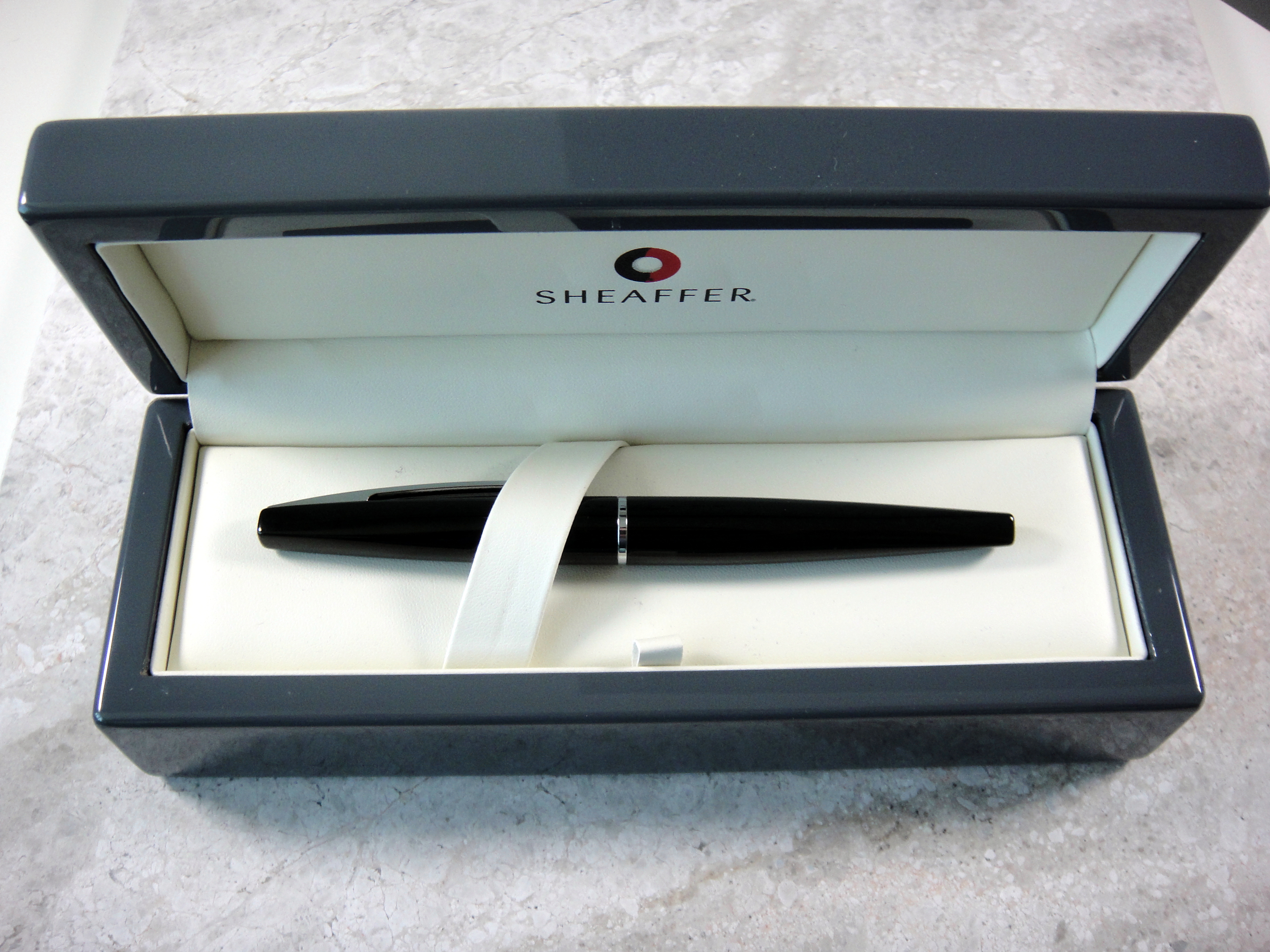
Comes with a large nicely branded box.
Bottom Line:
The Taranis is a good pen with an interesting design but at this price point it just doesn’t make sense. Final Score: 16/30
Please note: this product was provided to me at no charge by Sheaffer for review purposes.
Here are some great reviews of the Sheaffer Taranis:
Writing sample on Maruman Smooth To Write loose leaf paper
I have improved my review format for the writing sample to make it more informative. I am now including a rating system for four key areas; the ratings are from one to five (five being the best). Please let me know what you think.
I love red/orange brown inks and Diamine Ancient Copper is my new favorite. My two other (now former) favorites in this category are Montblanc Red Chalk and Noodler’s Antietam. Unlike Noodler’s Antietam, there are no issues with feathering and long dry times (on the papers I have tested) and unlike Montblanc Red Chalk, the flow is generous. Ancient Copper shows excellent shading; it doesn’t get much better. Dry time on this ink is on the faster side and it is not waterproof.
This ink changes quite a bit with different nib sizes; if you look at the writing sample you will see that with the Italix (1.3mm nib) the color is lighter and more orange, then compare to the Pilot (M nib) it looks darker and more red.
Overall, Ancient Copper is a beautiful, well behaved ink. I highly recommend it.
Please note: this product was provided to me at no charge by JetPens for review purposes.
Here are some great reviews of Diamine Ancient Copper:
(I have no affiliation with the sites linked below)
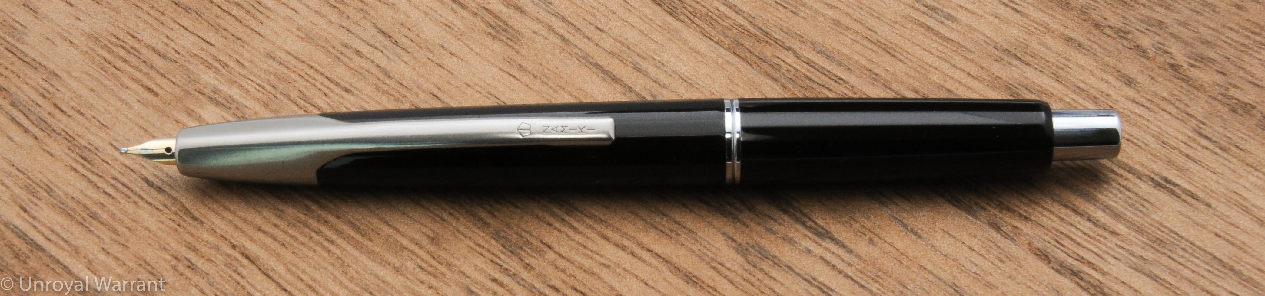
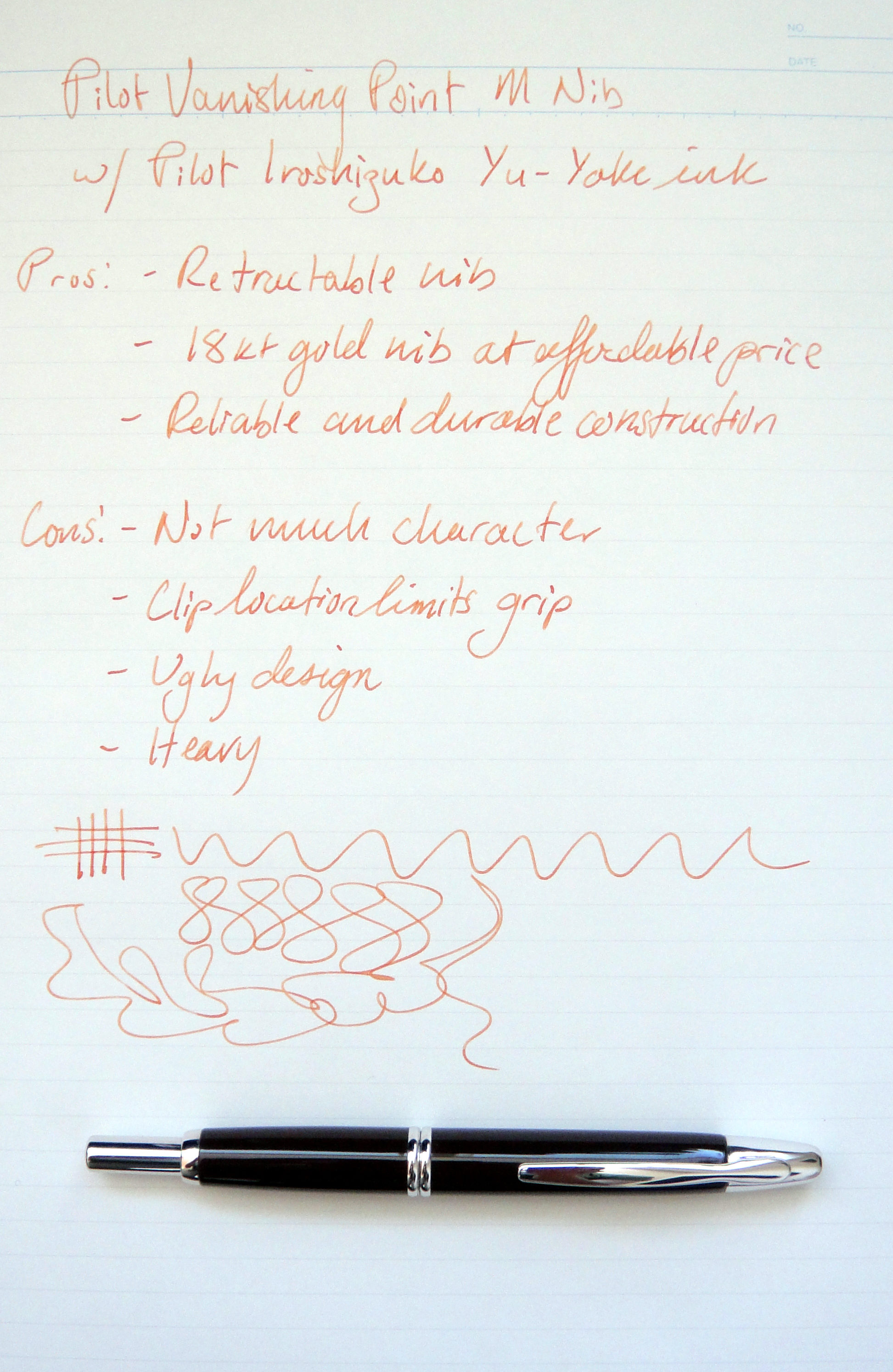
The Pilot Vanishing Point is an extremely popular fountain pen with a click mechanism that retracts the nib. I have had mine for several years now and while it’s frequently inked it’s far from my favorite pen. To me the Vanishing Point is purely a tool; it’s reliable and can be operated with one hand for quick notes but it’s not fun to write with. My VP has a brown lacquered brass body with rhodium accents weighing in at 30.9 grams with a full converter. The VP measures just under 5.5″ long and is about half an inch thick at its widest point. The Vanishing Point is a pretty ugly pen; it’s definitely not a show piece. The VP looks the most dignified in matte black and unfortunately for me it was released well after I purchased my brown one.
The stiff 18 carat gold medium point nib has no personality but is smooth and reliable. The medium point is a bit finer than most European mediums and the flow is pretty average.
Namiki marking on the nibNib extendedNib retracted
Depending on how you hold your pen the clip may be an issue because it is so close to the tip. Having a pretty standard grip it does not bother me but this pen definitely wont work for everyone. Also, I do not find the VP to be comfortable for long writing sessions as the grip area is relatively wide and the pen is quite heavy. The Vanishing Point comes with a converter, a cartridge and a metal cartridge cap (that prevents the click mechanism from crushing a plastic cartridge). The VP offers a lot of pen for the money with an average street price $140. The build quality is excellent as with all Pilot products and it has held up well quite well for me. The nib has a lot of tipping material so I may have it ground down into a stub to give this great pen some character. I recommend trying the Vanishing Point in person before purchasing.
Here are some great reviews of the Vanishing Point: