Kaweco Elite Fountain Pen Review With 18kt Gold Stub Nib

Kaweco Elite Fountain Pen -4

Kaweco is famous for its pocket-size pens but they also make a number of nice full-size pens including the Elite I am reviewing today.

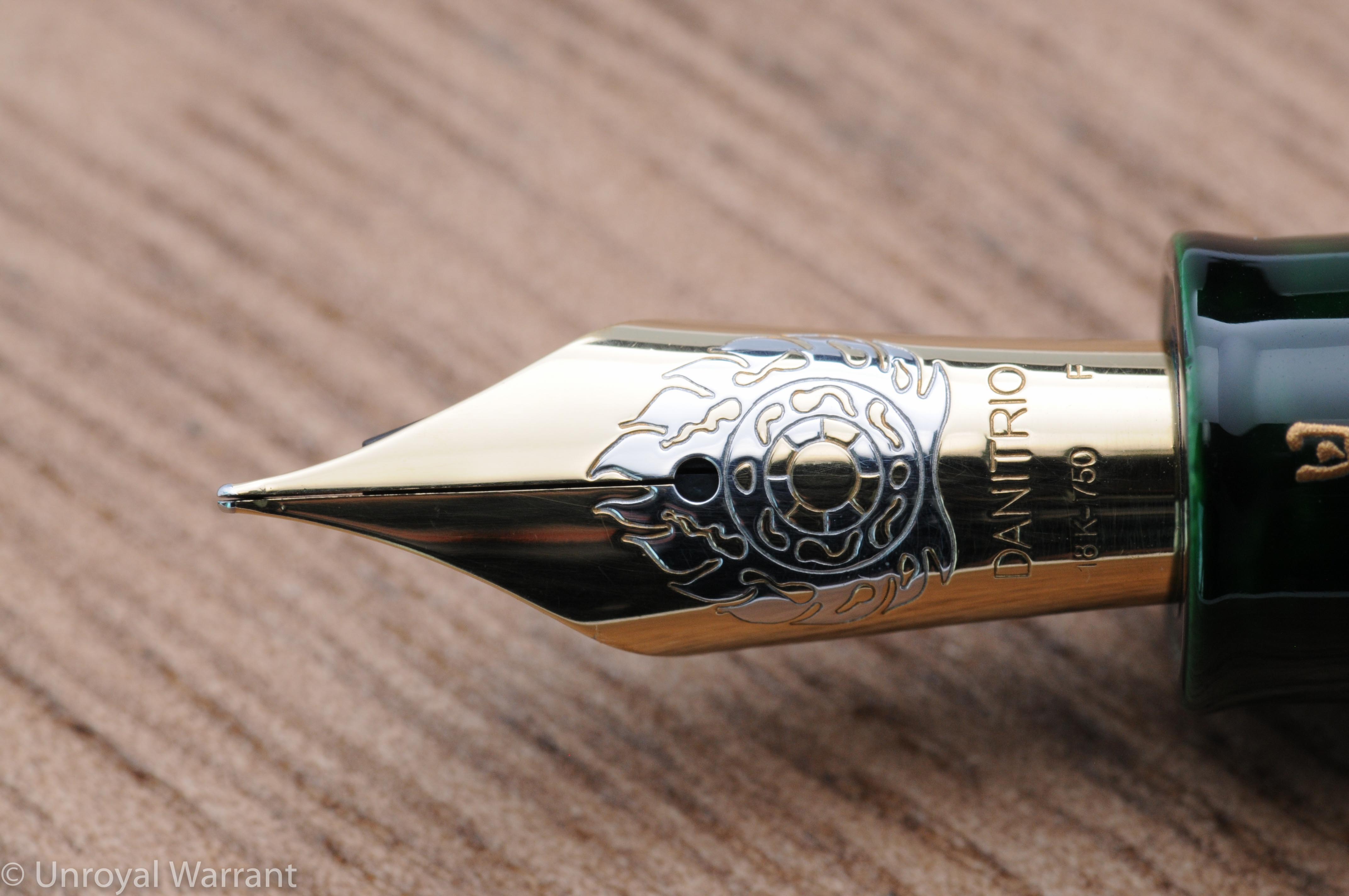
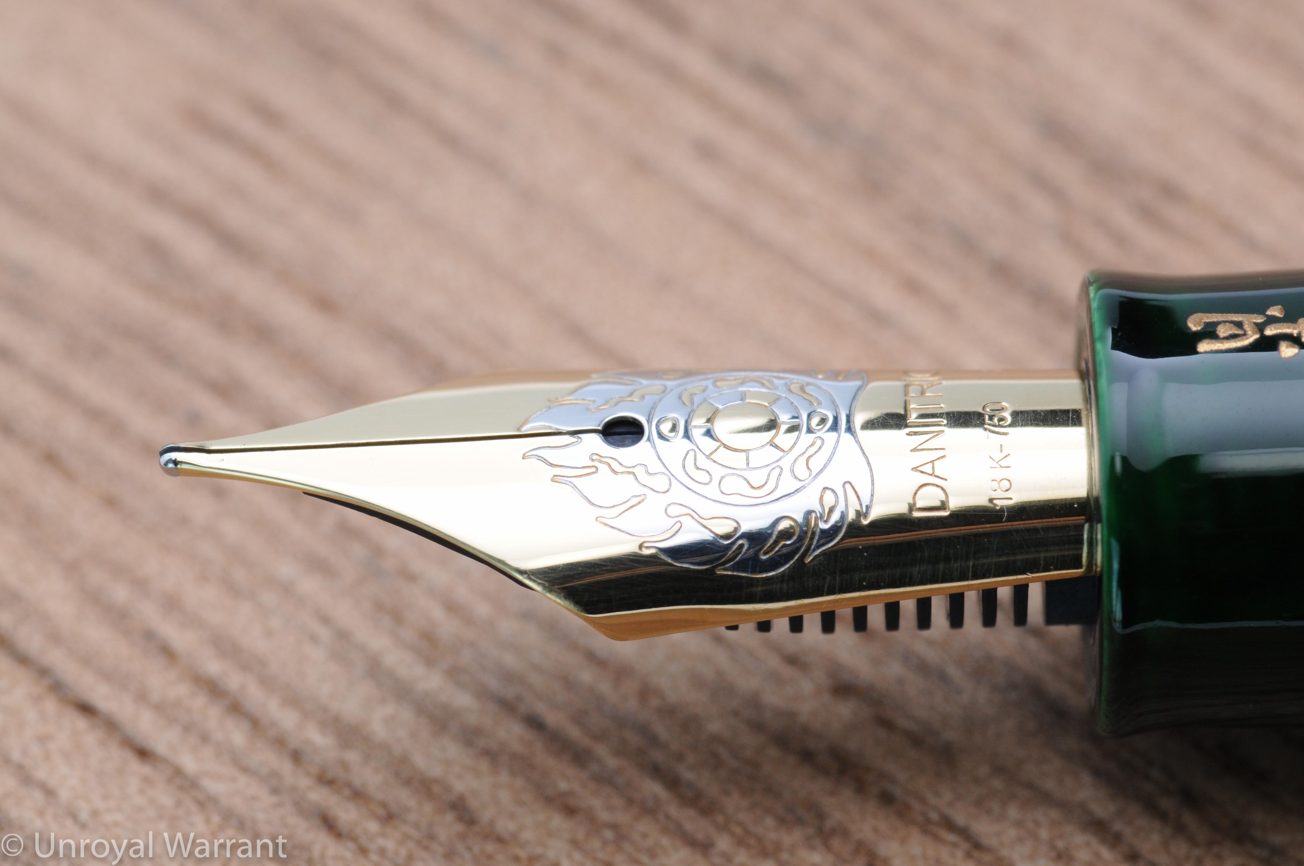
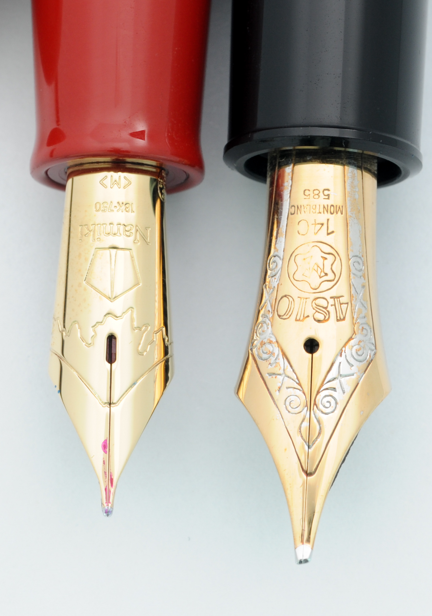
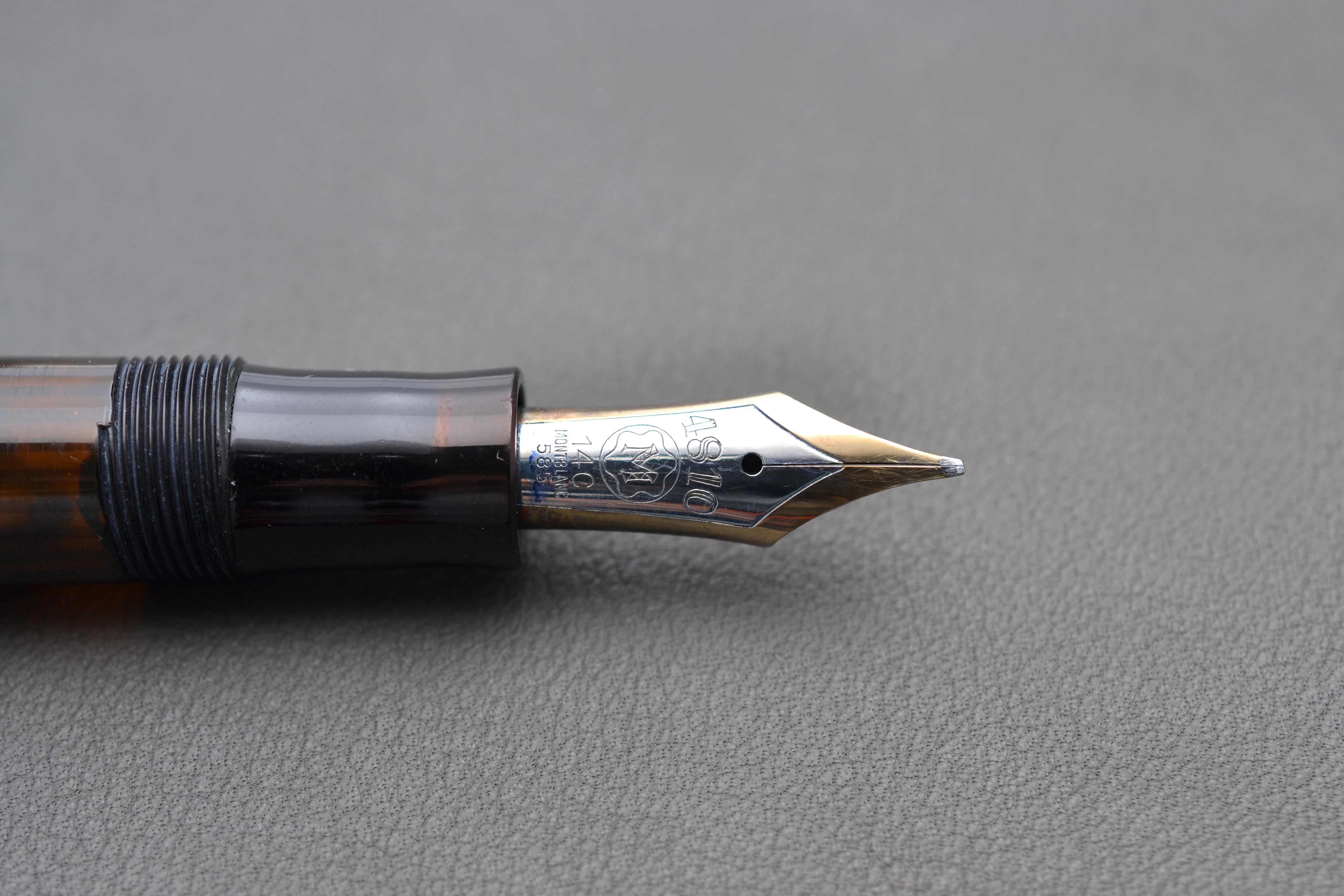
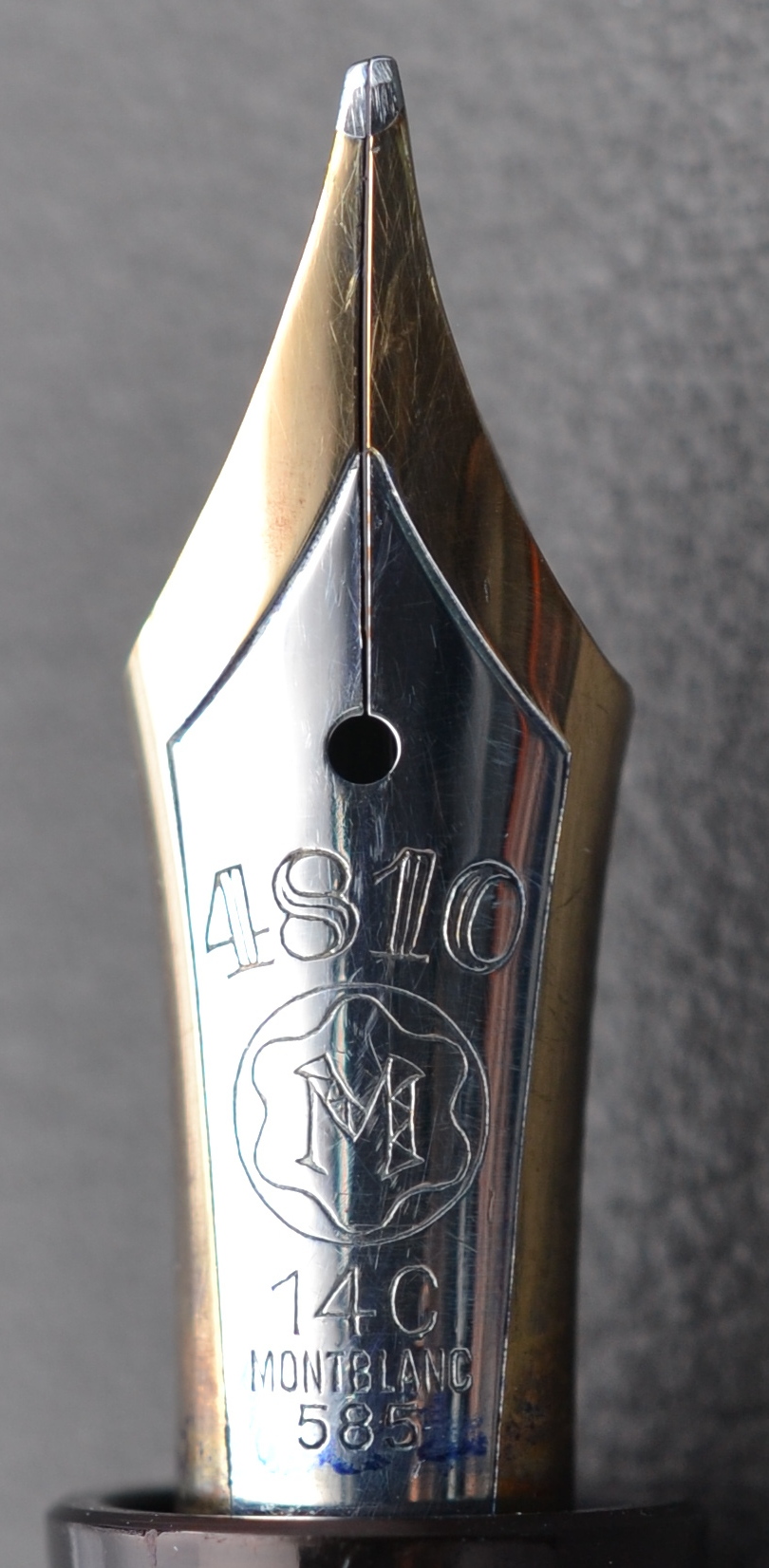
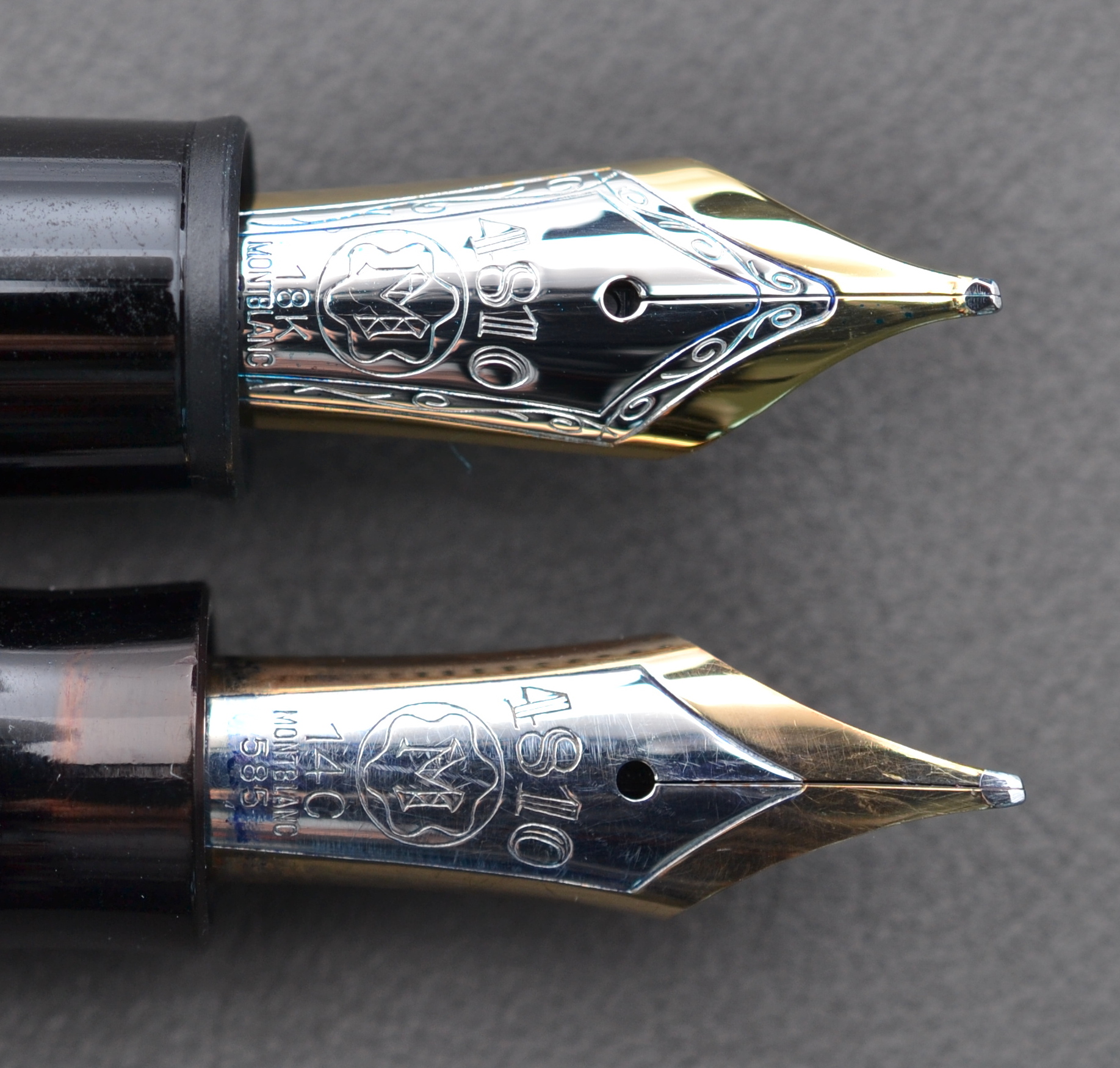
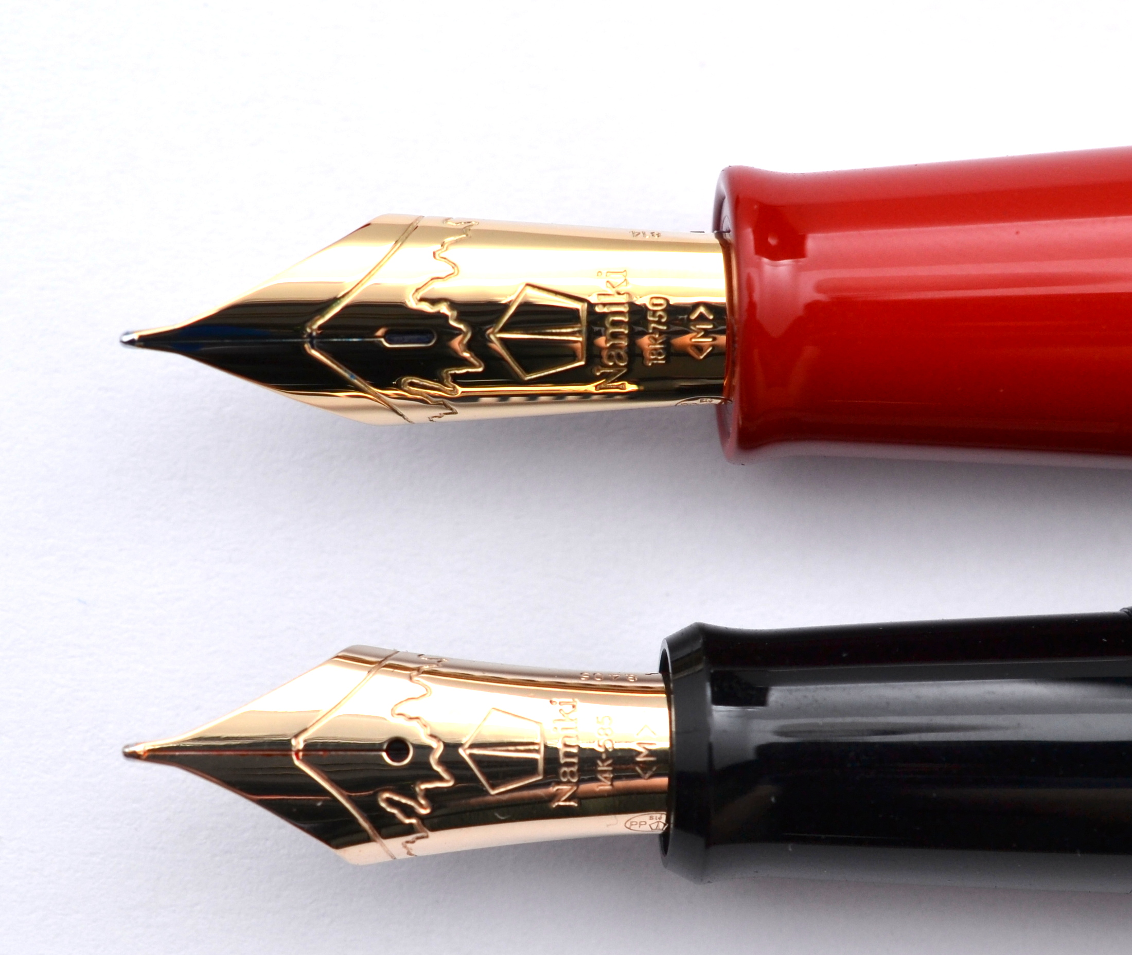
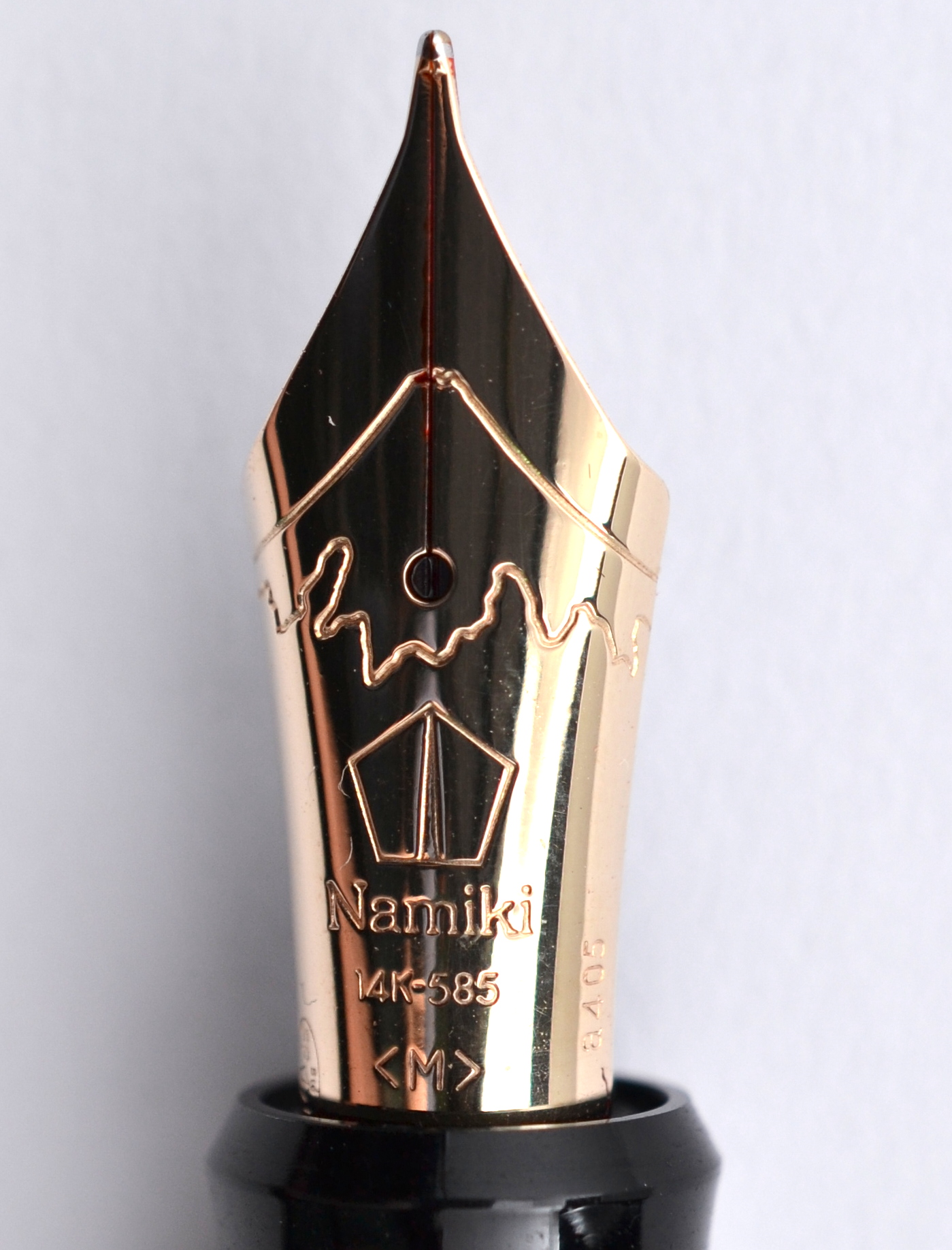
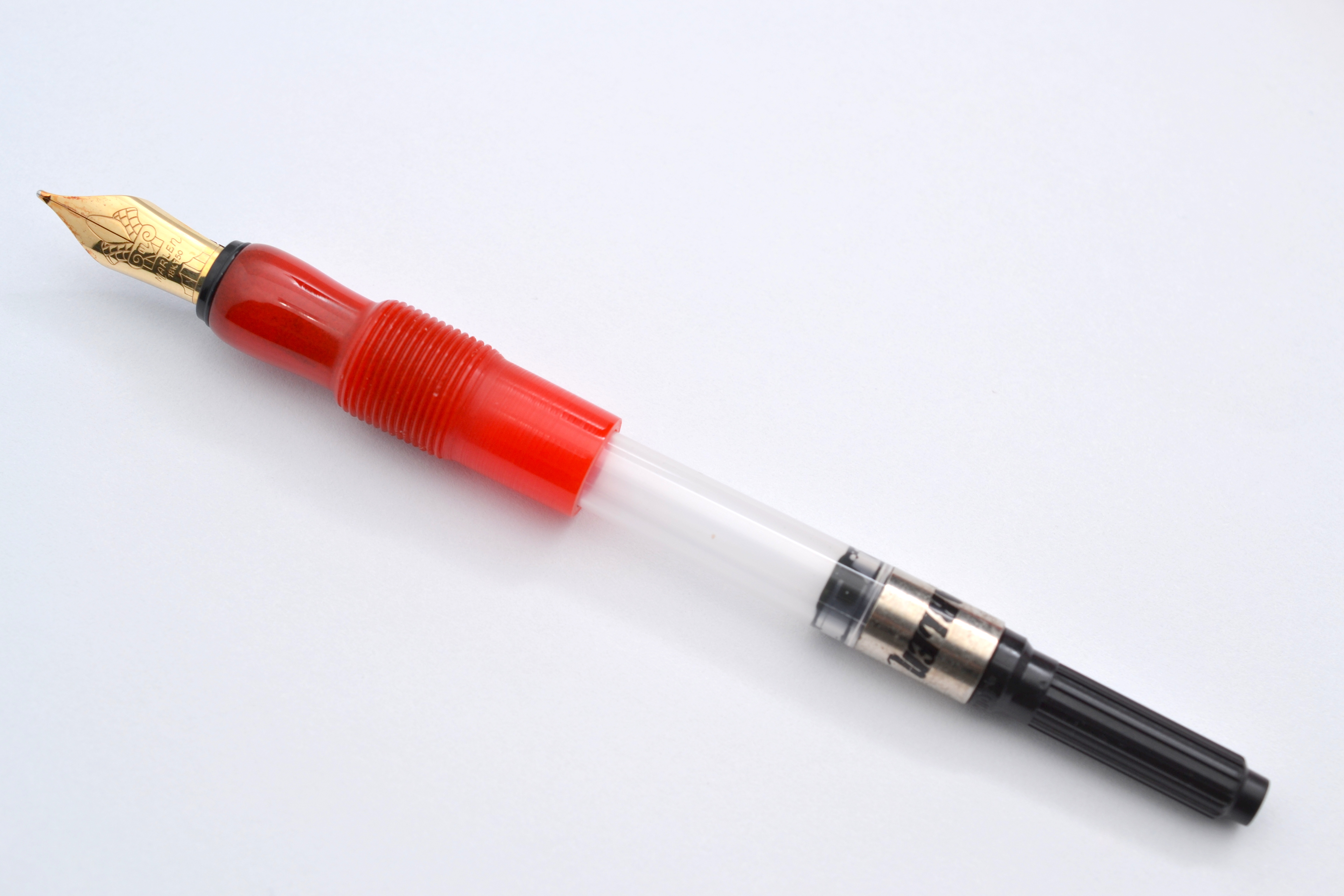
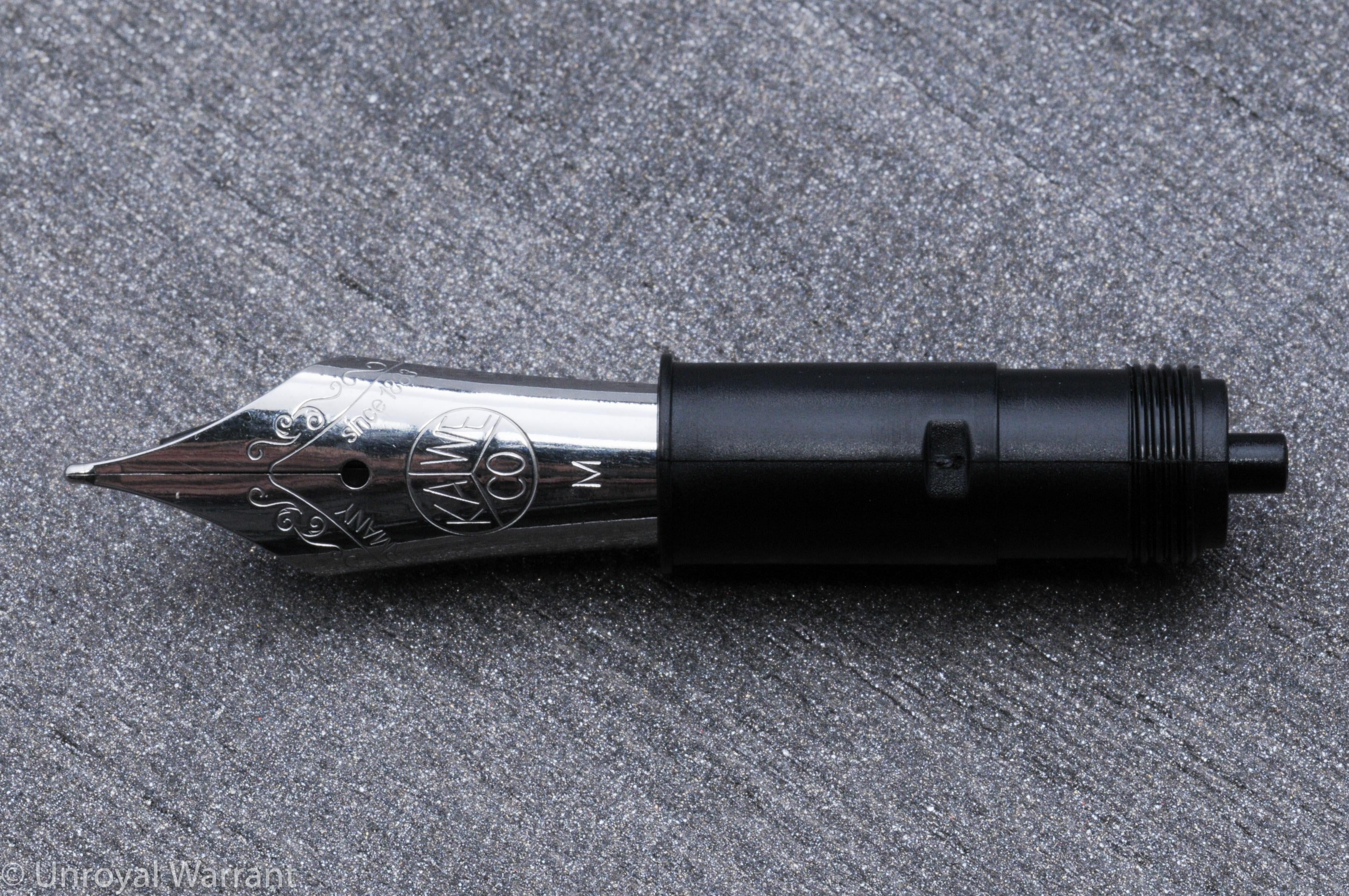
I was drawn to the Elite’s large nib, that Kaweco refers to as a size 250 (Bock #6).  Most Kaweco pens including many of their other full-size models use a much smaller nib that Kaweco calls size 060, similar to a Bock #5. Kaweco also makes a 14kt solid gold 250 nib but it is not sold with any of their standard pens.  You have to buy this nib separately and unlike the steel version, you only get one nib grade, medium.

You may have noticed that my review title says 18kt gold, this is because I ordered a 14kt nib and received an 18kt nib instead.  This particular nib is not listed in their parts catalog.  From what I can tell the nib I received is an 18kt gold stub nib from the beautiful $1,500 Kaweco King Limited Edition fountain pen.  Now that we have sorted out what I am reviewing here, let’s get to the pen.

Kaweco Elite Fountain Pen -5

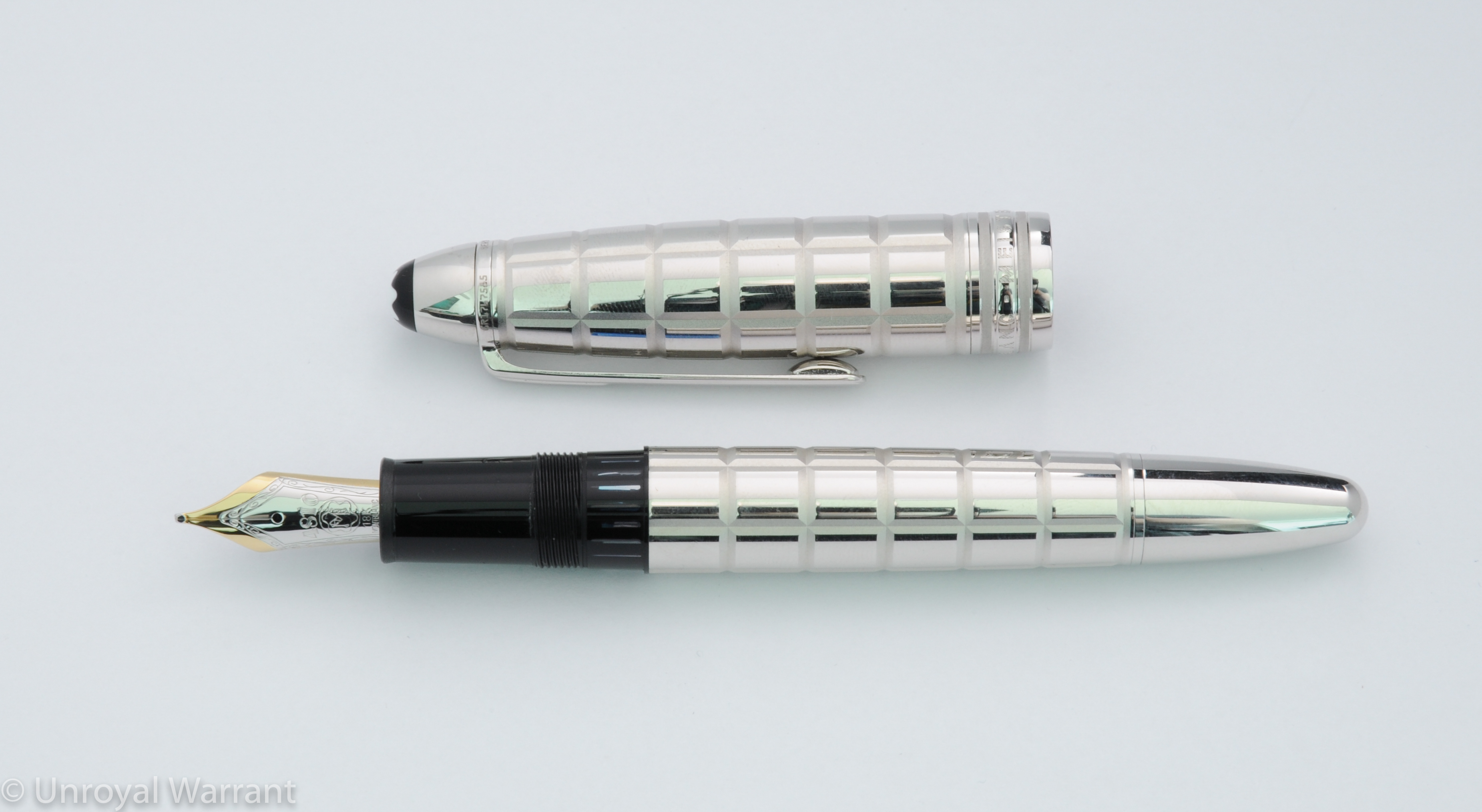
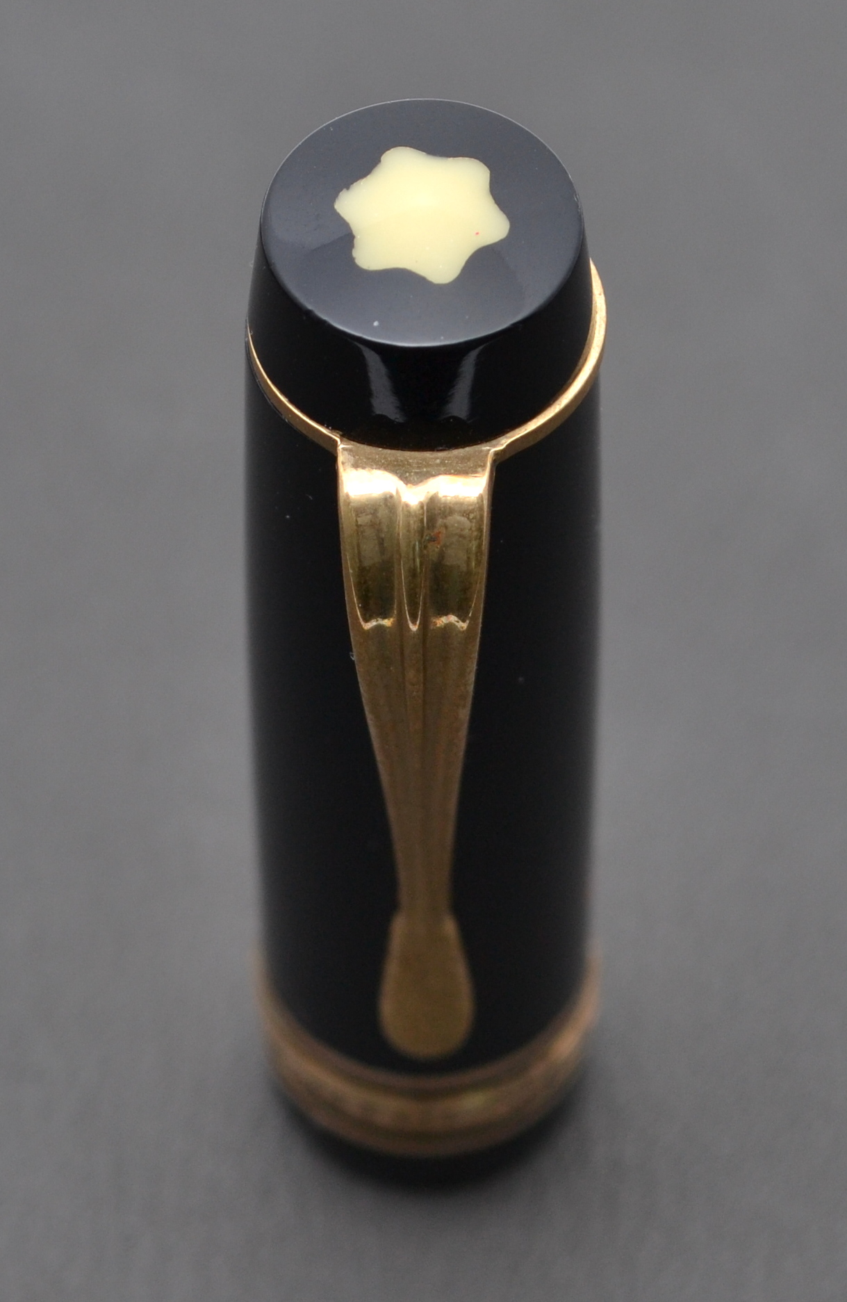
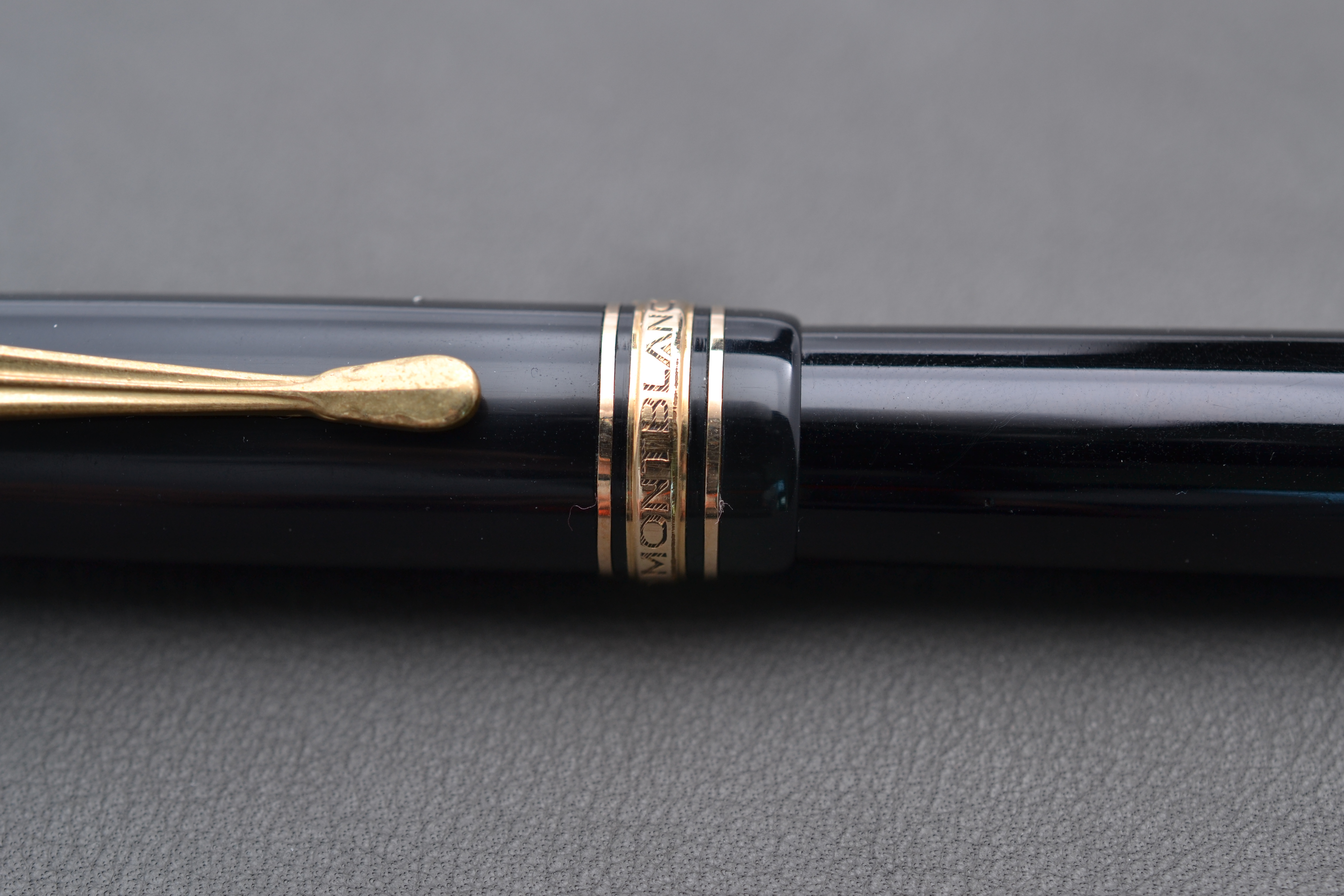
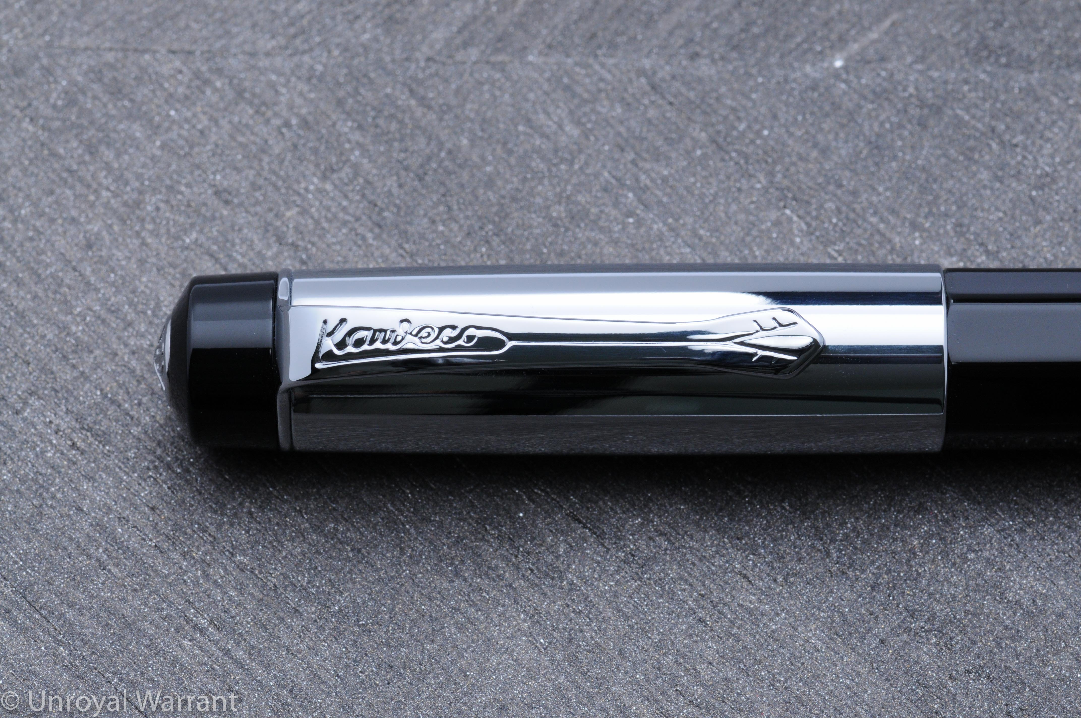
The Elite features a hand-polished faceted black piano lacquer acrylic body.  The acrylic is turned from a single block.  I imagine that “black piano lacquer” refers only to the color and high gloss and not the actual use of lacquer.  The cap is is chrome and features a black finial with a silver Kaweco “jewel”.  This same jewel is also found on the end of the barrel.  “Kaweco Elite GERMANY” is printed on the cap in black letters.

Vintage Kaweco Sport 12G  with the Kaweco Elite
Vintage Kaweco Sport 12G with the Kaweco Elite


I like the design of this pen; it looks modern and professional.  The high gloss acrylic feels silky smooth to the touch.  The clip is high quality with a clean imprint and no rough areas.

Kaweco Elite Fountain Pen -7

Even under the clip the finish is flawless.  I also like the knurling on the bottom of the barrel.

Kaweco "jewel" on the Elite
Kaweco “jewel” on the Elite

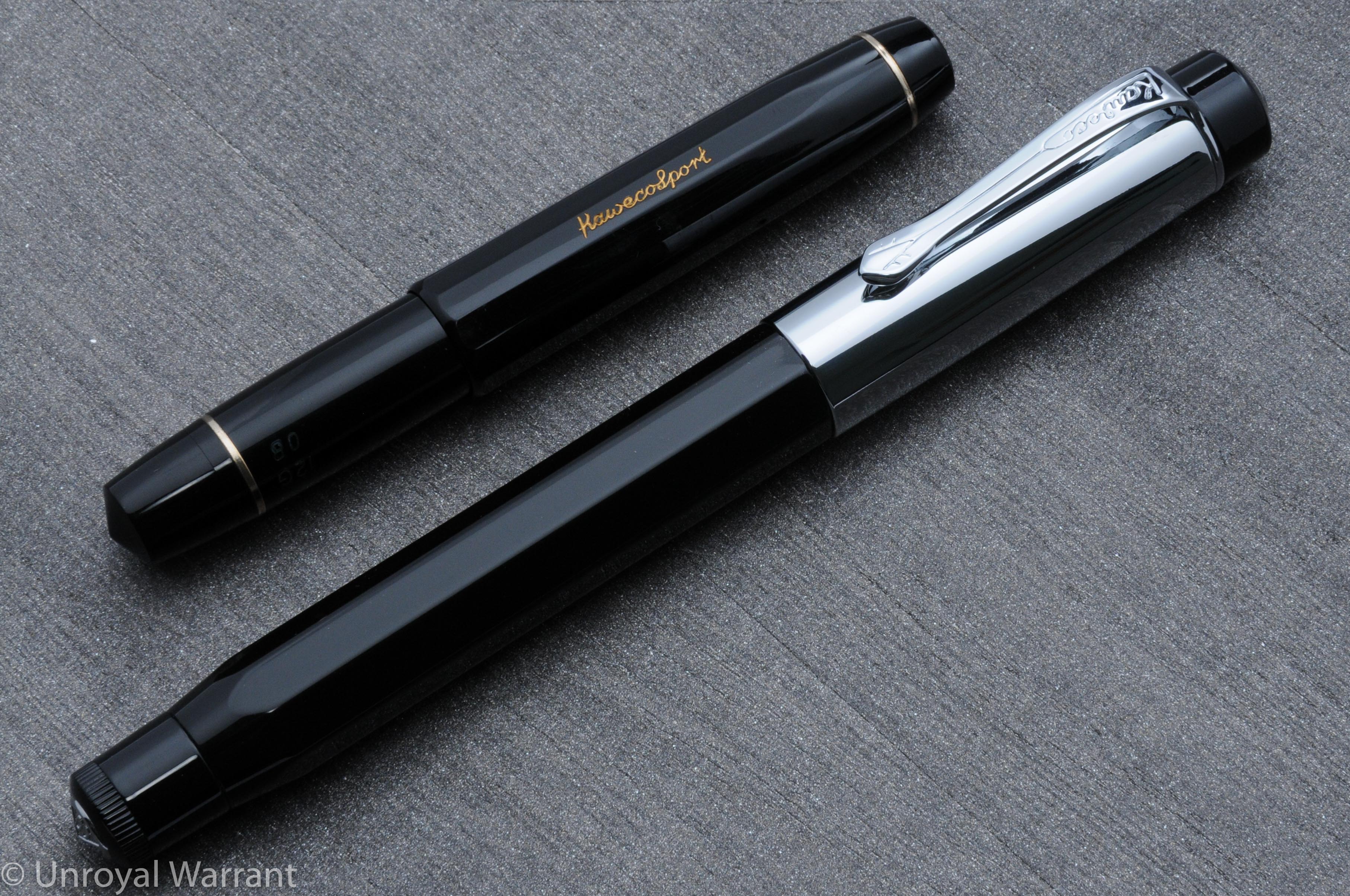
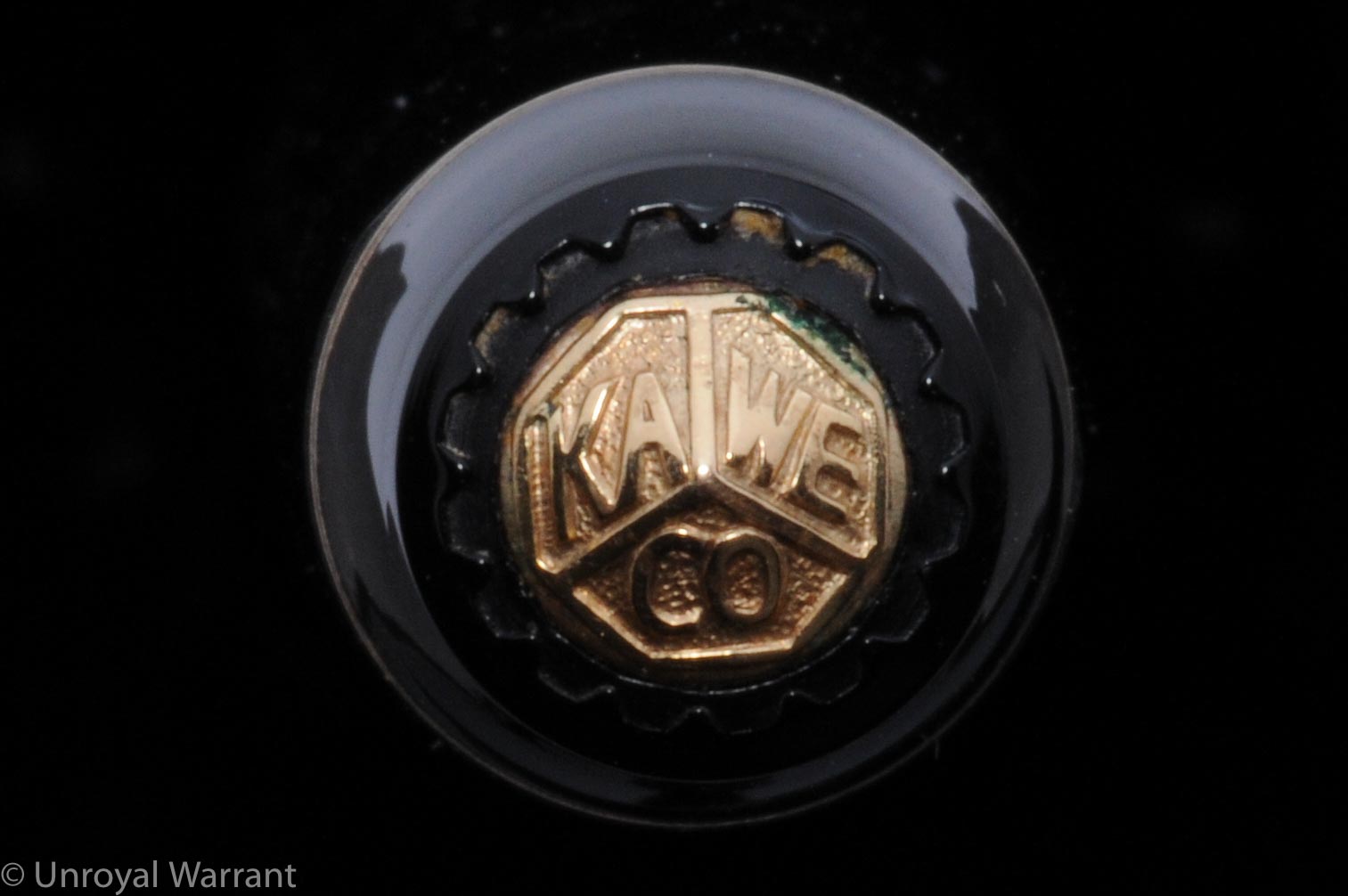
The Kaweco logo “jewels” on the top of the cap and end of the barrel are not as crisp as I would like and when I compared it to my vintage Kaweco Sport there was a noticeable difference; a small gripe but none-the-less worth pointing out.

Kaweco "jewel" on a vintage Sport
Kaweco “jewel” on a vintage Sport

The Elite weighs approximately 39 grams with the cap responsible for 18.5 of them; this makes the Elite on the heavy side.  To use this pen comfortably I had to write with the cap off.

Kaweco Elite Fountain Pen -3

Posting the cap makes the pen very top heavy and the cap does not sit very far down the barrel, so it’s length exacerbates the balance problem.

Kaweco Elite Fountain Pen -2

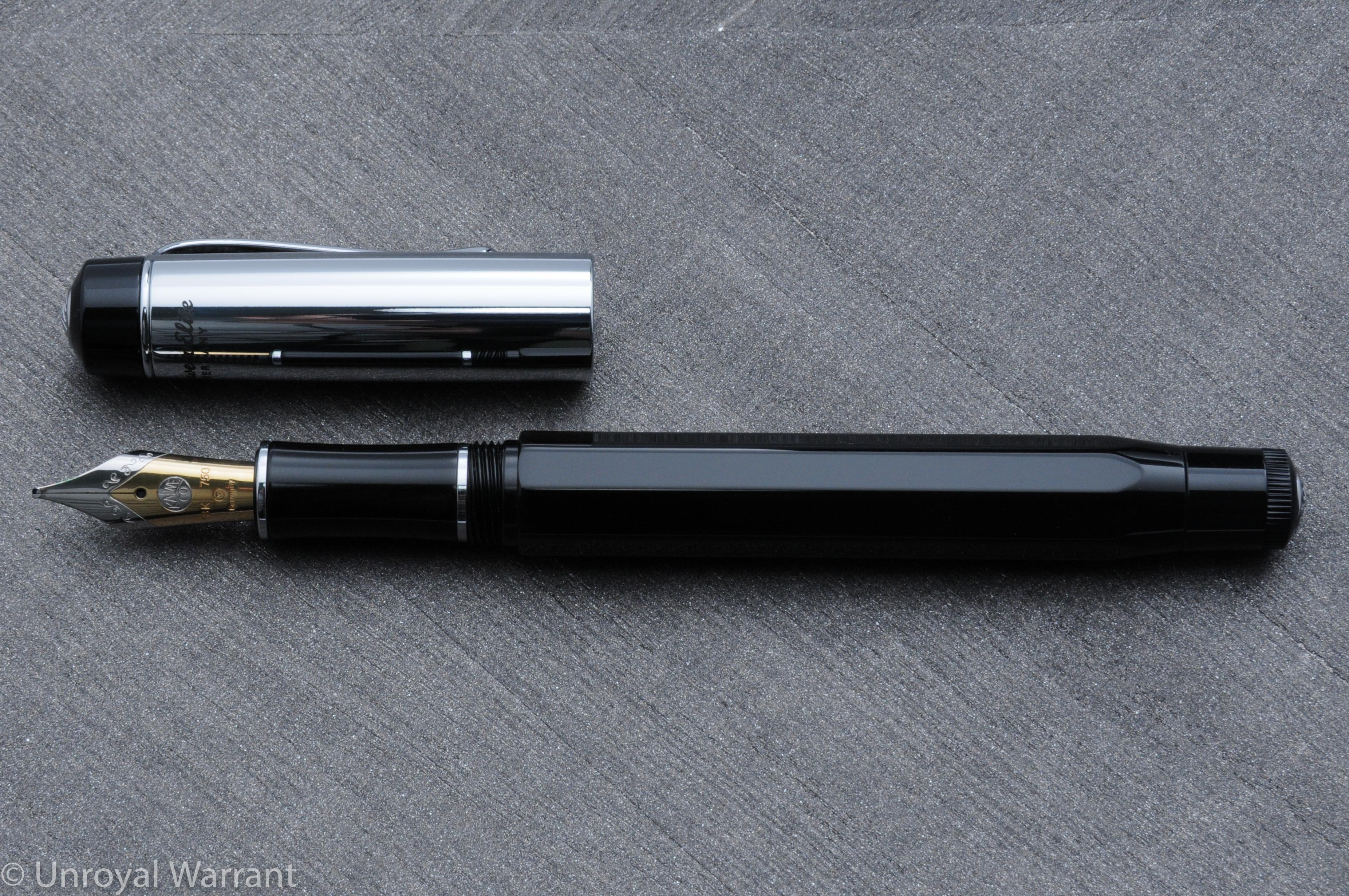
With the cap off the Elite is very comfortable with its long acrylic grip section.  The Elite measures 13.8mm long capped and about 13.4mm uncapped.

Kaweco Elite Fountain Pen -8

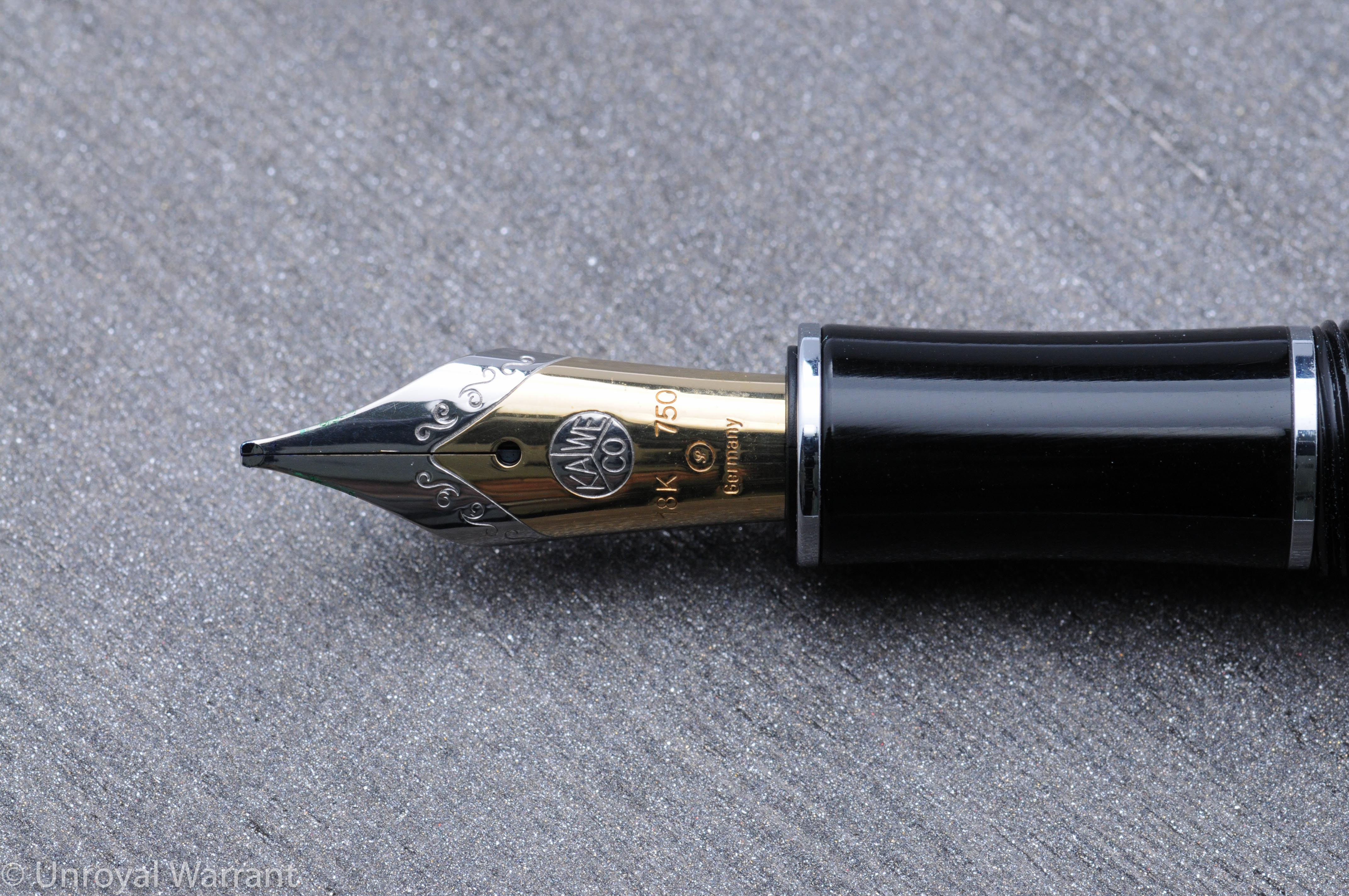
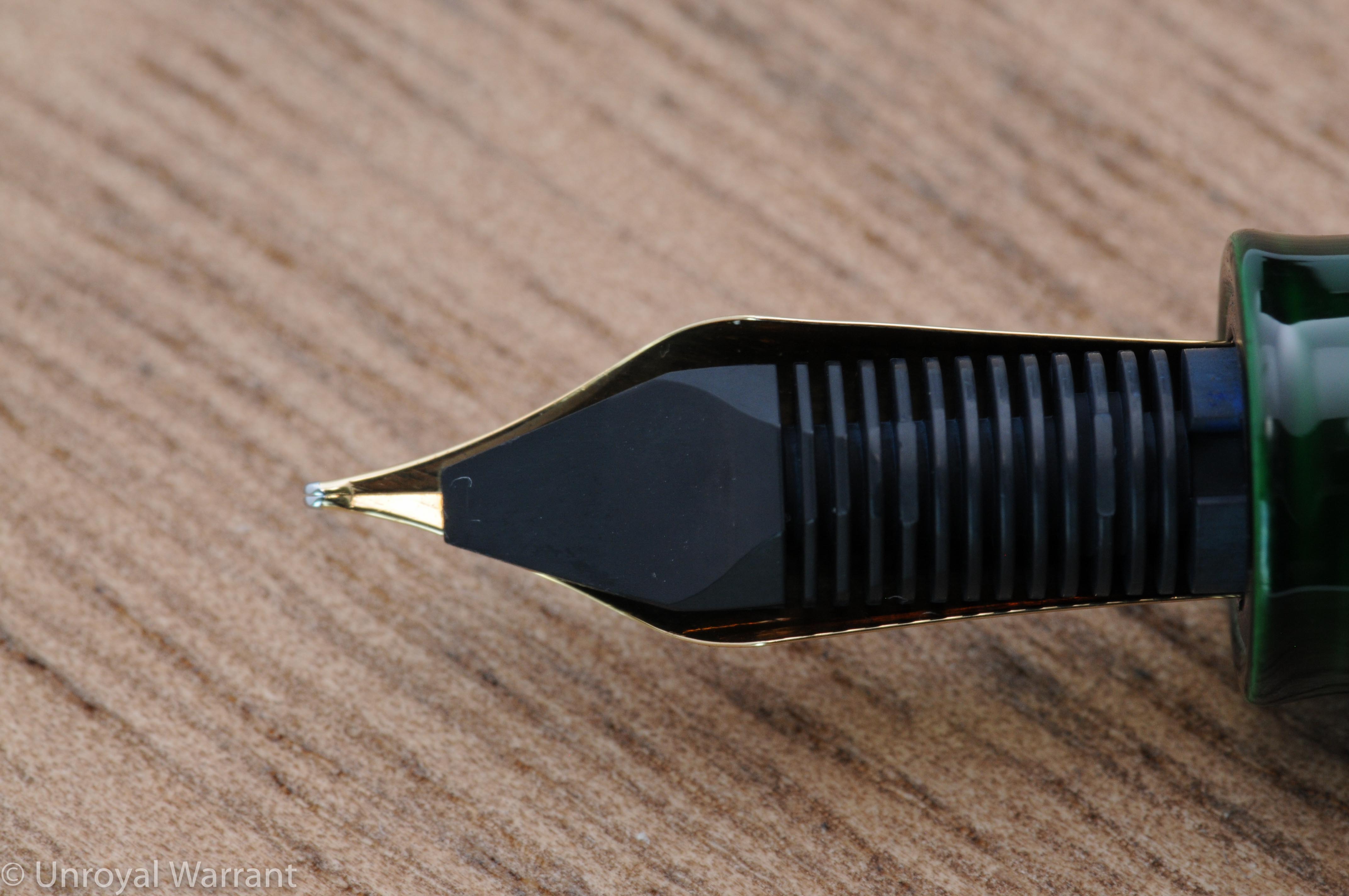
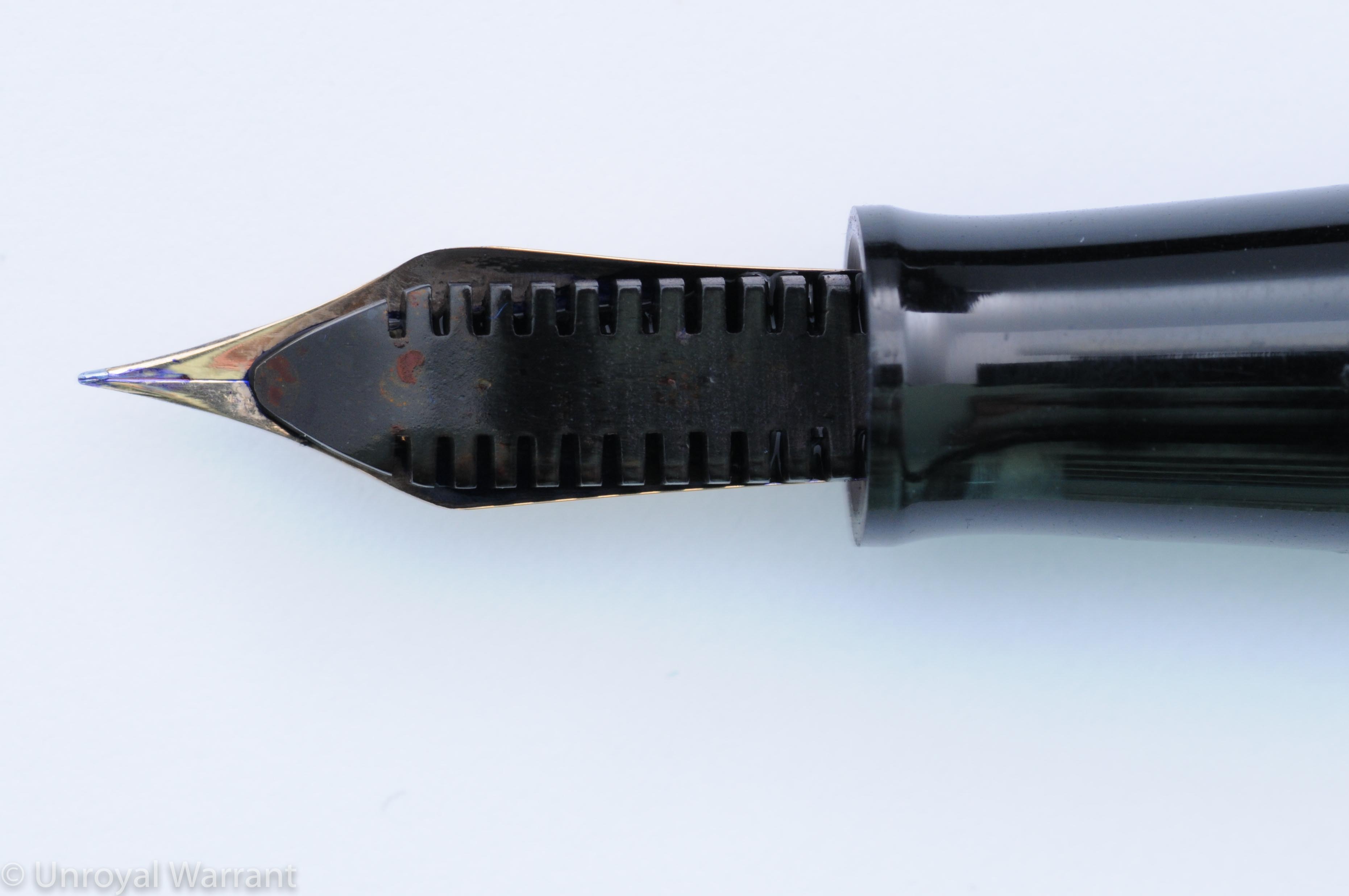
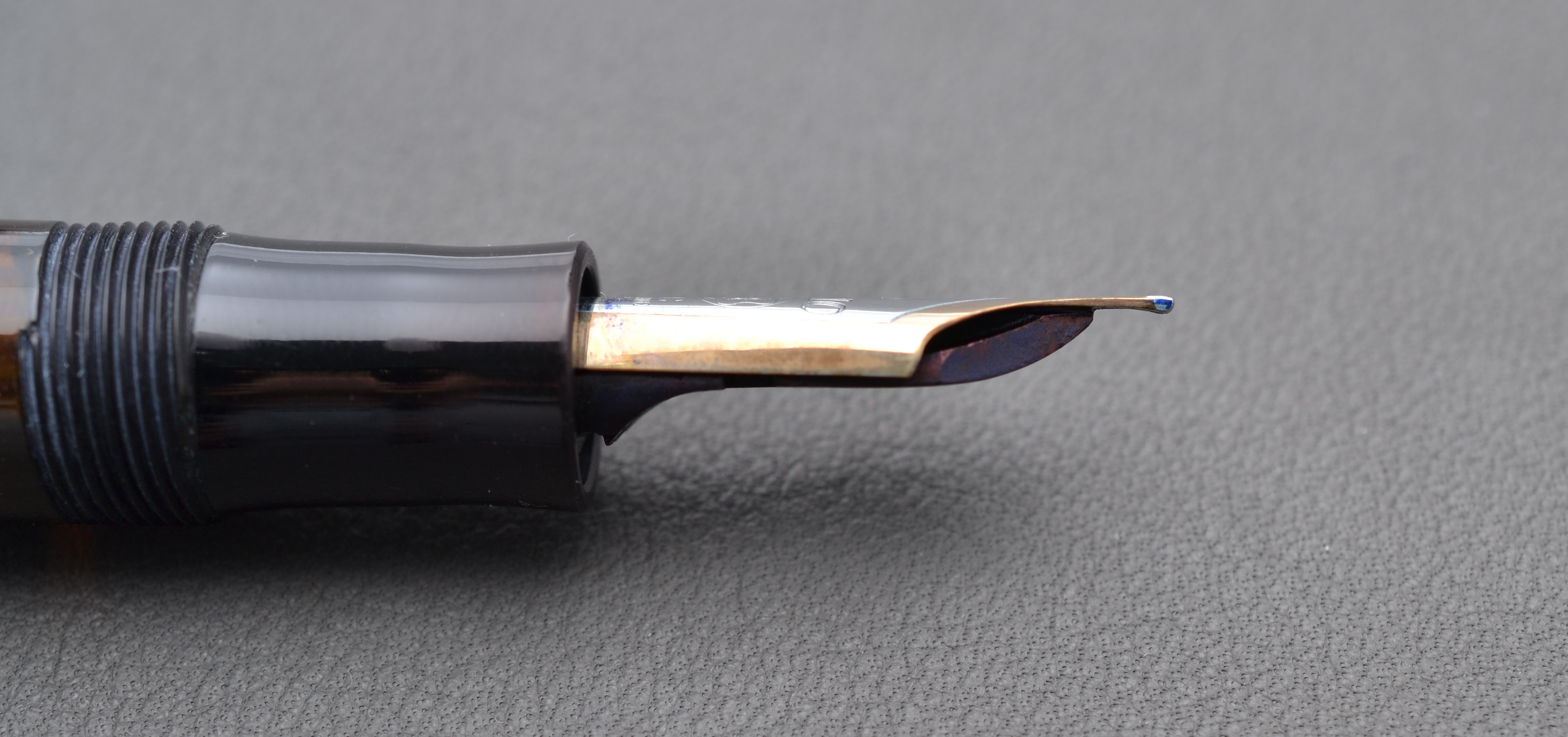
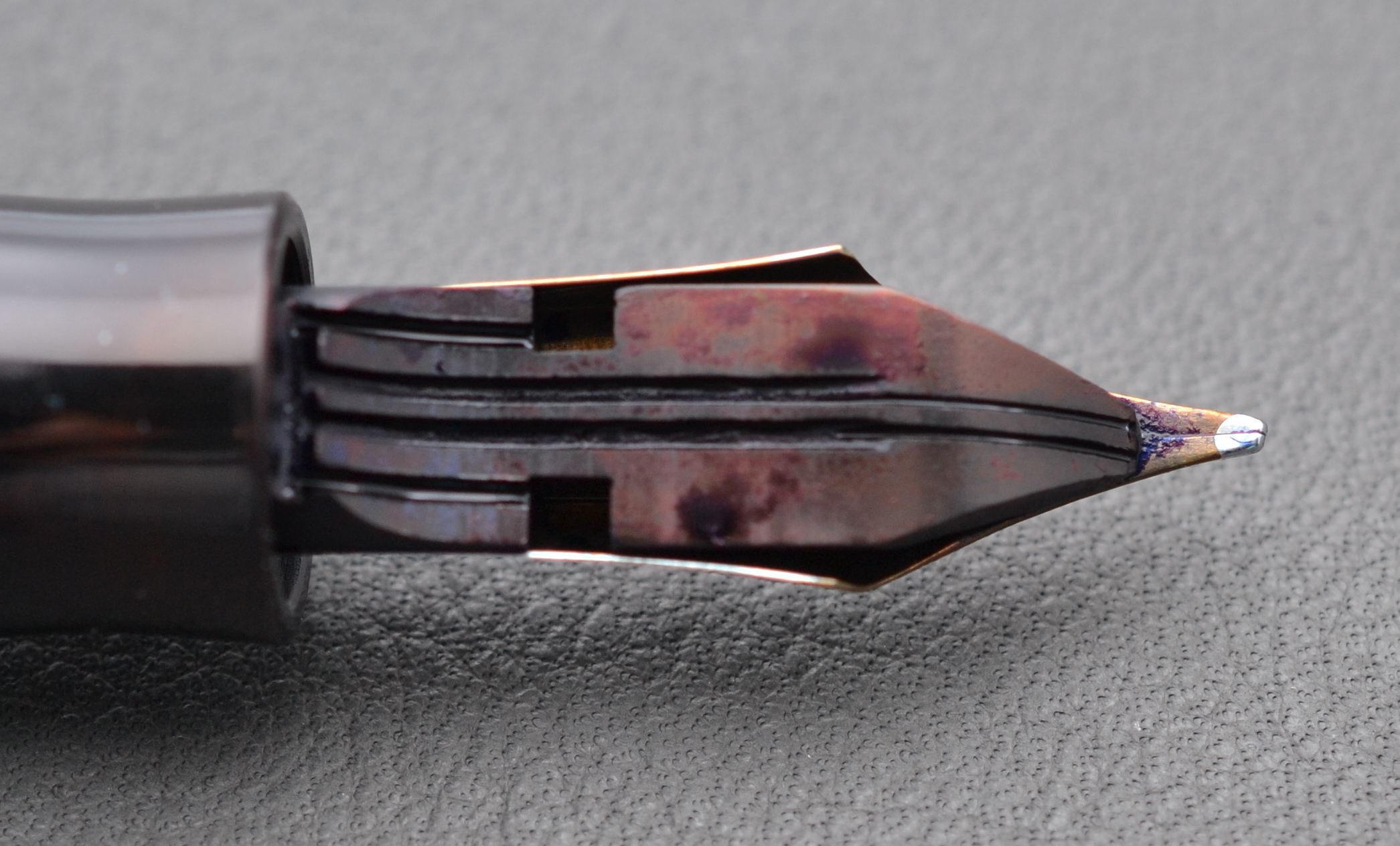
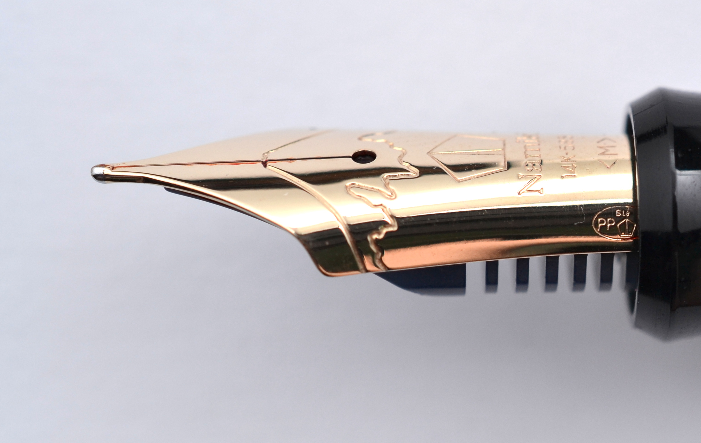
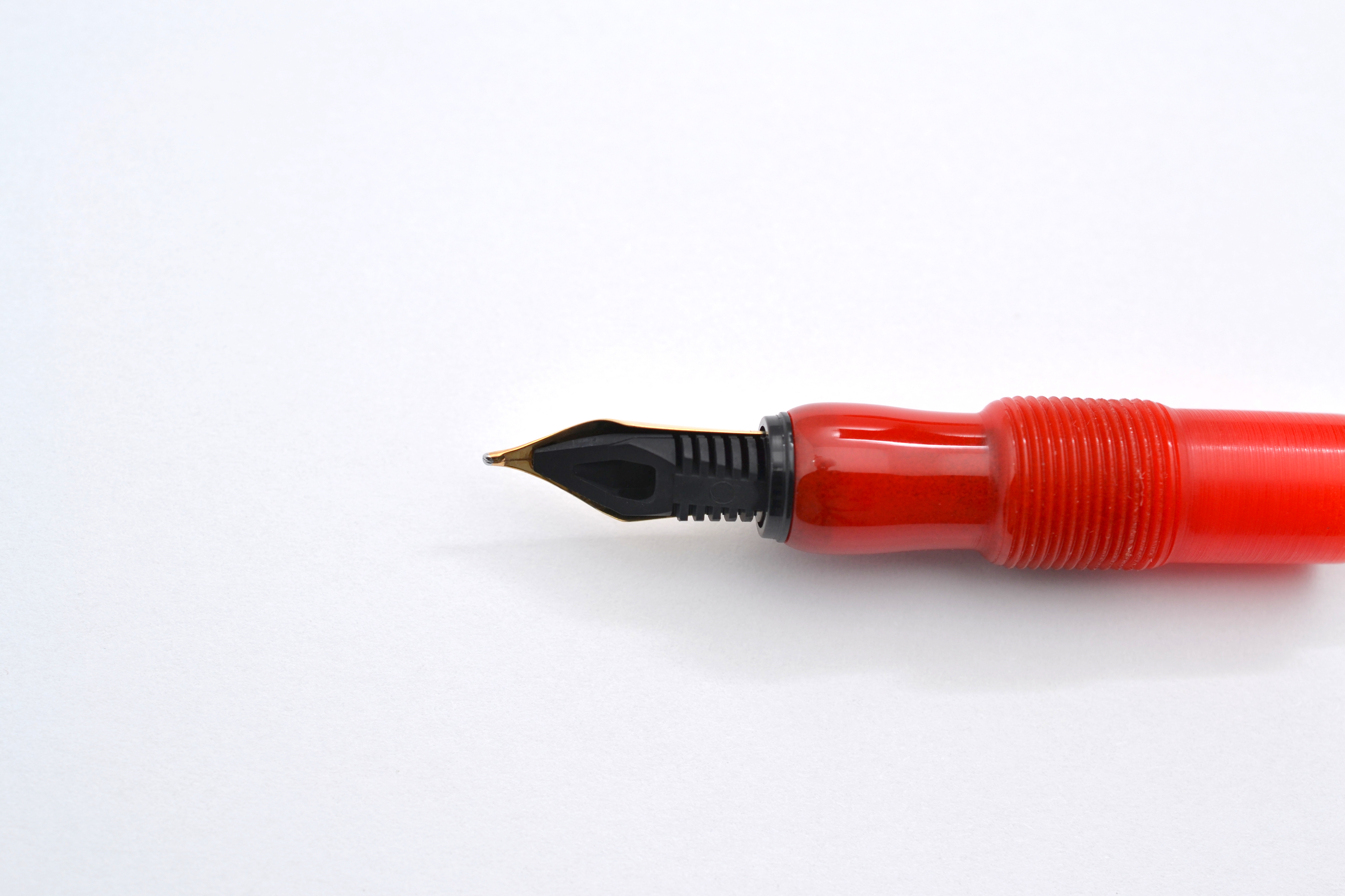
The 18kt gold nib is writes smoothly and is a good performer.  I find that it does write on the drier side (something I will likely adjust later) and that it can take a bit of work to get the ink flowing when a new cartridge is inserted.  Once it starts flowing the nib works great and is a pleasure to write with.  The 18kt gold nib has some spring but I wouldn’t say that it’s particularly soft.

18kt nib on top and steel on the bottom

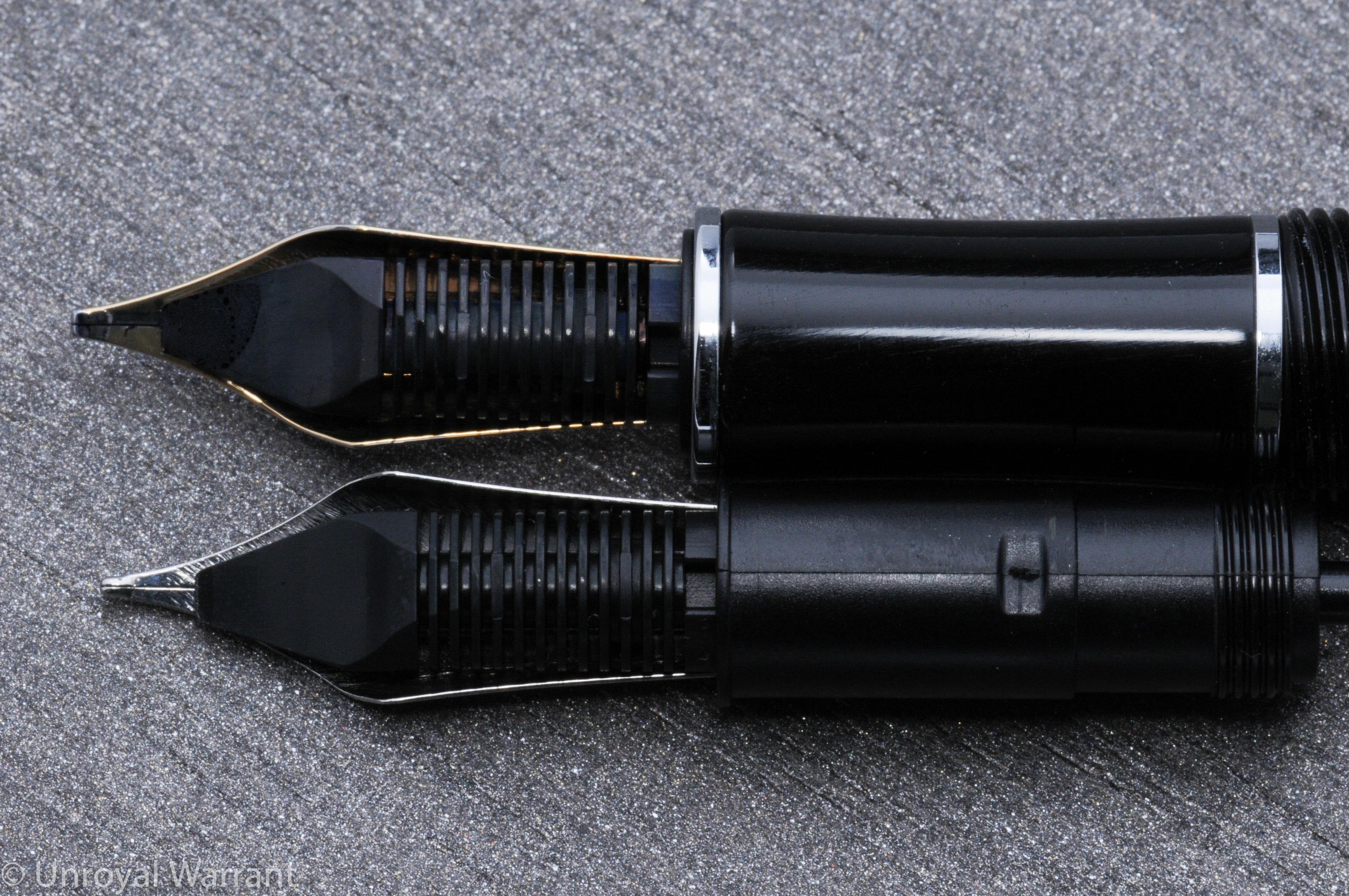
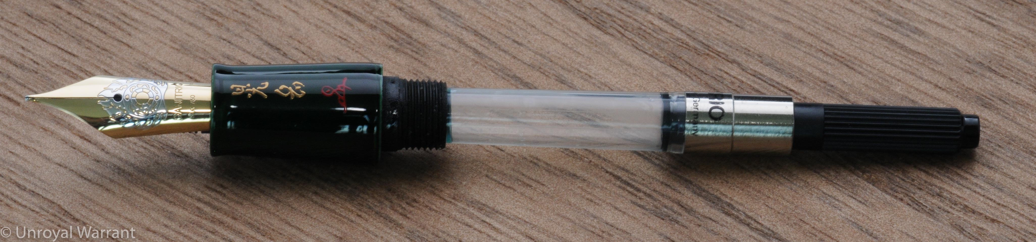
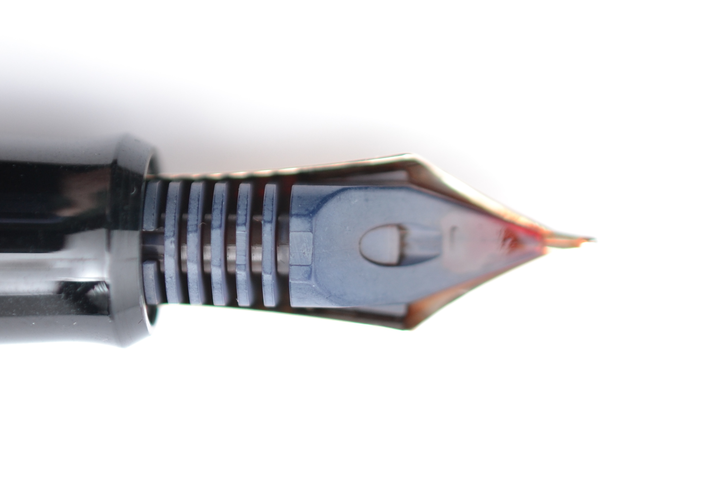
The nib shares the same plastic feeder as the steel nib.  The nibs are threaded like those from Pelikan and Aurora, making nib swaps a breeze.

Threaded nib units are a excellent feature
Threaded nib units are an excellent feature

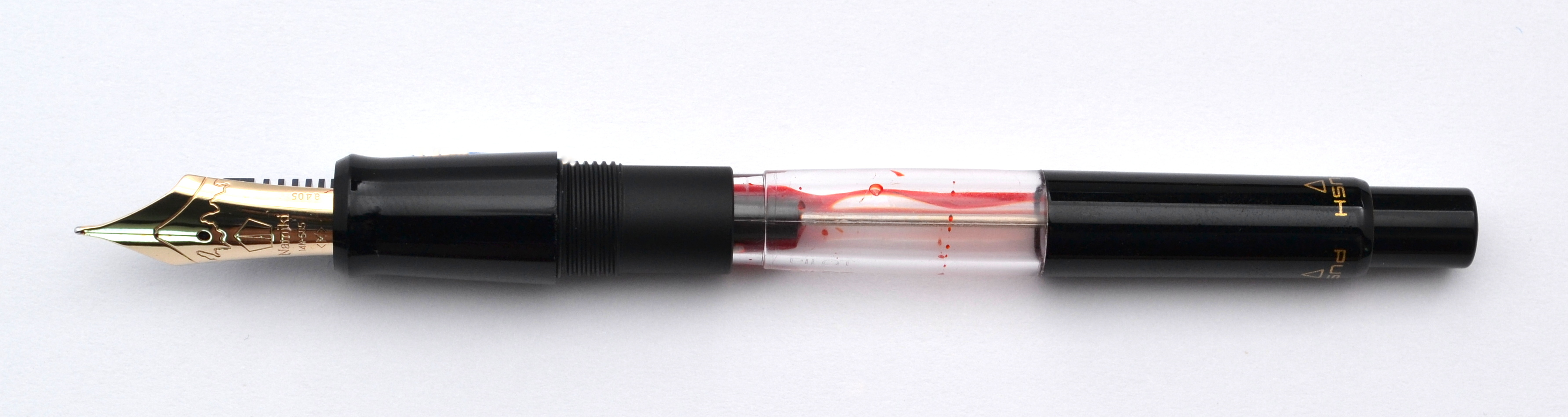
The Elite can hold two short international cartridges and interestingly there is a spring inside the barrel, something I haven’t seen on any other fountain pen.  This spring is useful in getting the second cartridge out of the barrel.

The Elite is not sold with a converter.  I tried a standard Bock converter which fit onto the section but was too fat for the barrel.  Luckily I have a Kaweco converter and surprise, surprise, it fit.  I did find that the converter regularly removed the spring when I unscrewed the section.  I would recommend removing the spring if you use a converter.

Kaweco Elite Fountain Pen -1

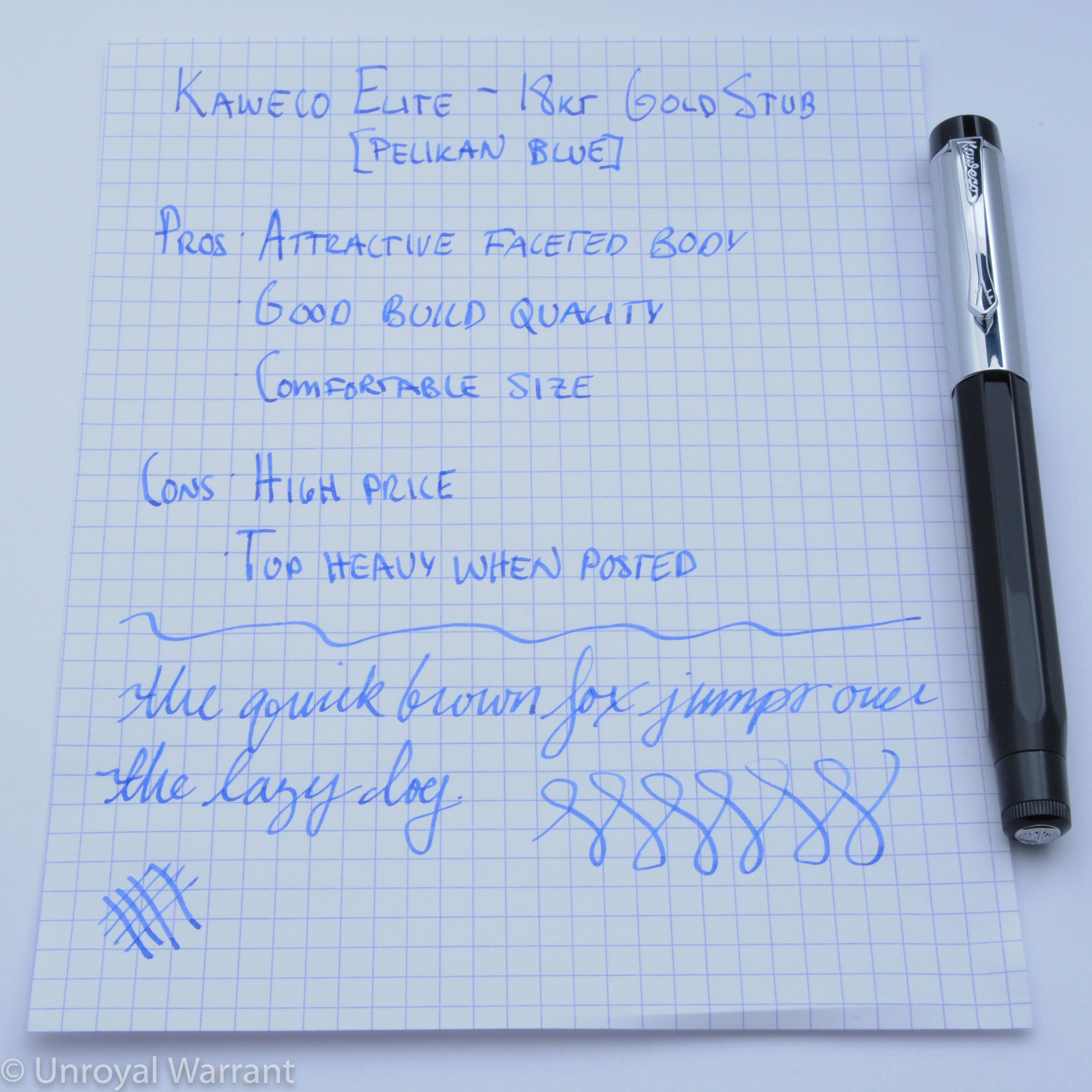
The Elite fountain pen has a street price of $150, while the 14kt gold nib (again, only sold separately) costs about $200.  In the $150 price bracket there are lots of excellent pens, like the Lamy 2000 and the Pilot Vanishing Point.  I find that Kaweco Elite stands up to these pens nicely.  It really comes down to preference.

But what about the $200 gold nib? The problem for me is that the steel nib is really good.  If we were talking an extra $50 then I would go for the gold but from a writing perspective the gold nib isn’t enough of an improvement to justify it’s high price.

Please note: this pen was provided to me by Kaweco at a subsidized cost for purposes of this review.

Here are some other great reviews of the Kaweco Elite fountain pen:

(I have no affiliation with any of the sites linked below)

The Pencilcase Blog – Kaweco Elite Fountain Pen

The Gentleman Stationer – Pen Review: Kaweco Elite

My Pen Needs Ink – Kaweco Elite – Pen Review

Pens! Paper! Pencils! – Kaweco Elite fountain pen review

Gourmet Pens – Review: @Kaweco Elite Fountain Pen – Medium @JetPens

Pen Addict – Kaweco Elite Review

Danitrio Hakkaku Ancient Flower Midori-Dame Fountain Pen Review

Danitrio Hakkaku Fountain Pen-4

Danitrio is perhaps the biggest name in Maki-e pens outside of the main three Japanese makers (Pilot/Namiki, Platinum/Nakaya and Sailor).

Danitrio Maki-e pens are not an entirely Japanese product. The company is based in California and the pens, as far as I know, are manufactured and painted in Japan but use Bock nibs from Germany…so it’s a multinational effort to put one these pens together.

I have been eyeing a Danitrio for a while as they offer very good value for money. While they are by no means cheap, they are considerably less expensive than most comparable Japanese pens.

One of the great things about Danitrio is that they offer their pens in a large number of shapes and finishes.

Danitrio Hakkaku Fountain Pen-5

Despite having similar dimensions to a Montblanc 149, the Hakkaku is one of Danitrio’s smallest models measuring 13.5cm long and 1.5cm wide.

The ebonite body has a faceted flat top design. The dark Midori-dame finish softens the look of the facets. A lighter color would do a better job of accentuating this pen’s shape.

The clip is sprinkled with gold flakes and painted in the same midori-dame finish as the body. Danitrio Hakkaku Fountain Pen-43I am not a big fan of flowers but I kept coming back to this ancient flower design.

Danitrio Hakkaku Fountain Pen-13

It is very well balanced and looks great against the green background.

Danitrio Hakkaku Fountain Pen-11

This pen (I am told) uses a Togidashi Maki-e technique.

Danitrio Hakkaku Fountain Pen-10

The finish quality of the Hakkaku is comparable to Nakaya. It’s not perfect like a Namiki pen; it has more of hand made look and feel to it. The threading is smoother than on my Nakayas and unlike my Nakaya Naka-ai Negoro the design always lines up when I put the cap on.

Danitrio Hakkaku Fountain Pen-12

The section is signed with the artist’s signature.

Danitrio Hakkaku Fountain Pen-9

The #6 size nib is solid 18kt gold and produced by Bock in Germany.

Danitrio Hakkaku Fountain Pen-6

The fireball design looks great. The nib has a fine point and is considered one of their “soft” nibs. The nib is soft and if you apply some pressure you can get some line variation but for me with a light hand I don’t notice much.

Danitrio Hakkaku Fountain Pen-7

The fine point is smooth and writes with a medium line width (typical Bock). If you want a true fine you are better off with an extra fine nib.  The nib doesn’t have as much character as those made by Pilot or Platinum but it’s a good performer and if you like a smooth soft nib this one is very nice.

The Hakkaku takes standard international cartridges and comes with a Bock converter.

Danitrio Hakkaku Fountain Pen-15

The feed is plastic (and out of alignment, the dealer has since remedied the problem).

Danitrio Hakkaku Fountain Pen-8

This pen has a retail price of $1,900 and I was able to get it for a bit less than half that.  By comparison, a plain urushi lacquer Namiki Yukari Royale runs $1,500 and a Maki-e versions range from about $4,000-$10,000.  I am not saying this pen is the same quality as a Namiki (it isn’t) but it is a more affordable way to get your hands on a good quality Maki-e pen.

Danitrio Hakkaku Fountain Pen-76

At the end of the day I am really happy with this pen.  It looks and writes great and it was reasonable enough that I don’t worry about using it everyday.

OMAS Extra Lucens and Lucens Fountain Pen Review

Top to bottom: OMAS Extra Lucens, OMAS Extra Lucens, OMAS Lucens

The Lucens and Extra Lucens were the best quality and best looking Italian pens of the 1930s and 1940s.

Italian pens during this period were largely inspired (and in many cases copies) of American pens. The Lucens and Extra Lucens were offered with visulated barrels much like the Parker Vacumatic and Waterman Ink View. The Extra Lucens also featured an arrow nib and an arrow clip not unlike the one found on the Parker Vacumatic.

In the late 1930s Wahl Eversharp came out with the Doric, a faceted pen very similar to the Extra Lucens; there is some debate about which pen was introduced first.

Omas Extra Lucens -2


The bodies were made of celluloid and all of them had a degree of transparency to them.  The pens in my photos that appear black (because they are filled with ink) have black striped barrels and were originally clear but have turned into to a red color.  There were a number of beautiful celluloids that these pens were produced in.  The rarest and most valuable color was a grey pearl (if you Google “OMAS Extra Lucens Limited Edition” you can see a reproduction of this pen, though the original was not brown).

Both the Lucens and Extra Lucens use a stantuffo tuffante, or plunger filling system. This system is considered to be the same as the one used by the American brand Dunn, which had a patent on this system in 1920. OMAS patented their version in 1936 and for this reason we see “Brev.73725 – 1936” on the barrels of these pens.

Omas Extra Lucens -4

The plunger filler eliminated the use of sacs which made for a (supposedly) more durable filling system with a larger ink capacity.

Omas Extra Lucens -9

Personally, I do not like this system and I am not surprised that it was abandoned in favor of the piston filler. Filling the pen requires pulling out the plunger which draws up ink into the pen and then quickly pushing the plunger back down allowing the air to escape through a breather tube inside the barrel…if you push the plunger down too slowly all of the ink you just drew into the pen will be expelled. The filling system is relatively durable such that I feel comfortable using these pens every day. The weak points being a cork seal and breather tube.

The Lucens and Extra Lucens came in three sizes, the largest of the three measures about 14cm long capped and the midsize measures about 13cm (unfortunately I don’t have a small one to measure). The larger model is more or less the same size as the current all celluloid OMAS Paragon. The midsize is very similar in feel to a Pelikan M400 though slightly longer.

Top to bottom: OMAS Extra Lucens (large), OMAS Extra Lucens (small), OMAS Lucens (small)
Top to bottom: OMAS Extra Lucens (large), OMAS Extra Lucens (midsize), OMAS Lucens (midsize)

The nibs of the Lucens and Extra Lucens are quite different. The Lucens “Extra” nib with heart shape breather hole was the standard nib used on all of the OMAS Extra pens, while the Extra Lucens had a special arrow nib with a pentagon shape breather hole.

OMAS Extra nib
OMAS Extra nib
OMAS Extra Lucens nib

The Extra nib has longer tines than the Extra Lucens nibs creating more flexibility. The Extra Lucens nibs are soft and springing but not flexible (based on the small handful I have sampled).

Two Extra Lucens nibs

During the war the Lucens and Extra Lucens pens had white metal trim and “permanio” nibs which were made of a steel alloy. These nibs, unlike Montblanc and Aurora’s wartime nibs, were not very resistant and many of them corroded.

The ebonite feed is much like those found on current production OMAS pens

The Extra Lucens was also offered with a bi-tone reversible arrow nib. The reverse side was stiff for carbon copies while right-side up the nib was soft like a regular OMAS nib.

Omas Extra Lucens -10
Writing sample with the Lucens

These pens are very nice reliable writers that I enjoy using. I almost always have one inked up. Like most vintage Italian pens, these are relatively rare and expensive. The large size Extra Lucens are the most desirable but for me as writers I prefer to use the smaller models.

Namiki Custom Impressions Fountain Pen Review

Namiki Custom Impressions Fountain Pen-1

The Namiki Custom Impressions line of pens was produced in the late 90s and while it predates the very popular Pilot Custom 74, it is essentially the same pen with a “celluloid” body and no markings on the cap band.  These pens are cellulose acetate and not the cellulose nitrate normally associated with the word “celluloid”. The difference is that the cellulose acetate feels and can often look like a more typical plastic without the depth and oily feel of real celluloid.

The Custom Impressions came in five colors: Sapphire, Medley, Ambertone, Ruby and Emerald. I have Sapphire, Medley and Ambertone. It has been suggested (and from what I can tell rightly so) that Aurora used the same green plastic as the Emerald in their Optima. I have photographed them with a couple of Optimas…I am not certain that the Ruby is the same as Aurora’s Burgundy but they are close.

My Namiki Custom Impressions with two Aurora Optimas
Left to right: Custom Impressions in Ambertone, Medley, Sapphire, Aurora Optimas in green and Burgundy

I particularly like the Sapphire and Medley colors; these to me are the most unique and beautiful.

These pens came with a con-70 converter and a 14kt gold #5 nib.

Namiki Custom Impressions Fountain Pen-7

There is another variation of the Custom Impressions that very closely resembles the shape of the Custom 845, but again in “celluloid” and with a #10 instead of #15 nib. This model seems to be much more scarce and considerably more expensive than the pens I am showing here.

Like the Pilot Custom 74, the Namiki Custom Impressions make excellent workhorses. The nibs are butter smooth and wonderful writers.

Namiki Custom Impressions Fountain Pen-6

To my knowledge these pens were only produced in fine, medium and broad nib grades.

Medium nib on top, fine on bottom

I also find the nibs on the Impressions to be softer than the ones on the Custom 74. It seems to me, based on a small sample of Pilot/Namiki pens, that the pens from the 90s and early 00s have softer nibs than the ones produced more recently.

I have a decent amount of experience writing with Pilot/Namiki nibs from size #5 to size #20 and while I find all of these nib sizes to be very comfortable, the #10 seems to hit the sweet spot, with the #5 feeling a bit small and the #15 and #20 feeling a bit big. If you have big hands, which I do not, you may not like the #5 nib on these pens.

Namiki Custom Impressions Fountain Pen-2

The Custom Impressions are full size pens measuring just over 13.5cm long, capped and weigh approximately 22.5 grams empty (with the con-70 installed).  These pens post very well and I find them comfortable to use posted and unposted.

Namiki Custom Impressions Fountain Pen-8

Prices for the Custom Impressions range a bit as they do not come up for sale all that often. If you can get one for around $150-$200 (depending on condition) I think that is a fair price but keep in mind if you prefer the look of a simple black body, a Custom 74 can be had for around $90 new.

Montblanc Meisterstück Solitaire Platinum-Plated Facet LeGrand Fountain Pen Review

Montblanc Le Grand Platinum Facet Fountain Pen-2

If you read this blog regularly you will know that this pen is not my typical cup of tea but as I was traversing the Warsaw airport I couldn’t help but see sale signs on a large Montblanc display.  The only pen that caught my eye was the Montblanc Meisterstück Solitaire Platinum-Plated Facet 146 (or LeGrand as they now call it).  I was curious to know how much it was and after seeing the price I decided to go for it.

Montblanc LeGrand Platinum Facet Fountain Pen-5

This pen is the typical Meisterstück design but in a faceted platinum plated stainless steel body instead of the usual “precious” resin.  It really is quite a stunning pen to behold and has much more of a presence than its resin sister.

Montblanc LeGrand Platinum Facet Fountain Pen-6

The facets create a tiled pattern.  You will notice that the face of the tiles are a mirrored platinum finish while the edges are brushed; this is a particularly nice touch and a testament to the craftsmanship put into this pen.

Montblanc LeGrand Platinum Facet Fountain Pen-9

This 146 came with a medium nib which was too fat for my tastes but Montblanc has a free nib exchange program than can be utilized within six months of purchase.  At the Montblanc boutique in Berlin I was able to try their tester set and found that the OB nib offered the most line variation and the next morning I picked up my pen with the OB installed.  That is exceptional service.

Montblanc LeGrand Platinum Facet Fountain Pen-4

The 146 is a full size pen fitted with an 18kt gold nib, a piston filling mechanism and a striped ink view window.  The standard resin 146 has a 14kt gold nib and when compared with the 18kt version I could not tell the difference.

Montblanc LeGrand Platinum Facet Fountain Pen-8

The nib is noticeably soft and is a very nice to use.  The ink flow is on the drier side but the smooth nib conceals this quite well.  I have found that lubricating inks work best with this pen.

Montblanc LeGrand Platinum Facet Fountain Pen-7

As is obvious in all of my pictures, this pen is a fingerprint magnet.  If you cannot handle finger prints and patina this 146 is a not a good choice.

Montblanc LeGrand Platinum Facet Fountain Pen-3

This pen retails for around $1,300 and even at over 50% off I don’t feel as though the price was a home run.  It’s very well made and nice to look at but to me it is not as special as say a hand turned Japanese pen or a pen made of beautiful Italian celluloid (all of which can be hand for a similar price).  If you want a flashy pen with the Montblanc brand cachet then this could make sense but otherwise at anywhere near retail I say forget it.

Namiki Yukari Royale Vermilion Fountain Pen Review

Namiki Yukari Royale

The Yukari Royale is an oversize fountain pen similar in size and shape to a Montblanc 149. Despite it’s oversize form the Yukari Royale sits mid-pack in the Namiki line-up; there is the standard full-size Yukari and the comically enormous Emperor.

Namiki Yukari Royale with Namiki Nippon Art (same size as a non-Royale Yukari)

Earlier this year in Japan I tried both the Yukari Royale and the Emperor in person. I quickly ruled out the baseball-bat-sized Emperor but the Yukari Royale I struggled with for a little while.  I thought “how could a pen so big and heavy be so comfortable?”; ultimately I decided not to take the risk on such an expensive pen and I bought a Platinum Izumo Yagumonuri instead.

Fast forward a few months and I was still thinking about the Yukari Royale and at the same time feeling disenchanted with the Izumo (the Izumo has a long section with a large step down that causes me discomfort in long writing sessions).

I ended up going for the Yukari Royale (thank you to Pen Chalet for making this possible).

The Yukari Royale has a large brass torpedo-shape body covered in vermilion (red) urushi lacquer (also available in black). The cap has Namiki’s (Pilot’s) ball clip and a very thin gold band at the end of the cap. The simple shape and minimal trim make for a very elegant pen.

Namiki Yukari Royale

The fit and finish of this pen is flawless. It really is perfect to the point where I genuinely question if it is in fact hand painted. Next to a Nakaya the difference is night and day. That is not to say that there is anything wrong with a Nakaya, there isn’t, a Nakaya has more of an organic beauty.

This pen weighs a hefty 45 grams but it is so well balanced in my hand that I don’t feel any fatigue from its weight. My other Namiki pens, a Nippon Art and a Yukari (non-Royale) share this same wonderful balance.

The Yukari Royale measures 5.8” capped. You can post this pen but it becomes too long for me. The grip section is about .4” in diameter which is thick but not as thick as a Montblanc 149s which measures over half an inch.

Namiki Yukari Royale
Yukari Royale next to Montblanc 149 (notice how much fatter the Montblanc section is)

Here you can see the Royale with a variety of Pilot/Namiki pens:

Namiki Yukari Royale
Left to right: Namik Yukari Royale, Pilot Custom 845, Namiki Yukari Nightline, Namiki Custom Impressions (same dimensions as Pilot Custom 74)

The Yukari Royale is the only pen pictured above to feature an urushi painted metal section.  All of the other pens (even the more expensive Yukari Nightline) have unpainted plastic sections with visible seams.

The Yukari Royale (using Pilot’s sizes) is a #20.

Namiki Yukari Royale

Interestingly, it is the same size as a Pilot #15 but with a different shape and an oblong breather hole as well as a red plastic feed.

Nibs left to right: Pilot/Namiki #20, #15, #10, #5

The nib is made of 18kt gold and is quite soft.  The performance is excellent.  No skipping no hard starting; this pen just works.  Out of all of my modern pens this is by far my favorite stock nib in my collection; it’s character is unique and lovely. Compared to my other Pilot and Namiki medium nibs which are butter smooth, the number 20 has a small amount of feedback which I love. It sort of reminds me of the feedback from an Aurora Optima nib with the softness of a Montblanc 149 nib…in other words this is a dream nib (for me at least).

With it’s large nib and feed this is a thirsty pen.

Namiki Yukari Royale

It uses a Con-70 converter that holds 1.1ml of ink and even with this large capacity I find that I run out of ink rather quickly. I also must admit that I am not as huge a fan of the Con-70 as I once was.

Namiki Yukari Royale

While it holds a lot of ink, it is the most difficult to use and the most difficult to clean converter on the market. I fill and clean mine with a blunt tip syringe.

So what about the price?

As I said earlier this is an expensive pen. The street price is $1,200 ($1,500 full retail).  I get a lot of enjoyment of the Yukari Royale and while I have a lot of wonderful pens this is the only one that I have refilled six times in a row…I just don’t want to put it away and to date I haven’t yet.

Is it worth it for you? Rationalizing a pen this expensive is a fool’s errand (though I have tried in past reviews, see Nakaya Naka-ai).

Namiki Yukari Royale

The Yukari Royale is a wonderful jewel of a pen to behold.

A special thank you once again to Pen Chalet for making this review possible.  If you buy a pen as nice as this you will want to purchase from a reputable authorized dealer with great customer service like Pen Chalet.

Montblanc Meisterstück 136 Fountain Pen Review

Montblanc Meisterstück 136 Fountain Pen

The 13X series of pens were the first Montblancs to feature a piston filling mechanism. The 136 was the senior size pen just as the 146 is today in the current Meisterstück line.

The 13X series was produced in the mid 1930s to the end of the 1940s and possibly into the early 1950s as there was a brief point when the 13X line and 14X were sold simultaneously.

There are several variations of the 136 which I won’t cover here other than to say that my version is a later model with the shorter ink window.

Montblanc Meisterstück 136 Fountain Pen

The differences between the 136 and the original 146 were mostly in design. The 146 had (and still has) a streamlined cigar shape where the 136 has more of a flat top.

Montblanc Meisterstück 136 Fountain Pen
136 cap with a star that has turned ivory in color over the years

They both had the same telescopic piston filling mechanism but if you look at the end of the barrel on a 136 you can see two knobs…the one at the very end is the regular piston filling knob you use to draw ink into the pen and the one below that is used to remove the actual piston filling mechanism…this makes repairs slightly easier.

Montblanc Meisterstück 136 Fountain Pen

I am quite fond of vintage Montblancs because they were very well made and have wonderful nibs. Unfortunately, these pens are expensive today, despite being mass produced.  Montblanc is now very valuable luxury brand name and this has had an effect on the prices of their vintage pens.

Like most pens, the larger the size in a given series the more expensive the price and that is certainly the case here. The oversized 138 and 139 are the most valuable and the 132 is the least. A 136 in black celluloid can range from about $400-$1,000 depending on condition. Most will be in the $600-$800 range.

All piston filler Meisterstücks that I have owned are suitable for daily use; they are reliable workhorses. With the older celluloid models, however there are a couple of things to look out for: 1) The cork piston seal. If the cork dries out there will be no seal, meaning you won’t be able to draw up ink.  The best thing you can do to prevent this is to use the pen regularly.  Alternatively, you can store your pen with water but be advised this method is not foolproof  2) Celluloid shrinkage. Many old Meisterstücks suffer from this and sadly there is no cure. The good news is that this rarely causes functional problems. Shrinkage on the cap can cause the cap rings to come loose and you may see subtle dips and bulges on the body and cap. On my pen there is some shrinkage on the section. You can see a little bump in the middle of it.

Montblanc Meisterstück 136 Fountain Pen

My 136 is fitted with a beautiful OB nib.

Montblanc Meisterstück 136 Fountain Pen

This nib is very soft and is wonderful to write with. These nibs were hand made and most I have come across are very soft. I have seen some Meisterstücks with flex nibs but these are considered extremely rare and generally command a small fortune.

Modern 146 on top and the 136 on the bottom

You can see that the 136 has a larger and more shapely nib compared to what is currently used on a modern 146.

Again, modern 146 on top and the 136 on the bottom
A view from the side shows that the feed is practically flush with the nib.
136 nib from the side

The 136 has a flat “ski-slope” ebonite feed that provides a generous amount of ink to the nib.

Ebonite "ski-slope" feed...looking ready for a deep cleaning
Ebonite “ski-slope” feed…looking ready for a deep cleaning

Montblanc Meisterstück 136 Fountain Pen

You will notice that unlike modern Meisterstücks the cap band is English, not German, and reads “MONTBLANC MASTERPIECE”.  This signifies that my 136 was an export model.  There is some debate about whether pens with “MASTERPIECE” on the cap band are more or less common than those that read “MEISTERSTÜCK”.  Based on what I have seen for sale on 13X and early 14X pens the cap bands in English are the most common.

Montblanc Meisterstück 136 Fountain Pen

The 136 weighs approximately 24 grams and measures 13cm long (or about 1.5cm shorter than the current 146). The 136 feels nice in hand and is a very comfortable size.

Montblanc Meisterstück 136 Fountain Pen

If you are looking for a vintage Montblanc I highly recommend a 136.

TWSBI Eco Fountain Pen Review

TWSBI Eco Fountain Pen

The highly anticipated TWSBI Eco is the company’s most affordable fountain pen to date at $28.99.  The Eco features a clear demonstrator body with a piston filling mechanism; these attributes combined with its low price make for a very enticing pen.

The Eco is a full size pen at just under 14cm long capped.  The Eco comes in only two colors white/clear and black/clear.  I opted for the black.

Like most TWSBIs, the Eco’s design offers a lot to digest.  The cap and piston knob are made of a faceted black plastic while the body is made of a round clear plastic allowing you to see the internal piston mechanism and the feed.

TWSBI Eco Fountain Pen

The Eco features a small stainless steel JoWo nib (the same that is used on the TWSBI Mini and Classic).   For a full sized pen the nib is on the smaller side but at this price point it’s a pretty minor gripe.  I ordered my pen with an extra fine nib and it is a delight to use.  I was surprised how smooth it was; in fact it puts my medium nib Safari to shame.

TWSBI Eco Fountain Pen

The Eco does post but the cap doesn’t seat very far down on the body making it a bit too long.  The pen feels solid in hand and overall the pen is well finished.  A Lamy Safari by comparison looks a feels cheap.

TWSBI Eco Fountain Pen

The Eco is designed to be user serviceable and as such comes with silicon grease and a wrench along with directions for servicing your pen.

TWSBI Eco Fountain Pen

This is my new favorite entry level pen.  To me is far better than the Lamy Safari and Kaweco Sport.

Namiki Nippon Art Flower Basket Fountain Pen Review

Namiki Nippon Art Flower Basket Fountain Pen

The Nippon Art series is Namiki’s entry level line of maki-e pens.  The pens are screened and on my Flower Basket version I do not believe any of the artwork to be done by hand. It’s “Hira” or flat maki-e and it really is flat to look at. I also see no gold sprinkles which makes me question if it should actually be considered “maki-e”, which I am told translates roughly to “sprinkle picture”.

Namiki Nippon Art Flower Basket Fountain Pen

The body of the pen is plastic covered in urushi lacquer and has a gold plated clip and thin cap band.  The pen is very simple and elegant; it looks great despite the dull hira maki-e.  The section has a seam on it and I do not believe it to be painted with urushi.  The pen is signed “Kokkokai” which is not a specific artist but rather a group of artists.

Namiki Nippon Art Flower Basket Fountain Pen
“Kokkokai” signature

The pen is very well balanced and feels great in hand.  It weighs about 32 grams with converter and measures 5.6” long capped.  This is a full-sized and very comfortable pen despite being the smallest in Namiki’s lineup.

Namiki Yukari Royale, Namiki Nippon Art
Nippon Art pictured with a Namiki Yukari Royale

The inside of the cap has a soft fuzzy material near the lip.  This is done so that when posted the cap does not scratch the lacquer body (a very nice touch).  Like the Pilot Custom 743 , the Nippon Art’s gold nib is lighter in color than the gold trim.

Namiki Nippon Art Flower Basket Fountain Pen

The pen has a #10 size nib and despite the different decoration, I believe this nib to be the same as a standard Pilot #10 (I am going off of a appearances only, so please correct me if I am wrong).  The Namiki #20 nib is the same size as the Pilot #15 but has a different shape and breather hole.

Namiki Yukari Royale nib above the Nippon Art nib
Namiki Nippon Art Flower Basket Fountain Pen
You can see the date stamp “a405” on the side of the nib. The “a” refers to the welding machine used at the Hiratsuka and “405” refers to April 2005.

The 14kt gold medium nib is ultra smooth and soft. It’s a wet nib and I find that it is a bit wider than your average Japanese medium.

Namiki Nippon Art Flower Basket Fountain Pen


Hiratsuka

The Nippon Art comes with the Pilot Con-70 vacuum fill converter.  The Con-70 holds 1.1ml of ink (more than twice as much as an average converter).  After using a good number of these Con-70s I have found that some work better than others.  I always fill them with a syringe for this reason.  I also find them more difficult to clean but the huge capacity outweighs any of these of these drawbacks.

Namiki Nippon Art Flower Basket Fountain Pen

This is my favorite Pilot/Namiki fountain pen I have used so far…the elegant design, balance, and wonderful nib have won me over.

Namiki Nippon Art Flower Basket Fountain Pen

The retail price for these pens is a staggering $750!  That is quite a lot of money for this pen.  I paid around $200 for mine second hand.  In my opinion these pens are a good buy at around $200-$350.  Some designs are more attractive than others and some have more handiwork.

Marlen Rainbow Over Hong Kong Fountain Pen Review

Marlen Rainbow Over Hong Kong Fountain Pen

Marlen is an Italian pen manufacturer that doesn’t get much attention.  They make weird pens…not sure how else to put it.  Their designs are unconventional and polarizing.  I never had much interest in them but early one morning while fighting off some jet lag I started perusing fountain pens on eBay and I came across the pen I am reviewing today, a Marlen Rainbow Over Hong Kong.

It was new old stock and had an 18kt gold nib for a bit over $50…I figured why not?  Some background on this odd pen.  First of all, this pen was sold in a set of seven pens (yes seven pens!) in the colors of the rainbow.  These pens were produced to celebrate the return of Hong Kong to China in 1997 and as such they made 97 sets in 1997.  Not surprisingly, few people bought the sets (who wants seven of the same pen?) and now today you can purchase new individual pens from the set for very cheap.

My pen is made from a beautiful red plastic and has a tapered shape that continues from the end of the barrel through to the cap.  The end of the barrel is threaded so that the cap can screw onto the back.  It’s not a brilliant look if I am honest but it’s functional.

Marlen Rainbow Over Hong Kong Fountain Pen

The cap features a solid sterling silver clip with a Greek column design.  The cap band is done in rainbow colors with sterling trim and looks a bit sloppy, the colors are not very uniform and in some spots overlaps the sterling silver.

Marlen Rainbow Over Hong Kong Fountain Pen

Unscrew the cap and you will see a small bulbous grip section and a small gold nib.  This is the only pen I have owned where the threading on the grip section is used to secure both the barrel AND the cap.  I could be wrong but this seems like a cheap shortcut.  The downside is you end up with a small grip section and nib.

Marlen Rainbow Over Hong Kong Fountain Pen

The nib is 18kt yellow gold which does not match the other metal furniture.  The nib has a column design with what to me looks like an ear of corn on top (if someone knows what it actually is please let me know).

Marlen Rainbow Over Hong Kong Fountain Pen

The nib is unbelievably soft and springy.  The only other semi-modern pen I can think of with a nib like this is the first year of the Pelikan M600 with the mono-tone 18kt gold nib.  It’s an amazing nib.

Marlen Rainbow Over Hong Kong Fountain Pen

Empty this pen weighs a comfortable 23 grams and measures 14cm long capped.  I found the small grip section to be comfortable enough though I found myself gripping the pen on the barrel which this pen doesn’t like.  Because of the cheap single threading when pressure is applied to the nib from the barrel the section moves slightly and clicks occasionally…this is annoying for sure.

My apologies for the poor picture I had trouble photographing the engraving.

The pen is numbered and I have number 81 of 97.  The red plastic has a bit of translucency to it and you can see on the cap there is a line where some of the color has worn away.

See that dark line going around the cap?

Marlen Rainbow Over Hong Kong Fountain Pen

So what do I think of this pen?  It’s not made very well but it has a fantastic 18kt gold nib and can be had for around $50-$80 new old stock…if you can get past the design and it’s quirks it’s not bad.