J. Herbin Stormy Grey Fountain Pen Ink Review

J. Herbin Stormy Grey Fountain Pen Ink -2

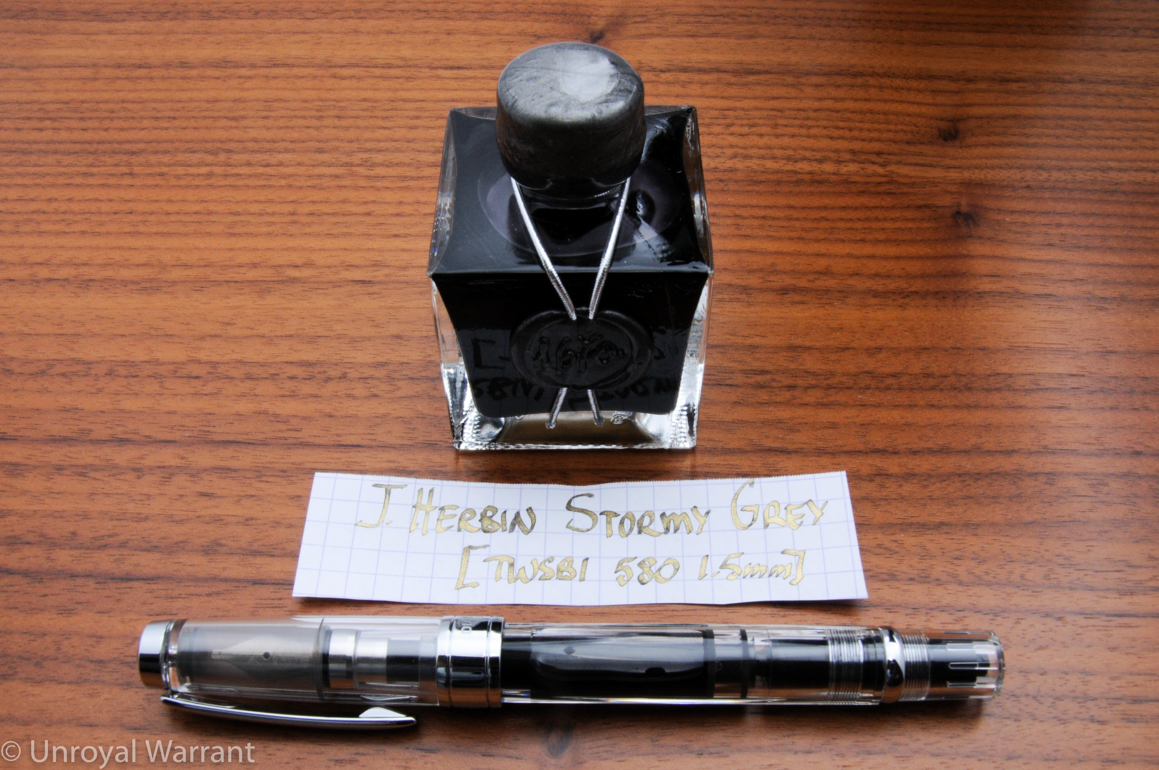
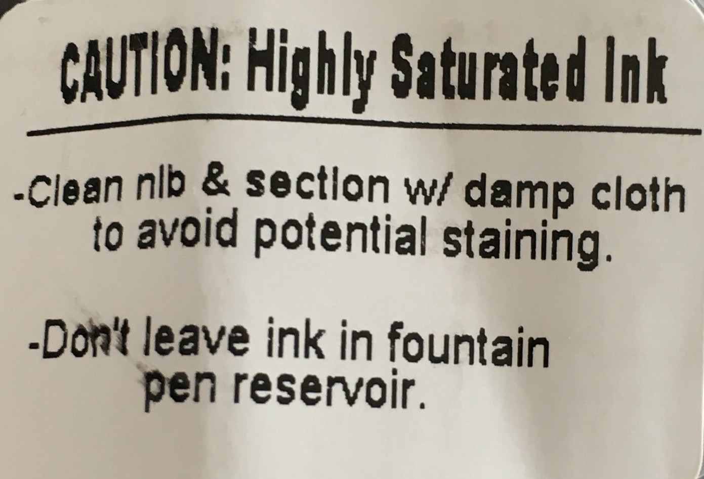
Shimmering inks have become very popular in the last year and it’s largely thanks to Stormy Grey.  Stormy Grey is part of J. Herbin’s “1670” line of fountain pen inks.  1670 inks are highly saturated and the original formulation of Rouge Hematite (the first ink in the line) was infamous for clogging pens.  All four inks in the 1670 line now come with this warning label:

J. Herbin 1670 warning

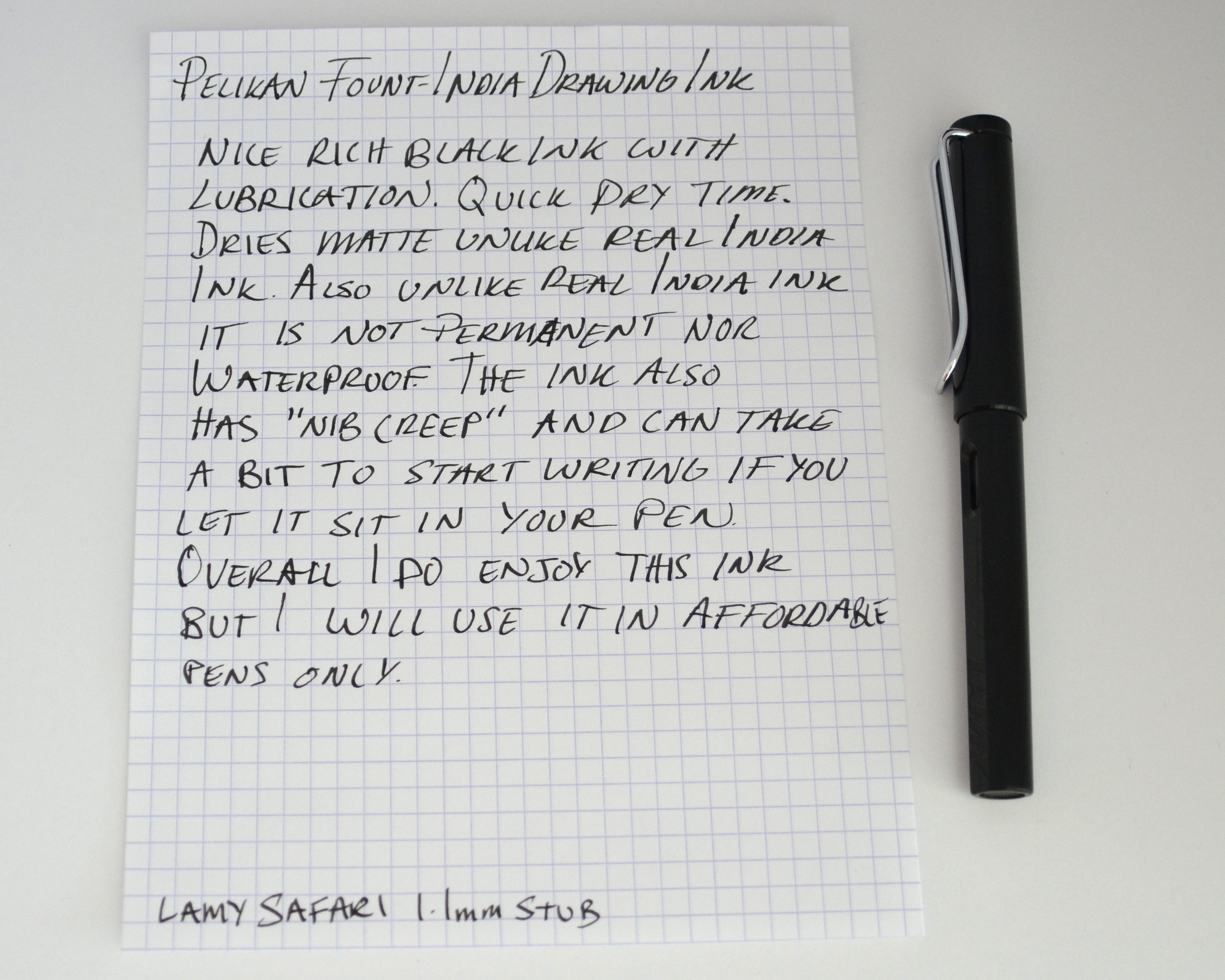
I only use these inks in my cheaper pens and ones that are easy to disassemble and clean.

J. Herbin Stormy Grey Fountain Pen Ink -1

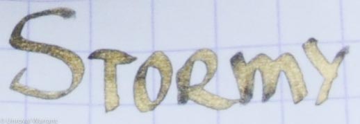
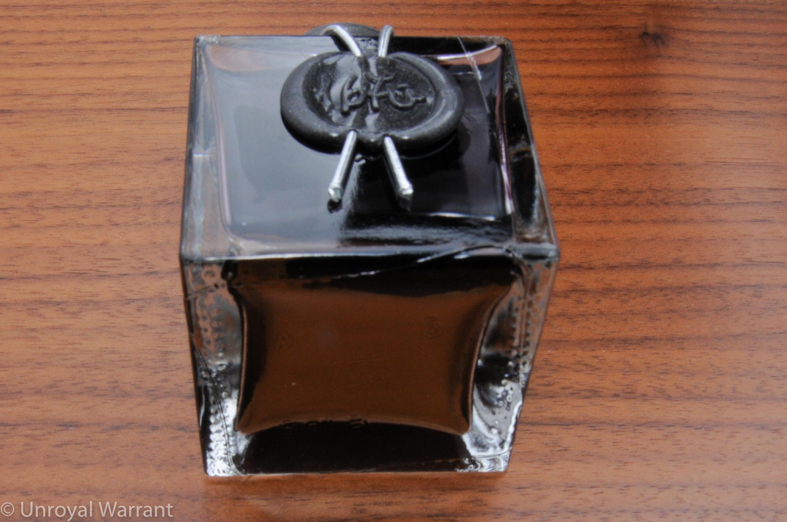
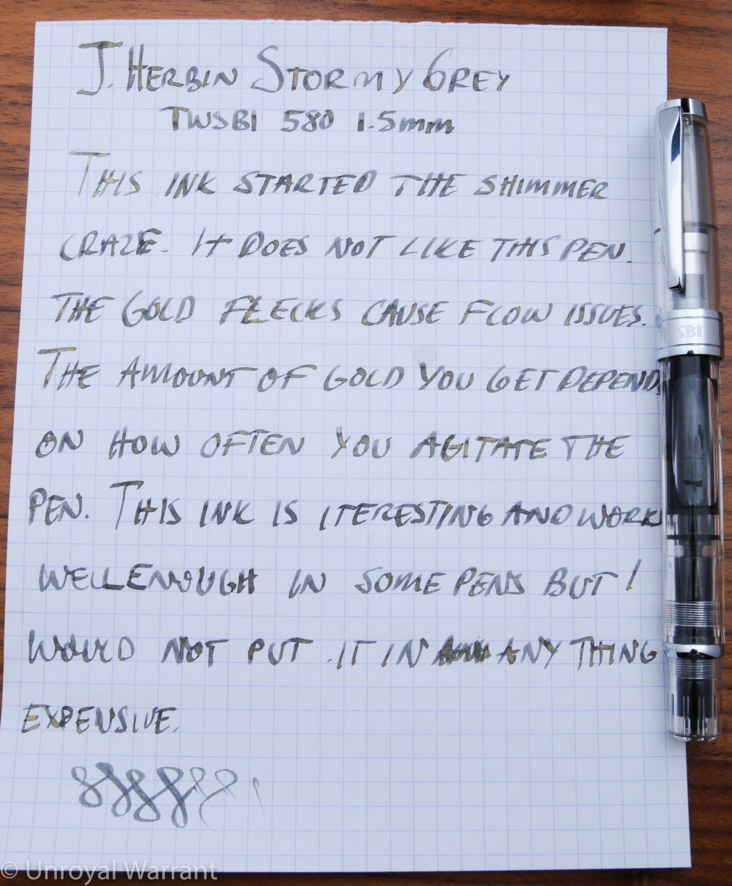
Stormy Grey contains flecks of gold that tend to settle at the bottom of the bottle and in order to draw them up the bottle must be shaken, otherwise you are left with a much more plain dark grey ink.

Gold flecks settled at the bottom of the bottle

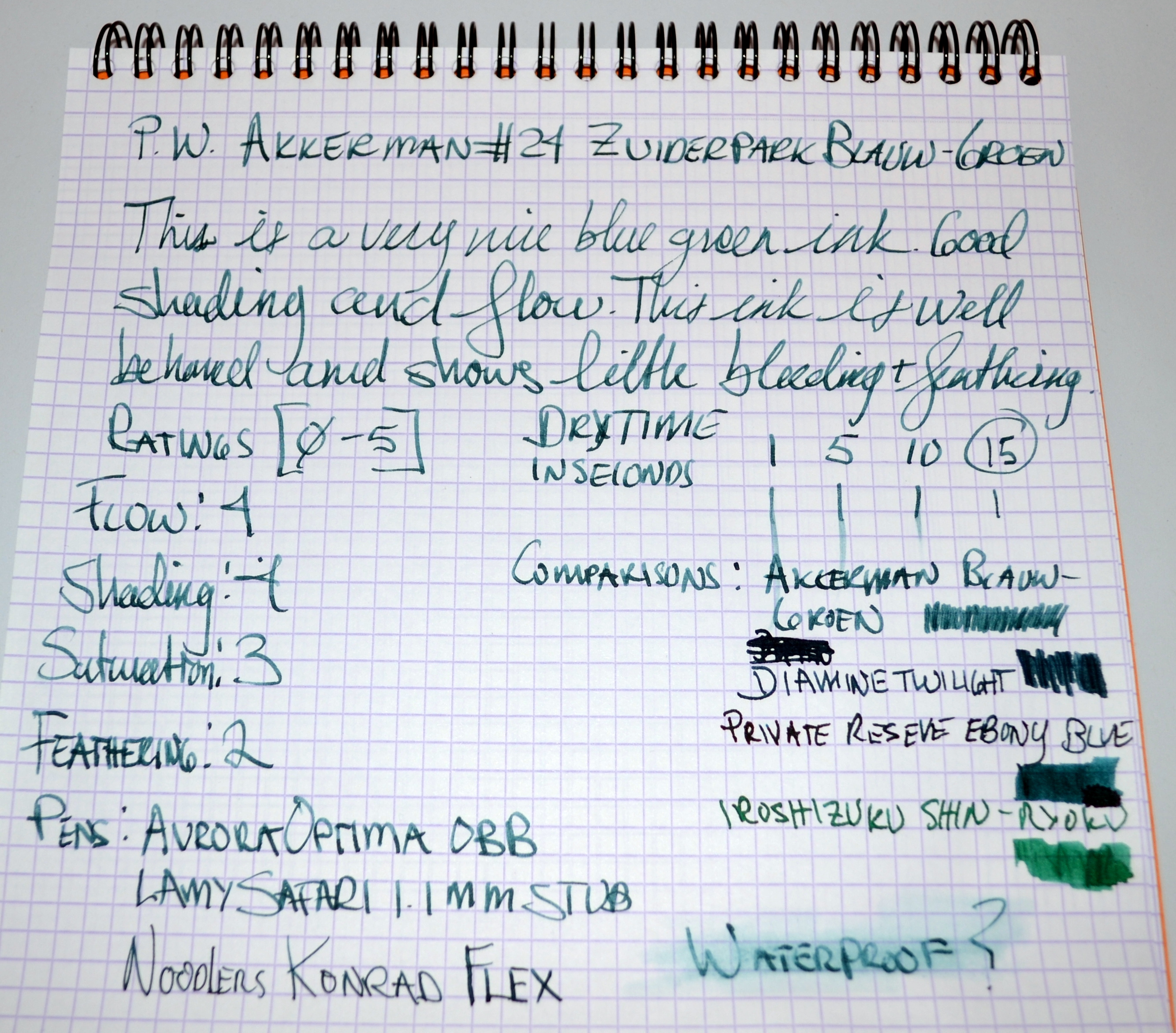
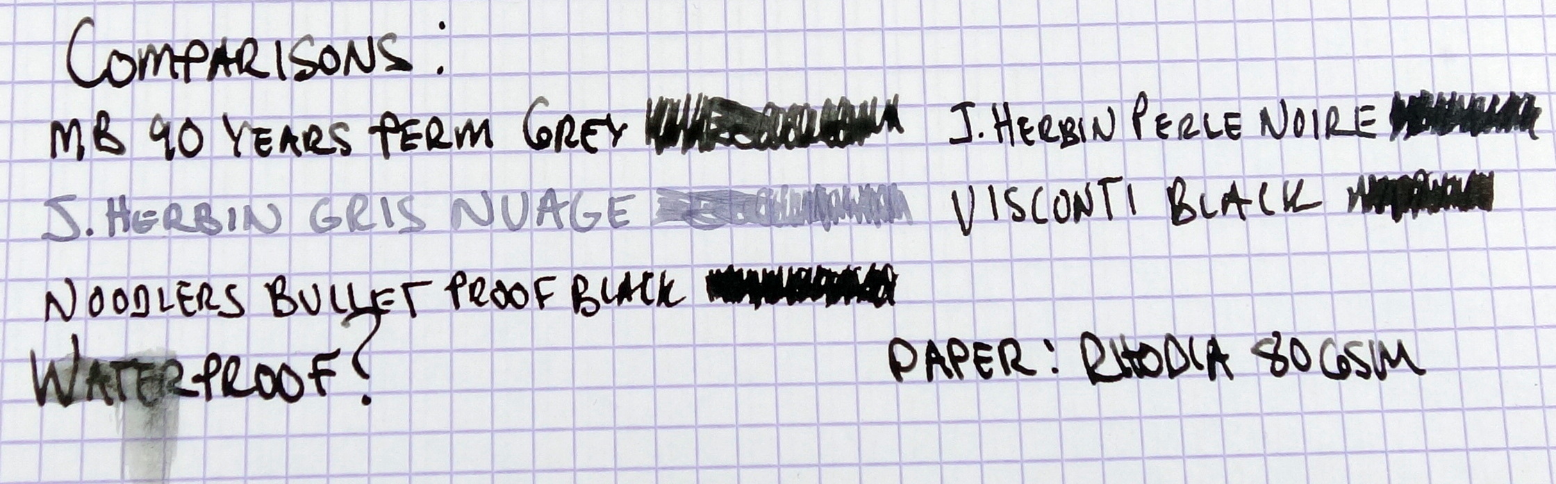
Stormy Grey is a very wet ink (perhaps to compensate for the gold flecks?) and this translates to bleeding and feathering on more absorbent papers.  The ink worked well on Rhodia but for more porous papers, a thin nib or dry pen is going to be a better match.

I have been using this ink for several weeks now and it performed trouble free in a number of pens until I put some in my TWSBI 580 with a 1.5mm stub nib.  In the TWSBI I got spotty performance; sometimes it would write just fine and other times it would choke and skip.

J. Herbin Stormy Grey Fountain Pen Ink -4

Apart from some gold flecks left behind, Stormy Grey cleaned out of the pens I tested nicely; this was a nice surprise for a highly saturated ink.

Objectively, Stormy Grey is not a good ink but it is attractive and interesting.  I can only recommend this ink as a curiosity; it is not a serious every day ink and but putting this stuff in your pen you are risking a clog.

Pilot Blue Black Fountain Pen Ink Review

Pilot Blue Black Fountain Pen ink

Pilot’s Iroshizuku line of inks has become incredibly popular in the last couple of years thanks to its agreeable performance and excellent color palette.  Despite Iroshizuku’s success Pilot still produces it’s original more affordable ink line that is simply branded as “Pilot” (or “Namiki …or “Pilot/Namiki”).

It is my understanding that these inks have a ph of over 7 making them basic and as such I would caution against putting them in a pen where ink makes direct contact with celluloid.

This line comes in bottle and cartridge formats.  The cartridges only fit Pilot and Namiki pens.  There are seven colors produced in the cartridge format.  In bottle format I have only seen three colors: blue, black, and blue black.

Pilot Blue Black Fountain Pen Ink

Pilot Blue Black is a bit pale for my tastes but the upshot is some nice subtle shading.  The ink provides some good lubrication, making it a great choice for dryer writing pens.  I had no issues with bleeding or feathering.  I also saw no nib creep (as is common for lubricating inks).  I found that this ink was easy to clean out unlike Pilot Blue which has a tendency to stain.

Packs of 12 cartridges go for $7 and 60ml bottles go for $12.  The affordable price makes Pilot Blue Black a great workhorse ink that would be appropriate for the office and general correspondence.


Pilot Iroshizuku Yama-Budo Fountain Pen Ink Review

Pilot Iroshizuku Yama-Budo Fountain Pen Ink

As a general rule, I do not purchase ink while traveling.  My reasoning is that if a $15 bottle of ink breaks in my luggage I would be out hundreds of dollars in ruined clothes.  Yes, I broke my rule.

Pilot Iroshizuku Yama-Budo Fountain Pen Ink

Pilot Iroshizuku Yama-Budo Fountain Pen Ink

On my way out of Itoya in Tokyo  (after buying some pens I didn’t need) I saw some well-packaged mini bottles of Iroshizuku in a lovely presentation box and that was that…I picked the three colors I wanted and here we are:  The Pilot Iroshizuku Yama-Budo Fountain Pen Ink Review.

Pilot Iroshizuku Yama-Budo Fountain Pen Ink
I wish all inks were packaged like this. 

Yama-Budo in Japanese means “Crimson Glory Vine” and it is a pinkish burgundy color that I really like.  Like all Iroshizuku inks, it performs beautifully, well-behaved with a good flow.  This ink has really nice shading to it.

Pilot Iroshizuku Yama-Budo Fountain Pen Ink

This ink isn’t really appropriate for a professional setting but it is a fun color that looks great in a demonstrator.

Pilot Iroshizuku Yama-Budo Fountain Pen Ink


I am not sure I could go through a full-size 50ml bottle of this one but I feel confident that I will be able to make my way through 15ml.

Pelikan Fount India Black Fountain Pen Drawing Ink Review

Pelikan Fount-India Drawing Ink

Pelikan Fount India ink is an oddball ink.  India inks (most often) contain binding agents like shellac that provide permanent and waterproof characteristics and consequently make them unsuitable for use in fountain pens (NEVER put real India ink in a fountain pen).

By making an “India-style” ink for use in a fountain pen you have to forgo the binding agent and you are left with a non-waterproof and non-permanent ink.  So, you may be asking, “what’s the point?”

Unlike regular fountain pen ink, Fount India, has a thicker consistency that affords a very smooth lubricated feel on the paper.  It is not the blackest fountain pen ink out there but it has a richness to it that few black inks can match.

Pelikan Fount-India Drawing Ink

It should be noted that unlike real India ink, Fount India dries matte and not glossy.

Because of it’s thicker consistency it can take a little bit to get the pen going after it has sat overnight but once it starts flowing the ink performs wonderfully.  I have also noticed that this ink is especially prone to “nib creep”.

Pelikan Fount-India Drawing Ink

I really enjoy using this ink but I only use Fount India ink in my more affordable pens that are easy to dissemble as it is a bit harder to fully clean out.  I have left the ink in my pens for three weeks without any consequences but I would urge caution when using a hybrid ink like this.


P.W. Akkerman #24 Zuiderpark Blauw-Groen Fountain Pen Ink Review

P.W. Akkerman #24 Zuiderpark Blauw-Groen Fountain Pen Ink

Every buy ink just for the bottle?  I can now say that I have. P.W. Akkerman’s bottle is both beautiful and highly functional. The small reservoir at the top of the bottle is narrow and deep allowing even large nibs to utilize a near empty bottle.  There is a glass marble inside the reservoir that when turned on its side allows ink to flow into the neck of the bottle.  This is without a doubt the best ink bottle design I have seen.  The Montblanc shoe and the old American-made Sheaffer Skrip bottles are good but the Akkerman bottle is great.

P.W. Akkerman #24 Zuiderpark Blauw-Groen Fountain Pen Ink

The most interesting color out of the 30 different Akkerman inks is #24 Zuiderpark Blauw-Groen which is a nice dark blue green ink with good shading and flow.  My first thought was that it looks a lot like Private Reserve Ebony Blue, which in my opinion is one of the best looking inks around.

P.W. Akkerman #24 Zuiderpark Blauw-Groen Fountain Pen Ink

The ink isn’t waterproof but it did resist the water better than many other non-waterproof inks and that makes me a little bit concerned about leaving this ink in a pen beyond a couple of weeks; that said, I was able to clean this ink out of my Aurora Optima without problem.

P.W. Akkerman #24 Zuiderpark Blauw-Groen Fountain Pen Ink

P.W. Akkerman #24 Zuiderpark Blauw-Groen Fountain Pen Ink

#24 Zuiderpark Blauw-Groen (excluding VAT) costs 12.4 EURO or about $16.35 USD which is a reasonable price for this great 60ml bottle of ink BUT the shipping is quiet expensive.  20 EURO or about $26 USD shipped to the United States.  Because of the high shipping cost I ended up buying three bottles.  Is it worth the price?  I think that depends on how much trouble you have filling your pens with large nibs.  For me not having to buy two bottles of the same sink so that I can top off one with the other is valuable. P.W. Akkerman #24 Zuiderpark Blauw-Groen Fountain Pen Ink


Lamy Turquoise Fountain Pen Ink Review

Lamy Turquoise Fountain Pen Ink

I have always been a fan of turquoise ink, it’s a fun and playful ink color that I enjoy using.  Lamy Turquoise is a true turquoise that’s not too green and not too blue.

Lamy Turquoise Fountain Pen Ink

My go to turquoise has been Diamine Turquoise but this Lamy ink looks near as nice and behaves much better.  No significant issues with bleeding and feathering as I experience with the Diamine.  I find that the Lamy Turquoise has an average flow and saturation with good shading.  Overall it’s a very well behaved ink that has become my new favorite Turquoise.

Lamy Turquoise Fountain Pen Ink

The Lamy ink bottle is very well designed.  The glass vessel is shaped like a top and the plastic base is a ink blotting paper for cleaning your pen after filling.

Lamy Turquoise Fountain Pen Ink


Please note: this product was provided to me at no charge by JetPens for review purposes.

Here are some great reviews of Lamy Turquoise Ink:

(I have no affiliation with the sites linked below)

Ink of Me Fondly – Lamy Turquoise Bottle Ink

Flotsam Not Jetsam – Lamy Turquoise Review 

The Pencil Case Blog – Inktastic: LAMY turquoise ink

Montblanc Meisterstuck 90 Years Permanent Grey Fountain Pen Ink Review

Montblanc 90 Years Permanent Grey Ink


Montblanc 90 Years Permanent Grey Ink

To celebrate the 90th anniversary of the Meisterstück, Montblanc has released a limited edition Meisterstück 149 fountain pen and a permanent grey ink.  The ink comes in a retro bottle that reads: “This ink fulfils all the demands made on it by durable, good-working, Fountain Pen”.

Montblanc 90 Years Permanent Grey Ink


Montblanc 90 Years Permanent Grey Ink

I have never been a fan of grey inks in the past but when I saw the bottle in the store I had to try it.  The salesman was kind enough to let me dip the new 90th Years 149 fountain pen into a bottle of the Permanent Grey.  The ink looked great so I bought a bottle.

Montblanc 90 Years Permanent Grey Ink

The 90 Years Permanent Grey is a beautifully saturated almost black ink.  The flow is excellent, especially for a permanent ink.  Good saturation and shading.  The big downside I see to this ink is the dry time…it’s long….very long.  In my tests on Rhodia 80gsm paper it took approximately 75 seconds to fully dry.

The 90 Years Permanent Grey is a beautifully saturated almost black ink.  The flow is excellent, especially for a permanent ink.  Good saturation and shading.  The big downside I see to this ink is the dry time...it's long....very long.  In my tests on Rhodia 80gsm paper it took approximately 75 seconds to fully dry. 

(click the picture to enlarge)

To test the ink’s permanence I let the ink dry over night and with a few drops of water the ink remained well intact.  I believe most of Montblanc’s permanent inks have an ISO certification but I don’t see any mention of that on the packaging of the 90 Years Permanent Grey.

Montblanc 90 Years Permanent Grey Ink

If you like grey inks, this one is a must have.  The price is on the expensive side at $20 for 35ml but I think it’s worth it.

Diamine Ancient Copper Fountain Pen Ink Review

Writing sample on Maruman Smooth To Write loose leaf paper.
Writing sample on Maruman Smooth To Write loose leaf paper

I have improved my review format for the writing sample to make it more informative.  I am now including a rating system for four key areas; the ratings are from one to five (five being the best).  Please let me know what you think.

I love red/orange brown inks and Diamine Ancient Copper is my new favorite.  My two other (now former) favorites in this category are Montblanc Red Chalk and Noodler’s Antietam.  Unlike Noodler’s Antietam, there are no issues with feathering and long dry times (on the papers I have tested) and unlike Montblanc Red Chalk, the flow is generous.  Ancient Copper shows excellent shading; it doesn’t get much better.   Dry time on this ink is on the faster side and it is not waterproof.

This ink changes quite a bit with different nib sizes; if you look at the writing sample you will see that with the Italix (1.3mm nib) the color is lighter and more orange, then compare to the Pilot (M nib) it looks darker and more red.

Overall, Ancient Copper is a beautiful, well behaved ink.  I highly recommend it.

Please note: this product was provided to me at no charge by JetPens for review purposes.

Here are some great reviews of Diamine Ancient Copper:

(I have no affiliation with the sites linked below)

Pens! Paper! Pencils! – Diamine Ancient Copper Ink Review

Inkdependence – Diamine Ancient Copper

Vertical Paper – Ink Review: Diamine Ancient Copper

Waterman Serenity Blue (FKA Florida Blue) Fountain Pen Ink Review

Waterman Serenity Blue

If I was only allowed one ink, Waterman Serenity Blue would be it.  While the color is not particularly special, I have had more bottles of Florida Blue (now called Serenity Blue) than any other ink.  I love Serenity Blue because it is so well behaved.  If I buy a vintage pen this is my initial go to ink because it is very easy to clean out of my pens.  I have had no issues with this ink the 12 years I have been using it.  No clogging, no staining, no nothing.

The color is a soft blue, not a lot of saturation but there is good shading.  I haven’t had any issues with feathering and it is not prone to bleeding.  Serenity Blue is not lubricated and the flow is average to dry.  The ink isn’t waterproof  and is easily washed off the page.  The dry time is about average.

Waterman Serenity Blue is a staple that all fountain pen users should own.

Here are some great reviews of Waterman Serenity Blue (FKA Florida Blue):

(I have no affiliation with the sites linked below)

Pen Paper Ink Letter – Quick Handwritten Ink Review: Waterman Serenity Blue

Coffee, Ink, & Serenity – Fountain Pen Ink Review: Waterman’s “Serenity Blue”

Tyler Dahl Pens – Ink Review – Waterman Florida Blue

Montblanc Leonardo da Vinci Red Chalk Fountain Pen Ink Review

Montblanc Red Chalk

Montblanc Red Chalk

The Montblanc Leonardo da Vinci Red Chalk is a limited edition ink that was introduced with the Montblanc da Vinci fountain pen.  The 30ml bottle is the same standard ink bottle I have seen with the other inks in the Montblanc “Great Characters” series.  The color is a nice reddish brown color that to me looks a bit like a darker version Noodler’s Antietam.  I have not see any issues with feathering or bleed through on the papers I have tested the ink with so far.  There is a good amount of shading and saturation so I am not sure why it’s called “Red Chalk”.  The flow is a little on the dry side but it’s not dry enough to prevent me from using the ink.  Dry time is about average and the ink is not waterproof.  Overall I really like this ink.  I am going to have to try and get another bottle before they sell out.

Montblanc Red Chalk