In this 4K video I review the Scribo Feel fountain pen. This pen features an excellent flexible gold nib and a piston filling system.
Scribo Feel Promessa Fountain Pen
Products used in this video:
Fountain Pens, Paper, and Ink
In this 4K video I review the Scribo Feel fountain pen. This pen features an excellent flexible gold nib and a piston filling system.
Scribo Feel Promessa Fountain Pen
Products used in this video:
In this 4K video I review the Montblanc Meisterstuck 149 Calligraphy Flex Nib Fountain Pen. This is the flagship model of the Meisterstuck line, featuring an oversized body and a large flexible calligraphy nib.
In this video I review the Lamy Hardcover Notebook in the A5 size. This notebook has excellent quality fountain pen friendly paper and a unique Lamy rule.
Lamy A5 Hardcover Notebook – https://amzn.to/3eeqqrR
This video is NOT sponsored.
Some product links are affiliate links which mean if you buy something I will receive a small commission at no additional cost to you.
———Cameras and Gear Used To Shoot This Video ——-
The Yukari Royale is an oversize fountain pen similar in size and shape to a Montblanc 149. Despite it’s oversize form the Yukari Royale sits mid-pack in the Namiki line-up; there is the standard full-size Yukari and the comically enormous Emperor.
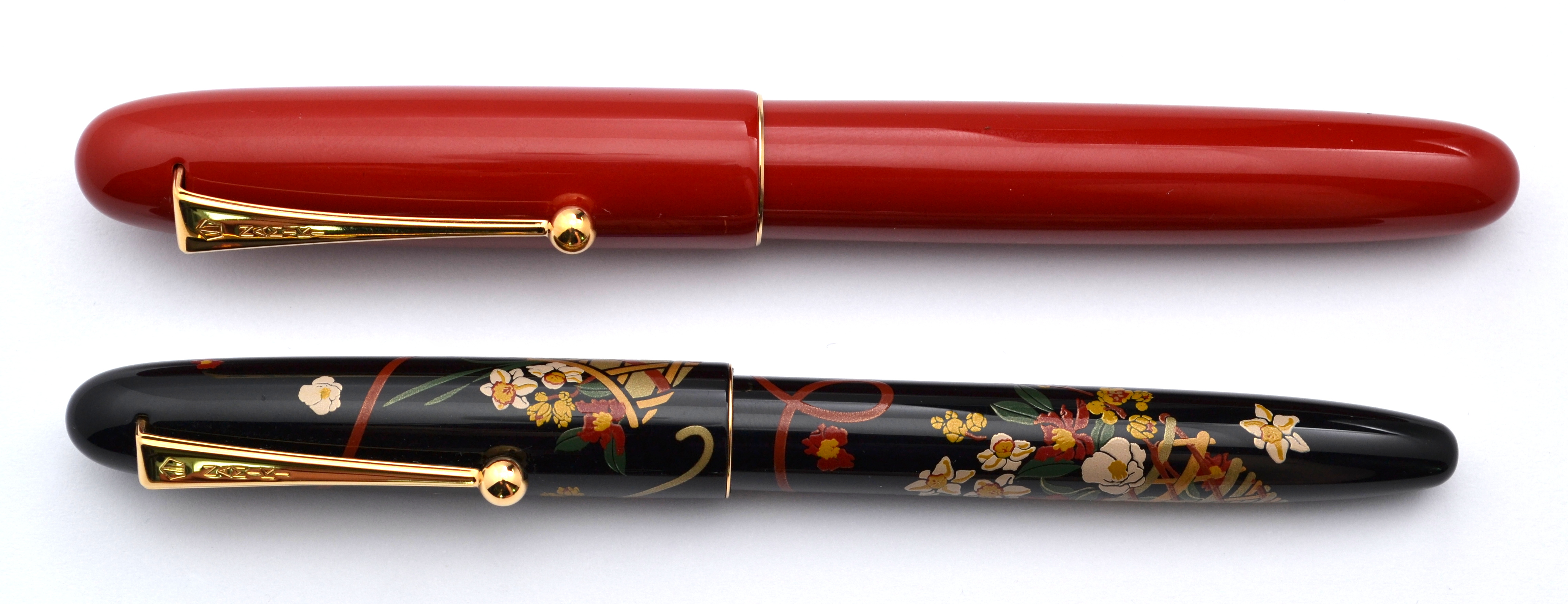
Earlier this year in Japan I tried both the Yukari Royale and the Emperor in person. I quickly ruled out the baseball-bat-sized Emperor but the Yukari Royale I struggled with for a little while. I thought “how could a pen so big and heavy be so comfortable?”; ultimately I decided not to take the risk on such an expensive pen and I bought a Platinum Izumo Yagumonuri instead.
Fast forward a few months and I was still thinking about the Yukari Royale and at the same time feeling disenchanted with the Izumo (the Izumo has a long section with a large step down that causes me discomfort in long writing sessions).
I ended up going for the Yukari Royale (thank you to Pen Chalet for making this possible).
The Yukari Royale has a large brass torpedo-shape body covered in vermilion (red) urushi lacquer (also available in black). The cap has Namiki’s (Pilot’s) ball clip and a very thin gold band at the end of the cap. The simple shape and minimal trim make for a very elegant pen.
The fit and finish of this pen is flawless. It really is perfect to the point where I genuinely question if it is in fact hand painted. Next to a Nakaya the difference is night and day. That is not to say that there is anything wrong with a Nakaya, there isn’t, a Nakaya has more of an organic beauty.
This pen weighs a hefty 45 grams but it is so well balanced in my hand that I don’t feel any fatigue from its weight. My other Namiki pens, a Nippon Art and a Yukari (non-Royale) share this same wonderful balance.
The Yukari Royale measures 5.8” capped. You can post this pen but it becomes too long for me. The grip section is about .4” in diameter which is thick but not as thick as a Montblanc 149s which measures over half an inch.
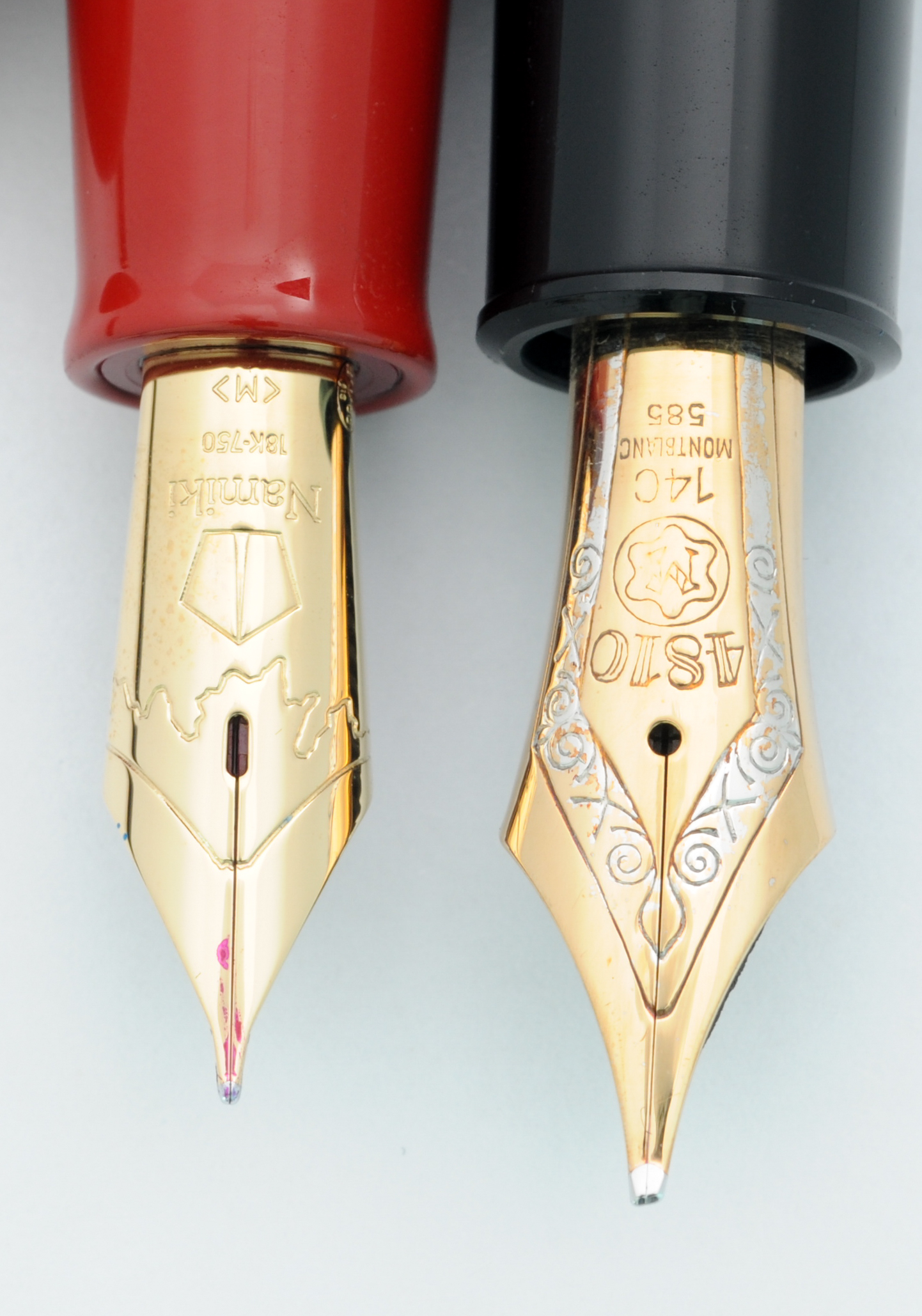
Here you can see the Royale with a variety of Pilot/Namiki pens:
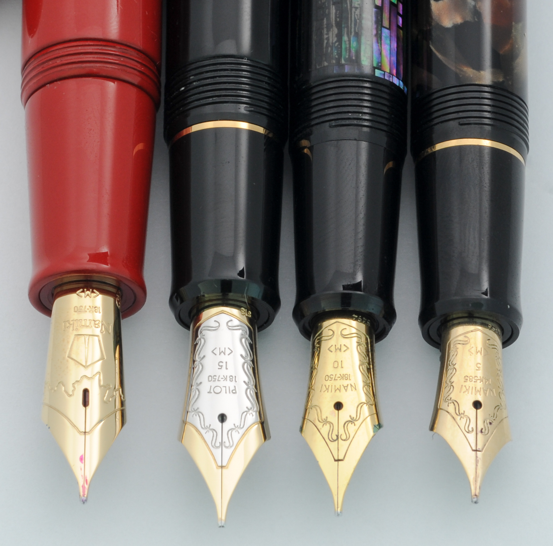
The Yukari Royale is the only pen pictured above to feature an urushi painted metal section. All of the other pens (even the more expensive Yukari Nightline) have unpainted plastic sections with visible seams.
The Yukari Royale (using Pilot’s sizes) is a #20.
Interestingly, it is the same size as a Pilot #15 but with a different shape and an oblong breather hole as well as a red plastic feed.
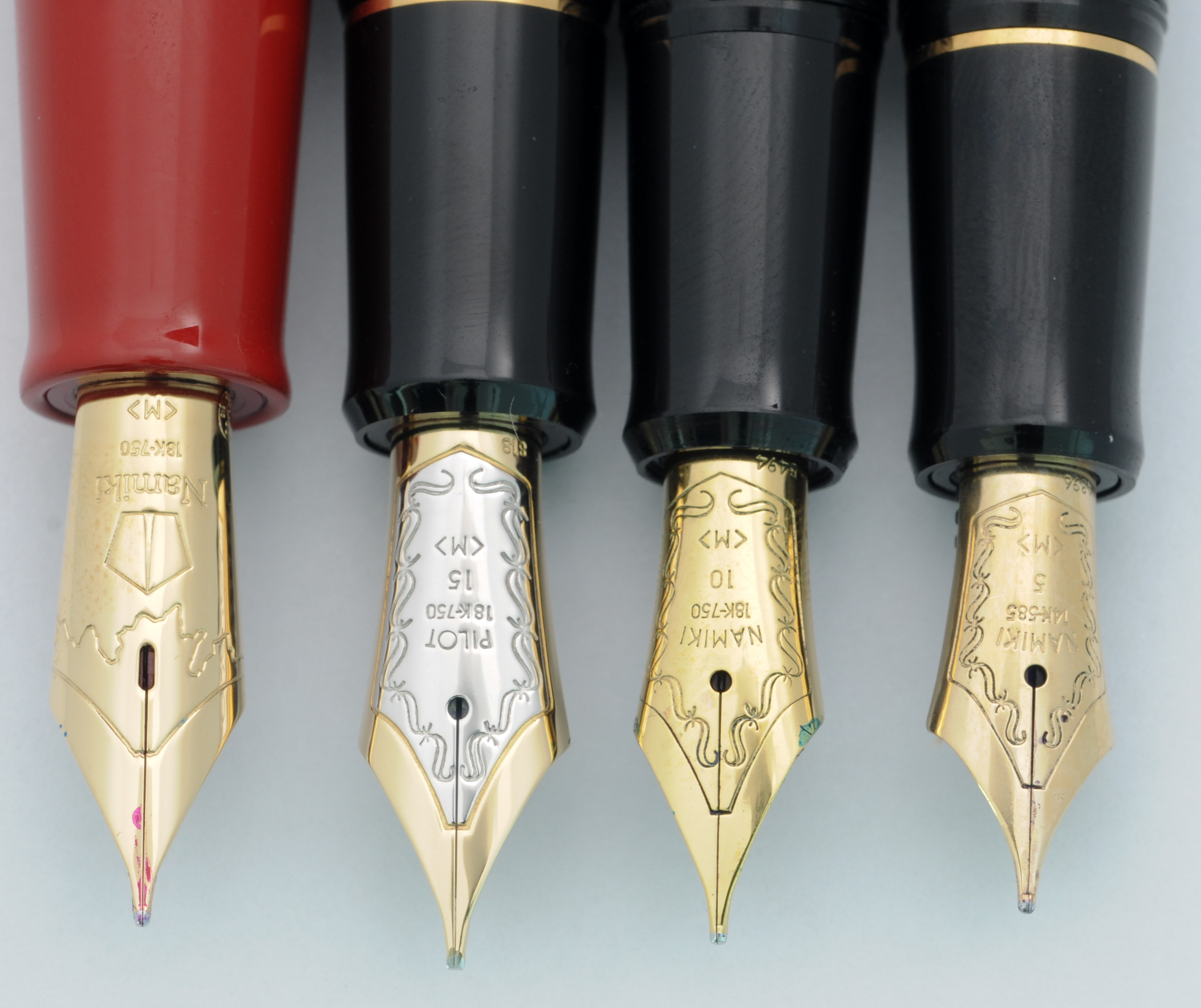
The nib is made of 18kt gold and is quite soft. The performance is excellent. No skipping no hard starting; this pen just works. Out of all of my modern pens this is by far my favorite stock nib in my collection; it’s character is unique and lovely. Compared to my other Pilot and Namiki medium nibs which are butter smooth, the number 20 has a small amount of feedback which I love. It sort of reminds me of the feedback from an Aurora Optima nib with the softness of a Montblanc 149 nib…in other words this is a dream nib (for me at least).
With it’s large nib and feed this is a thirsty pen.
It uses a Con-70 converter that holds 1.1ml of ink and even with this large capacity I find that I run out of ink rather quickly. I also must admit that I am not as huge a fan of the Con-70 as I once was.
While it holds a lot of ink, it is the most difficult to use and the most difficult to clean converter on the market. I fill and clean mine with a blunt tip syringe.
So what about the price?
As I said earlier this is an expensive pen. The street price is $1,200 ($1,500 full retail). I get a lot of enjoyment of the Yukari Royale and while I have a lot of wonderful pens this is the only one that I have refilled six times in a row…I just don’t want to put it away and to date I haven’t yet.
Is it worth it for you? Rationalizing a pen this expensive is a fool’s errand (though I have tried in past reviews, see Nakaya Naka-ai).
The Yukari Royale is a wonderful jewel of a pen to behold.
A special thank you once again to Pen Chalet for making this review possible. If you buy a pen as nice as this you will want to purchase from a reputable authorized dealer with great customer service like Pen Chalet.
I have been collecting fountain pens for a little while now and have made a few poor purchases. My most expensive blunder has been this pen, a Montblanc 149 Meisterstück. (If you want just want to hear about the 149 as a pen skip down to the “Appearance” section.)
There is a well-regarded pen catalog (whose name I will not mention) and the best pens are purchased almost instantly upon release of the catalog so you don’t have much time to think.
The 1960s 149 that I had wanted sold before I had a chance so I jumped on the still available 1972 model and paid a hefty premium as it was new-old-stock.
The pen arrived in the original box with the original guarantee and with the sticker still on the pen. When I took off the cap and found that the nib was tarnished and the rhodium plate had disappeared in spots. The pen must have been dipped at one point and then put away uncleaned.
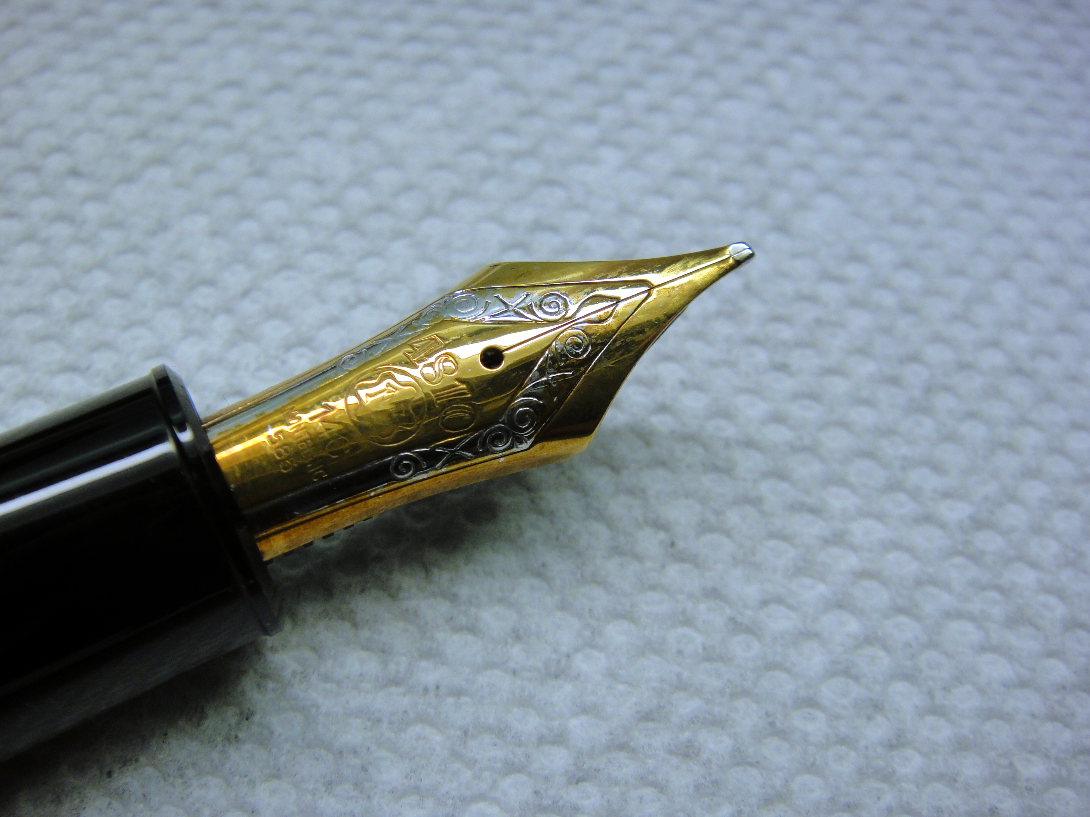
I contacted the catalog owner and to his credit he offered a few fair options: 1) lower the price, 2) re-plate the nib, or 3) refund my money. I foolishly became attached to the pen and decided to go for the lower price when I should have simply returned the pen. Oh well…
When I first saw a 149 in person years ago I thought it looked like a ridiculous cartoon pen; it is just so large. I have come around to liking the looks of it’s imposing size but if I am honest I would be embarrassed to use this pen at work…or around people in general.
The streamlined shape with black resin and gold furniture is a classic and this pen really is the archetype for a luxury fountain pen. The 149 is an icon much like a Rolex Submariner and as such there are many lookalikes.

The 149 has the best shape of any pen in the Meisterstück line. It is more cigar-like than the other Meisterstücks, which tend to have a longer and thinner profiles. There isn’t too much to say other than it’s a classic and a very attractive shape.
Score: 4/5
Montblanc has been producing the 149 since the late 1940s/early 1950s and there have been numerous iterations. The first models were the best quality and as such are the most valuable. So what about my early 1970s model? In my opinion, the Meisterstück line has gotten worse over time.
My 149 is made from plastic (“precious resin”) and has a plastic piston mechanism (not the metal telescopic one from the 50s and early 60s nor the metal one in the current 149). The barrel is a single piece of plastic compared to the modern two-piece barrel, which is cheaper to manufacture. The plastic is soft and scratches easily. Montblanc finishes the plastic with a very high shine so it is possible to polish out scratches if they are not too deep.
The tri-color nib is made of a soft 14ct gold with a solid ebonite feed instead of the plastic feed and stiffer 18kt tri-color nib on the modern 149. Montblanc produces all of their nibs in house and hand grinds and hand finishes each nib. If you look closely you will see that the slit between the tines doesn’t quite line up with the design.
One sore point on my pen is the plating on the nib. The rhodium (white metal) plating seems to have come off a bit. Which is something that shouldn’t really happen on a pen this expensive. I have confirmed through accounts of members of the Fountain Pen Network that this is not that uncommon for Montblanc pens.
Overall I would consider the build good but not great for a pen this expensive.
Score: 2/5
One of the benefits of the plastic piston mechanism is that it keeps the weight down to 29.3 grams (empty). The 149 is the fattest pen I own and for me it is too fat to use comfortably for a longer period of time. See the picture below…
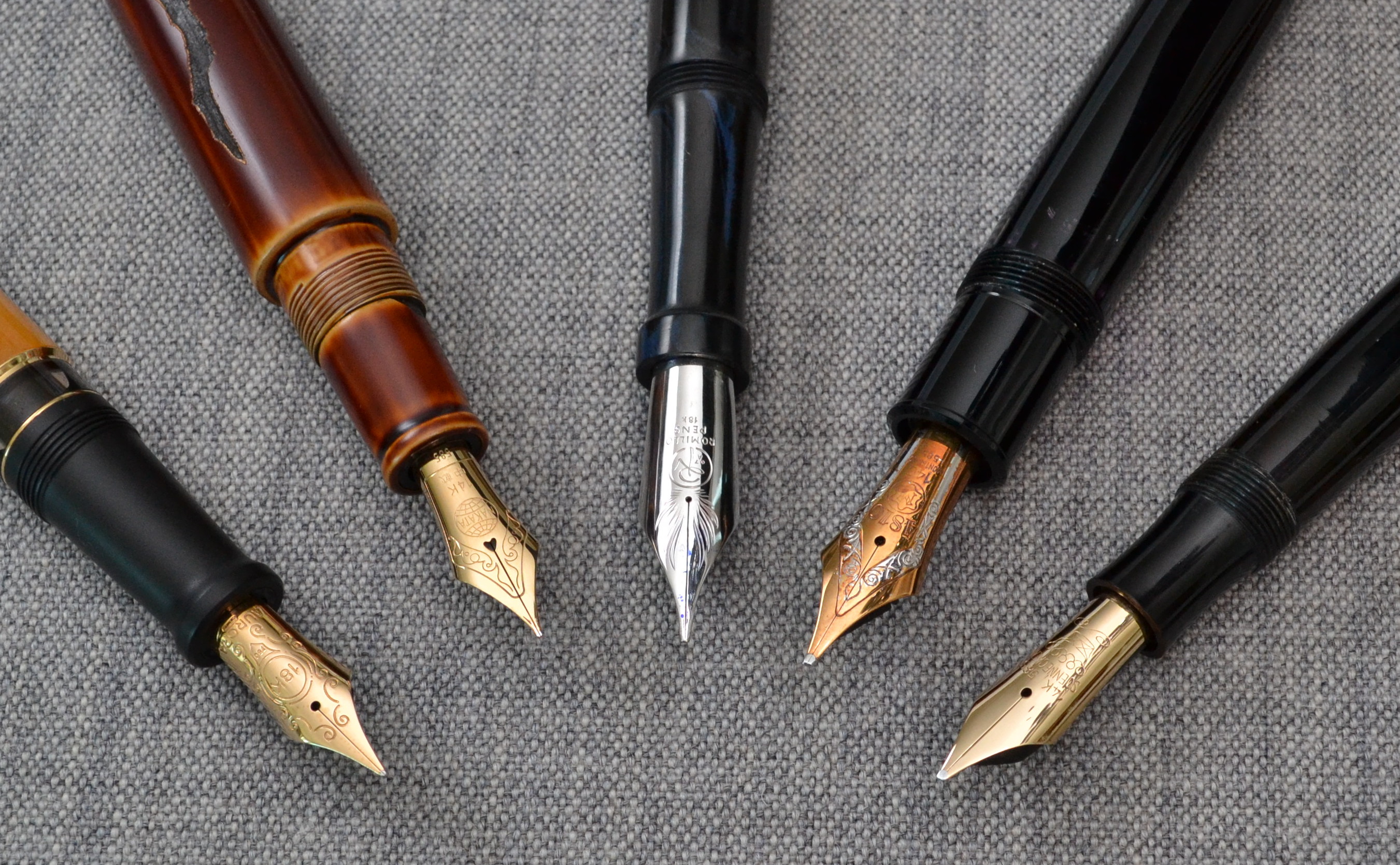
Even though this pen doesn’t have the biggest nib it clearly has the fattest section by a big margin.
The pen measures just under 15cm long and 1.6cm at it’s widest point. The grip section is about 1.3cm in diameter which is the most oversized measurement of the entire pen. You can post this pen but there really is no need to do so as it is a hair over 13cm long uncapped.
There are people with small hands and people large hands that love this pen so don’t assume that it wont work for you. If you want a 149 I highly suggest to you try before you buy. One of the major perks of owning a Montblanc is that there are many boutiques all over the world so they are easy to purchase and service. It is worth mentioning that pens serviced by Montblanc may be repaired with modern (often less desirable) parts.
Score: 2/5
The big OB nib is a great performer. The nib has long tines that make the nib soft and springy. The OB point is more round than the points on the older 1950s nibs. The rounder the nib the less line variation but the tradeoff is that nib is less position sensitive. Given the choice I much prefer the flatter nib.
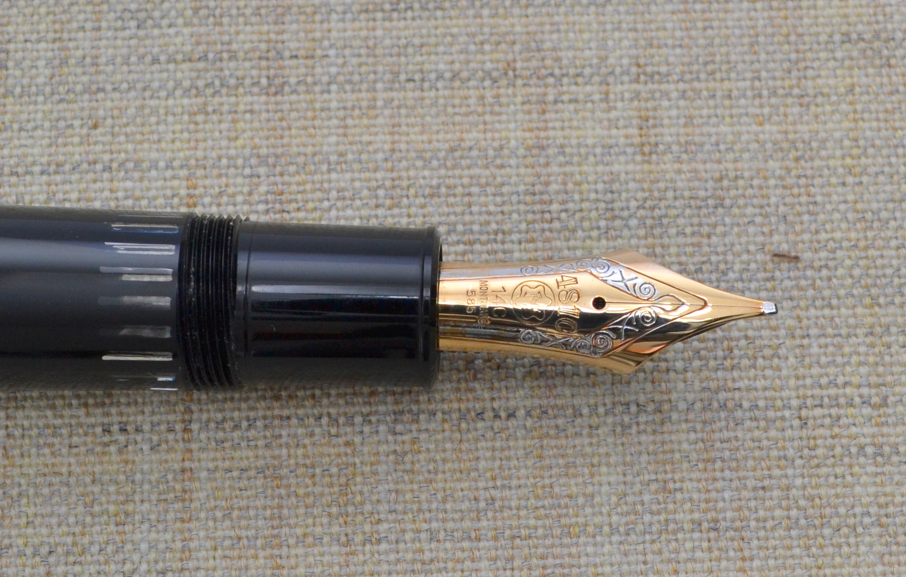
The nib does allow for some line variation with pressure; it is much better than most modern pens in this regard.
Score: 4/5
One of the benefits of the 149 is the massive 2.7ml ink capacity. By comparison the average converter holds about 0.5ml of ink and the average piston filler holds about 1.0ml.
The piston is very smooth and the striped ink window is ultra clear and has remained easy to clean. One thing that I don’t care for is the amount of play in the piston knob once loosened; it hasn’t caused any problems but it doesn’t instill confidence.
If ink capacity is your top priority this may be the pen for you.
Score: 4/5
Used, these pens can be had for around $300-$400. The 1960s versions go for a bit more and the 1950s models are usually over $1,000. For $300 you get an impressive looking iconic pen that non-pen people will notice and appreciate; if that sort of thing is important to you, I can assure you wont do better for the money.
New, the 149 costs around $900 and for me there many other pens that I prefer in terms of quality and comfort but none can really match the imposing presence of the 149. If you want something with true snob appeal the $900 might be justifiable.
Score: 3/5
The 149 is fat….fat price, fat size, fat snob appeal.
Final Score 17/30
Here are some great reviews of the Montblanc 149:
(I have no affiliation with the sites linked below)
Inky Journal – Montblanc Meisterstück no 149 (fine) Review
Best Fountain Pen – Montblanc 149 Meisterstuck Fountain Pen Review
What! No Tea and Scones? – Montblanc Meisterstuck 149 Review
A Nakaya has been on my buy list for a few years now but because my taste in fountain pens has been moving towards vintage European pens it has taken a long time for my first Nakaya purchase to materialize.
Nakaya gets a lot of attention on pen forums and blogs and while the pens are clearly beautiful there is more to it than that; there is an x-factor to these pens. Much like a handmade car, one has to use it in order to understand its real value.
I spent a lot of time on pen forums and on nibs.com (no affiliation) before selecting a Naka-ai Cigar Negoro Shiro-tamenuri.
Let’s attempt to explain the name: Nakaya is the brand which was the original name of the Platinum Company. “Naka-ai” is the model name, which means “middle” in Japanese. The Naka-ai is the result of a collaboration between Nakaya and John Mottishaw of Classic Fountain Pens Inc. (nibs.com). “Cigar” refers to the pen’s cigar shape and lack of a clip; the version with the clip is called the “Writer”. “Negoro” (couldn’t find the Japanese translation) refers to the weathered/cracked treatment applied to the pen. “Shiro-tamenuri” refers to the color and the clear urushi lacquer applied to the pen.
Appearance
The Naka-ai is really a work of art. The many layers of Urushi lacquer give the golden brown color a lot of depth. The “cracks” are hand engraved into the barrel and look beautifully weathered. It takes over six months to make a Negoro model and it shows. The lighter golden brown shows through near the edges of the cap and barrel as well as on the cracks and threading. The long tapered shape of the Nakai-ai is beautiful and being a Cigar model it has no clip which offers a more uniquely Asian look than the more practical Writer model.
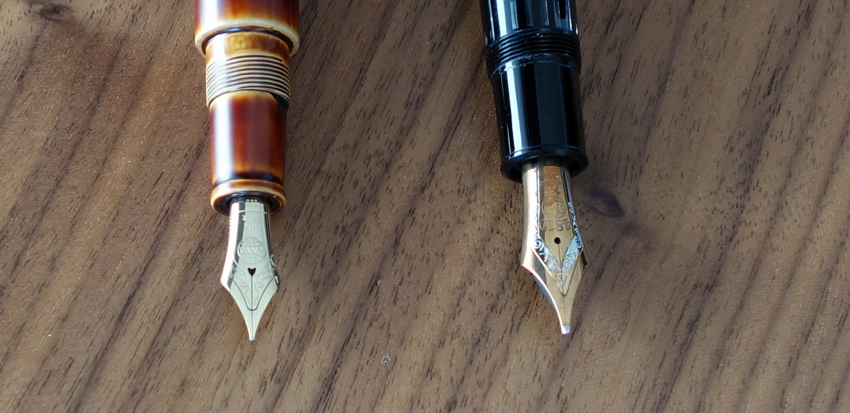
Under the cap is a big shapely 14k gold nib that features the Nakaya globe logo and some scrollwork.
The converter features Maki-e painted goldfish which not only makes the converter look like an aquarium full of ink but also really sets it apart from the cheap plain converters I am so accustomed to seeing.
The Naka-ai is easily the most exotic-looking and most beautiful pen in my collection. I am not usually one for embellishments but the non-ostentatious look of the Negoro is fantastic.
Score: 5/5
Build Quality
The Naka-ai is clearly of a high quality but it has a very different feel to it than the high-end European pens I am used to handling. To me it feels much more delicate.
It’s hard to explain; if it were a car it would be a handmade Bentley Mulsanne compared to a Montblanc 146 which would be more like a Mercedes S-Class, that is to say everything on the Naka-ai is gorgeous, but not made with the laser precision of the much less gorgeous Montblanc.
The feel of urushi lacquer is special…it almost has a moist or wet quality to it. It’s wonderful to touch. I believe that urushi lacquer is the same or at least very similar to the Chinese lacquer S.T. Dupont used to put on their pens. I haven’t seen anyone test the flame resistant qualities of urushi though, so that special characteristic may only apply to Chinese lacquer.
The Naka-ai is designed to accommodate decoration on its body and as a result there is a lot of threading so that the design will always line up when capped. In practice though, I have found it to be difficult to properly line up the large crack (decoration) that spreads from the body to the cap. When I use the Naka-ai regularly I can get the design to line up without too much thought but admittedly when I pick up the pen, not having used it for a week or two I find that it can take me 2-4 tries to get it correct. I suppose this isn’t really a quality issue but it’s worth pointing out.
Everything on the Naka-ai fits tightly and there is no indication that this is anything less than an heirloom quality pen.
Score: 4/5
Size & Weight
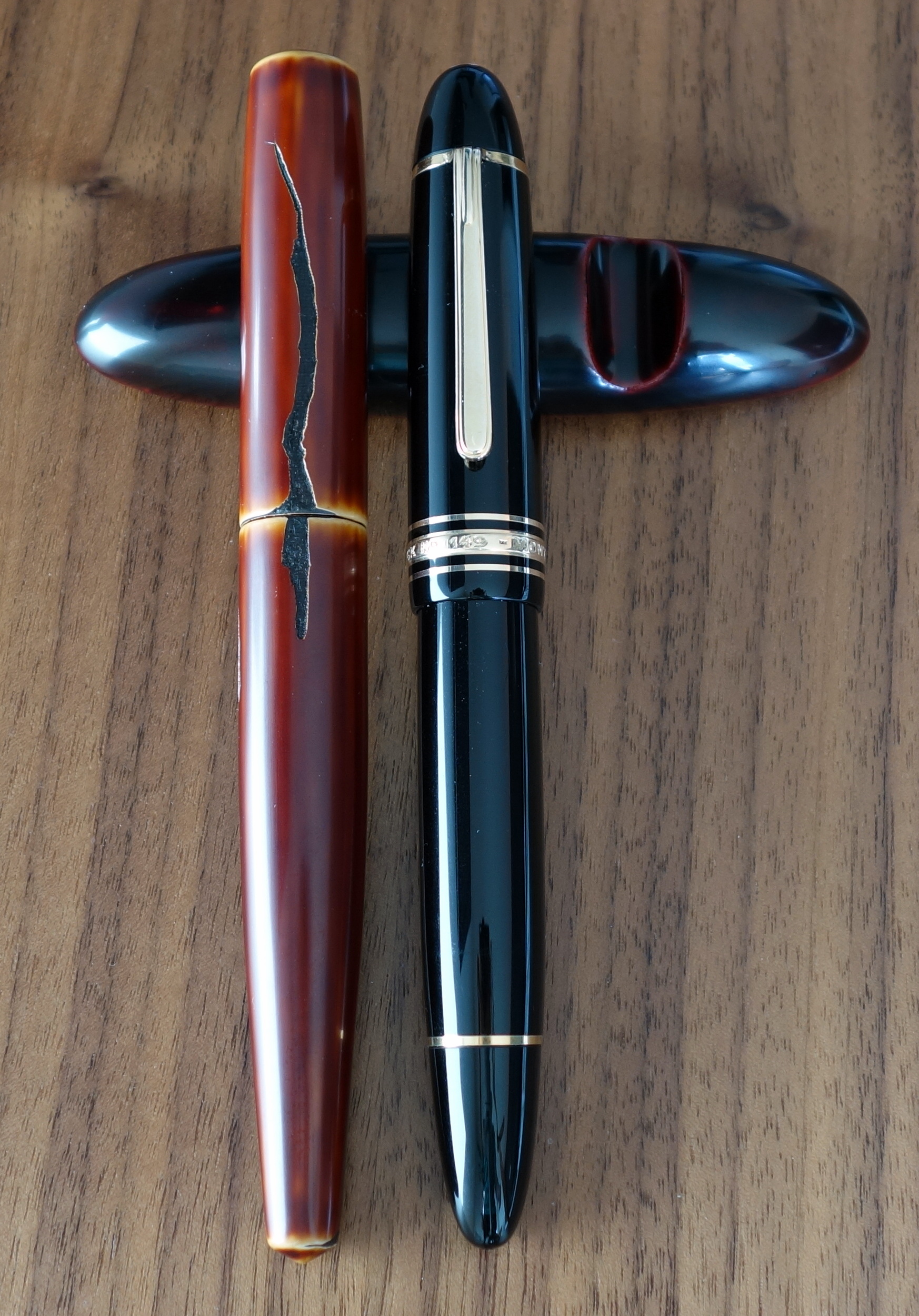
The Naka-ai measures a little over 6” capped and about 5.5” uncapped. At its widest point it is about 0.7” and weighs about 27.5 grams. It is definitely a large pen but not so big as to be uncomfortable for regular use. Because of its excellent balance I can write with this pen for long periods of time. The grip section is on the smaller side but I find it to be quite comfortable. By comparison, the similarly sized Montblanc 149 section is too fat to be comfortable; I can jot down some quick notes but I wouldn’t write a letter with a 149.
It should be noted that the Naka-ai is not designed to be posted. If you get a cigar (clipless) model you will need a place for the cap so that it doesn’t roll off the table. I started with a Nakaya 3 pen pillow but ended up opting for a Nakaya Desk Pen stand for my uncapped Nakaya. I leave the cap in the kimono case that comes with the pen.
Score: 3/5
Performance
A little background on the nib: I purchased my Nakaya from Classic Fountain Pens Inc (nibs.com) with a soft medium nib that I had modified to match the softness of the nib on my Montblanc 146 from the early 1950s (which was coincidently already at CFP for repairs). I spoke with John Mottishaw on the phone and we decided that in addition to softening up the nib we would add a left foot oblique modification.
The 14kt gold nib writes beautifully. It is soft and makes my writing look more distinctive. I have had no issues with hard starting or skipping. I have had my Nakaya for 5 months now and the performance has been excellent.
The softer nib makes for a little bit wetter writing experience; if you like a drier nib I wouldn’t recommend adding any flex. Also, it should be pointed out that the modifications listed above make the nib less beginner friendly. Being a Japanese medium the line is more equivalent to a western fine and when you add the oblique modification you have a more defined sweet spot than a regular ball-pointed nib or a wider oblique.
Score: 5/5
Filling System
As I have stated many times before, I am a big fan of converters and while they may not be as elaborate or as expensive to make as other types of fillers they are the easiest to use and keep clean. Nakaya uses a very nice quality Platinum converter that holds a decent amount of ink. I have both the standard Platinum converter and the special Nakaya goldfish Maki-e painted converter; both offer the exact same function but the painted one is a bit more special.
The Naka-ai will also take Platinum ink cartridges and can be fitted with an adapter that will allow you to use international short ink cartridges.
Score: 4/5
Value
Nakaya’s pricing has been going up over the last few years but comparable Urushi lacquer pens are (in most cases) at least $100 more expensive. From the other Urushi lacquer pens I have seen in person (Danitrio, Platinum, Sailor, and Namiki) I truly believe that Nakaya gives you the most for your money without compromising on any important detail.
The Negoro version is an extra $350 over the standard Naka-ai (in standard colors) and with my modifications and the Maki-e converter my pen was over $1,000, which is a lot of money for a pen, but to me this pen is a real work of art and priced quite fairly.
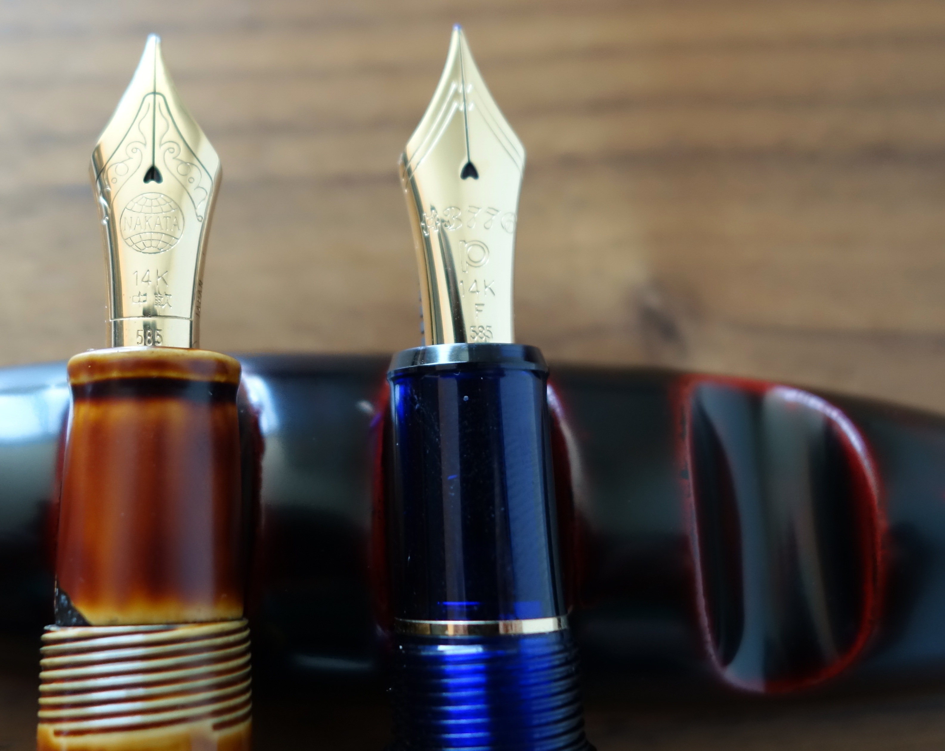
I should point out that Nakaya uses Platinum nibs and it is possible to get the same nib on a much more affordable pen. I have a Platinum 3776 Century with the same big 14kt gold nib (sans the modifications) and it performs superbly.
Score: 4/5
Bottom Line
The Nakaya Naka-ai is a beautiful work of art that lives up to the hype.
Final Score 26/30
I finally got my hands on some Nock Co cases and while I haven’t had a chance to use all of them yet I have been carrying around the Lookout case the last few days.
The Lookout is a 3 pen case made out of a soft but heavy duty nylon exterior and a smooth pack cloth interior. I choose the steel exterior and the blue jay interior. The color combo looks great; I especially love the blue stitching on the grey exterior.
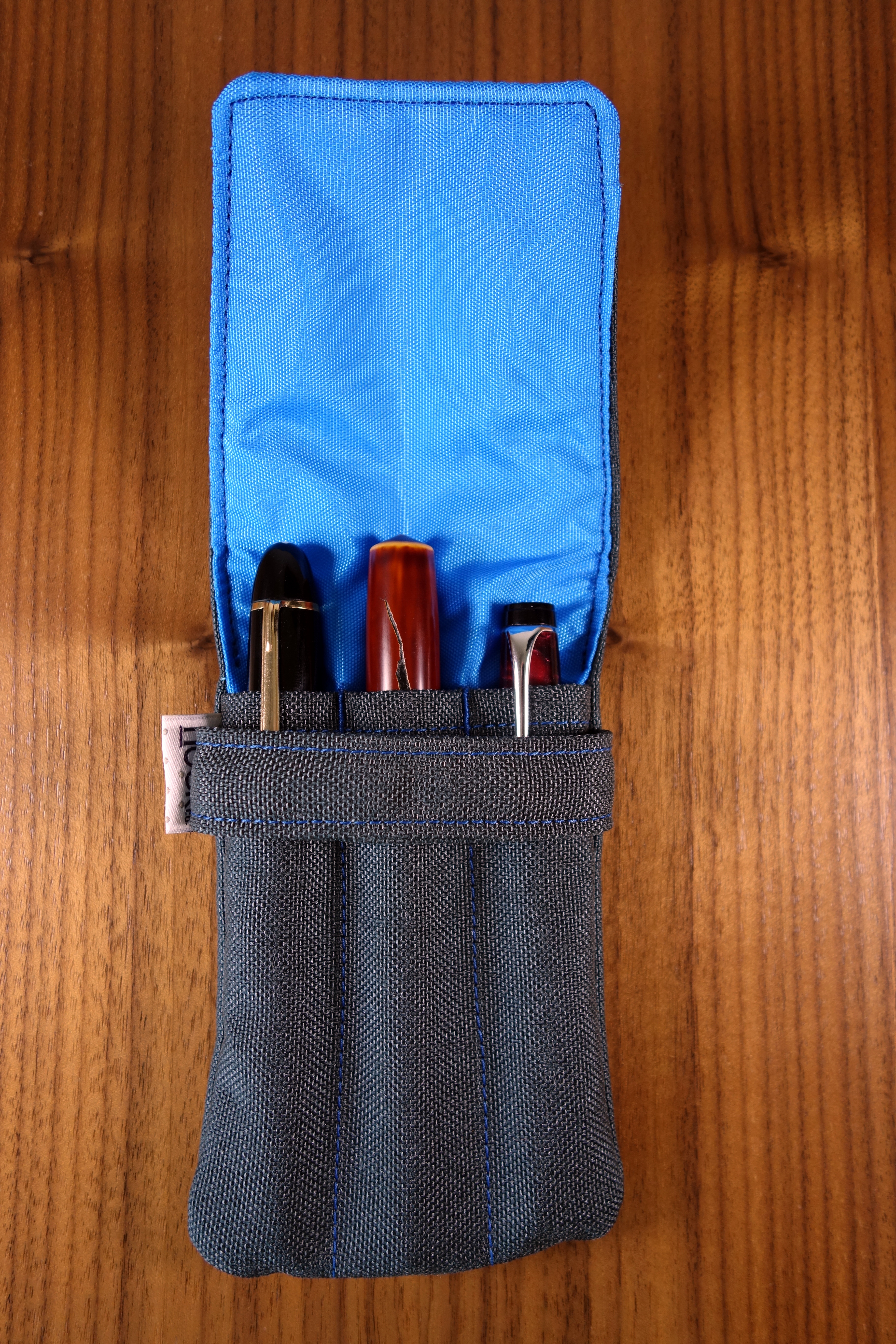
The exterior nylon feels somewhat similar to a Cordura nylon, that is to say it is a textured nylon which gives it a more organic and less technical feel. The interior packcloth actually reminds me of the nylon material on Nakaya’s Kimono cases.
When I backed the Nock Co Kickstarter I was not certain that I would want to use the cases with some of my more expensive pens. After handling the cases I believe them to be pretty safe. Being a soft case the Lookout may not provide as much external protection as the Pelikan 3 slot pen case, which has a more rigid structure; that said, the Lookout separates the pens better so I am much less worried about my pens coming in contact with each other.
Unlike the Pelikan case, the Lookout can hold three large pens comfortably. I was able to fit my Nakaya Naka-ai, Montblanc 149 and OMAS Paragon into the lookout without problem.
So how is the build quality? The Lookout, like all Nock Co cases, are made by hand in Georgia, USA. The stitching is tight; I measured a consistent 9 stitches per inch which means the seams should be very strong. I noticed that the band that holds the flap isn’t perfectly aligned; the right side seems to be a bit lower. The stitching while, tight is not perfectly straight in some areas but being a handmade item there is always going to be a bit of variation and that’s part of the charm.
I am not certain what the price will be when the Lookout becomes available for sale on the Nock Co website but in the $15-$25 range, this pen case is a great buy.
Here are some great reviews of the Lookout:
(I have no affiliation with the sites linked below)
Alt. Haven – Review: Nock Co – The Lookout
Ed Jelley – NOCK CO. – “THE LOOKOUT” PEN CASE KICKSTARTER LAUNCH
The Well-Appointed Desk – Review: Nock Co Lookout 3-Pen Holster
Up until now I have been carrying my larger and more expensive pens in single pen pouches. I would carry two to three pouches at a time which was cumbersome; I finally broke down and bought a Pelikan 3 pen pouch. I have been using a Pelikan Fine Leather Black Triple Pen Pouch every day for about a month now and I quite like it. I spent a good amount of time looking for a quality case that really protects pens. I had originally wanted a Montblanc pen pouch but after looking at it, I knew that it wasn’t right. The main issue I found with the Montblanc case (apart from the $180 price tag) was the fact that the dividers stopped about halfway down the case; this in my opinion is a design flaw that would allow the bottom of the pens to knock into each other. So after doing a bit more research I found that the Pelikan case would accommodate larger pens and had dividers that run the length of the case.
The Pelikan pouch is made out of a soft leather (softer than the Montblanc case) and comes in black with a green strap or black with a black strap. Each case has the Pelikan logo embossed on the strap. The leather is of good quality, however, it is not as nice as the leather Montblanc uses but for $35 the Pelikan case is of excellent quality. I don’t know where the case is made but I cannot find any flaws in its construction; every thing is cleanly cut and sewn. It’s clear that this case was carefully made. The interior of the flap is leather and the inside of the case seems to be some sort of felt sort of felt.
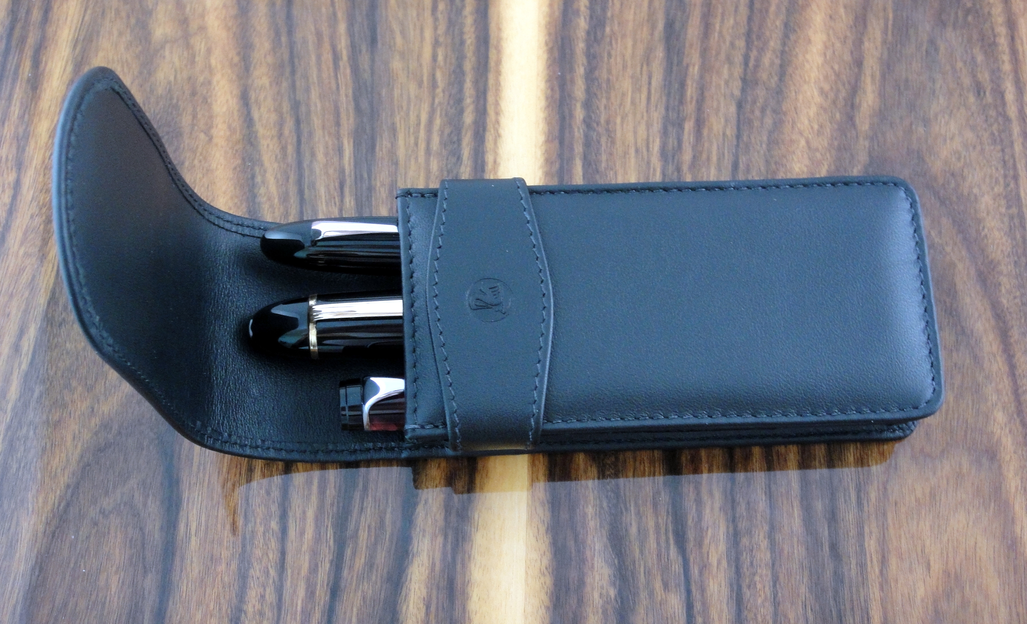
Compared to the Montblanc case pens do fit a bit more snugly. I can easily fit my Montblanc 149, 146, and Aurora Optima into the case but it is a tight fit. If you want to fit three 149s the Pelikan case is not for you. Also the top of the pens that the flap covers are not protected much on the side. I carry my case in a backpack or briefcase without issue.
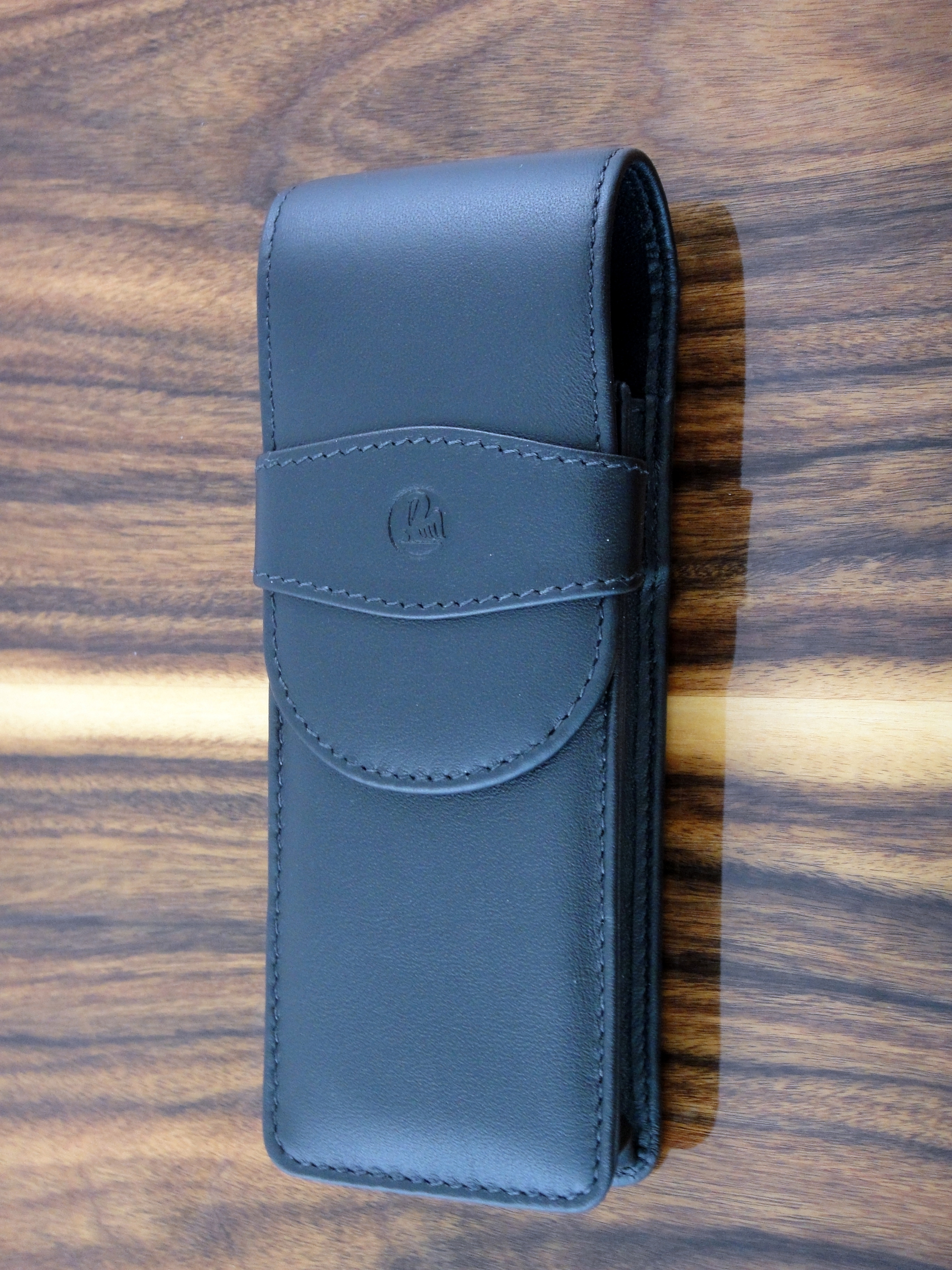
Overall I am really satisfied with this case and highly recommend it.