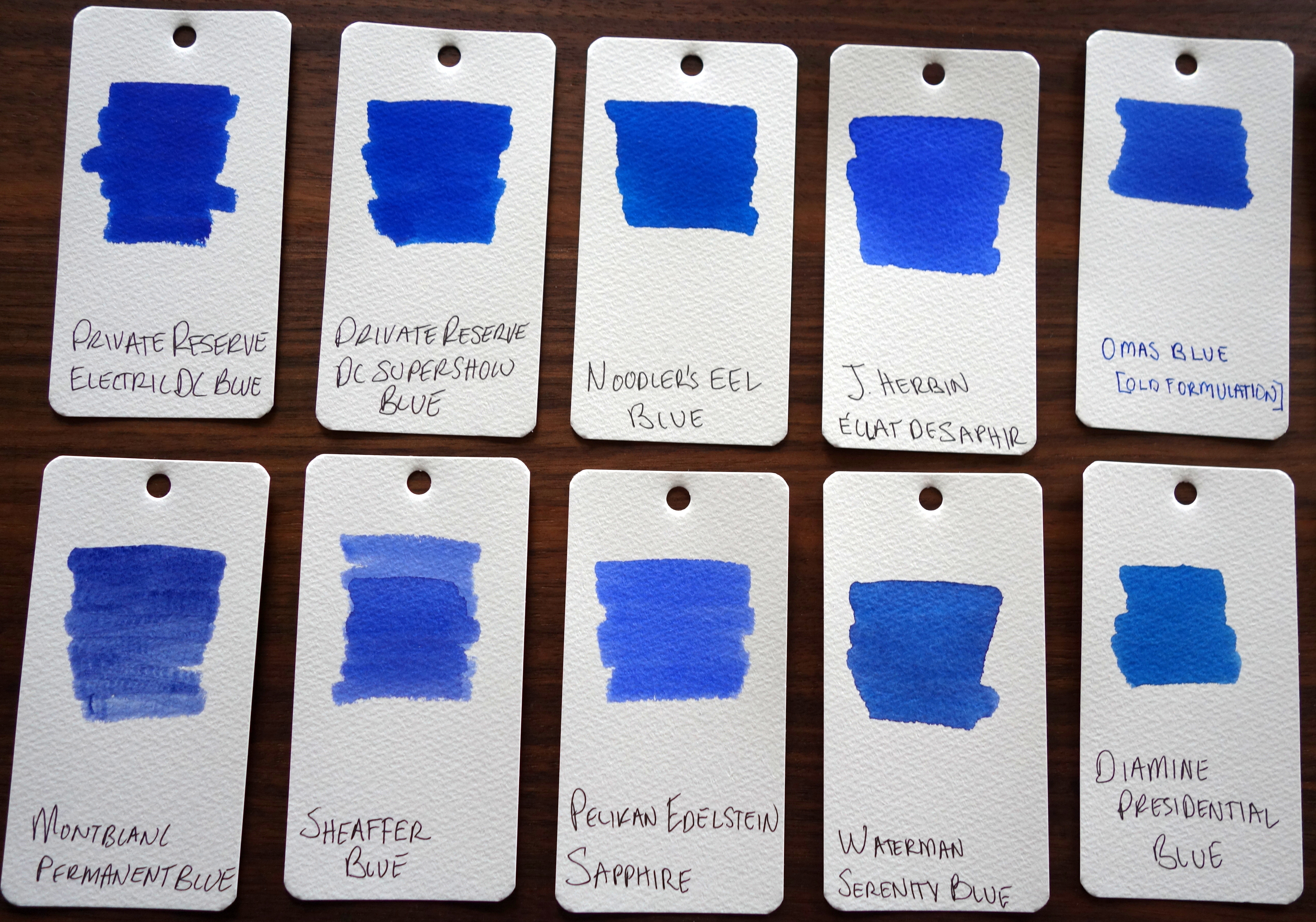
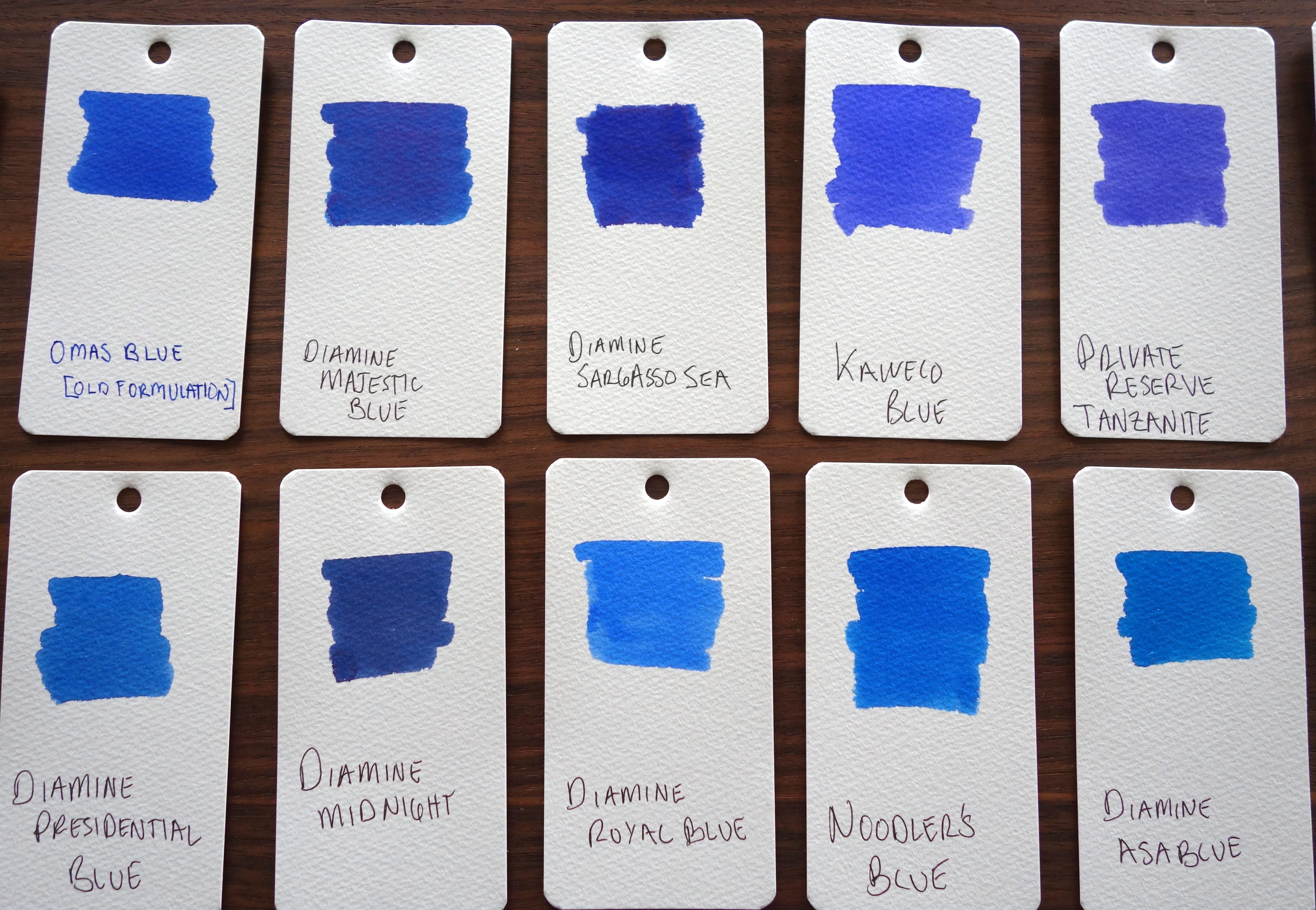
I don’t consider myself an ink person…I like ink but I like pens much more. Boring old Waterman Serenity Blue (FKA Florida Blue) has been my go-to ink for vintage pens for a good while now but I have been finding that with dryer and finer nibbed pens it isn’t the best match. I had to find a safe blue ink with good lubrication and Diamine (with all inks in a pH range of 6-8) was the brand that came to mind.
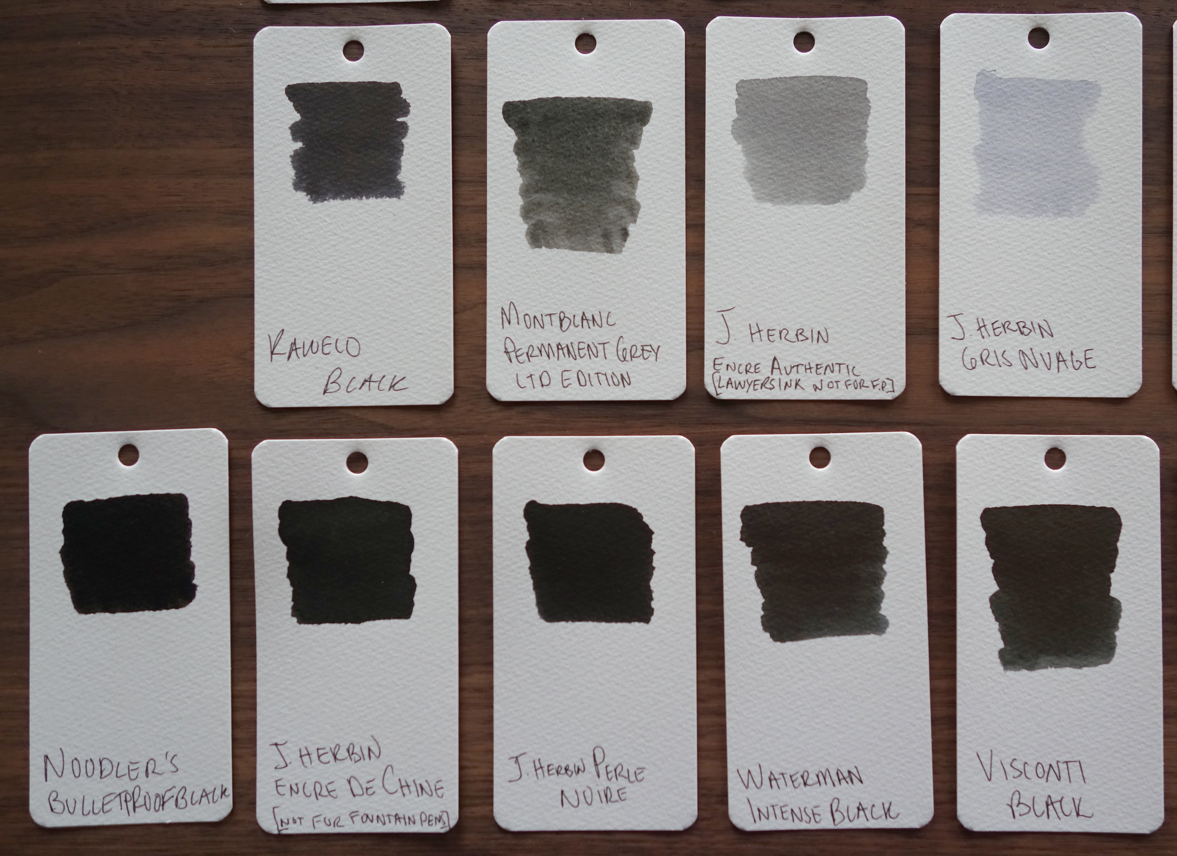
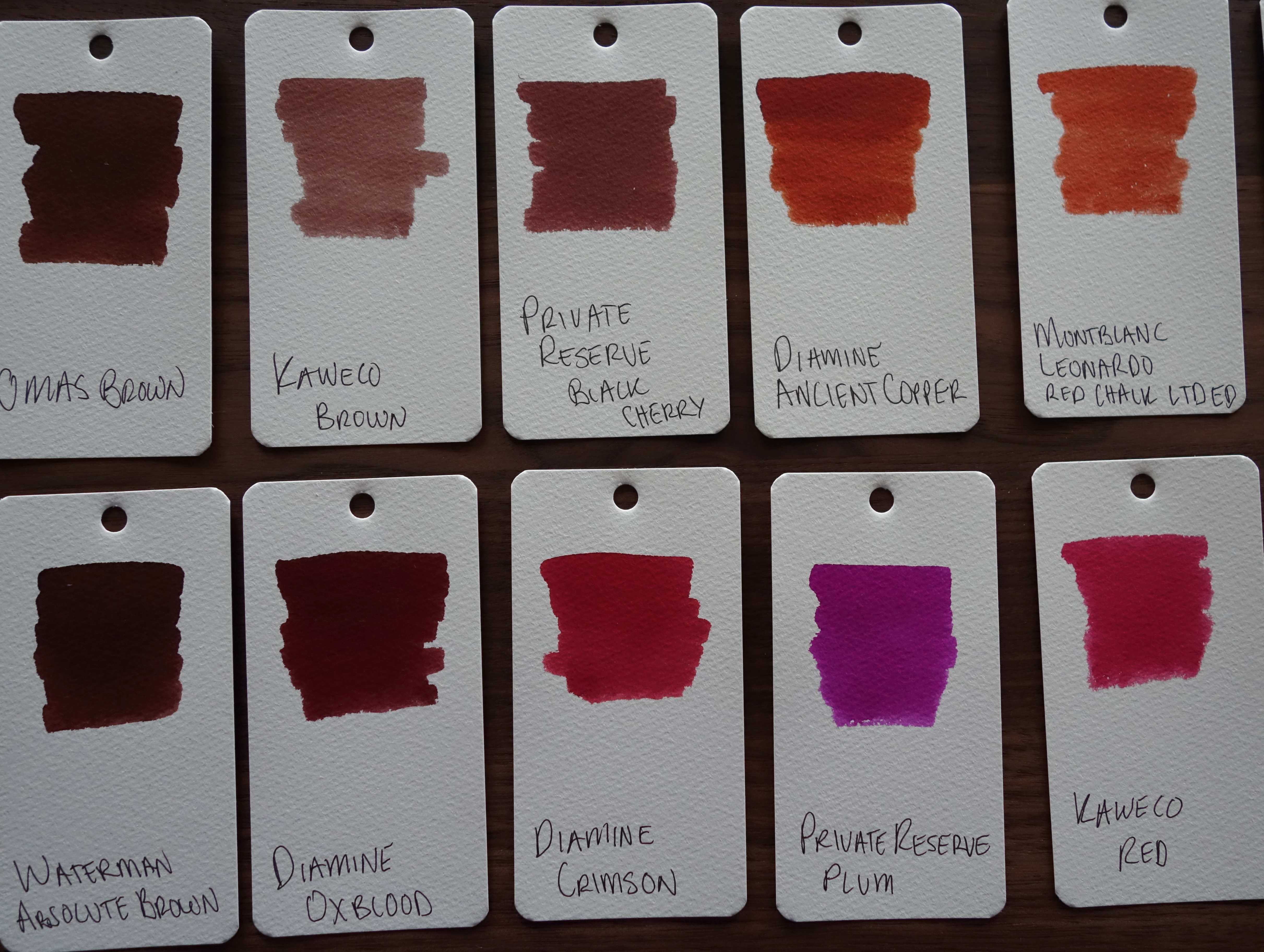
I ordered 14 Diamine samples from the Goulet Pen Company (no affiliation) and to narrow it down I put the samples on Maruman Mnemosyne Word Book cards as I had first seen on The Pen Addict (again no affiliation)…well one thing led to another and I decided put all of my bottled inks on the Word Book cards and here is the result:
The blues:
The greens:
The purples:
The grays and blacks:
The browns and reds:
The orange and pinks:
I haven’t picked a new blue yet but Diamine Majestic Blue and Diamine Asa blue are the ones catching my eye.
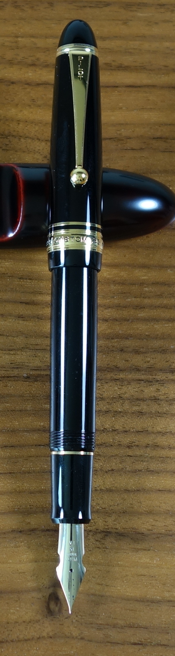
The Pilot Custom 743 is the only pen to use Pilot’s full line of #15 size nibs. In the store I tried three of the more unusual nibs: a music nib, a Waverly nib and a falcon nib. I ended up picking the falcon nib, which is a soft flexible nib.
Appearance
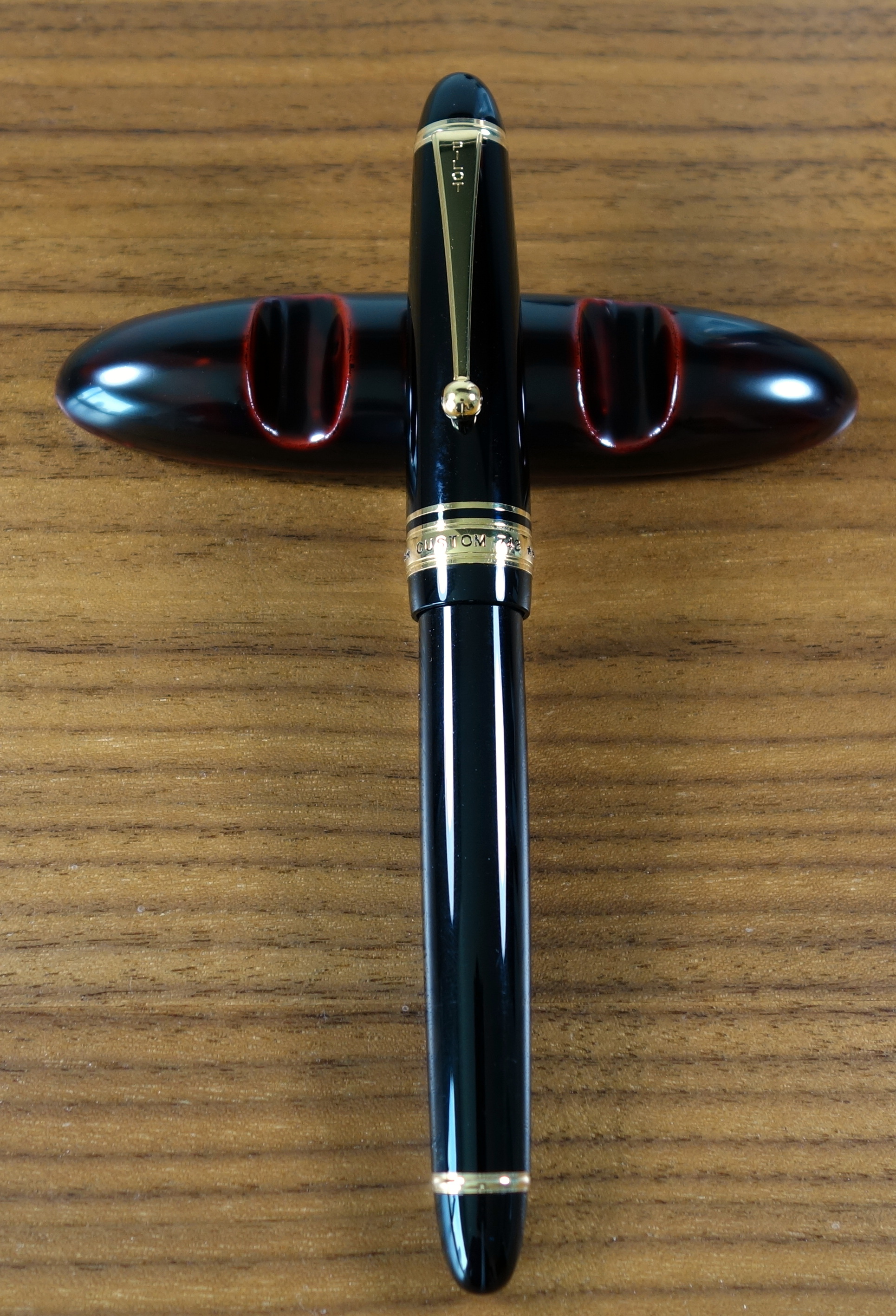
Like most pens in the Custom series, the 743 is a very traditional and classic looking executive pen with a black plastic body and yellow gold furniture. The trim level is the same as you get on the Custom 823 and they look almost identical. The trim ring on the bottom of the body is closer to the end of the pen than on the 823 (the 743 has vacuum mechanism to accommodate) but otherwise they look the same.
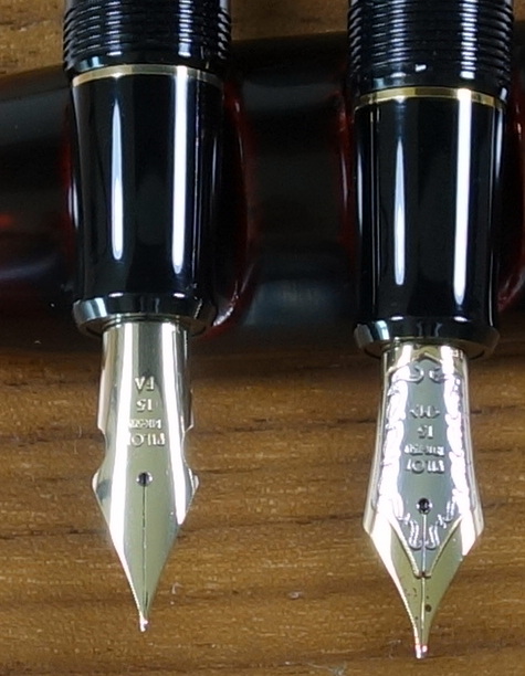
The cap has a rounded top with a clip that starts broad and narrows ending with a ball; this is the classic Pilot/Namiki clip and I think it looks great. The gold band at the bottom of the cap reads “* * * CUSTOM 743 * * * PILOT MADE IN JAPAN”. The letters are filled in with black (paint?) just as you would see on the Custom 845 and Custom 823. The large 14ct gold #15 nib is plain, with no decoration to speak of. The cuts on the sides of the nib help to increase flexibility and in my opinion make up for the lack of decoration.
The gold trim is much more yellow in color than the 14ct gold nib. This is quite apparent with the cap posted. I would like to have seen the gold match a bit better but it’s not a big deal.
All things considered, the Custom 743 is a clean looking pen with no strangeness to its proportions. It’s not going to score any points for originality but it’s a nice looking pen nonetheless. Score: 3/5
Build Quality
The build quality like most Pilot products is quite good. The section (as on the Custom 845) has two big seams that just look cheap on a $300 pen.
Custom 845 with Custom 743. Both have the same plastic section.
Unlike the Custom 845, the 743 also suffers from seams on the body as well. They are clearly defined in the threading on the body and then they disappear about a quarter of an inch in on the glossy part of the body. You wouldn’t really notice any of this unless you are looking closely. The fit and finish is otherwise quite good and I suspect this pen will last a long time. Score: 2.5/5
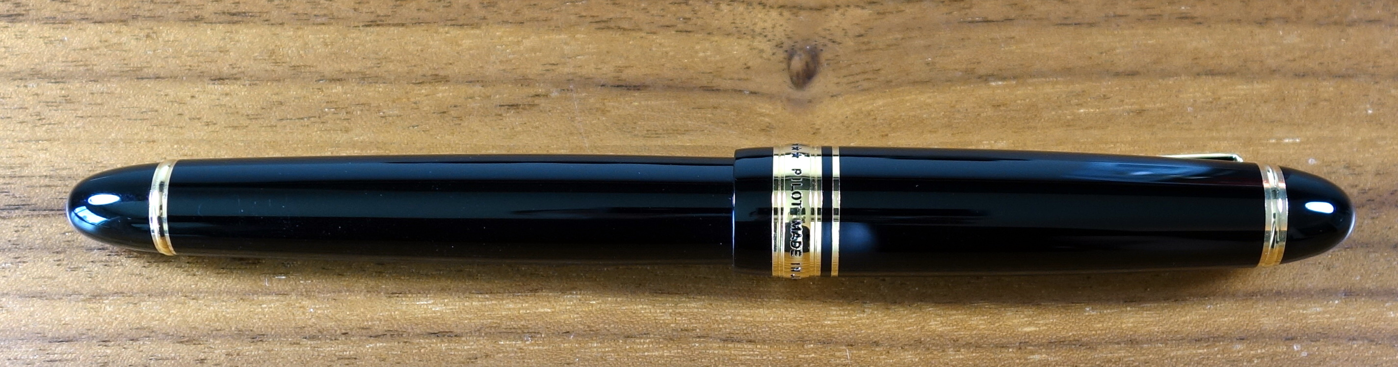
Size & Weight
The Custom 743 measures about 5.9” capped and about 5.2” uncapped. At its widest point it is about 0.6” and weighs about 25.6 grams with a converter full of ink. Like the 845, the 743 is a good sized pen similar in girth to a Montblanc 146 but closer to the 149 in length. I find the 743 to be well balanced in my hand. It looks quite long posted but it remains comfortable. Score: 4/5
Performance
I think it is fair to say that this pen will not be for everyone. I was lucky enough to try it in a store in Japan before I purchased it. It would be a mistake to think you are getting a new pen that is going to write like a vintage flex pen; it does not and I haven’t seen a modern flex pen that does.
Compared to a vintage flex pen there is minimal flex when pressure is applied to the Falcon nib.
The falcon nib is a bit on the scratchy side, not unpleasantly so but there is a good amount of feedback. With little or no pressure the nib writes with a pretty fine line, definitely an extra fine by western standards.
If apply some pressure you can get the line to become broad but this will require more force than you would need on most vintage flex pens. I find that with nib flexed and writing slowly (as you should) the pen has a tendency to railroad by which I mean produce two thin parallel lines instead of one fat line. The feed seems unable to keep up with the pen.
I have been experimenting with different inks and I have found Diamine inks to work the so far. I tried Noodler’s Blue Eel as I thought that might help with the railroad situation but alas it performed the same as the Waterman and Pilot inks I tried.
The “no pressure” and “medium pressure” writing samples were written quickly at my normal pace and the “Pressure” sample was written slowly with the most pressure…notice all the railroad tracks.
In normal writing there are no real performance issues and I can get some nice (not huge) line variation with medium pressure without causing any problems but if you want to make extra extra fine lines and triple broad lines the Falcon nib isn’t going to cut it. With a careful hand (sadly not something I possess) I have seen some beautiful western writing with the 743 Falcon. Score: 2/5
Filling System
The Custom 743 uses Pilot’s top-of-the-line Con-70 converter that is considered by many to be the best converter on the market. It holds a good amount of ink and is quite easy to use.
The 743 has the standard metal Con-70 which is not quite as nice as the black one you get in the Pilot Custom 845 and most Namiki pens but the function is the same. Score: 3.5/5
Value
I bought my Custom 743 in the low $200s, which I think is a pretty reasonable price for this pen. The retail price is 30,000 Yen (approximately $295 USD) is pretty high. If the pen had no seams and the gold trim matched the nib nicely I could easily justify a $300 price tag for the 743. Score: 3/5
Bottom Line
The feed prevents the 743 Falcon from living up to its full potential as a “flex” pen.
Writing sample on Maruman Smooth To Write loose leaf paper
I have improved my review format for the writing sample to make it more informative. I am now including a rating system for four key areas; the ratings are from one to five (five being the best). Please let me know what you think.
I love red/orange brown inks and Diamine Ancient Copper is my new favorite. My two other (now former) favorites in this category are Montblanc Red Chalk and Noodler’s Antietam. Unlike Noodler’s Antietam, there are no issues with feathering and long dry times (on the papers I have tested) and unlike Montblanc Red Chalk, the flow is generous. Ancient Copper shows excellent shading; it doesn’t get much better. Dry time on this ink is on the faster side and it is not waterproof.
This ink changes quite a bit with different nib sizes; if you look at the writing sample you will see that with the Italix (1.3mm nib) the color is lighter and more orange, then compare to the Pilot (M nib) it looks darker and more red.
Overall, Ancient Copper is a beautiful, well behaved ink. I highly recommend it.
Please note: this product was provided to me at no charge by JetPens for review purposes.
Here are some great reviews of Diamine Ancient Copper:
(I have no affiliation with the sites linked below)
Written with a Rohrer & Klingner glass dip pen on Maruman Smooth-To-Write paper.
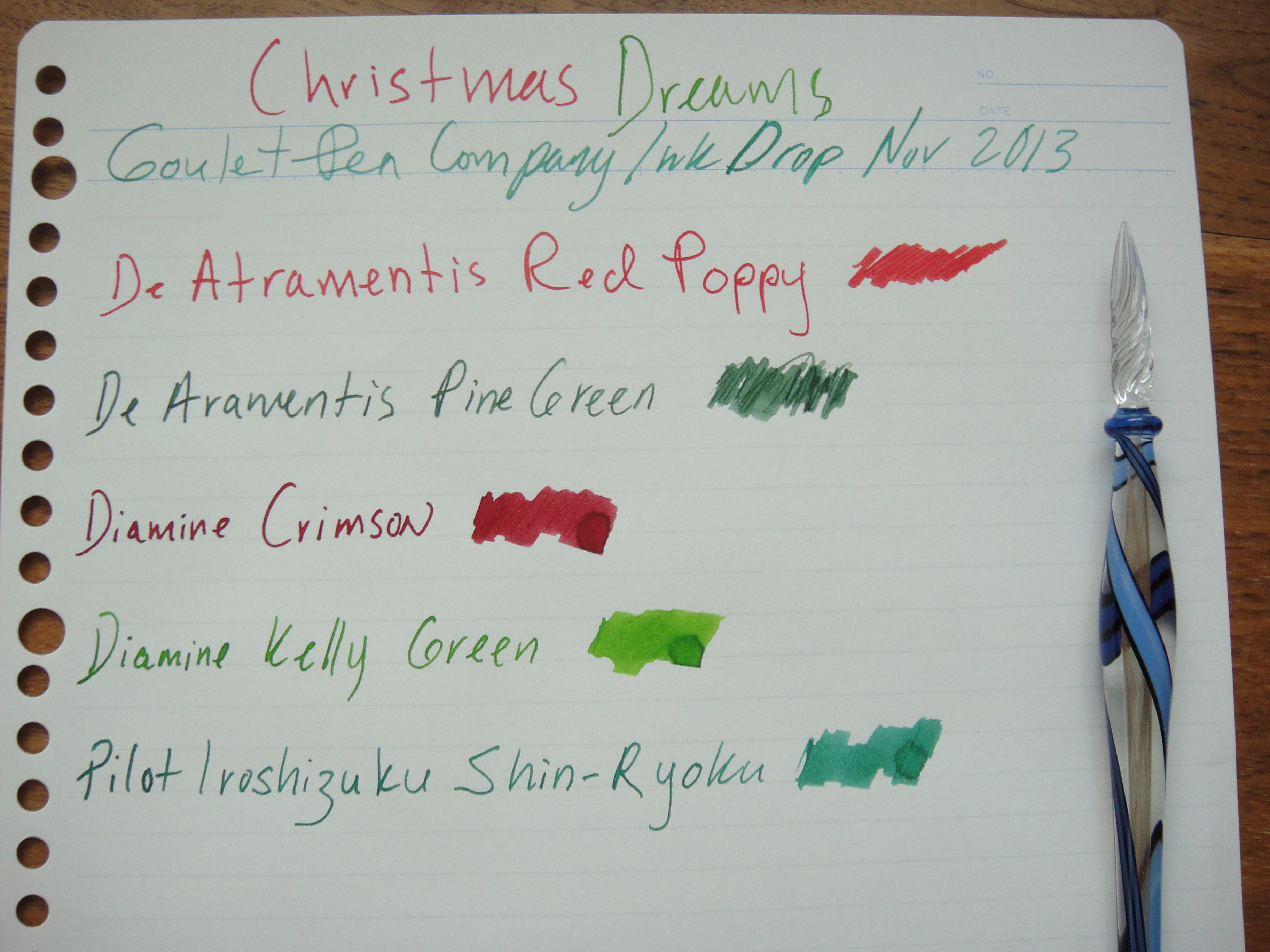
This month’s Goulet Pen Company Ink Drop is titled “Christmas Dreams” and includes the following inks:
De Atramentis Poppy Red (not Red Poppy as I put in the writing sample…oops)
De Atramentis Pine Green (not Aramentis…double oops)
Diamine Crimson
Diamine Kelly Green
Pilot Iroshizuku Shin-Ryoku
My favorites this month are the Shin-Ryoku and the Poppy Red (reviews to follow). From my quick first impressions none of these inks are a buy for me. The Shin-Ryoku looks amazing when wet but it becomes a little dull when dried; it’s very similar to J Herbin Lierre de Sauvage which I think has a little bit more character and is cheaper to buy.
Ink Drop is a subscription service through The Goulet Pen Company (no affiliation) that consists of monthly shipments of 5 ink samples. Each shipment is $10.
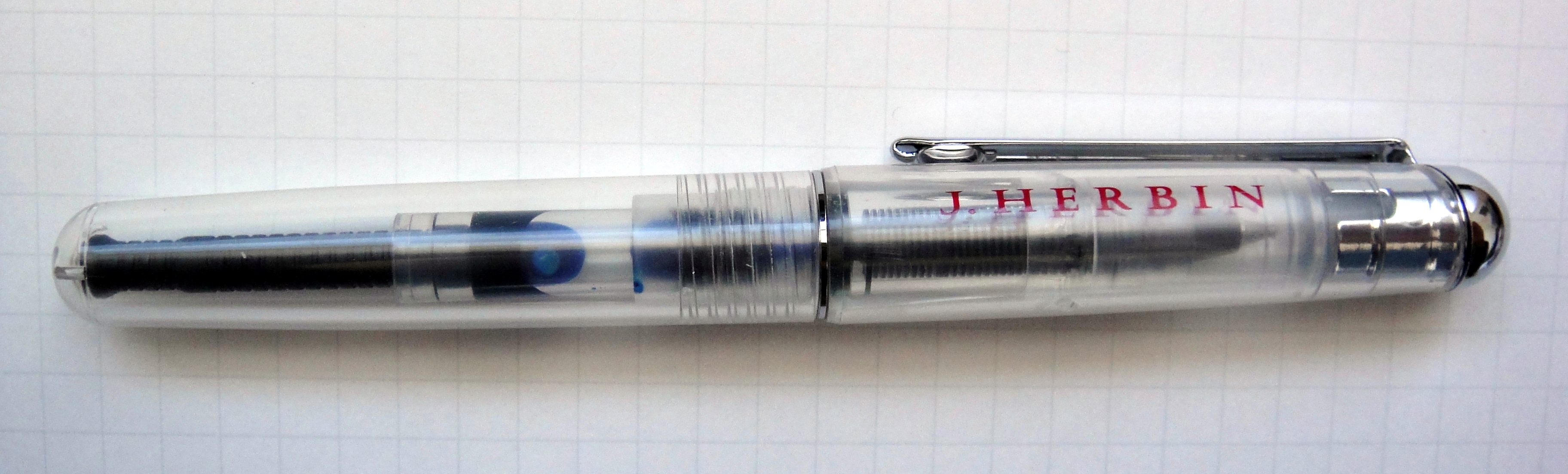
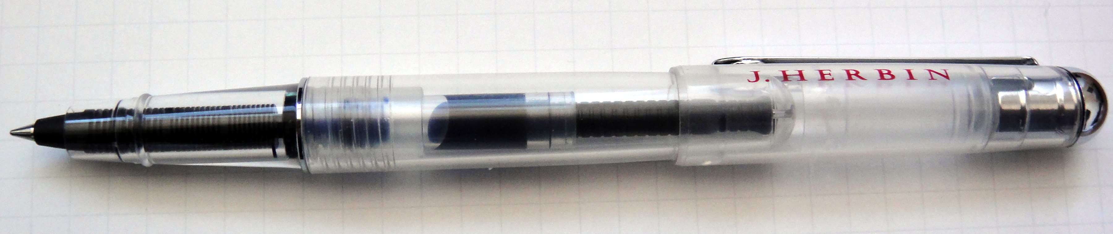
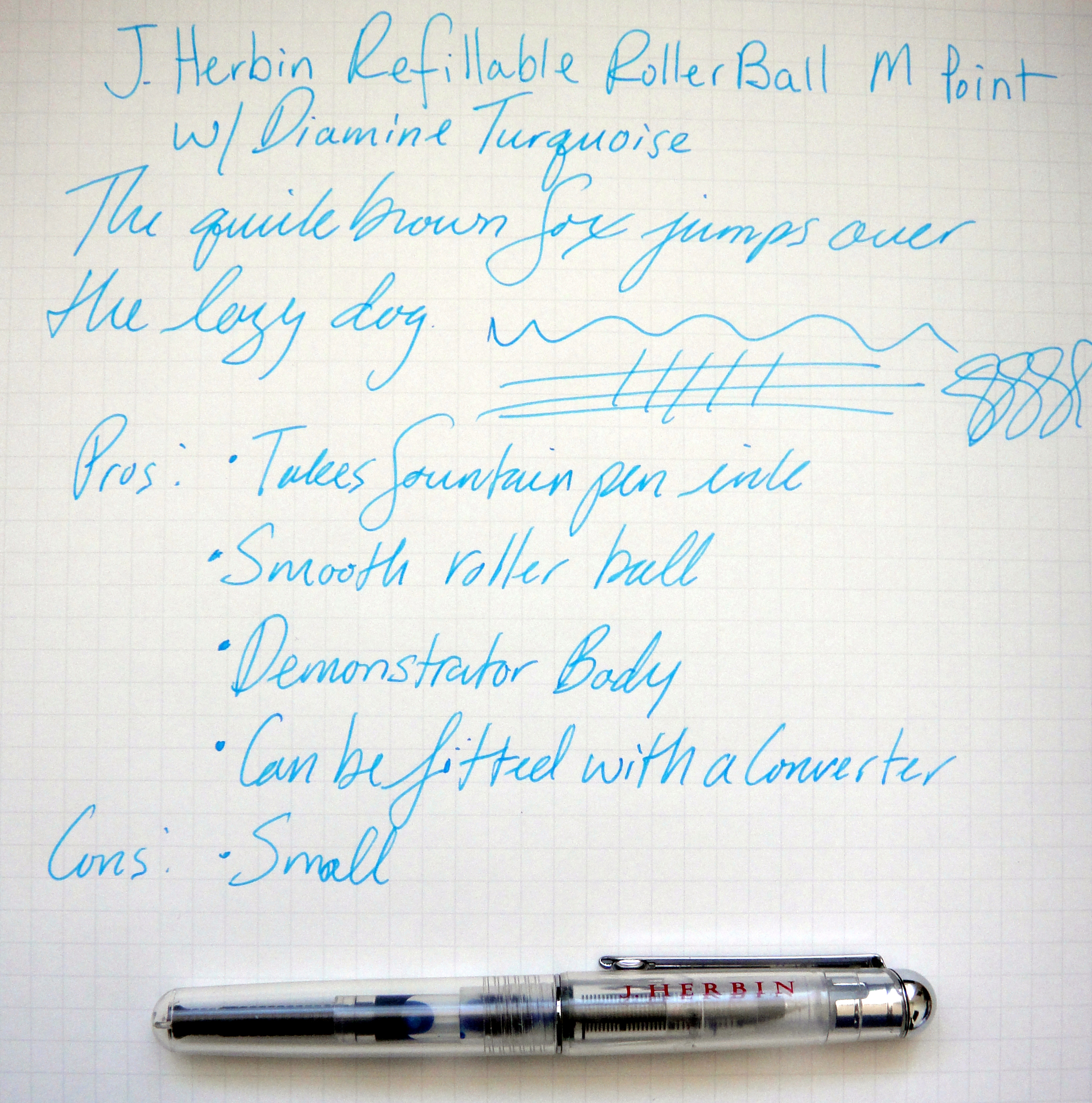
J. Herbin is the oldest ink manufacturer in the world and was established in 1670. The J. Herbin roller ball is special because it is designed to use fountain pen ink. It takes short standard international cartridges which gives you a very wide variety of inks to choose from. I have been able to fit a Monteverde mini ink converter and now the ink possibilities are endless.
When I received the pen the first thing I noticed was that it was quite small at 4.5″ capped and about 5.5″ posted. The translucent demonstrator body is decently made. If you look closely you can see some seams but you cannot feel them. The metal clip feels pretty sturdy. I don’t like the “J. HERBIN” in red along the cap; I would have preferred something more subtle. There are three little holes on the bottom of the body so this pen could not be used as an eyedropper. The cap snaps on to the body to close and posts securely. Due to the small size of the pen, some people will need to post the cap to use this pen comfortably.
I filled the pen with Diamine Turquoise and the roller ball wrote quite well. Nice clean lines no skipping or any other bad behavior to report. It is not as smooth as a hybrid gel ink roller ball but that is to be expected. The line is about a medium width. The Monteverde mini converter does not hold a lot of ink so the standard international cartridge may be a better choice for some.
Overall I really like this little pen; it’s well-made, a good writer and can use all my favorite inks but if you are willing to put up with the hassle of fountain pen ink and cleaning the feed when changing colors why wouldn’t you use a fountain pen instead? I can’t come up with any reasons.
Here are some great reviews of the J. Herbin Roller Ball: