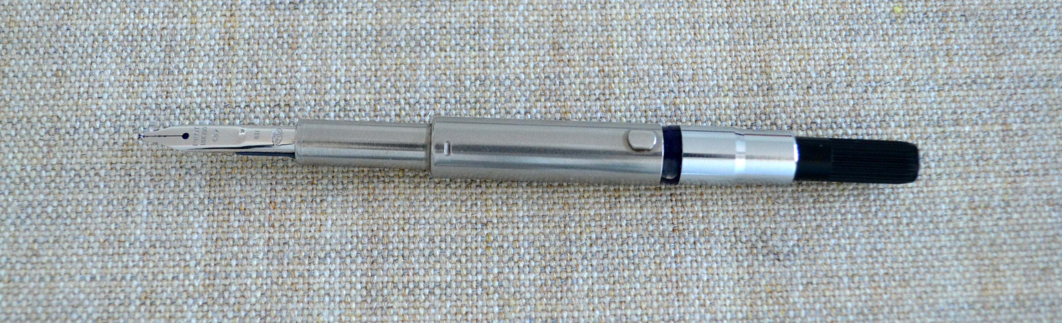
When I heard that Richard Binder was winding down his retail business I knew it was finally time to give one of his “ItaliFine” nibs a go. For those of you who do not know, an ItaliFine nib is a combination nib that offers an italic point on one side and a fine point on the other.
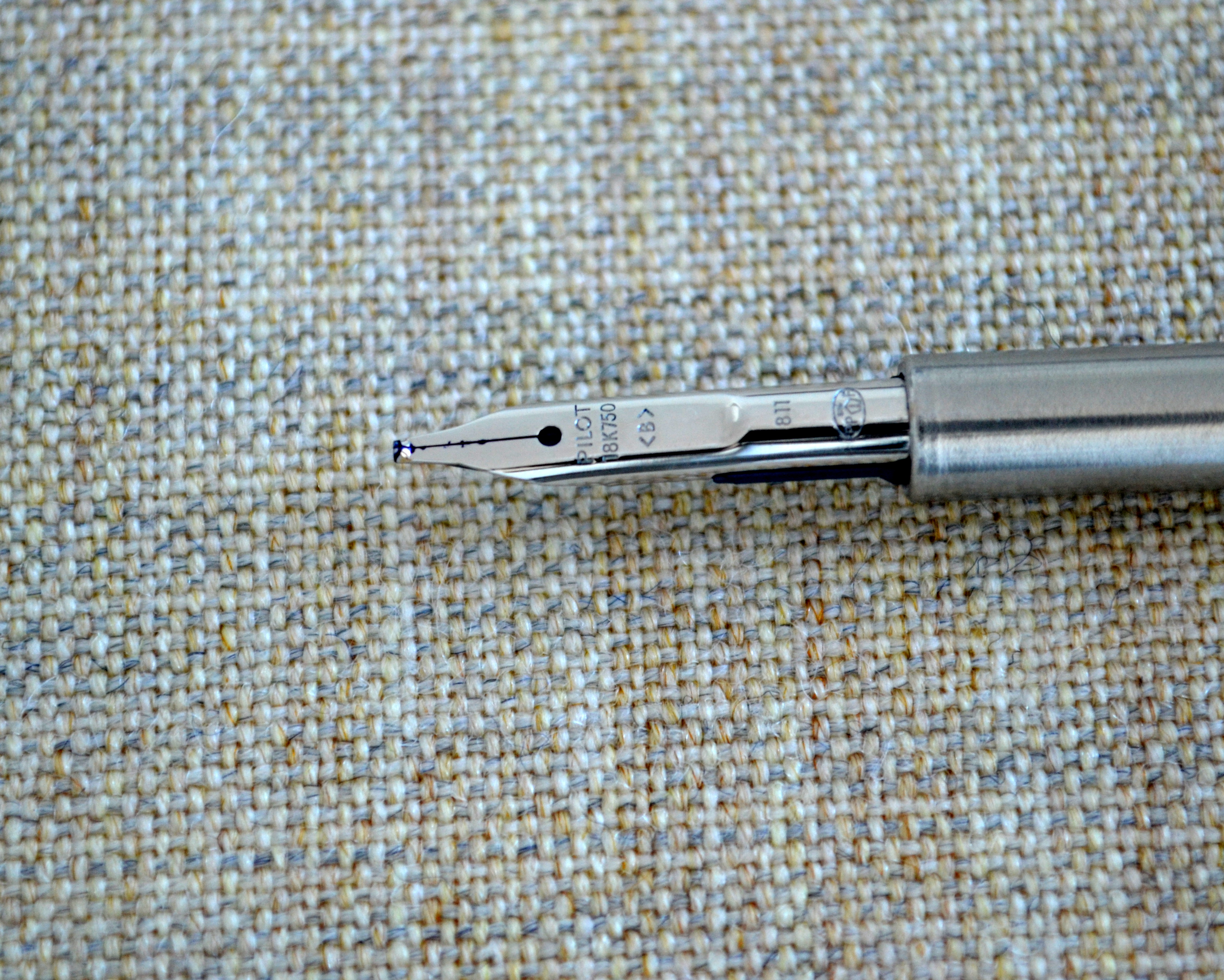
As you can see from the pictures this nib started life as a standard 18kt gold broad nib which Mr. Binder customized into an ItaliFine.
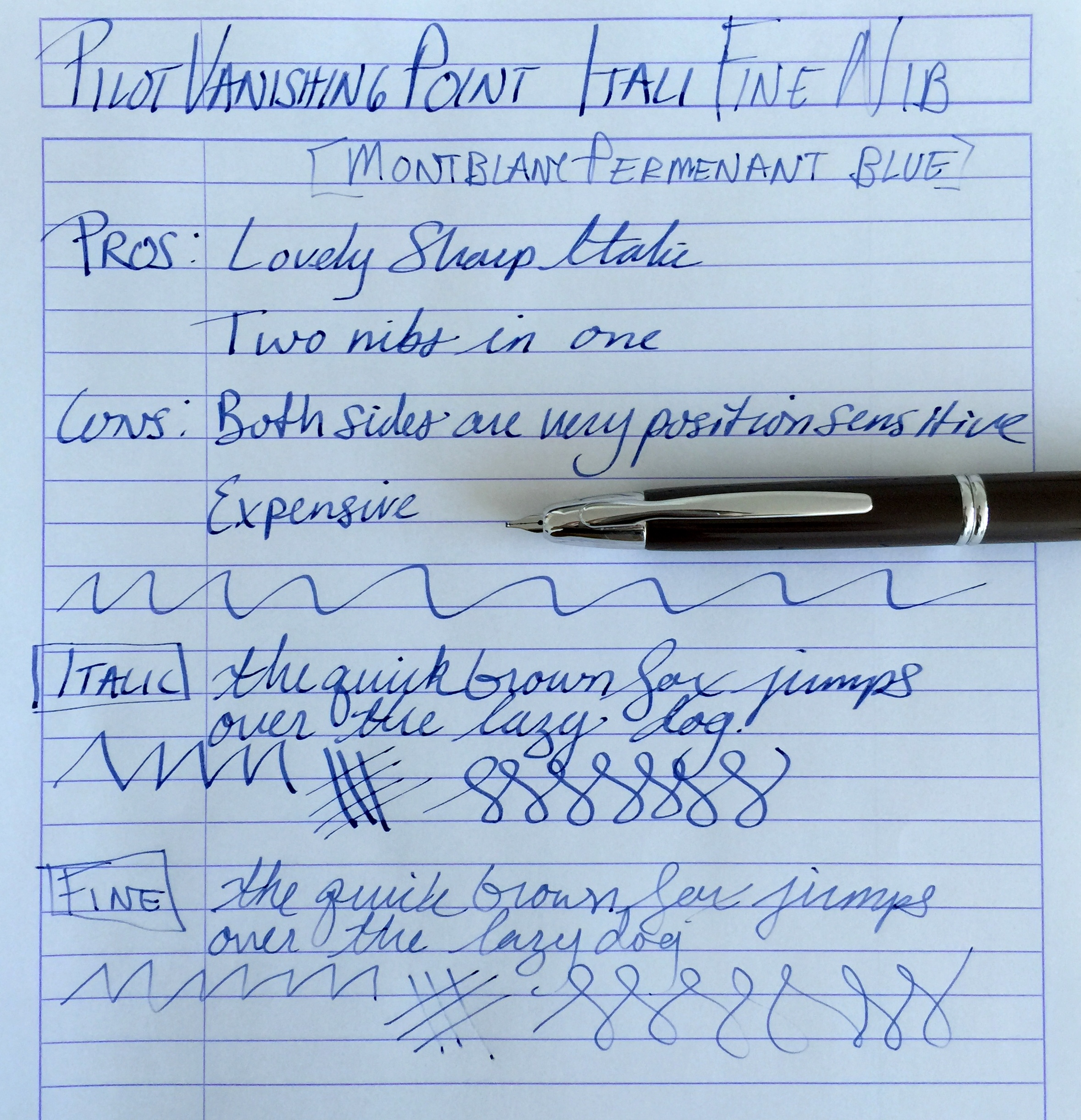
With the nib right side up the nib writes with an italic point. This nib is a true 0.9mm italic and as such is quite sharp and offers a good deal of line variation.
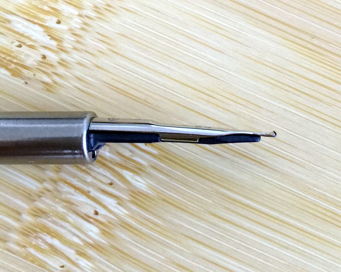
With the nib upside down the nib writes with a fine point. I have found the fine side to be a bit more tricky than the italic. The fine side does not like pressure and will skip with anything but the lightest pressure.
Also the fine side of this nib is position sensitive as its opposite side is fatter and straight cut. For me there was a short learning curve with this nib and now that I have it down, it is a wonderful nib that has transformed my Pilot Vanishing Point into a pen that is now a joy to use. The cost of this nib while still available is $125 and that is expensive for a VP nib but it really works as two nibs that you can use in the same pen on the fly…it’s worth it.
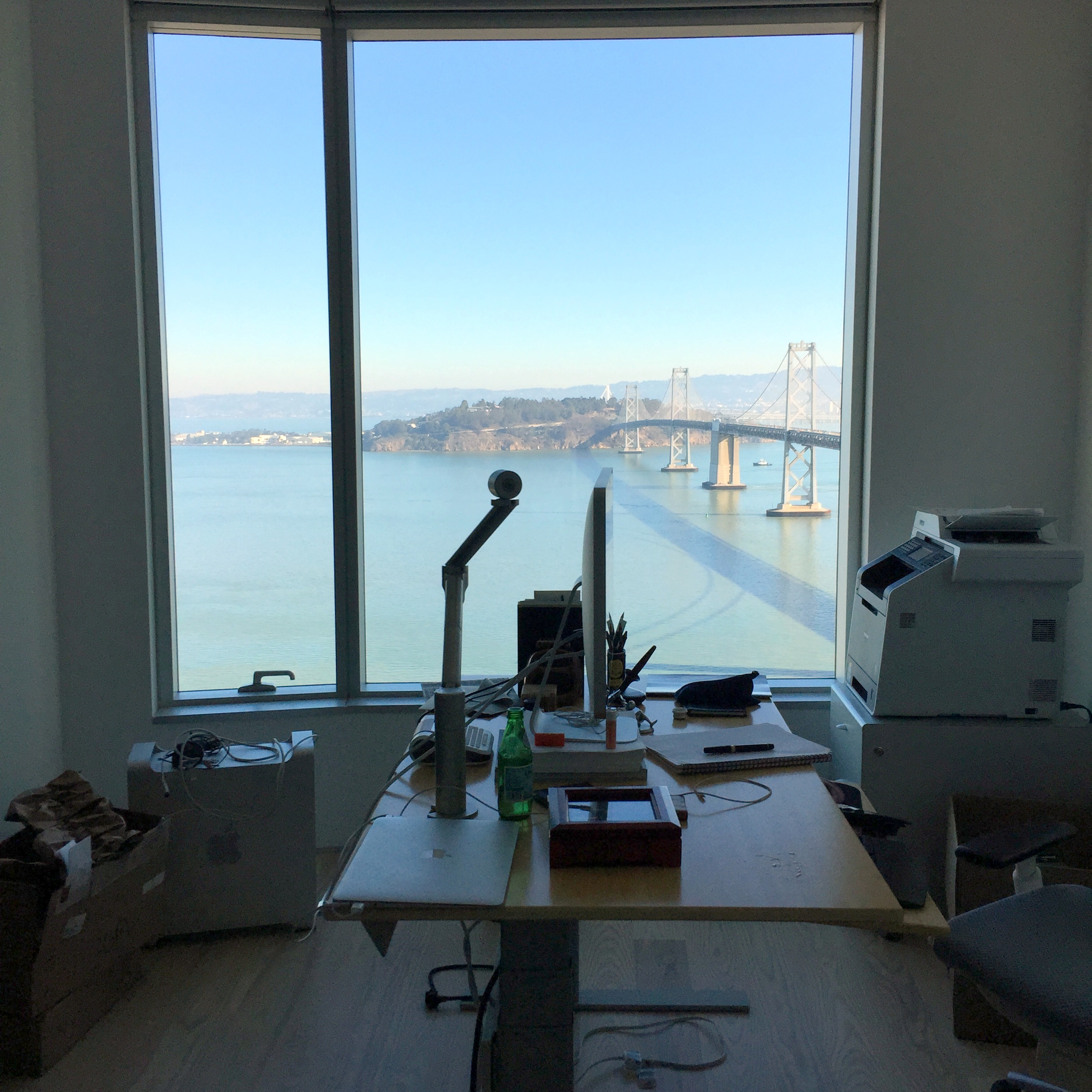
Side Note: Some of you may have noticed that I have been gone for a little while. I have been in the process of moving and I am still working on getting my office (The Unroyal Warrant HQ) set up but as of today I am mostly operational, a new computer and some new furniture is on its way but I will be able to provide regular content 1-3 times a week going forward.
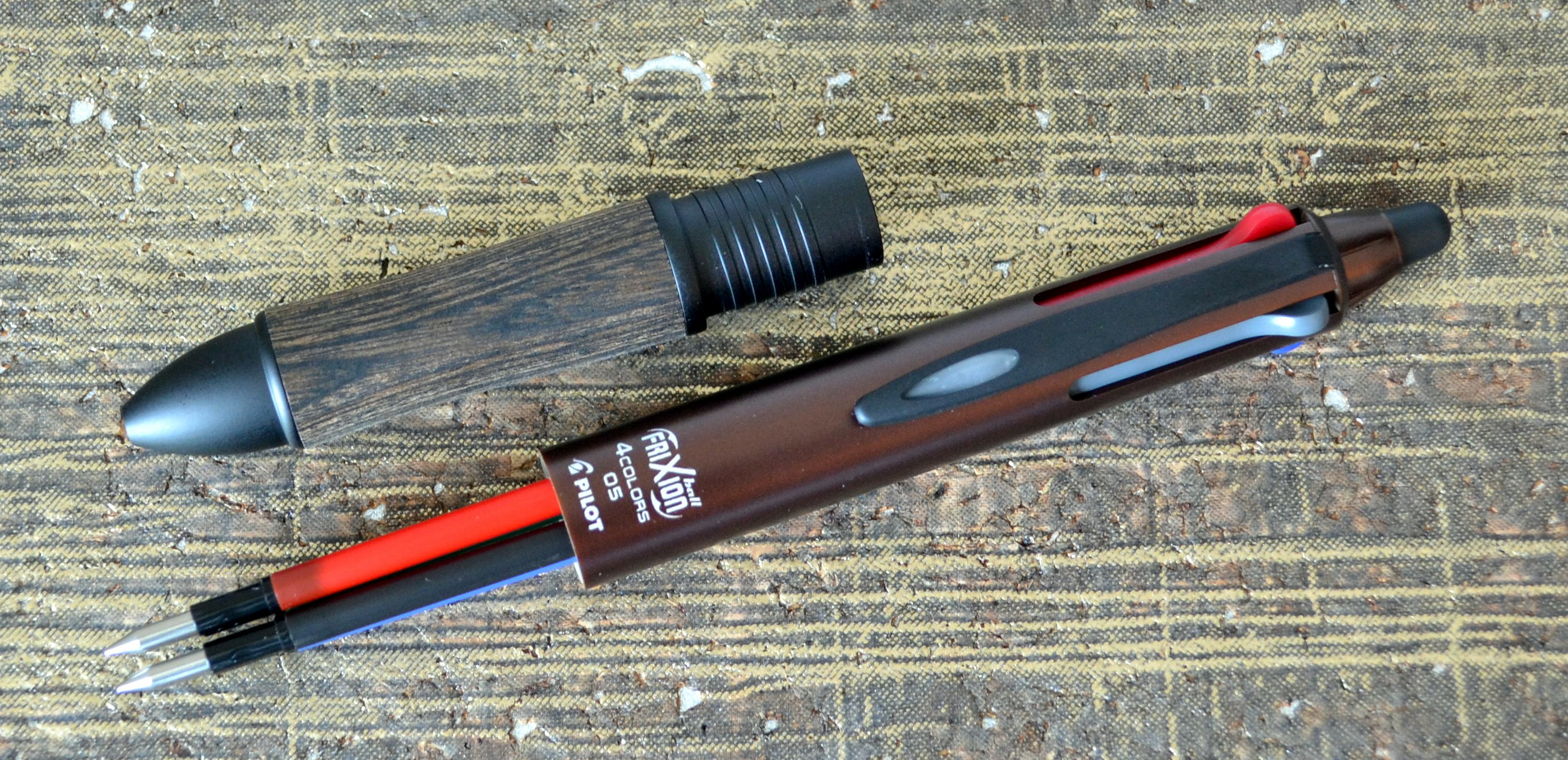
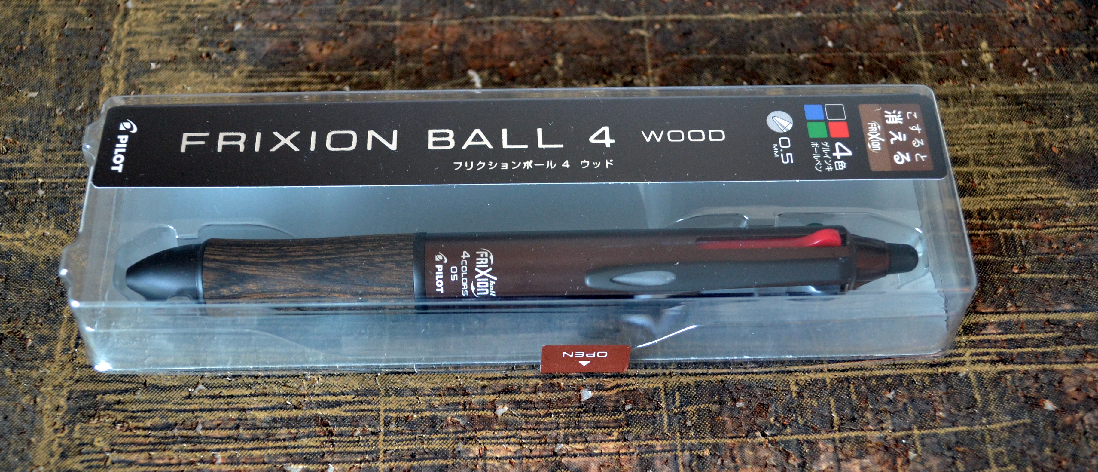
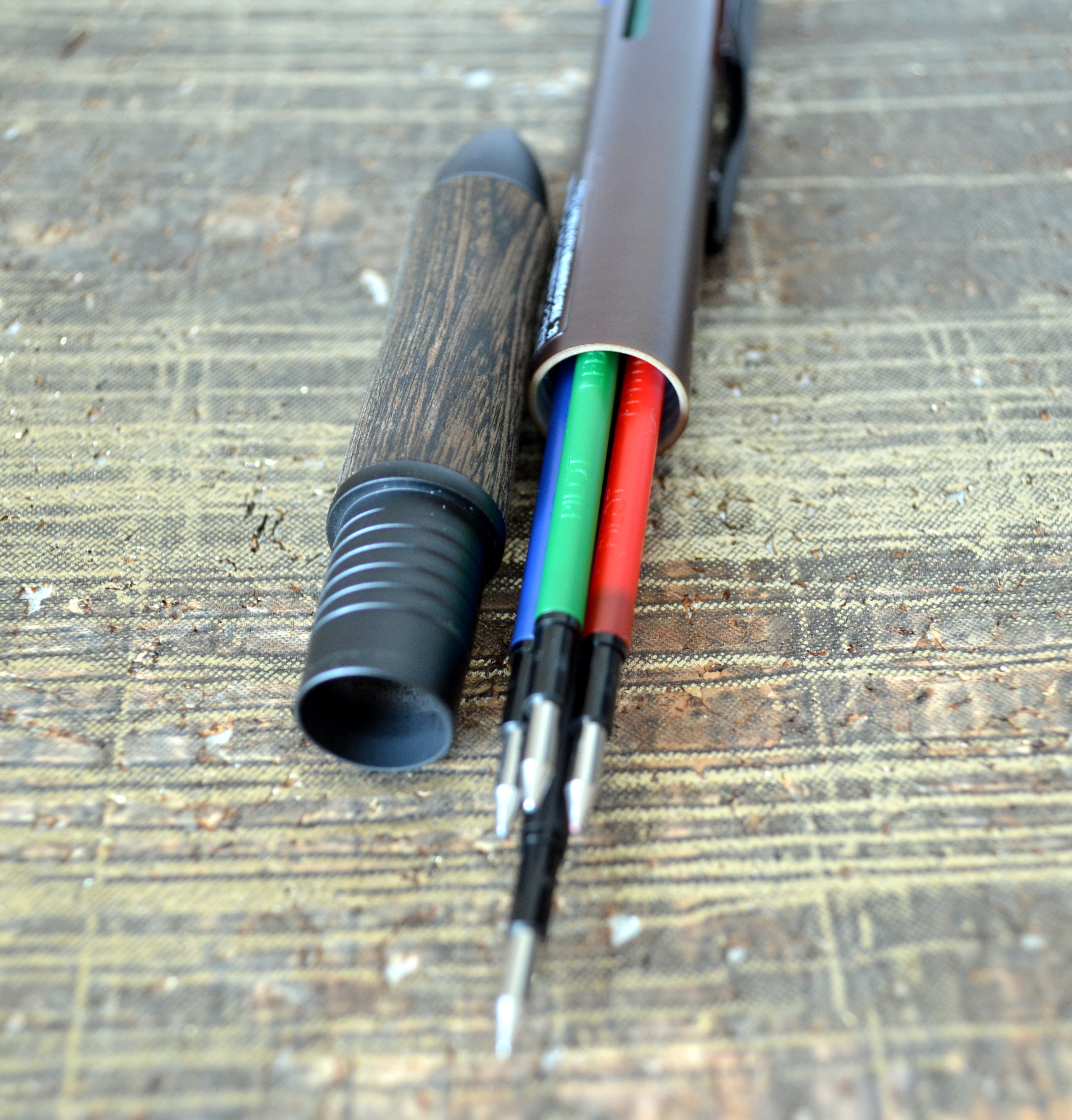
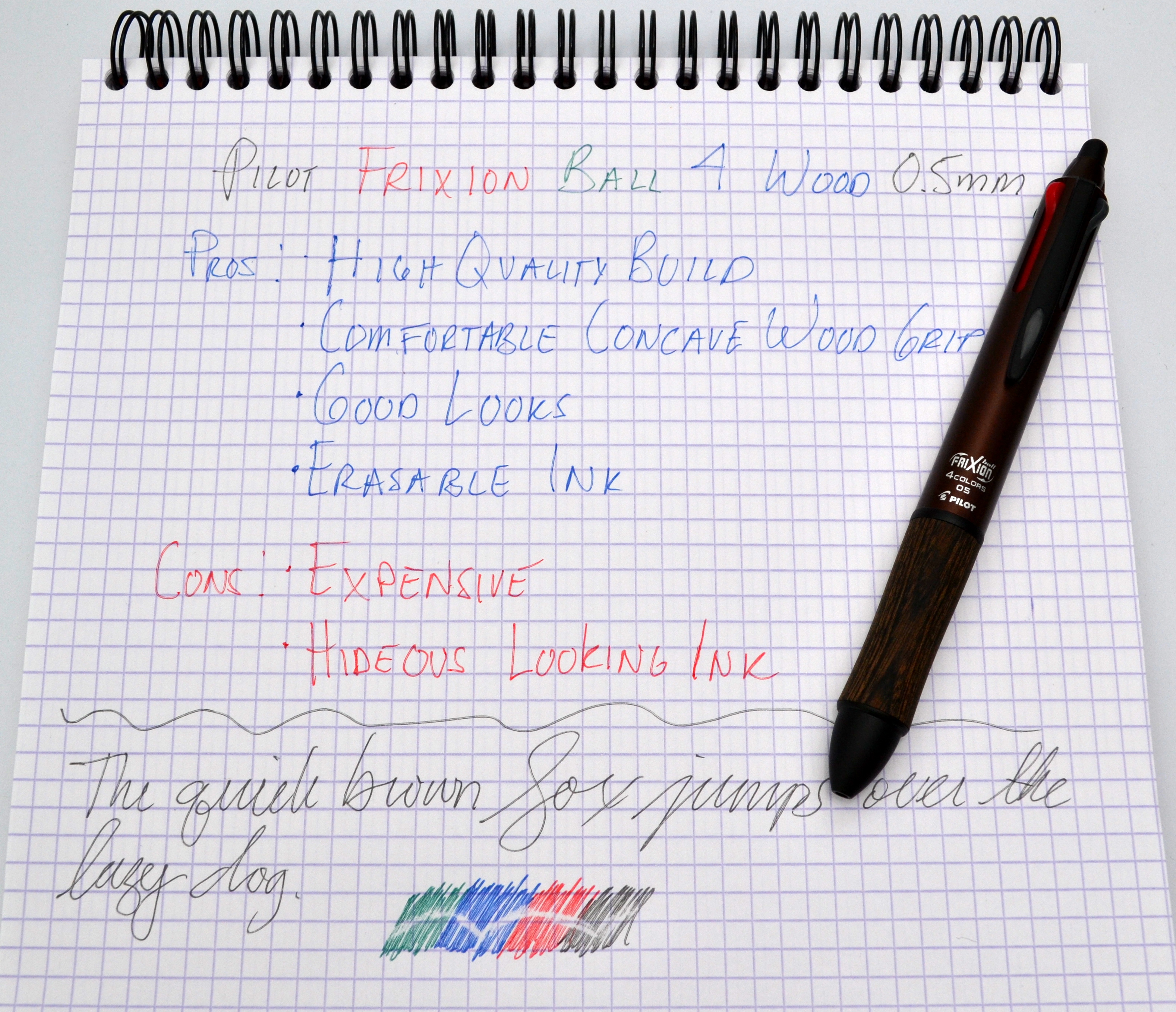
The Pilot Frixion Ball 4 Wood is one of the many pens I picked up on my trip to Japan that I have yet to review.
The Frixion Ball 4 Wood is a multi-pen that features four erasable gel ball points, a wood grip and an attractive brown and black body.
This is one of the best looking multi-pens I have used and it has a very high quality feel, weighing in at 26.7 grams. It is a well built pen with a satin brown plastic body that is completely free of seams. The section is made of wood and metal and is what gives the pen its nice weight.
It is fair to say I love everything about this pen except for the way it writes. The erasable Frixion ink looks nasty. The colors are washed out and the lines aren’t particularly clean. It is a smooth writer especially for a 0.5mm pen but it’s not a winner for me.
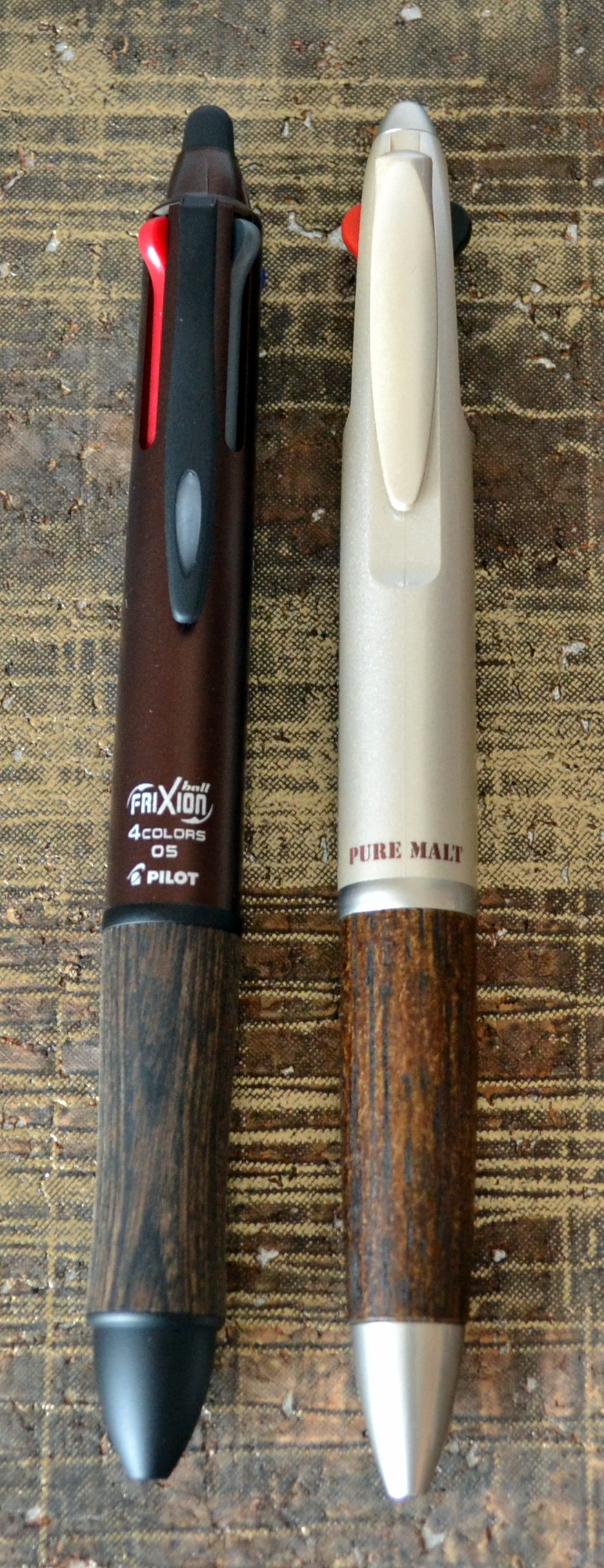
The price is also prohibitive at 3,000 YEN (just under $30USD); that is three time the price of the Uni Pure Malt which while not as nicely made offers a better writing experience with Uni Jetstream ink.
Frixion Ball 4 Wood with Unit Pure Malt
I am quite smitten with the body so I am going to try and see what other refills will work in the Frixion Ball 4 Wood.
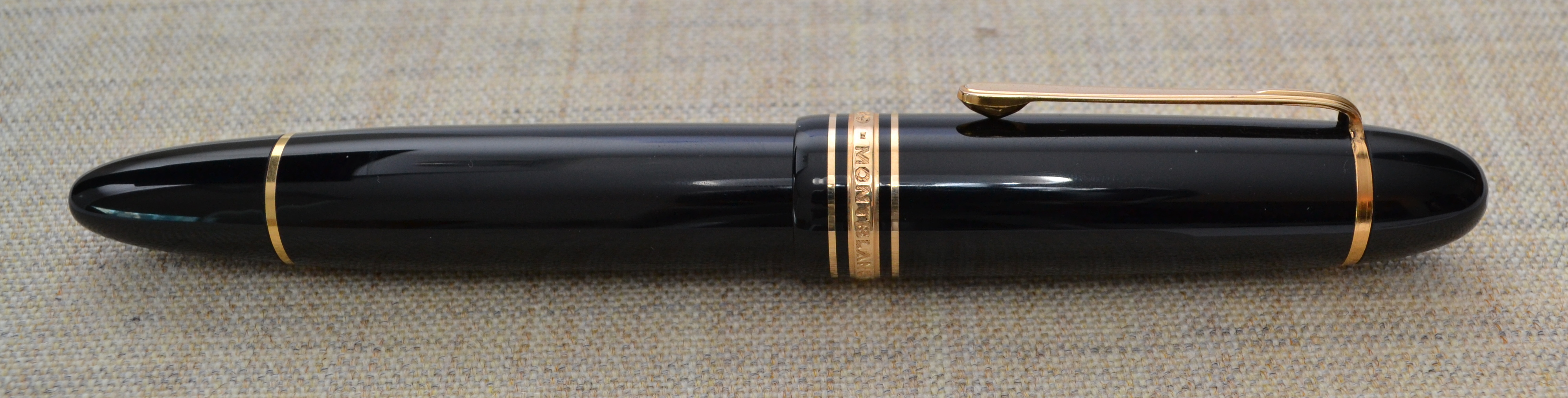
I have been collecting fountain pens for a little while now and have made a few poor purchases. My most expensive blunder has been this pen, a Montblanc 149 Meisterstück. (If you want just want to hear about the 149 as a pen skip down to the “Appearance” section.)
There is a well-regarded pen catalog (whose name I will not mention) and the best pens are purchased almost instantly upon release of the catalog so you don’t have much time to think.
The 1960s 149 that I had wanted sold before I had a chance so I jumped on the still available 1972 model and paid a hefty premium as it was new-old-stock.
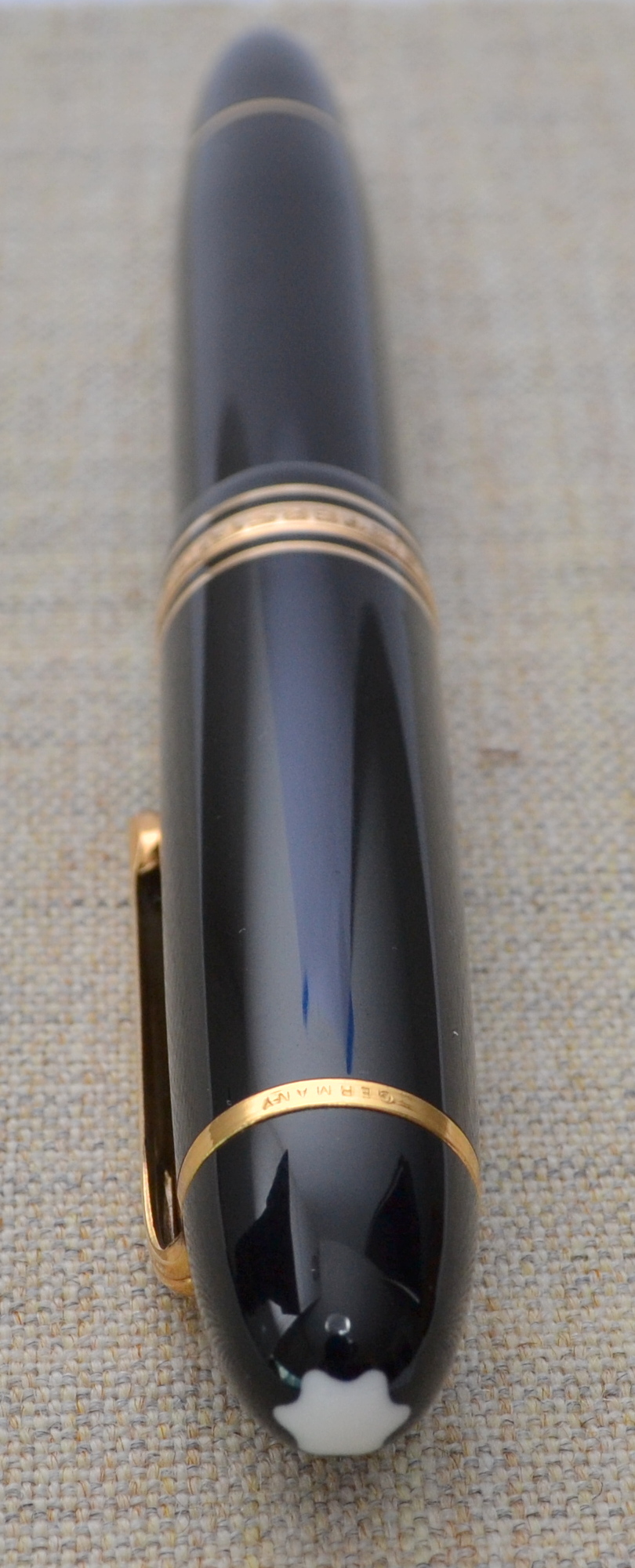
The pen arrived in the original box with the original guarantee and with the sticker still on the pen. When I took off the cap and found that the nib was tarnished and the rhodium plate had disappeared in spots. The pen must have been dipped at one point and then put away uncleaned.
This is how I received the pen. With some light polishing with a jewelers cloth I was able to get rid of most of the orange tarnish.
I contacted the catalog owner and to his credit he offered a few fair options: 1) lower the price, 2) re-plate the nib, or 3) refund my money. I foolishly became attached to the pen and decided to go for the lower price when I should have simply returned the pen. Oh well…
Appearance
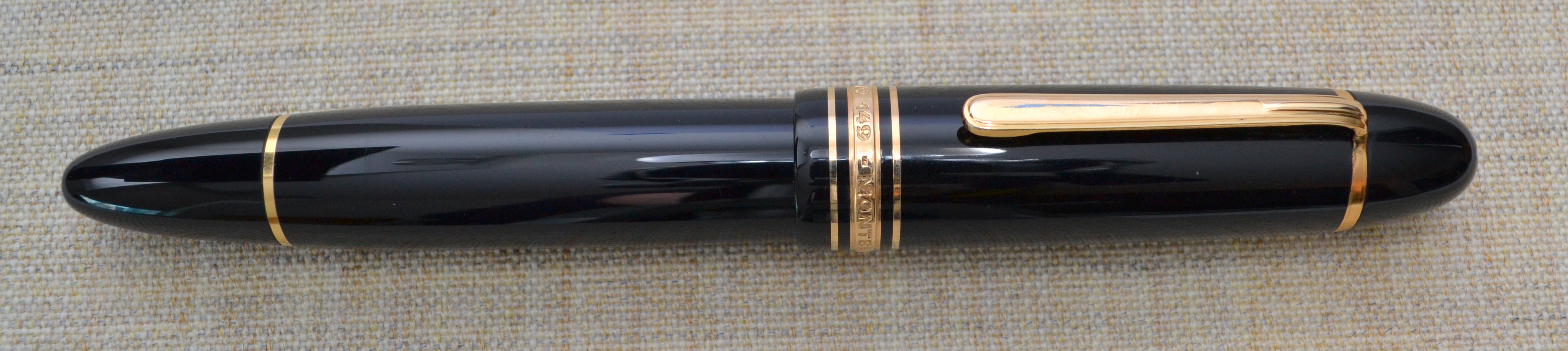
When I first saw a 149 in person years ago I thought it looked like a ridiculous cartoon pen; it is just so large. I have come around to liking the looks of it’s imposing size but if I am honest I would be embarrassed to use this pen at work…or around people in general.
The streamlined shape with black resin and gold furniture is a classic and this pen really is the archetype for a luxury fountain pen. The 149 is an icon much like a Rolex Submariner and as such there are many lookalikes.
The 149 has the best shape of any pen in the Meisterstück line. It is more cigar-like than the other Meisterstücks, which tend to have a longer and thinner profiles. There isn’t too much to say other than it’s a classic and a very attractive shape.
Score: 4/5
Build Quality
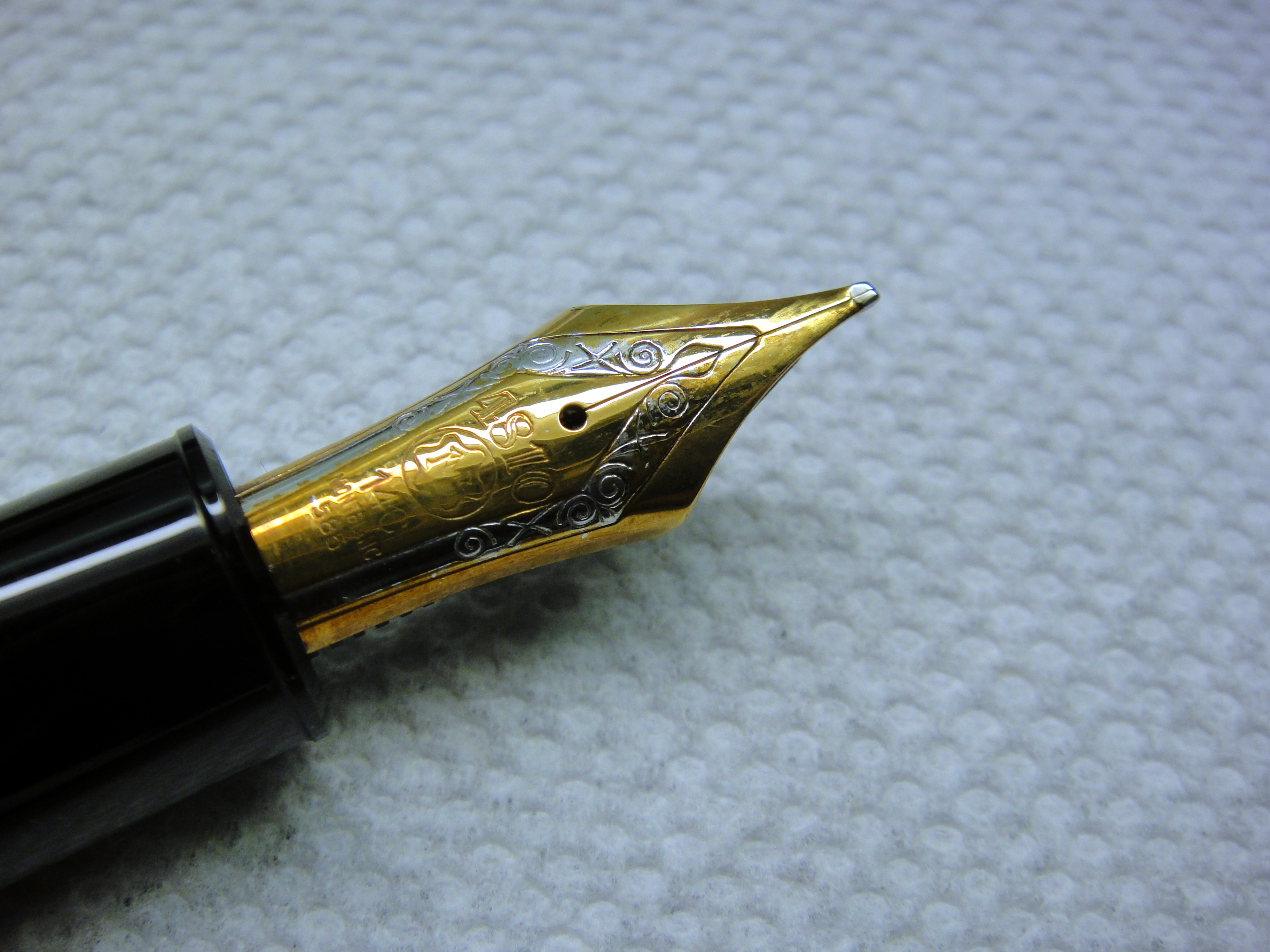
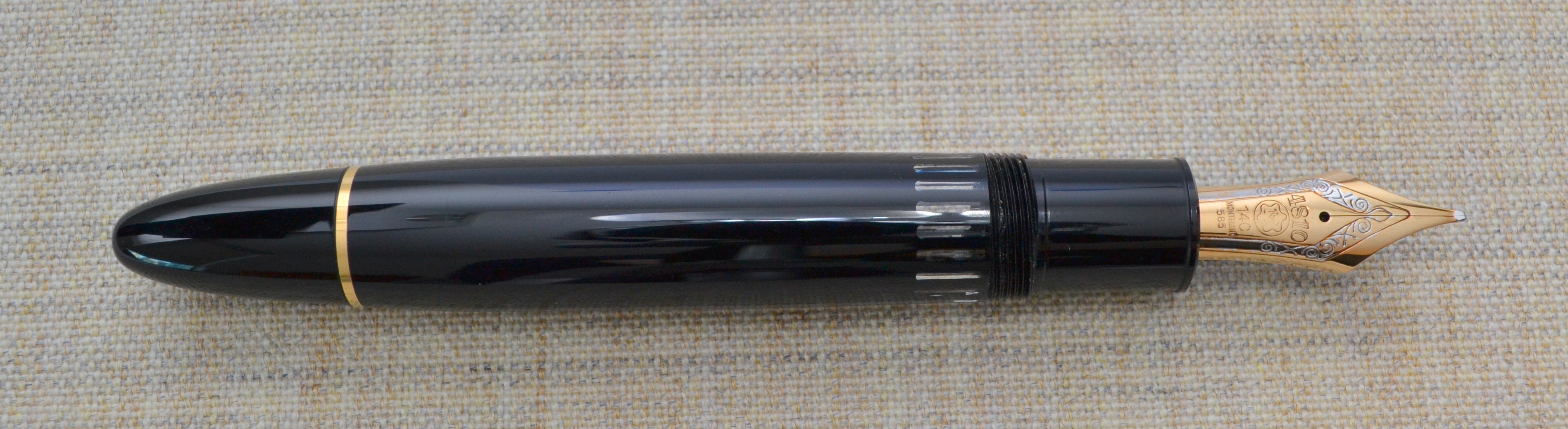
Montblanc has been producing the 149 since the late 1940s/early 1950s and there have been numerous iterations. The first models were the best quality and as such are the most valuable. So what about my early 1970s model? In my opinion, the Meisterstück line has gotten worse over time.
My 149 is made from plastic (“precious resin”) and has a plastic piston mechanism (not the metal telescopic one from the 50s and early 60s nor the metal one in the current 149). The barrel is a single piece of plastic compared to the modern two-piece barrel, which is cheaper to manufacture. The plastic is soft and scratches easily. Montblanc finishes the plastic with a very high shine so it is possible to polish out scratches if they are not too deep.
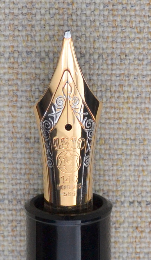
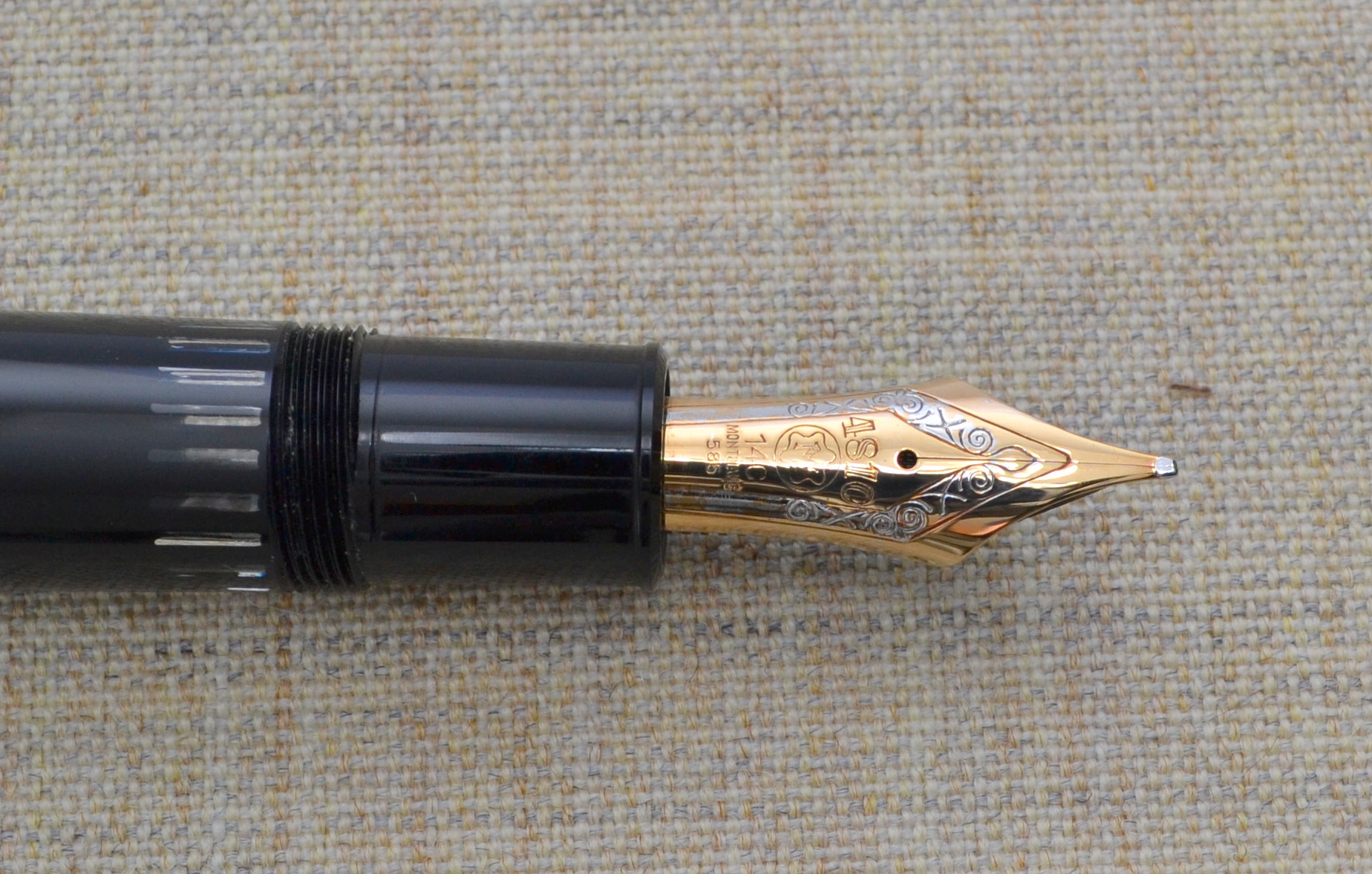
The tri-color nib is made of a soft 14ct gold with a solid ebonite feed instead of the plastic feed and stiffer 18kt tri-color nib on the modern 149. Montblanc produces all of their nibs in house and hand grinds and hand finishes each nib. If you look closely you will see that the slit between the tines doesn’t quite line up with the design.
One sore point on my pen is the plating on the nib. The rhodium (white metal) plating seems to have come off a bit. Which is something that shouldn’t really happen on a pen this expensive. I have confirmed through accounts of members of the Fountain Pen Network that this is not that uncommon for Montblanc pens.
Overall I would consider the build good but not great for a pen this expensive.
Score: 2/5
Size & Weight
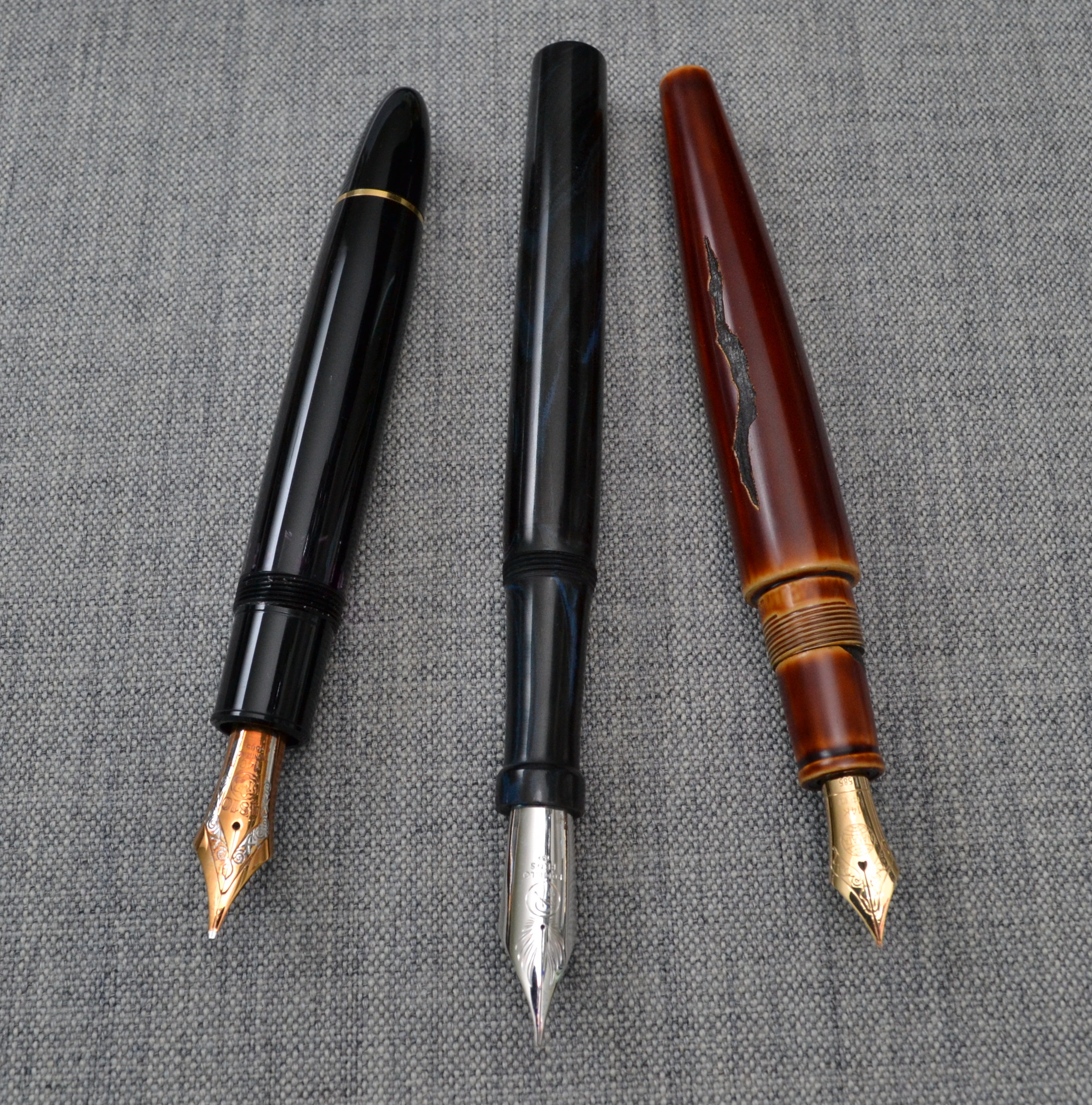
One of the benefits of the plastic piston mechanism is that it keeps the weight down to 29.3 grams (empty). The 149 is the fattest pen I own and for me it is too fat to use comfortably for a longer period of time. See the picture below…
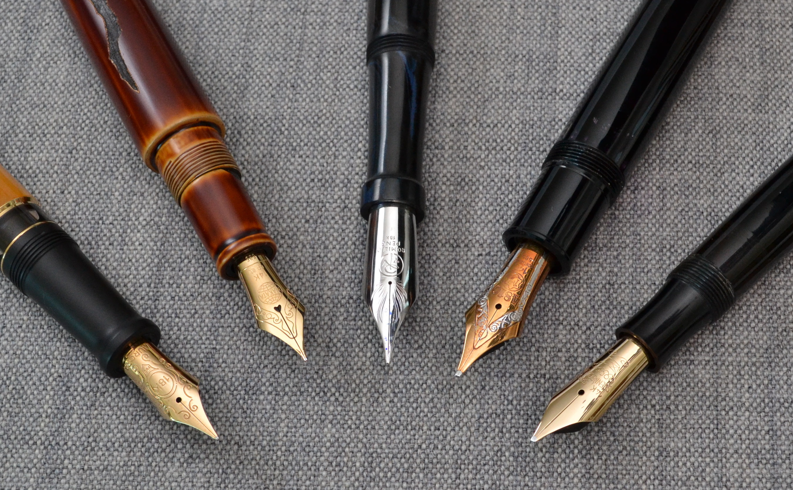
Left to right: Aurora Afrika, Nakaya Naka-ai Negoro Shiro-tamenuri, Romillo Essential No. 9, Montblanc 149, Soennecken 1 Extra
Even though this pen doesn’t have the biggest nib it clearly has the fattest section by a big margin.
The pen measures just under 15cm long and 1.6cm at it’s widest point. The grip section is about 1.3cm in diameter which is the most oversized measurement of the entire pen. You can post this pen but there really is no need to do so as it is a hair over 13cm long uncapped.
There are people with small hands and people large hands that love this pen so don’t assume that it wont work for you. If you want a 149 I highly suggest to you try before you buy. One of the major perks of owning a Montblanc is that there are many boutiques all over the world so they are easy to purchase and service. It is worth mentioning that pens serviced by Montblanc may be repaired with modern (often less desirable) parts.
Score: 2/5
Performance
The big OB nib is a great performer. The nib has long tines that make the nib soft and springy. The OB point is more round than the points on the older 1950s nibs. The rounder the nib the less line variation but the tradeoff is that nib is less position sensitive. Given the choice I much prefer the flatter nib.
The nib does allow for some line variation with pressure; it is much better than most modern pens in this regard.
Score: 4/5
Filling System
One of the benefits of the 149 is the massive 2.7ml ink capacity. By comparison the average converter holds about 0.5ml of ink and the average piston filler holds about 1.0ml.
The piston is very smooth and the striped ink window is ultra clear and has remained easy to clean. One thing that I don’t care for is the amount of play in the piston knob once loosened; it hasn’t caused any problems but it doesn’t instill confidence.
If ink capacity is your top priority this may be the pen for you.
Score: 4/5
Value
Used, these pens can be had for around $300-$400. The 1960s versions go for a bit more and the 1950s models are usually over $1,000. For $300 you get an impressive looking iconic pen that non-pen people will notice and appreciate; if that sort of thing is important to you, I can assure you wont do better for the money.
New, the 149 costs around $900 and for me there many other pens that I prefer in terms of quality and comfort but none can really match the imposing presence of the 149. If you want something with true snob appeal the $900 might be justifiable.
Score: 3/5
Bottom Line
The 149 is fat….fat price, fat size, fat snob appeal.
Final Score 17/30
Here are some great reviews of the Montblanc 149:
(I have no affiliation with the sites linked below)
My Romillo Essential No. 9 has finally arrived. While I take some time to get to know the pen I thought I would share some pictures and some first impressions.
Left to right: Aurora Afrika, Nakaya Naka-ai Negoro Shiro-tamenuri, Romillo Essential No. 9, Montblanc 149 (early 70s), Soennecken 1 Extra
Since this pen has the biggest nib I have ever used I put it up next to some other big nib fountain pens for comparison.
This italic 0.7mm nib feels like no other nib I have ever used. It’s very soft and produces nice line variation without feeling sharp; this is a bit weird because there definitely is a sweet spot and it’s not small but without the normal feedback it isn’t as easy to find.
The pen is very comfortable in hand, and is not overly fat like a 149. The threading that attaches the barrel to the section is all brass and as a result the pen is nose heavy. The Essential has a very long section which is a feature that I love but seldom see.
The threading on the cap isn’t very smooth and I worry about twisting the cap too far. The shape of the pen is beautiful but subtle in its design.
The ebonite body is nicely polished and feels warm to the touch. I requested to have the nib coated with rhodium and I had them add a rhodium coated solid silver lentil/roll stopper added.
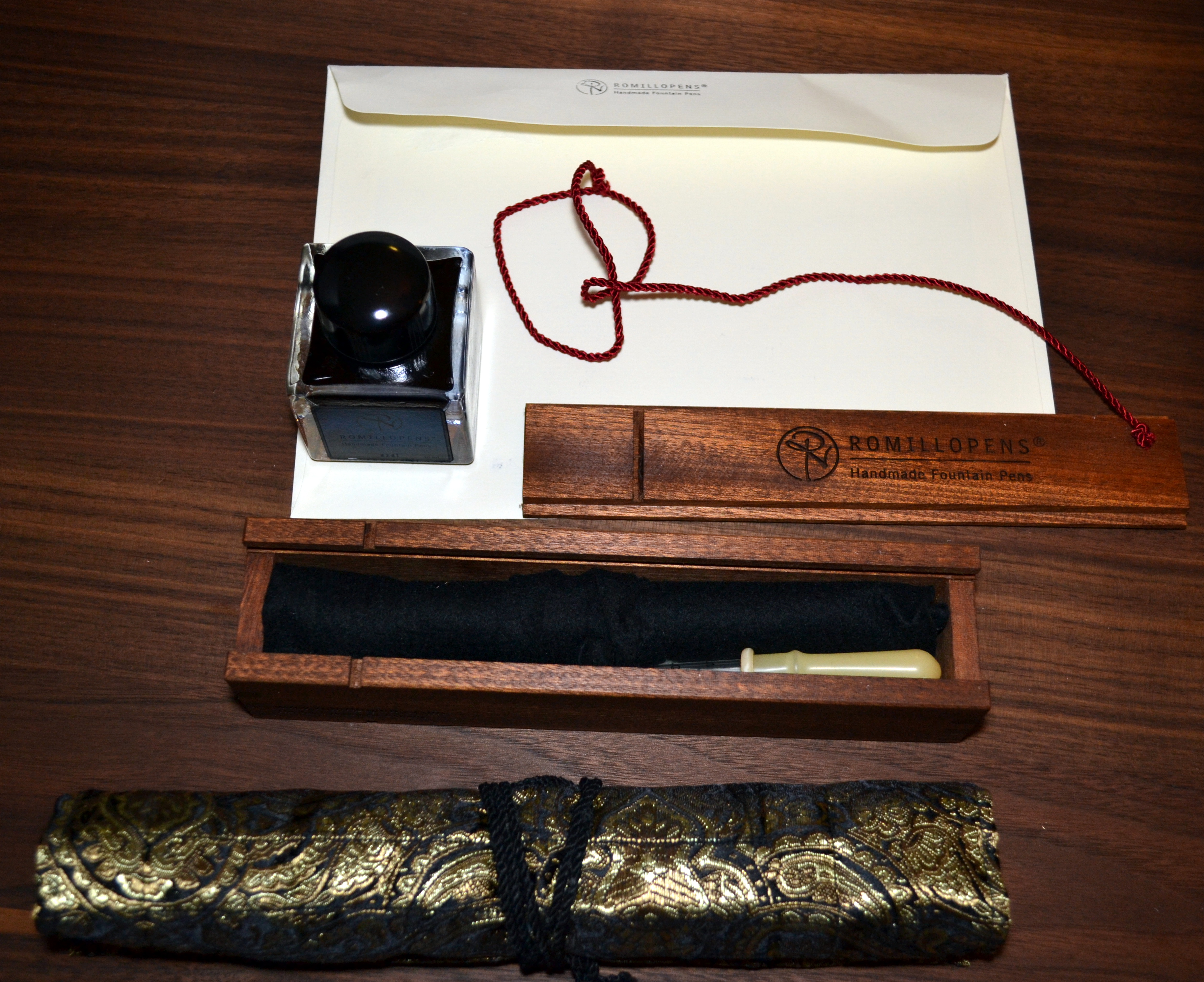
The packaging and presentation was really nice:
Warrant information, certificate with all the pens information, and two nib test pages.A beautiful wood box containing the pen, eye dropper and instructions, as well as a bottle of ink (which leaked a bit), and a nice pen wrap.
So far I am loving the pen…I will give a full review once I have more time with it.
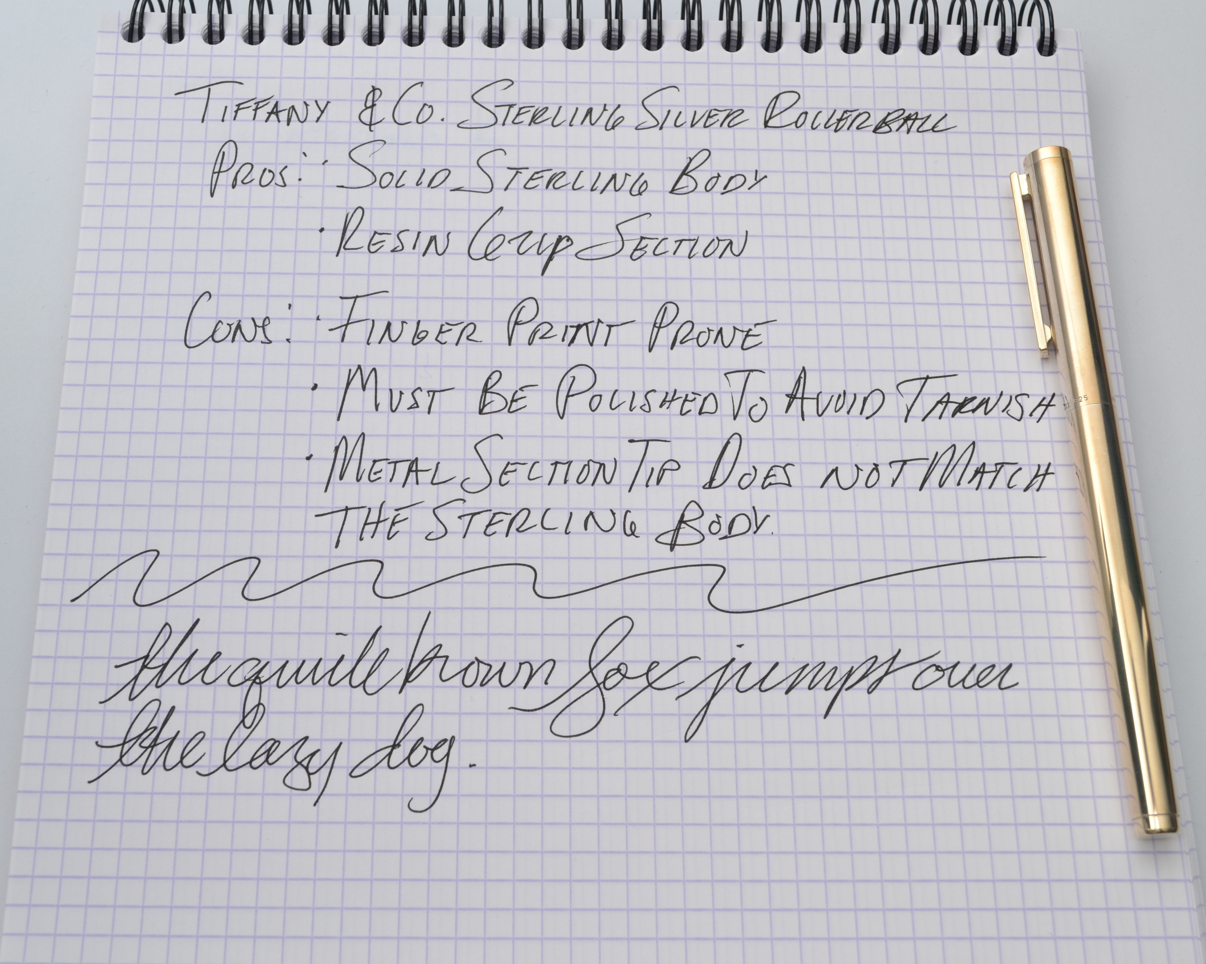
I received this pen as gift and while it was a lovely gesture, I didn’t like the pen. Touching a perfectly polished piece of sterling silver was unpleasant for me. I tried using it but found that I was spending more time polishing it with the robin’s egg blue Tiffany sleeve than actually writing with it.
Recently, upon cleaning out some drawers I found the pen again and started using it. This time I told myself I wouldn’t endlessly try to polish the pen I would just use it.
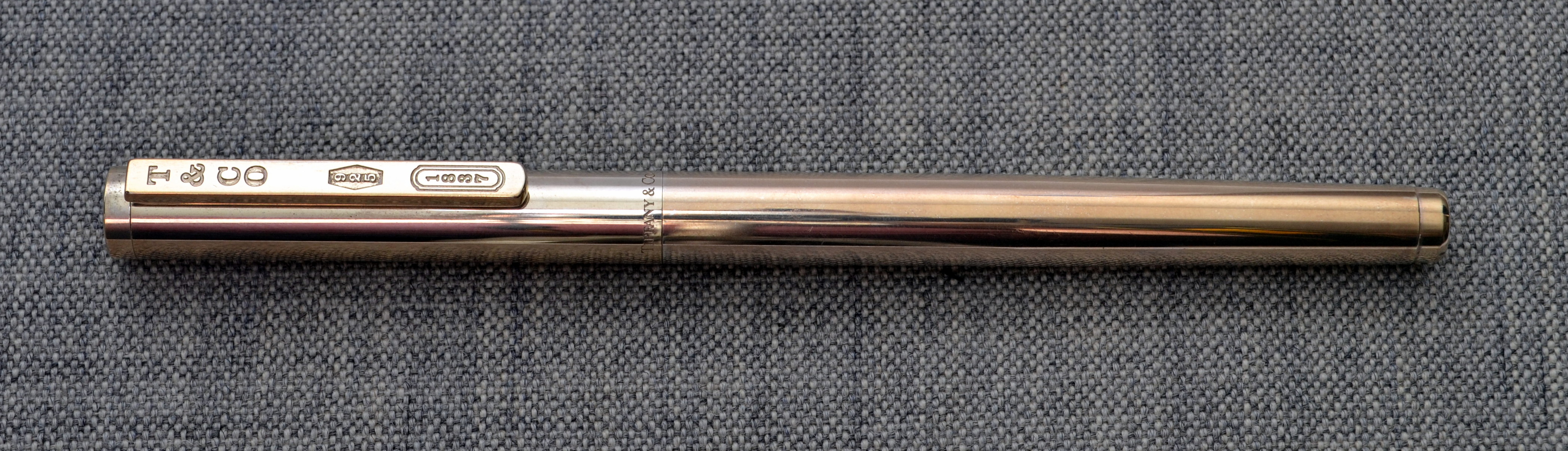
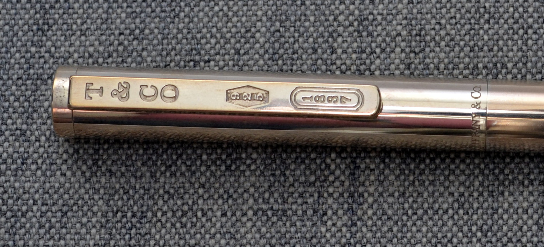
The pen is a very simple straight sterling silver cylinder with a clip that has been engraved “T & CO”, “925” (92.5% silver), “1837” (Tiffany’s founding year). Around the bottom of the cap reads “Tiffany & Co. 925” and “Germany”.
The pen weighs 27.4 grams and measures 14cm long and 1cm wide. This is a pretty thin pen but I have found it comfortable enough to write with for a longer period of time.
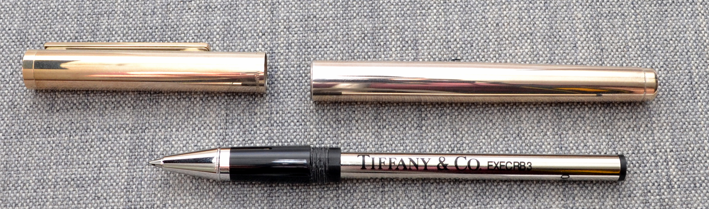
I believe that this pen is manufactured for Tiffany & Co. by Waldmann of Germany. The grip section is a seamless resin with a stainless steel (?) point that does not match the sterling silver on the cap and barrel. It is quite noticeable to me that these two silver colored metals do not match.
The Tiffany branded Schmidt rollerball refill writes well but it’s nothing noteworthy. I am going to see if I can find a fineliner refill for this pen.
The more I use the pen the more I like sterling silver as a pen material. Sterling silver evolves sort of like a urushi lacquer and I like that.
From what I can tell these pens cost about $200 which isn’t a terrible price for solid sterling silver though this isn’t something I would buy for myself but I like it nonetheless.
I think I see a sterling silver Yard-O-Led fountain pen in my future.
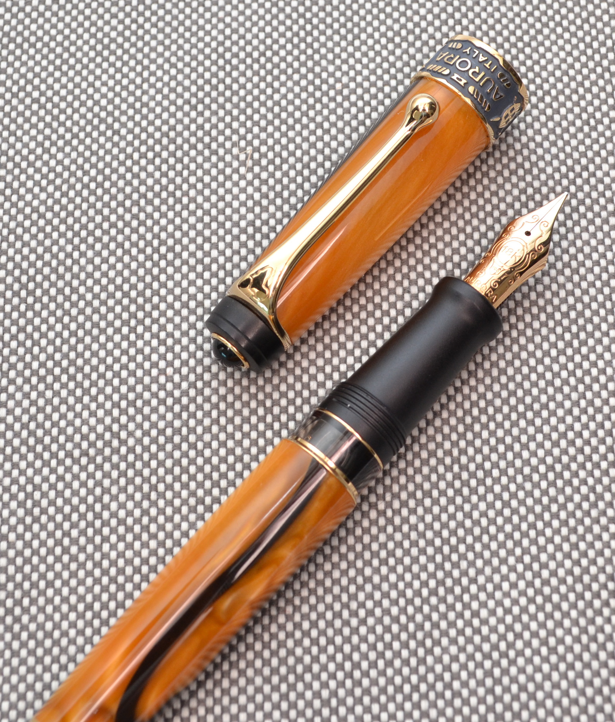
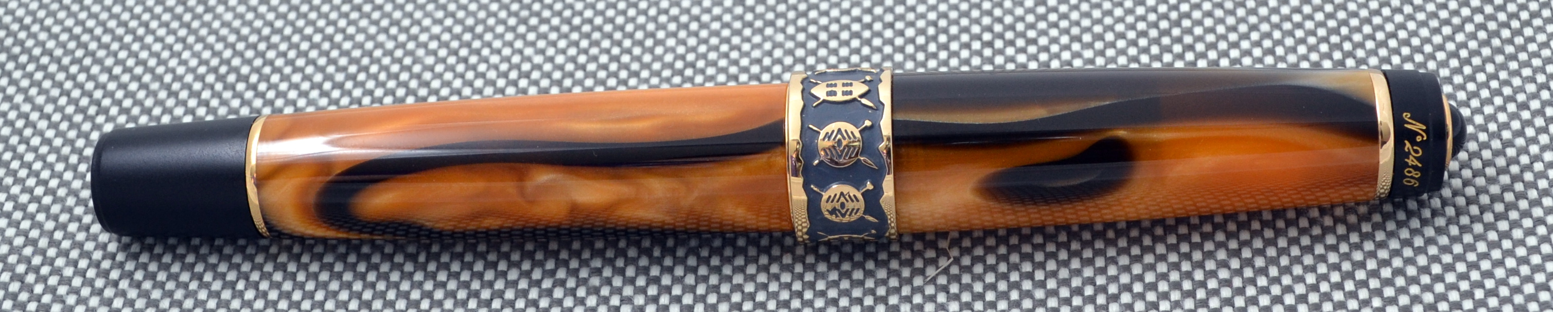
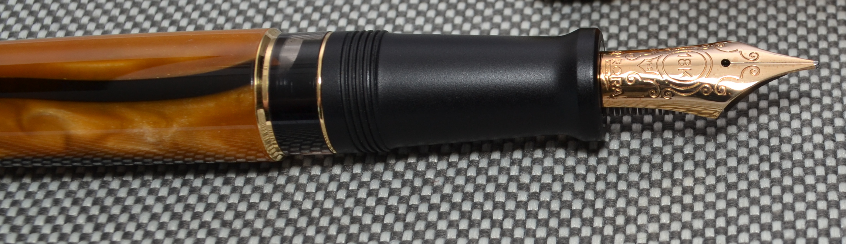
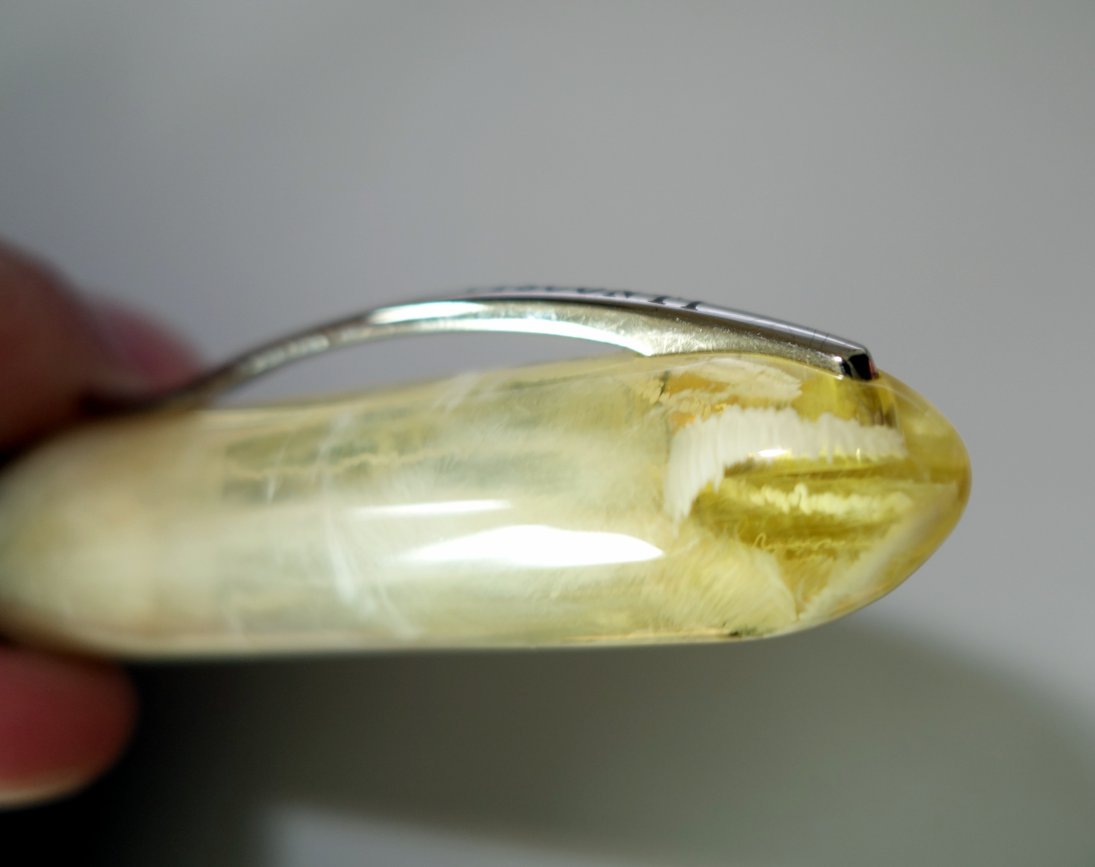
The Aurora Afrika is the first in Aurora’s Continents series of limited edition pens. Each pen is based on Aurora’s top-of-the-line Optima, which is one of my favorite modern fountain pens. Aurora produced 7,500 Afrika fountain pens and I have acquired No. 2486.
Appearance
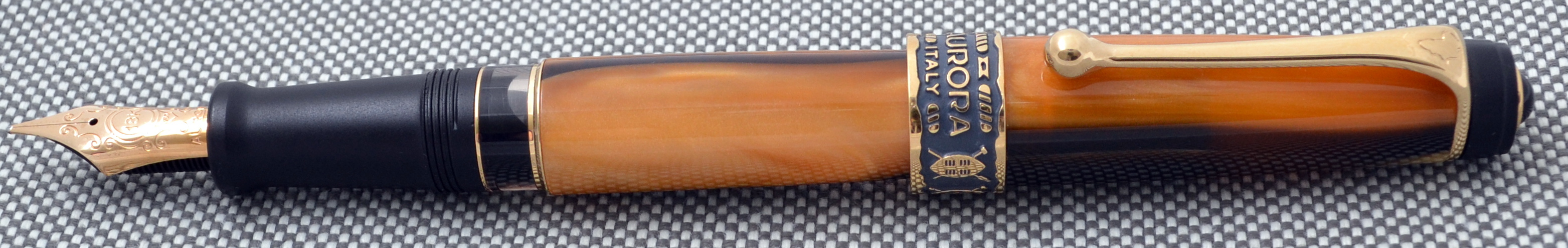
The Afrika looks like an Optima but with some key improvements. The shiny black resin section and end caps have been replaced with matte black resin. The cap ring has been improved with a deeper and more intricate engraving that provides much more contrast.
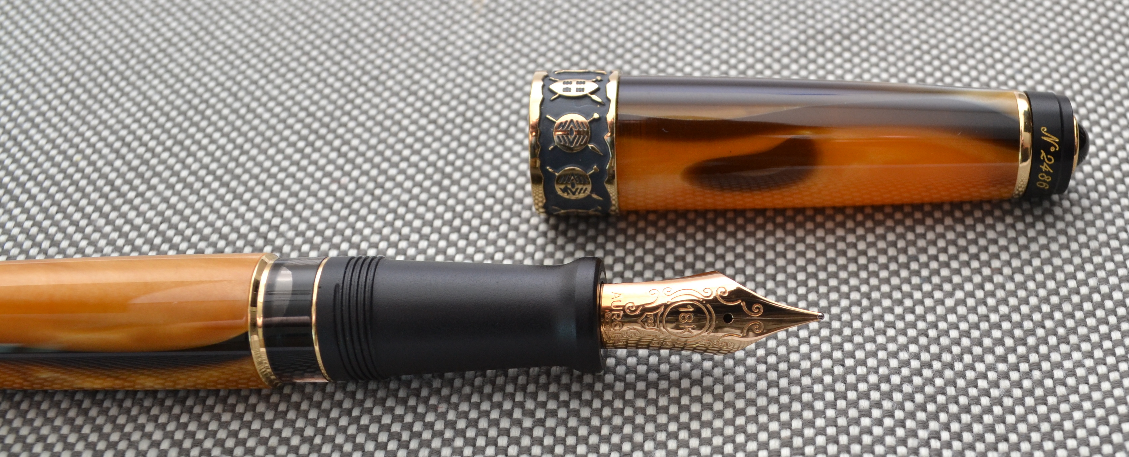
The clip is engraved with the shape of Africa and the finial is engraved with the pen’s number and features a “precious deep-black Onyx”.
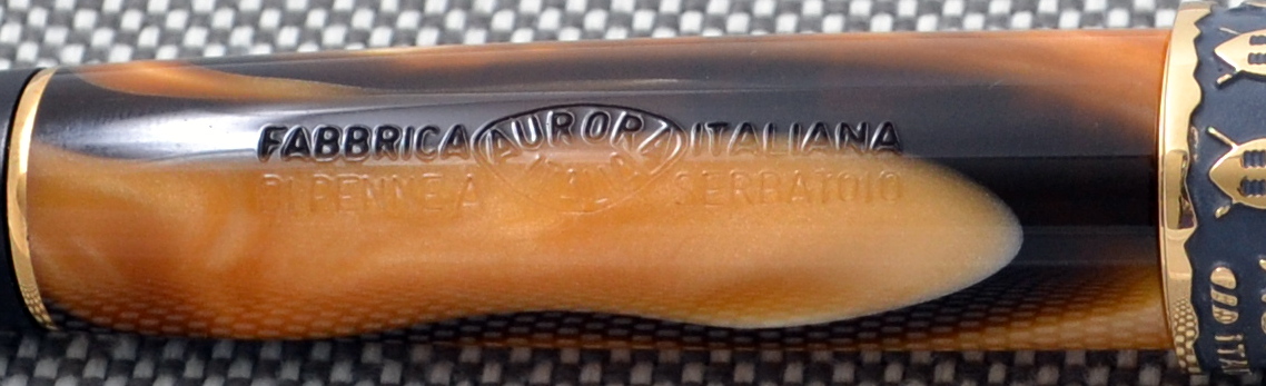
The body is made out of a marbled “Land of Afrika” resin that is a gorgeous orangish gold color with black swirls. This resin has a lot of depth, much more than an “Auroloide” Optima.
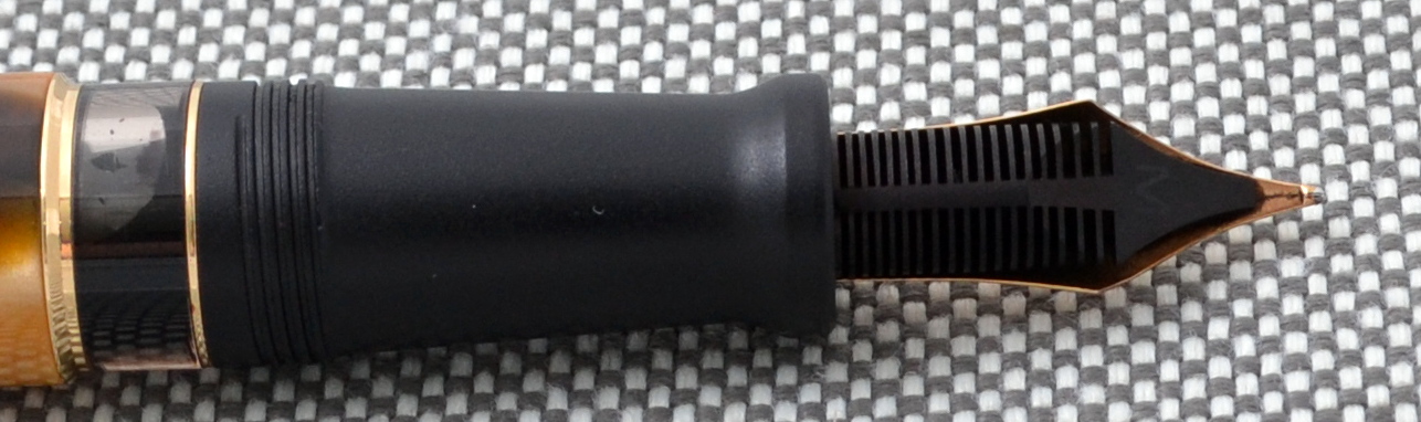
The large and beautiful 18kt gold nib shares the same design as the Optima and other high-end Auroras.
The design of the Optima is uniquely Aurora and while it looks like no other pen, I do have to admit that its stocky appearance has not always been my favorite. With some key enhancements the Afrika has more than just a great personality, it has a beautiful face as well.
Score: 4.5/5
Build Quality
Let’s start with a confession; I recently broke my Aurora Optima. The piston knob came off. I set the pen down with the piston unscrewed to attend to something else and when I came back to it I suspect that I turned it the wrong way without thinking and off it came. This is the first pen I have broken in very long time, ten years maybe. It is now on holiday in Italy for the time being.
It is possible that the glue failed but I am waiting to hear Aurora’s assessment before I make any judgements.
For all intents and purposes the Afrika is of the same build quality as the Optima. The engraving on the cap ring is the only thing that stands out to me as an improvement…the other differences I sighted in the appearance section are merely a more tasteful selection of materials and design choices.
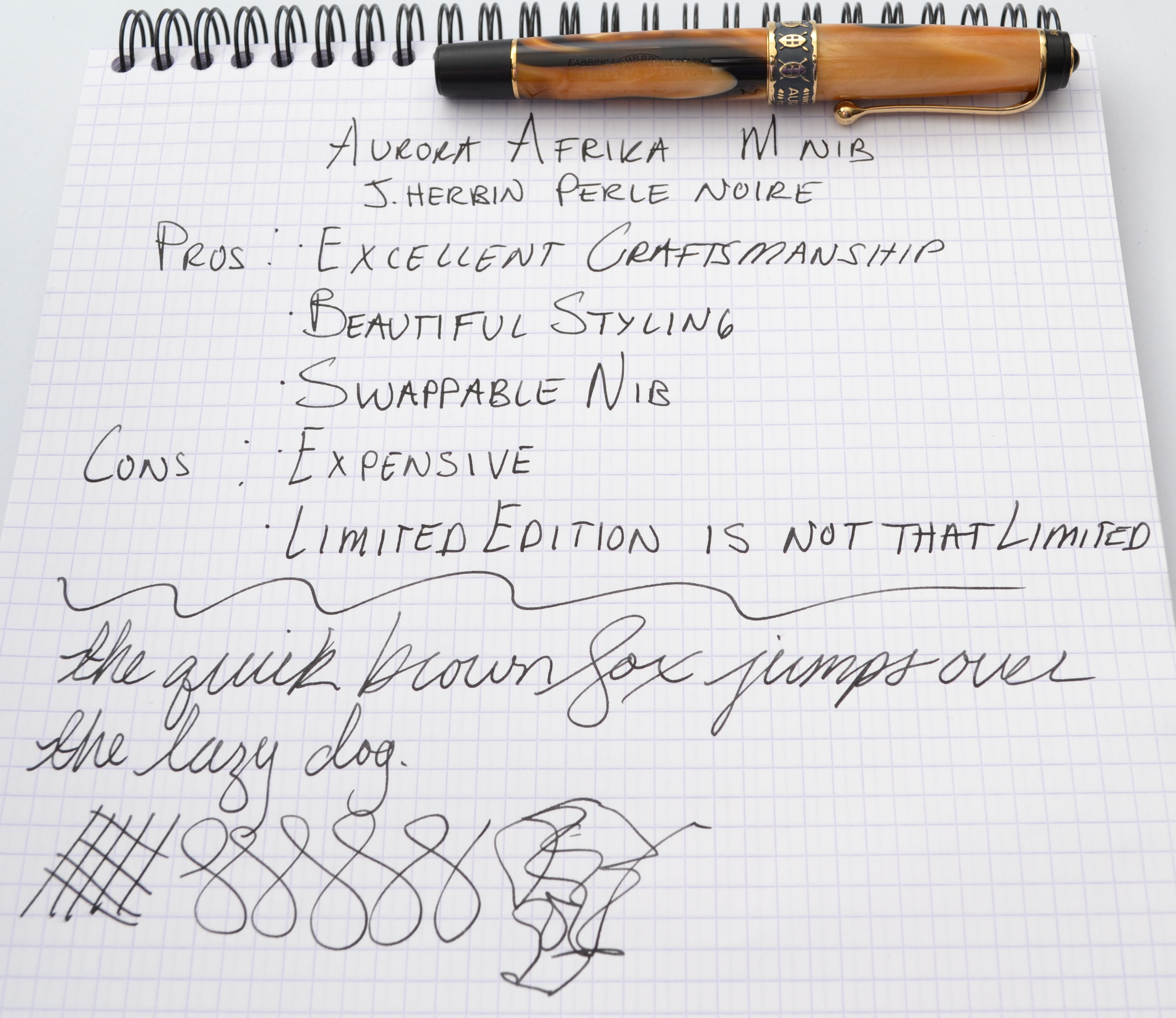
Note the different African tribal shields.
Even though I broke my Optima I still believe that it is one of the highest quality fountain pens money can buy. Like the Optima, the Afrika has the smoothest piston mechanism I have used and the fit and finish are flawless. Aurora makes their own nibs in-house and uses solid ebonite feeds…I don’t think there is more that I can ask for.
Score: 5/5
Size & Weight
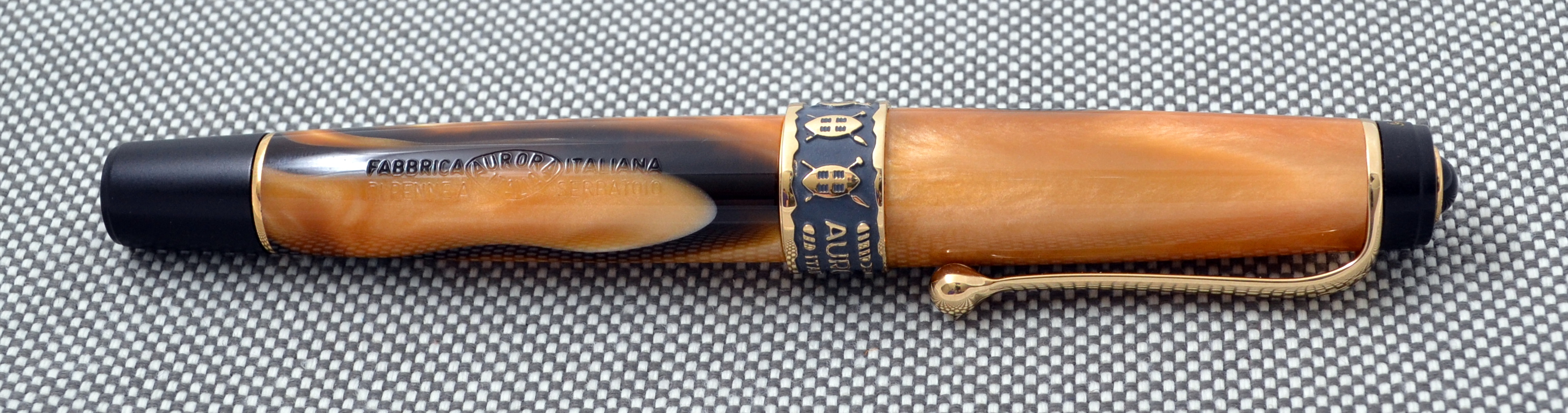
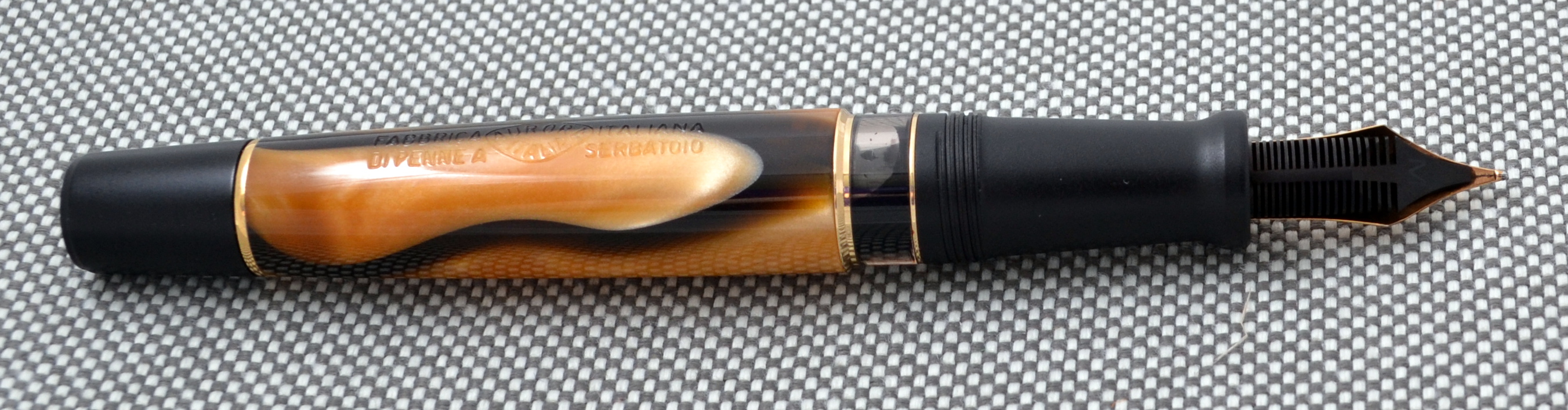
The Aurora Optima first appeared in the late 1930s as a competitor to my favorite vintage pen, the OMAS Extra Lucens.
One of the things that Aurora got right that almost all vintage Italian makers missed was girth. Aurora made fat pens. Anything other than the senior and oversized models from OMAS, Ancora, Montegrappa, Columbus and so on are too skinny for me to use comfortably but the medium and small Auroras are comfortable because they are fat.
The Afrika takes after the vintage Optima’s 1930s proportions. Measuring just 5.1” with a section diameter of 0.4”; that’s the same size my Nakaya Naka-ai and my OMAS Paragon which each measure almost 6” long.
Notice how much of the body is the section compared to the OMAS above.
The section is fat but unlike my Nakaya and OMAS the grip section is also very long which makes the Afrika (and Optima) one of the most comfortable pens on the market. The section is big enough to accommodate almost any grip style.
The Afrika is ever so slightly heavier than the Optima weighing in at 22.2 grams which still makes the Afrika a lightweight pen by any measure.
When it comes to size and weight the Optima is appropriately named….it gets everything right (as does its African sibling).
Score: 5/5
Performance
As I mentioned earlier, Aurora makes all of their nibs in-house and as such their nibs feel different than any other manufacturers. Aurora’s obliques, stubs and italics are sharper than any other big brands I have come across.
Aurora’s round pointed nibs have more feedback than most other quality brands as well. They are more or the less the opposite of the buttery smooth nibs Visconti is known for and as such Aurora’s nibs can be polarizing.
People love them or hate them. I for one like the feedback because it helps me slow down my cursive and really focus on properly forming my letters (don’t look at my writing sample)….if a Visconti nib is a rollerball (which slides all over the place) the Aurora is like a pencil…you feel in control.
My Optima has a 14kt gold nib and the Afrika has an 18kt gold nib and while the design and shape are all the same I have noticed some differences using a small sampling of each. Both nibs are nails…one isn’t more flexible than the other but the 18kt nibs seem to have a finer line width than the 14kt gold ones that I have tested.
The ebonite feed holds a lot of ink thanks to it’s many fins.
Another great thing about these nibs is that they can be easily swapped. The nib units unscrew out of the sections just like Pelikans do and with Aurora’s wide range of exotic nibs there is a lot to chose from. I should warn you though that their nibs are expensive. Street price for the 18kt gold nibs are $420 ($440 for italics, stubs and obliques). The 14kt gold nibs are $300 ($320 for italics, stubs and obliques).
All of my Aurora pens have been flawless performers out of the box and the Afrika is no exception.
Score: 5/5
Filling System
The Afrika is a piston filler that holds 1.1ml of ink which is more than most converters but less than many full sized piston fountain pens. The Afrika also features Aurora’s “reserve tank” technology. When the pen runs out of ink you twist the piston knob all the way and the “reserve tank” is activated, allowing you to write for a couple more pages.
Personally I find the reserve tank annoying. It makes it difficult to clean the pen and change ink colors because with the piston fully depressed there is still water or ink left in the pen by design.
Score: 1.5/5
Value
Aurora recently raised their prices and the Afrika now retails for $1,075 but these pens can be found new in box on that auction site for around $350-$400. I picked up mine used for about $250 which is oddly less than you can get a used Optima for (these pens seem to be under the radar for the time being).
The authorized dealer street price is about $860 which when compared to a Montblanc 149 doesn’t seem crazy but the 149’s $935 price is only justified by people who view it as a status symbol and that’s something the Aurora cannot offer.
Also I should point out that the Afrika is a limited edition of 7,500 pieces and even though this pen has been out for more than 5 years Aurora dealers still have brand new inventory to sell. It seems as though Aurora made too many and is asking too much.
Score: 3/5
Bottom Line
The Afrika is truly sublime and presents a tremendous value on the secondhand market.
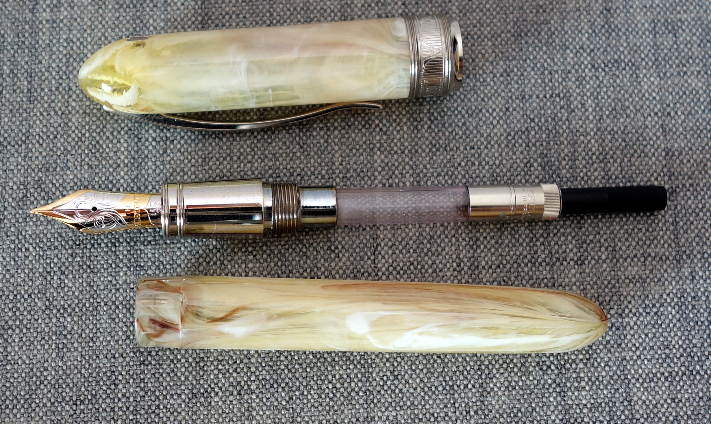
The Visconti Van Gogh was one of the very first gold nib fountain pens I owned. I purchased this pen new from World Lux in 2002 for just under $200. I should note that this is the original Visconti Van Gogh and it differs from the newer versions in a variety of ways. First off it only came in the “Maxi” size at a 14.5 cm capped and was simply called the “Van Gogh”. Other differences include a solid 14kt two-tone nib (instead of steel) and a “3 K” locking mechanism on the cap (instead of being magnetic) and a round (instead of faceted) body.
Appearance
The Visconti Van Gogh is a stunning pen, especially in the vanilla resin; it works beautifully with the two-tone nib and the silver trim. This is a large and shapely pen that attracts attention.
The pen is somewhat translucent allowing you to see into the barrel and the cap. I picked this one over a couple of other vanillas because this had an unusual “crystalized” part on the top of the cap.
One of the things I dislike about this pen’s design is the screw on the back of the cap…I cannot think of any other pen in this price range with an exposed screw. To me it’s a bit of an odd choice.
Score: 3/5
Build Quality
The Van Gogh is not a cheaply made pen; the fit and finish on the pen (including that exposed screw) are very well done. Visconti built the Van Gogh with high quality materials and used a large highly modified ( read expensive) Bock nib. In the last 12 years the silver trim has aged a bit and is in need of a good cleaning.
The “3K” locking system was developed by the automotive industry and it allows you to secure the cap with a short twist. You can take off the cap with one hand; something you wouldn’t be able to do on a normal threaded cap. To my knowledge Visconti discontinued the use of this locking system because it put too much stress resin causing the caps to crack. This is an oversight that Visconti rightly corrected though I am sure proper testing would have avoided this whole debacle.
Score: 3/5
Size & Weight
The Van Gogh is what I would consider an oversize pen, measuring a whopping 14.5 cm capped and 13.75 cm uncapped. At it’s widest point it is 1.5cm and it weighs 31.5 grams. This pen has a heavy cap and for me it is most comfortable to use uncapped. Uncapped the pen is a bit nose heavy but I have found it comfortable to use for long writing sessions.
Score: 2/5
Performance
The 14kt gold nib has been a strong and reliable performer for me. The nib has been prone to “singing” which some people will find annoying. The medium point is quite fat, even for a European pen. The ink flow is wet and definitely not suited to cheap papers.
Score: 3/5
Filling System
The Van Gogh uses a standard size cartridges and converters, though the converter does need to be threaded. Somewhere along the way I lost the Visconti one and have replaced it with a threaded Waterman converter.
Score: 3/5
Value
When I bought this pen in 2002 for under $200 it was an excellent value as you got a beautiful large Italian fountain pen with excellent fit and finish in addition to a large 14kt gold nib. I am not sure I could recommend anyone buy one of the original Van Goghs because of the cracking issue…mine has lasted but other’s have not.
Score: 2/5
Bottom Line
The Van Gogh is a big an beautiful Italian pen but a design flaw in the cap’s locking system makes it hard to recommend.
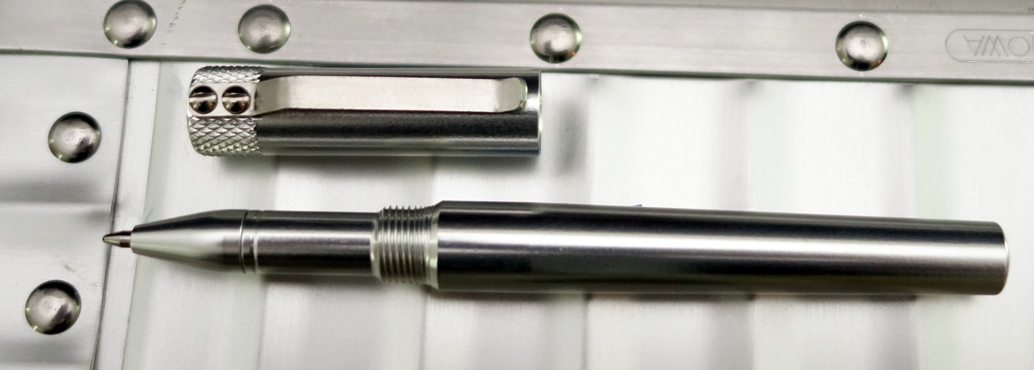
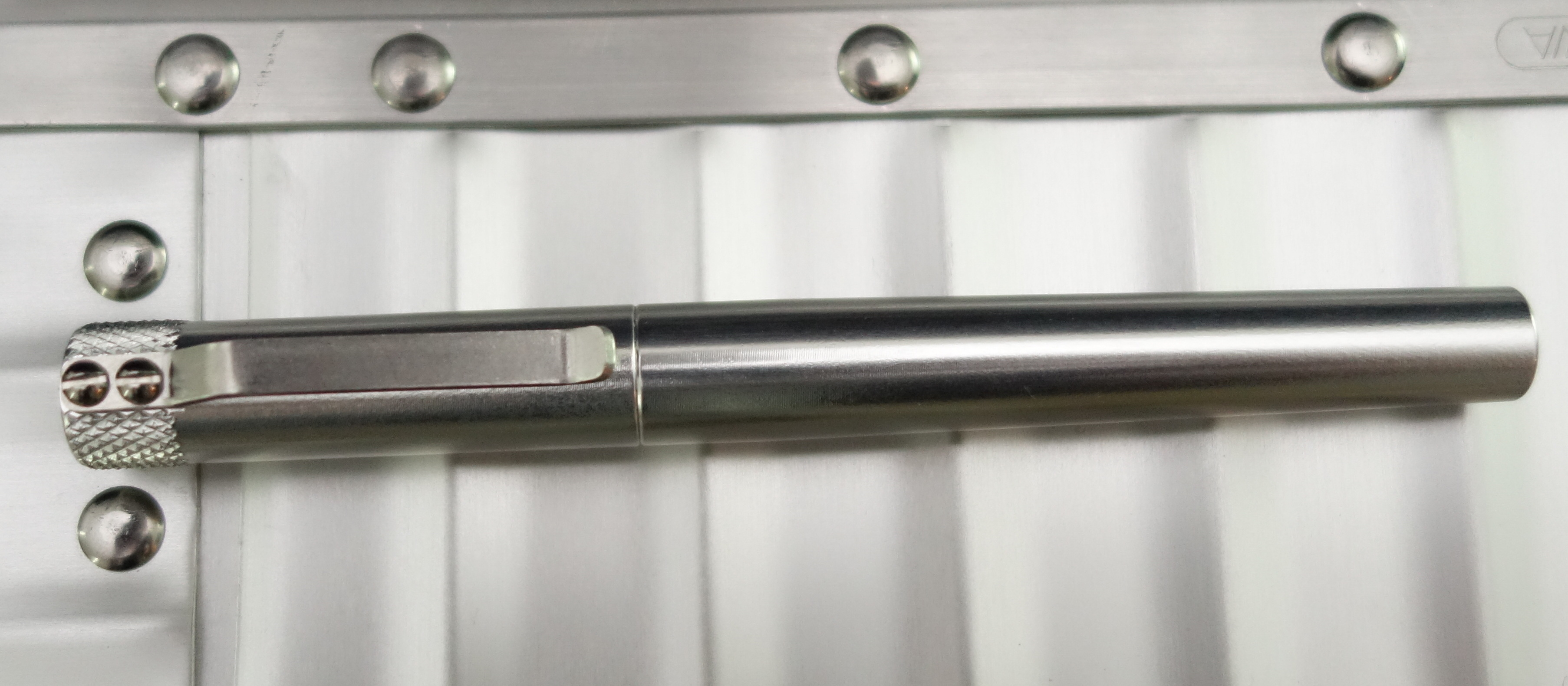
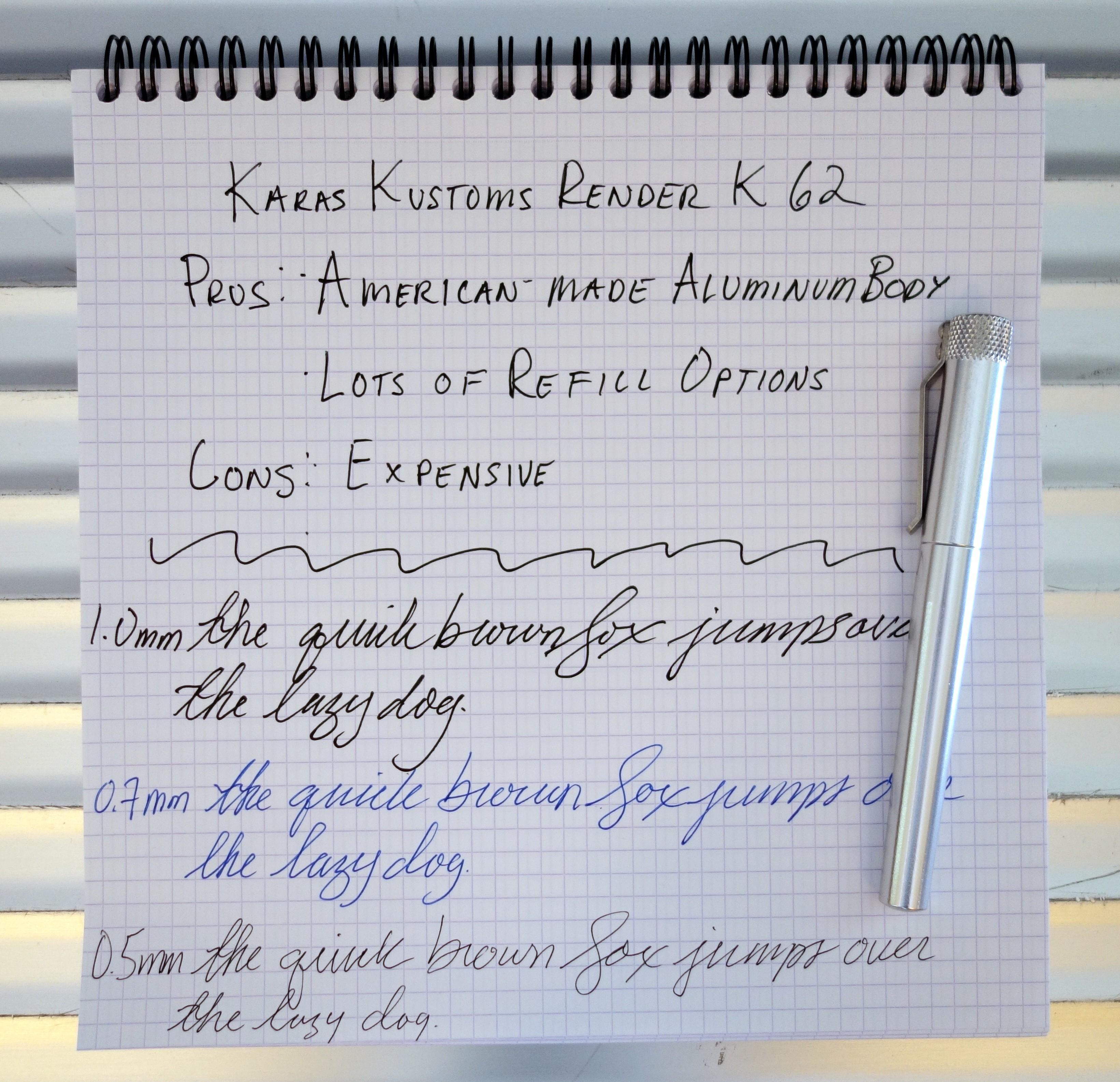
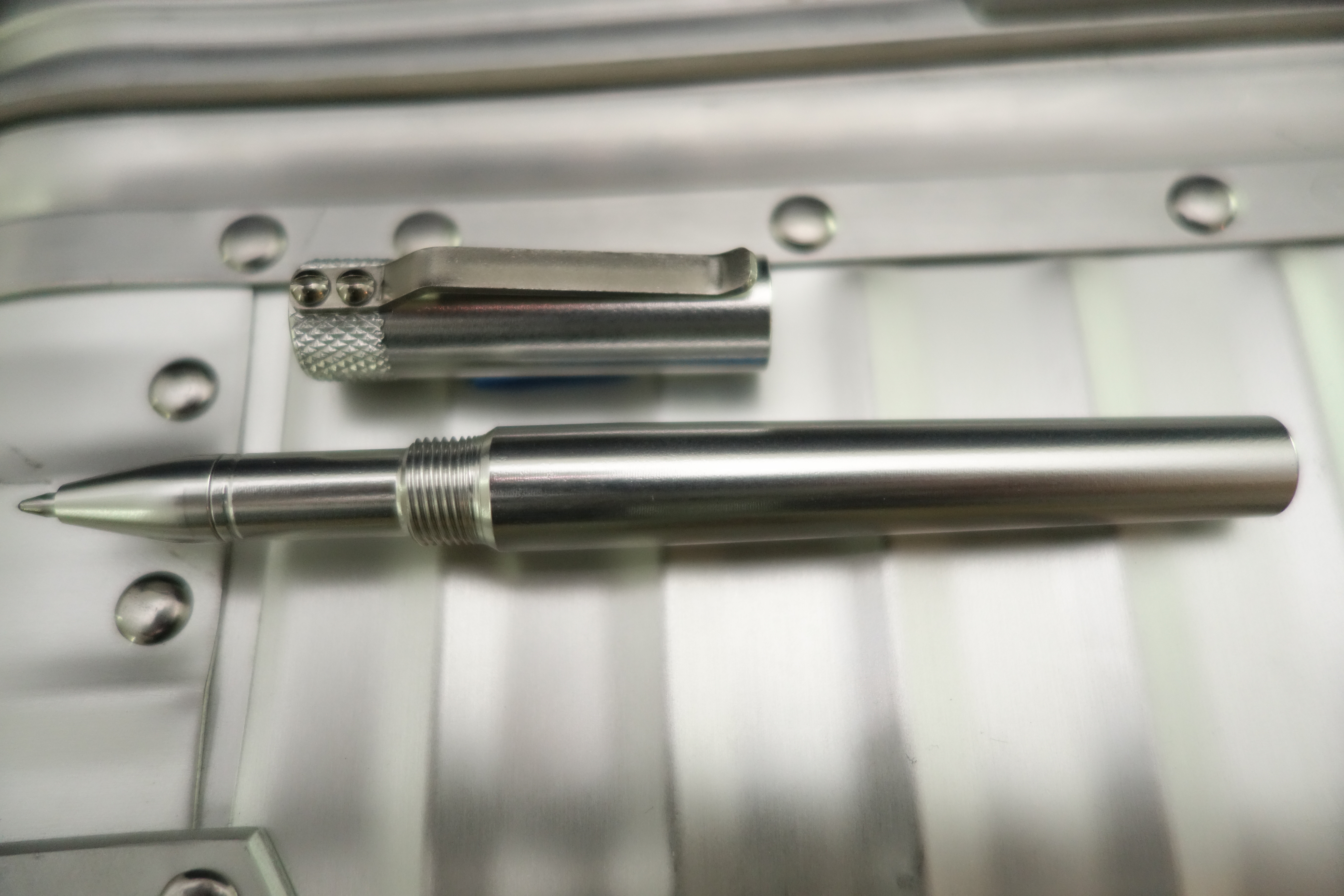
In the last few years a lot of interesting pens have come to the market via Kickstarter and one of the most appealing pens launched is the Render K by Karas Kustoms. I am a bit late to the game on this one but nonetheless it remains a simple and beautiful pen that is worthy of your attention.
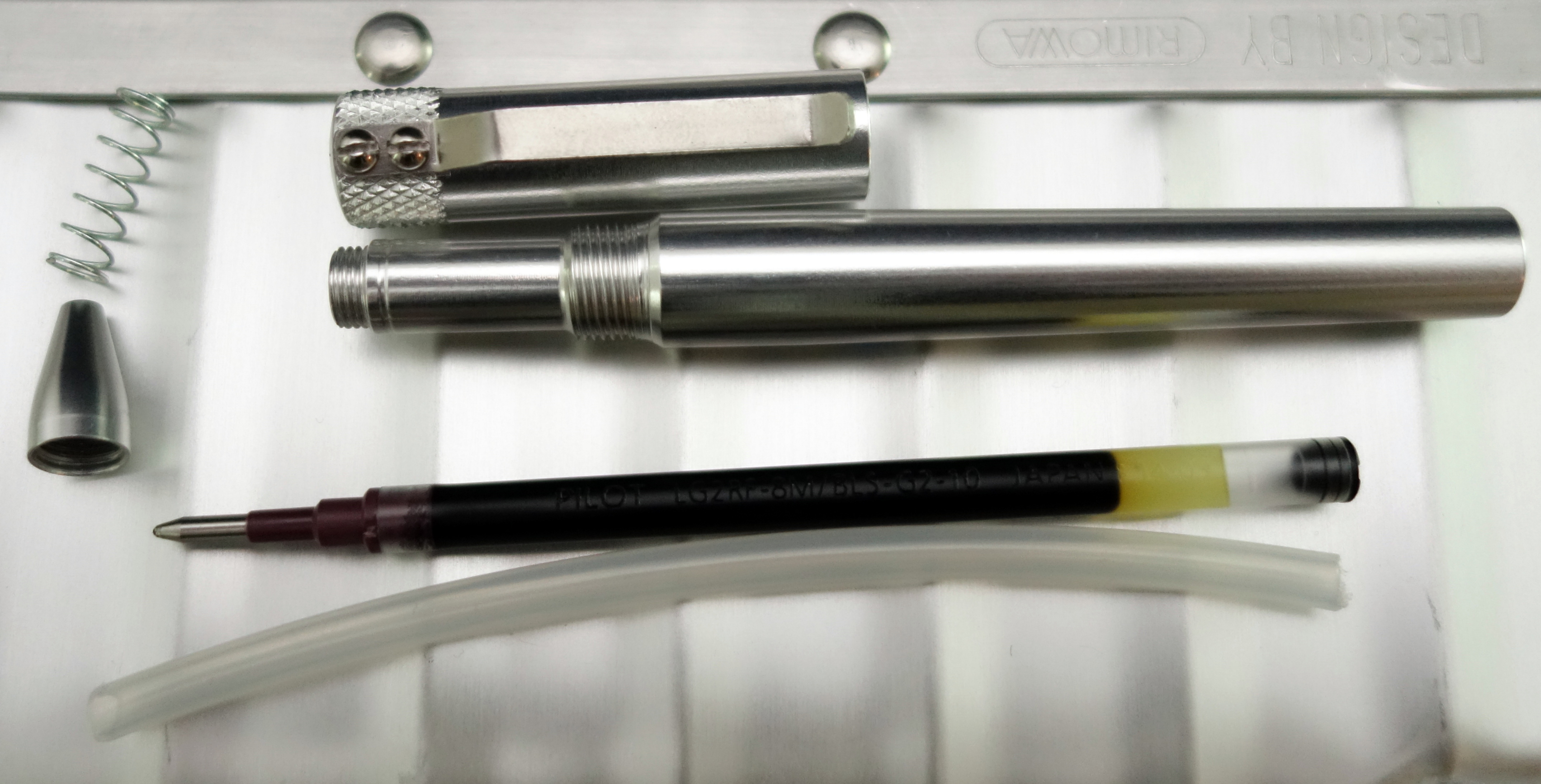
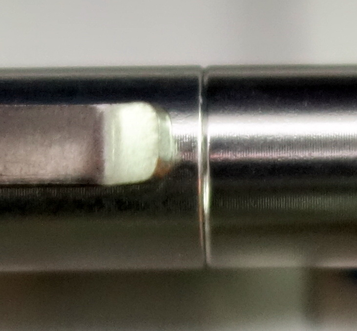
The Render K is an American-made pen crafted out of solid aluminum. The original (Kickstarter launched) Render K utilizes Parker-style refills that provides customers with an enormous range of refill options. The Render K G2 is designed to take the ultra popular Pilot G2 refill. Without modification I have been able to use Montblanc rollerball and fineliner refills in the the Render K G2.
The pen is sold without a refill because the manufacturer want’s you to choose the refill that suits you best. The pen comes with a piece of plastic tubing that is designed to be cut to accommodate other refills that maybe a bit too short for the Render K G2 unmodified.
The Render K’s metal body and knurling on the top of the cap reminds me of the Retro 51 Tornado Lincoln Copper fountain pen I reviewed earlier this year. The Render K’s minimalistic design is very attractive; there is no ugly branding or unnecessary fluff to clutter the design…it’s pure function.
Capped the pen measures just over 5″ long and weighs 34.4 grams with a Pilot G2 refill installed.
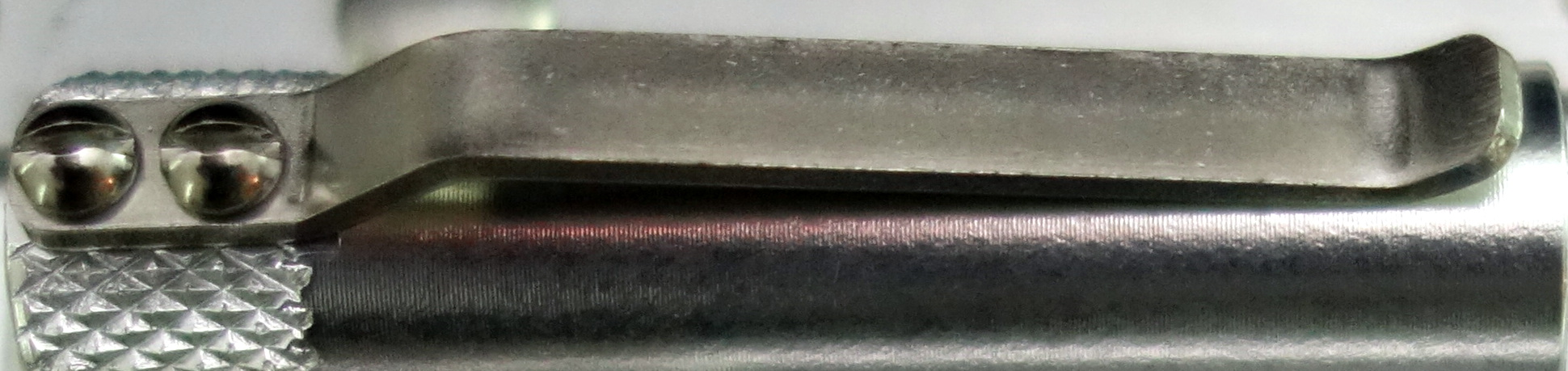
On many pens I find the clip to be a weak point; I have bent dozens of them by clipping them to my pants pocket or notebook. The stiff stainless steel clip on the Render K is ultra strong and because it is secured by two exposed screws it can be easily replaced if you happen to damage it.
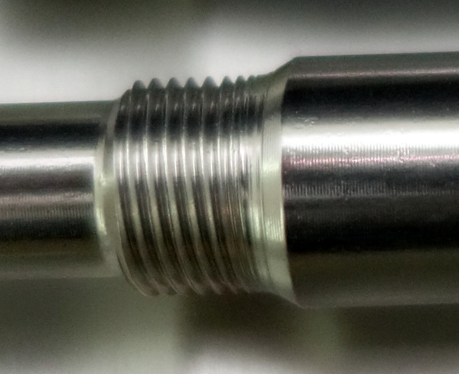
I have been using the Render K for a couple of days now and it’s a strangely satisfying pen. Screwing the cap onto the body reminds me of screwing a nut on to a bolt; the feel is very similar and I love it.
I am also quite fond of how tight the cap fits on to the body when fully screwed on…it’s lovely.
The standard aluminum Render K G2 sells for $45 and comes in various colors. The Render K G2 is also made in solid brass for $65 and solid copper for $95. Overall I am impressed by this pen, it’s enjoyable to use and built to last. It’s not cheap but for a high quality piece of American craftsmanship, it’s not hard to justify the price.
Please note: this pen was provided to me at no charge by Karas Kustoms for purposes of review.
Here are some great reviews of the Render K (original and G2):
(I have no affiliation with the sites linked below)
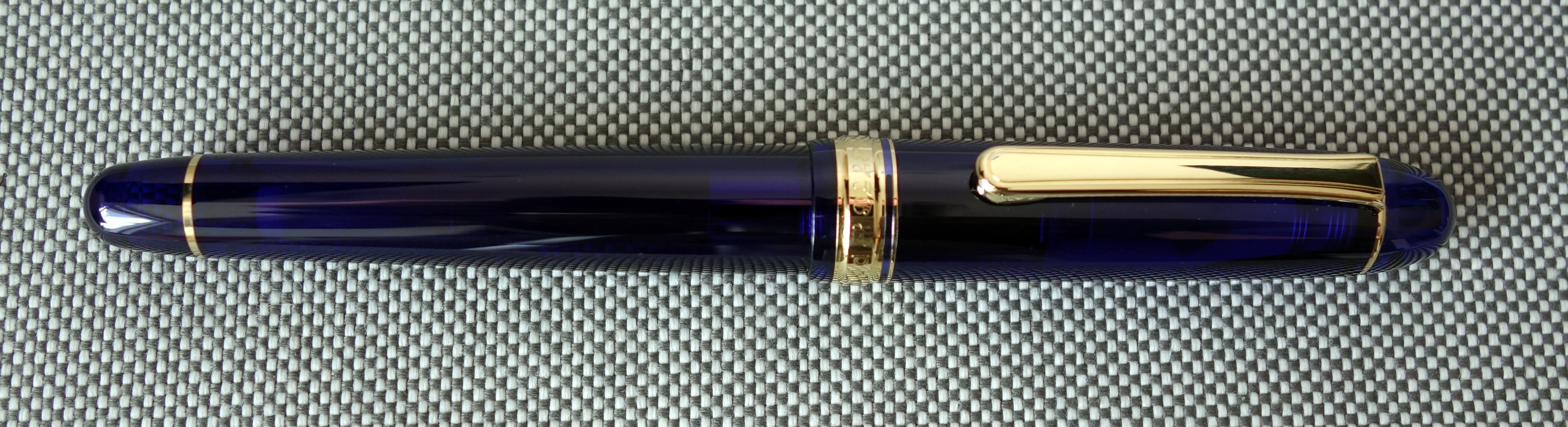
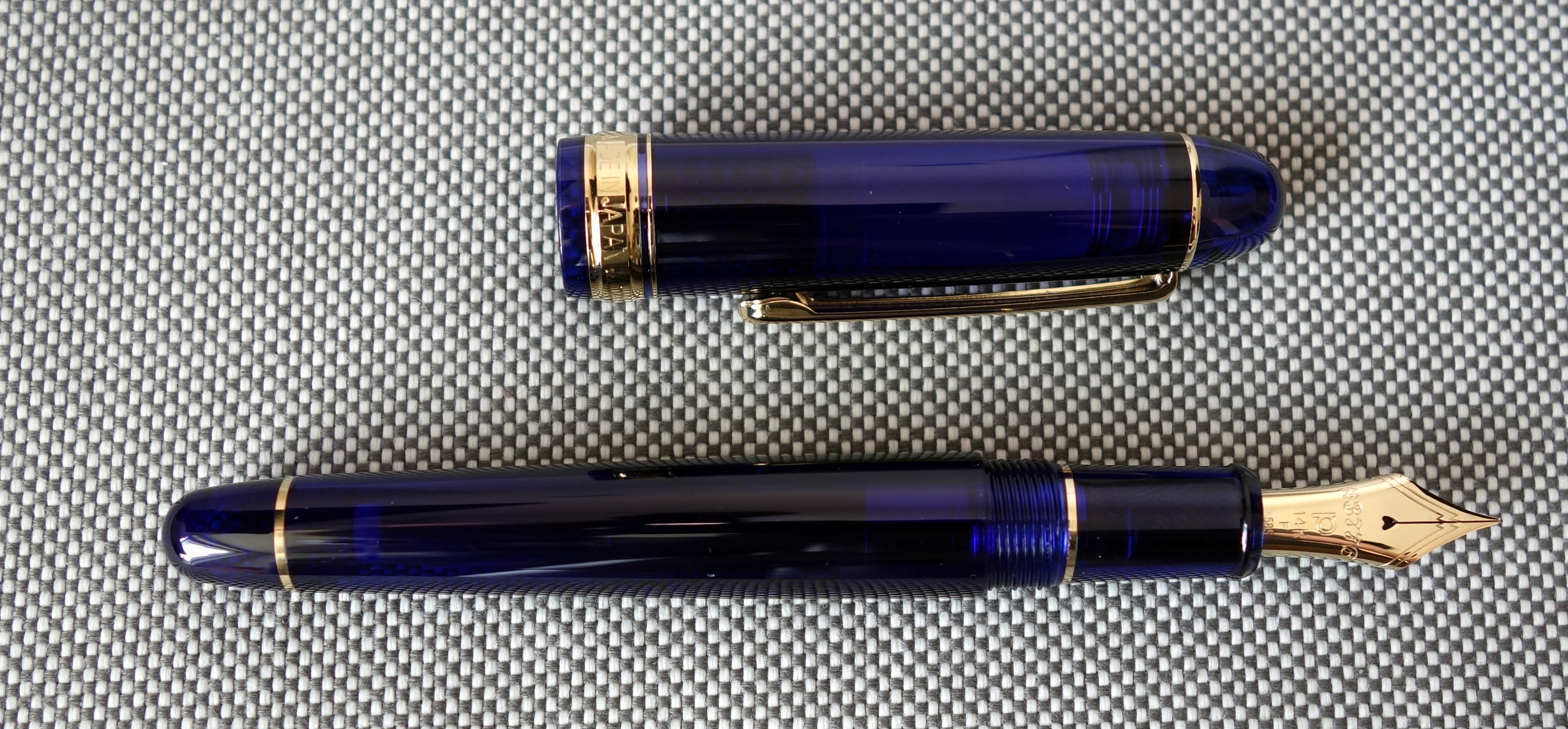
On specifications alone the Platinum 3776 fountain pen is a winner; it’s affordably priced and it features a full-sized body and solid gold nib…what’s not to love?
Appearance
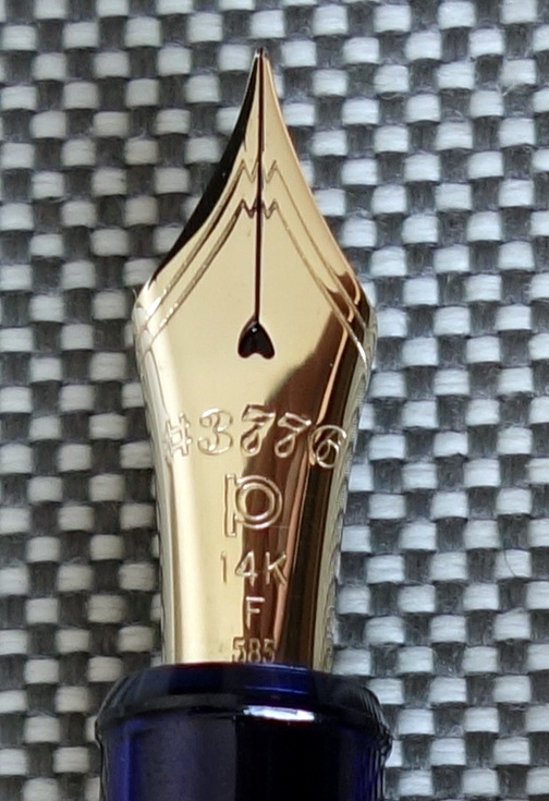
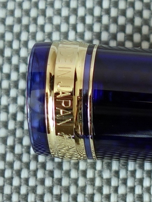
There are a lot of Japanese Montblanc look-alikes but the Platinum 3776 takes the cake with its mountain theme. The streamlined design and gold furniture are all very similar to a Montblanc Meisterstück. If you look at the nib of a Montblanc Meisterstück you will see the number “4810”; this number represents the height (in meters) of Mont Blanc in the Graian Alps. What do you suppose “3776” refers to? It’s the height (in meters) of Mount Fuji.
The nib features a mountain design with “#3776” right in the middle.
When you put the Montblanc similarities aside the 3776 is a pretty plain looking fountain pen.
The Chartres Blue body is translucent but not clear enough for this pen to truly be considered a demonstrator. I quite like the Chartres Blue body because it allows you to see the innovative “Slip & Seal” cap mechanism that prevents the pen from drying out. Supposedly you can leave this pen inked for 24 months without problem…I don’t want to test that, so I will take Platinum’s word for it.
You can see the spring portion of the “Slip & Seal” mechanism through the cap.
The 14kt gold nib is large and shapely; it’s a much more agreeable size than similarly priced Pilot Custom 74.
While the 3776 has a well proportioned, modest and understated design, it isn’t going to win any style awards. At the end of the day this pen has a boring unoriginal appearance.
Score: 2/5
Build Quality
The build quality of the 3776 isn’t bad. There are seams in the plastic but everything fits together as it should and the use of the “Slip & Seal” mechanism shows that Platinum isn’t just pushing out cheap Montblanc lookalikes.
The gold plated trim matches the color of the solid 14kt nib.
I compared the 3776 to the similarly priced Pilot Custom 74 and to my eye the engraving and the overall fit and finish of the gold furniture is better on the Pilot BUT the gold trim on the Pilot is much more yellow than its 14kt gold nib…so you kind of have to pick your poison: mismatched nib and trim or cheaper looking engraving?
Score: 3.5/5
Size & Weight
The 3776 measures 5.5” capped and 4.7” uncapped. The pen weighs a comfortable 24.3 grams. It is an agreeable size that most people will find comfortable. The pen posts well and has a good balance posted or unposted.
Score: 4/5
Performance
The fine nib on the 3776 is a phenomenal performer and in my opinion it is the reason to buy this pen. Being Japanese the fine point is an extra or extra extra fine by western standards but despite this the nib is smooth and a real pleasure to use. I haven’t noticed a single skip or hard start since I began using this pen four months ago.
The nib is pretty stiff so you wont be seeing much in the way of line variation.
Left to right: Pilot Custom 74 Music Nib, Nakaya Naka-ai Negoro nib, Platinum 3776 nib. Notice that the similarly priced Pilot has a much smaller nib.
This is the same nib that is used on $500+ Nakayas. In the sub $100 range I don’t believe you can find a better performer.
Score: 5/5
Filling System
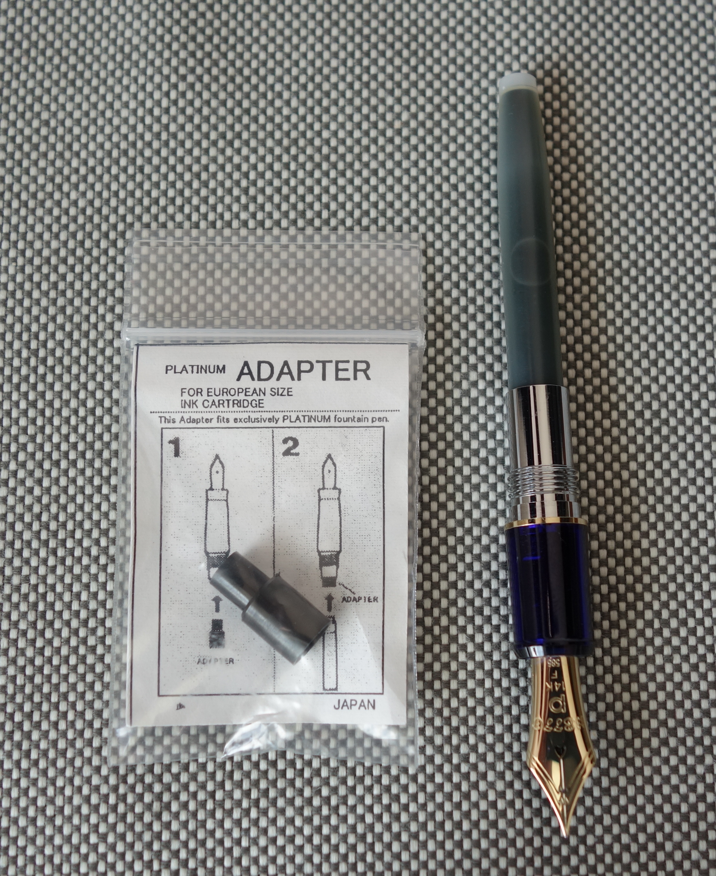
The Platinum uses a proprietary cartridge converter filling system but for $1 you can buy an adaptor that will allow you to use international cartridges.
Platinum cartridge installed.
In Japan, the 3776 is sold without converter but in the US it is sold with the same Platinum converter you get with a Nakaya and I have to say its one of the nicest converters out there.
Score: 2.5/5
Value
I bought my 3776 new in Japan for about $80, which is an awesome deal for a pen with a phenomenal 14kt gold nib. The US street price is about $175 ($220 retail). I am not sure why it is so much more money in the US but you can buy a new one on eBay from Japanese sellers for $90 (I haven’t tried this but it’s what I would do if I were to buy one again).
Score: 4/5
Bottom Line
This is a sleeper pen, boring looks but with a monster performer under the cap.
Waterford is synonymous with fine leaded crystal, so I was surprised to learn that they make fountain pens (or at least have someone else make fountain pens under their name).
If you search for “Waterford Kilbarry” you will see plates and flatware under the same name, though I don’t see much correlation in design.
Guilloche pattern up close
The most interesting feature of the Kilbarry is the amber-colored solid brass body which features an engraved “guilloche” pattern that is covered in a clear lacquer. This design gives the body some depth and it shimmers in the light.
The rest of the pen is decidedly less interesting. The gold furniture and black end caps are not that appealing when taken in as a whole. The top of the cap features the Waterford star symbol which does resemble a classic Waterford crystal design.
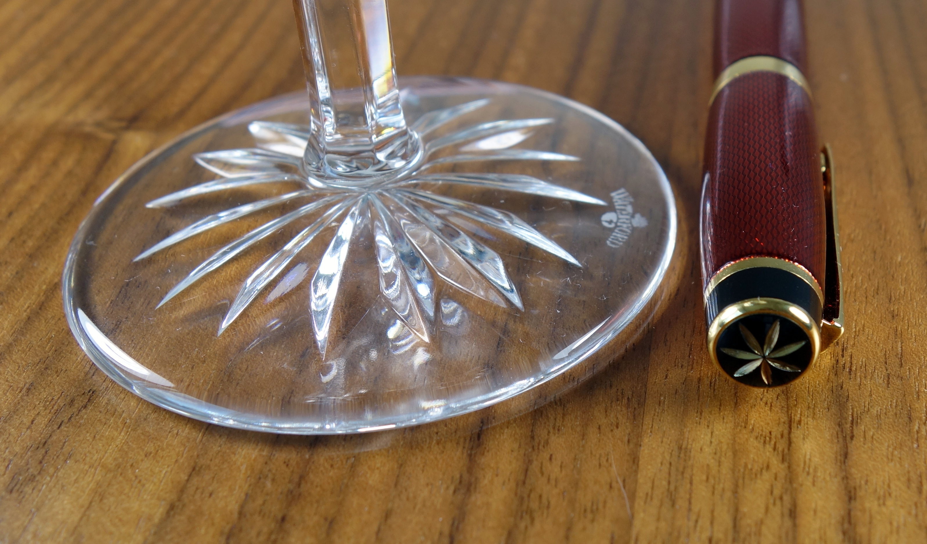
Waterford crystal martini glass base with star design.
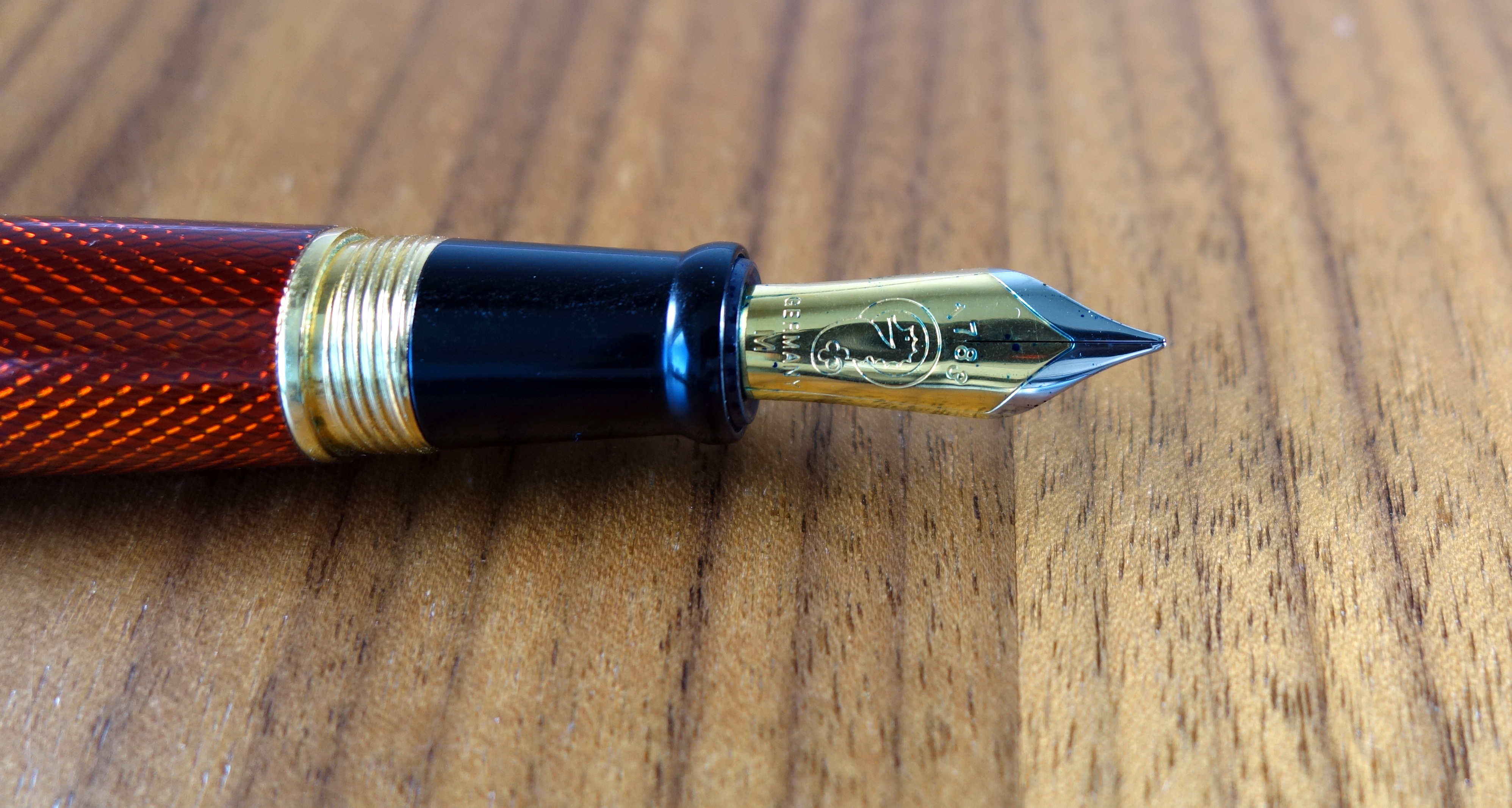
The large two-tone steel nib is produced by Jowo in Germany and features “1789” (the year of Waterford’s founding), the Waterford seahorse symbol and the absence of a breather hole. The nib also reads “Germany” which to me makes the nib seem cheap. That is not a knock against, Germany, it is just that many mass produced nibs I have come across read “iridium point Germany.”
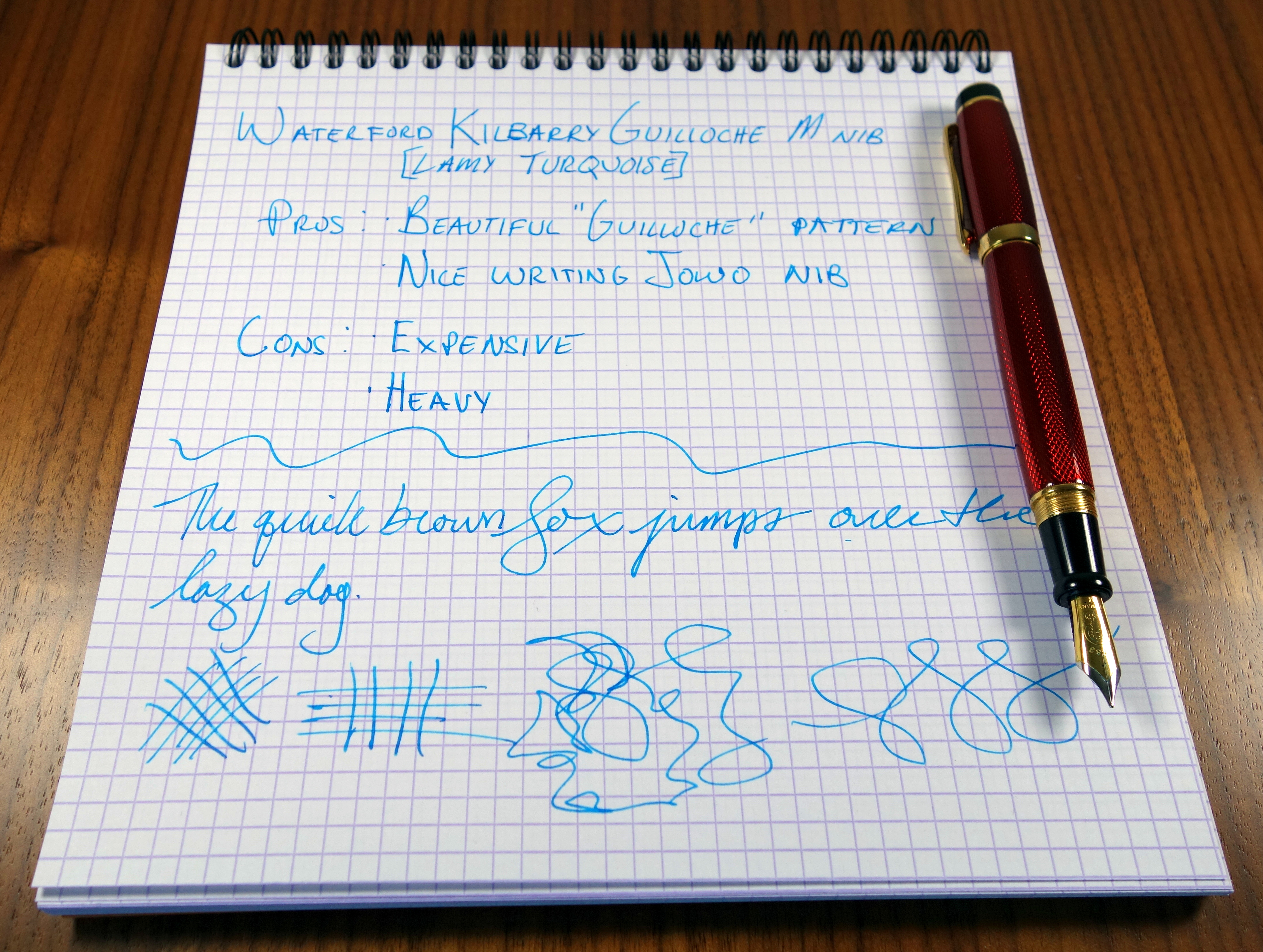
The nib performs beautifully with a fat, juicy medium line. I have experienced no issues with hard starting or skipping. The Klibarry takes standard international cartridges and converters.
The grip section is made out of black plastic with no seams that I can detect and the cap posts nicely on the the back of the pen. Being that the pen has a solid brass body it weighs almost 41 grams (with the converter installed). The pen is well balanced when posted but I find that I prefer to write cap off with this pen.
Capped, the pen measures 5.25″ and about 4.8″ uncapped. At it’s widest point the Kilbarry measures just over half an inch.
The build quality overall is quite good, the Waterford star on the top of the cap isn’t cut as crisply as it could be but otherwise there are no real flaws to speak of. I don’t know where this pen is made but I would suspect it is made somewhere in Asia.
The Kilbarry feels nice in hand and writes very well but ultimately it’s not my cup of tea. The $135 retail price is quite high and I think this pen would make more sense around $70.