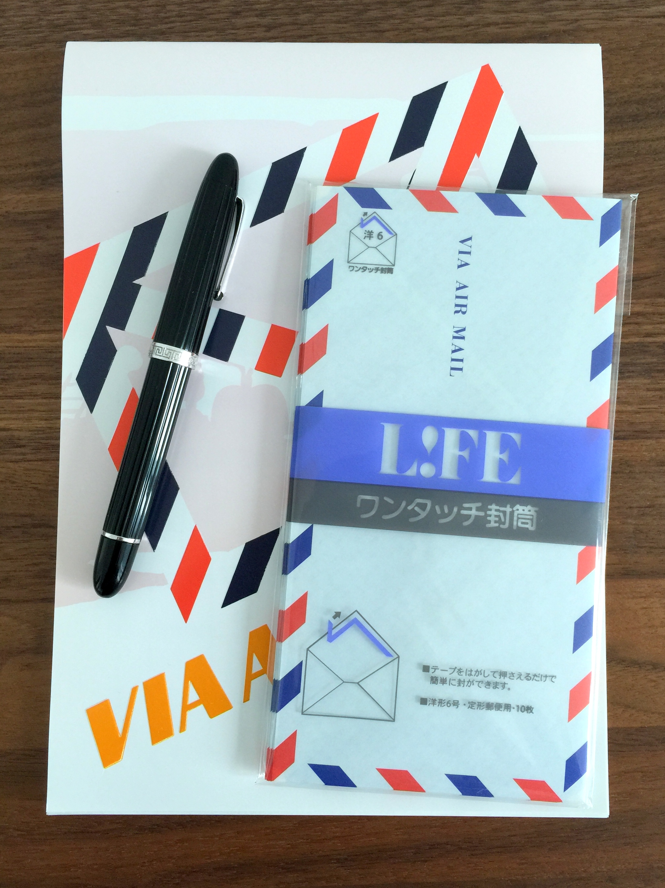
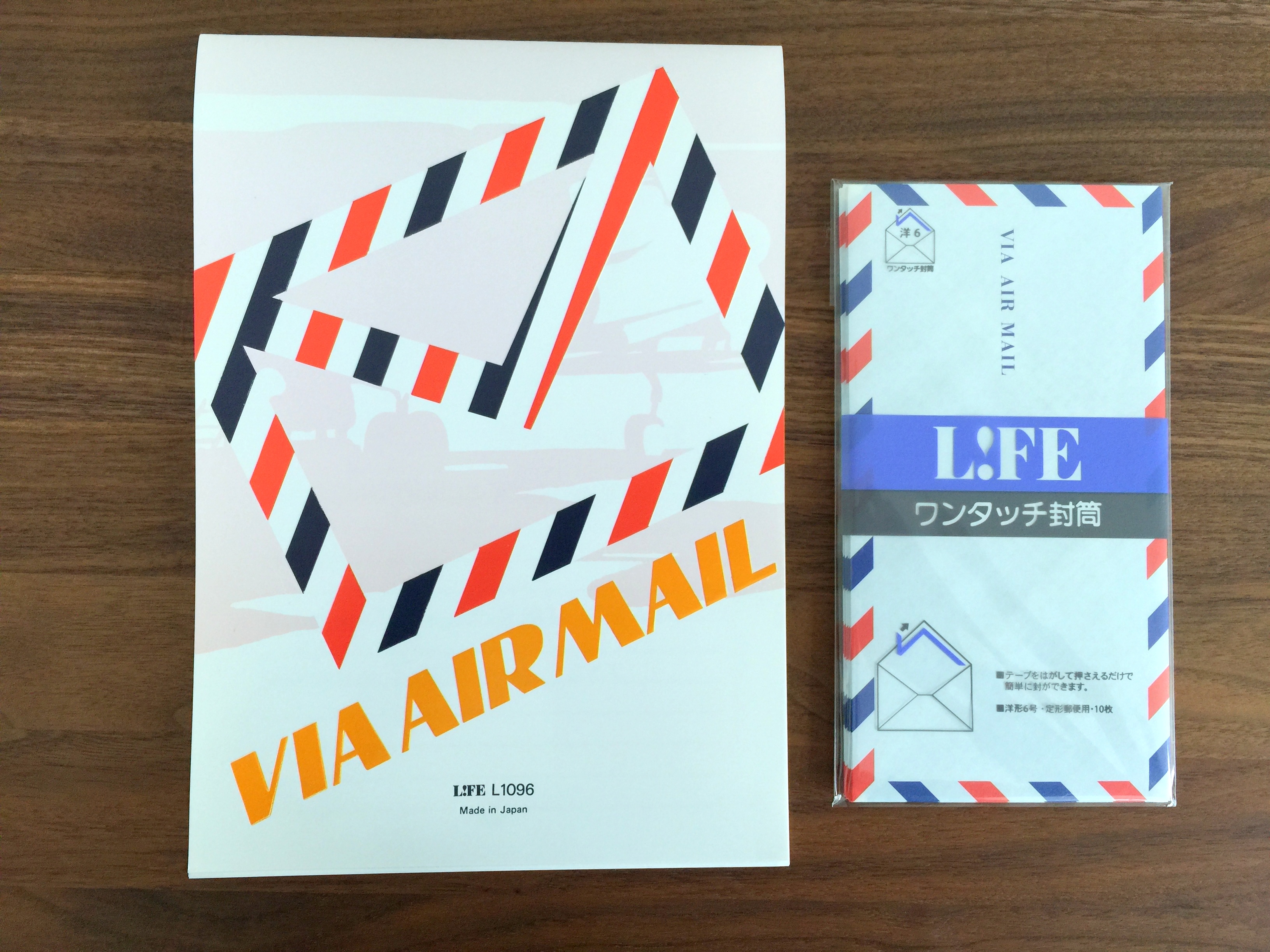
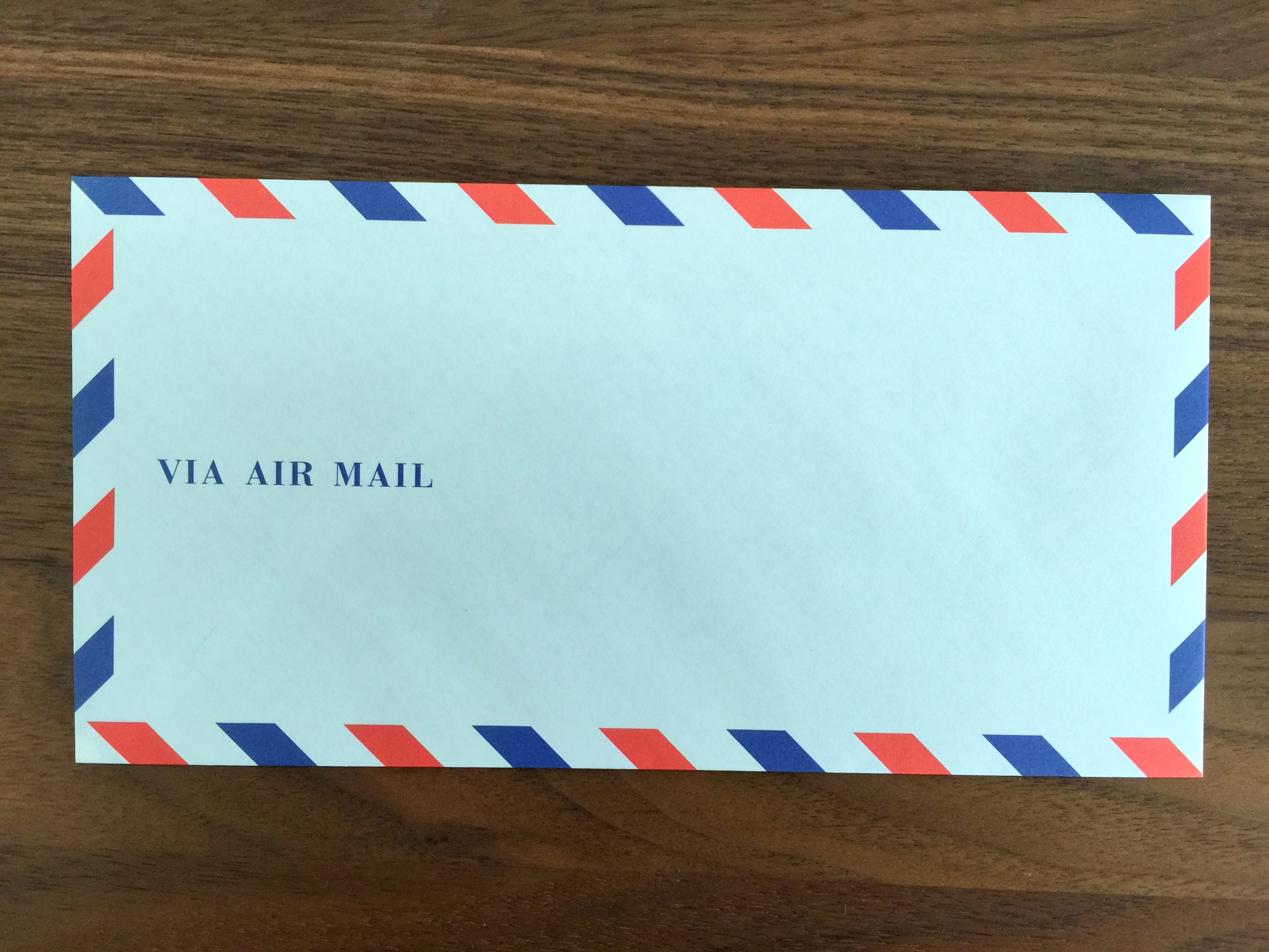
The LIFE Airmail letter set (LIFE L1096 + E26) offers both retro styling and an affordable price. I paid approximately $7 USD for the set which contains 10 “VIA AIR MAIL” envelopes and 50 sheets of onion skin paper. Purchased individually the pad is $5 and the envelope is $2.
For those not familiar with onion skin paper, it is a durable but thin transparent paper that resembles, you guessed it, the skin of an onion.
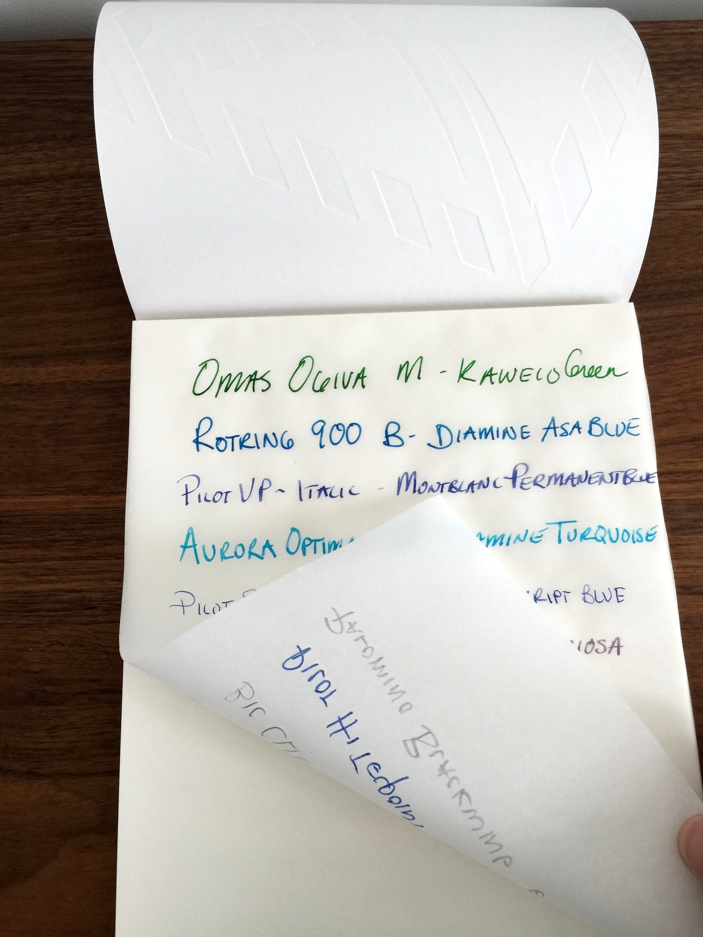
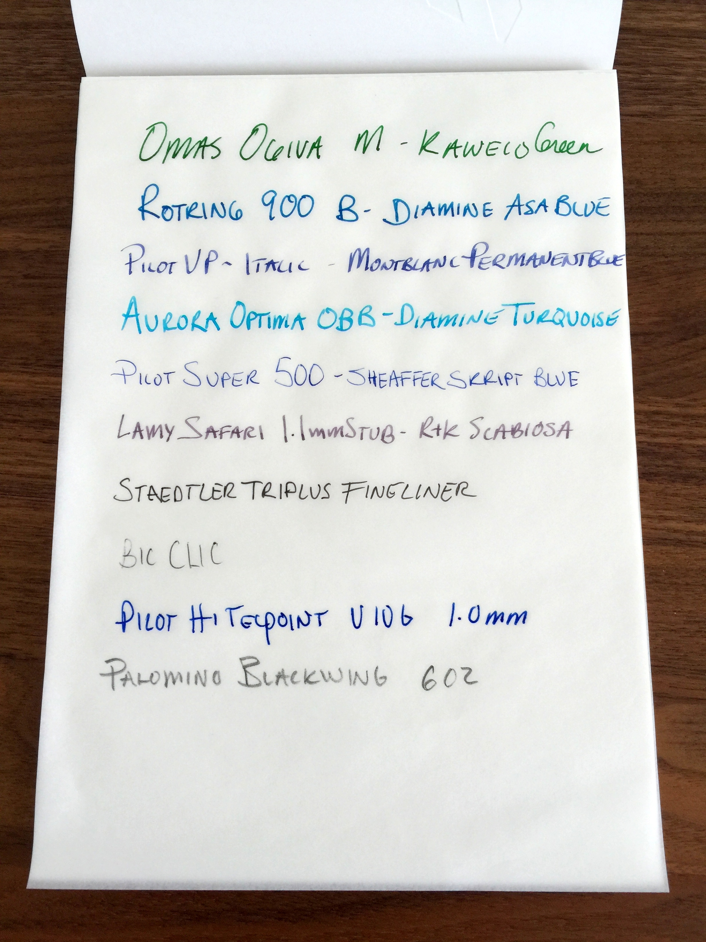
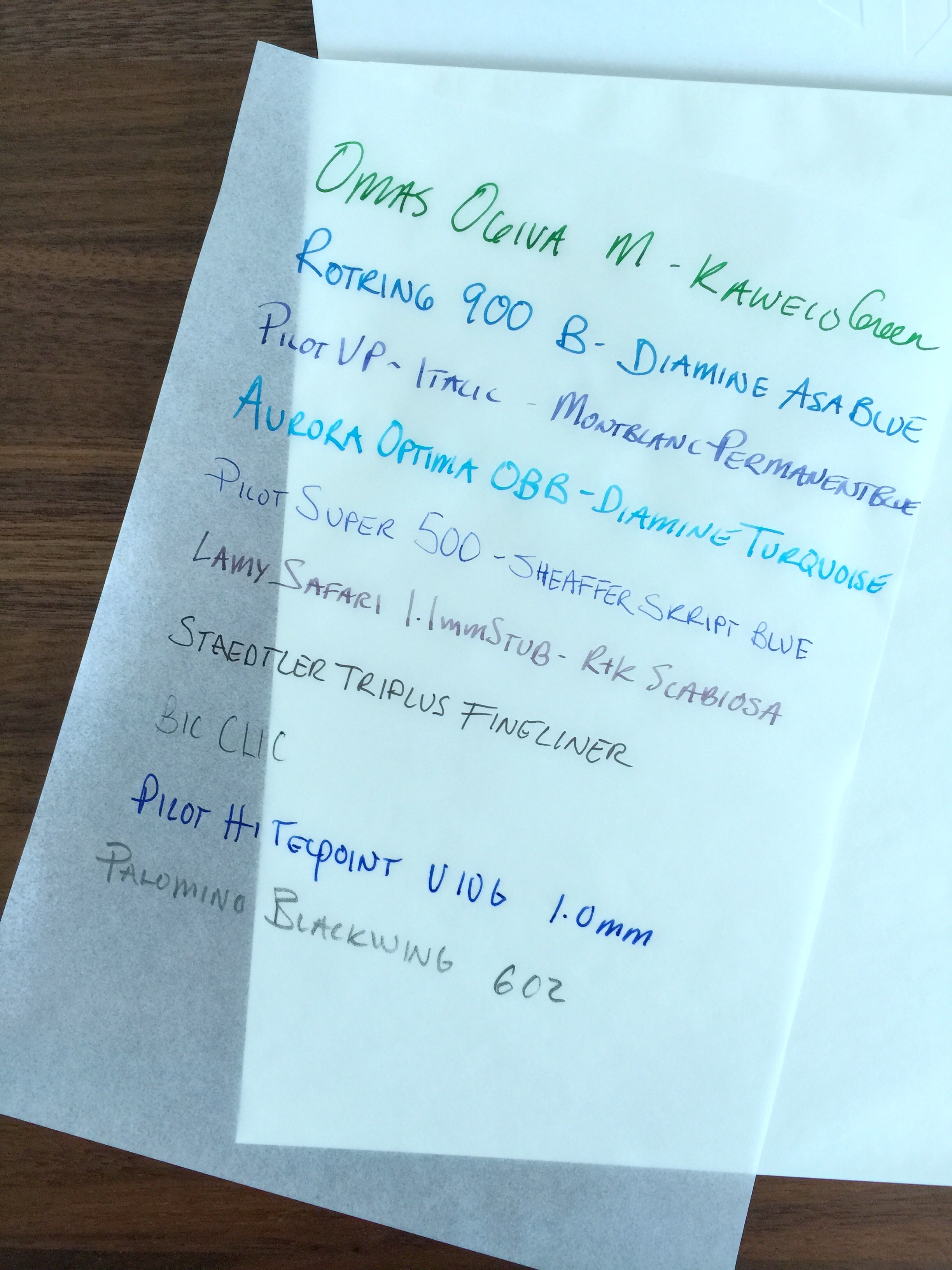
I wouldn’t dare use a fountain pen on a standard tracing paper but this LIFE onion skin paper is of excellent quality.
There is some very minor feathering with all of the fountain pens and the Pilot Hi-Tec Point gel pen but it is not enough to bother me.
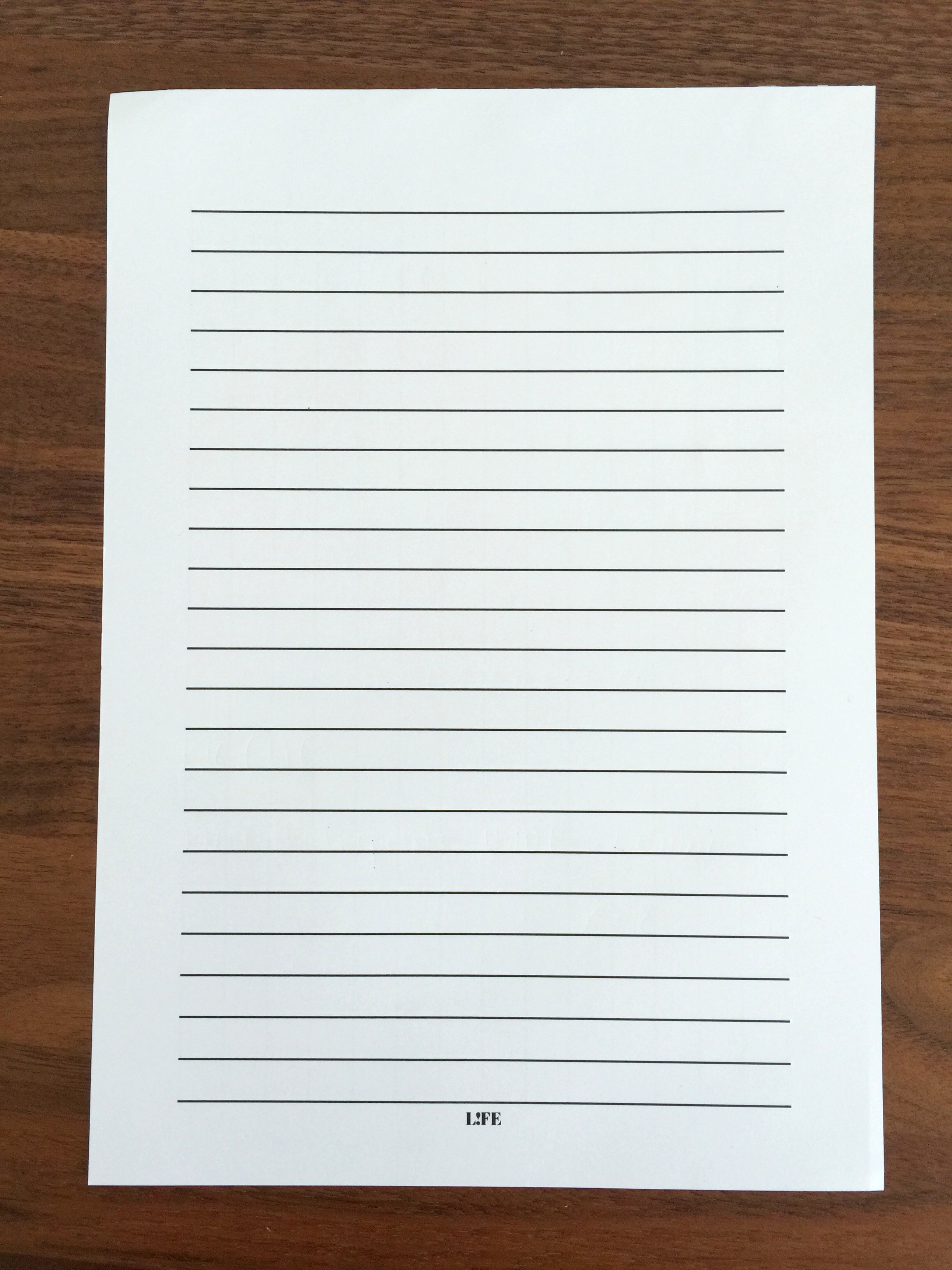
I experienced no bleed through as evidenced by this perfectly clean template I used for the writing sample.
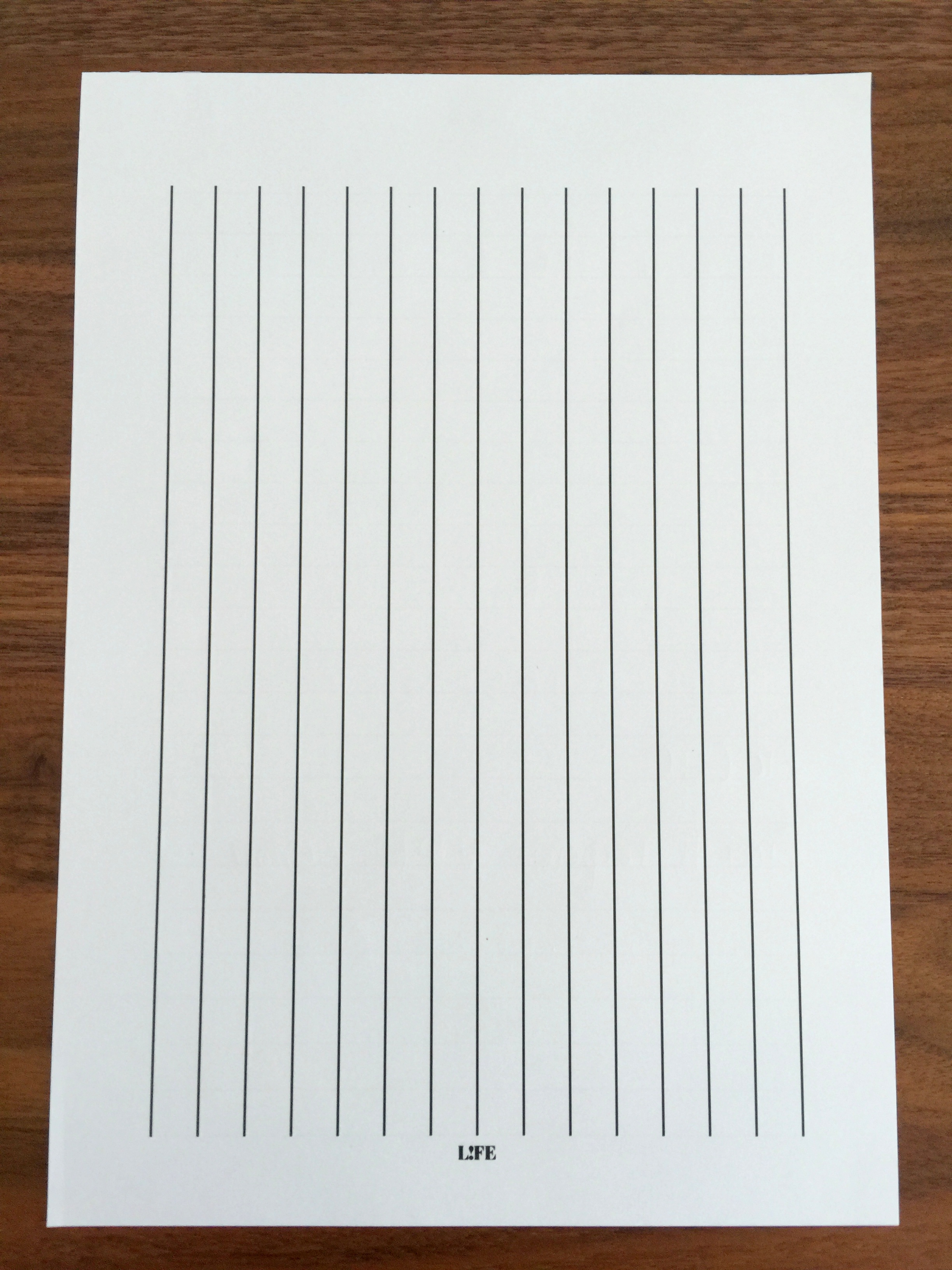
The guide sheet is double sided to accommodate different writing styles.
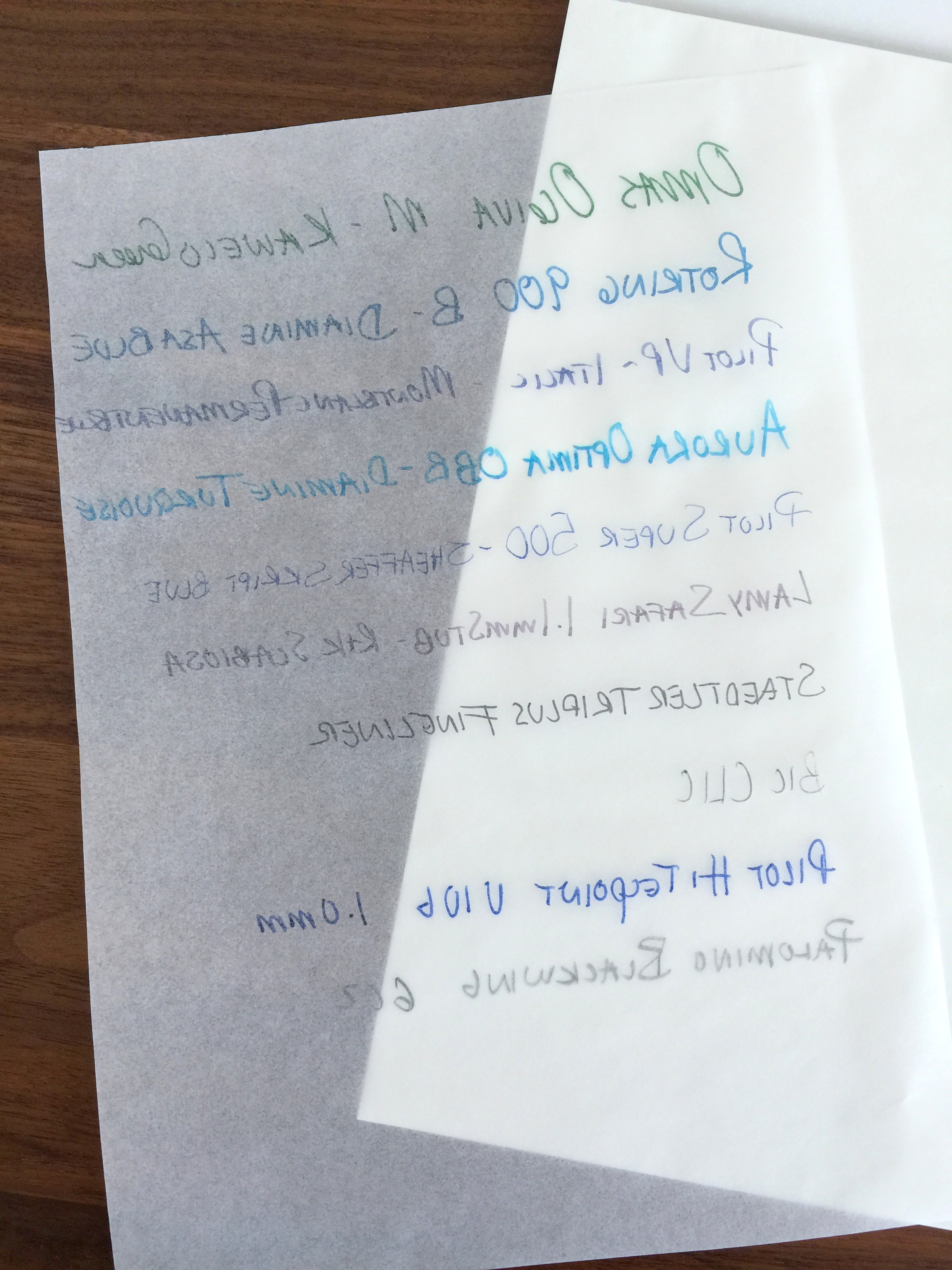
Because this paper is transparent you aren’t likely going to want to write on both sides.
The envelopes are my favorite part of the set.
They look great.
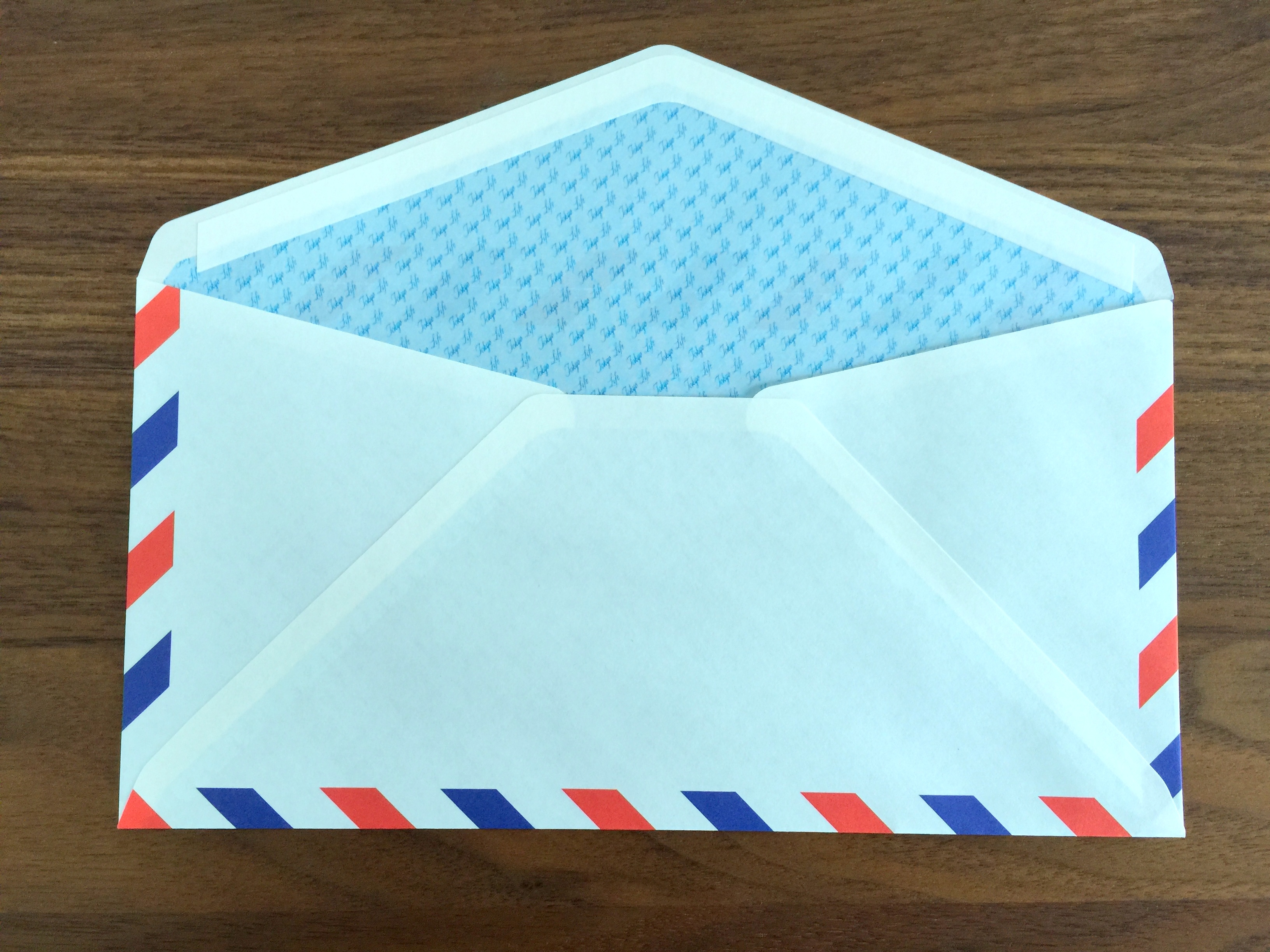
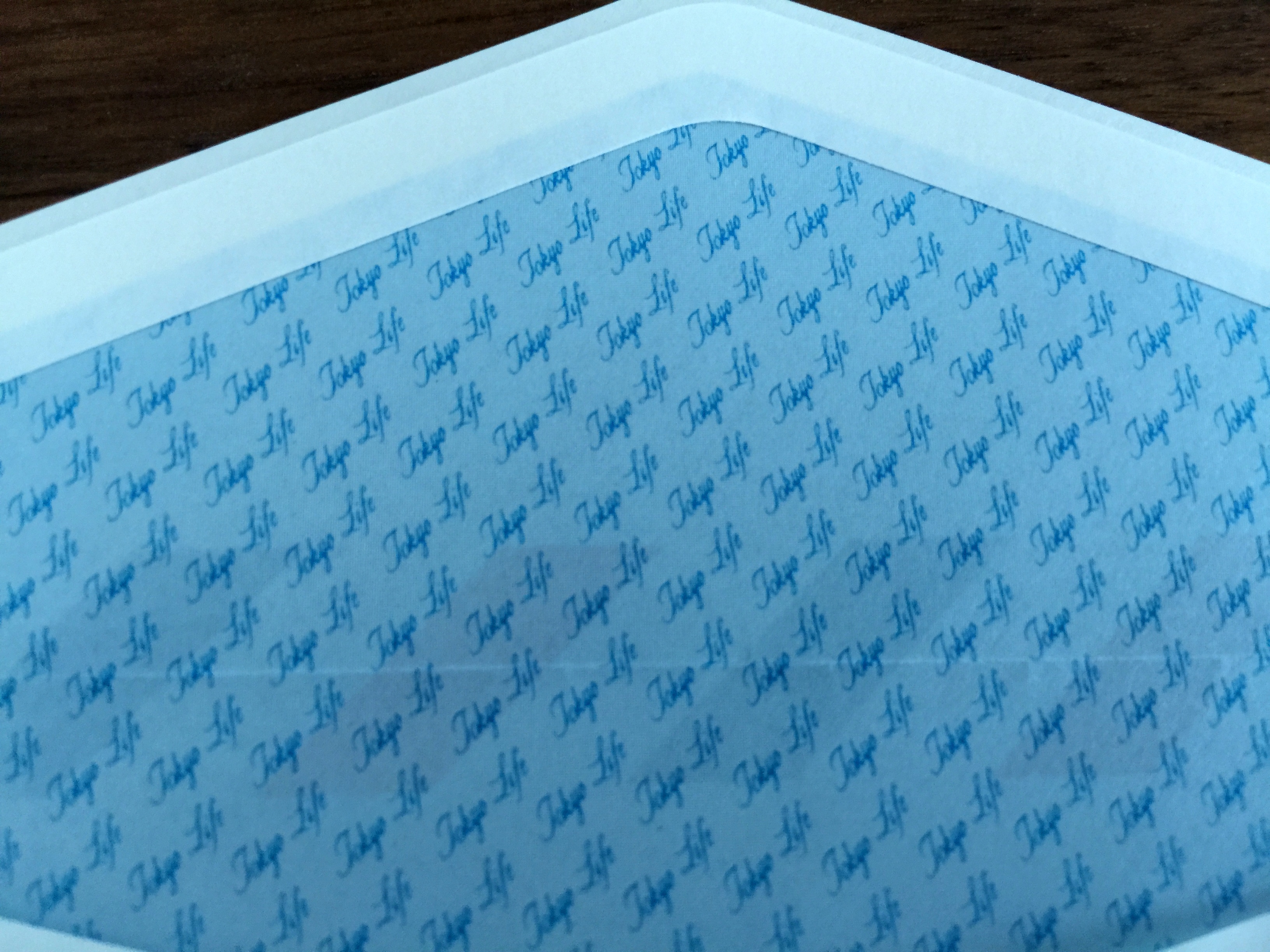
The envelopes feature self adhesive and have a security pattern on the inside which reads “TOKYO LIFE”.
Like all other LIFE products I have come across, the Airmail letter set is well executed and of a high quality. I would have liked to see a blotter page in the pad but that is a small gripe.
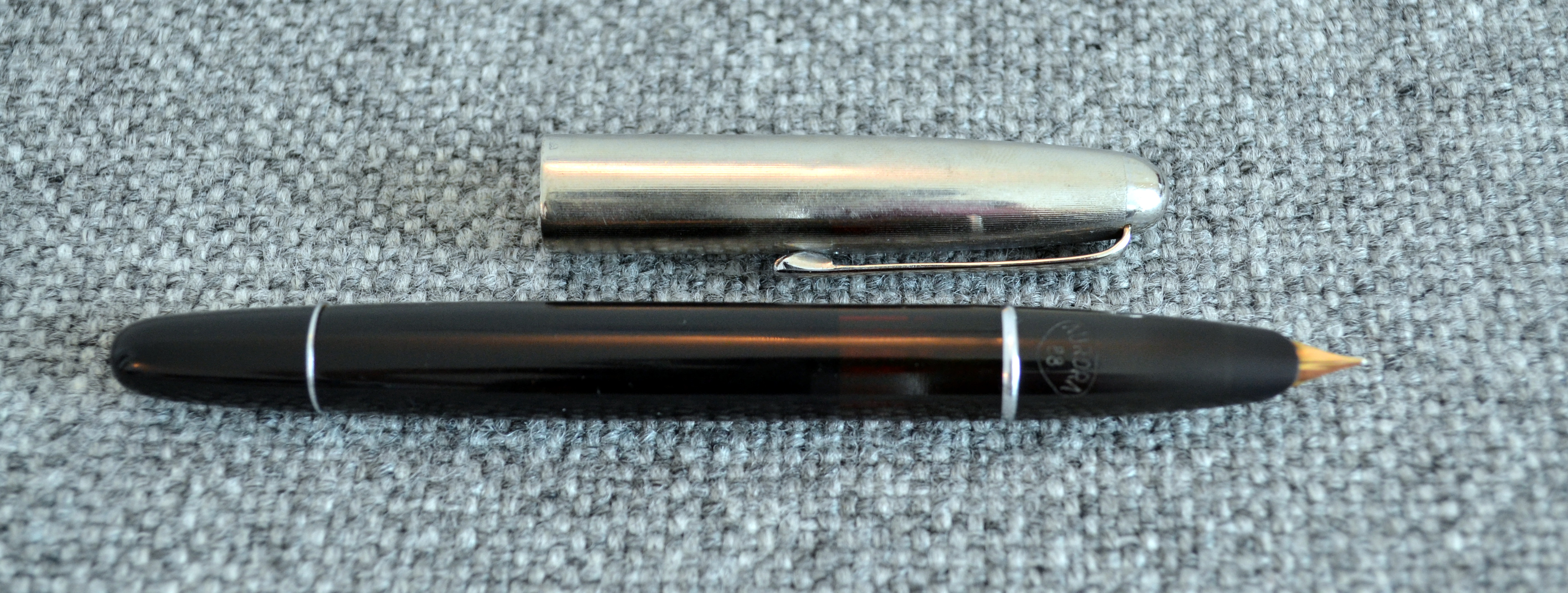
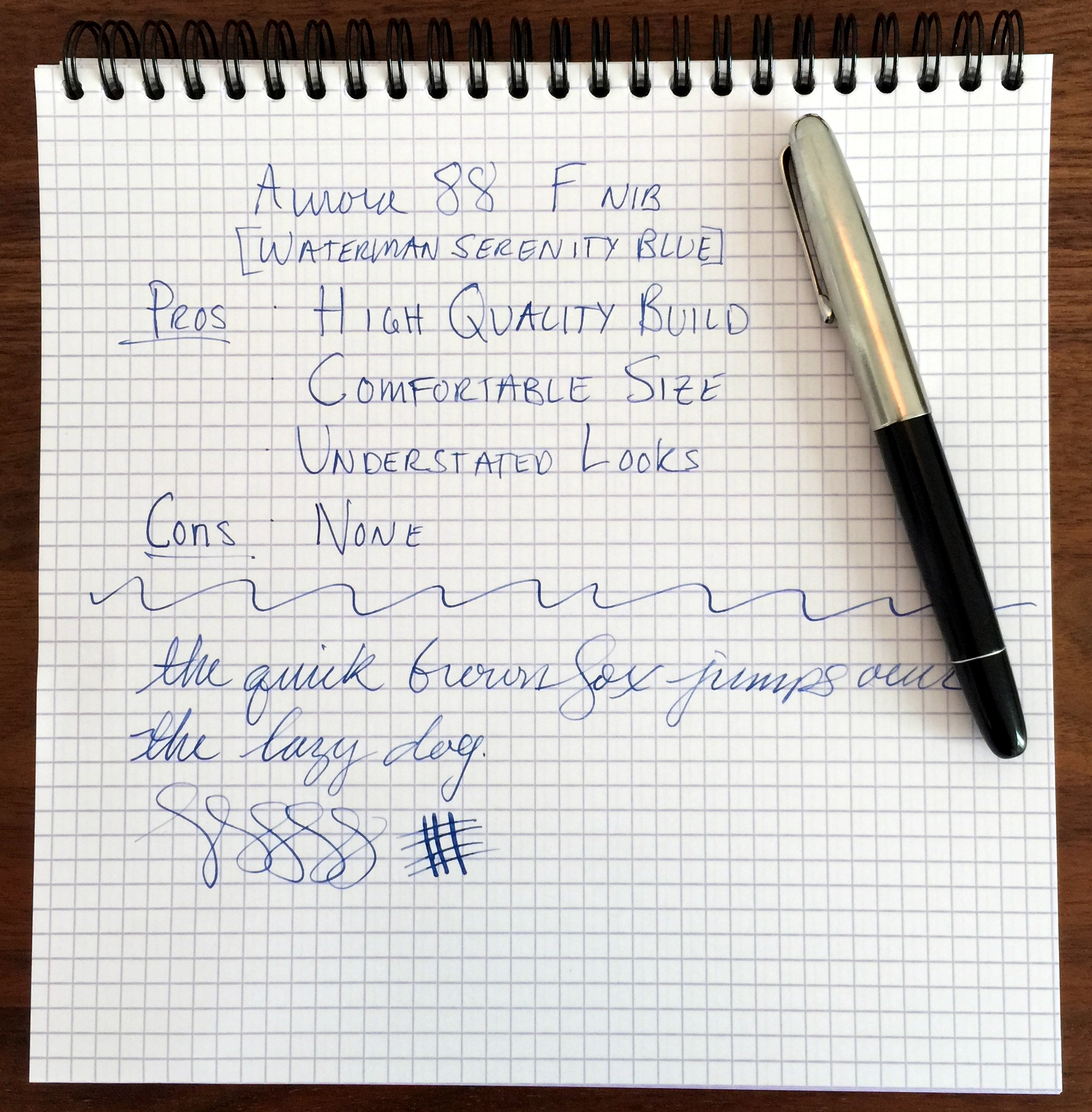
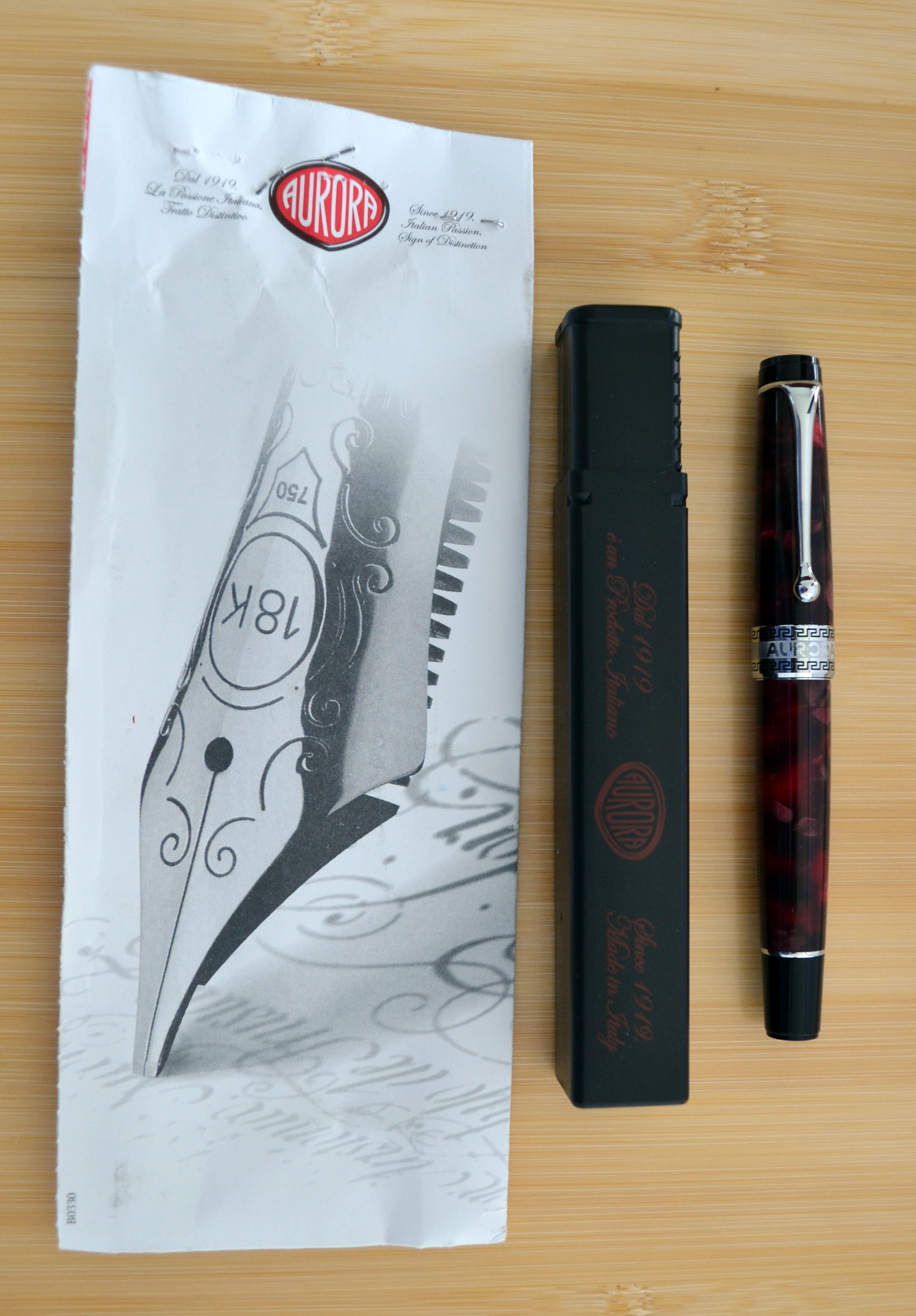
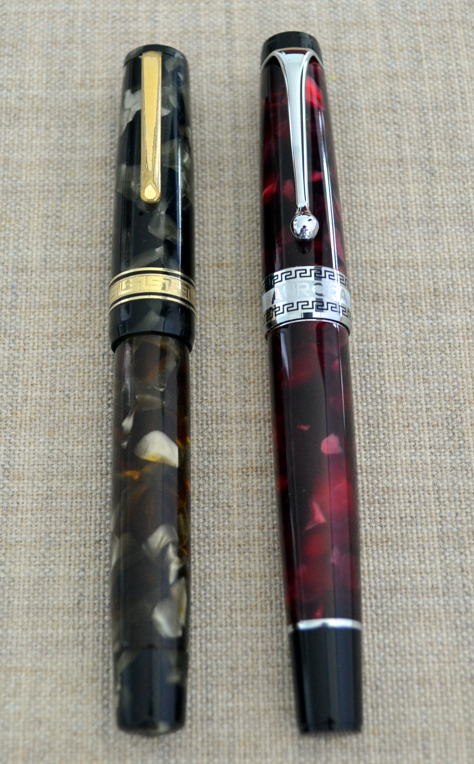
The Aurora 88 is one of the best Italian fountain pens ever produced and is, without question, the most commercially successful Italian fountain pen of all time.
The 88 was designed by architect Marcello Nizzoli in the late 1940s and features a streamlined style with a hooded nib and a metal slip cap much like the Parker 51.
Because of its commercial success the Aurora 88 is not a rare pen and as such prices are reasonable (unlike most vintage Italian pens). Nice examples of the original 88 model can be had for $100-$200. I particularly like the Nikargenta capped version as this silver material was only available on the original model unlike the rolled gold, chrome and solid gold versions.
The Aurora 88 is a true workhorse and makes an excellent everyday pen. Compared to the standard-size Parker 51, the 88 is slightly fatter and heavier. The added weight and girth make the 88 feel more expensive than the 51.
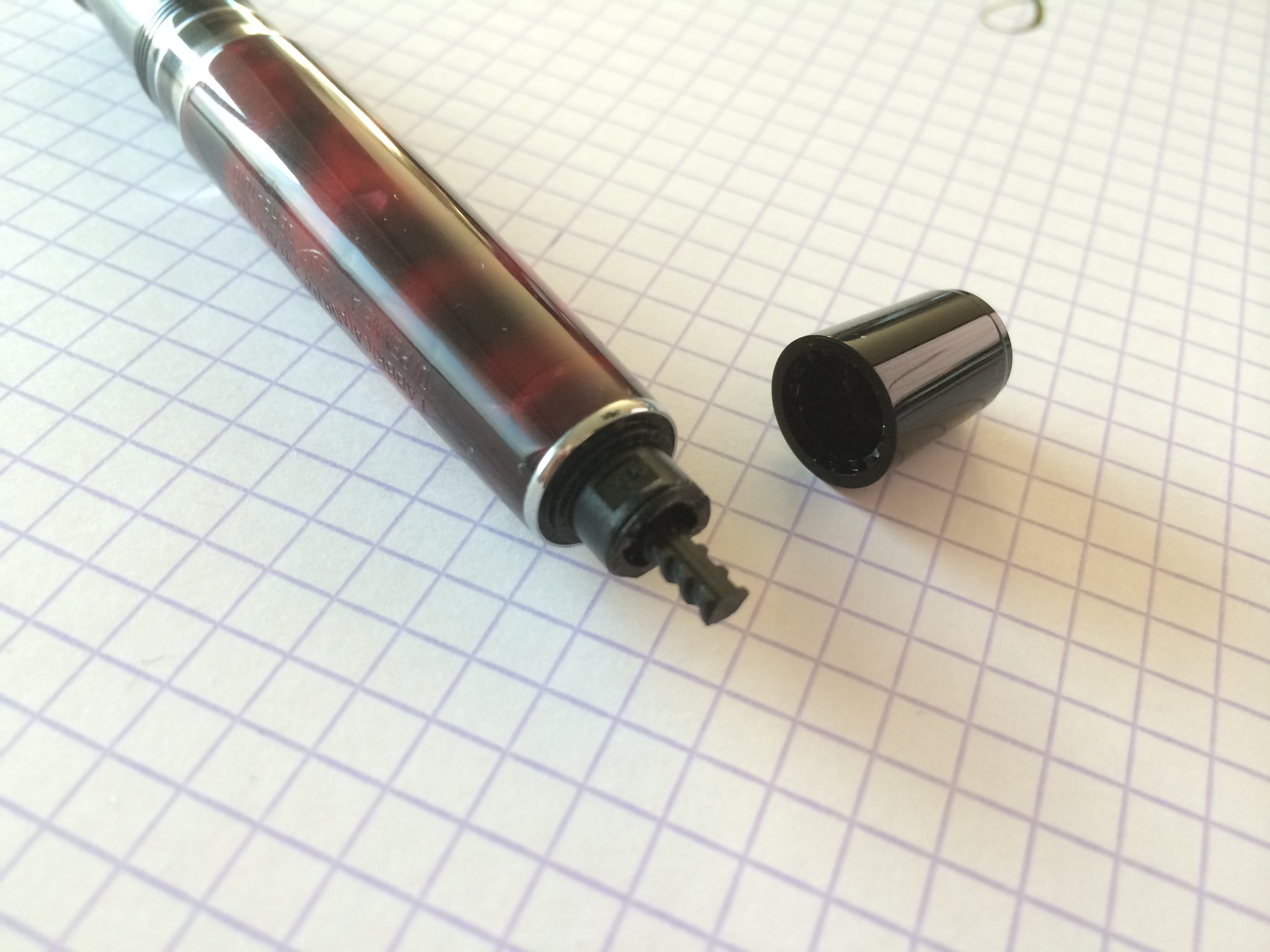
The 88’s 14kt hooded nib is more exposed than the Parker 51s allowing more flexibility and line variation. The 88 also features a piston filler with an ink view window.
I had a hard time coming up with negatives for the 88…it’s a really good pen all around. It’s (relatively) affordable, it’s hard working, it writes well, it looks and feels good…
I suspect that the (aerometric) Parker 51 is a slightly tougher pen with it’s ultra durable filling system and more protected nib but the Aurora is more fun to write with.
I highly recommend the Aurora 88, it is excellent.
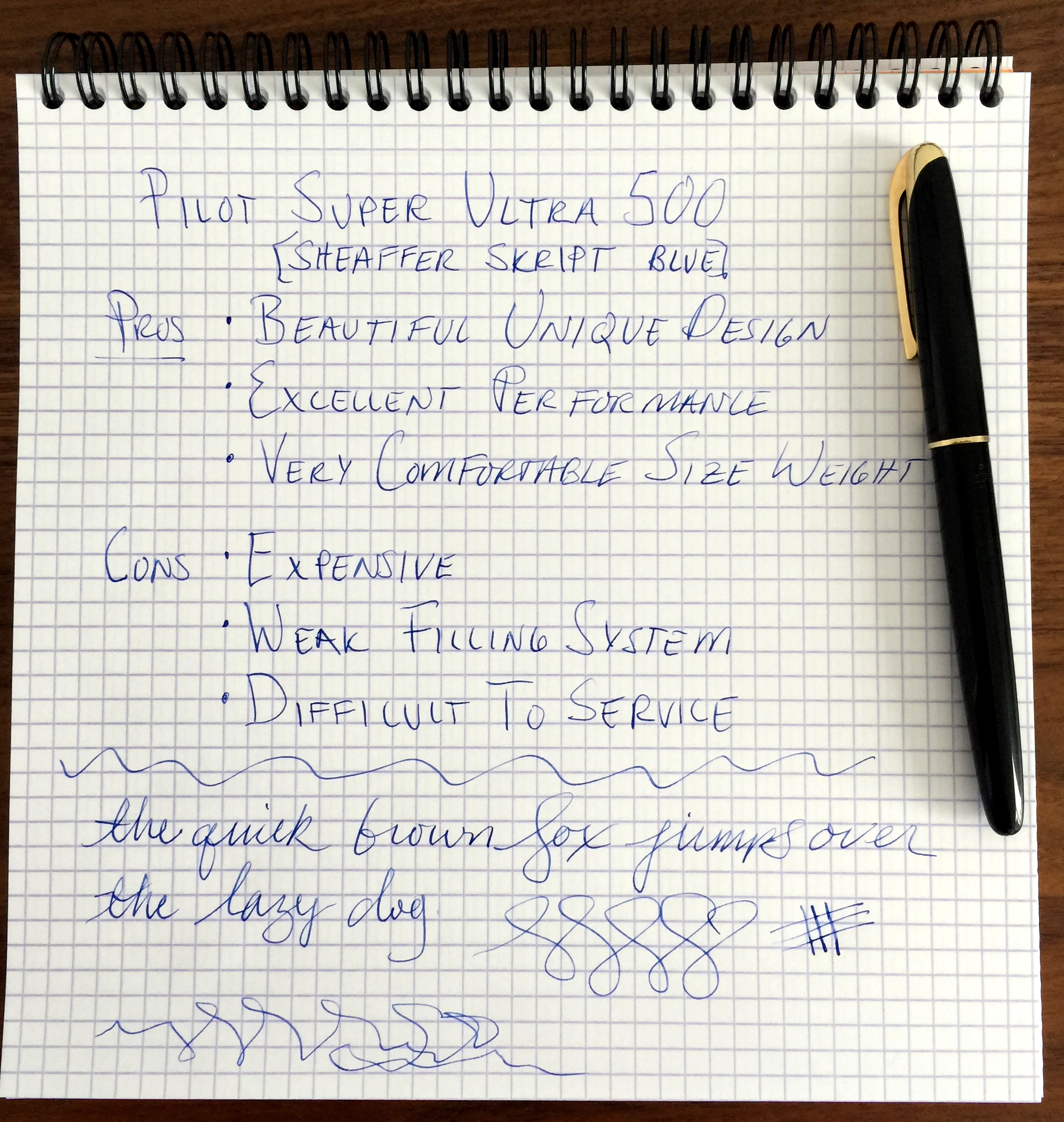
About a year or so ago I saw the Pilot Super Ultra 500 on the Fountain Pen Network and I was blown away by its beautiful design. The hunt began and in September I was able to locate one in Italy.
The filling system needed a new sac so I sent it over to John Mottishaw for refurbishment. Now that I have had it in my hands for a few months I thought I would share my thoughts on this awesome pen.
Side note: It has occurred to me on a number of occasions that it is a bit silly to use a point rating system in my reviews as they are arbitrary despite my efforts to be objective as possible. I have found reviews of vintage pens to be the most problematic as the qualities of the same make and model can vary dramatically from one pen to the other and as such, it would be a mistake to fully extrapolate my experience (of one example) to another
Appearance
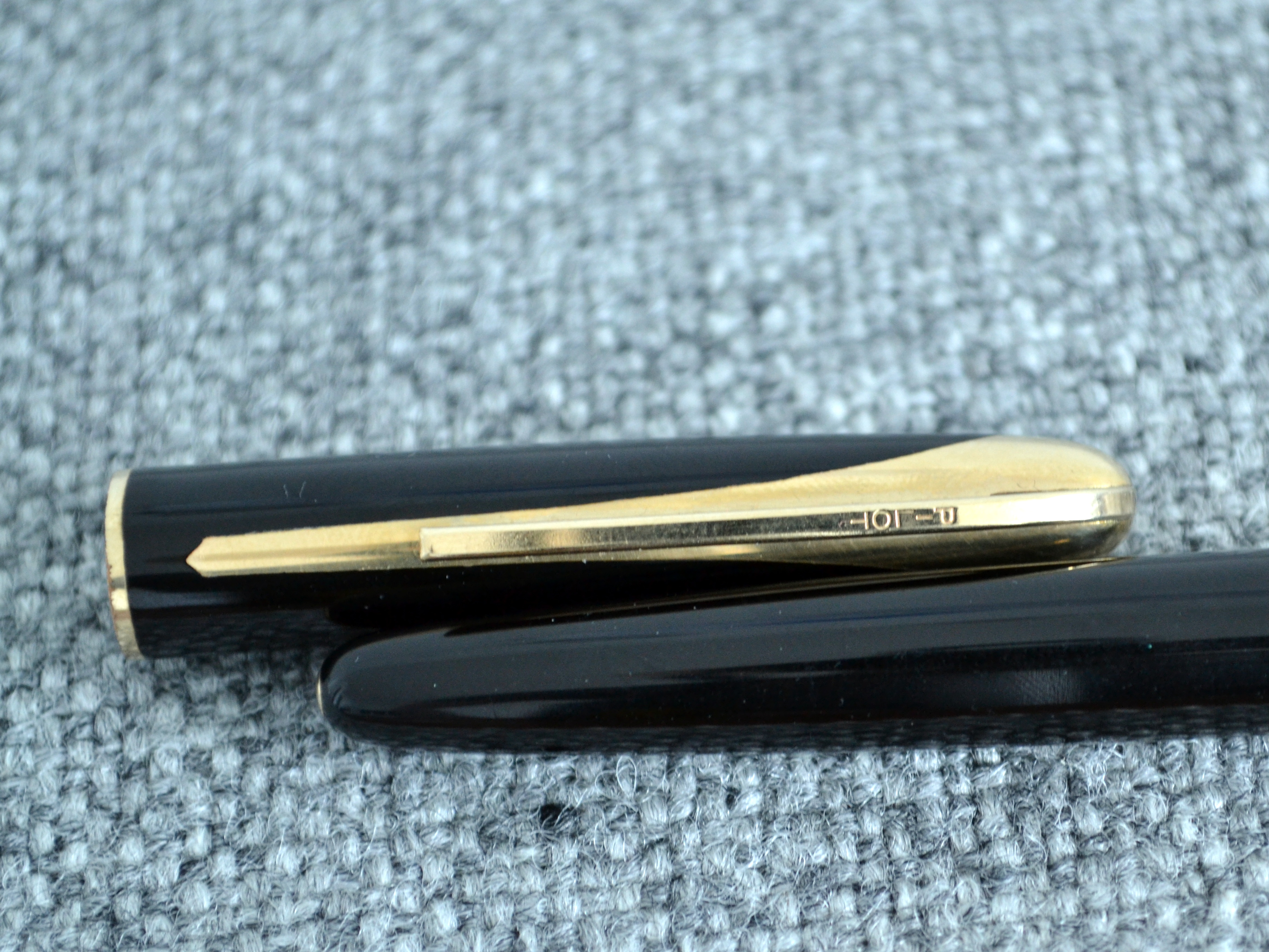
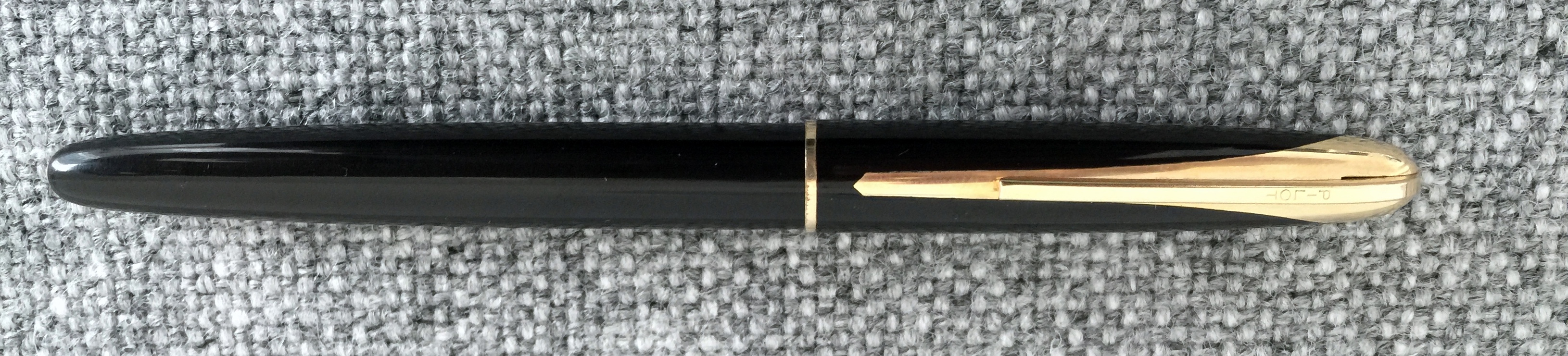
The black plastic version is the most beautiful (and luckily the most common) 500. The ones with gold filled caps lose the wonderful mirrored design that make this pen so fantastic.
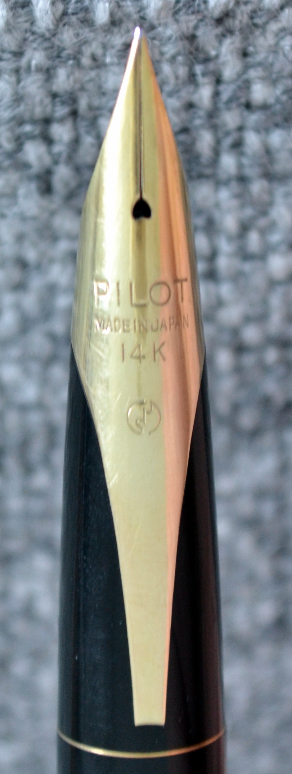
The inlaid gold nib is gorgeous and despite all of this beauty that I keep harping on about the pen is a reserved and understated elegance that I find very appealing.
Gold tassie at the end of the barrel.
This pen ticks all of the design boxes for me.
Score: 5/5
Build Quality
The majority of products that come out of Japan today are of a very high quality and I am certainly happy to pay a premium for a “made in Japan” product but in 1958 the sentiment was different; Japan was considered an emerging market that produced more affordable products. Does this have an affect on the quality of pens coming out of Japan in the late 50? I don’t know BUT I can confidently say that the 500 is of a high quality. Would consider it superior to a Montblanc or OMAS from the same time period? No, not really.
The black plastic body has held up quite well and the rolled 14kt gold trim is well done, though there is wear on the bottom of the cap ring.
From reading Bruno Taut’s wonderful articles on the 500 (please see the links to his site, Crónicas Estilográficas, at the bottom of this review) I learned that the 500 was considered to costly to manufacture and as a result was only produced for a couple of years.
Score: 3/5
Size & Weight
The 500 measures 14.1cm long capped and 12.7cm uncapped and 1.2cm at its widest point. The 500 weighs a comfortable 18.3 grams. This is a very nicely sized pen that I have had no problem writing with for extended periods of time.
Score: 4/5
Performance
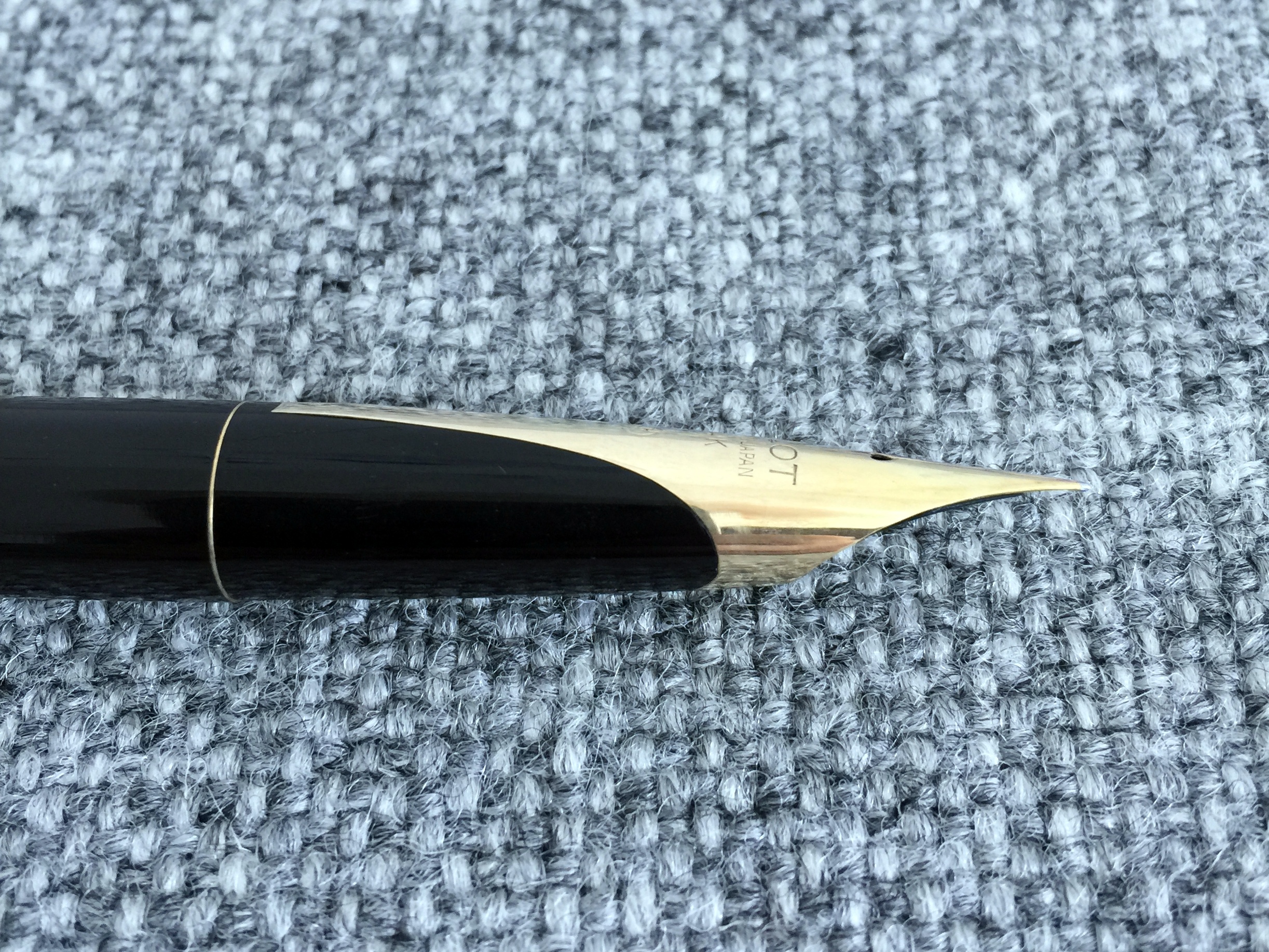
The nib writes with an extra fine line by western standards but find the nib to be quite smooth despite it’s point size.
With a bit of pressure the solid 14kt gold nib does offer some line variation, though I am cautious not to push too hard as any damage to this nib would be a small tragedy.
I have not had any issues with hard starting or skipping. It is by all accounts a great nib.
Score: 4/5
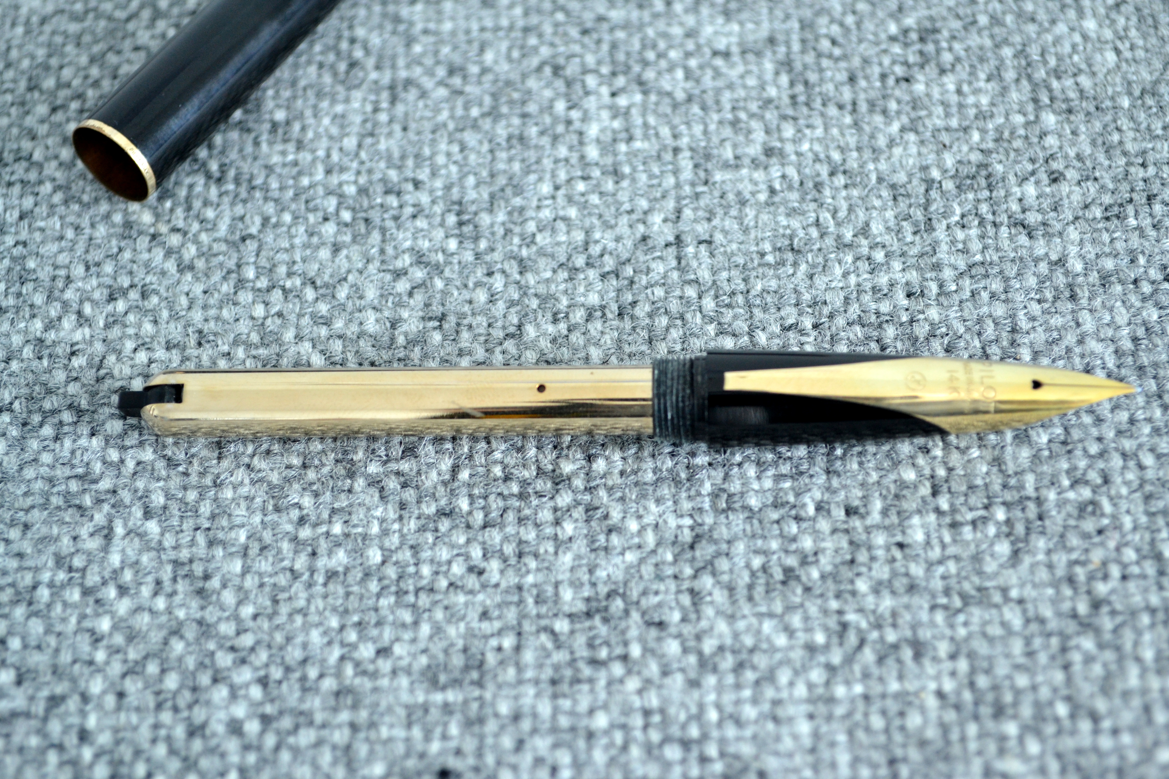
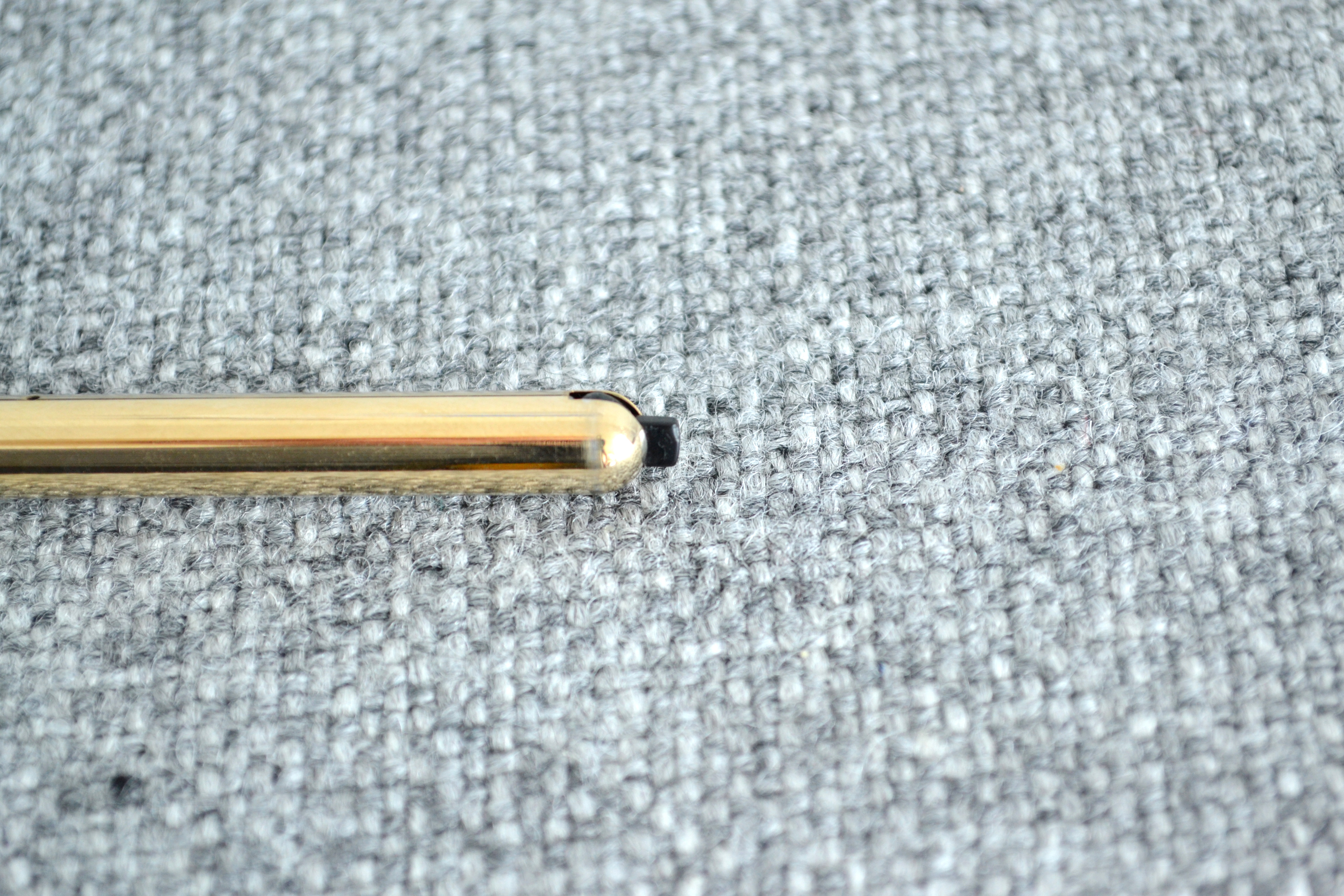
Filling System
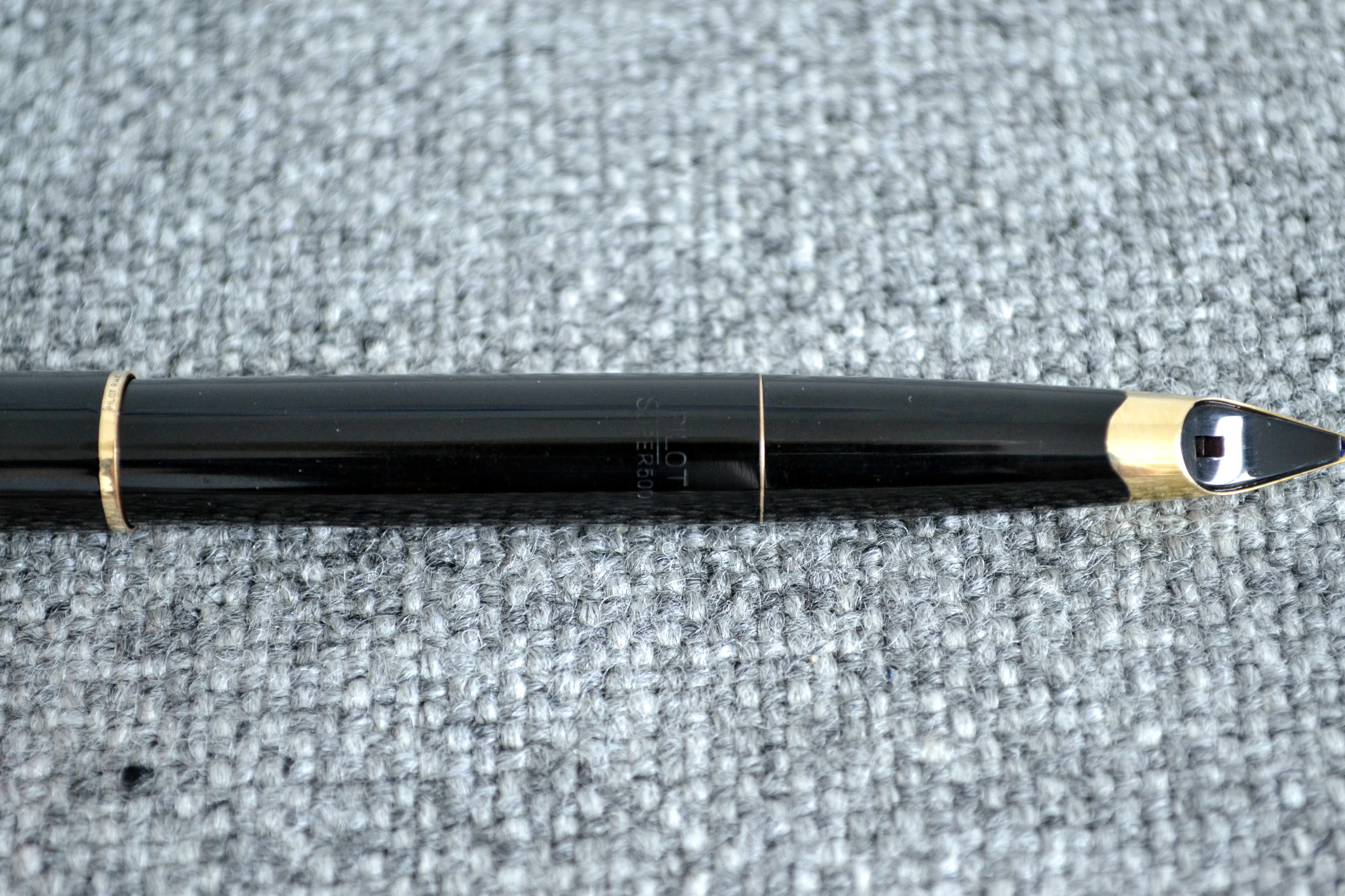
The 500 has what is known as a “switch” or “quarter turn” filling system. To fill you insert the nib into a bottle of ink and move the notch 90 degrees, this makes the pressure bar squeeze the sac just like on a regular lever filler.
When I received the 500 I tested the mechanism and the sac had dried out. I asked a couple of well known restorers/nib meisters and to my surprise the first three said they wouldn’t work on the pen, not having worked on one before. John Mottishaw agreed to do the work and upon return the pen functioned beautifully.
When the pen ran out of ink I flushed it a few times and RATS! the pressure bar detached from the switch and back to Mottishaw again it went. This time he beefed up the internals a bit and it seems to be working.
This pen holds a good amount of ink but I wish the mechanism was more robust.
Score: 2/5
Value
I picked up this pen for right around $600 and that is quite a lot of money for an old black pen. I have consulted with a few collectors and I was told that I got a decent deal.
The pen is beautiful but you really have to appreciate the design to justify spending the money. I want to use and enjoy this pen but if it breaks on me again I may have to let it go because what good is a pen that you can’t use?
Score: 2/5
Bottom Line
The beautiful and rare 500 is a great writer that’s only hitch seems to be it’s fragile filling system.
Final Score 20/30
I would like to thank Mr. Bruno Taut for his excellent articles on the Pilot Super Ultra 500. Here are links to those articles (including disassembly instructions Ultra (III)).
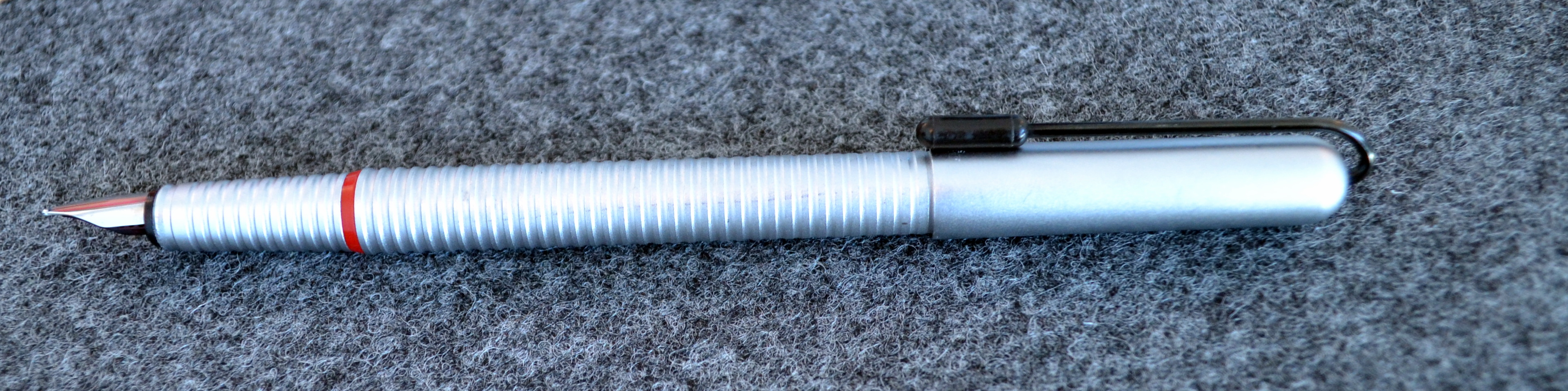
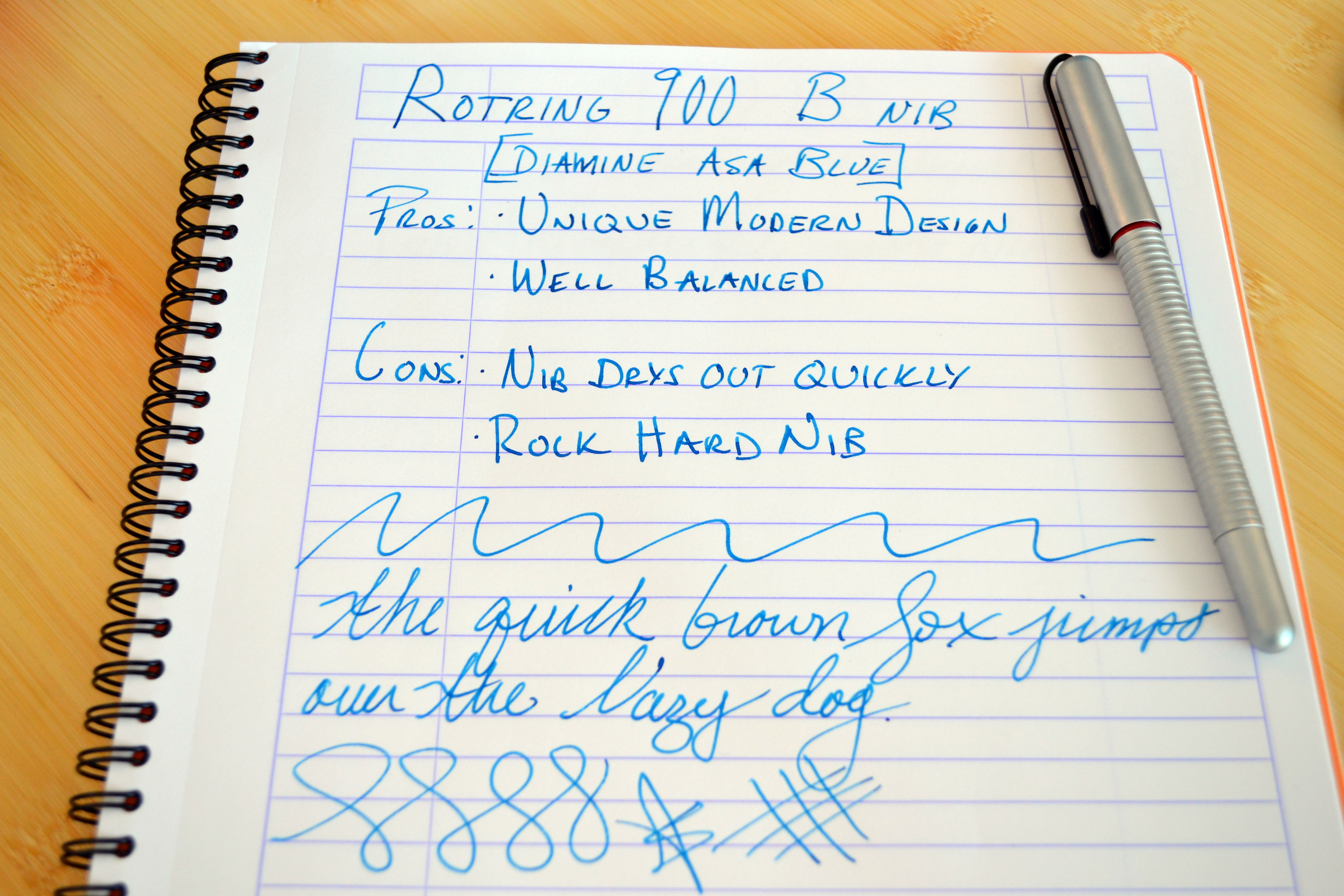
The 900 is the only Rotring fountain pen I have ever owned. I have not been a fan of Rotring’s tool-like design nor their (generally) scratchy nibs but my 900 is an exception. The 900 is an excellent industrial design that is more in tune with Lamy’s Dialog line than drafting-pencil-look that Rotring is famous for.
The 900, like the better-known Rotring 600 fountain pen has long been discontinued. They both share the same undecorated nib and were both designed as pencils first. The Rotring 900 pencil had a very interesting “side knock” mechanism that required you to bend the pencil in the middle to advance the lead…the fountain pen’s mechanism is decidedly less interesting, with a standard cartridge/converter filling system.
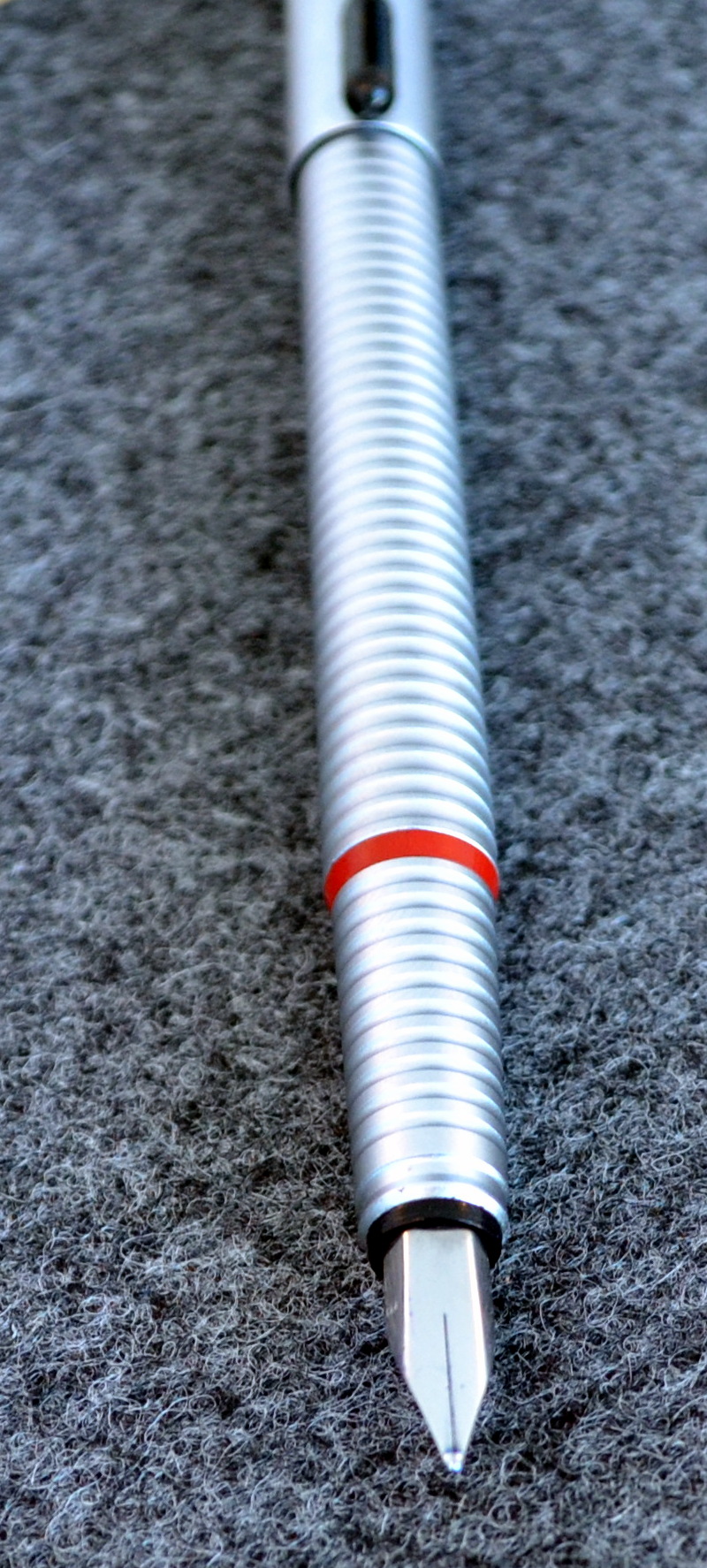
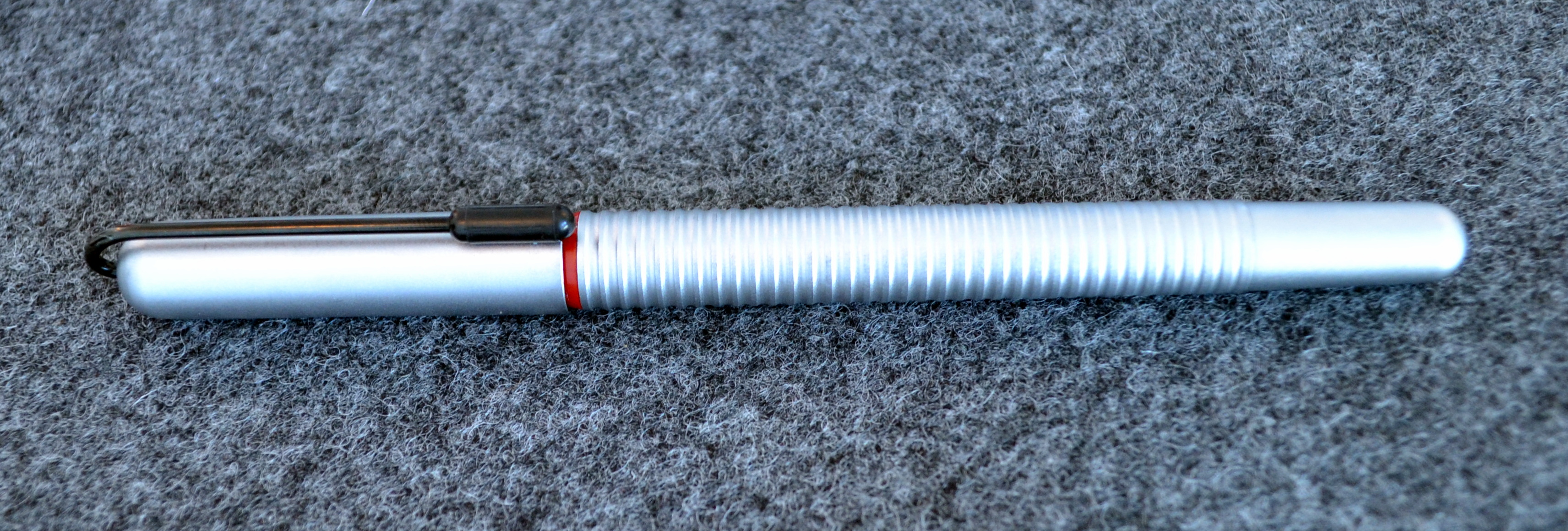
The Rotring 900 has a beautiful grooved barrel and section with an unusual black clip that sort of looks like a paper clip. The grooves are deepest at the section and get shallower as they make their way down the barrel. The cap meets the section at the red ring. I believe this pen is made entirely out of machined aluminum based on its color and the way it scratches.
Capped this pen measures 15cm and weighs a hefty 37.8 grams (with converter and ink). The pen is surprising well balanced while posted and makes for a comfortable writing experience.
I am not normally a fan of metal pens as they make my fingers sweat but the combination of the grooved section and matte finish work very nicely for me.
The broad nib is a nail but it is smooth and does offer some minimal line variation. This is the first broad nib Rotring I have used but in my experience the fine and medium nibs on the half dozen or so Rotring 600s I have tried were a bit too scratchy.
I have found that the pen left uncapped for a couple of minutes will dry out, though it is easy to get flowing again. The matte finish does scratch as you can see in the picture below and I have also noticed that the cap requires a good bit of force to uncap.
The Rotring 900 isn’t really a good fountain pen (like most Rotring fountain pens) but it’s attractive design and good balance are justifiable reasons to keep it in my collection.
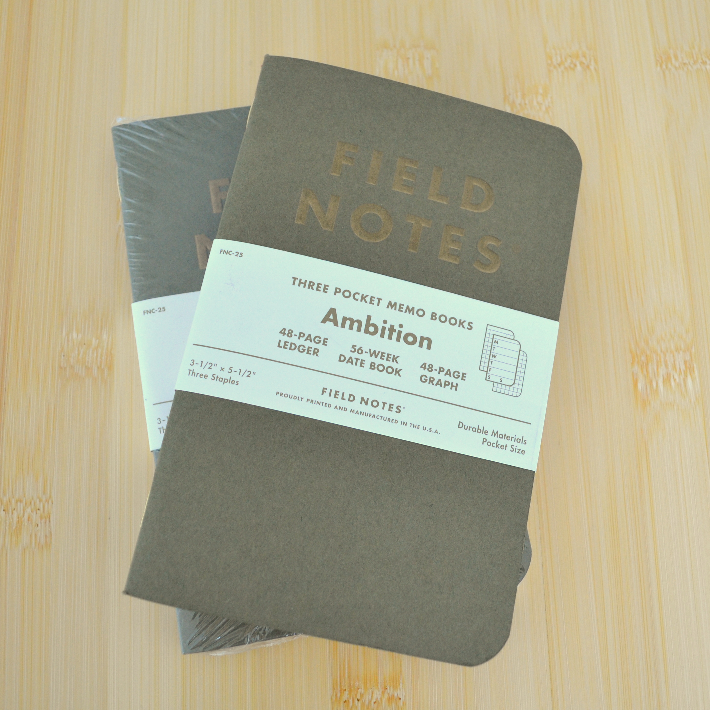
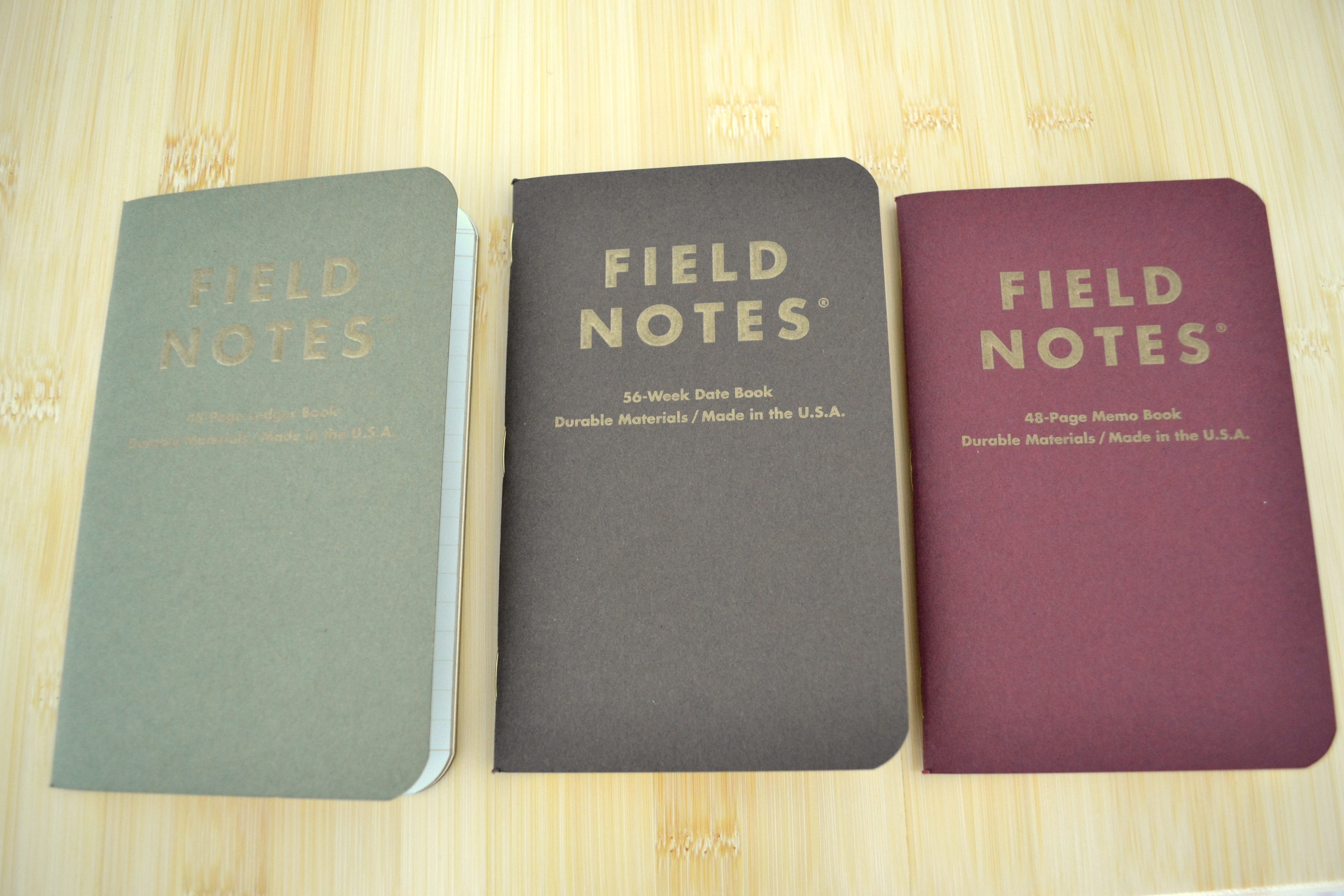
“Ambition” is the 25th release in the Field Notes Colors series of limited edition notebooks.
The three pack contains a datebook, ledger and memo book.
Let me say right off the bat that I do not have any use for a datebook or a ledger and I would have liked more memo books in any of the standard formats (dot grid, blank, lined, etc…). That aside, I think this is one of the very best Colors editions.
I love the subdued covers with gold embossed logos, gold colored staples, and gold leaf gilded edges. These books are nice.
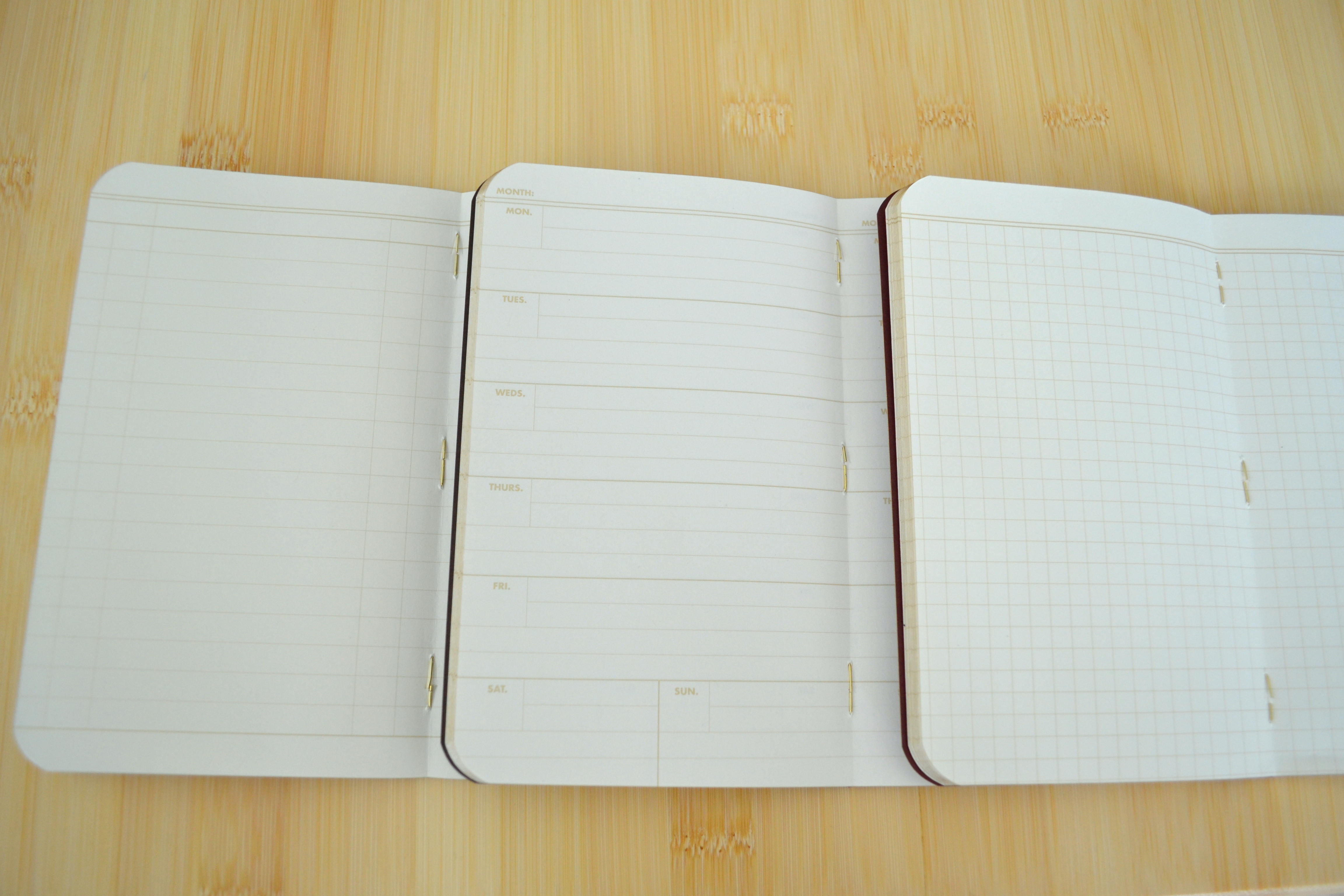
The paper holds up to fountain pen ink quite well though thicker and juicer pens will bleed through.
Some bleed through and ghosting but not bad at all by Field Notes’ standards.
I hope the Field Notes decides to make the Ambition memo book part of their permanent line. I would happily pay a premium for it over the standard memo book.
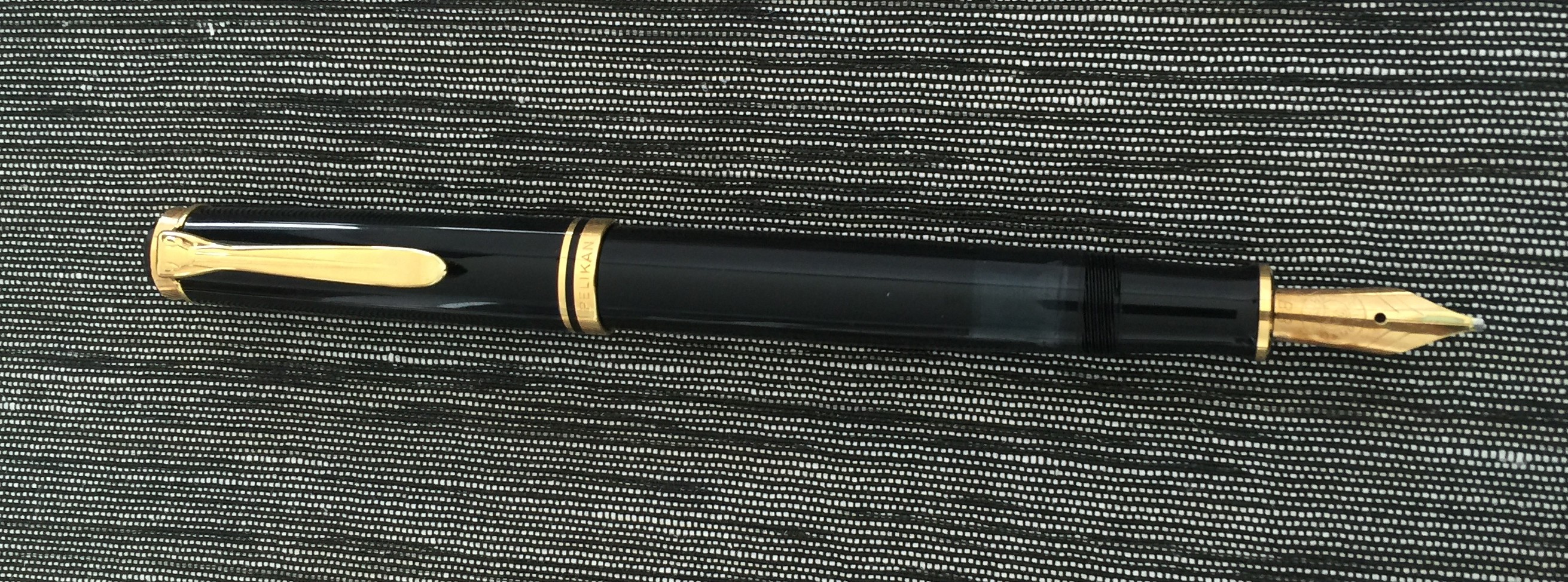
In 1988 Pelikan introduced the M600, a M400 sized pen with the upgraded trim of the larger M800.The M600 was sold with a monotone 18kt gold nib for it’s first year only, switching to a bi-tone 14kt gold nib in 1989.
In my opinion, the 1988 Pelikan M600 is the most desirable model as its nib is softer than any other post 1960s fountain pen I have used.
Appearance
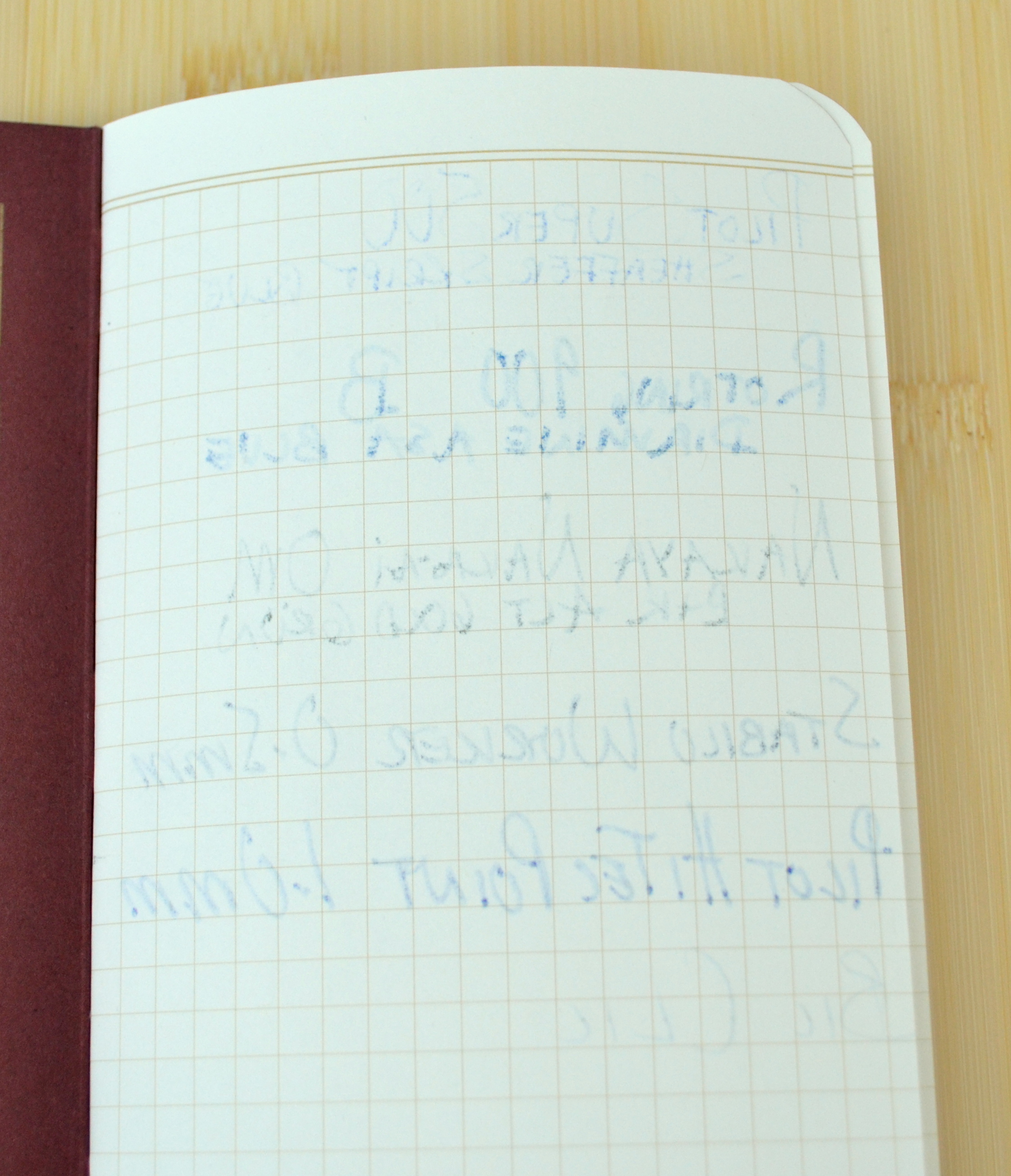
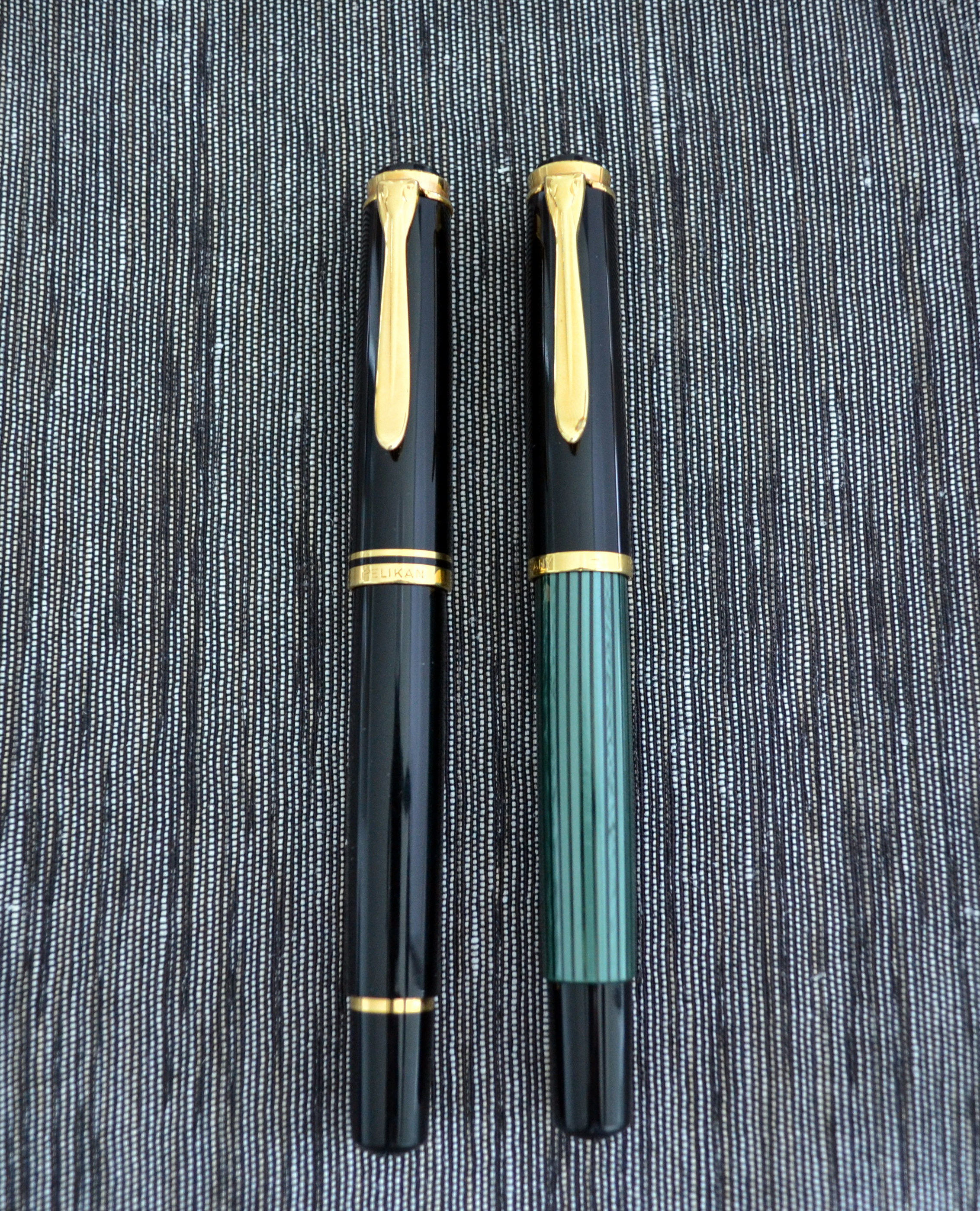
Pelikan M600 with Pelikan M400
The M600 features a classic design that Pelikan has been using since the 1950s with the introduction of the 400.The M600 differs from the modern M400 in that it has an extra gold cap band, a gold band on the piston knob and a gold band on the end of the section.
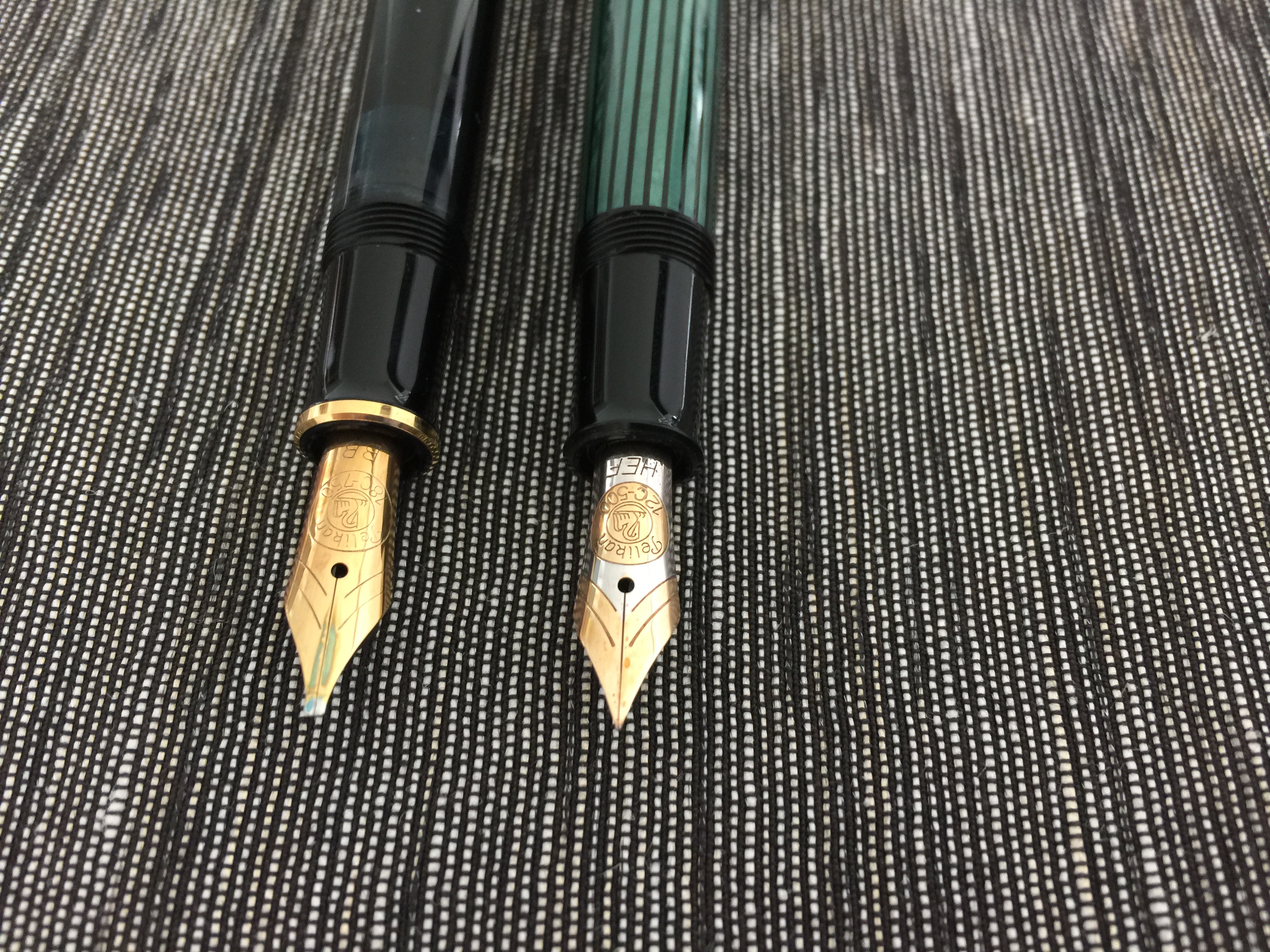
Pelikan M600 and Pelikan M400 with rare 12C HEF nib .
In solid black with gold trim this pen’s classic styling wont be garnering much attention but it is elegant and understated.
Score: 3/5
Build Quality
Is this a good quality pen?I spent a lot of time thinking about this and my honest answer is no, not really.
The fit and finish of the gold furniture is pretty good and the threaded nib assemblies are a great design that allows the user to easily swap nibs.The finish of the black plastic (or “resin”) barrel and cap is excellent but the plastic section has big nasty seams.
As big and nasty as those seems are they were not easy to photograph.
The M600 does not have the screw in piston assembly of the modern M800 and M1000 fountain pens; instead it snap fits into the barrel.This makes the pen much less serviceable and more prone to breakage.
When I received my M600 I noticed the piston knob was not sitting flush with the barrel and after some research I discovered that this was a side effect of the “snap-fit” design of the piston assembly.
With the palm of my hand I was able to knock the knob back into place (thank you to Francis Goossens for the tip) but there is no guarantee that it wont pop back out again with use.
I know this is an old pen (as old as I am in fact) but I have not had this problem on any of the dozens of piston fillers I have owned produced from the 1940s to present day.
Score: 2/5
Size & Weight
The pre-1997 M600 is the same size as the M200, M400 and classic 400.This was considered a standard size pen back in the 1950s but today it seems a bit small.The post-1997 M600 is larger and, as you would expect, sits in between the M400 and M800 sizes.
I find the M600 to be very comfortable.It measures 12.5 cm capped, and 12.2cm uncapped.It weighs a mere 15 grams with half a tank of ink.People with larger hands will probably want to post this pen but for me it is comfortable posted and unposted.
Score: 4/5
Performance
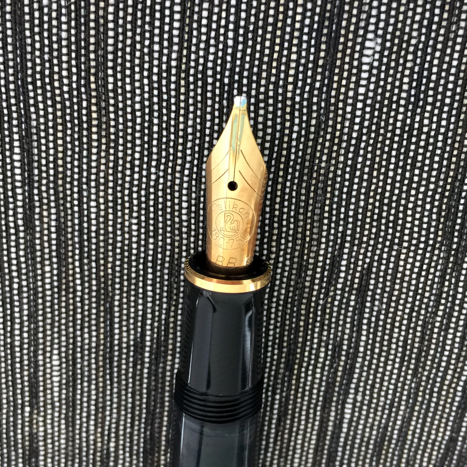
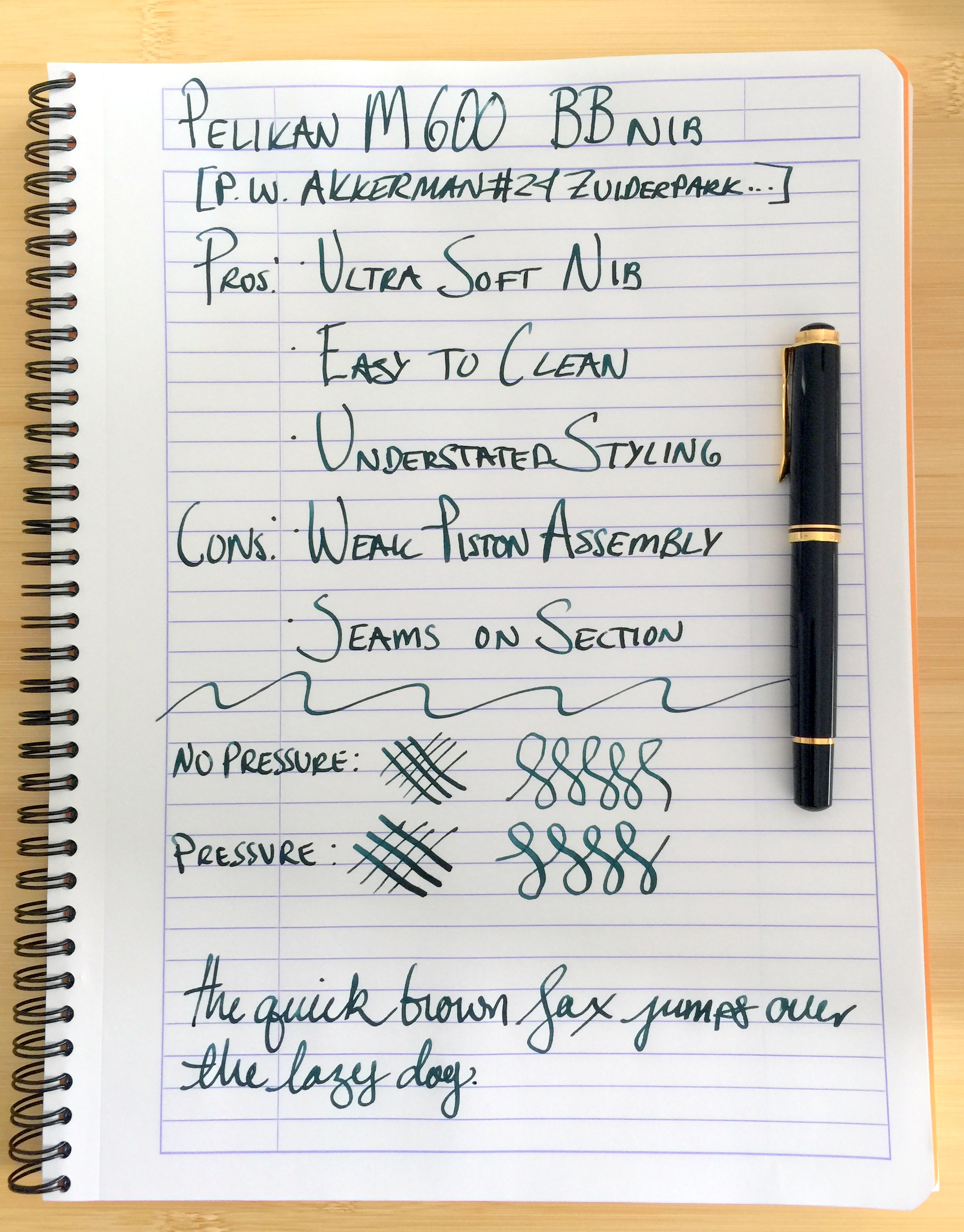
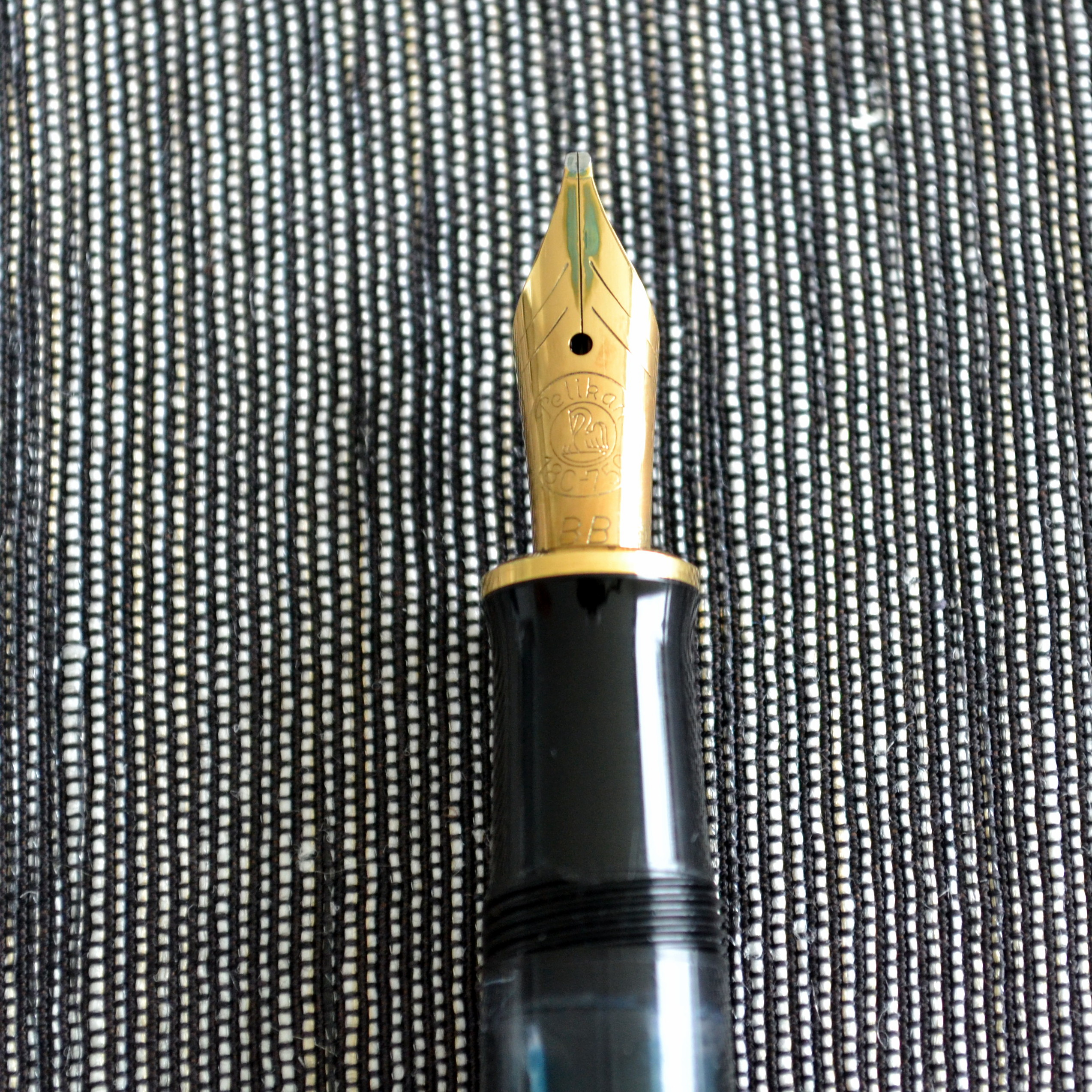
As mentioned above, in it’s first year of production the M600 was fitted with a single tone 18kt gold nib that was also used on the M700 Toledo at the time.This is one of the softest post 1960s nibs I have ever used.The BB point is stubbish and offers line variation without pressure.
The nib is ultra smooth and quite wet.By comparison, my Pilot music nib puts down a thinner line.
The nib sings a bit, which some people may find annoying but it has no affect on the performance of the nib.I have started looking for more of these 1988 M600s and their related nibs as I find them to be quite wonderful.
Score: 4/5
Filling System
The piston filling system holds a decent amount of ink and is very easy to clean and lubricate thanks to the user removable nib units.With the juicy nib though it doesn’t take long for the ink to run out.
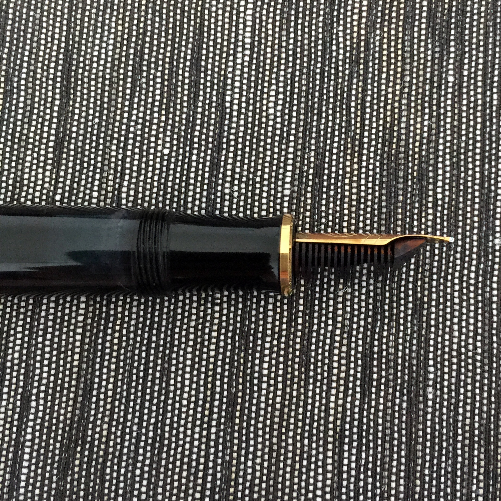
You can see that the blue ink window is full of ink and that the nib has blue ink on it’s tines (the fountain pen equivalent a baby’s face after a bowl of heavily sauced spaghetti).
As I mentioned in the build quality section, the piston assembly is a weak point on these pens and as such it is wise to use the piston gently and make certain that it is properly lubricated.
Score: 3/5
Value
I paid $165 for this M600 and to me that price is certainly worth it for the fantastic nib.I think if you can get a 1988 model for $200 or less you will have a hard time finding anything that comes close with an ultra soft nib, piston filling mechanism, and threaded nib units.
Score: 4/5
Bottom Line
The great nib and design make this pen a winner despite mediocre build quality.
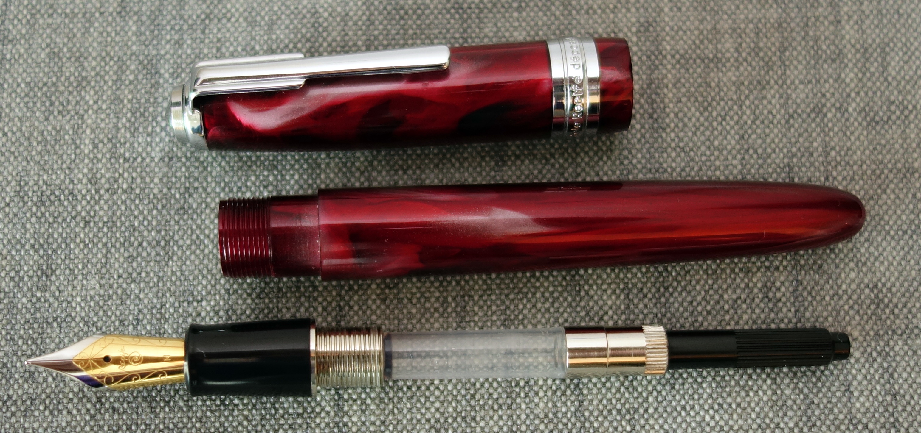
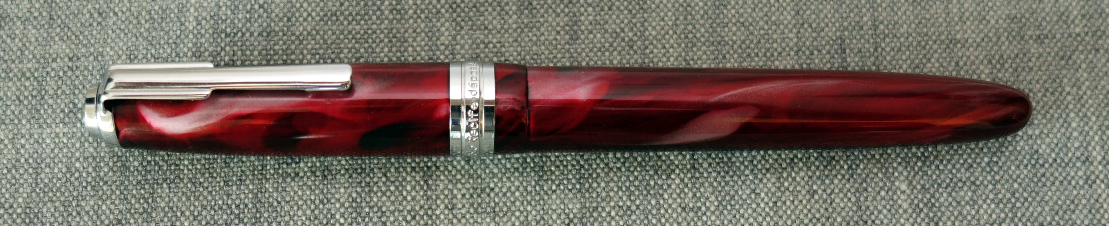
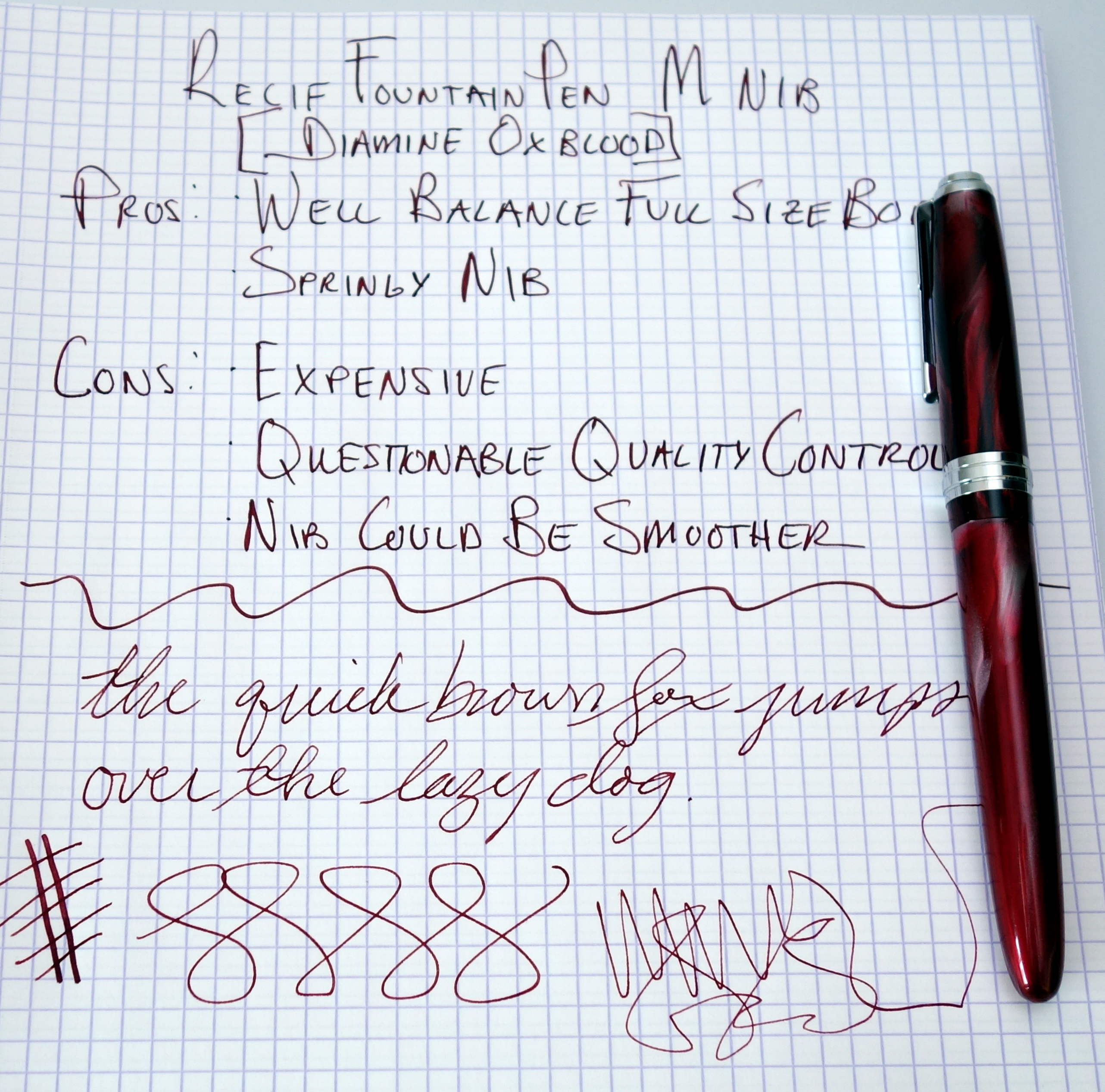
During my recent move I uncovered some fountain pens that I have not used in over 10 years. One of these was a large Récife fountain pen. Many of you may be unfamiliar with this French brand as it is not regularly discussed on pen blogs and pen forums but the brand does still exist and the pens they produce today seem to be largely the same.
The red swirled acrylic body is big and beautiful. The pen measures 6 inches long capped and with brass threading weighs 35.2 grams. For such a large pen it is well balanced and I am able to use it comfortably both posted and unposted.
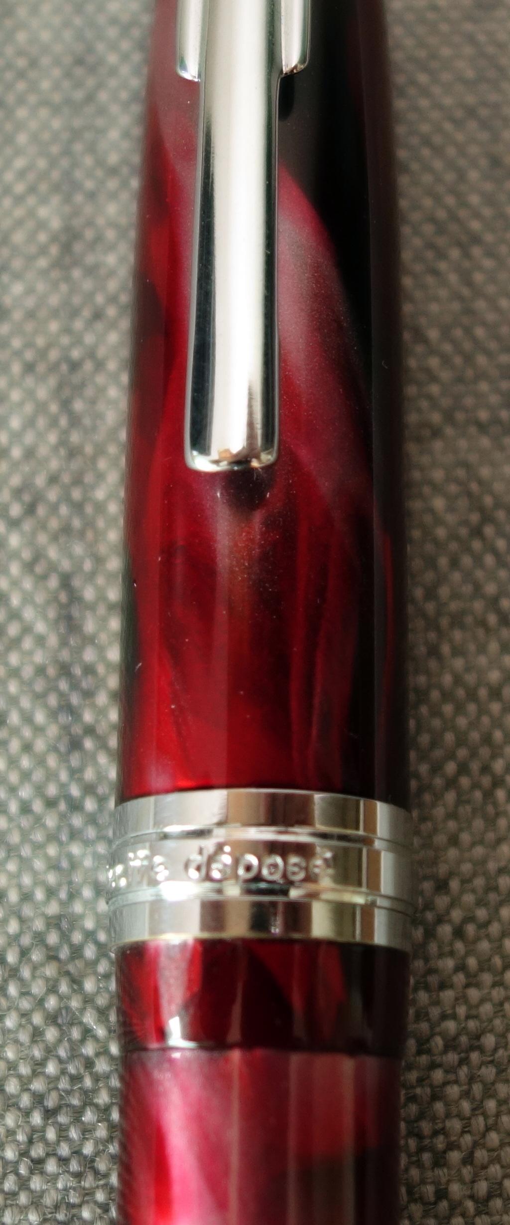
The silver metal trim doesn’t seem to be fitted with much care as the words “Modele Recife Depose” are badly off center from the clip. I have to say I am also not a fan of the Art Deco style clip; it looks cheap.
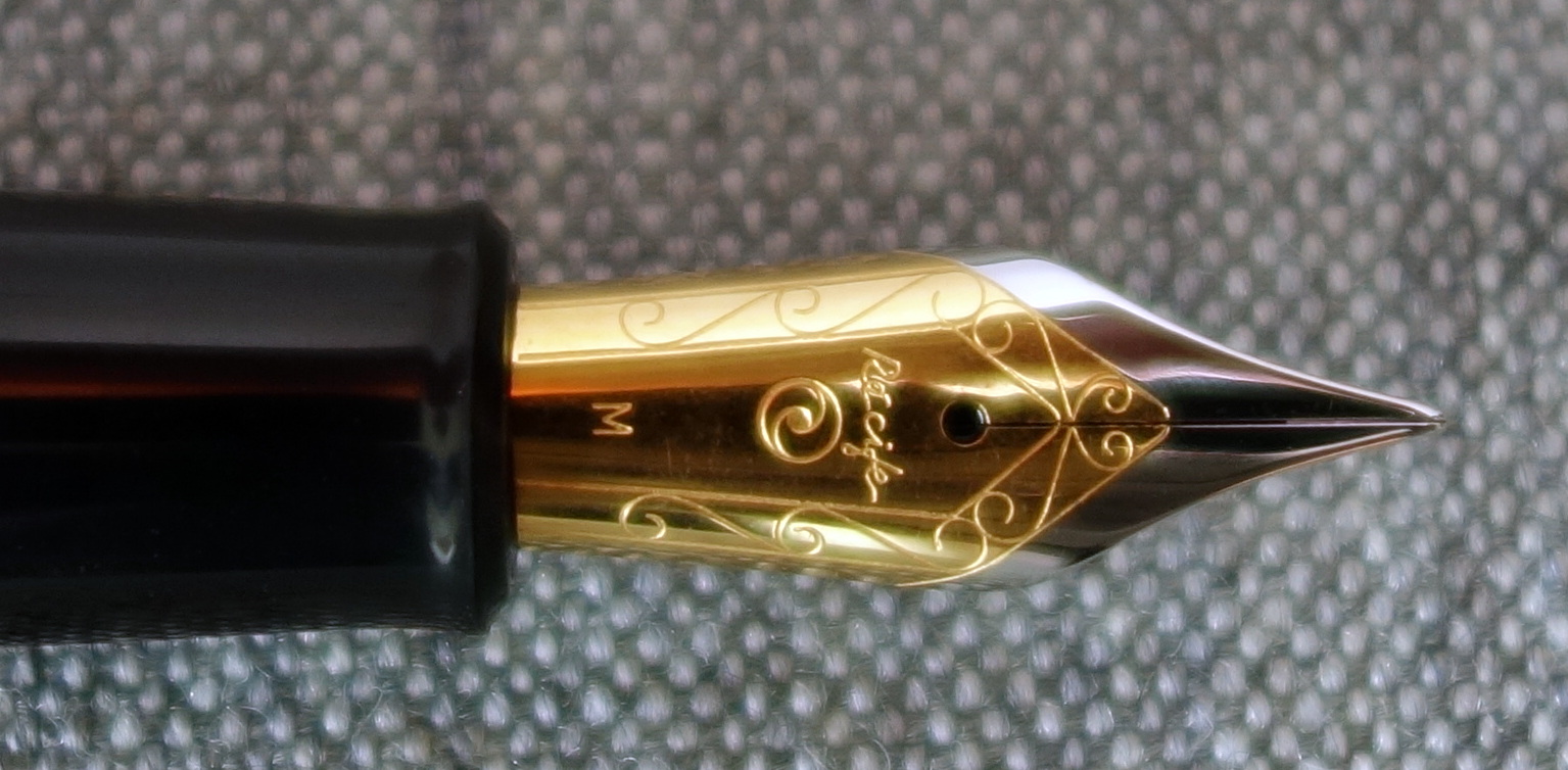
The large steel two-tone Jowo nib isn’t a stunner but it is surprisingly springy and I was able to get a decent amount of line variation out of the nib.
The nib isn’t the smoothest and it writes rather fine for a medium point.
Today these pens go for $125+ and there are a lot of great pens for the same money. You could get a pen with a piston filling mechanism like a Pelikan M200 or a pen with a solid gold nib like a Pilot Custom 74 but if you want a big brightly colored body with a springy nib the Recife may not be such a bad option.
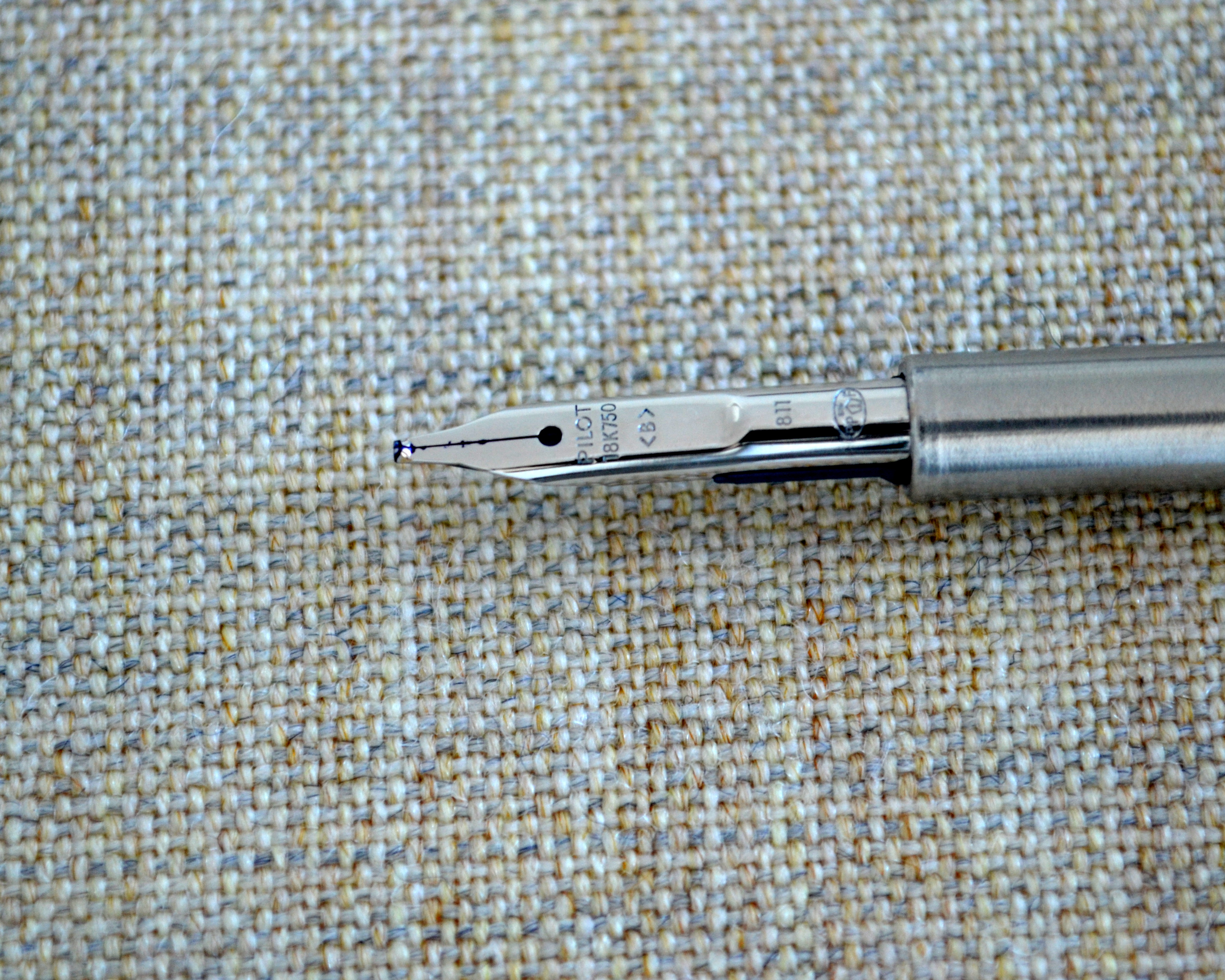
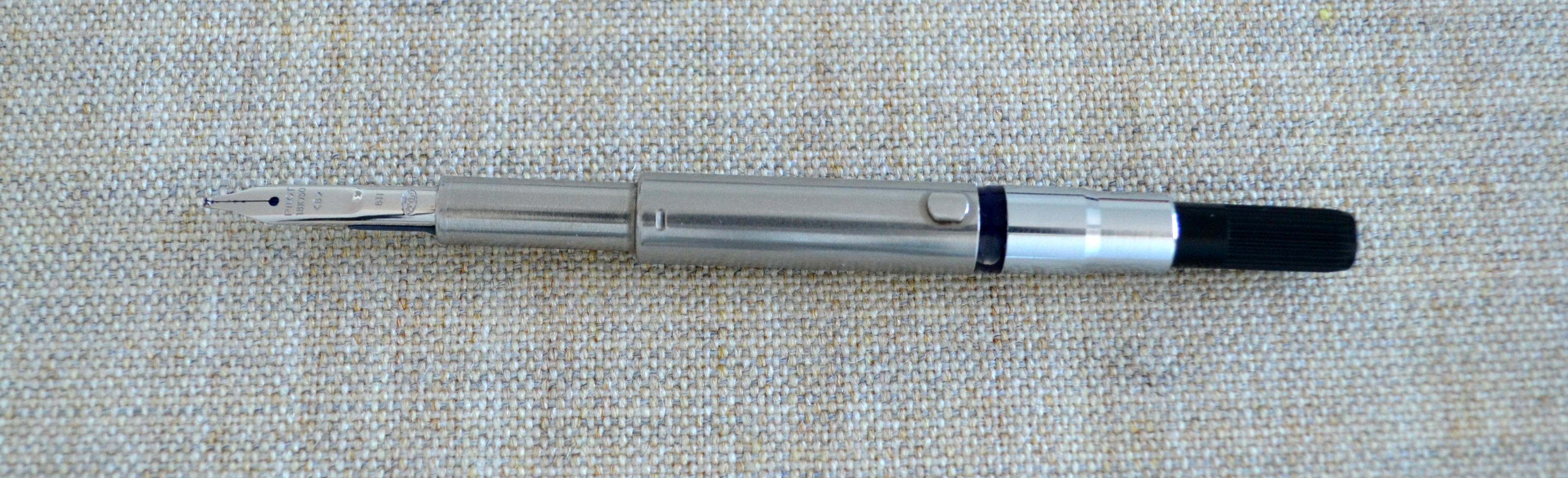
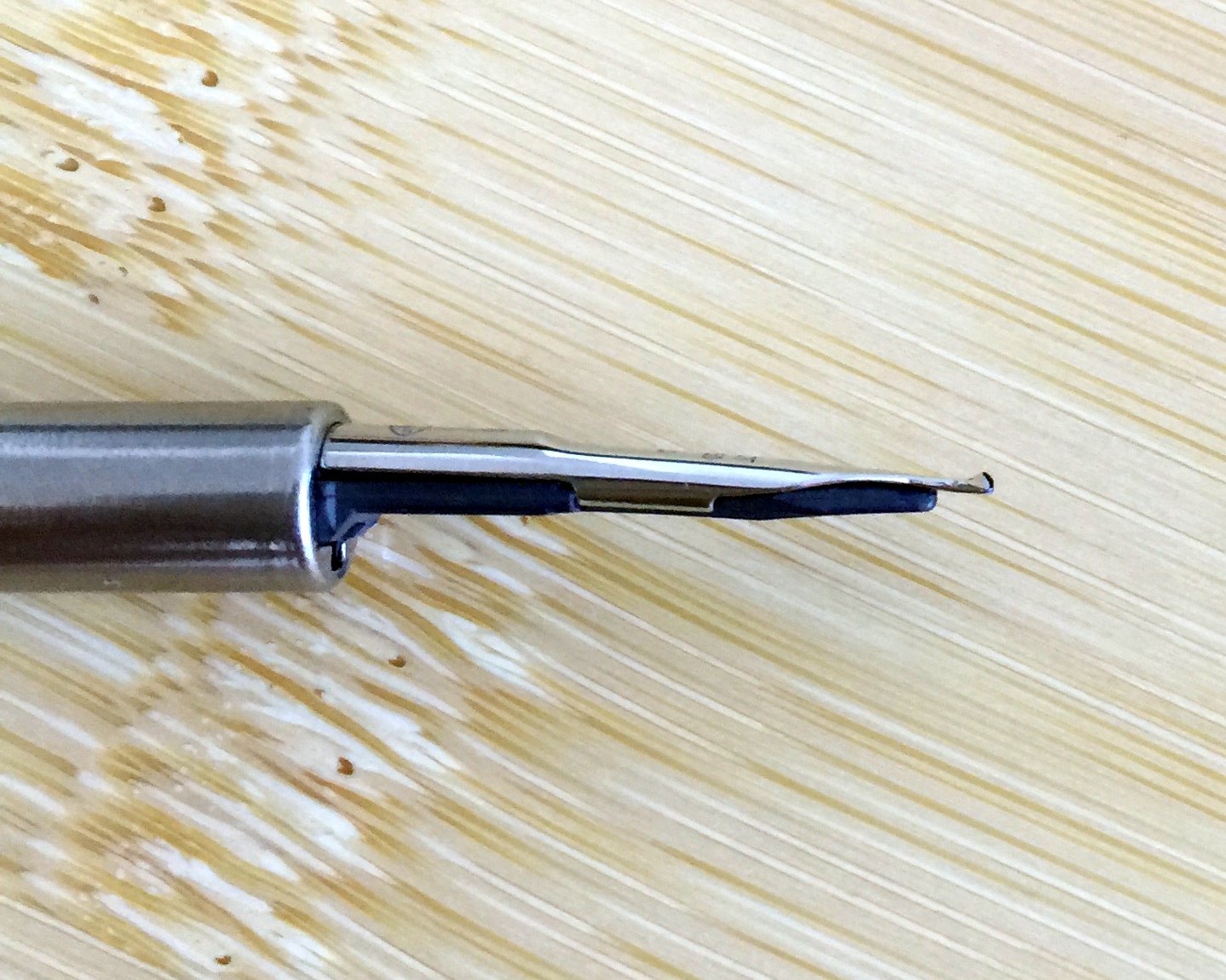
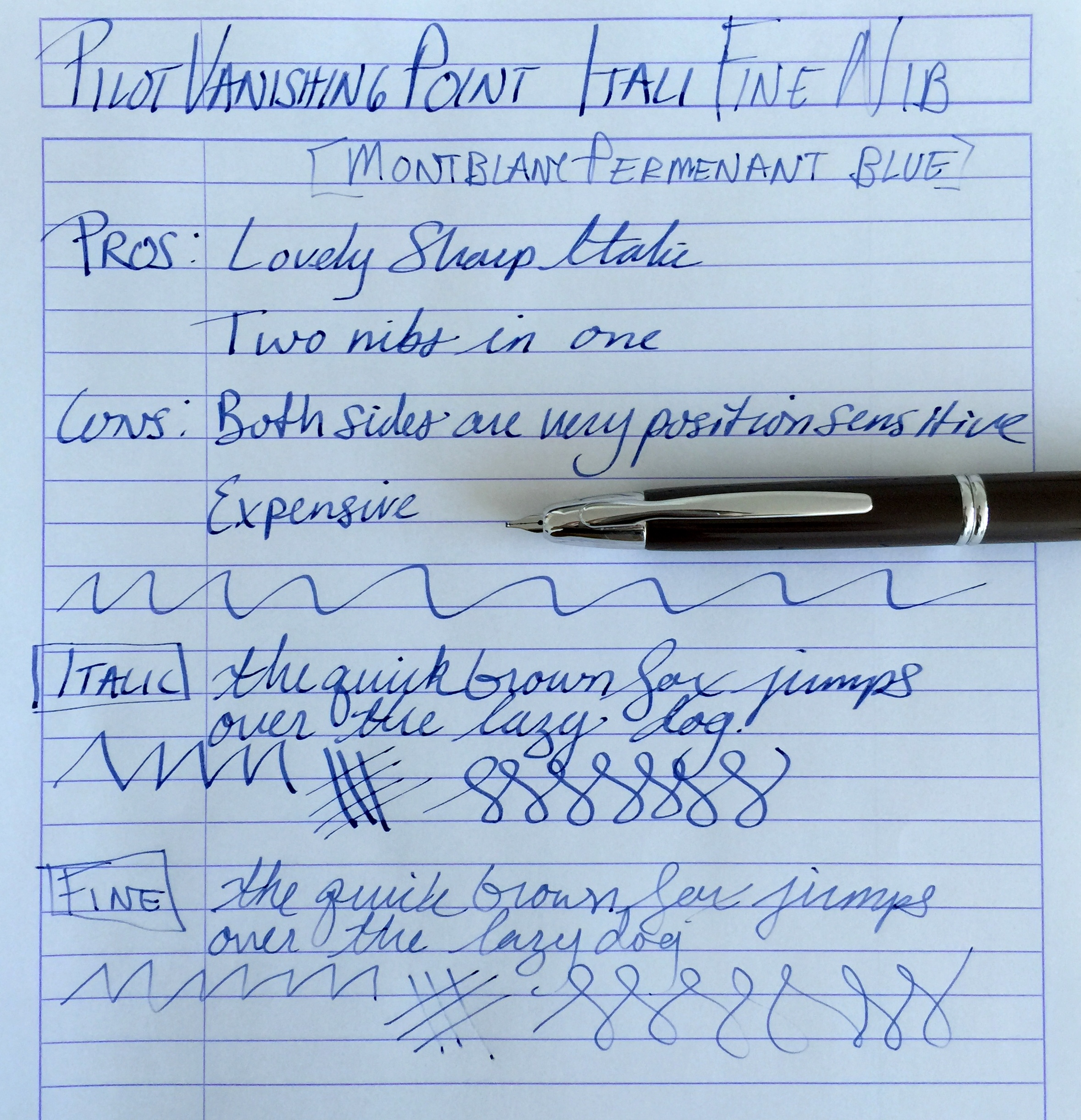
When I heard that Richard Binder was winding down his retail business I knew it was finally time to give one of his “ItaliFine” nibs a go. For those of you who do not know, an ItaliFine nib is a combination nib that offers an italic point on one side and a fine point on the other.
As you can see from the pictures this nib started life as a standard 18kt gold broad nib which Mr. Binder customized into an ItaliFine.
With the nib right side up the nib writes with an italic point. This nib is a true 0.9mm italic and as such is quite sharp and offers a good deal of line variation.
With the nib upside down the nib writes with a fine point. I have found the fine side to be a bit more tricky than the italic. The fine side does not like pressure and will skip with anything but the lightest pressure.
Also the fine side of this nib is position sensitive as its opposite side is fatter and straight cut. For me there was a short learning curve with this nib and now that I have it down, it is a wonderful nib that has transformed my Pilot Vanishing Point into a pen that is now a joy to use. The cost of this nib while still available is $125 and that is expensive for a VP nib but it really works as two nibs that you can use in the same pen on the fly…it’s worth it.
Side Note: Some of you may have noticed that I have been gone for a little while. I have been in the process of moving and I am still working on getting my office (The Unroyal Warrant HQ) set up but as of today I am mostly operational, a new computer and some new furniture is on its way but I will be able to provide regular content 1-3 times a week going forward.
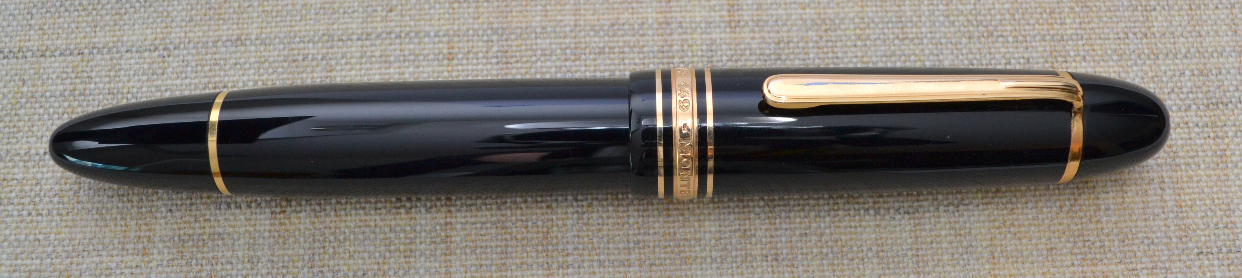
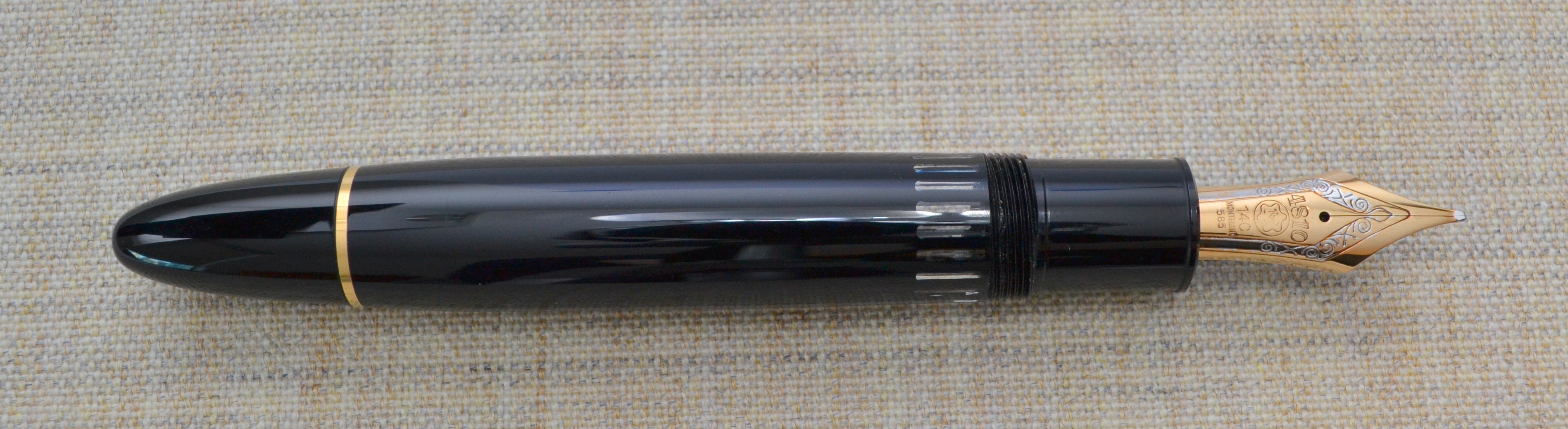
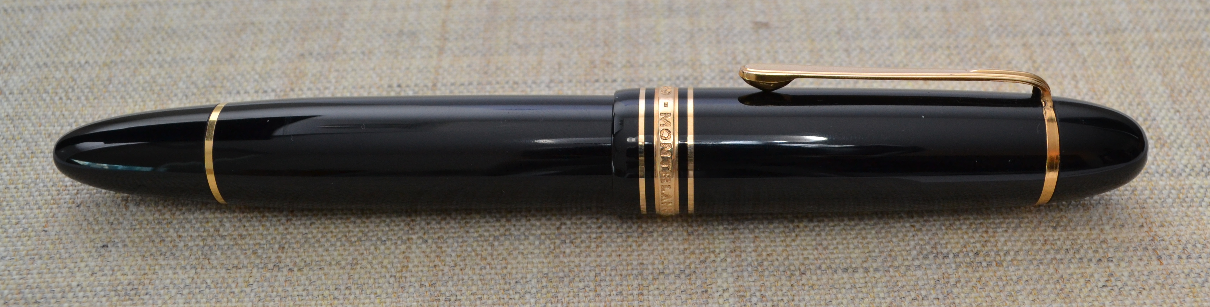
I have been collecting fountain pens for a little while now and have made a few poor purchases. My most expensive blunder has been this pen, a Montblanc 149 Meisterstück. (If you want just want to hear about the 149 as a pen skip down to the “Appearance” section.)
There is a well-regarded pen catalog (whose name I will not mention) and the best pens are purchased almost instantly upon release of the catalog so you don’t have much time to think.
The 1960s 149 that I had wanted sold before I had a chance so I jumped on the still available 1972 model and paid a hefty premium as it was new-old-stock.
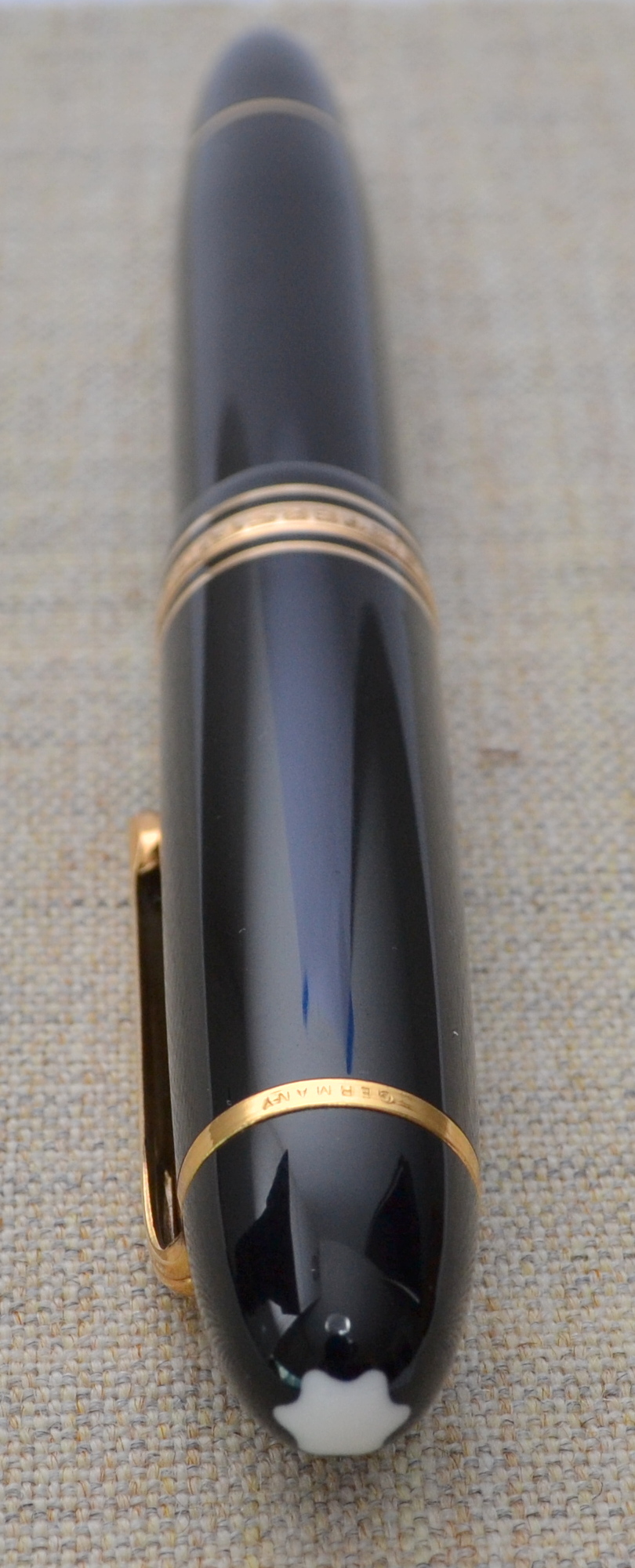
The pen arrived in the original box with the original guarantee and with the sticker still on the pen. When I took off the cap and found that the nib was tarnished and the rhodium plate had disappeared in spots. The pen must have been dipped at one point and then put away uncleaned.
This is how I received the pen. With some light polishing with a jewelers cloth I was able to get rid of most of the orange tarnish.
I contacted the catalog owner and to his credit he offered a few fair options: 1) lower the price, 2) re-plate the nib, or 3) refund my money. I foolishly became attached to the pen and decided to go for the lower price when I should have simply returned the pen. Oh well…
Appearance
When I first saw a 149 in person years ago I thought it looked like a ridiculous cartoon pen; it is just so large. I have come around to liking the looks of it’s imposing size but if I am honest I would be embarrassed to use this pen at work…or around people in general.
The streamlined shape with black resin and gold furniture is a classic and this pen really is the archetype for a luxury fountain pen. The 149 is an icon much like a Rolex Submariner and as such there are many lookalikes.
The 149 has the best shape of any pen in the Meisterstück line. It is more cigar-like than the other Meisterstücks, which tend to have a longer and thinner profiles. There isn’t too much to say other than it’s a classic and a very attractive shape.
Score: 4/5
Build Quality
Montblanc has been producing the 149 since the late 1940s/early 1950s and there have been numerous iterations. The first models were the best quality and as such are the most valuable. So what about my early 1970s model? In my opinion, the Meisterstück line has gotten worse over time.
My 149 is made from plastic (“precious resin”) and has a plastic piston mechanism (not the metal telescopic one from the 50s and early 60s nor the metal one in the current 149). The barrel is a single piece of plastic compared to the modern two-piece barrel, which is cheaper to manufacture. The plastic is soft and scratches easily. Montblanc finishes the plastic with a very high shine so it is possible to polish out scratches if they are not too deep.
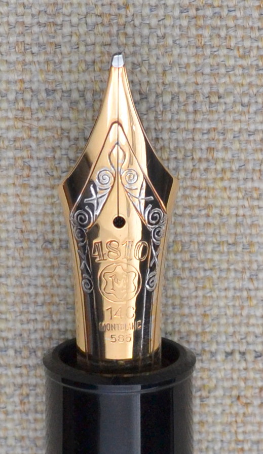
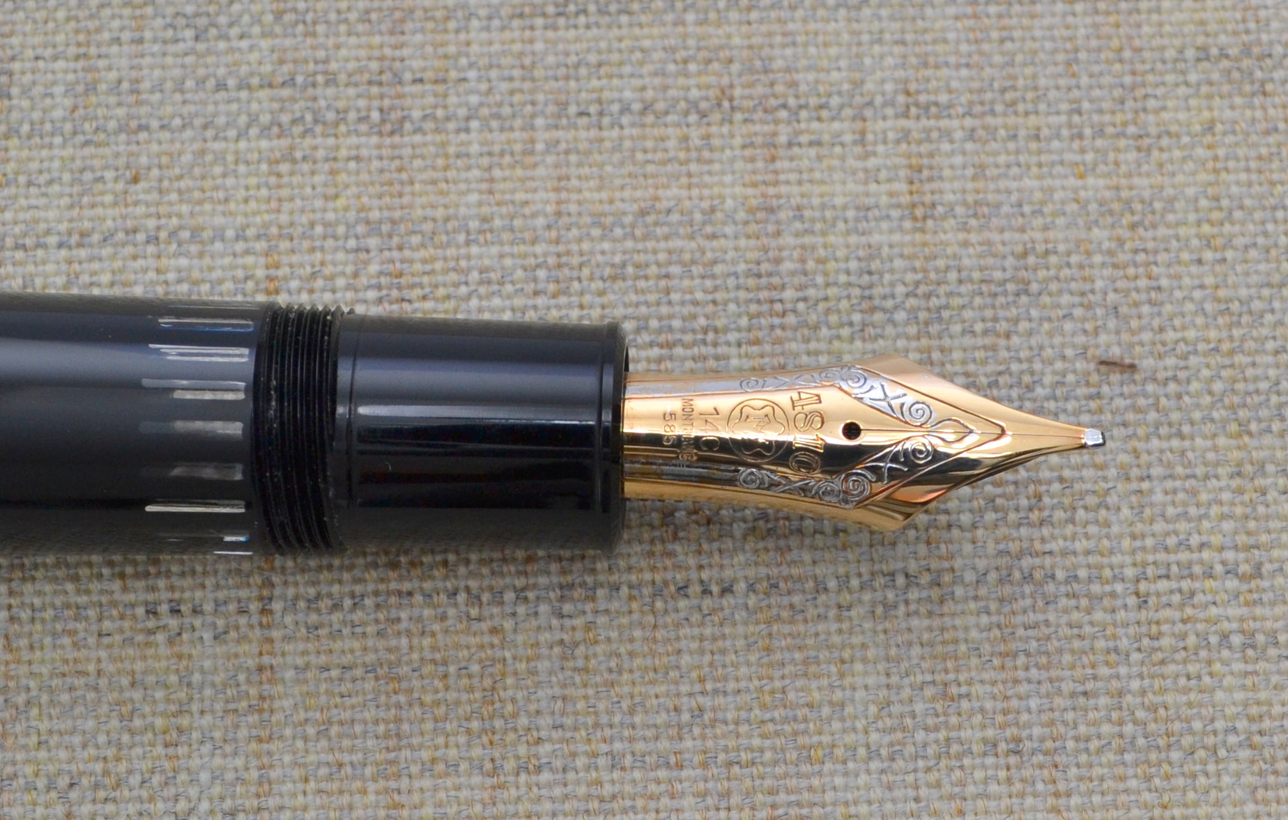
The tri-color nib is made of a soft 14ct gold with a solid ebonite feed instead of the plastic feed and stiffer 18kt tri-color nib on the modern 149. Montblanc produces all of their nibs in house and hand grinds and hand finishes each nib. If you look closely you will see that the slit between the tines doesn’t quite line up with the design.
One sore point on my pen is the plating on the nib. The rhodium (white metal) plating seems to have come off a bit. Which is something that shouldn’t really happen on a pen this expensive. I have confirmed through accounts of members of the Fountain Pen Network that this is not that uncommon for Montblanc pens.
Overall I would consider the build good but not great for a pen this expensive.
Score: 2/5
Size & Weight
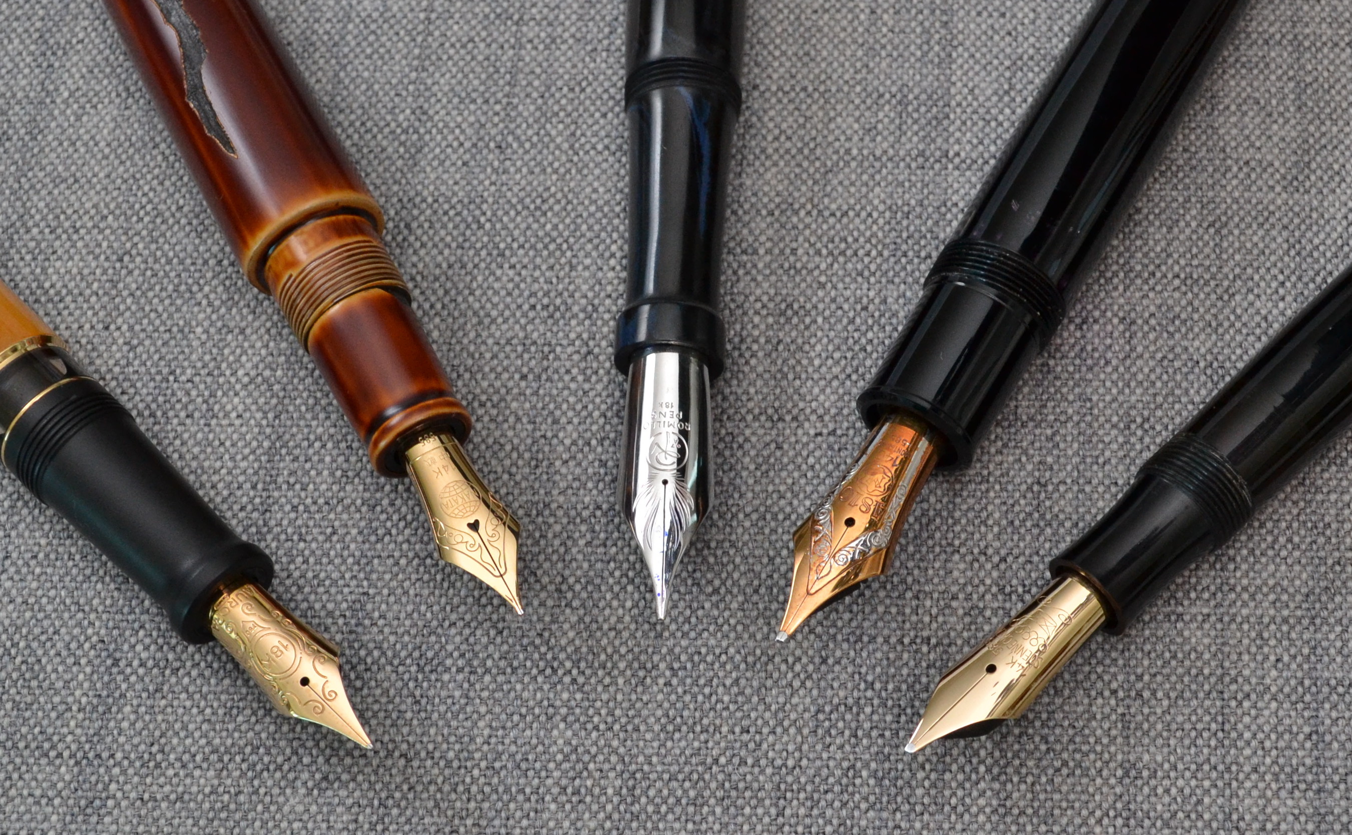
One of the benefits of the plastic piston mechanism is that it keeps the weight down to 29.3 grams (empty). The 149 is the fattest pen I own and for me it is too fat to use comfortably for a longer period of time. See the picture below…
Left to right: Aurora Afrika, Nakaya Naka-ai Negoro Shiro-tamenuri, Romillo Essential No. 9, Montblanc 149, Soennecken 1 Extra
Even though this pen doesn’t have the biggest nib it clearly has the fattest section by a big margin.
The pen measures just under 15cm long and 1.6cm at it’s widest point. The grip section is about 1.3cm in diameter which is the most oversized measurement of the entire pen. You can post this pen but there really is no need to do so as it is a hair over 13cm long uncapped.
There are people with small hands and people large hands that love this pen so don’t assume that it wont work for you. If you want a 149 I highly suggest to you try before you buy. One of the major perks of owning a Montblanc is that there are many boutiques all over the world so they are easy to purchase and service. It is worth mentioning that pens serviced by Montblanc may be repaired with modern (often less desirable) parts.
Score: 2/5
Performance
The big OB nib is a great performer. The nib has long tines that make the nib soft and springy. The OB point is more round than the points on the older 1950s nibs. The rounder the nib the less line variation but the tradeoff is that nib is less position sensitive. Given the choice I much prefer the flatter nib.
The nib does allow for some line variation with pressure; it is much better than most modern pens in this regard.
Score: 4/5
Filling System
One of the benefits of the 149 is the massive 2.7ml ink capacity. By comparison the average converter holds about 0.5ml of ink and the average piston filler holds about 1.0ml.
The piston is very smooth and the striped ink window is ultra clear and has remained easy to clean. One thing that I don’t care for is the amount of play in the piston knob once loosened; it hasn’t caused any problems but it doesn’t instill confidence.
If ink capacity is your top priority this may be the pen for you.
Score: 4/5
Value
Used, these pens can be had for around $300-$400. The 1960s versions go for a bit more and the 1950s models are usually over $1,000. For $300 you get an impressive looking iconic pen that non-pen people will notice and appreciate; if that sort of thing is important to you, I can assure you wont do better for the money.
New, the 149 costs around $900 and for me there many other pens that I prefer in terms of quality and comfort but none can really match the imposing presence of the 149. If you want something with true snob appeal the $900 might be justifiable.
Score: 3/5
Bottom Line
The 149 is fat….fat price, fat size, fat snob appeal.
Final Score 17/30
Here are some great reviews of the Montblanc 149:
(I have no affiliation with the sites linked below)