Field Notes 18-Month Work Station Calendar Review

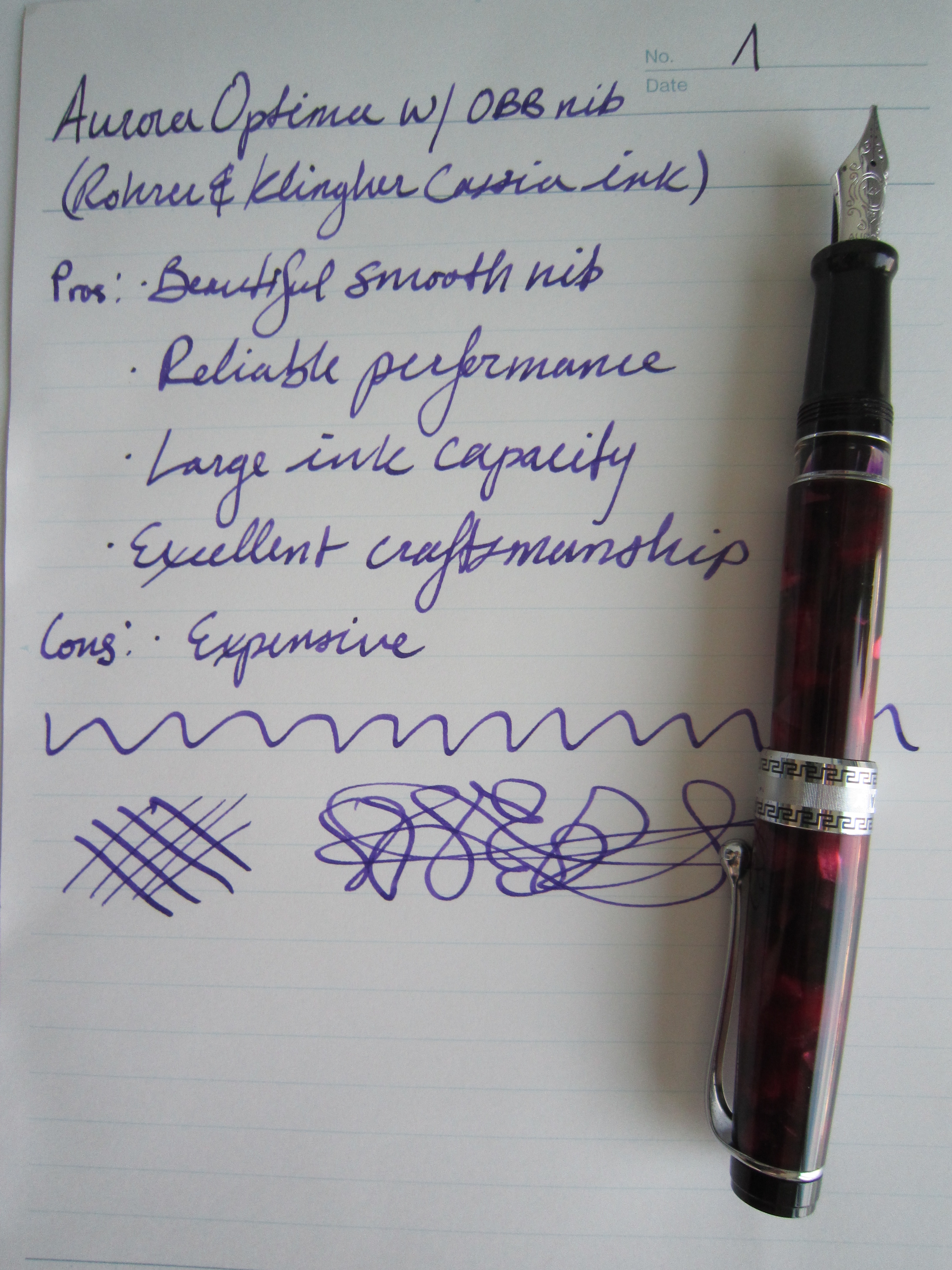
When I tried Field Notes journals a few years back I didn’t like them; the paper wasn’t fountain pen friendly so I gave them away and that was that.  Recently, I saw a friend’s vast collection of limited edition Field Notes and realized that I couldn’t live without them.  Beyond the journals I have ventured out into some of their other products which brings me to the Field Notes 18-Month Work Station Calendar.

The calendar features the same Futura Bold font as the journals and the chipboard backing has the typical sort of campy/amusing signage you expect from Field Notes.  For example, it states “No maintenance or special tools required.”  As the name suggests this calendar has 18 months starting November 2013 and ending with April 2015.

Field Notes 18-Month Work Station Calendar (front)

The back of the chipboard features a list of “Real Big Days” including major holidays and the dates of (random) historical events; here is a sample of the dates:

Mar 22: “Leonard ‘Chico’ Marx, hat-wearing comedian (b. 1887)”

May 1 : “1982 World’s Fair opens in Knoxville, Tennessee (1982)”

Jun 12 : “Dr. Cyclops begins filming in three-stage Technicolor (1939)”

The back also lists details about what was used in the manufacturing process.

Field Notes 18-Month Work Station Calendar (back)

The calendar itself is very simple; the only real features are moon phases and holidays.  There isn’t much space to write in the date boxes so like the Field Notes journals you would buy this more for looks than for function.  The Field Notes 18-Month Work Station Calendar looks great and I am excited to use it at my desk.

fieldnotesbrand.com

Pilot FriXion Clicker Erasable Gel Pen Review

While there are a lot of things I don’t like about the Pilot FriXion Clicker Erasable Gel Pen, it is easily the best erasable pen I have used.

Sorry about the picture quality.  Out of town for the weekend and forgot my camera.
Sorry about the picture quality. Out of town for the weekend and forgot my camera.

One thing I didn’t mention in the written review is that the eraser doesn’t make a mess like a normal pencil eraser.  The ink disappears with heat caused by the “frixion” of the eraser against the paper.

Here is another Pilot FriXion Clicker review:

(I have no affiliation to the site linked below)

Pilot FriXion Clicker Erasable Gel Pen Review – by Y-uhao’s

S.T. Dupont Liberte Ballpoint Pen Review

I have never been a fan of non-gel ballpoints; the ink is generally inconsistent and not particularly vivid.  I have received ballpoints as gifts on a number of occasions and on a pen blog it would be wrong to ignore them.

IMG_1401

The S.T. Dupont Liberté ballpoint is made from a brass barrel finished in black lacquer (not the more expensive Chinese lacquer S.T. Dupont is famous for) with palladium accents.  The tapered design is elegant and the top of the cap its faceted with “D” in metal.  Even though this is a lower end model for S.T. Dupont it still costs a whopping $480 retail.  The Liberté is a fingerprint magnet and that drives me nuts but the fit and finish is exceptional.

IMG_1405

The Liberté weighs in at 1.16oz which makes it a heavier pen but in my hand it is incredibly well balanced.  The body of the pen attaches to the cap with threading on the INSIDE of the barrel (see below).  To deploy and retract the ballpoint you simply twist the pen.  The twist mechanism is both very smooth and very crisp.

IMG_1396

The ballpoint is an S.T. Dupont branded EasyFLOW Schmidt refill that is unusually smooth.  It is so smooth in fact that I felt inclined to write in my normal cursive-esque hand.  Unfortunately the look of the ink is unusually hideous.  The easyFLOW refill always starts up without delay which is nice but when the ink looks this washed out and faint who really cares?

IMG_1398
With a better refill The S.T. Dupont Liberté would be a great ballpoint pen that quality-wise is superior to many pens in the same price-range (the modern version of the Montblanc Meisterstück and the Cartier Diabolo come to mind).

Zebra Arbez Eo Ballpoint Pen Review


2013-09-17 16.08.24

The Zebra Arbez Eo Ballpoint Pen 0.7 mm has an unusual body that is inspired by various modes of transport in London.  The Arbez series from Zebra (arbreZ…the name is Zebra spelled backwards) is the company’s designer series which features pens designed by winners of a competition aimed at young new designers.

The body of the pen has a toy-like look to it and has a weird half oval shape (one size is flat and the rest of the pen is rounded; think of an elongated “D”) which has been suggested is to resemble a Tube tunnel.  I have a normal grip but I generally don’t care pens that dictate how I should hold them.  Based on the design of the pen and where the branding is, this pen should be held with your index finger resting on the flat portion of the barrel.  I don’t find the barrel to be uncomfortable but I don’t want to waste brain cycles thinking about how to hold a ballpoint pen.

The ballpoint writes smoothly but is not as nice as some other less expensive ballpoints like the Pilot Acroball.  Also I don’t like that this pen has a cap.  Ballpoints don’t need a cap and I would prefer not to deal with one if I don’t have to.

If you love the design or simply want a conversation piece then it may be worth shelling out the $3.30 the Zebra Arbez Eo Ballpoint.

Here are a couple other reviews of the Zebra Arbez Eo Ballpoint Pen:

(I have no affiliation to the site linked below)

The Pen Addict – Zebra Arbez Eo Ballpoint Pen 0.7 mm Review


Aurora Optima Fountain Pen Review

Aurora Optima writing sample
Writing sample on a Maruman Report Pad P160 A5

The Optima is one of Aurora’s higher-end pens with a piston fill system and a 14k gold nib.  My Optima has a factory oblique-double-broad (OBB) nib and a burgundy “Auroloide” (celluloid) body.  The nib can be unscrewed for easy swapping.  Being a piston filler this pen holds a lot of ink and even has a “reserve tank”.  When the pen becomes low you simply twist the piston knob as far as it will go and this activates the special reserve tank which gives you another page or so of ink.  The Optima has the smoothest piston of all the pens in my collection, it is a real joy to use.

Aurora makes all of its nibs in house and the Optima’s nib is large and beautifully decorated.  This is my only OBB nib and I was surprised by how much I like it.  The nib glides effortlessly across the paper without being overly toothy like my other stub and oblique pens tend to be.   Aurora is famous for having nail-like nibs and the Optima’s is no exception.  If you are looking for some flex this definitely isn’t for you.  The nib features and ebonite feed with lots of fins.  This pen has been very reliable; it doesn’t skip and starts right away even after being uncapped for 15+ minutes.

Optima Nib

The Cassia ink appears green on the ebonite feed.

The Optima has a very nice weight and size.  It’s a shorter pen at 5.9 inches capped but is thicker than normal at slightly over half an inch at the widest point making it very comfortable to hold.  The Optima’s dimensions suit me very well.  The celluloid body is beautiful. The flat cap and engraving on the barrel which reads “AURORA ITALIA” and “FABBRICA ITALIANA DI PENNE A SERBATOIO” gives this pen a nice vintage feel.  The embellishments on the cap are nice quality but I am not in love with them.  The Greek keys to my eye are not as tasteful as those found pens by OMAS and Montegrappa.

Optima closed

Optima barrel

I have had this pen for about six months and it has been in my regular rotation since purchase.  It’s a great workhorse.  The quality and attention to detail set this pen apart.

Here are some great reviews on the Optima:

(I have no affiliation to any of the sites linked below)

Best Fountain Pen – Aurora Optima Review

Gold Spot Pens – Aurora Optima Review