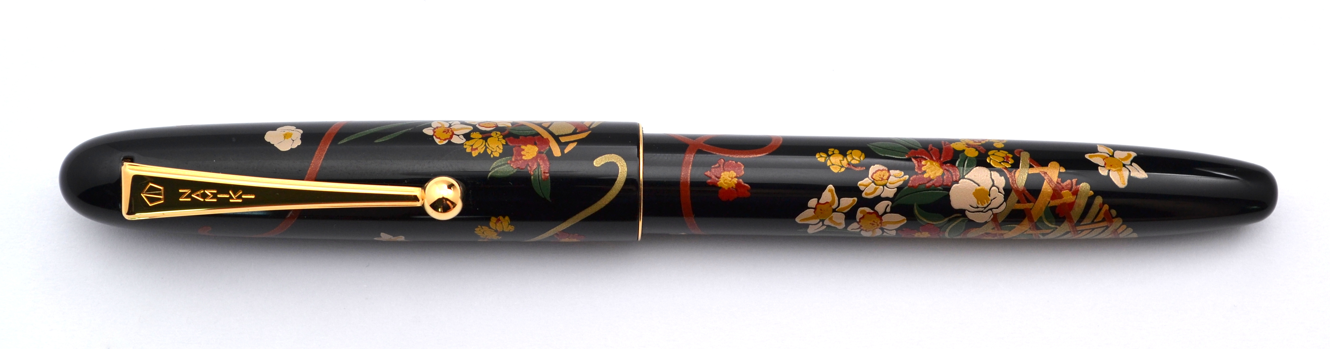
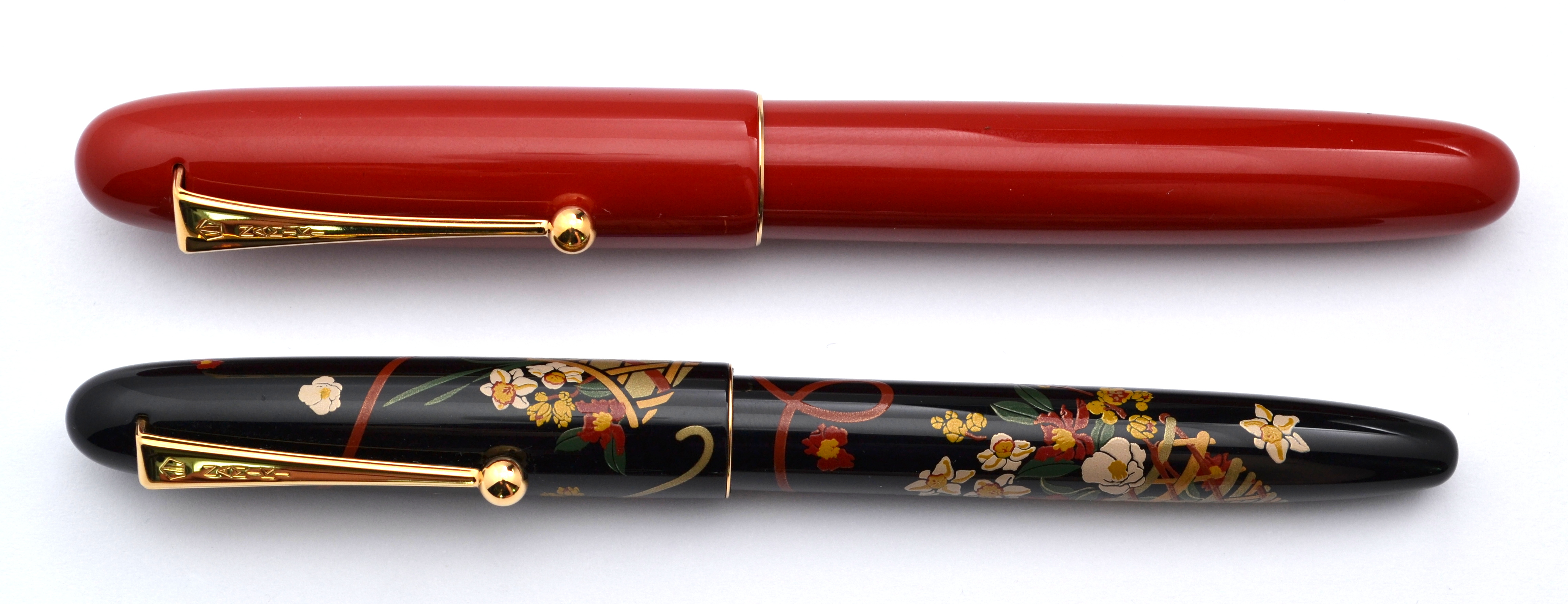
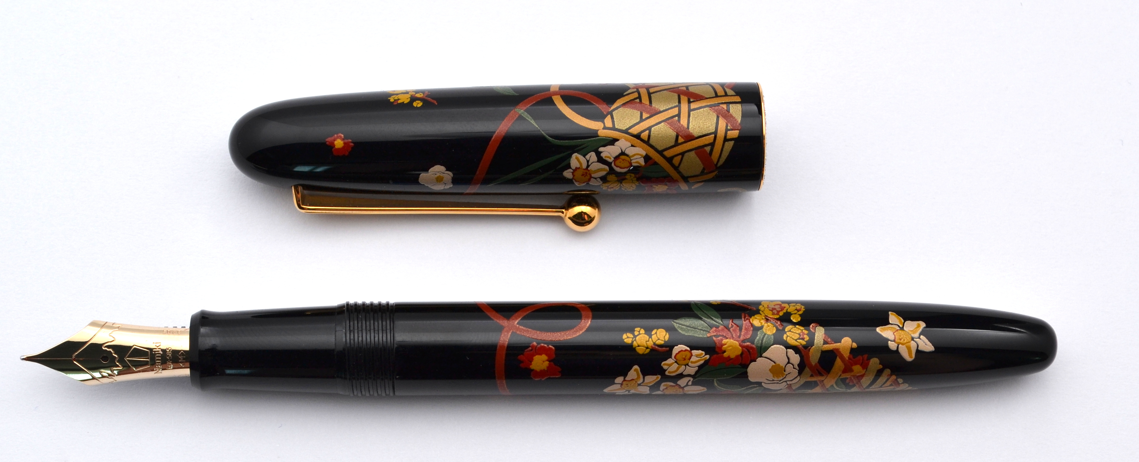
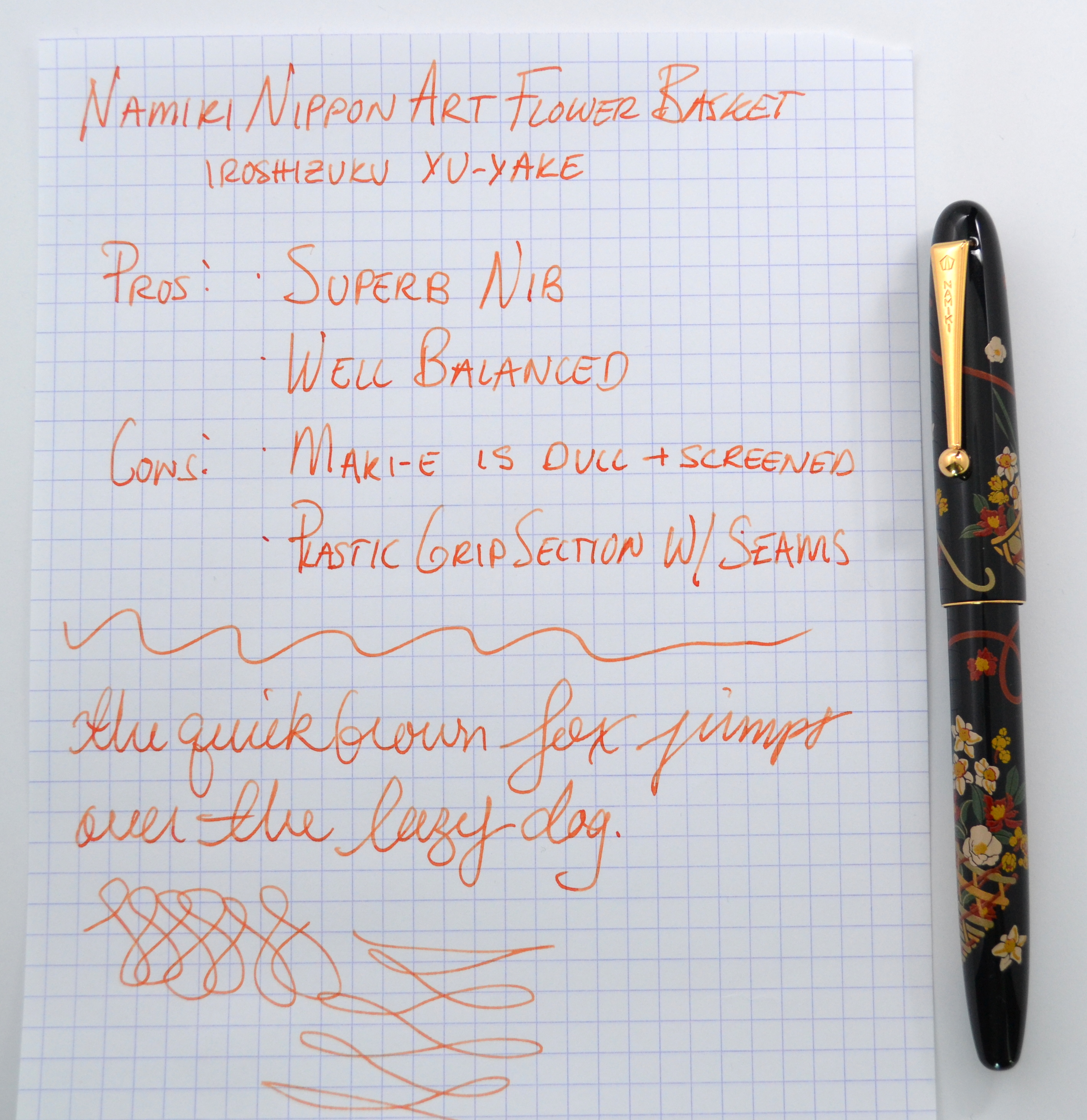
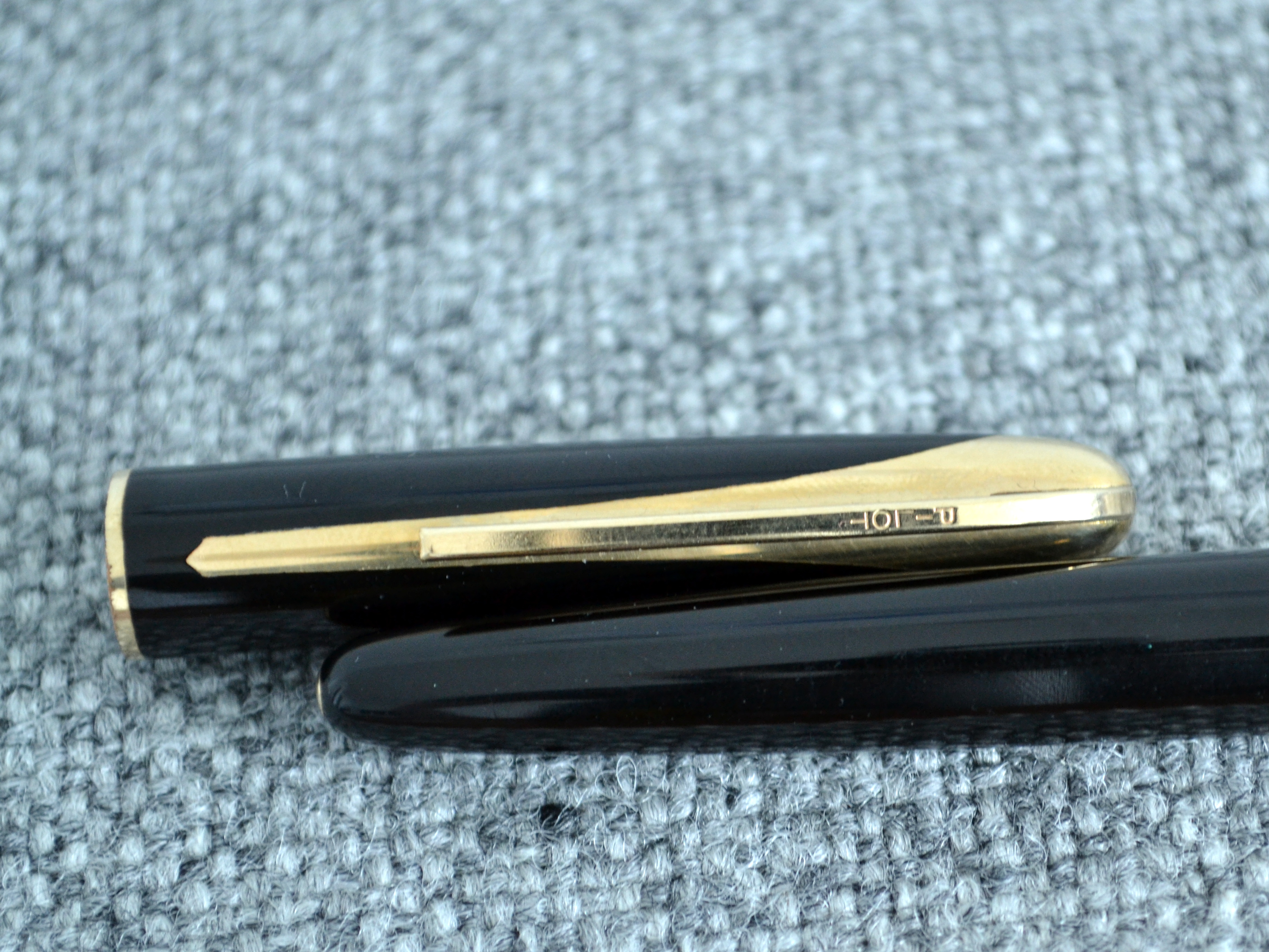
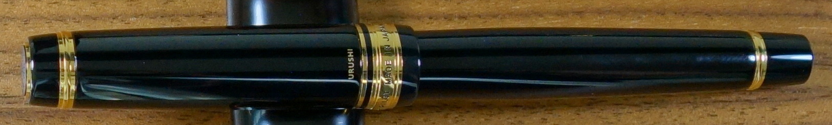
The Nippon Art series is Namiki’s entry level line of maki-e pens. The pens are screened and on my Flower Basket version I do not believe any of the artwork to be done by hand. It’s “Hira” or flat maki-e and it really is flat to look at. I also see no gold sprinkles which makes me question if it should actually be considered “maki-e”, which I am told translates roughly to “sprinkle picture”.
The body of the pen is plastic covered in urushi lacquer and has a gold plated clip and thin cap band. The pen is very simple and elegant; it looks great despite the dull hira maki-e. The section has a seam on it and I do not believe it to be painted with urushi. The pen is signed “Kokkokai” which is not a specific artist but rather a group of artists.
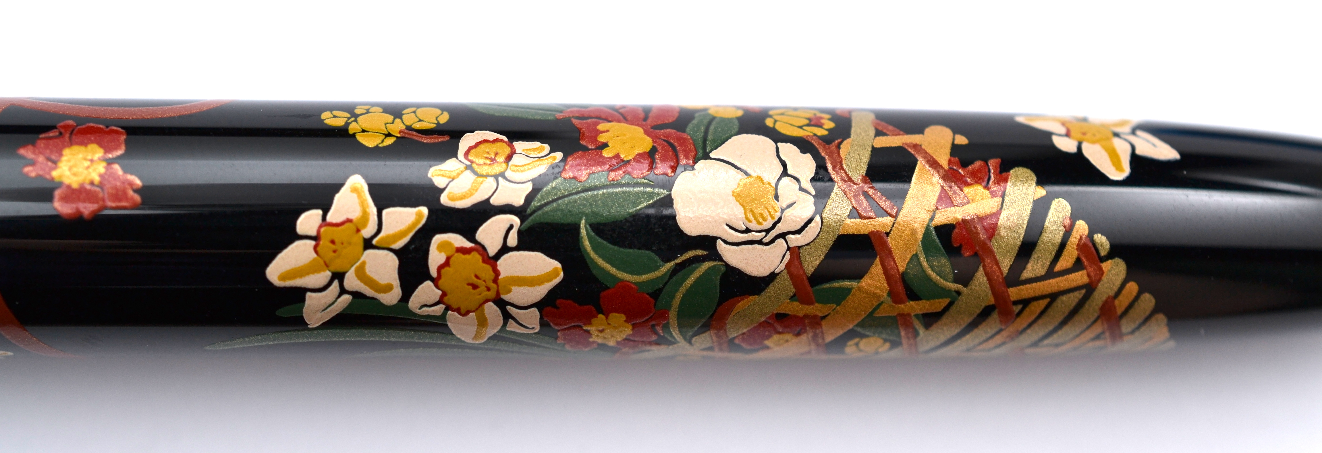
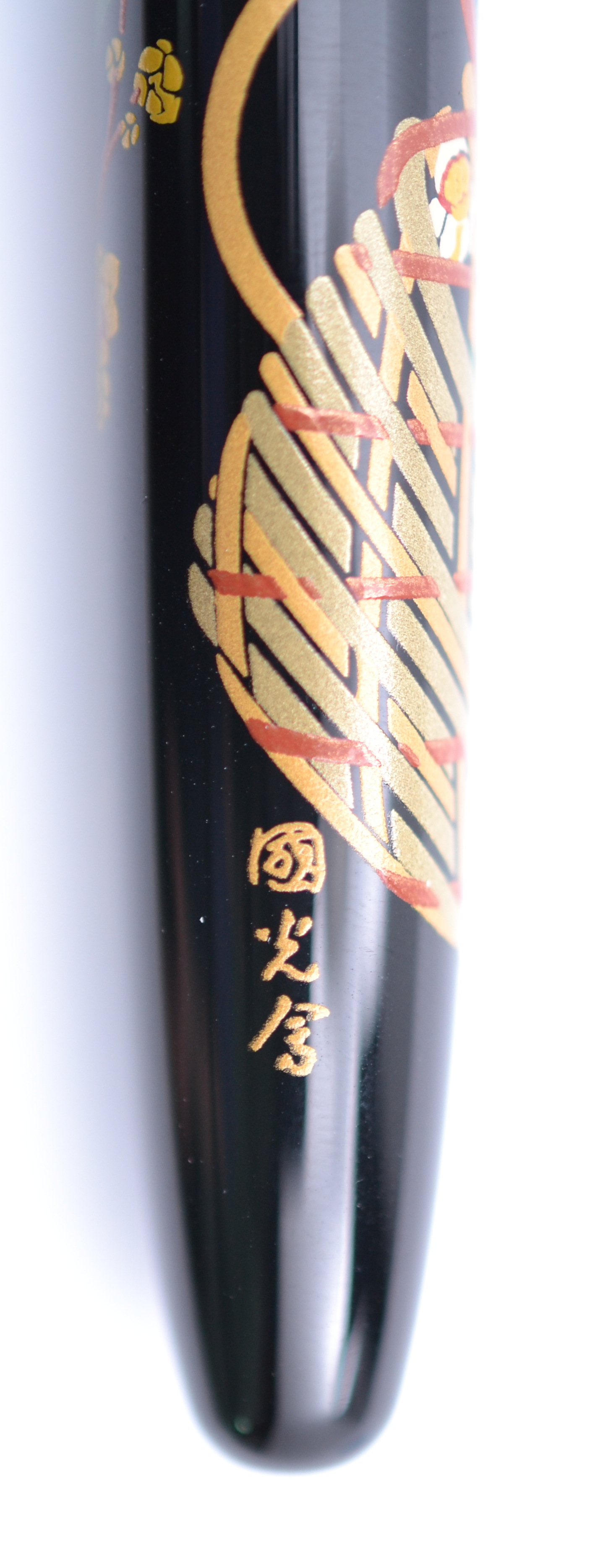
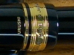
“Kokkokai” signature
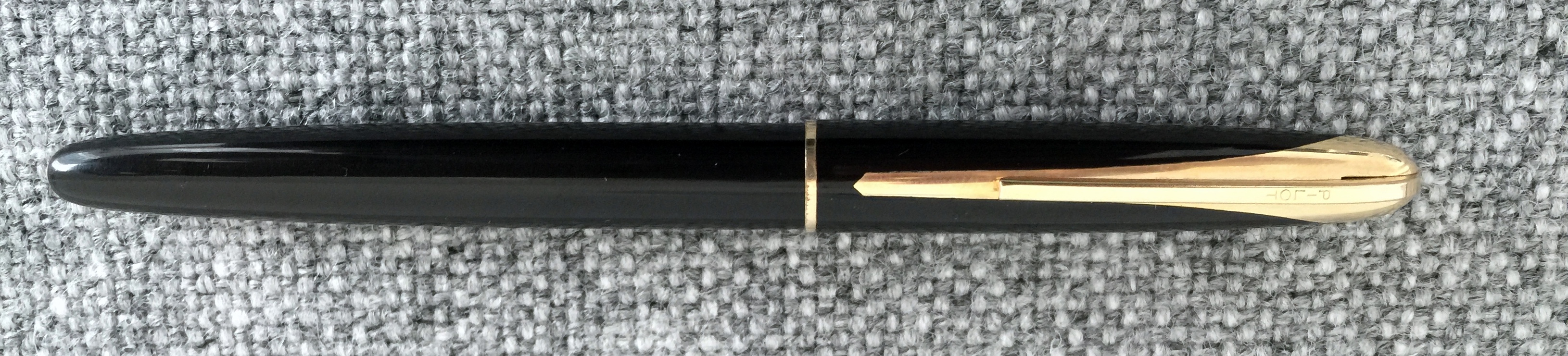
The pen is very well balanced and feels great in hand. It weighs about 32 grams with converter and measures 5.6” long capped. This is a full-sized and very comfortable pen despite being the smallest in Namiki’s lineup.
Nippon Art pictured with a Namiki Yukari Royale
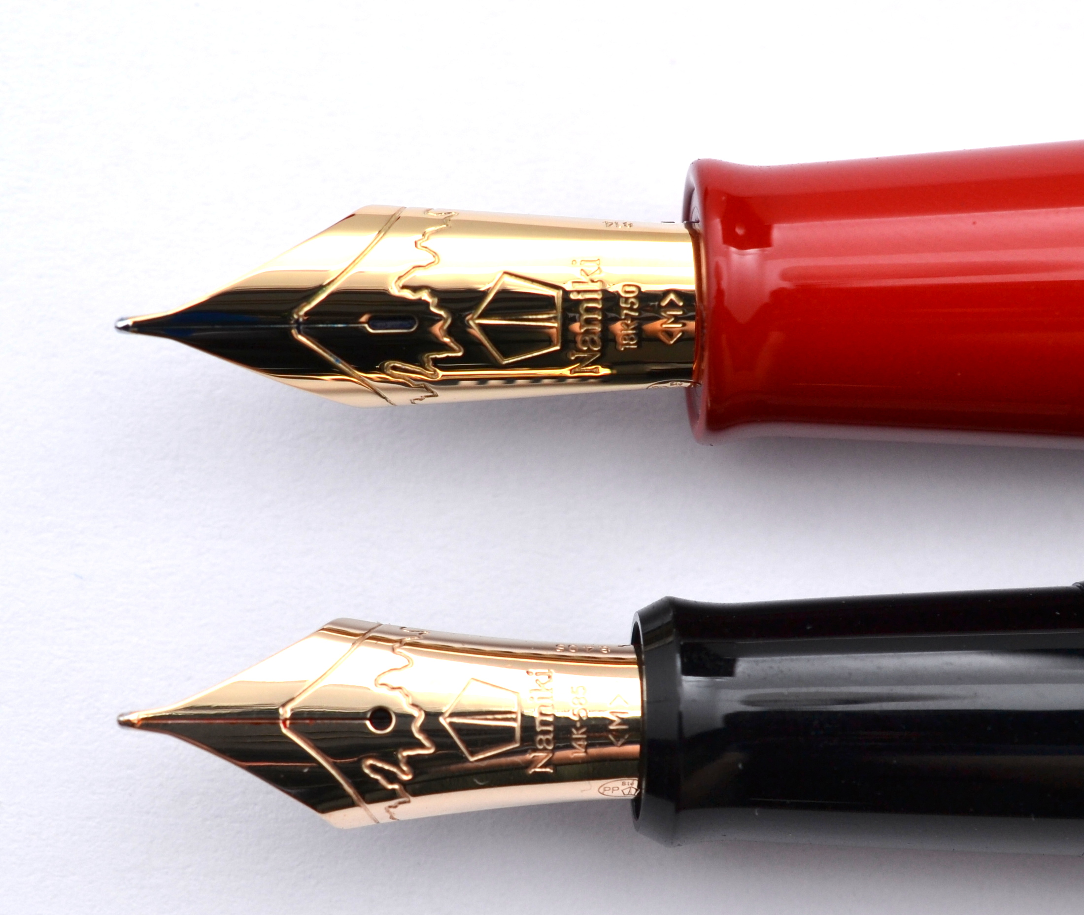
The inside of the cap has a soft fuzzy material near the lip. This is done so that when posted the cap does not scratch the lacquer body (a very nice touch). Like the Pilot Custom 743 , the Nippon Art’s gold nib is lighter in color than the gold trim.
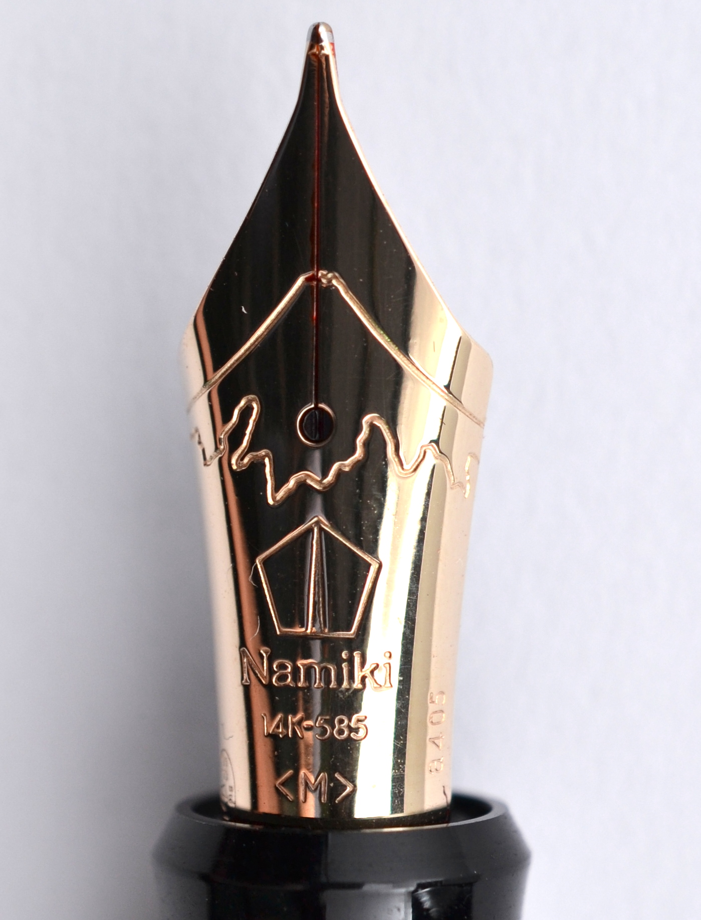
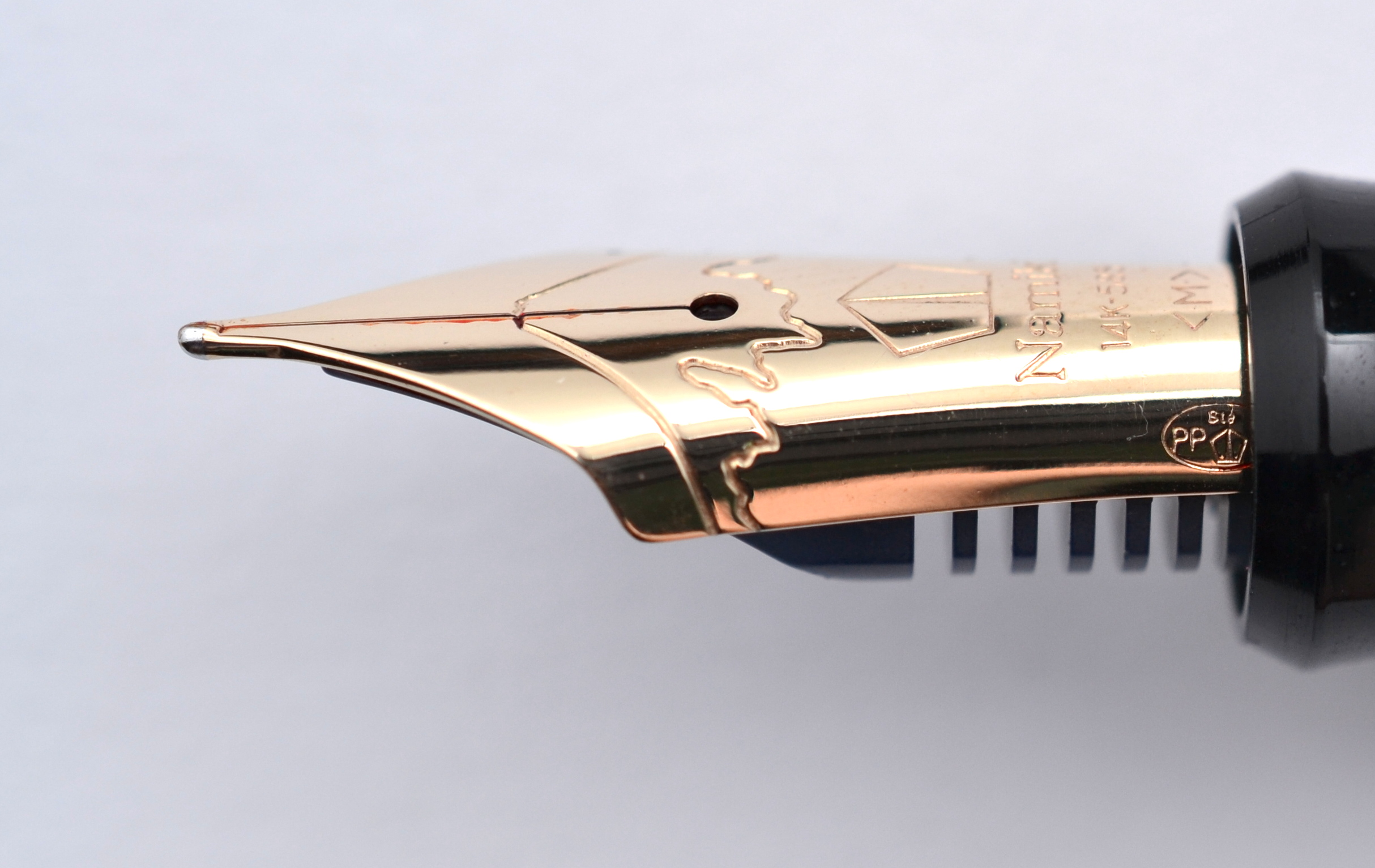
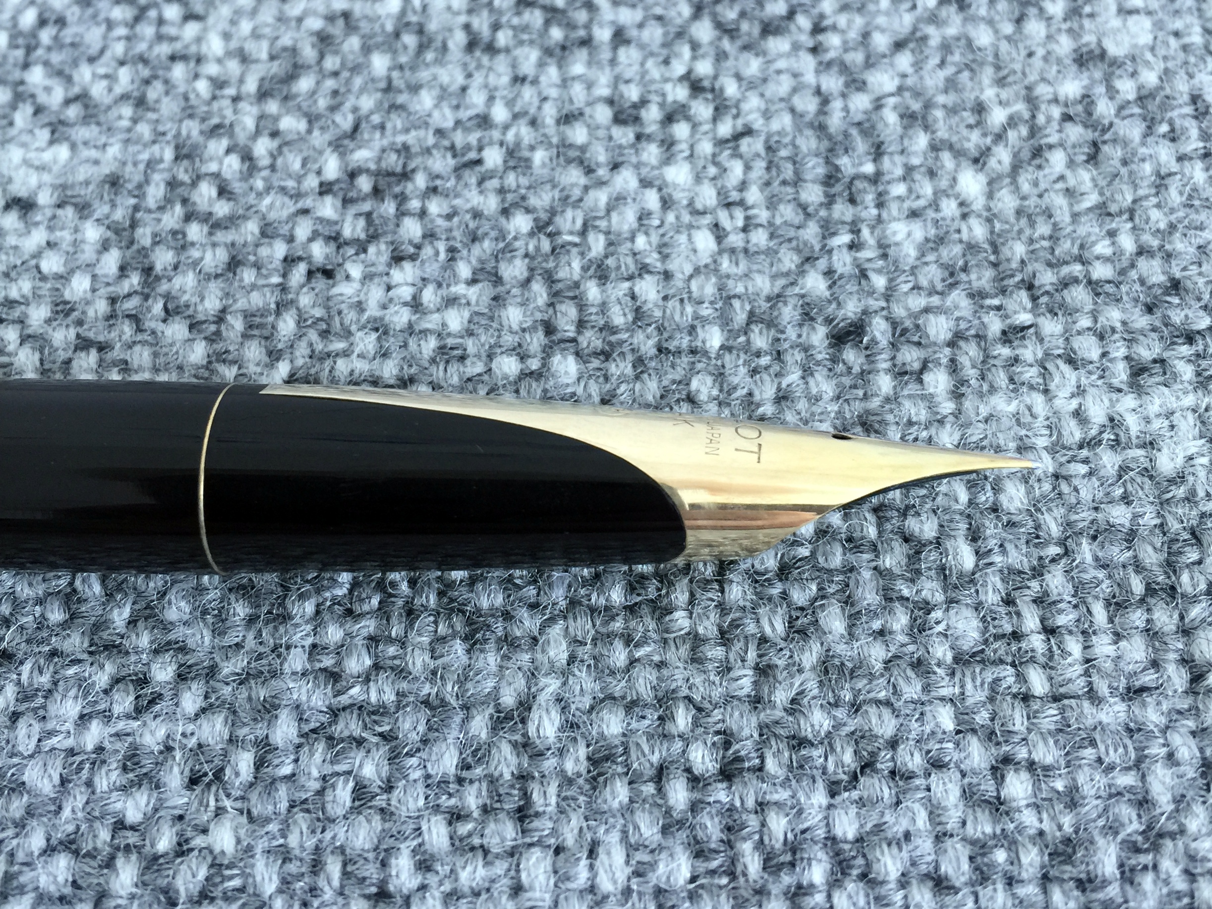
The pen has a #10 size nib and despite the different decoration, I believe this nib to be the same as a standard Pilot #10 (I am going off of a appearances only, so please correct me if I am wrong). The Namiki #20 nib is the same size as the Pilot #15 but has a different shape and breather hole.
Namiki Yukari Royale nib above the Nippon Art nibYou can see the date stamp “a405” on the side of the nib. The “a” refers to the welding machine used at the Hiratsuka and “405” refers to April 2005.
The 14kt gold medium nib is ultra smooth and soft. It’s a wet nib and I find that it is a bit wider than your average Japanese medium.
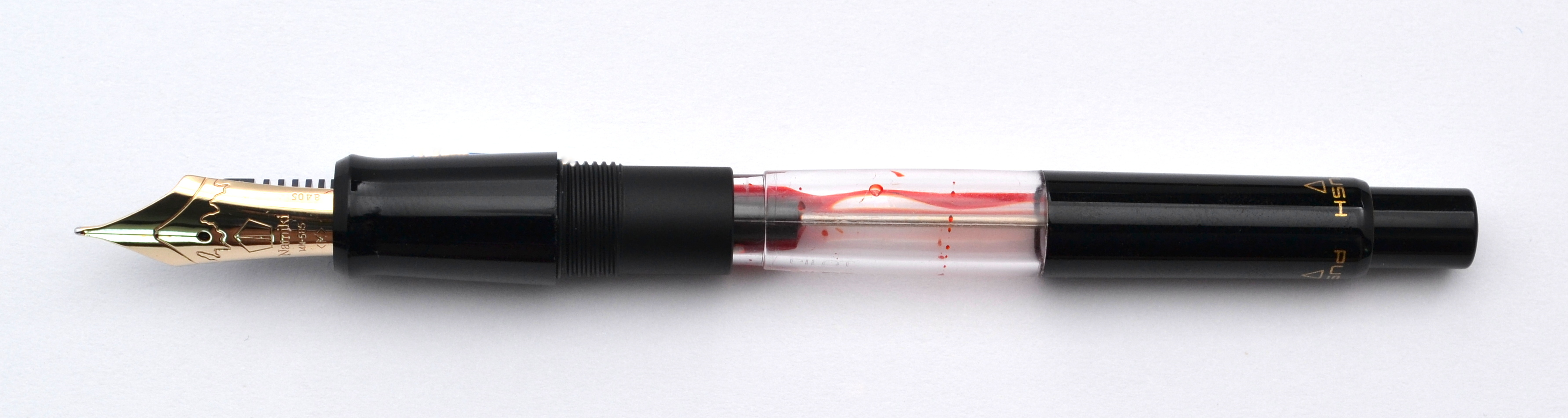
The Nippon Art comes with the Pilot Con-70 vacuum fill converter. The Con-70 holds 1.1ml of ink (more than twice as much as an average converter). After using a good number of these Con-70s I have found that some work better than others. I always fill them with a syringe for this reason. I also find them more difficult to clean but the huge capacity outweighs any of these of these drawbacks.
This is my favorite Pilot/Namiki fountain pen I have used so far…the elegant design, balance, and wonderful nib have won me over.
The retail price for these pens is a staggering $750! That is quite a lot of money for this pen. I paid around $200 for mine second hand. In my opinion these pens are a good buy at around $200-$350. Some designs are more attractive than others and some have more handiwork.
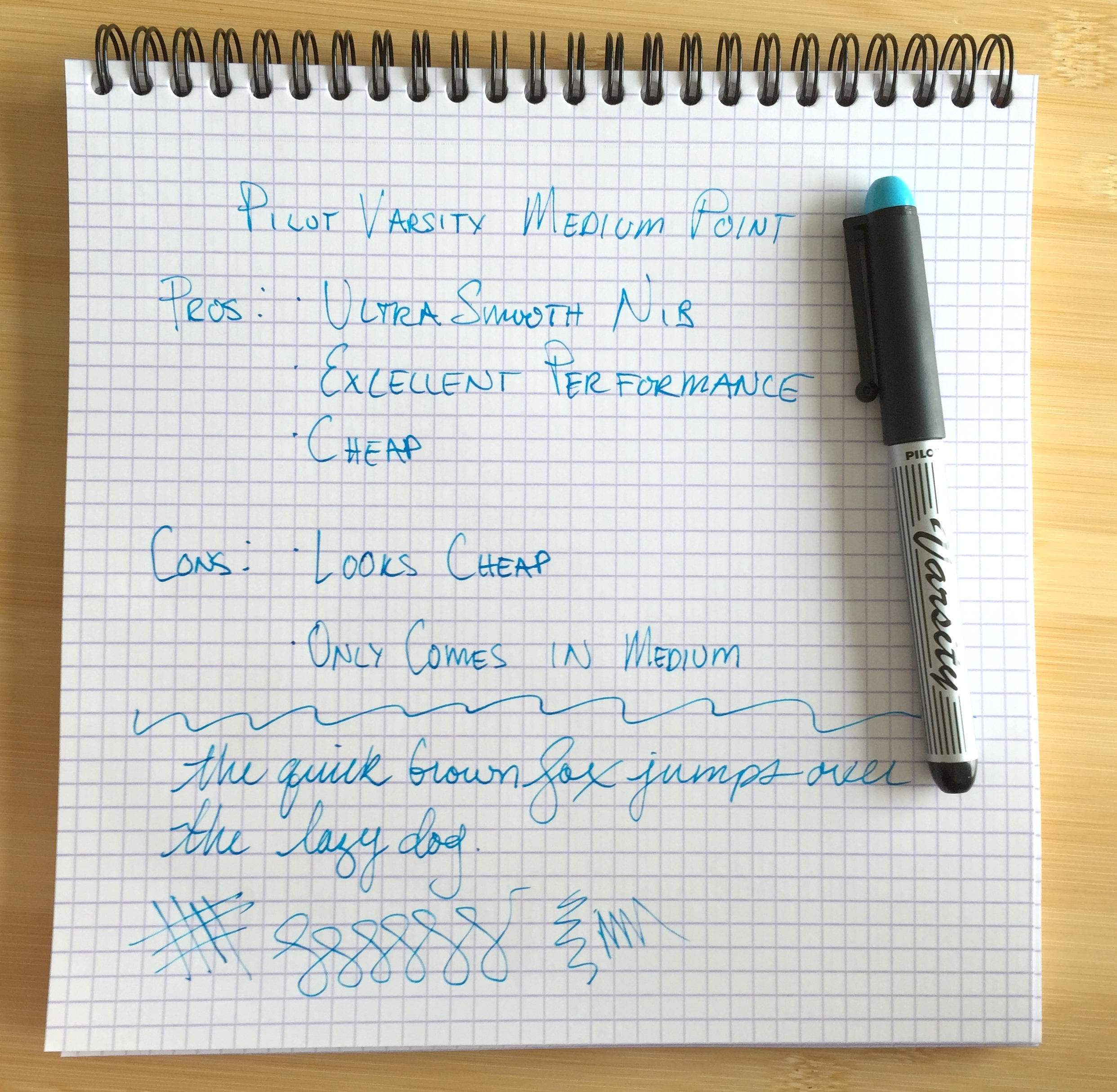
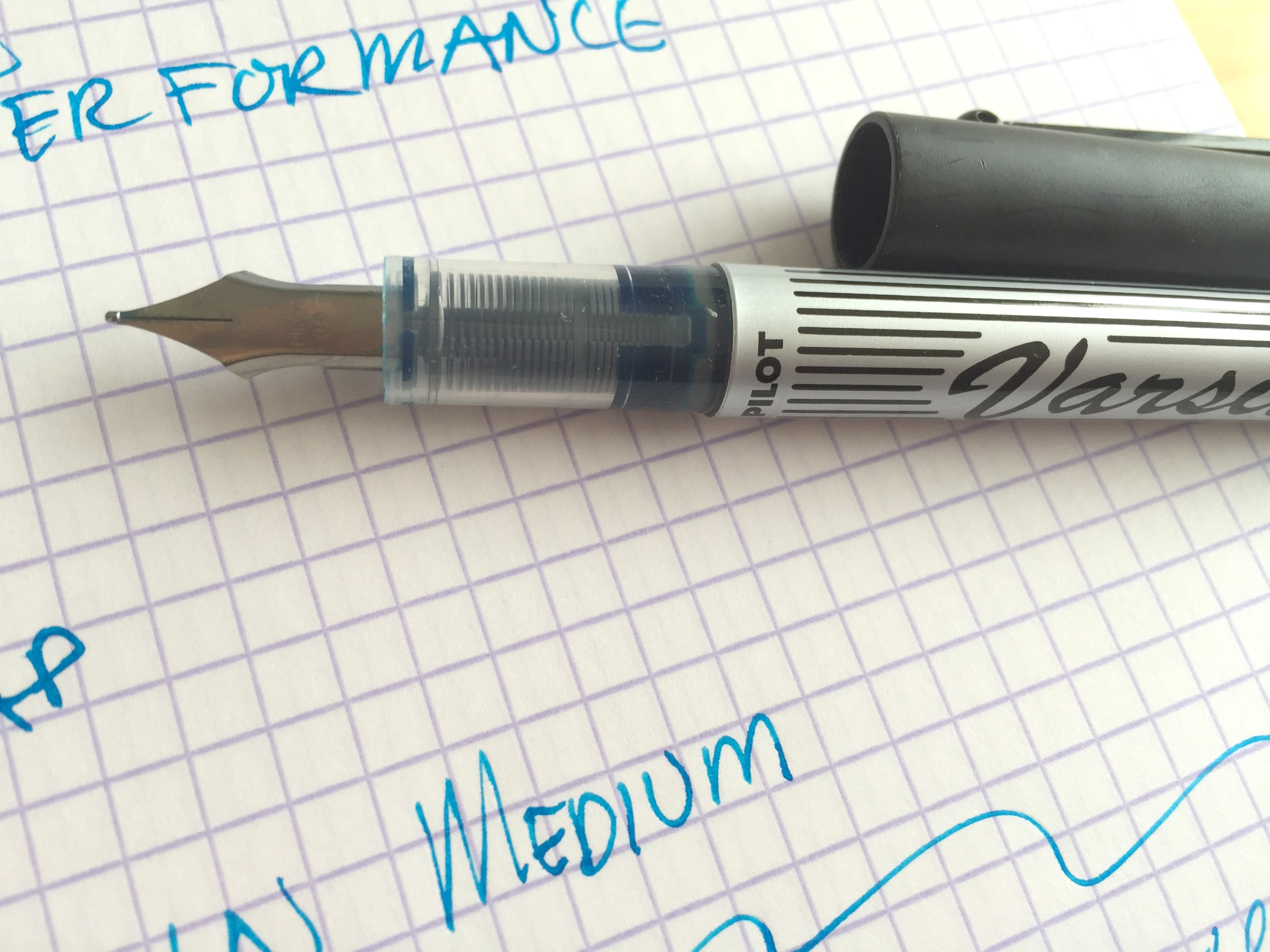
There are a couple of cheap fountain pens on the market for around $3-$4 but in my experience there is only one good one and that is the Pilot Varsity (or V-Pen as it is know in other markets).
The Pilot Varsity is cheap disposable plastic-bodied fountain pen with a stainless steel nib. They come in seven colors and in only one nib grade: medium. [Edit: It has been brought to my attention that the Pilot “V-Pen” branded version is available with a fine nib (thank you Mark for the tip).]
The problem with most cheap fountain pens is a lack of quality control (and at $4 what do you expect?). Most of them work very poorly; the Platinum Preppy and Sailor Clear Candy immediately come to mind.
I have been using Varsity fountain pens for years now and I have only had one bad one. I have had closer to a 50% success rate with the Preppy.
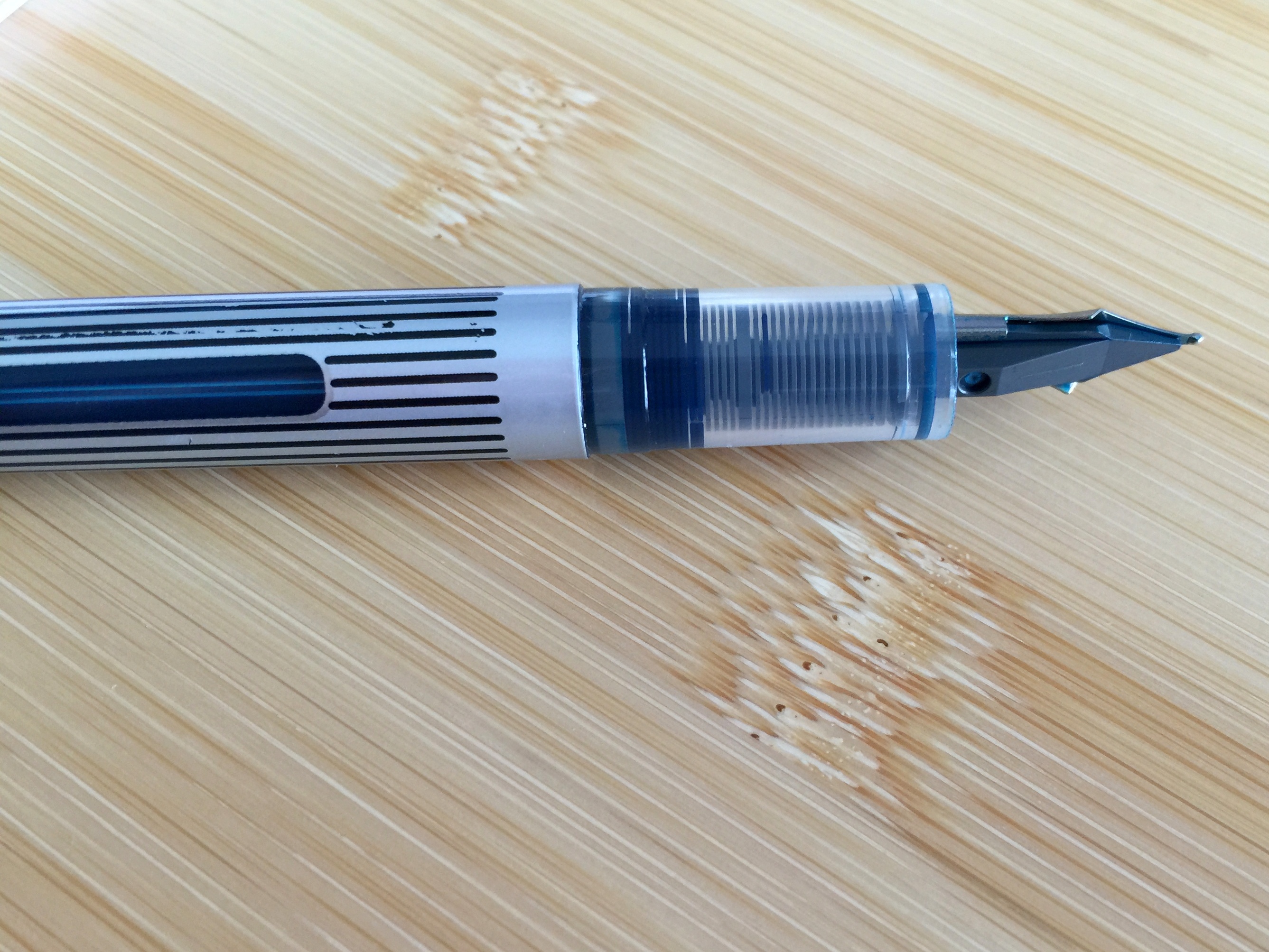
The Varsity’s laser cut stainless steel nib is very smooth and quite springy. You can also write just as easily with the nib upside down. The medium point is on the finer side and should be agreeable to most users.
The ink is not waterproof and to my knowledge there is no way to refill a Varsity. Because of the rollerball-style feed you don’t have to worry (as much) about leaks or spills. These pens are as airplane friendly as your standard issue rollerball.
The body has a translucent grip section allowing you to see the feed and the body has a small ink view window.
The Varsity I photographed is the old pinstriped livery but everything else is the same on the current model.
The Varsity looks and feels inexpensive and as long as I can remember they have always been quite ugly. The new design is hideous as are the V-Pen branded models but they work well and that’s what counts.
If you want a cheap worry free fountain pen it’s hard to beat the Pilot Varsity.
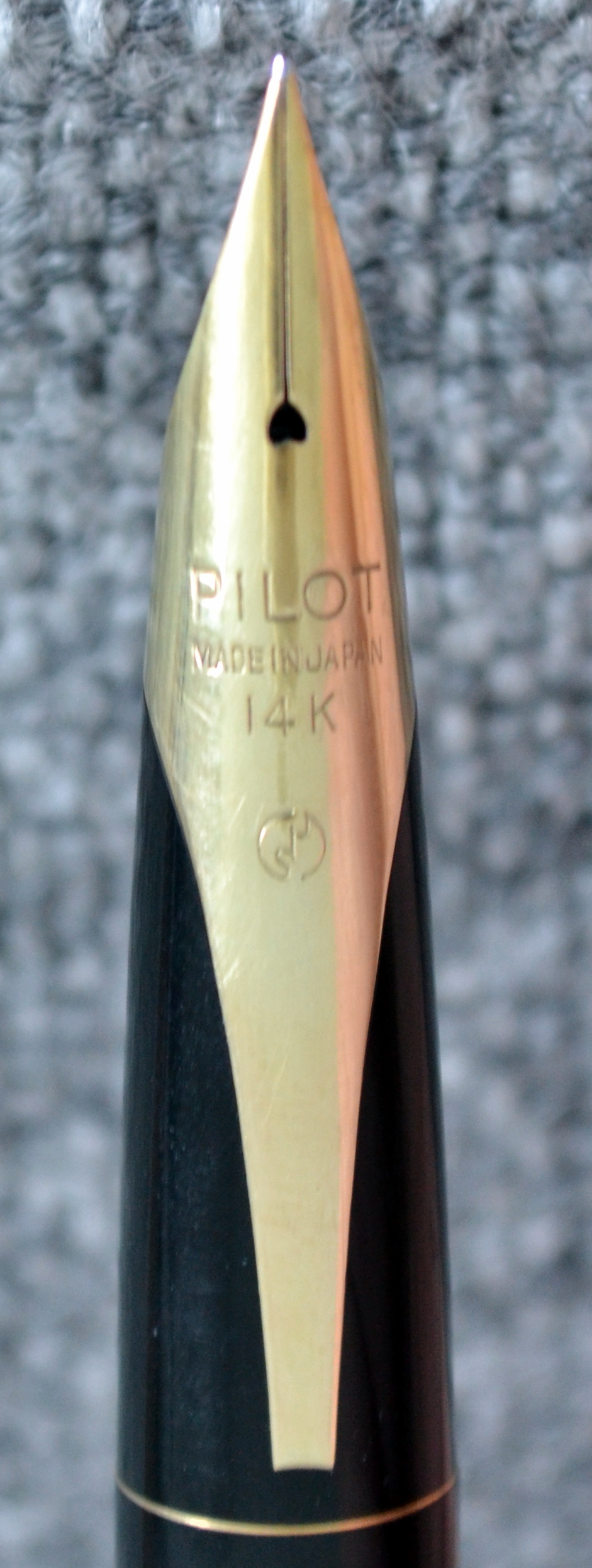
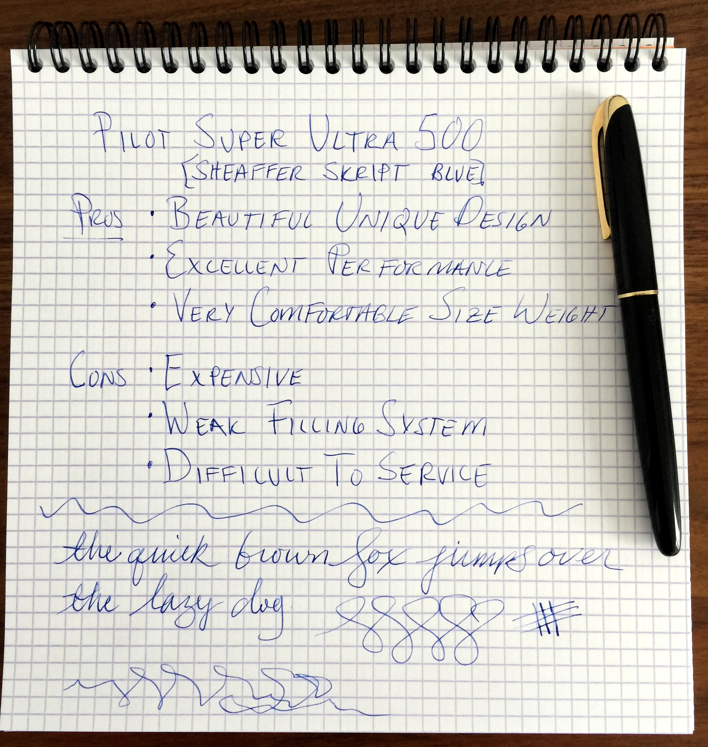
About a year or so ago I saw the Pilot Super Ultra 500 on the Fountain Pen Network and I was blown away by its beautiful design. The hunt began and in September I was able to locate one in Italy.
The filling system needed a new sac so I sent it over to John Mottishaw for refurbishment. Now that I have had it in my hands for a few months I thought I would share my thoughts on this awesome pen.
Side note: It has occurred to me on a number of occasions that it is a bit silly to use a point rating system in my reviews as they are arbitrary despite my efforts to be objective as possible. I have found reviews of vintage pens to be the most problematic as the qualities of the same make and model can vary dramatically from one pen to the other and as such, it would be a mistake to fully extrapolate my experience (of one example) to another
Appearance
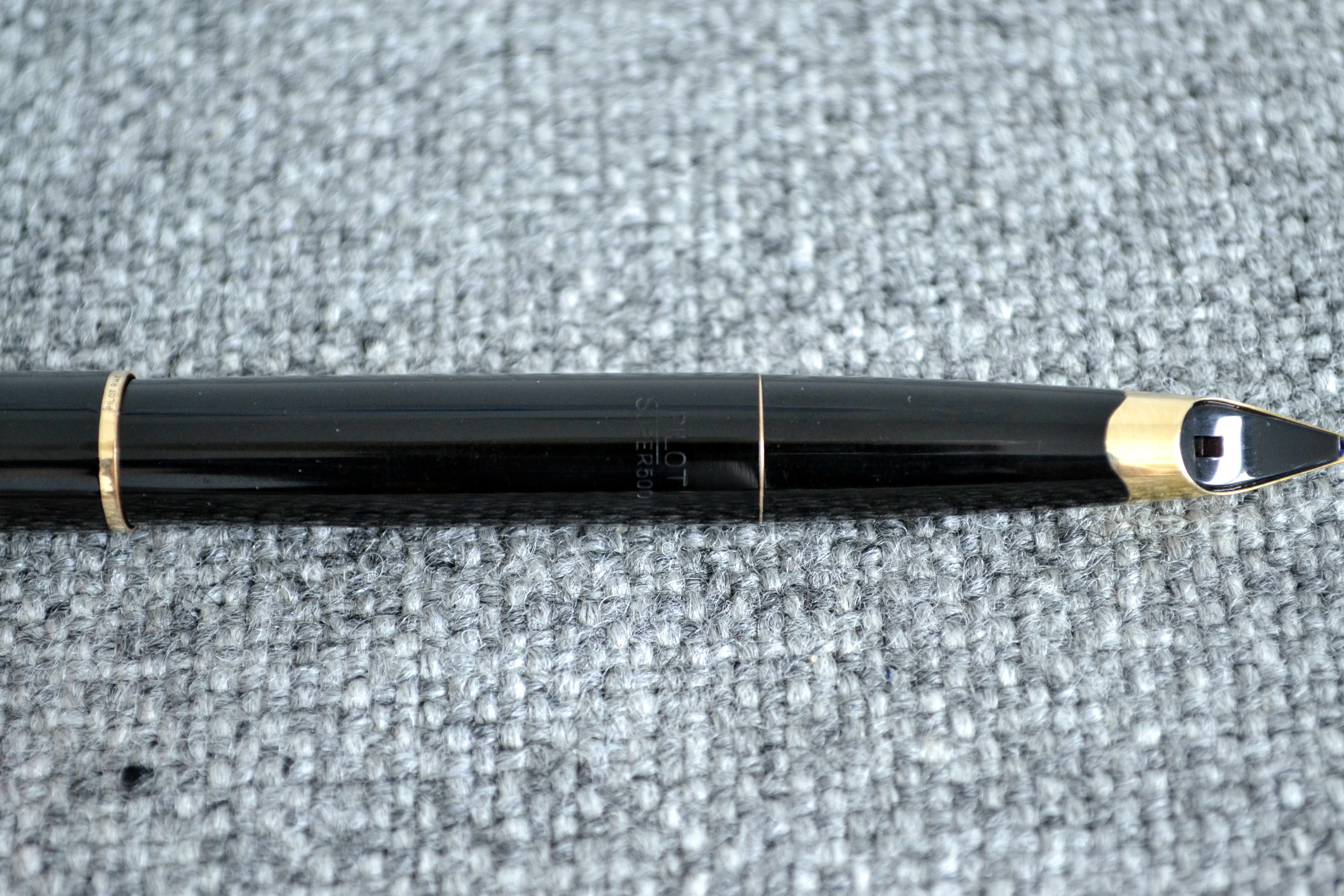
The black plastic version is the most beautiful (and luckily the most common) 500. The ones with gold filled caps lose the wonderful mirrored design that make this pen so fantastic.
The inlaid gold nib is gorgeous and despite all of this beauty that I keep harping on about the pen is a reserved and understated elegance that I find very appealing.
Gold tassie at the end of the barrel.
This pen ticks all of the design boxes for me.
Score: 5/5
Build Quality
The majority of products that come out of Japan today are of a very high quality and I am certainly happy to pay a premium for a “made in Japan” product but in 1958 the sentiment was different; Japan was considered an emerging market that produced more affordable products. Does this have an affect on the quality of pens coming out of Japan in the late 50? I don’t know BUT I can confidently say that the 500 is of a high quality. Would consider it superior to a Montblanc or OMAS from the same time period? No, not really.
The black plastic body has held up quite well and the rolled 14kt gold trim is well done, though there is wear on the bottom of the cap ring.
From reading Bruno Taut’s wonderful articles on the 500 (please see the links to his site, Crónicas Estilográficas, at the bottom of this review) I learned that the 500 was considered to costly to manufacture and as a result was only produced for a couple of years.
Score: 3/5
Size & Weight
The 500 measures 14.1cm long capped and 12.7cm uncapped and 1.2cm at its widest point. The 500 weighs a comfortable 18.3 grams. This is a very nicely sized pen that I have had no problem writing with for extended periods of time.
Score: 4/5
Performance
The nib writes with an extra fine line by western standards but find the nib to be quite smooth despite it’s point size.
With a bit of pressure the solid 14kt gold nib does offer some line variation, though I am cautious not to push too hard as any damage to this nib would be a small tragedy.
I have not had any issues with hard starting or skipping. It is by all accounts a great nib.
Score: 4/5
Filling System
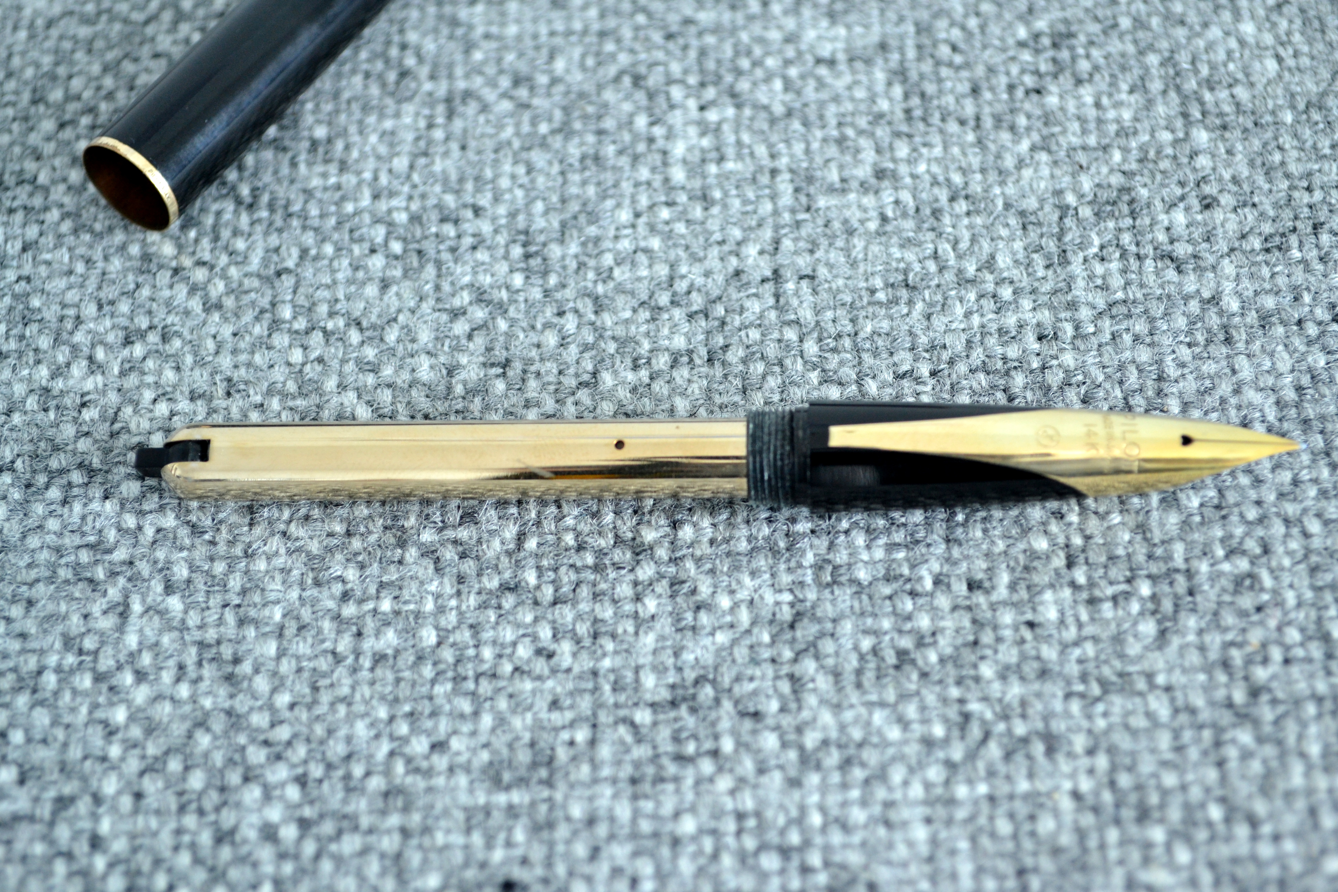
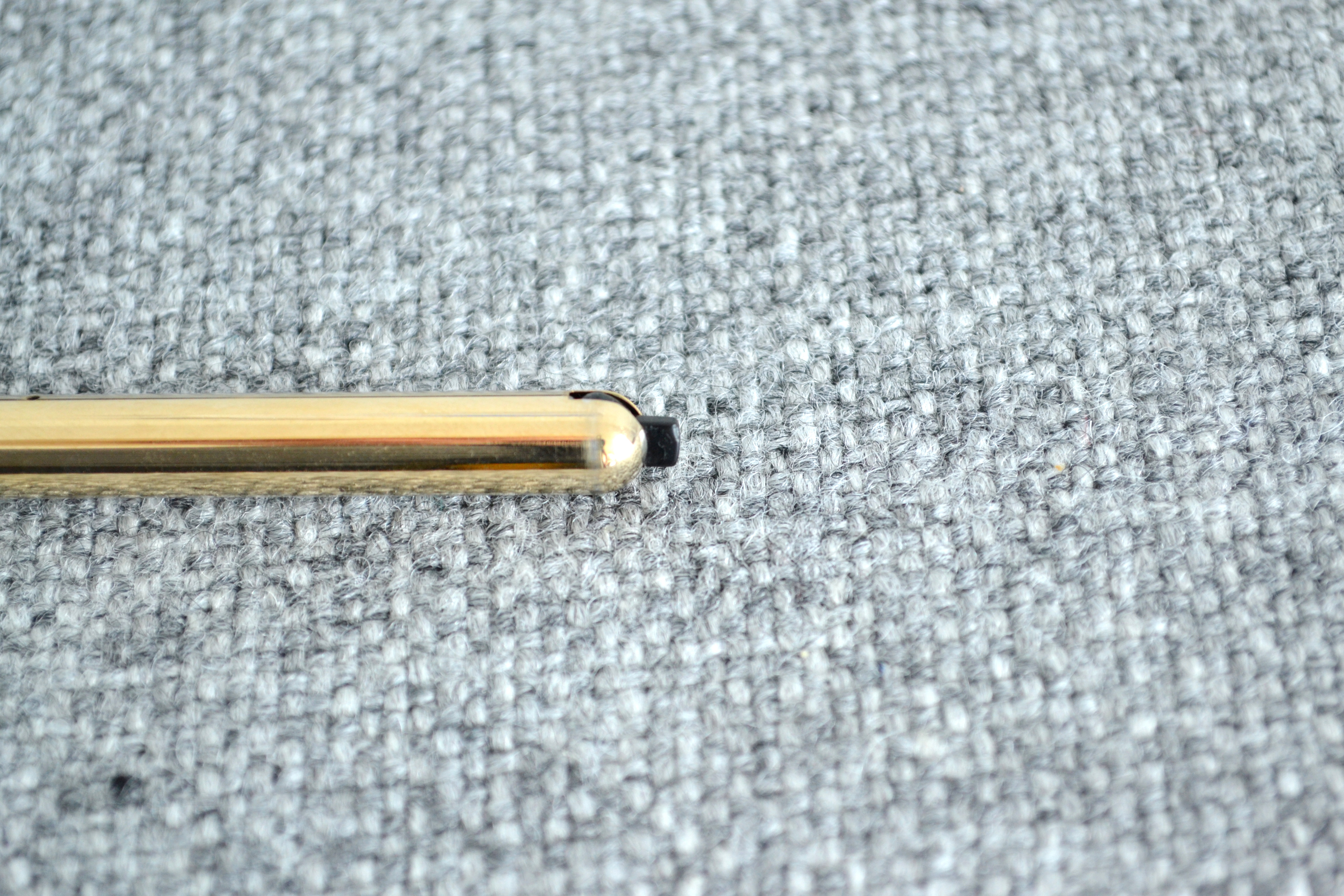
The 500 has what is known as a “switch” or “quarter turn” filling system. To fill you insert the nib into a bottle of ink and move the notch 90 degrees, this makes the pressure bar squeeze the sac just like on a regular lever filler.
When I received the 500 I tested the mechanism and the sac had dried out. I asked a couple of well known restorers/nib meisters and to my surprise the first three said they wouldn’t work on the pen, not having worked on one before. John Mottishaw agreed to do the work and upon return the pen functioned beautifully.
When the pen ran out of ink I flushed it a few times and RATS! the pressure bar detached from the switch and back to Mottishaw again it went. This time he beefed up the internals a bit and it seems to be working.
This pen holds a good amount of ink but I wish the mechanism was more robust.
Score: 2/5
Value
I picked up this pen for right around $600 and that is quite a lot of money for an old black pen. I have consulted with a few collectors and I was told that I got a decent deal.
The pen is beautiful but you really have to appreciate the design to justify spending the money. I want to use and enjoy this pen but if it breaks on me again I may have to let it go because what good is a pen that you can’t use?
Score: 2/5
Bottom Line
The beautiful and rare 500 is a great writer that’s only hitch seems to be it’s fragile filling system.
Final Score 20/30
I would like to thank Mr. Bruno Taut for his excellent articles on the Pilot Super Ultra 500. Here are links to those articles (including disassembly instructions Ultra (III)).
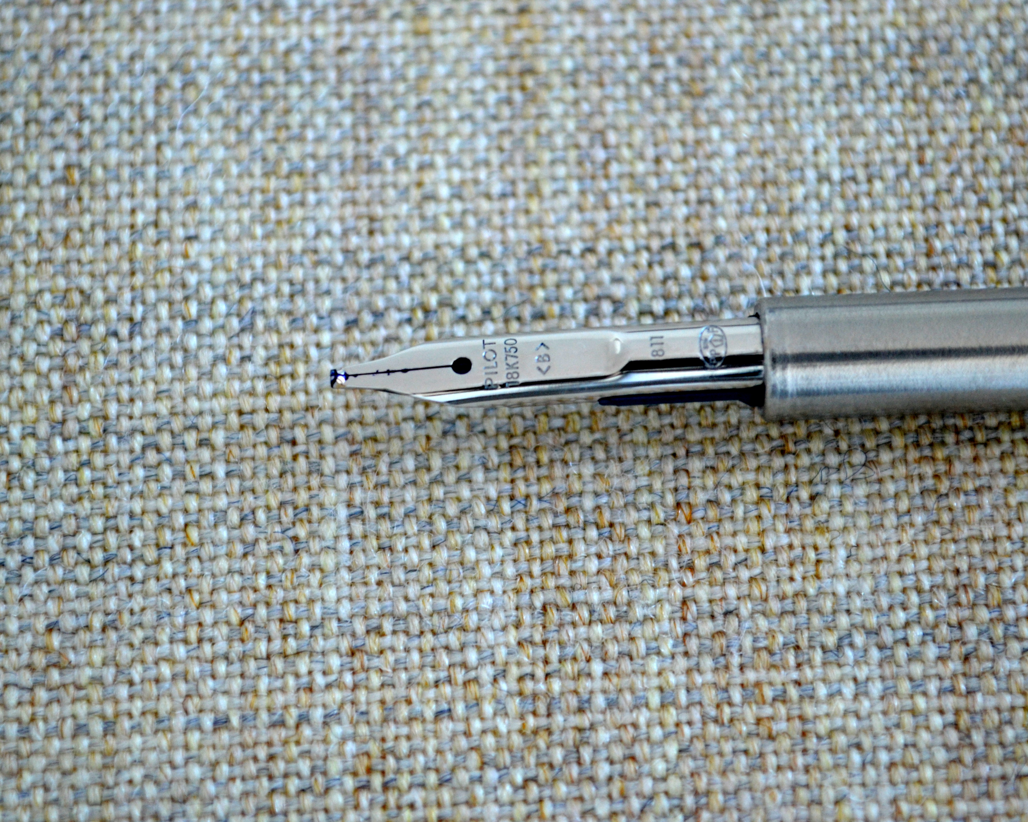
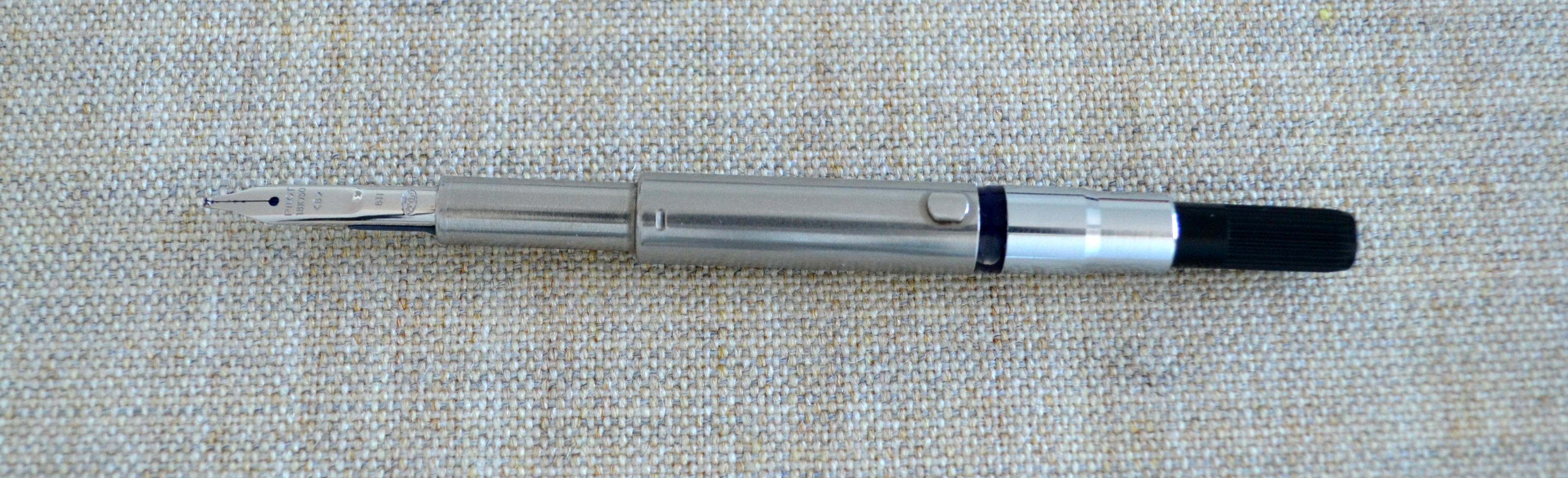
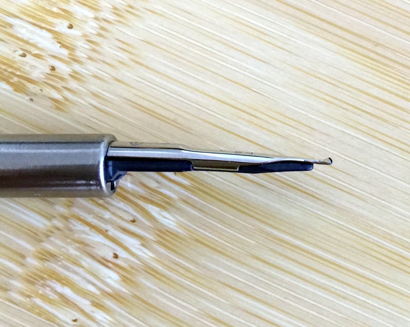
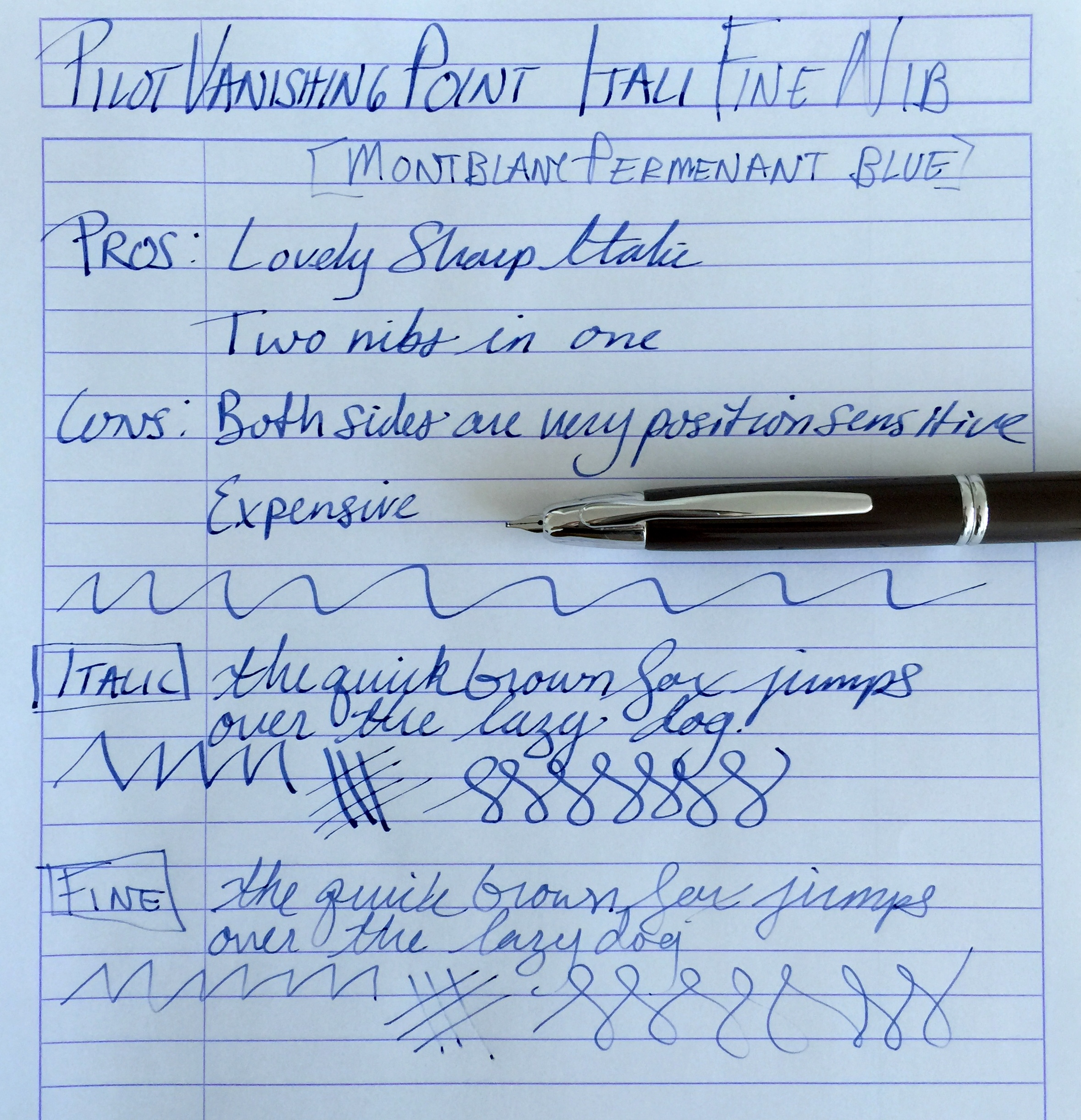
When I heard that Richard Binder was winding down his retail business I knew it was finally time to give one of his “ItaliFine” nibs a go. For those of you who do not know, an ItaliFine nib is a combination nib that offers an italic point on one side and a fine point on the other.
As you can see from the pictures this nib started life as a standard 18kt gold broad nib which Mr. Binder customized into an ItaliFine.
With the nib right side up the nib writes with an italic point. This nib is a true 0.9mm italic and as such is quite sharp and offers a good deal of line variation.
With the nib upside down the nib writes with a fine point. I have found the fine side to be a bit more tricky than the italic. The fine side does not like pressure and will skip with anything but the lightest pressure.
Also the fine side of this nib is position sensitive as its opposite side is fatter and straight cut. For me there was a short learning curve with this nib and now that I have it down, it is a wonderful nib that has transformed my Pilot Vanishing Point into a pen that is now a joy to use. The cost of this nib while still available is $125 and that is expensive for a VP nib but it really works as two nibs that you can use in the same pen on the fly…it’s worth it.
Side Note: Some of you may have noticed that I have been gone for a little while. I have been in the process of moving and I am still working on getting my office (The Unroyal Warrant HQ) set up but as of today I am mostly operational, a new computer and some new furniture is on its way but I will be able to provide regular content 1-3 times a week going forward.
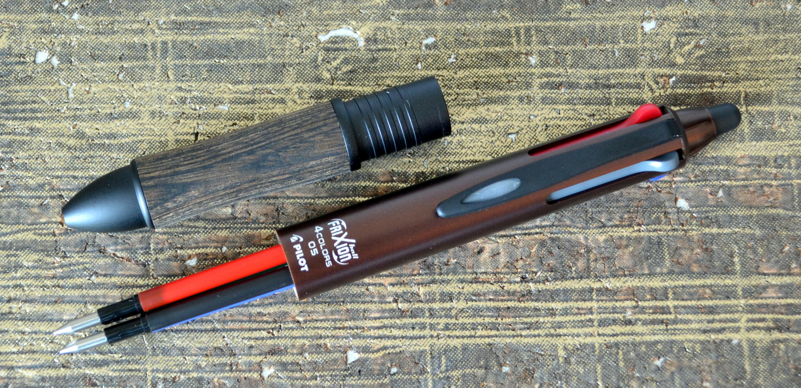
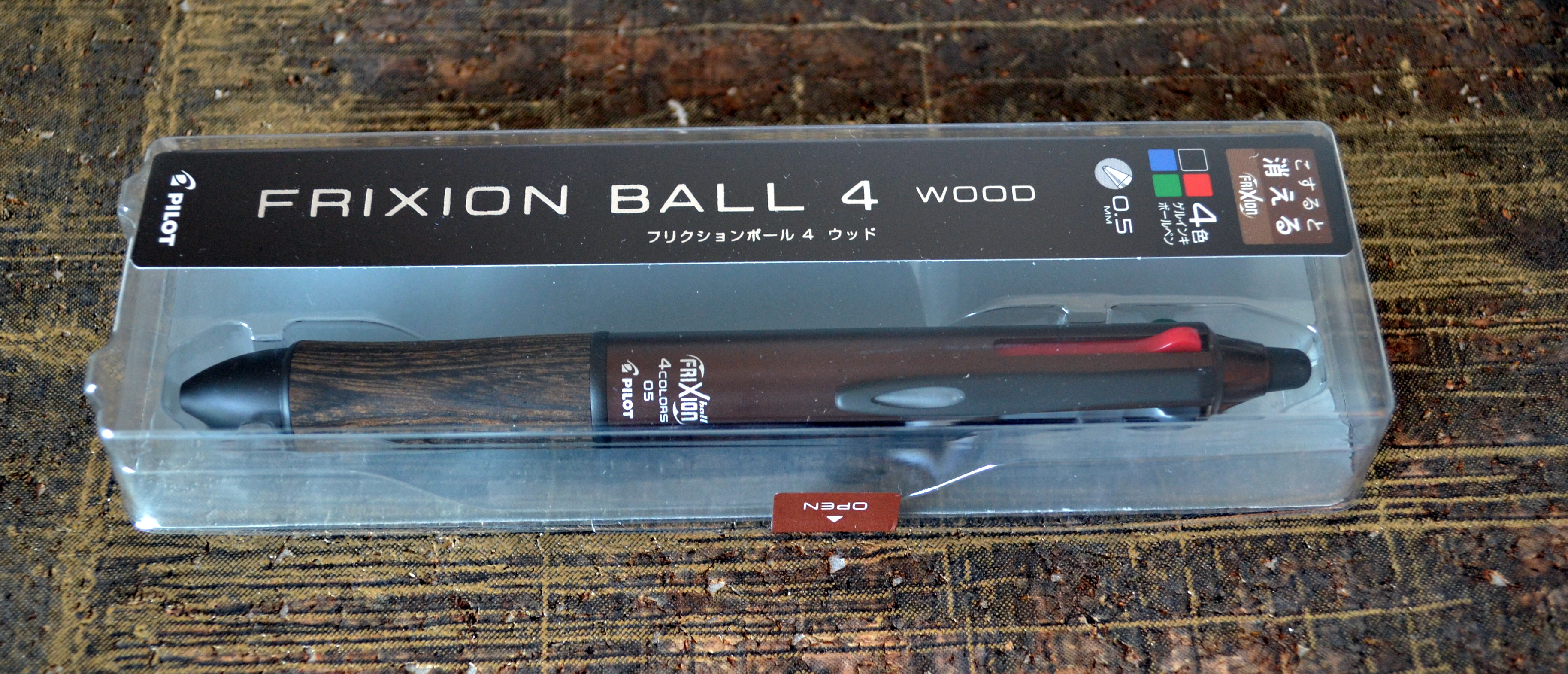
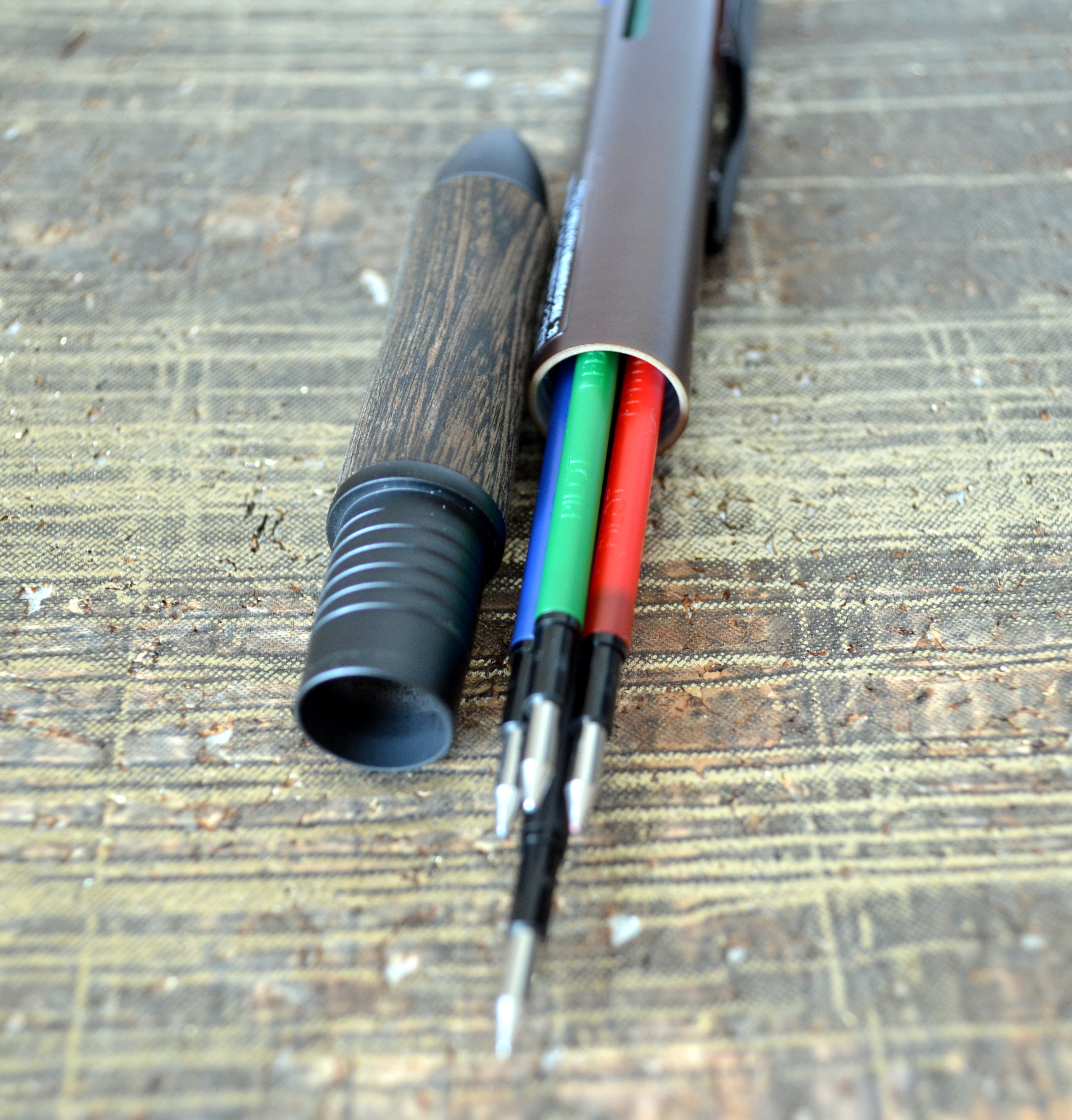
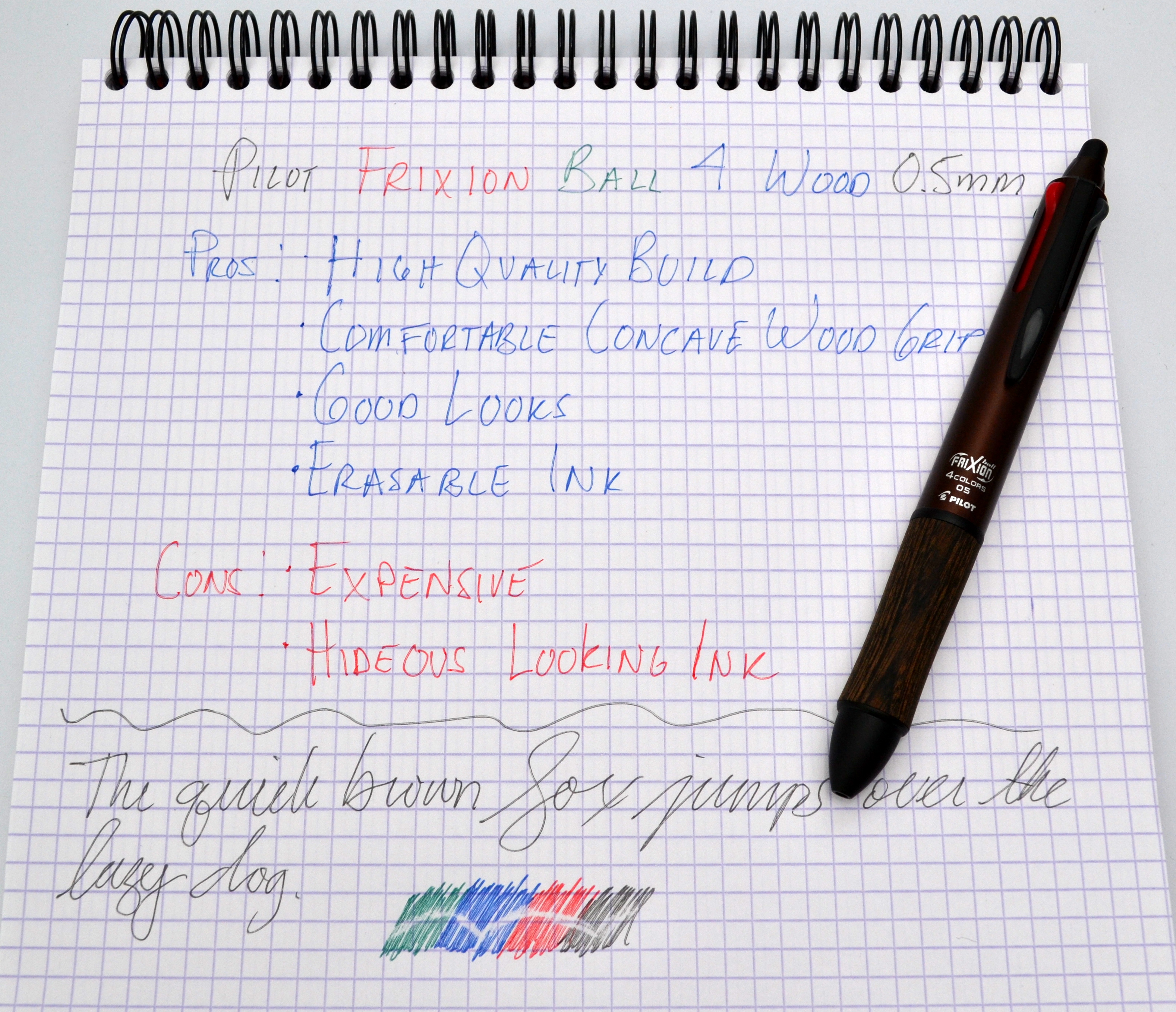
The Pilot Frixion Ball 4 Wood is one of the many pens I picked up on my trip to Japan that I have yet to review.
The Frixion Ball 4 Wood is a multi-pen that features four erasable gel ball points, a wood grip and an attractive brown and black body.
This is one of the best looking multi-pens I have used and it has a very high quality feel, weighing in at 26.7 grams. It is a well built pen with a satin brown plastic body that is completely free of seams. The section is made of wood and metal and is what gives the pen its nice weight.
It is fair to say I love everything about this pen except for the way it writes. The erasable Frixion ink looks nasty. The colors are washed out and the lines aren’t particularly clean. It is a smooth writer especially for a 0.5mm pen but it’s not a winner for me.
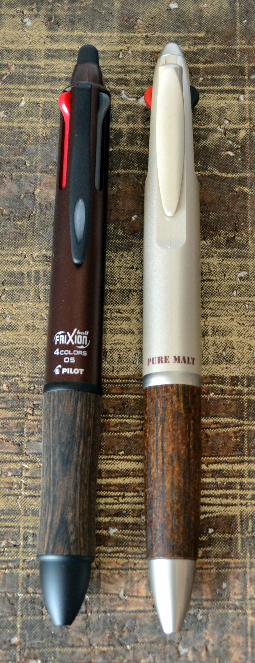
The price is also prohibitive at 3,000 YEN (just under $30USD); that is three time the price of the Uni Pure Malt which while not as nicely made offers a better writing experience with Uni Jetstream ink.
Frixion Ball 4 Wood with Unit Pure Malt
I am quite smitten with the body so I am going to try and see what other refills will work in the Frixion Ball 4 Wood.
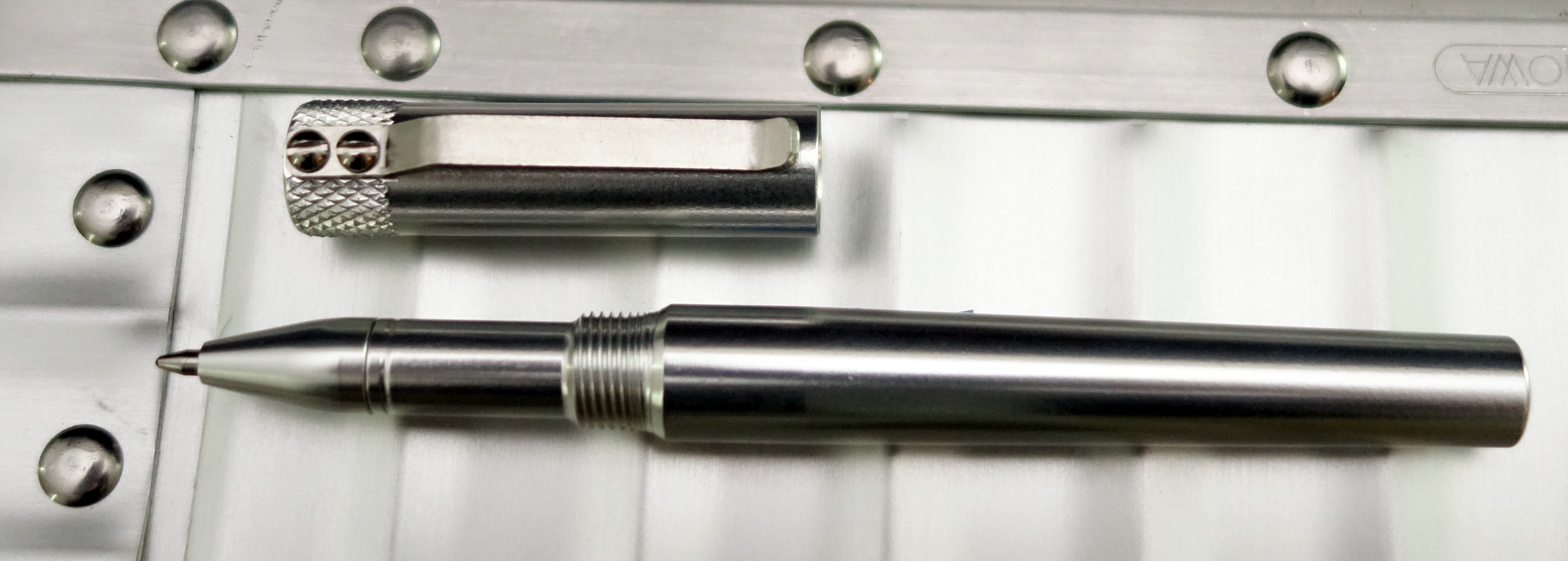
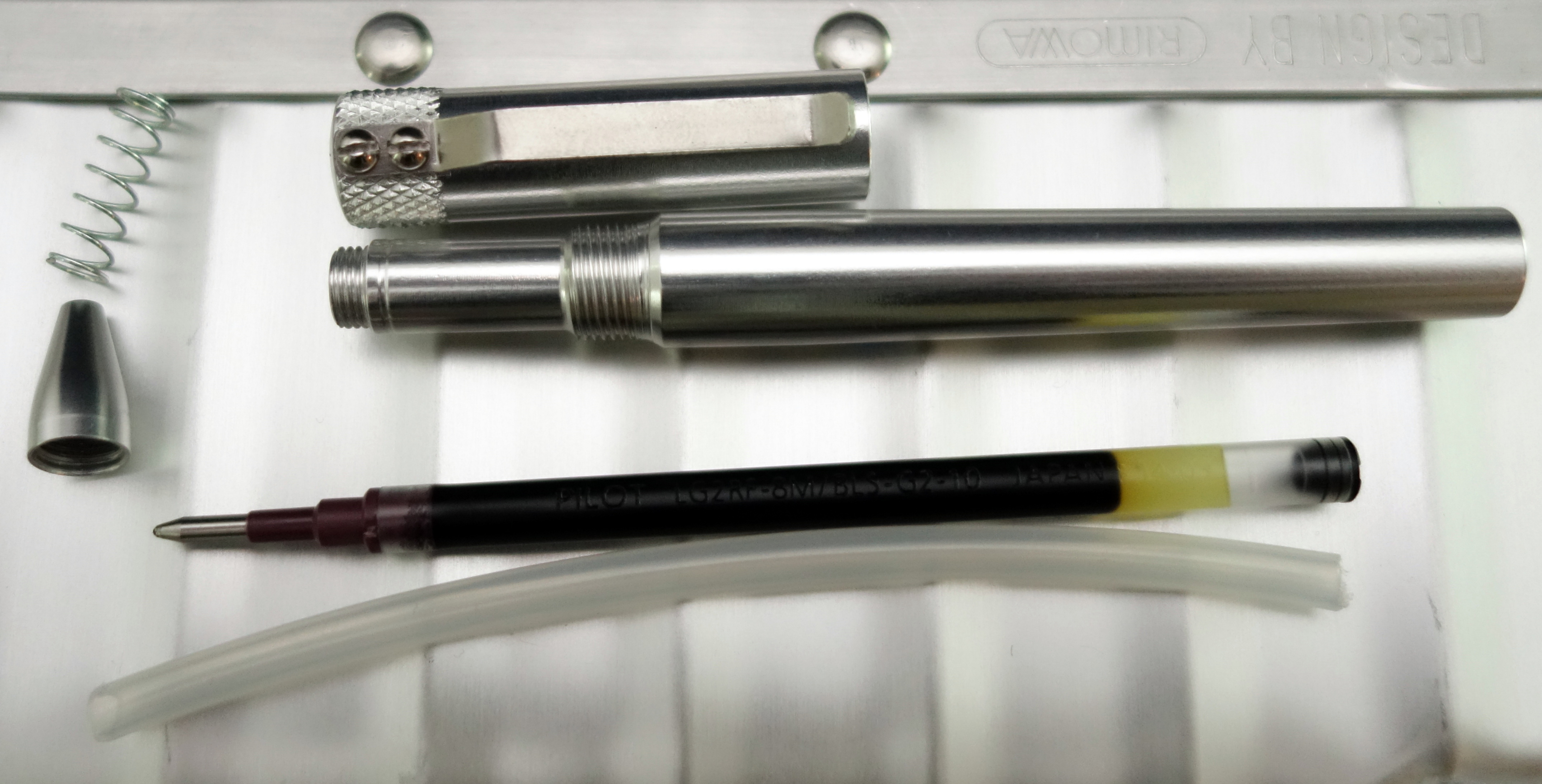
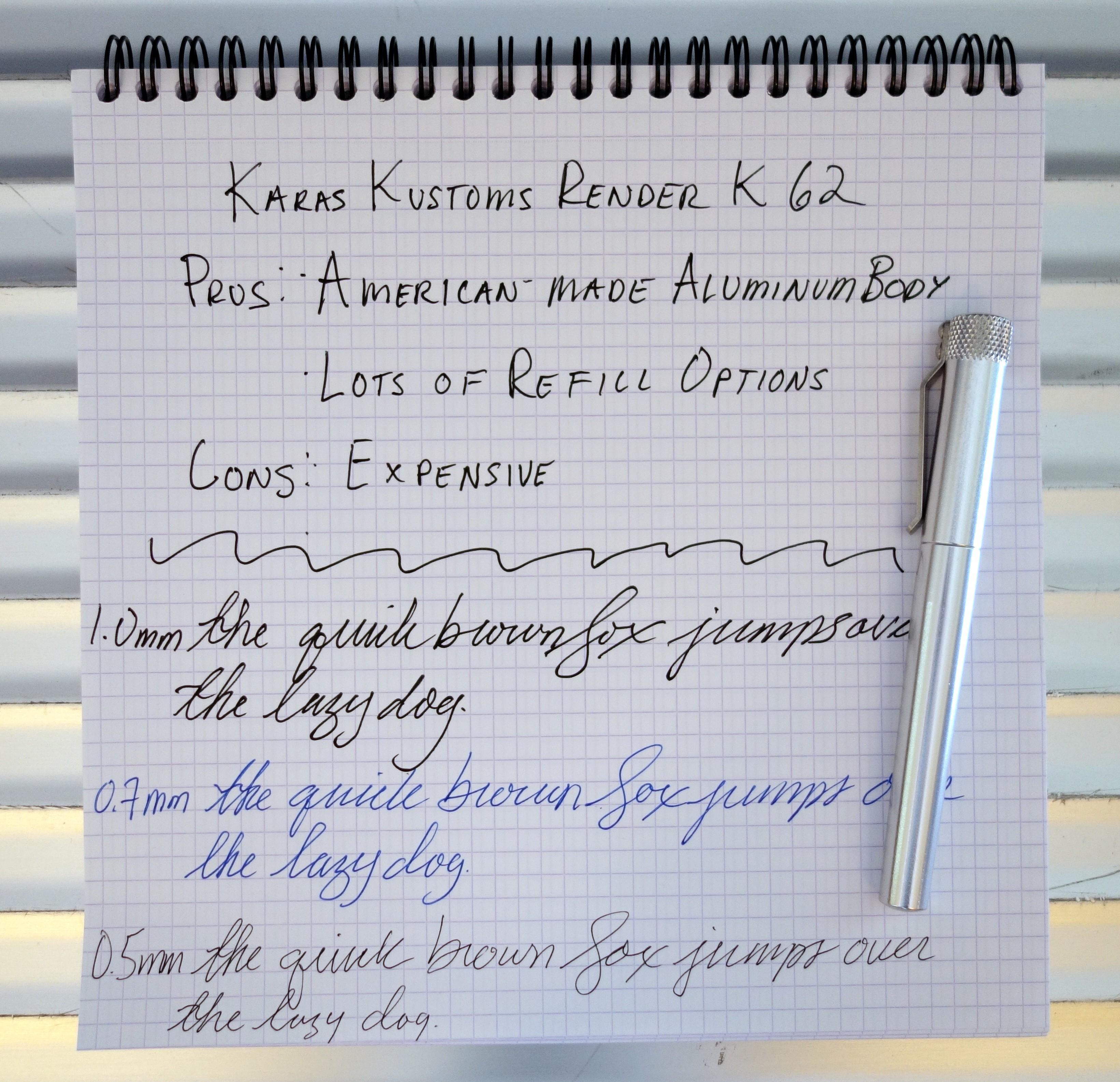
In the last few years a lot of interesting pens have come to the market via Kickstarter and one of the most appealing pens launched is the Render K by Karas Kustoms. I am a bit late to the game on this one but nonetheless it remains a simple and beautiful pen that is worthy of your attention.
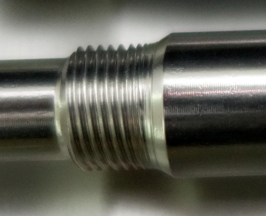
The Render K is an American-made pen crafted out of solid aluminum. The original (Kickstarter launched) Render K utilizes Parker-style refills that provides customers with an enormous range of refill options. The Render K G2 is designed to take the ultra popular Pilot G2 refill. Without modification I have been able to use Montblanc rollerball and fineliner refills in the the Render K G2.
The pen is sold without a refill because the manufacturer want’s you to choose the refill that suits you best. The pen comes with a piece of plastic tubing that is designed to be cut to accommodate other refills that maybe a bit too short for the Render K G2 unmodified.
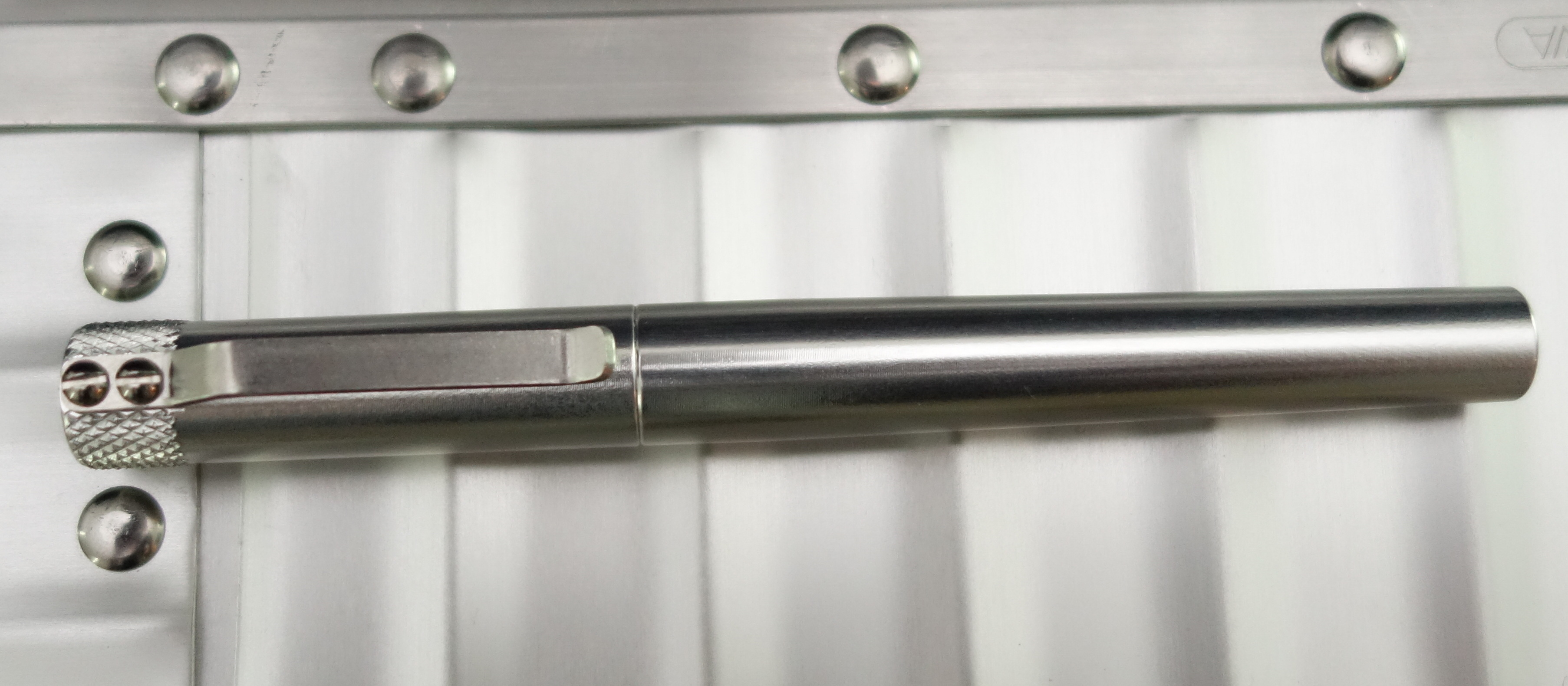
The Render K’s metal body and knurling on the top of the cap reminds me of the Retro 51 Tornado Lincoln Copper fountain pen I reviewed earlier this year. The Render K’s minimalistic design is very attractive; there is no ugly branding or unnecessary fluff to clutter the design…it’s pure function.
Capped the pen measures just over 5″ long and weighs 34.4 grams with a Pilot G2 refill installed.
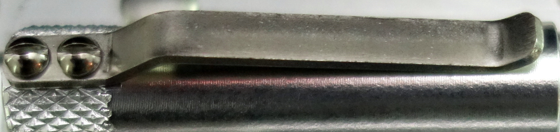
On many pens I find the clip to be a weak point; I have bent dozens of them by clipping them to my pants pocket or notebook. The stiff stainless steel clip on the Render K is ultra strong and because it is secured by two exposed screws it can be easily replaced if you happen to damage it.
I have been using the Render K for a couple of days now and it’s a strangely satisfying pen. Screwing the cap onto the body reminds me of screwing a nut on to a bolt; the feel is very similar and I love it.
I am also quite fond of how tight the cap fits on to the body when fully screwed on…it’s lovely.
The standard aluminum Render K G2 sells for $45 and comes in various colors. The Render K G2 is also made in solid brass for $65 and solid copper for $95. Overall I am impressed by this pen, it’s enjoyable to use and built to last. It’s not cheap but for a high quality piece of American craftsmanship, it’s not hard to justify the price.
Please note: this pen was provided to me at no charge by Karas Kustoms for purposes of review.
Here are some great reviews of the Render K (original and G2):
(I have no affiliation with the sites linked below)
The Pilot Custom 743 is the only pen to use Pilot’s full line of #15 size nibs. In the store I tried three of the more unusual nibs: a music nib, a Waverly nib and a falcon nib. I ended up picking the falcon nib, which is a soft flexible nib.
Appearance
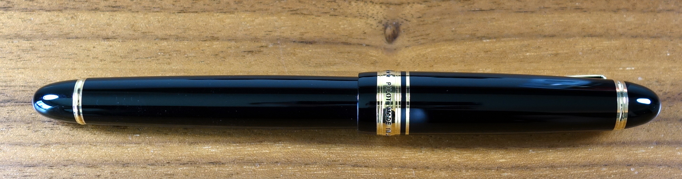
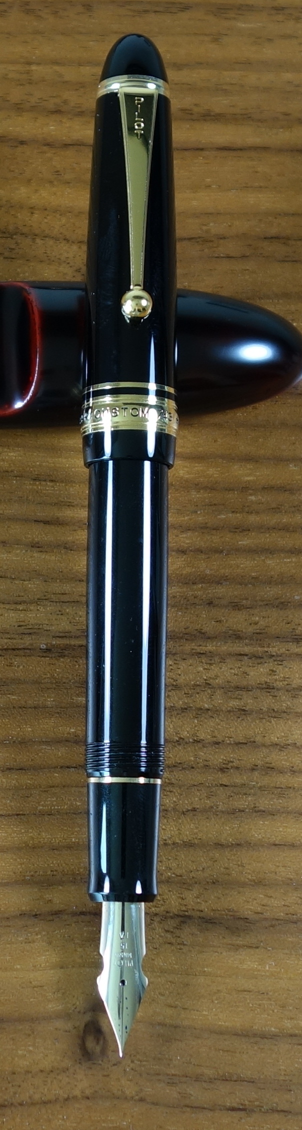
Like most pens in the Custom series, the 743 is a very traditional and classic looking executive pen with a black plastic body and yellow gold furniture. The trim level is the same as you get on the Custom 823 and they look almost identical. The trim ring on the bottom of the body is closer to the end of the pen than on the 823 (the 743 has vacuum mechanism to accommodate) but otherwise they look the same.
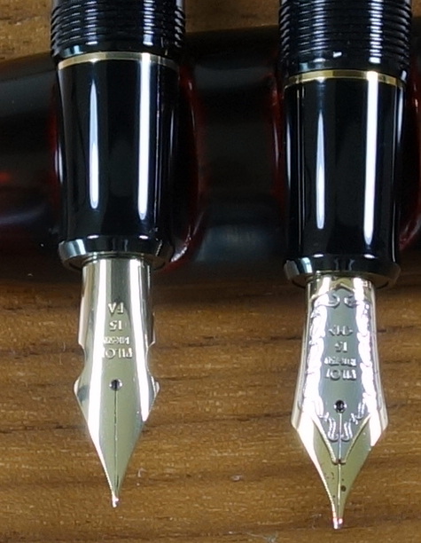
The cap has a rounded top with a clip that starts broad and narrows ending with a ball; this is the classic Pilot/Namiki clip and I think it looks great. The gold band at the bottom of the cap reads “* * * CUSTOM 743 * * * PILOT MADE IN JAPAN”. The letters are filled in with black (paint?) just as you would see on the Custom 845 and Custom 823. The large 14ct gold #15 nib is plain, with no decoration to speak of. The cuts on the sides of the nib help to increase flexibility and in my opinion make up for the lack of decoration.
The gold trim is much more yellow in color than the 14ct gold nib. This is quite apparent with the cap posted. I would like to have seen the gold match a bit better but it’s not a big deal.
All things considered, the Custom 743 is a clean looking pen with no strangeness to its proportions. It’s not going to score any points for originality but it’s a nice looking pen nonetheless. Score: 3/5
Build Quality
The build quality like most Pilot products is quite good. The section (as on the Custom 845) has two big seams that just look cheap on a $300 pen.
Custom 845 with Custom 743. Both have the same plastic section.
Unlike the Custom 845, the 743 also suffers from seams on the body as well. They are clearly defined in the threading on the body and then they disappear about a quarter of an inch in on the glossy part of the body. You wouldn’t really notice any of this unless you are looking closely. The fit and finish is otherwise quite good and I suspect this pen will last a long time. Score: 2.5/5
Size & Weight
The Custom 743 measures about 5.9” capped and about 5.2” uncapped. At its widest point it is about 0.6” and weighs about 25.6 grams with a converter full of ink. Like the 845, the 743 is a good sized pen similar in girth to a Montblanc 146 but closer to the 149 in length. I find the 743 to be well balanced in my hand. It looks quite long posted but it remains comfortable. Score: 4/5
Performance
I think it is fair to say that this pen will not be for everyone. I was lucky enough to try it in a store in Japan before I purchased it. It would be a mistake to think you are getting a new pen that is going to write like a vintage flex pen; it does not and I haven’t seen a modern flex pen that does.
Compared to a vintage flex pen there is minimal flex when pressure is applied to the Falcon nib.
The falcon nib is a bit on the scratchy side, not unpleasantly so but there is a good amount of feedback. With little or no pressure the nib writes with a pretty fine line, definitely an extra fine by western standards.
If apply some pressure you can get the line to become broad but this will require more force than you would need on most vintage flex pens. I find that with nib flexed and writing slowly (as you should) the pen has a tendency to railroad by which I mean produce two thin parallel lines instead of one fat line. The feed seems unable to keep up with the pen.
I have been experimenting with different inks and I have found Diamine inks to work the so far. I tried Noodler’s Blue Eel as I thought that might help with the railroad situation but alas it performed the same as the Waterman and Pilot inks I tried.
The “no pressure” and “medium pressure” writing samples were written quickly at my normal pace and the “Pressure” sample was written slowly with the most pressure…notice all the railroad tracks.
In normal writing there are no real performance issues and I can get some nice (not huge) line variation with medium pressure without causing any problems but if you want to make extra extra fine lines and triple broad lines the Falcon nib isn’t going to cut it. With a careful hand (sadly not something I possess) I have seen some beautiful western writing with the 743 Falcon. Score: 2/5
Filling System
The Custom 743 uses Pilot’s top-of-the-line Con-70 converter that is considered by many to be the best converter on the market. It holds a good amount of ink and is quite easy to use.
The 743 has the standard metal Con-70 which is not quite as nice as the black one you get in the Pilot Custom 845 and most Namiki pens but the function is the same. Score: 3.5/5
Value
I bought my Custom 743 in the low $200s, which I think is a pretty reasonable price for this pen. The retail price is 30,000 Yen (approximately $295 USD) is pretty high. If the pen had no seams and the gold trim matched the nib nicely I could easily justify a $300 price tag for the 743. Score: 3/5
Bottom Line
The feed prevents the 743 Falcon from living up to its full potential as a “flex” pen.
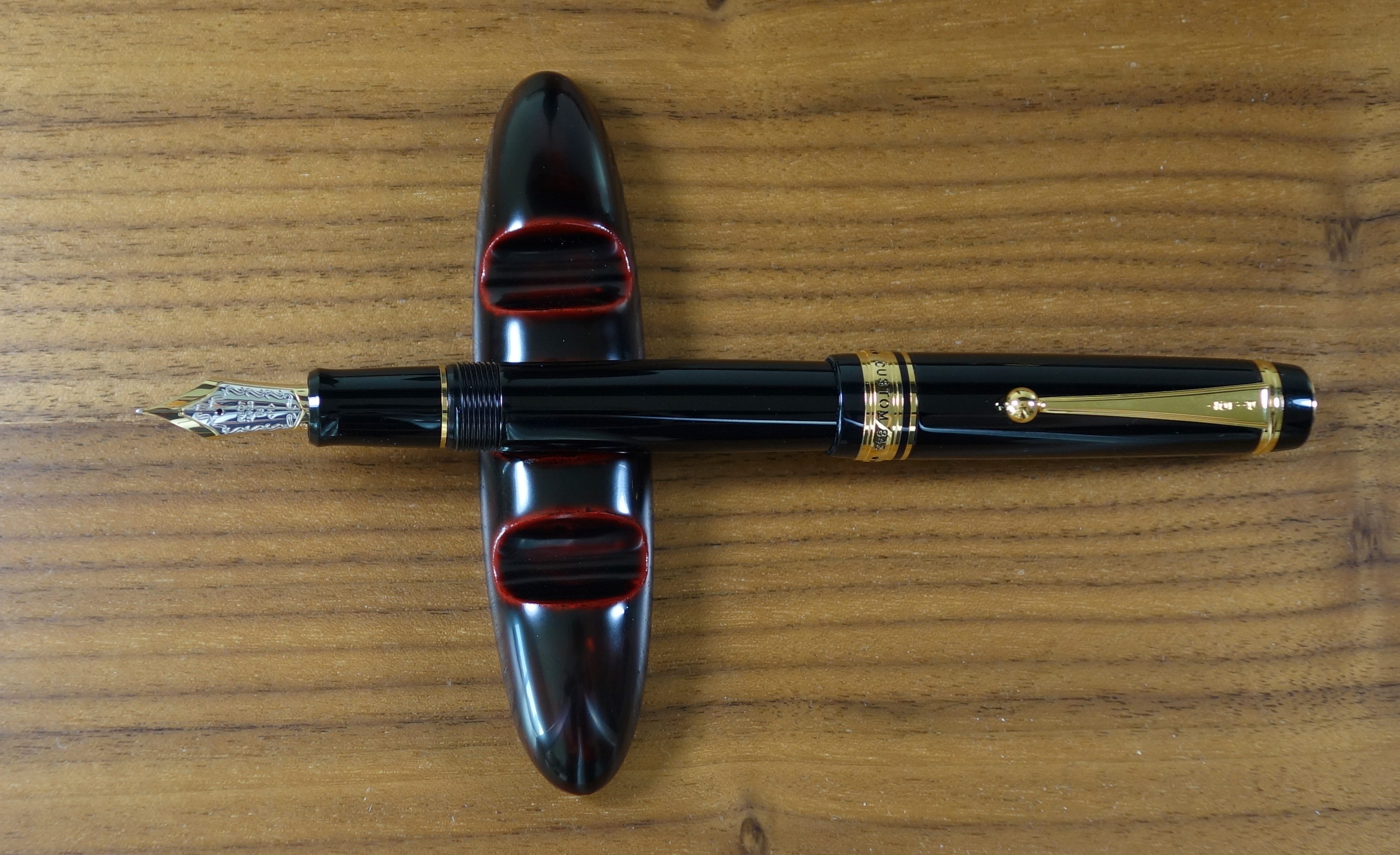
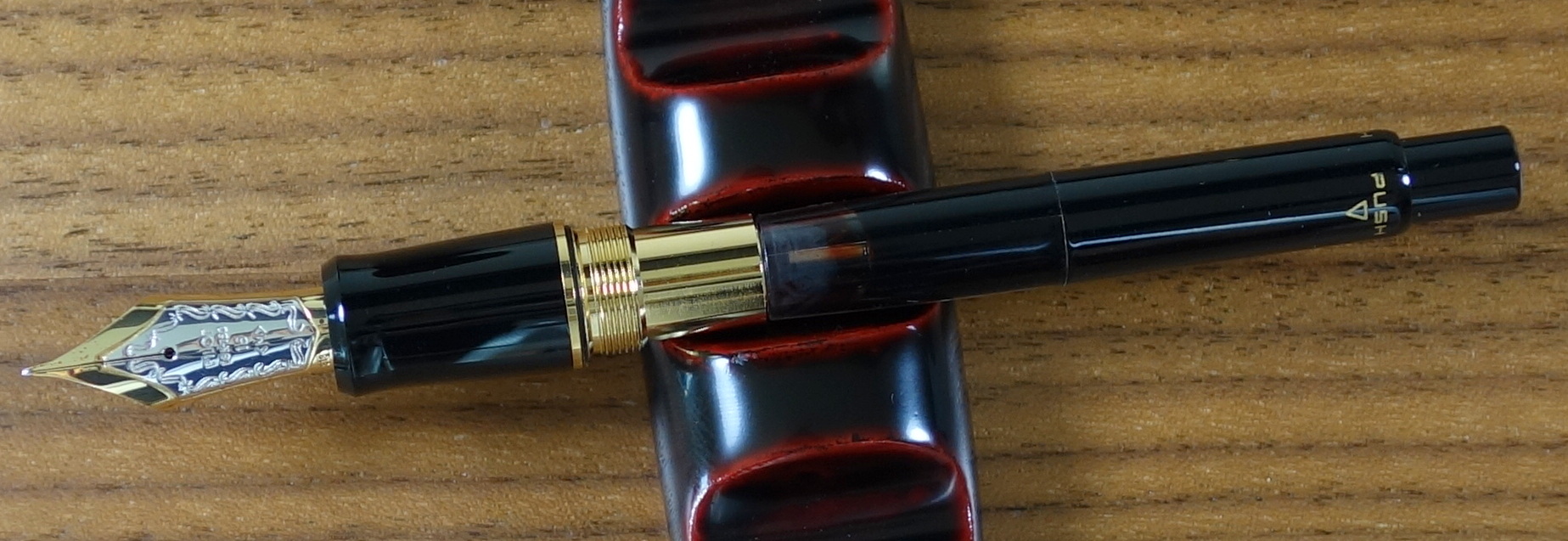
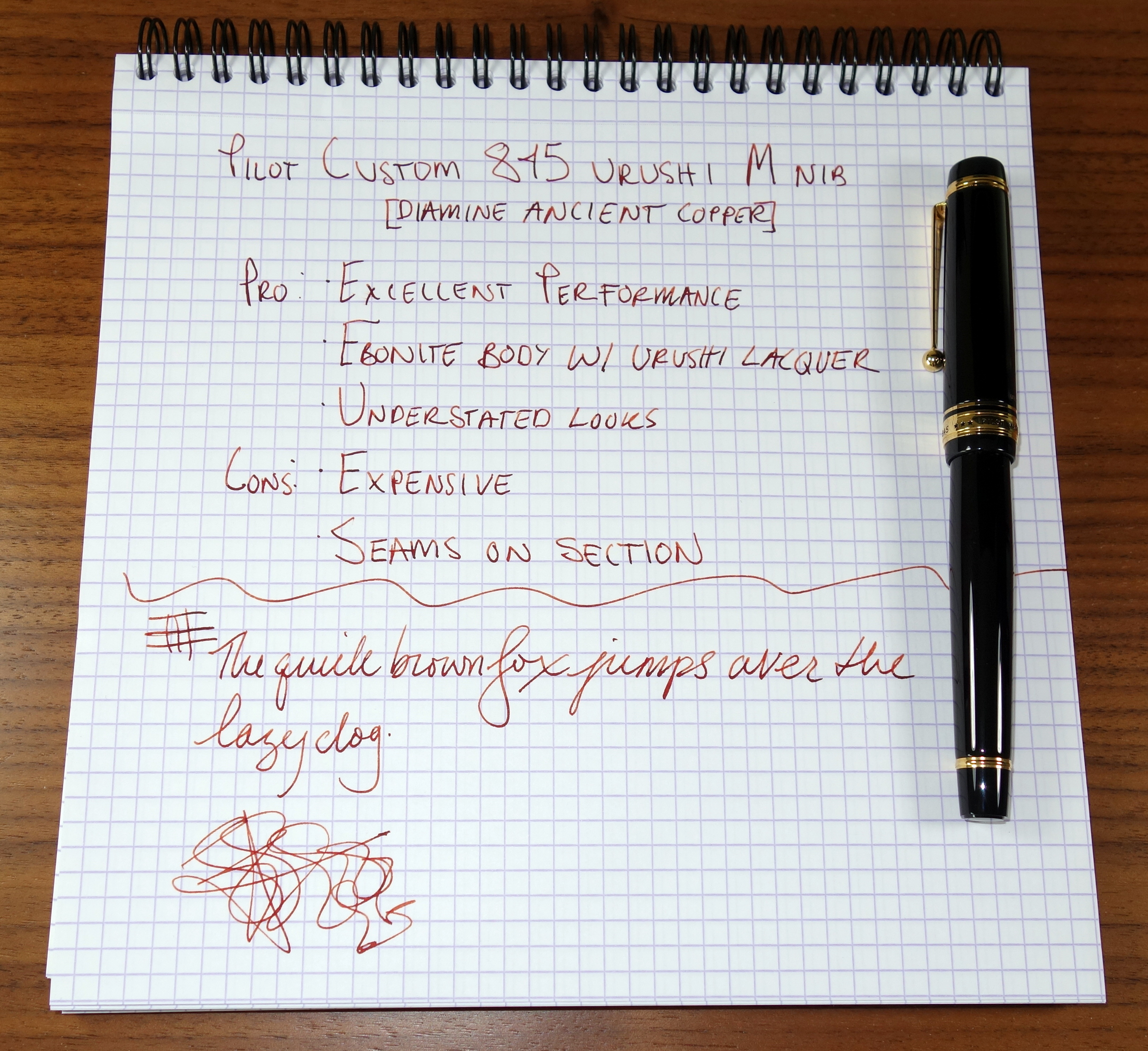
The Custom 845 is Pilot’s top of the line fountain pen (limited editions and Namiki branded pens not included). The 845 retails for an eye-watering 500,000 YEN (approximately $495 USD) and has received some mixed reviews. People have questioned whether it should command a price near an entry-level Nakaya.
What do you get for $500?
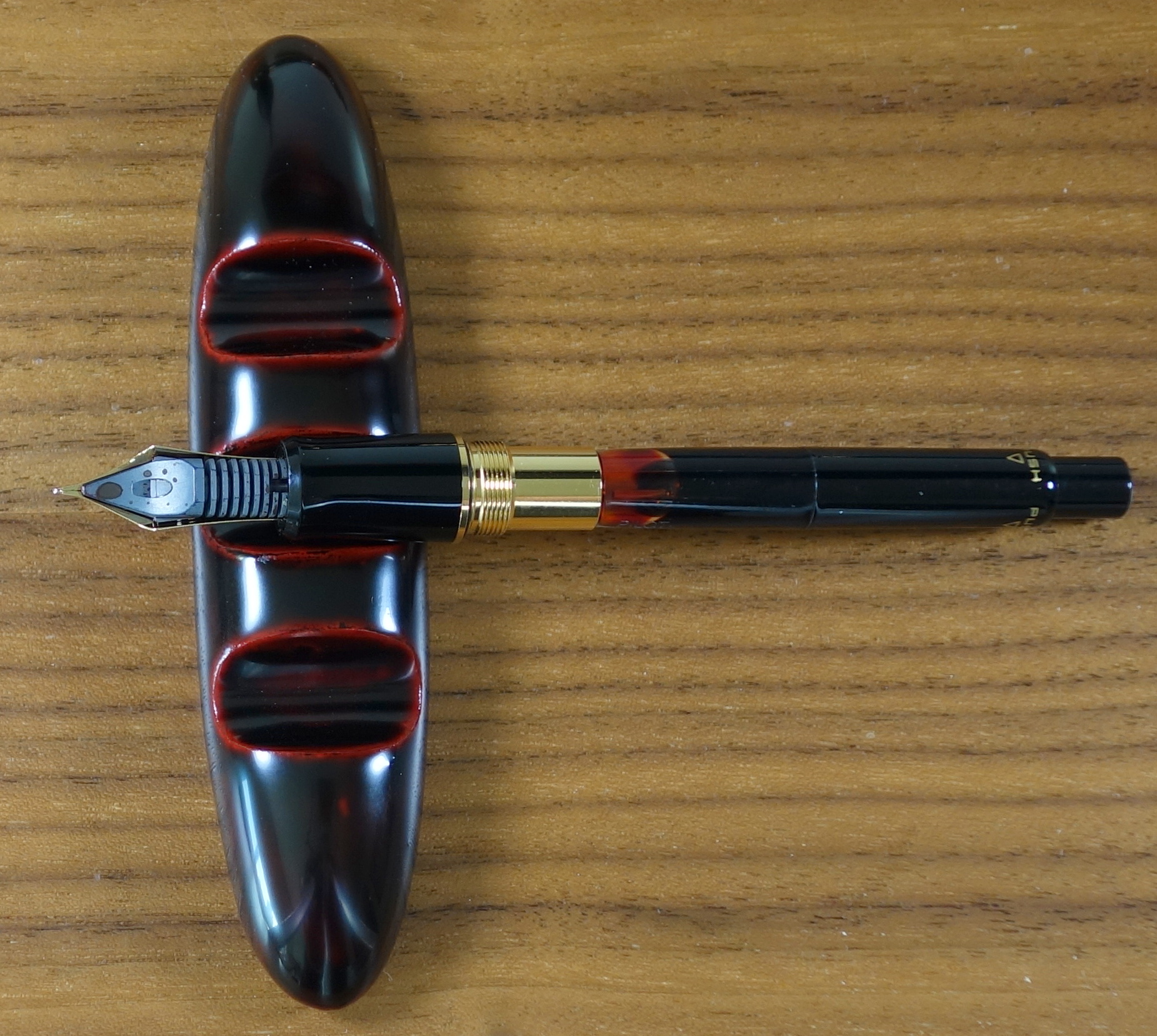
You get Pilot’s largest (Pilot branded) #15 nib in two tone 18kt gold with a large “gem” carved ebonite body and urushi lacquer finish. You also get a black painted Con-70 converter and an upgraded box.
While in Japan I was able to play with a number of Pilot/Namiki pens and I ended up loving the Custom 845. Now that I have had a few weeks to put it through its paces let’s see how it stacks up.
Appearance
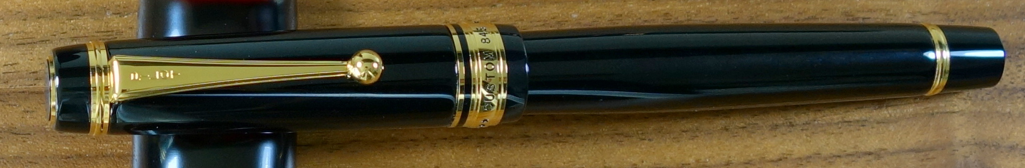
The Custom 845 is a classic looking executive pen with a black body and yellow gold furniture. The cap has a flat top with a clip that starts broad and narrows ending with a ball.
The gold band at the bottom of the cap reads “* * * CUSTOM 845 * * * PILOT MADE IN JAPAN”. The letters are filled in with black (paint?) so they look nice and crisp. The back of the cap has “URUSHI” in gold letters.
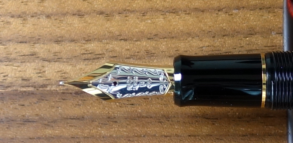
The large two-tone #15 nib looks great and features some nice scrollwork on the silver center. I really like that Pilot puts a date stamp on these nibs. The left bottom corner of the nib is stamped “813” which translates to August 2013.
It’s hard to look at a pen like this and not think about Montblanc. The 845 with its flat top clearly isn’t a Meisterstück but it clearly is a Japanese take on a German style pen and that is definitely not a bad thing.
Score: 4/5
Build Quality
Many people, including myself, rave about Pilot’s build quality. I hadn’t spent much time with the Custom line before these last three weeks and while I still maintain that Pilot builds exceptional quality pens I do have some issues with the Custom 845 and the Custom 743 (review to come later).
To start let’s talk about the body of the 845. Above I said this pen has a lacquered ebonite body and it does….mostly, except for the section, the end of the body and the ends of the cap, which are plastic, or “resin” if that sounds more appetizing.
Custom 743 with Custom 845. Both have the same plastic section.
The plastic parts are not painted with urushi lacquer but nonetheless they do blend together well. The section has two visible seams and this to me is just wrong on a $500 pen.
To be fair these “issues” aren’t actual build quality problems but more an indication that this pen was built to a price. If you could build this pen without plastic and paint the entire pen in lacquer why wouldn’t you?
Other than the seams the fit and finish are flawless. The pen is sturdy and does not have the delicate feeling that a Nakaya has. With the 845, Pilot took a very practical design and really brought it to the next level by adding multiple coats of urushi lacquer. It is a wonderful pen to touch.
I compared the 845 to my Montblanc 149 and based on superficial fit and finish alone the Montblanc wins. The engraving on the ring of the 149 to me looks nicer and the Montblanc has no seams on its body despite being made entirely out of plastic.
I suspect that in the long-term the Pilot will hold up better than a 149 as the lacquer is much more scratch resistant than plastic and I have seen real problems with Montblanc quality. I have had plating issues with Montblancs as well as nib issues on brand new Montblanc pens; both things I have yet to see with any Pilot.
Score: 2.5/5
Size & Weight
The Custom 845 measures 5.7” capped and about 5.2” uncapped. At its widest point it is about 0.6” and weighs about 28.8 grams. The 845 is a good sized pen similar in girth to a 146 but closer to the 149 in length.
Montblanc 149 with the Custom 845
The 845 posts well and does have a good balance posted but for long writing sessions I prefer the 845 unposted. I believe most people would find the 845 to be a comfortable pen.
Score: 4/5
Performance
I sampled the fine, medium and broad nibs and found that the medium to be my favorite. Being Japanese, the medium is closer to a western fine. The Pilot-made # 15 18kt gold nib writes beautifully. I haven’t had any issues with skipping, hard starting or poor flow. The nib is somewhat soft for a standard nib and it is ultra smooth and responsive. It writes like a $500 pen should. The feel is phenomenal; in fact I believe it’s the best writing stock round tipped nib I have come across on a modern pen.
Score: 5/5
Filling System
The Custom 845 uses Pilot’s famous Con-70 converter which is considered by many to be the best converter money can buy; despite this, the 845’s cartridge/converter filling system tends to receive some criticism as many people feel that the $200 cheaper Custom 823 offers more value with it’s vacuum filling system.
It is true that the vacuum filing system holds more ink and it is likely a more expensive mechanism but as a cartridge/converter lover the black Con-70 is pretty much perfect. The Con-70 holds more ink than most converters and has a unique push button mechanism that you push four times to fill.
Score: 4/5
Value
The problem here is what do you compare the 845 to? At $550 a Nakaya is a great value and I know that because there are a lot of similar pens to compare it to.
The 845 is different, it’s more usable, it’s more solid feeling than a Nakaya, to me it’s an urushi Montblanc sans the status and for someone who wants that there aren’t many alternatives in this price range. I think $495 is about right for this pen. You will be hard pressed to find another high quality urushi fountain pen for less money and while it’s hard to call the 845 a steal it’s also hard to call it overpriced.
My ratings for this pen have been pretty harsh but I would like to mention that when I bought this pen I tired a TON of pens at the store including much more expensive Namiki pens with #20 and #50 nibs as well as a number of Sailors and Platinum pens. I liked the feel of the 845’s nib the best and I think I would pick the 845 again given the chance.
Score: 3/5
Bottom Line
If a Montblanc and a Nakaya had a baby it would be the Pilot Custom 845.
Much like the Pilot Precise, the Pilot Razor Point is a classic. The Razor Point is a simple felt tipped pen that (to my knowledge) has remained unchanged for at least a decade now. The completely opaque metallic blue plastic body and the thin metal clip are clues that this pen was designed quite a while ago. I personally find the design refreshing as I am so used to loudly colored pens with horrible branding and translucent bodies.
The Razor Point has an extra fine felt tip that writes with a smooth wet line and manages to stay true to its specified 0.5mm width.
There are a couple downsides to the Razor Point that its modern peers do not share. First off, the ink in the Razor Point tends to bleed more than other porous tip pens like the Copic Multiliner or the Staedtler Triplus Fineliner. Second, the tip is not particularly durable; in my experience the tip gets worn out before the pen runs out of ink.
While there are better felt tip pens out there, the Razor Point is really quite likeable and I think worth a try if you are curious about it.
Here are some great reviews of the Pilot Razor Point:
(I have no affiliation with the sites linked below)
The Pilot Precise Rolling Ball pen is the predecessor to the very popular Pilot Precise V5 (and V7) and has been one of my favorite roller balls for quite a while now. Compared to the V5, the Precise is more satisfying to write with; to me it provides the right combination of smoothness and feedback.
The basic beige plastic body wont turn any heads but its understated looks really appeal to me. The Precise features a durable tungsten carbide ball and stainless steel point as well as the same clip and overall shape of the V5. Unlike the V5, it does not have an ink window or a visible feed. You wont find the Precise in most office supply stores anymore but they can easily be bought online. I still highly recommend this pen.