This month’s Goulet Pen Company Ink drop is a tribute to the creator of Private Reserve Ink, Terry Johnson. This shipment contained eight inks from the same manufacturer instead of the usual five from various manufacturers.
My favorites this month are DC Supershow Blue and the Ebony Blue. All of these inks have a lot of saturation. The Ebony Blue is the most unique; it is a blue black with a bit of turquoise in it.
Ink Drop is a subscription service through The Goulet Pen Company (no affiliation) that consists of monthly shipments of 5 ink samples. Each shipment is $10.
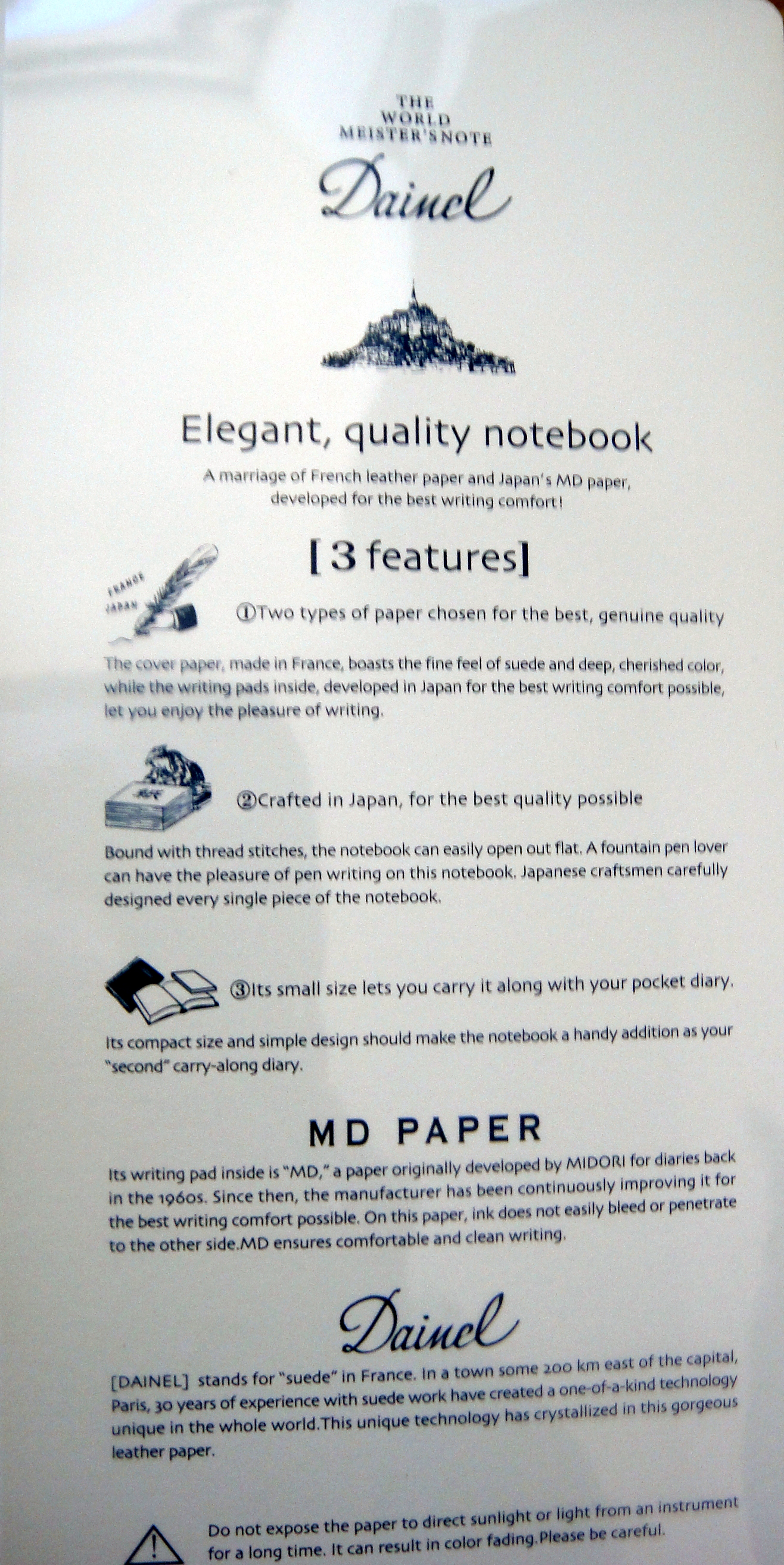
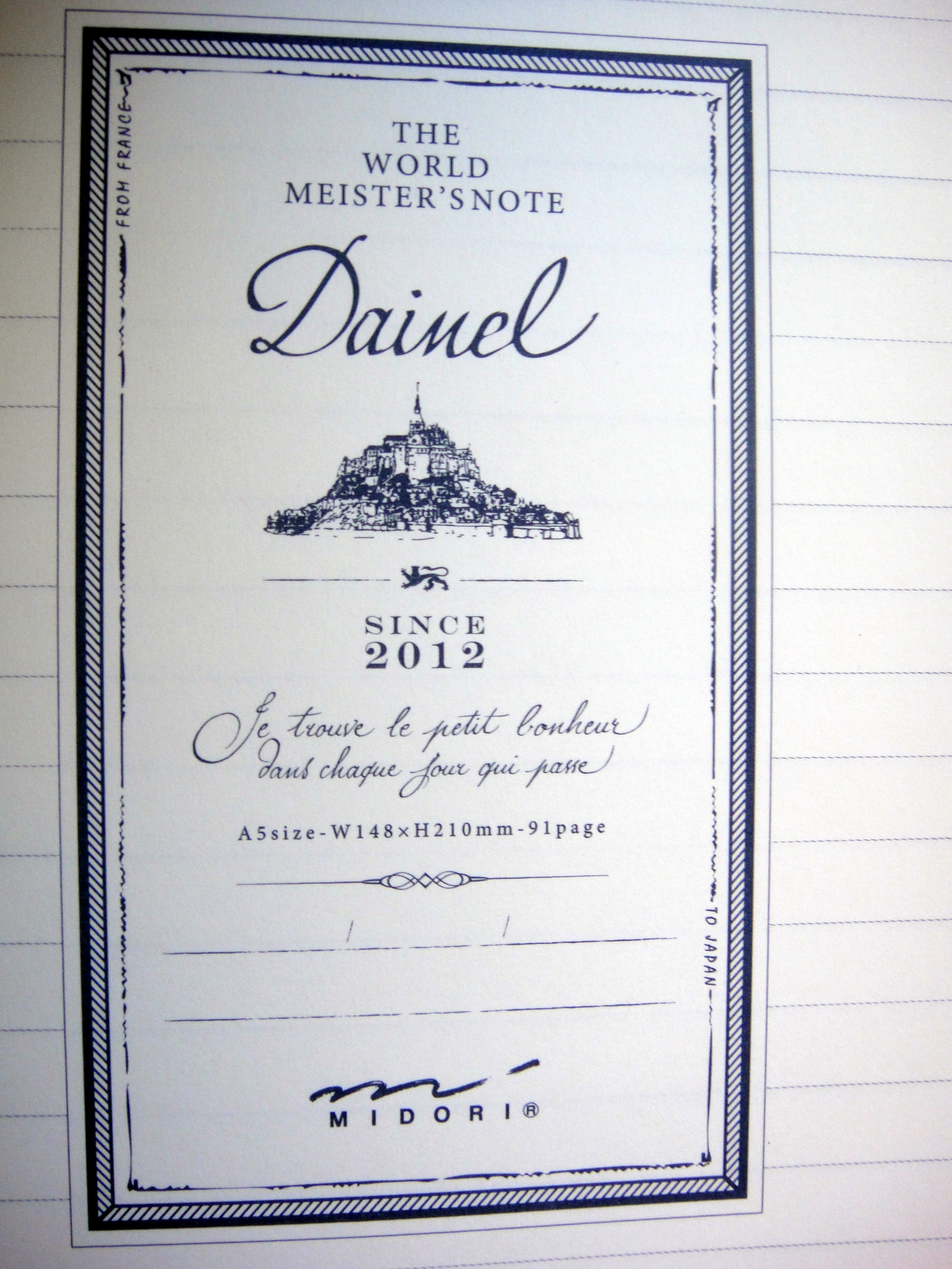
The Midori World Meister’s Note series features collaborations between Japan and other countries. The Dainel is the first in the series which Midori describes as ” A marriage of French leather paper and Japan’s MD paper, developed for the best writing comfort”.
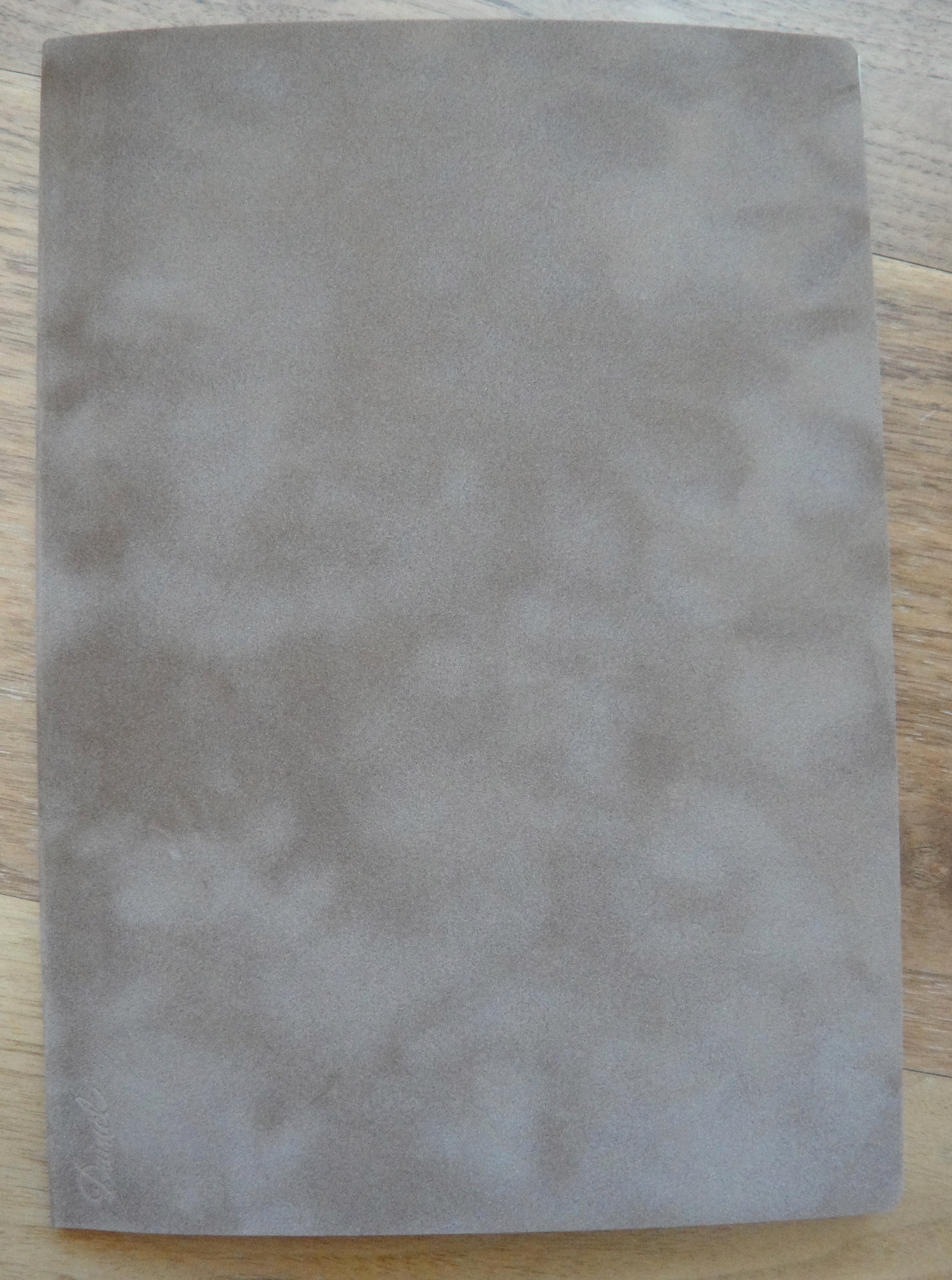
The color of the cover is a bit more brown and less grey than the picture shows.
Let’s start with the cover and then make our way inside. The cover is made in France out of “French leather paper” and according to the packaging:
“[Dainel] stands for ‘suede’ in France. In a town some 200 km east of the capital, Paris, 30 years of experience with suede work have created a one-of-a-kind technology unique in the whole world. This unique technology has crystallized in this gorgeous leather paper.”
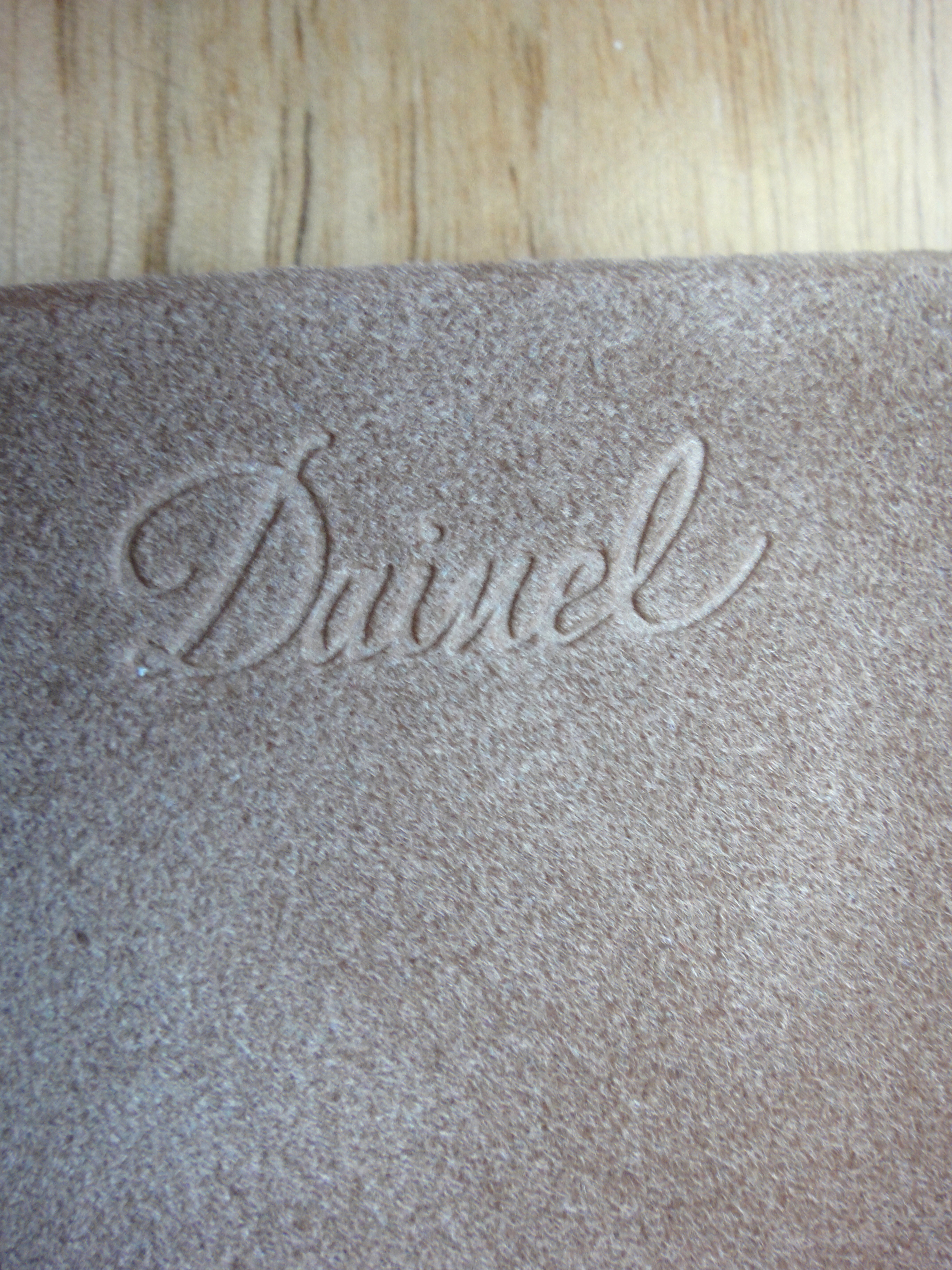
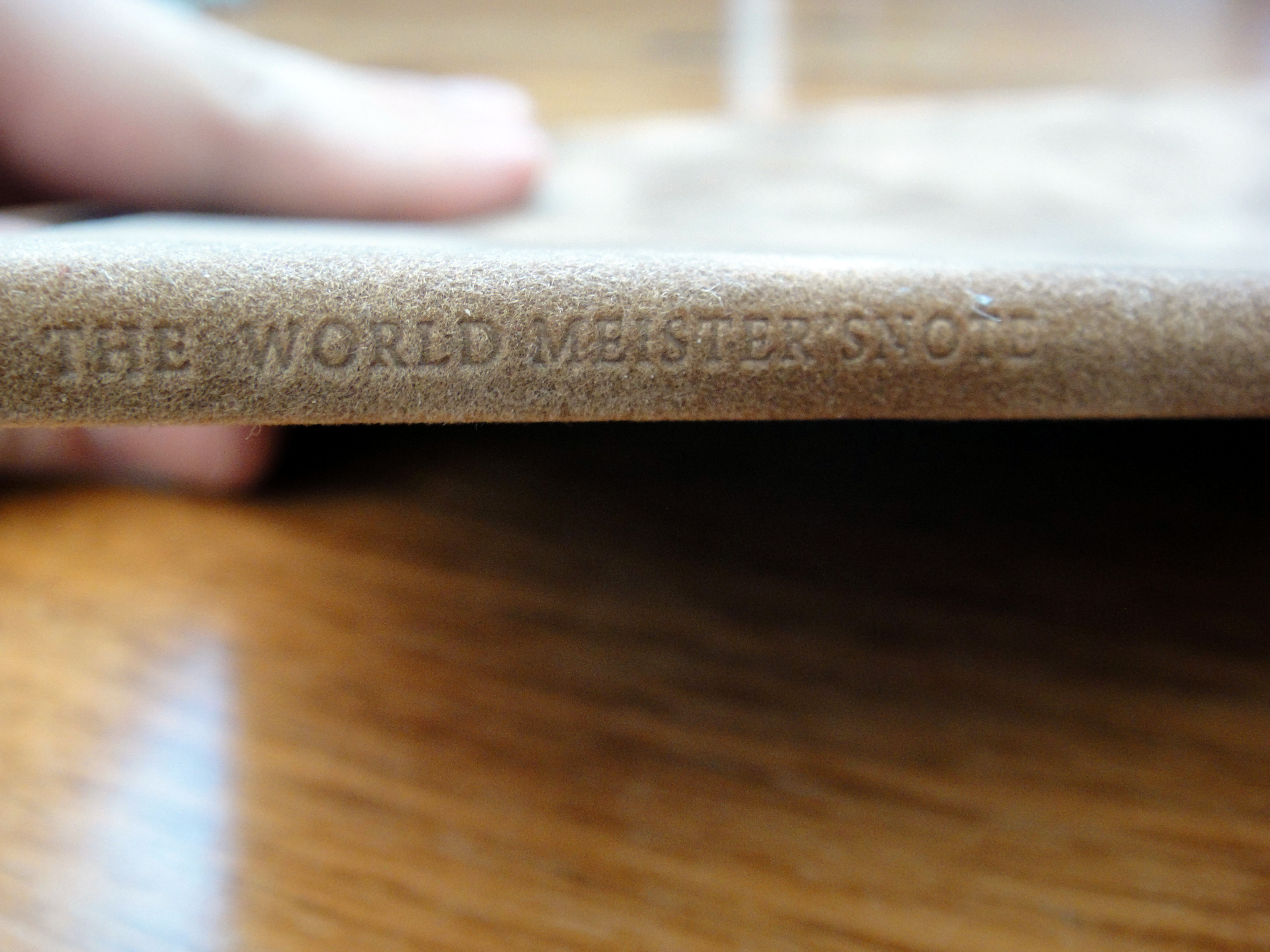
To me the cover looks a bit like suede but I was disappointed when I touched it; it feels like a mediocre felt. The more I use the notebook the more I like the cover; it is a lot nicer than a paper cover but it certainly isn’t leather. The cover has “Dainel” pressed into the front of the cover and “The World Meister’s Note” pressed into the spine. This cover is the light brown color and I believe they come in four or five other colors.
This notebook is extremely well made and dare I say, better than anything else I have seen in its price range. The notebook is nicely stitched this notebook lays flat.
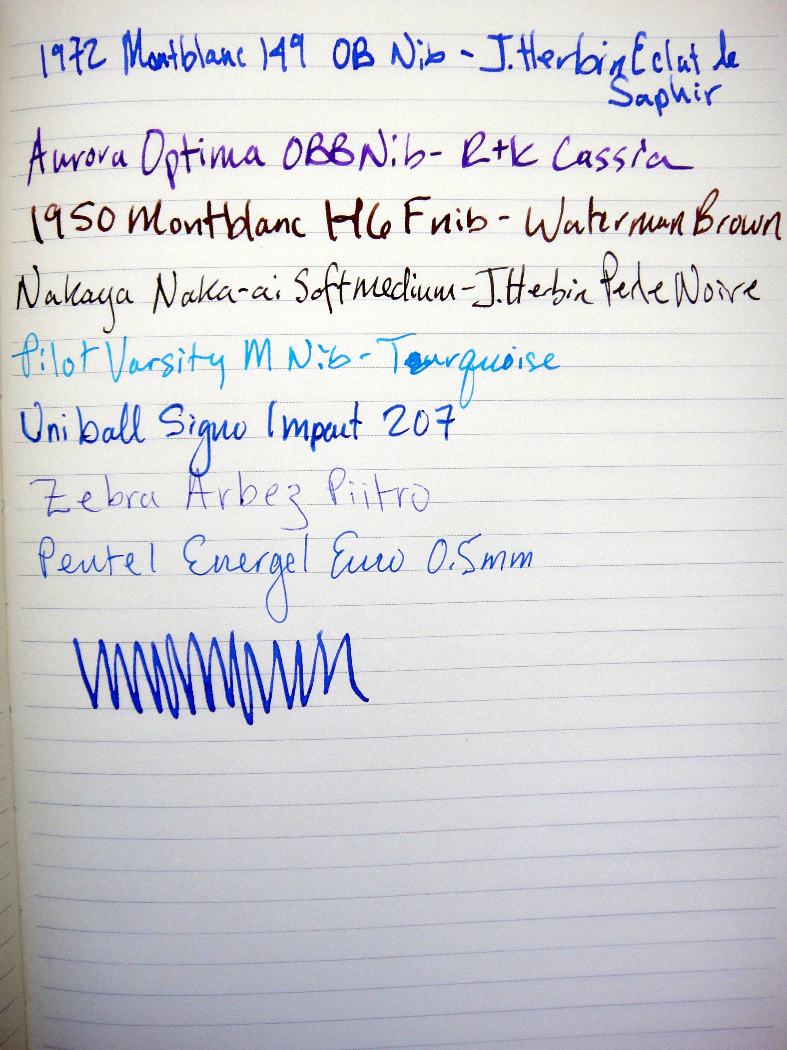
The inside of the notebook features 91 A5 pages of Midori’s exceptional cream colored MD paper which holds fountain pen ink beautifully. There is no bleed through even with juicy pens and almost no feathering.
It’s a 91 page notebook because the first page has this logo printed on it.
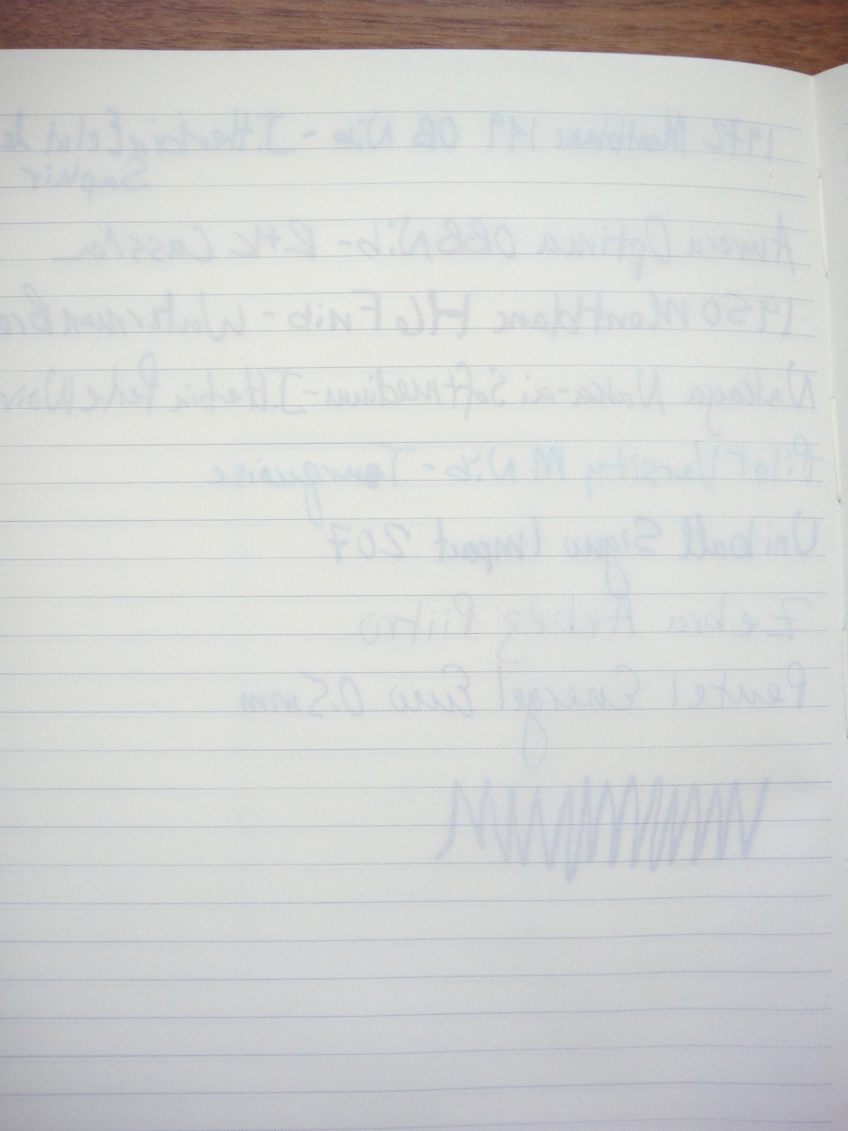
No bleed through and minor ghosting.
At around $13 this notebook is not cheap but the combination of the quality and the branding make it a winner. I look forward to getting my hands on the other notebooks in this series; I believe they are up to volume 3.
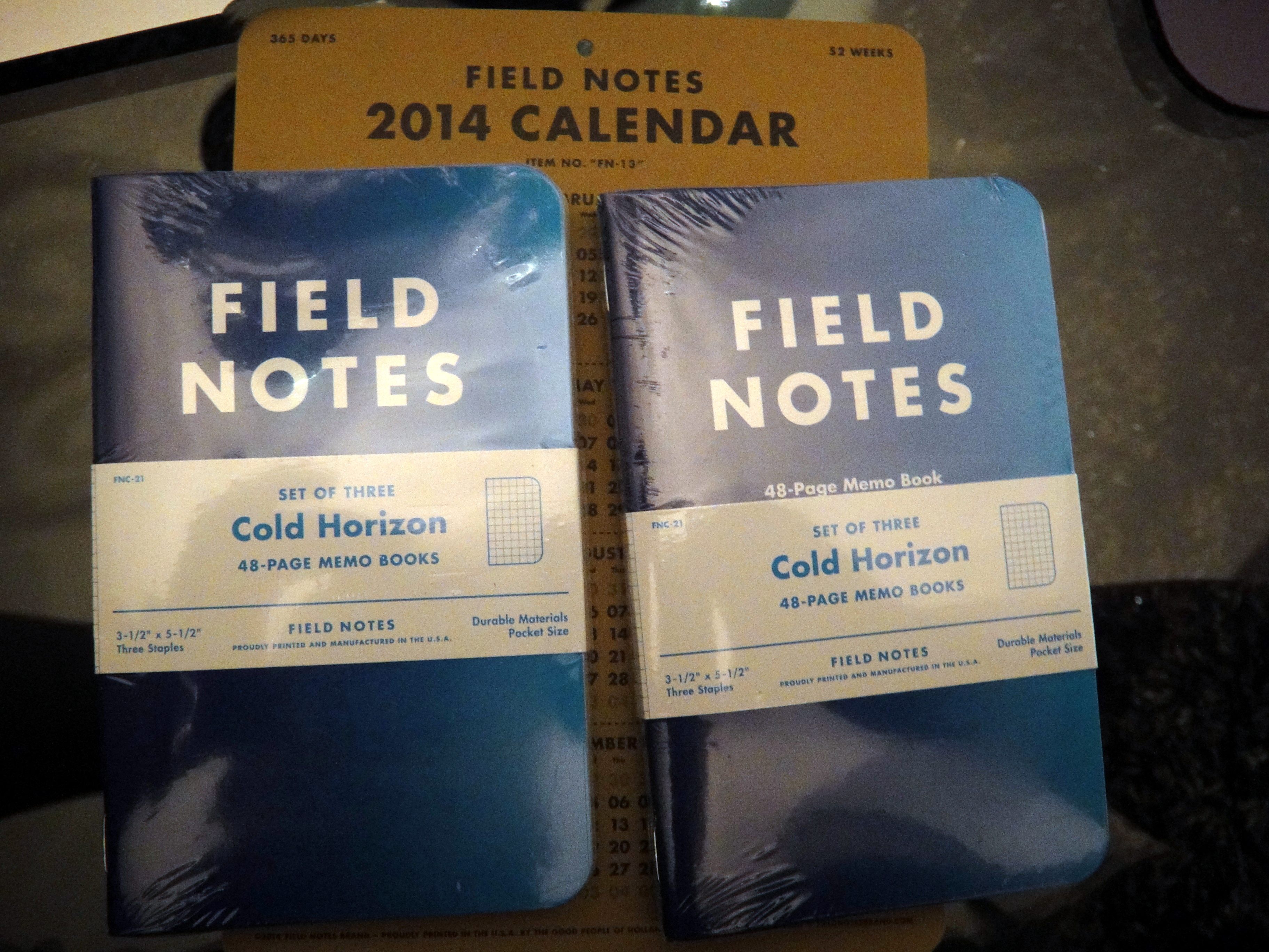
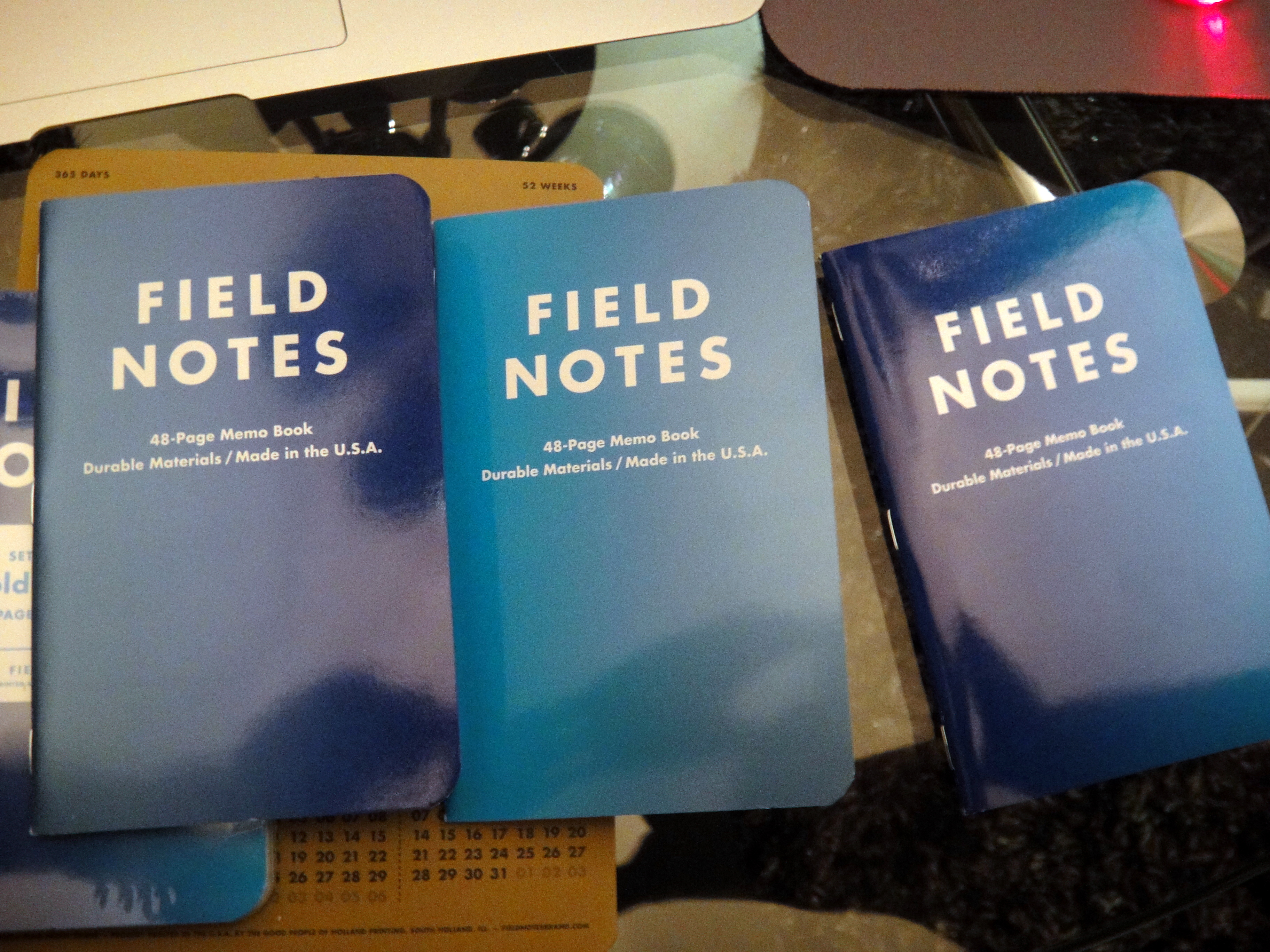
Cold Horizon is the latest edition in Field Notes’ Colors series. When the covers are lined up you can see a blue gradient. The blue gradient is continued in the font on the inside of the front and back cover.
Font in blue gradient
In the set each notebook features a different paper color, blue, green, and grey. Each notebook has grey grids.
Top to bottom: grey, green, blue
Overall, I love the design; it is clear that they really put some thought into these notebooks.
On to the bad:
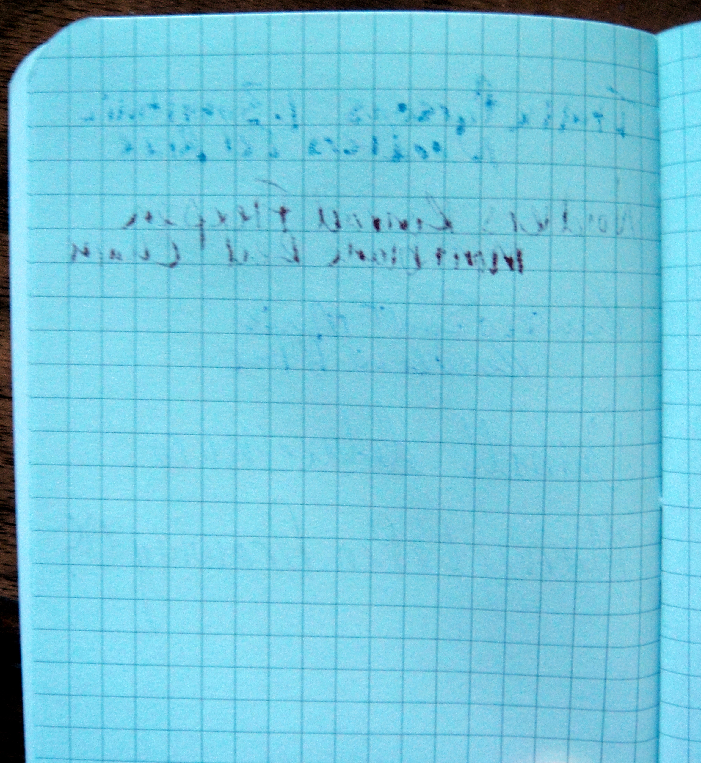
The covers are unpleasant to touch; they have a bit of a grainy feel which seems odd on a glossy cover. Most Field Notes are not considered fountain pen friendly and the Cold Horizon edition is no exception, in fact, the paper actually seems to resist fountain pen ink.
Notice the paper resisting the fountain pen ink.Bleed through
While I like the look of these Field Notes I don’t think I will be purchasing another set.
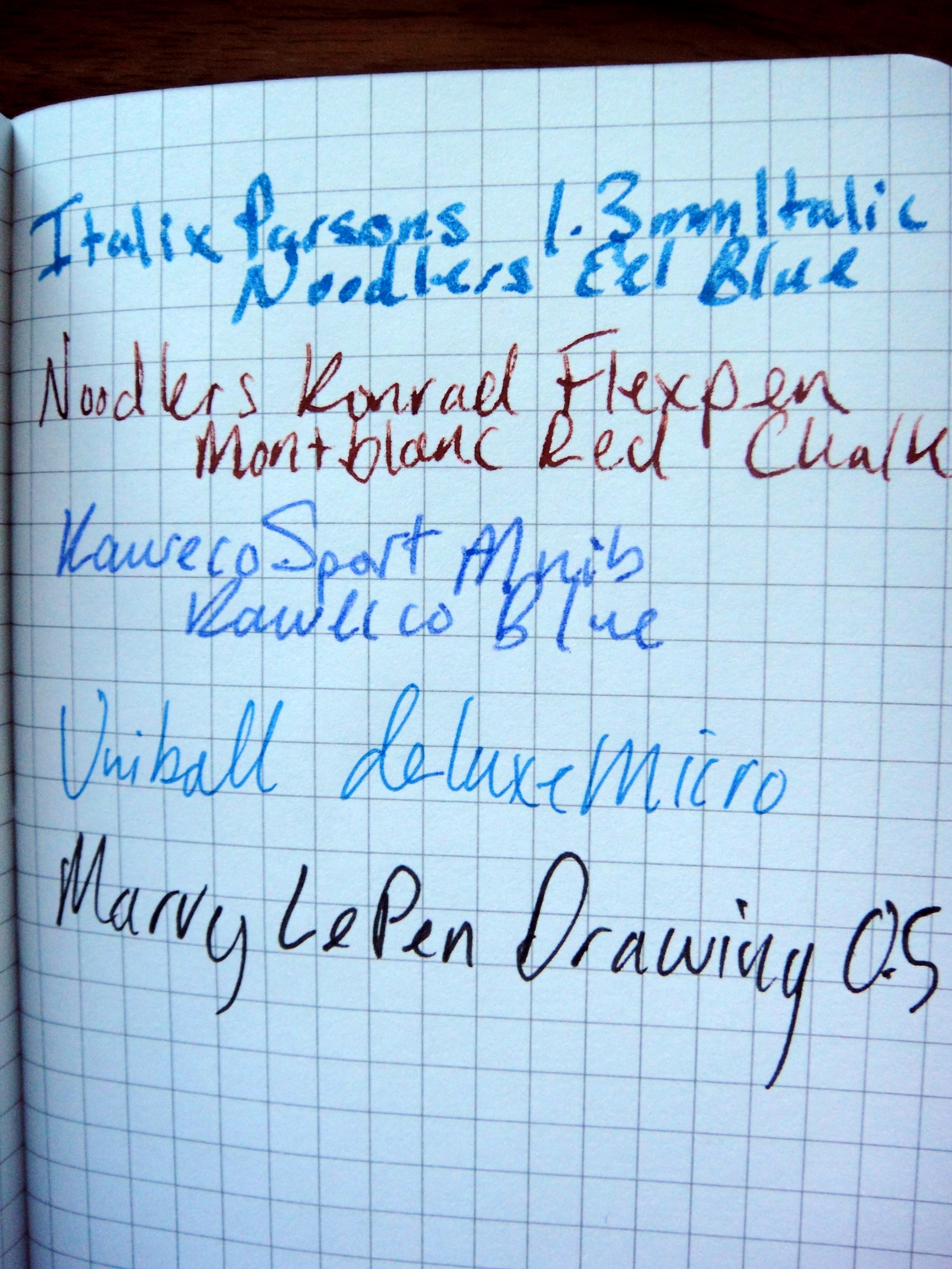
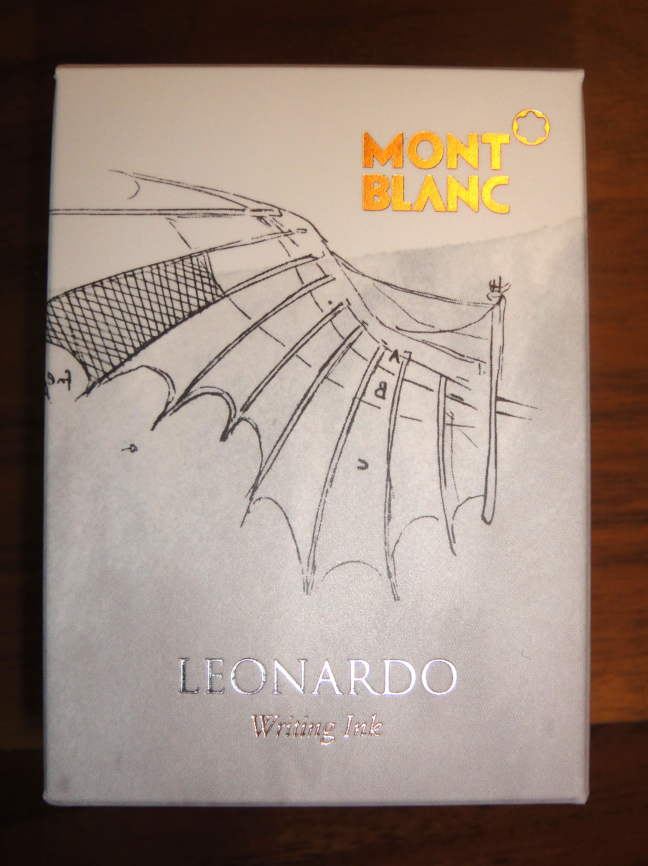
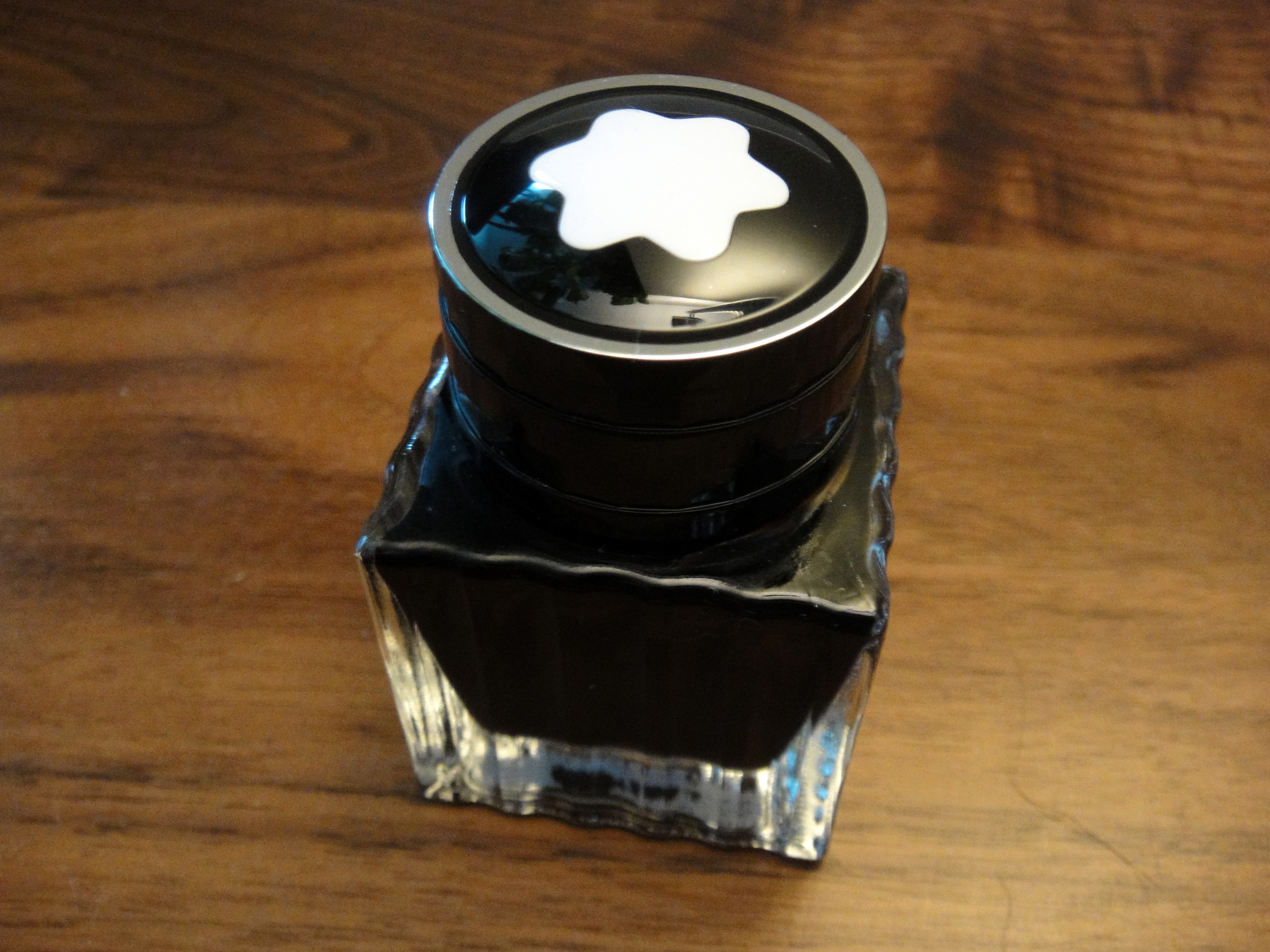
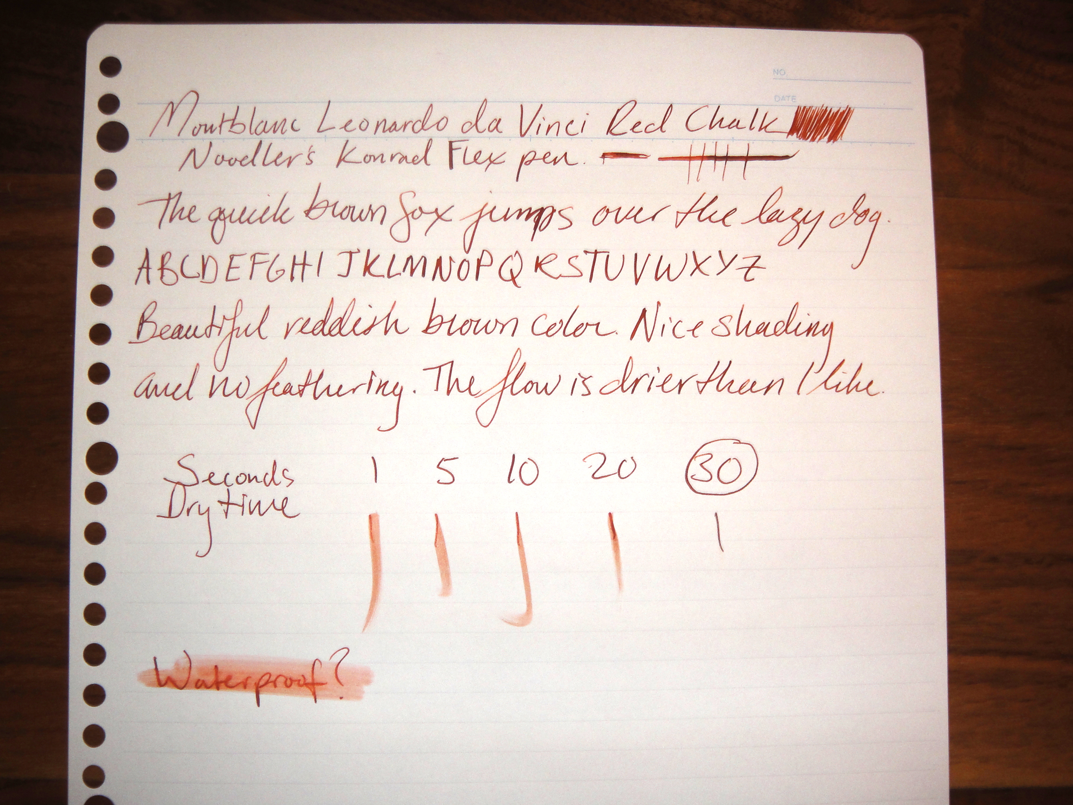
The Montblanc Leonardo da Vinci Red Chalk is a limited edition ink that was introduced with the Montblanc da Vinci fountain pen. The 30ml bottle is the same standard ink bottle I have seen with the other inks in the Montblanc “Great Characters” series. The color is a nice reddish brown color that to me looks a bit like a darker version Noodler’s Antietam. I have not see any issues with feathering or bleed through on the papers I have tested the ink with so far. There is a good amount of shading and saturation so I am not sure why it’s called “Red Chalk”. The flow is a little on the dry side but it’s not dry enough to prevent me from using the ink. Dry time is about average and the ink is not waterproof. Overall I really like this ink. I am going to have to try and get another bottle before they sell out.
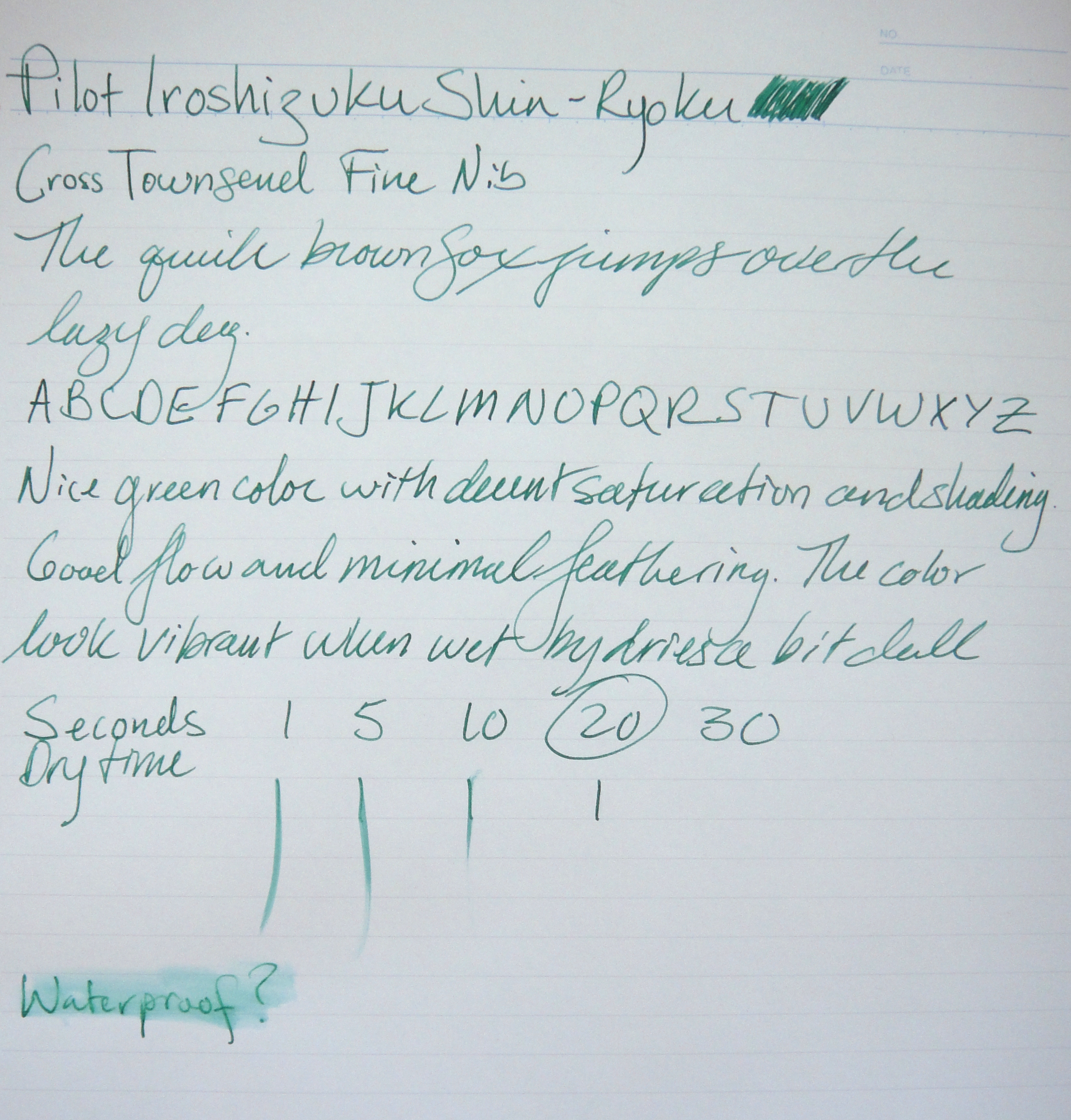
So first I want to start by saying that 50ml of this ink retails for $35 and can be had online for $28. In my experience Pilot Iroshizuku inks are well behaved and have a satisfactory flow. I am not certain however, that the consistent quality and beautiful bottle justify the price. I have found that other inks half the price are as good or better in some cases. My point: don’t think that for $35 you are going to get some kind of magical ink that is beyond the rest. If you fall in love with one of the Iroshizuku colors, go for it you wont be disappointed.
On to Shin-ryoku:
This ink in my opinion is very close to J. Herbin Lierre de Sauvage (I would do a comparison but my bottle had mold in it so I threw it out *harumph*). The translation of the name is “forest green” and the color is quite nice, particularly vibrant when wet. When it dries it ends up looking a bit flat which is disappointing. Shin-ryoku offers some nice shading (harder to see with the fine nib on my Cross) and like all Iroshizuku inks I have tried, no issues with feathering. Dry time is faster than most inks on Maruman Smooth-To-Write paper. The ink is not waterproof. I wont be purchasing a bottle of this one as Lierre de Sauvage is more vibrant when dried (I will be crossing my fingers that my next bottle wont have a mold problem).
Here are some great reviews of Shin-ryoku:
(I have no affiliation with the sites linked below)
Here is a preview of my first Nakaya fountain pen, a Naka-ai Cigar Negoro in Shiro-tame with a soft medium nib modified to be even softer and ground to be a left foot oblique (review to come next month):
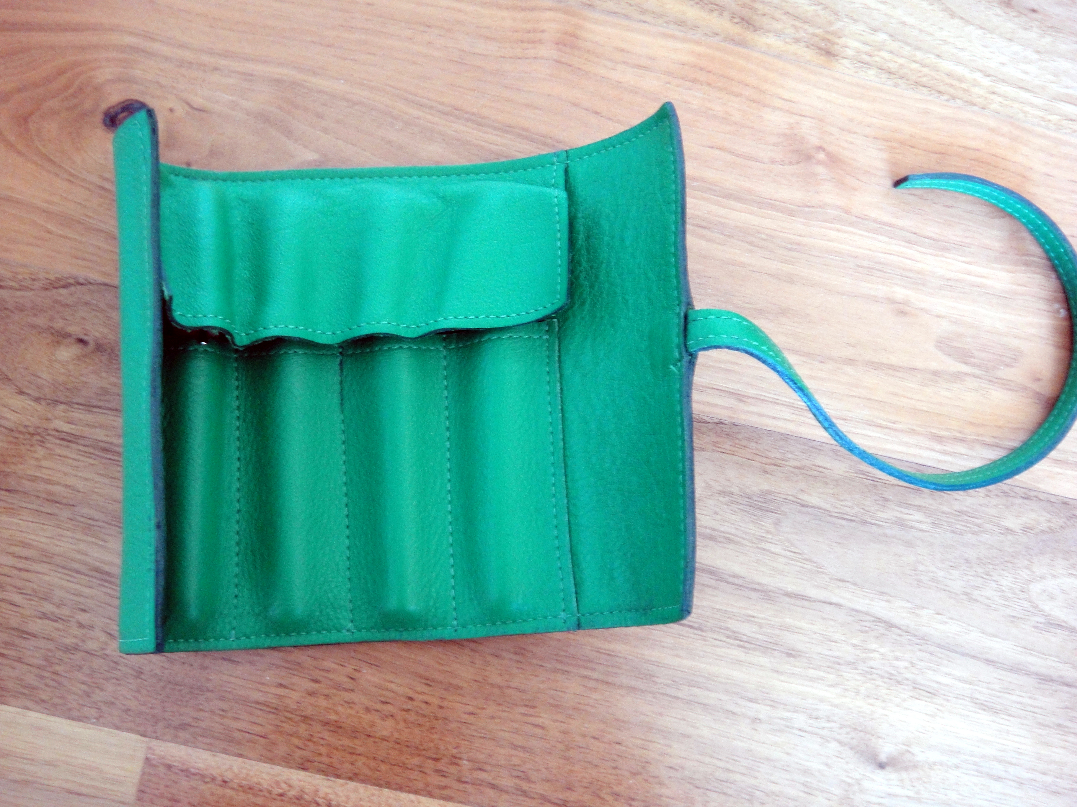
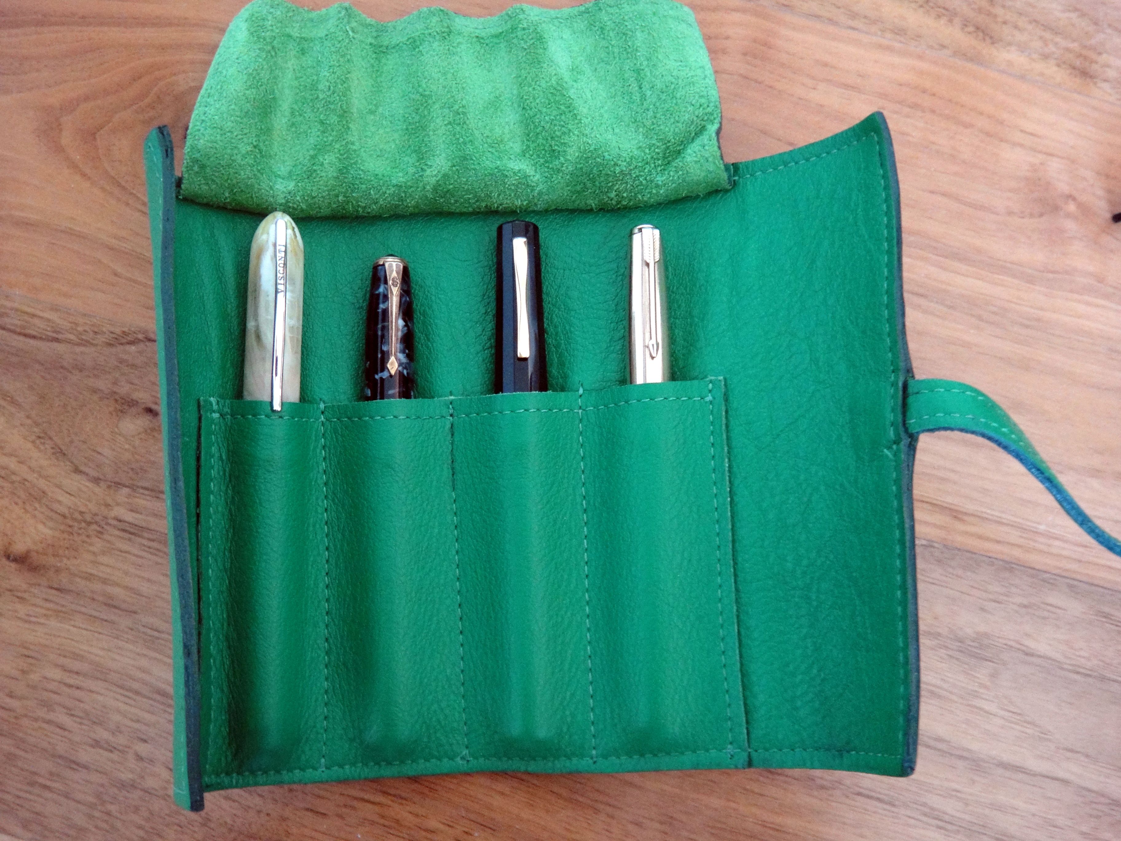
The Sula Jane & Earl pen wrap is hand made in Los Angeles out of genuine leather. I have been using mine daily for over a year now and as you can see from the pictures it has held up quite well. The Kelly green leather quite thick and protects my pens well. My OMAS Paragon and Montblanc 146 fit quite nicely but larger pens like a Montblanc 149 or a Pelikan M1000 will not fit. At $42 this wrap is a pretty decent deal considering the quality of the construction and materials. It should be noted that leather is not good for long term pen storage as it can cause metal to corrode.
Left to right: Visconti Van Gogh, Conway Stewart 58, OMAS Paragon, Parker P51
Here is a great of the Sula Jane & Earl pen wrap:
(I have no affiliation with the site linked below)
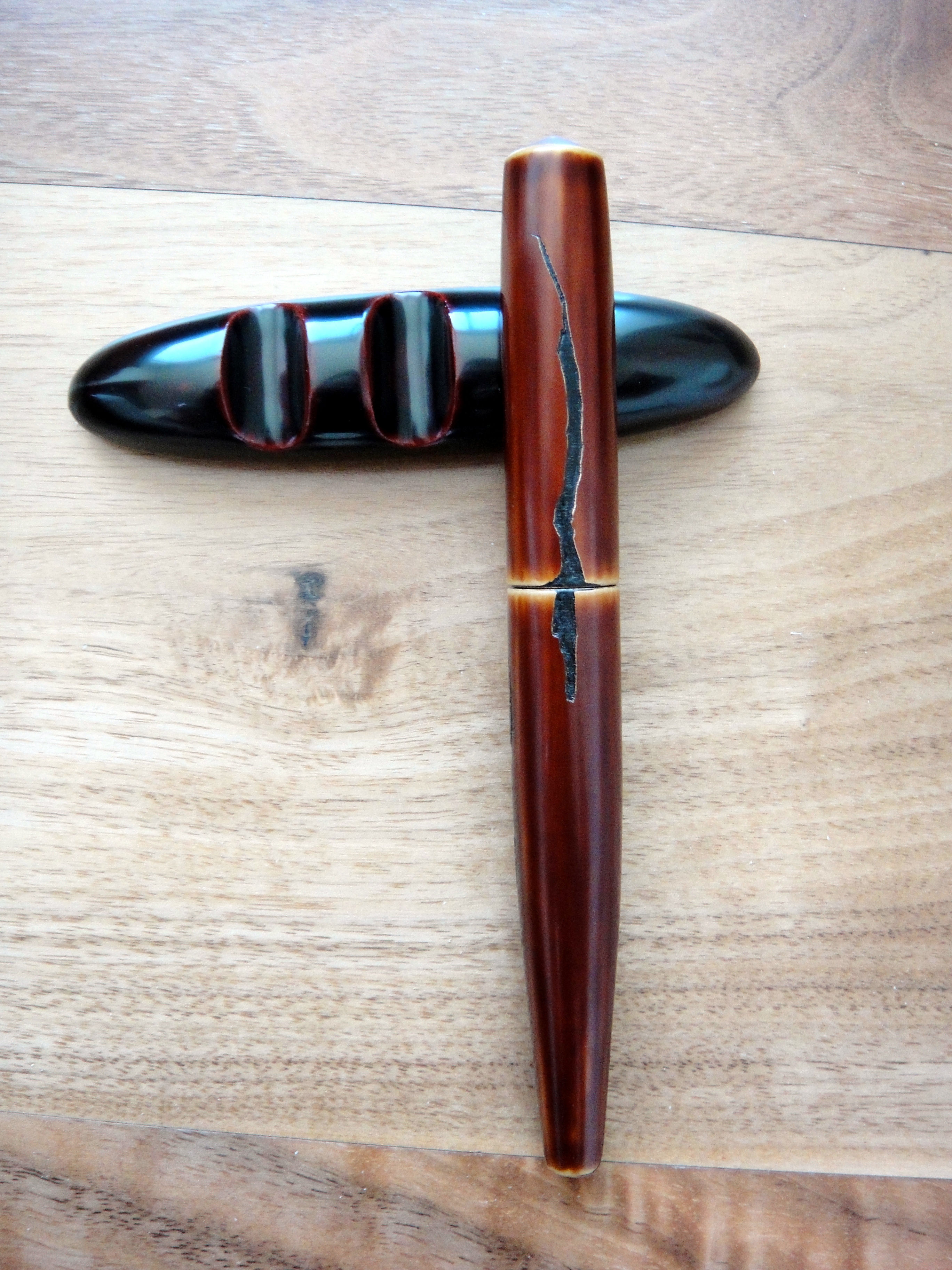
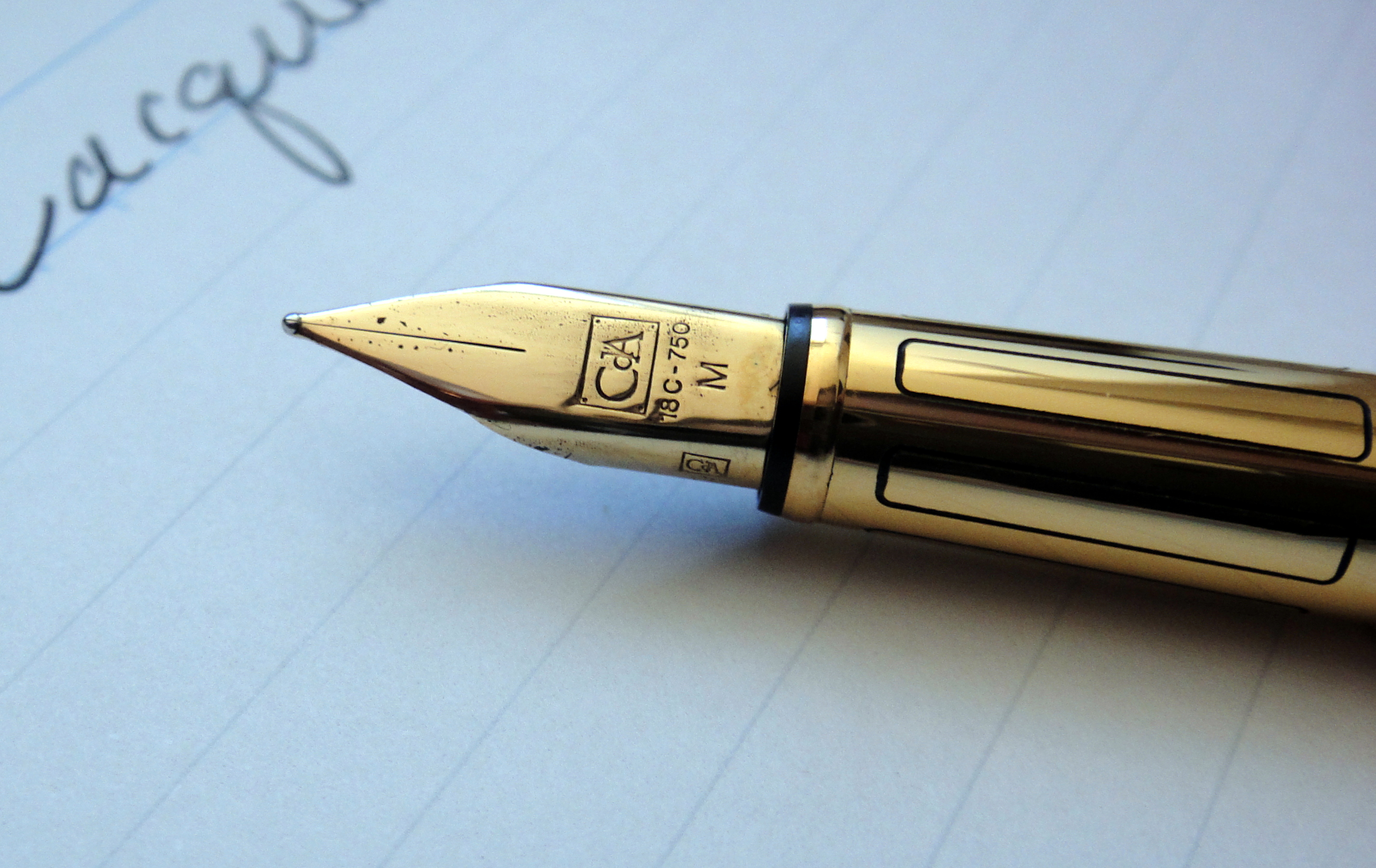
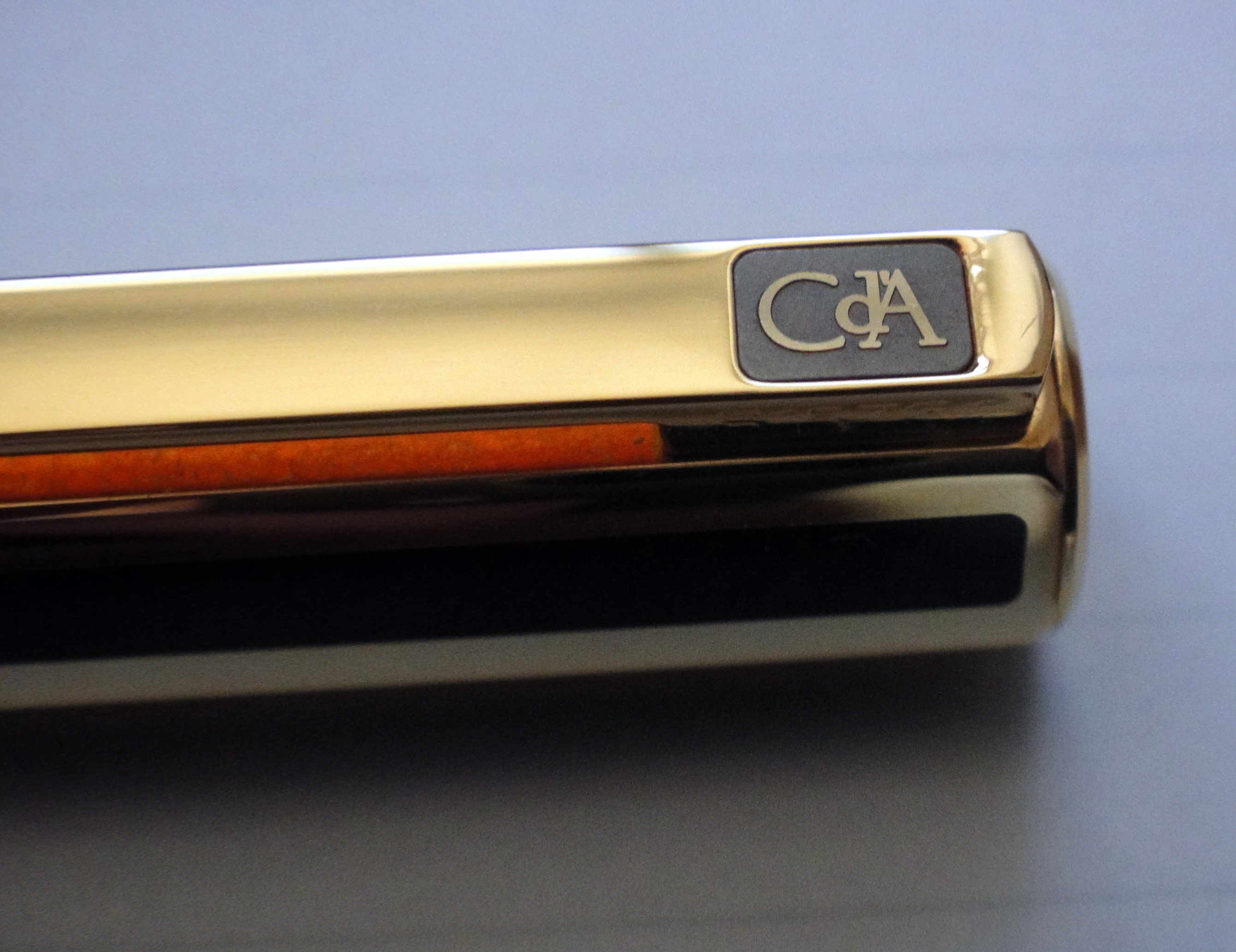
The Caran d’Ache Hexagonal Ecaille Chinese Lacquer fountain pen is an odd ball in my collection. I don’t like skinny pens nor do I like fingerprint prone pens and pens with metal sections….this pen is all of these things. So why do I have it you ask? It was the price. I saw this pen new old stock in a small pen shop in the Netherlands and I just couldn’t let it go.
I have decided to use a more standardized review process for nicer fountain pens with six categories and a scale of 1-5 (5 being the best and 1 being the worst).
Appearance:
It is hard to see the marbled red look of the Chinese lacquer in the pictures.
The Hexagonal shares the same shape as the original Caran d’Ache Ecridor pencil. The combination of gold plate and red marbled Chinese lacquer are pretty dated looking but the fit and finish make this pen still beautiful in my eyes as an objet d’art. I can’t think of another pen in production today that is comparable. The Hexagonal Chinese Lacquer is still listed on Caran d’Ache’s website but if you look around you will have a hard time finding one. The rectangles carved into the grip section are a touch I quite like. I love the squarish shape of the 18kt gold nib and the lack of a breather hole. My pen is from the 90s and the more recent Hexagonals have a more traditional nib with a breather hole. This pen is a fingerprint magnet and I worry that even wiping it with a soft cloth with scratch it. Score: 3.5
Build Quality:
Just by looking at the Hexagonal you can tell that it is of the highest quality. The “Maison de Haute Ecriture” will never disappoint you in the quality department. The gold plate is beautifully polished and the hand painted Chinese lacquer is gorgeous. Running your finger on the barrel you will notice that there is a seamless transition between the gold and lacquer; you cannot feel it at all. The rectangle shapes carved into the section are painted with lacquer. The pen both caps a posts with a crisp snap. This is an incredibly well made pen and is easily on the same quality level as S.T. Dupont and Graf von Faber-Castell. Score: 5
Size and Weight:
The Hexagonal weighs in at just under 27 grams which is neither light nor overly heavy for a normal fountain pen. The pen measures 5.25″ capped, 6″ posted and without the cap the pen measures 4.75″. At its widest point it is less than half an inch thick and the grip section measures about a quarter of an inch thick. The weight and the length of the pen are all excellent but the width makes this pen uncomfortable.
What Caran d’Ache did was made a capped version of the Ecridor pencil which has the same girth as a pencil wooden pencil. Keeping the same form factor with a capped pen means shrinking the grip section width and this is a serious problem comfort-wise. The smaller the girth, the more pressure needed to control the pen and when you consider that this pen weighs many times more than a wooden pencil the result is not brilliant.
I wrote a letter with the Hexagonal and about half way into the second page my hand was in pain and it was a struggle to continue. As a pen for quick notes you shouldn’t run into any problems but I wouldn’t recommend it for long writing sessions at all. Score: 1.5
Performance:
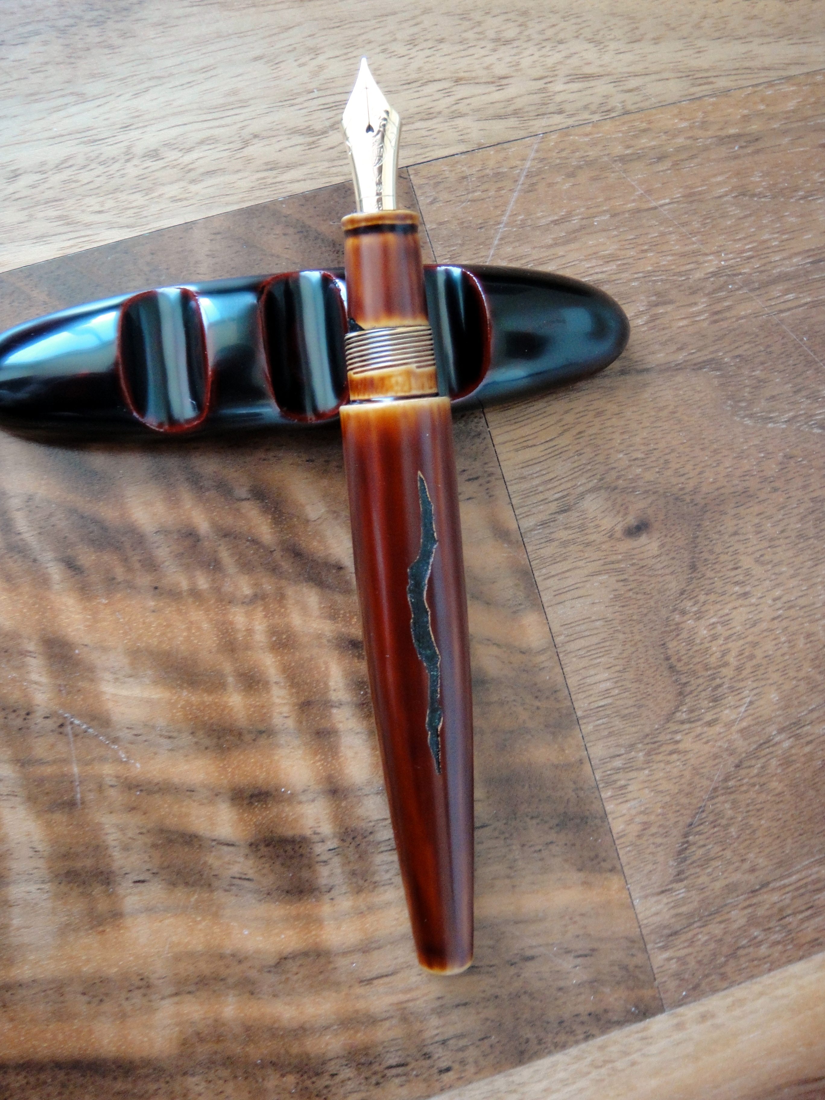
Lots of tipping material
The 18kt gold medium nib writes well and is very smooth with some light feedback. I have had no issues with skipping or hard starting. The performance of the nib has been flawless for me. It’s a pretty stiff nib so you wont see much in the way of line variation. I love nibs with character and unfortunately (like most modern nibs) the Hexagonal’s nib does not have much. Score: 3
…Perle Noire*** (I did it again)
Filling System:
The Hexagonal uses a cartridge or converter which is a feature I am starting to like on high-end pens. A piston filling system is more expensive to produce and holds more ink but from a cleaning perspective is much less desirable. I like to be able to change inks frequently and a cartridge or converter allows me to do just that without much hassle. I can easily go from an dark black to an ultra light orange without even giving it a second thought. With a piston fill pen I wouldn’t be able to make that change without a ton of cleaning. I use a regular Waterman converter with the Hexagonal and I have had no issues. Like the nib, the performance is good but there is nothing special to note here. Score: 3
Value:
The retail price of this pen (with the updated nib) is about $1,300 and I could never pay that for this pen. The quality is certainly there but it’s just not comfortable. I also feel as though there is no X-factor with this pen like you would have on many similarly priced pens from other manufacturers. I paid about €120 for my new old stock Hexagonal and at that price it is not a regret for me but it also isn’t a home run purchase as I rarely use it. Score: 2
Bottom Line:
Unless you love the style and can put up with the thin grip section, the Hexagonal isn’t a pen I would ever recommend. Final score : 18/30
Before I discovered ReDuRan I was using dishwasher detergent powder to remove fountain pen ink from my hands. Using a powder to clean your hands can be cumbersome and messy. ReDuRan is a product specifically designed for getting ink and dye off of your hands. The cleanser actually feels very gritty like dry dishwasher detergent but in a cream form. To use you simply apply a small amount (I usually use a pea sized amount) and rub the affected areas without water. Next, add a little bit of water and rub some more, rinse thoroughly and marvel in your new ink free hands.