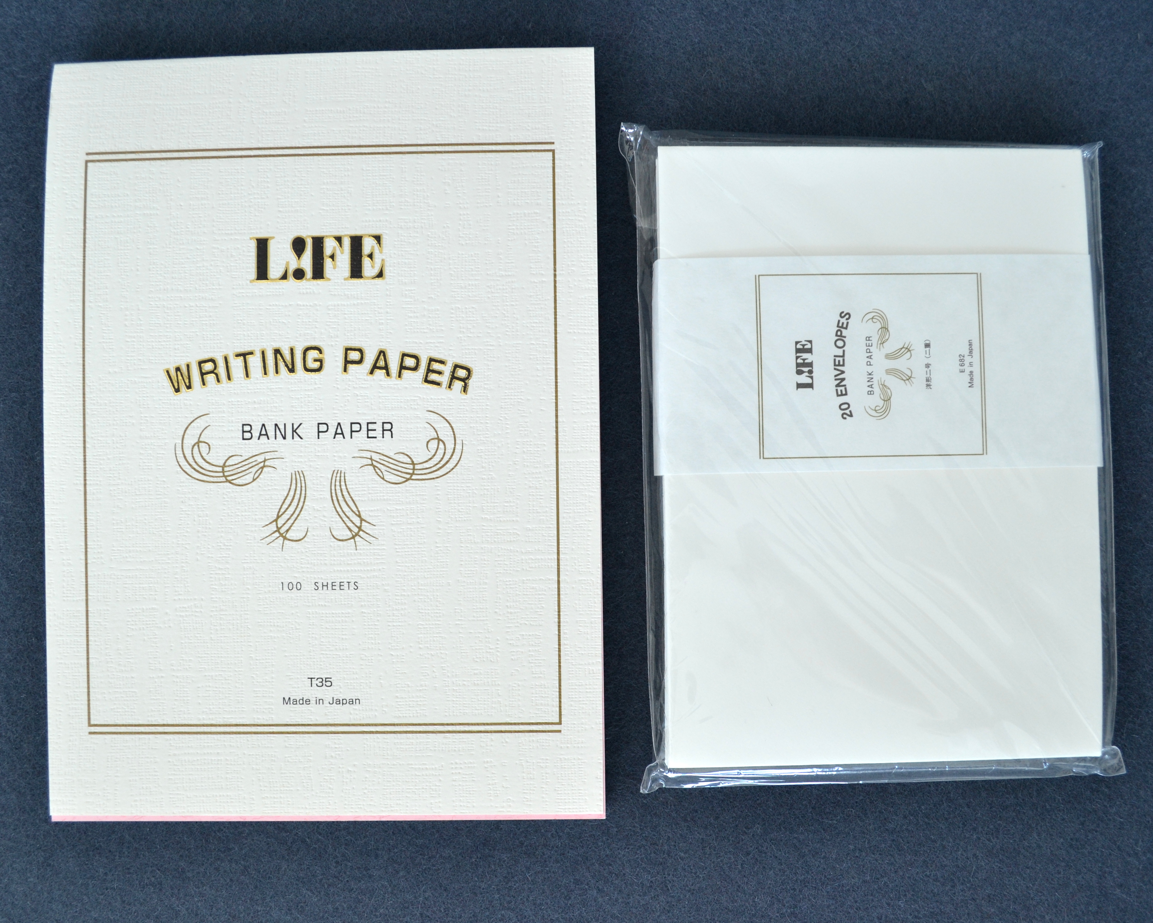
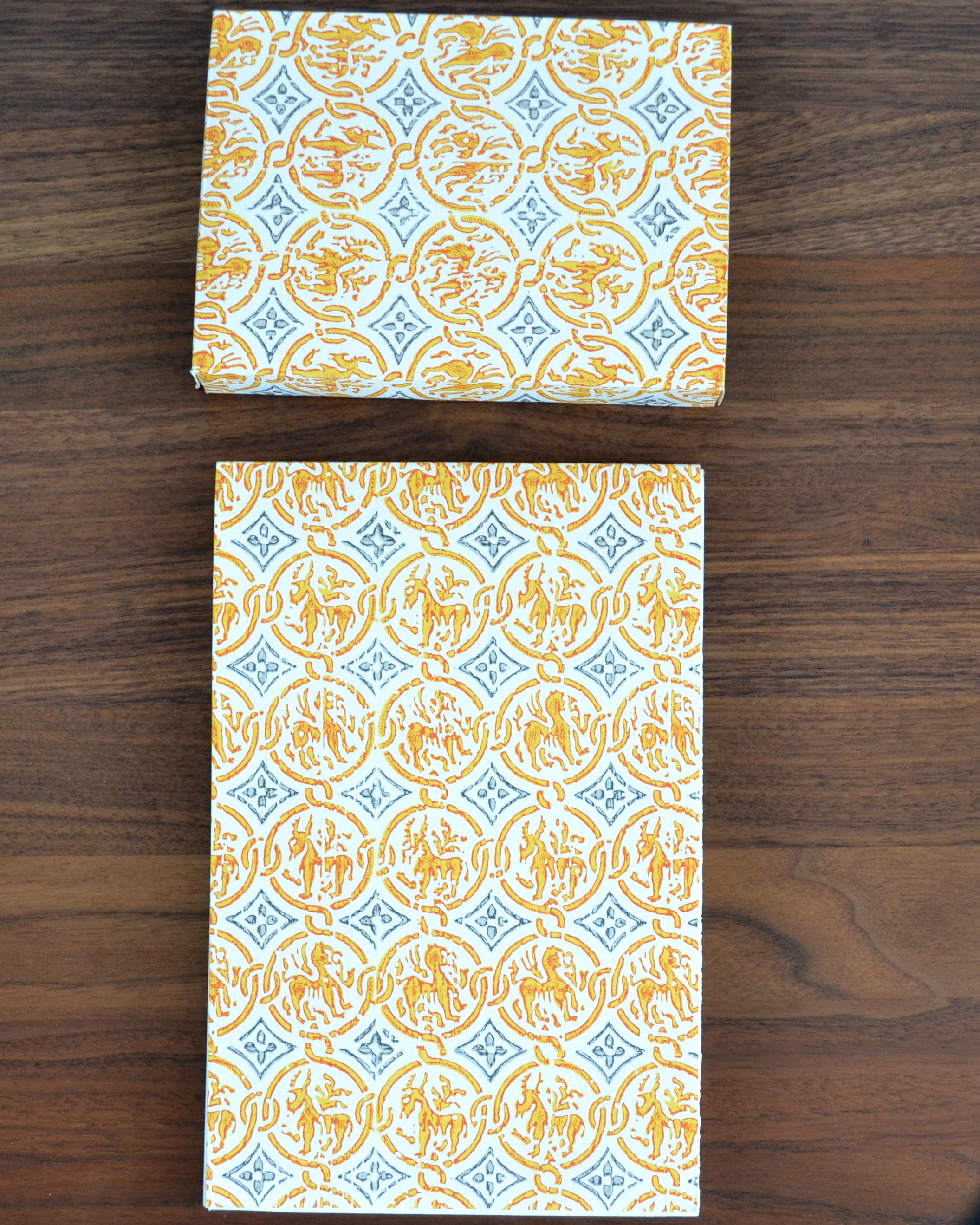
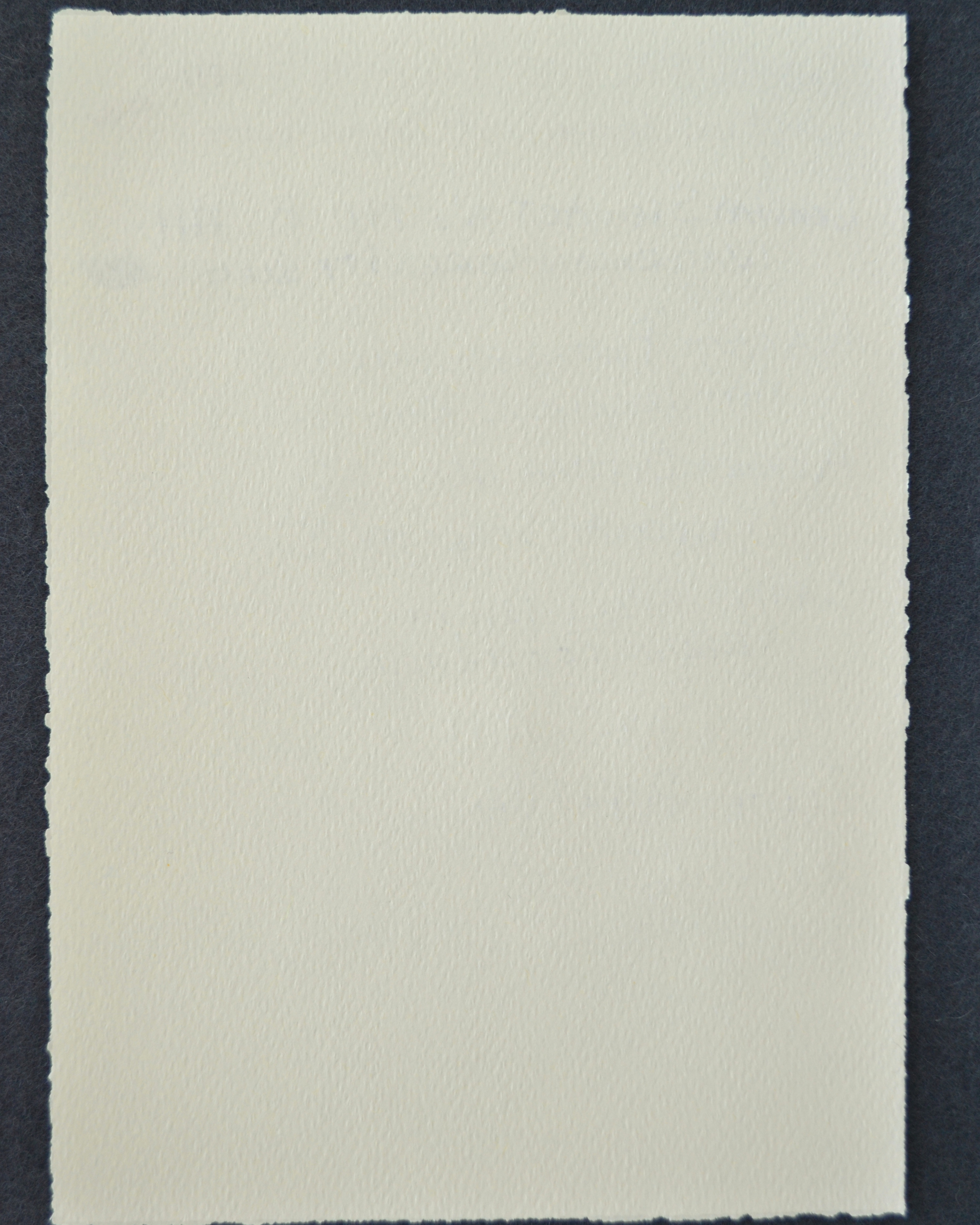
Life Bank Paper is a smooth woven paper that I really like for its high quality and simplicity. They are sold in pad of 100 sheets and packages of 20 envelopes in A4 and A5 sizes. I purchased the A5.
I do not know the weight of this paper but my guess is that it is somewhere between 90 and 100 gsm based on comparisons with other papers. The paper is thin enough that I can use a guide sheet to keep my sentences straight (something I really need help with).
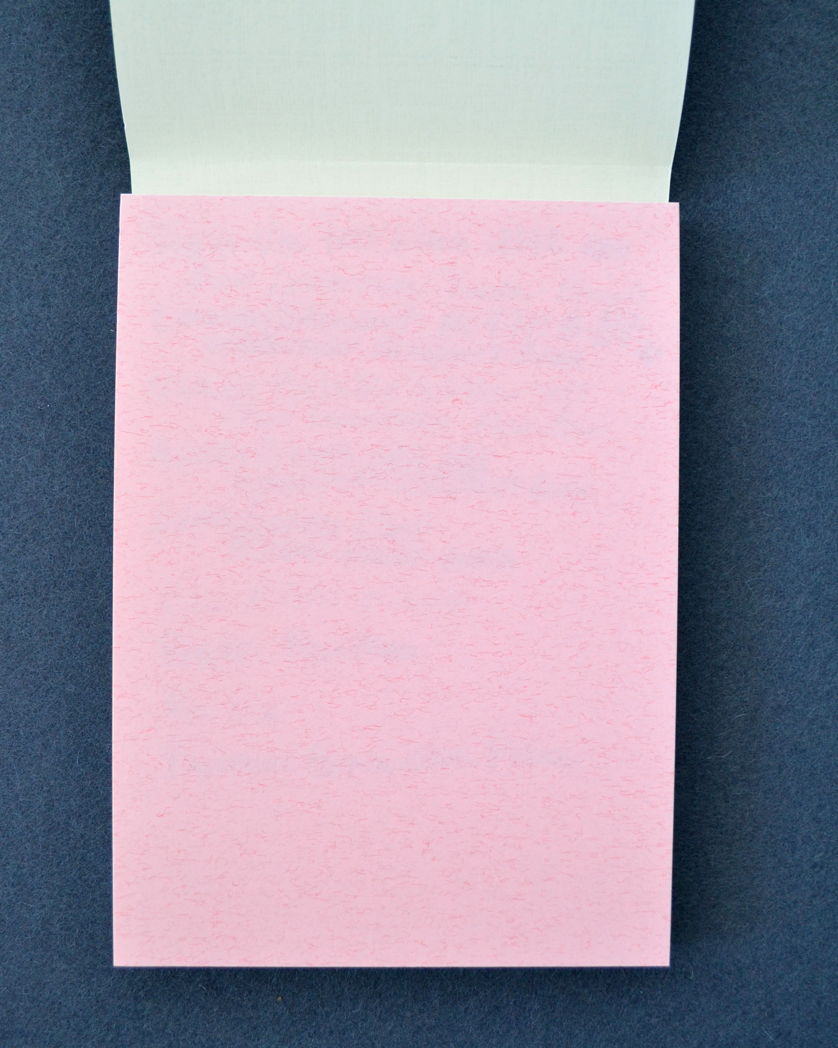
The pad has a nice pink blotter page. The paper handles fountain pen ink with flawless performance.
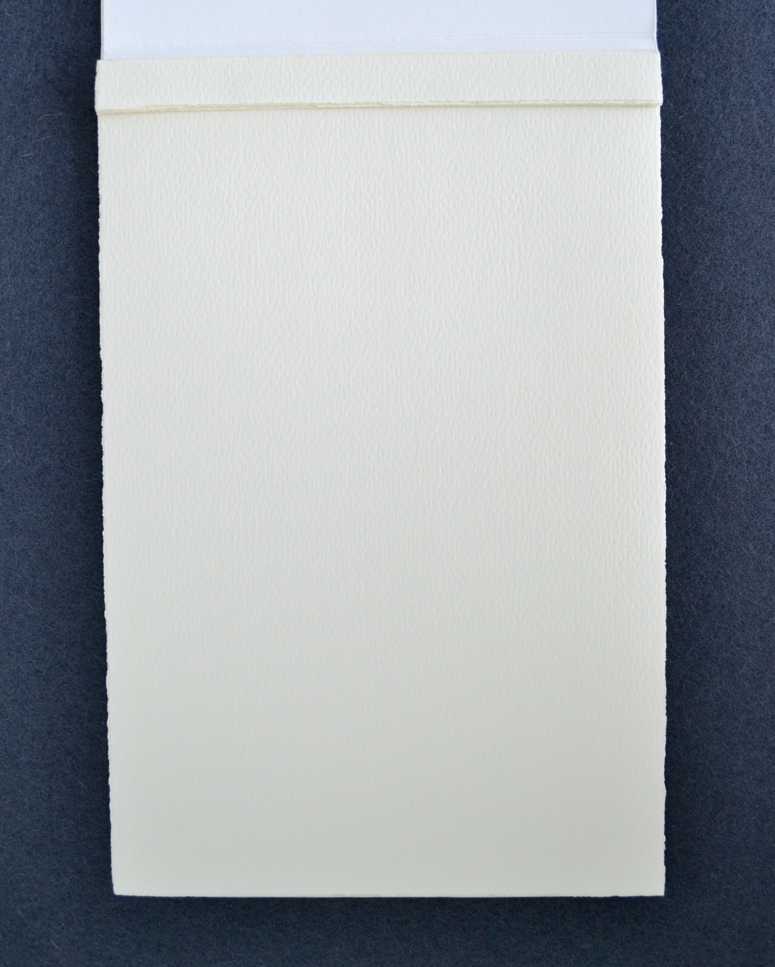
No bleed-through no feathering. The paper is thin so you do get some ghosting but it’s not enough to bother me.
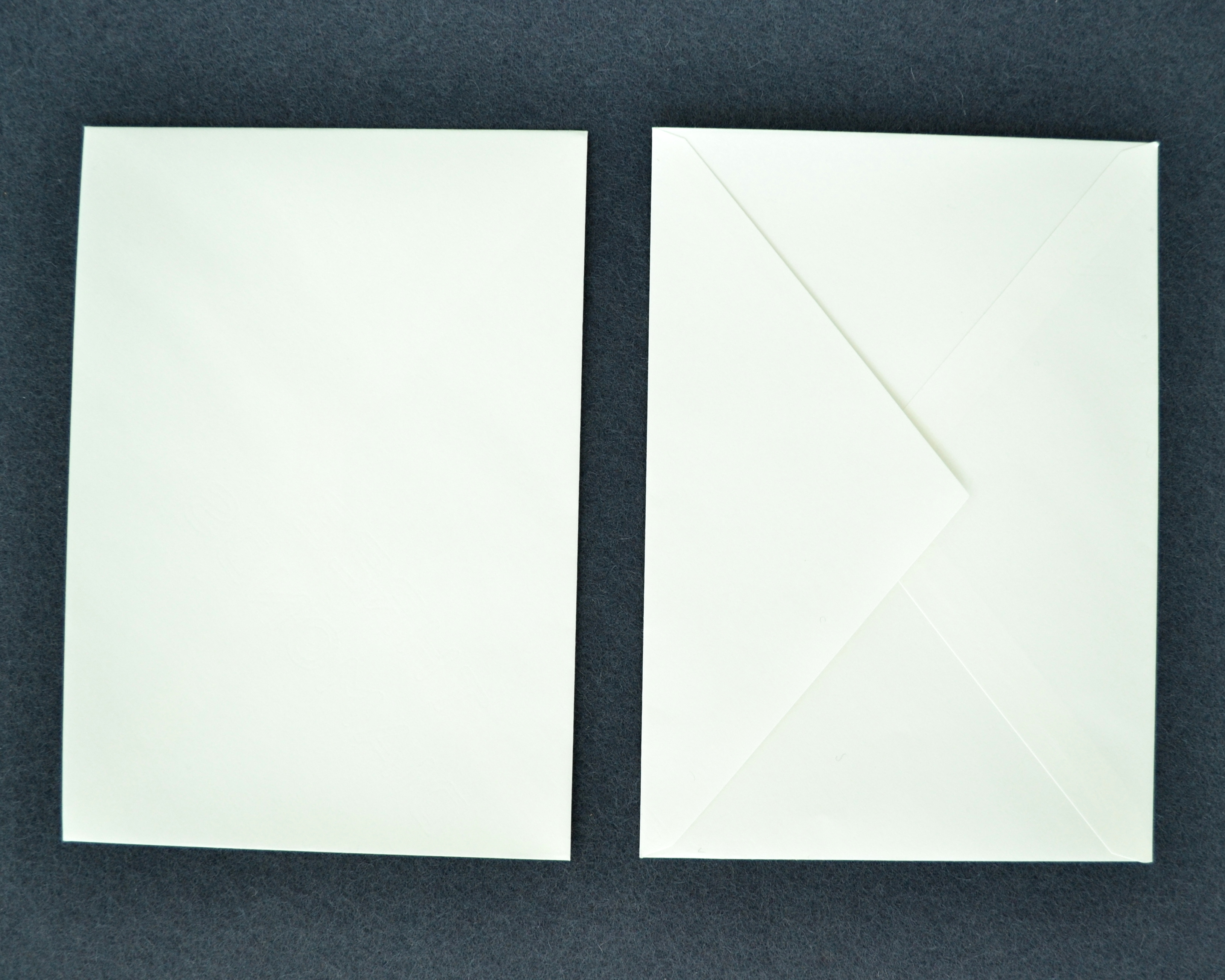
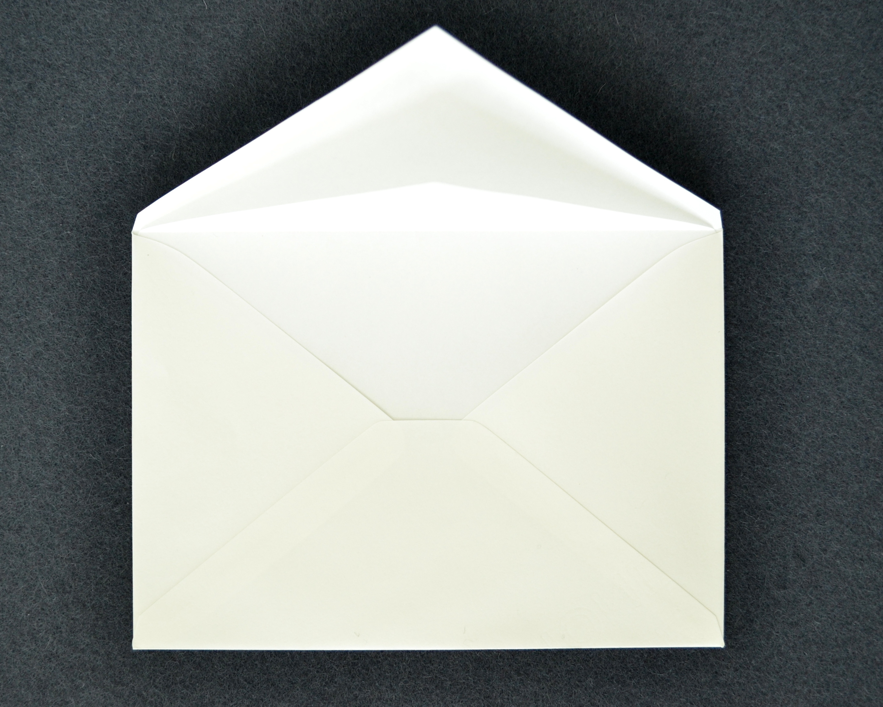
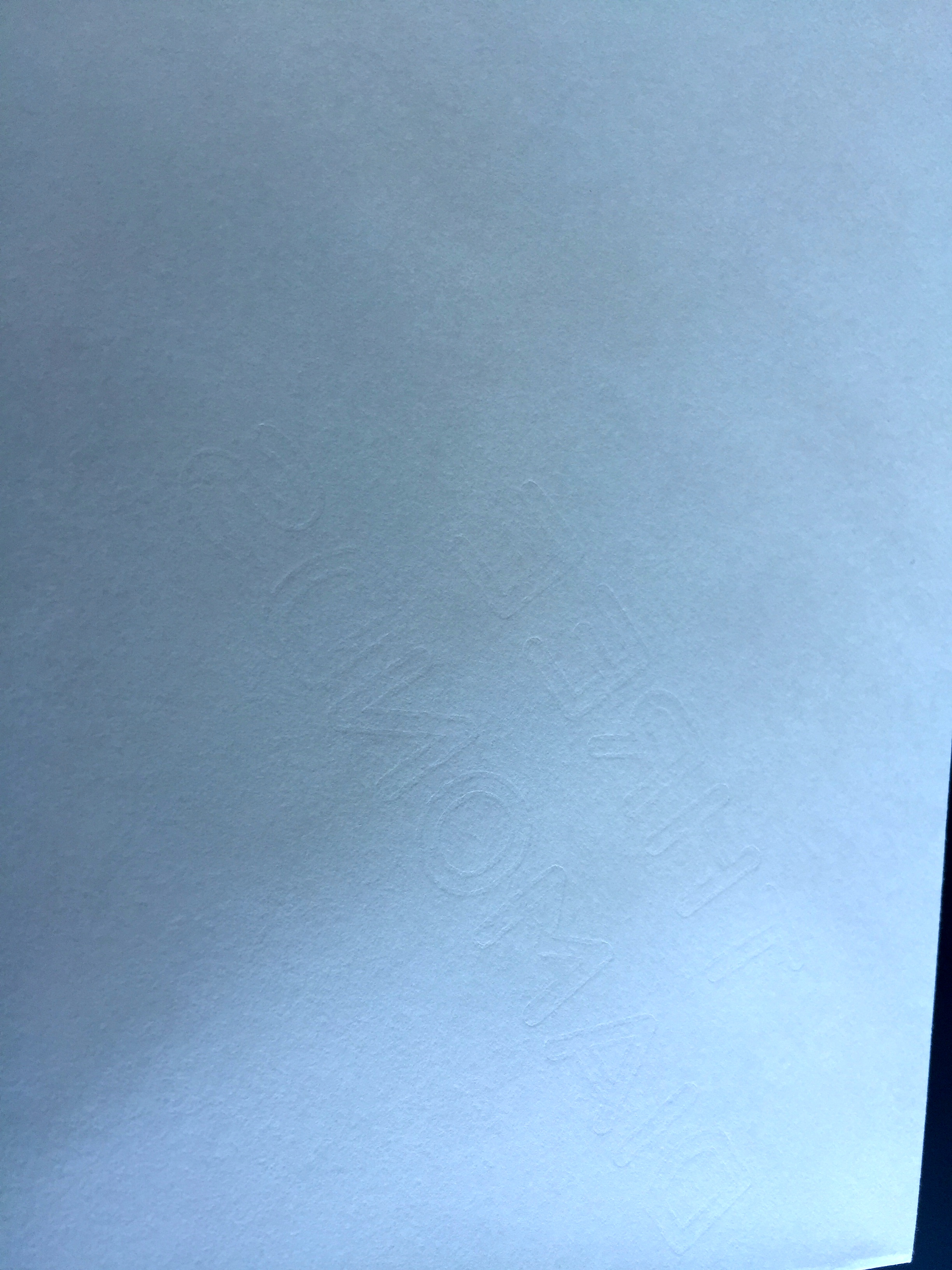
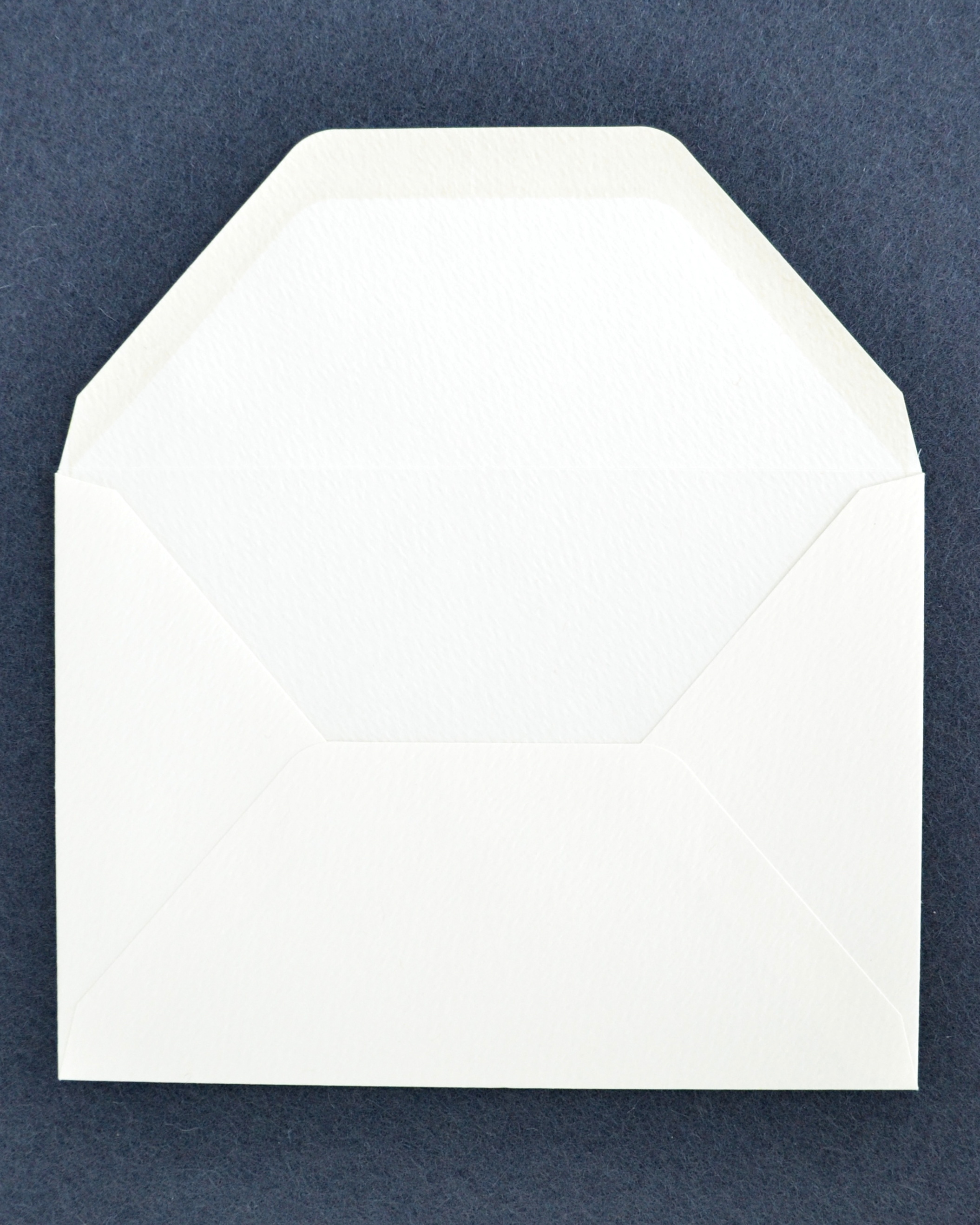
The envelopes paper lined and have a very faint unusual embossing (?)
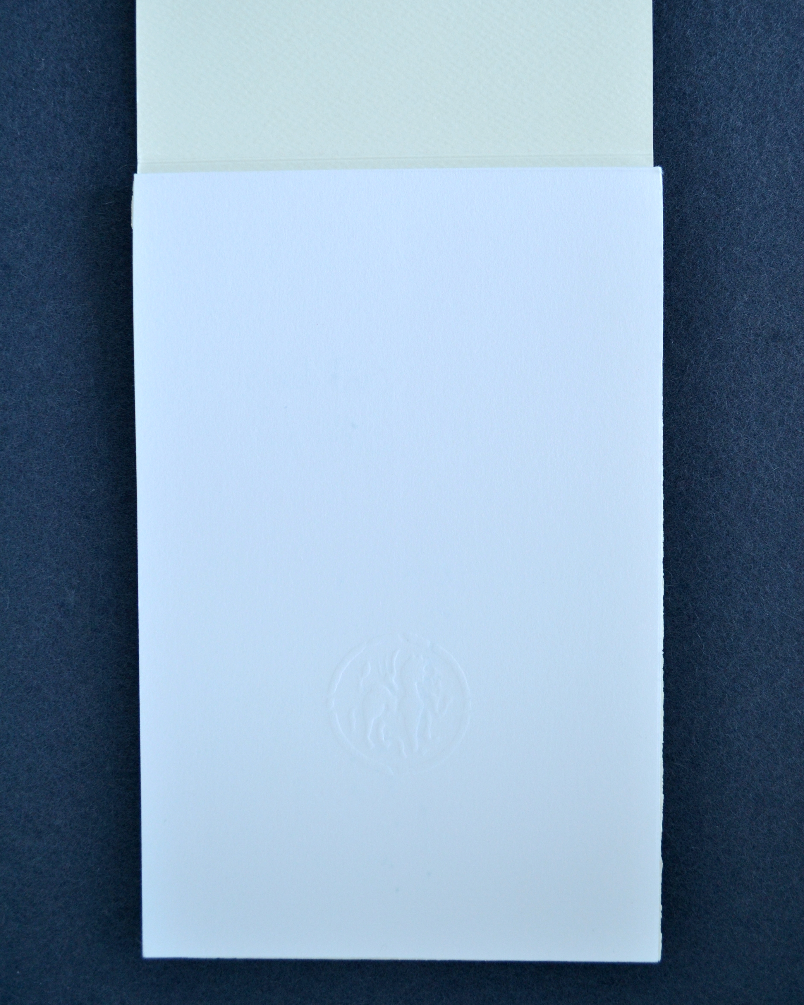
Maybe it’s a watermark but it seems pressed into the paper and holding it up to the light makes it harder to see. The other strange thing is that it appears to be printed backwards as if you are to read it from the inside of the envelope but you can’t because they have a paper lining. As a sanity check I looked at the other envelopes and they are all done this same way.
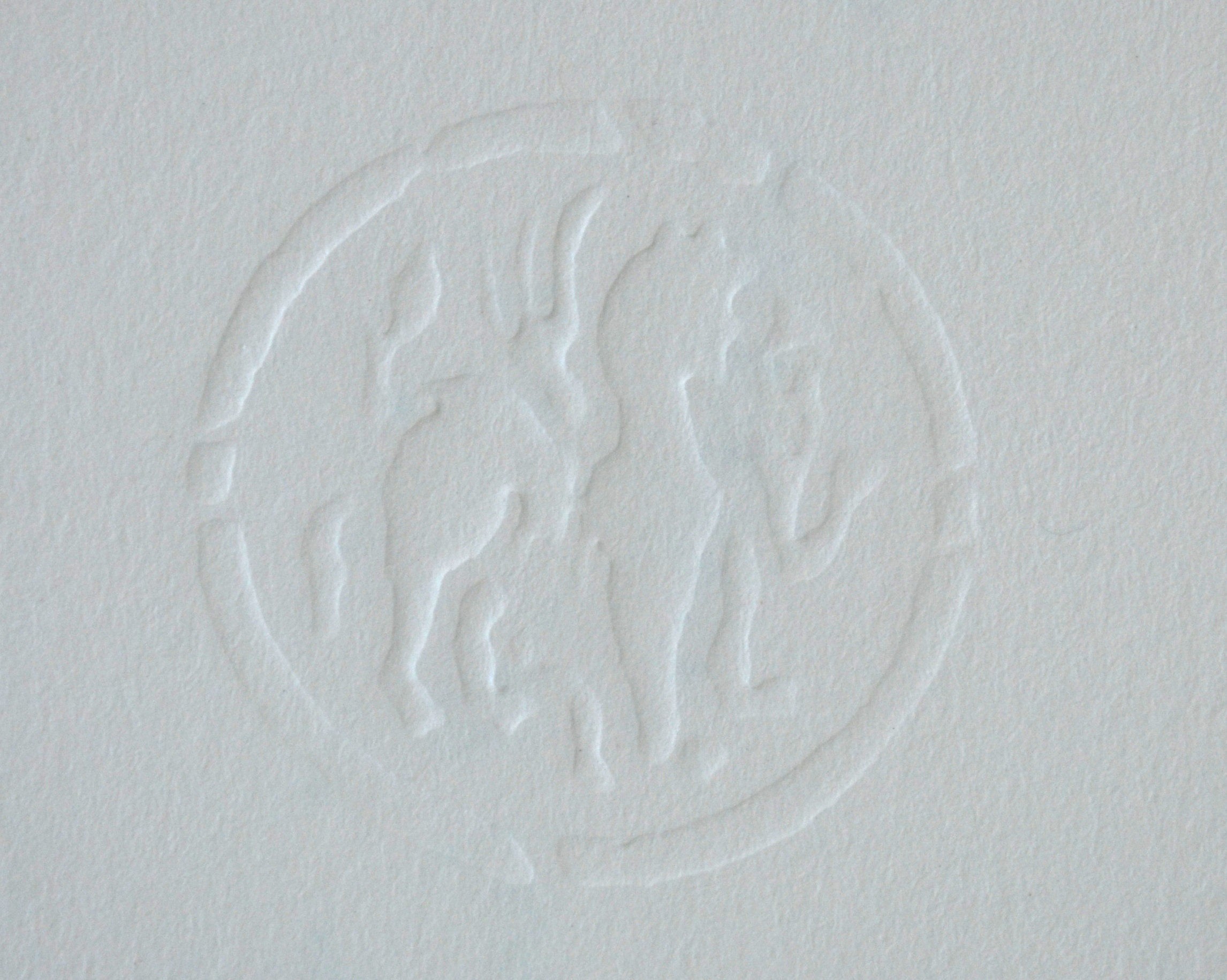
The embossing or whatever it is reads “THREE DIAMONDS”; I don’t know what it refers to. I also am not sure why they call it bank paper. It’s a simple woven paper not something that you would use for bank notes.
…anyways I paid about $7 for the pad and $6 for the envelopes when I was in Japan. I really wish I had bought a lot more of the pads because they cost approximately the same as an A5 Rhodia pad. In the United States the prices I have seen are a lot higher, $20-$22 for the pad only and that price I wouldn’t bother.
I have been informed that this paper is actually manufactured by Mitsubishi, hence the watermark “THREE DIAMONDS”. According to Mr. Taut this paper’s originates from the Mitsubishi Group’s banking activities, the most visible of these being Japan’s largest bank, The Bank of Tokyo-Mitsubishi UFJ.
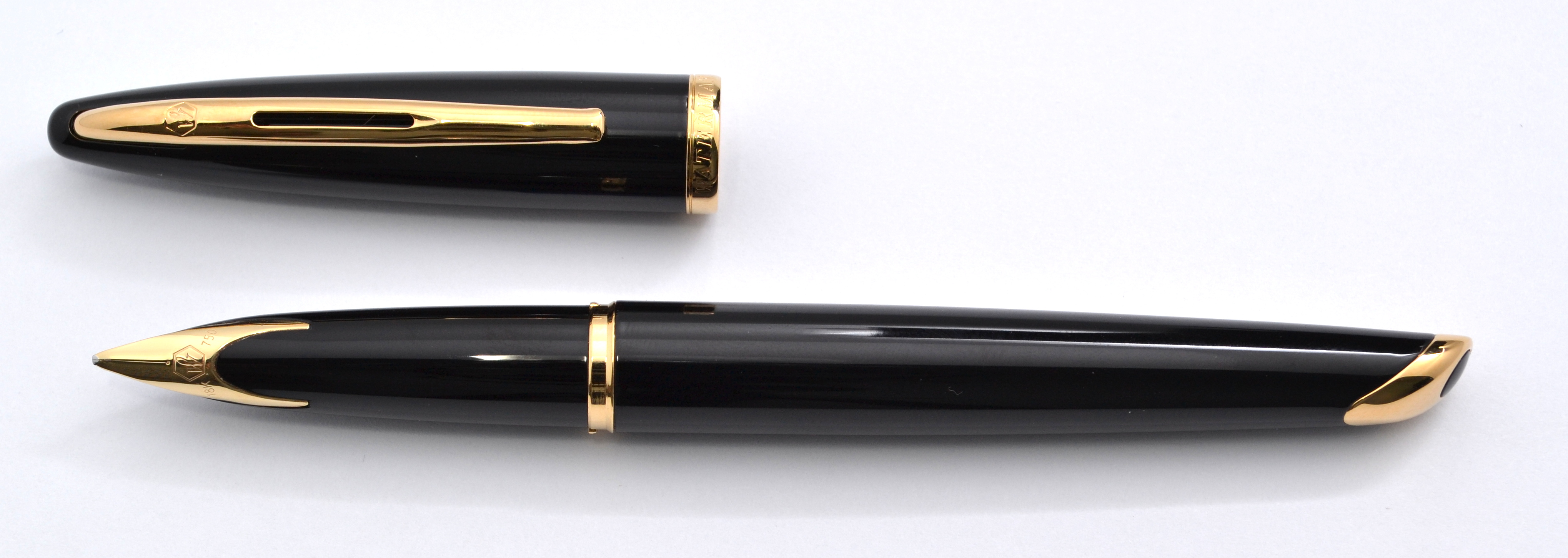
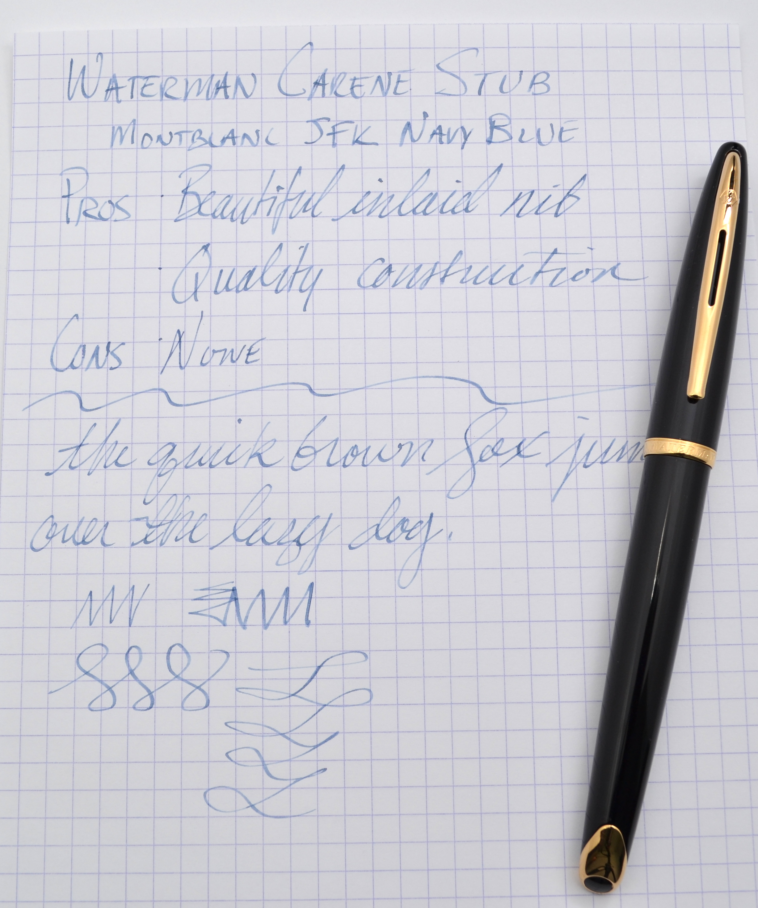
Mild curiosity mixed with a very good deal got the better of me and I now have a Waterman Carene.
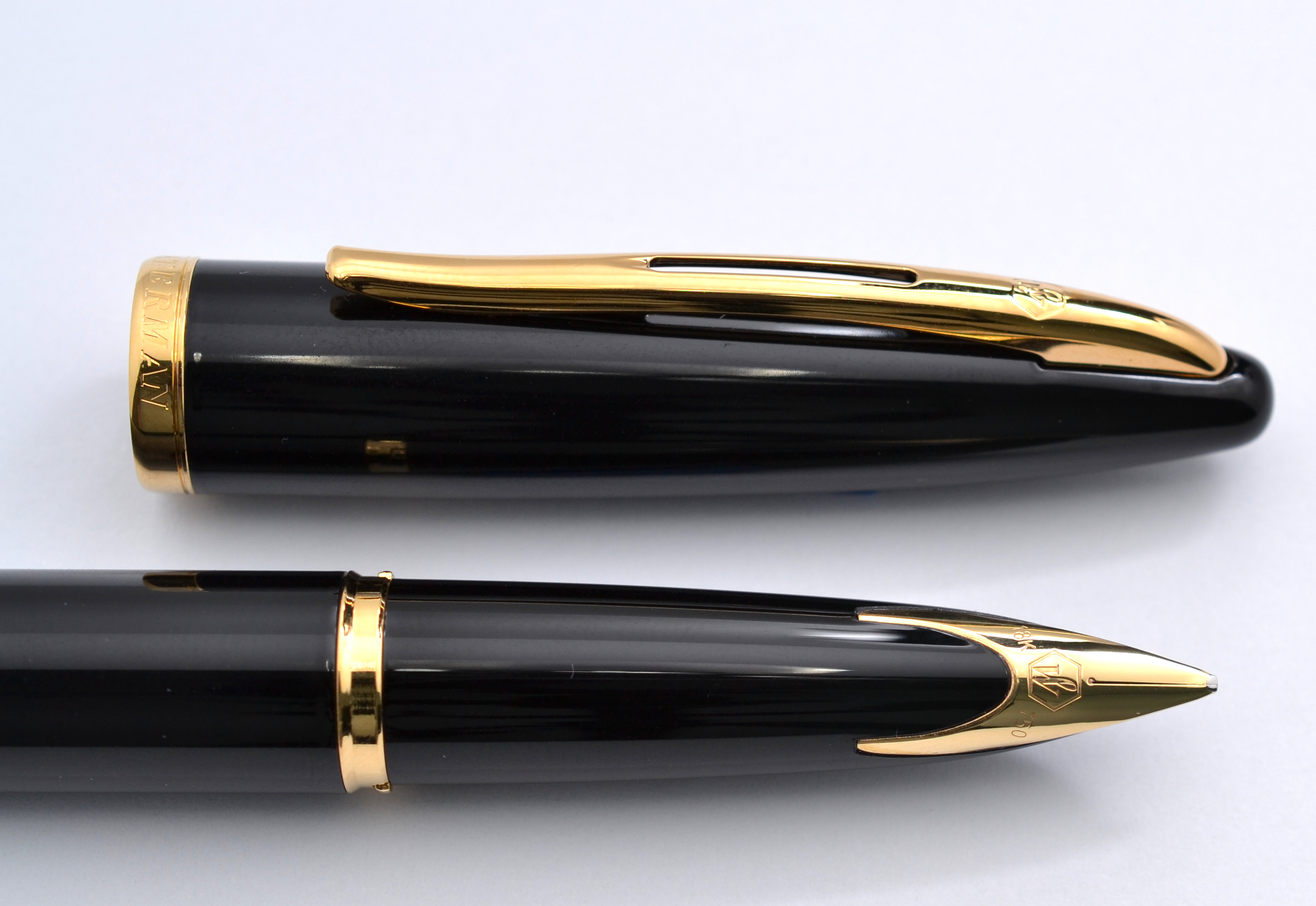
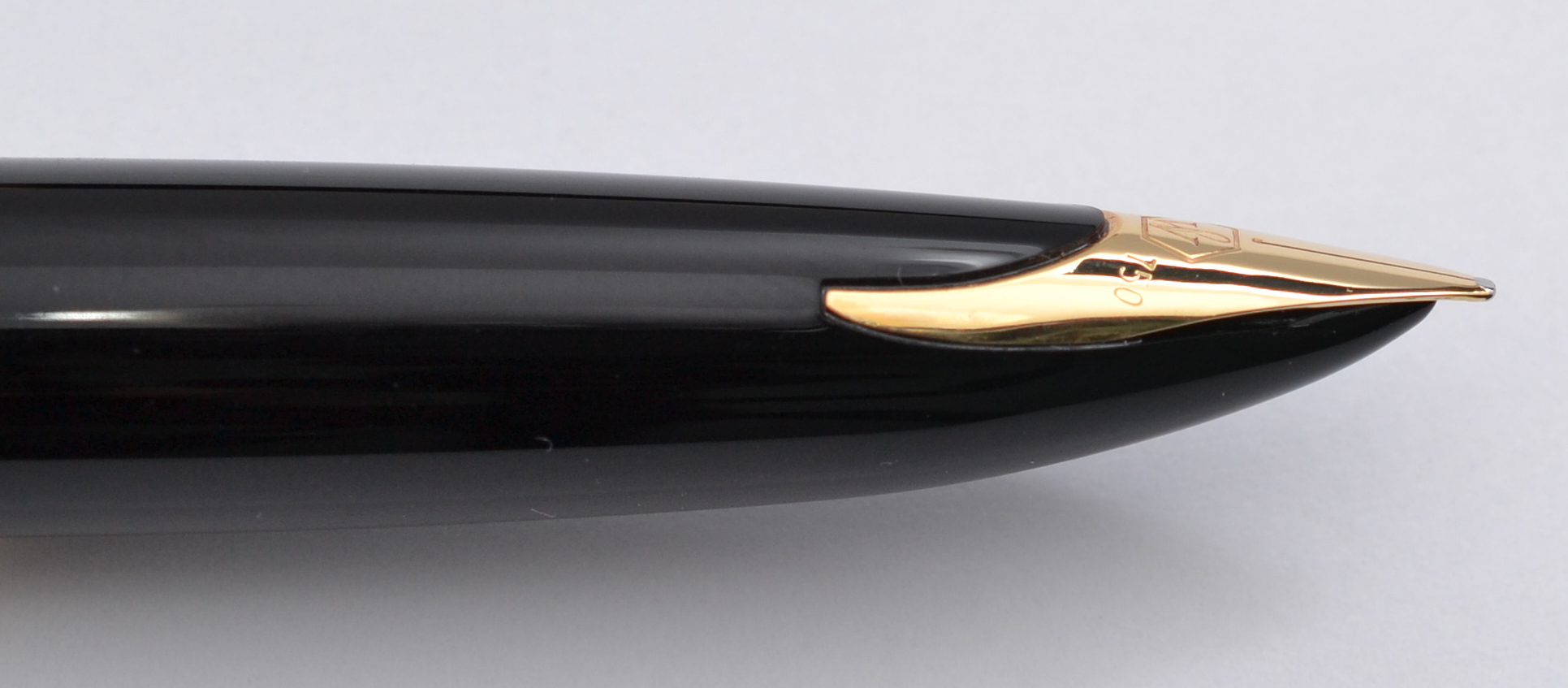
The Carene is one of the older pens in the Waterman lineup and features an inlaid nib like their flagship Edson pen. Carene in French means “hull” and the literature for this pen states that the Carene is inspired by “luxury yacht design”. The ends of this pen do bear resemblance to the bow and stern of a yacht but other than that there are no cues to signify a nautical theme.
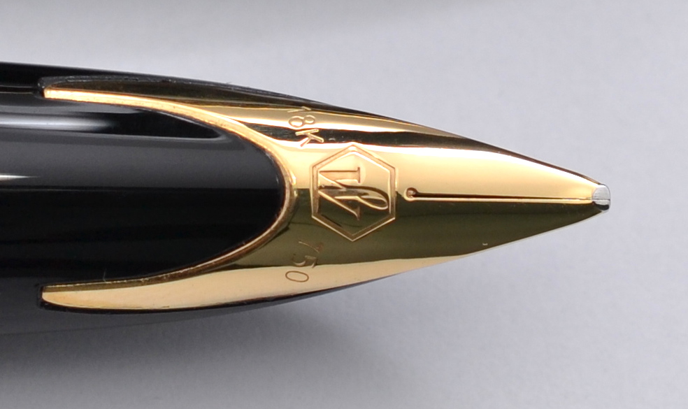
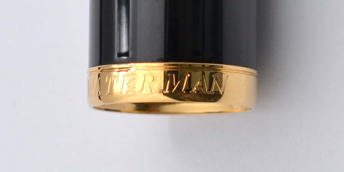
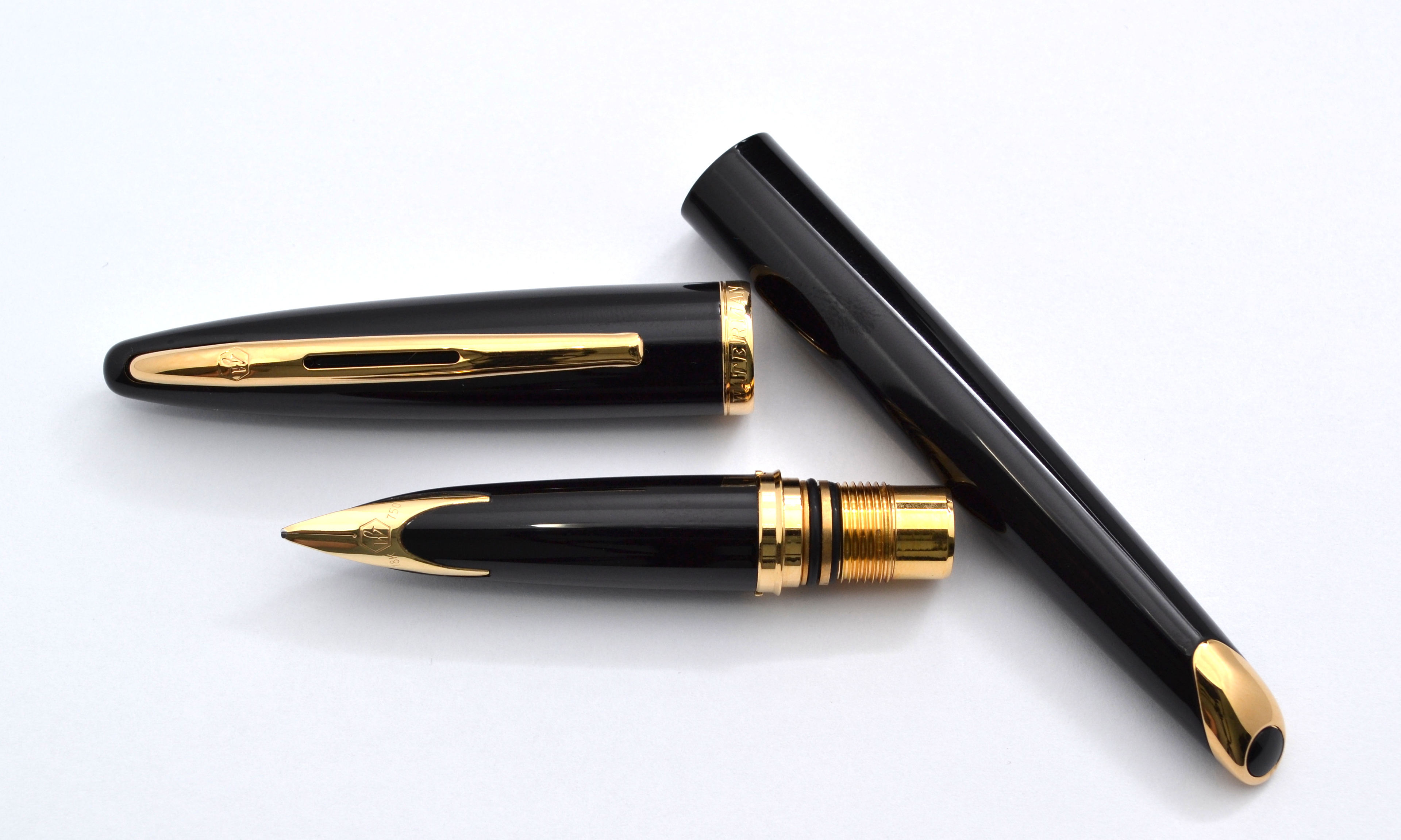
The pen has a metal body covered in black lacquer and weighs a hefty 33 grams. The Carene measures 5.7″ capped and is a nicely balanced pen posted or unposted. I did find that you have to push the cap onto the barrel with a bit of effort for it to stay posted. The real star of this pen is it’s beautiful inlaid nib. It is solid 18kt gold with a stub point made in house by Waterman. The nib is a nail but performs very nicely. It is on the finer side for a stub and is quite forgiving on paper. The downside is that you get a little bit less flare but more usability overall.
The Carene like all modern Watermans uses a cartridge converter system. The pens comes with a Waterman branded converter as well as a box of 6 Waterman ink cartridges.
The build quality of the pen is excellent. There are no flaws in any of the materials. The section has two rubber o-rings on the threading and I found that these made it difficult to get the nib in line with the gold tail of the barrel.
Amazon UK (no affiliation) had this pen for sale brand new for 60 GBP (approximately $90 USD) and at that price I couldn’t pass it up. Even though this is an excellent pen by all accounts, I didn’t end up bonding with it; it’s boring. If this pen had some personality it would be a home run. With a street price around $220 it’s definitely a pass for me. At $90-$100? It is a lot of pen for the money but I get more enjoyment out of pens like the TWSBI Vac 700 and the Pelikan M200 even though they are not made as well nor adorned with gold nibs.
Here are some other great reviews of the Waterman Carene:
(I have no affiliation with any of the sites linked below)
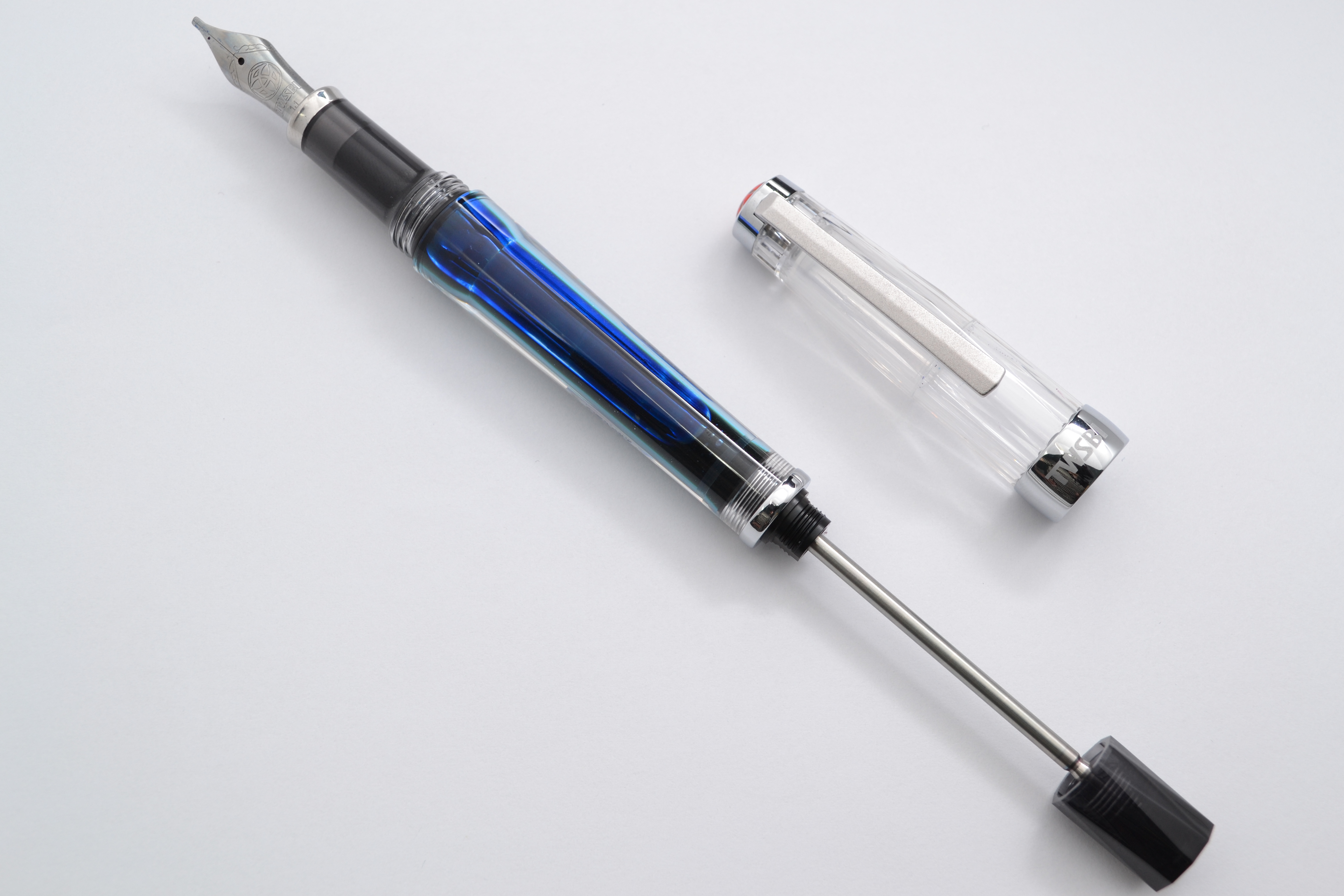
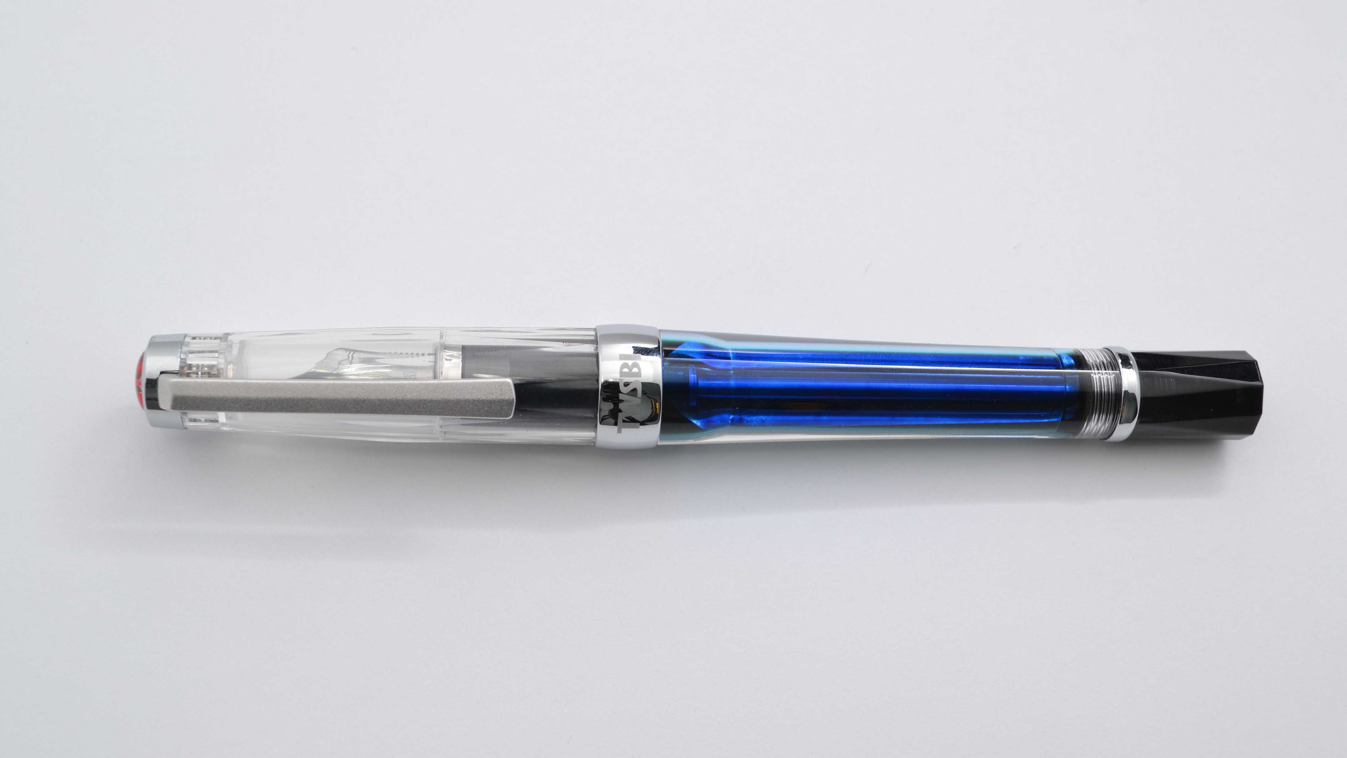
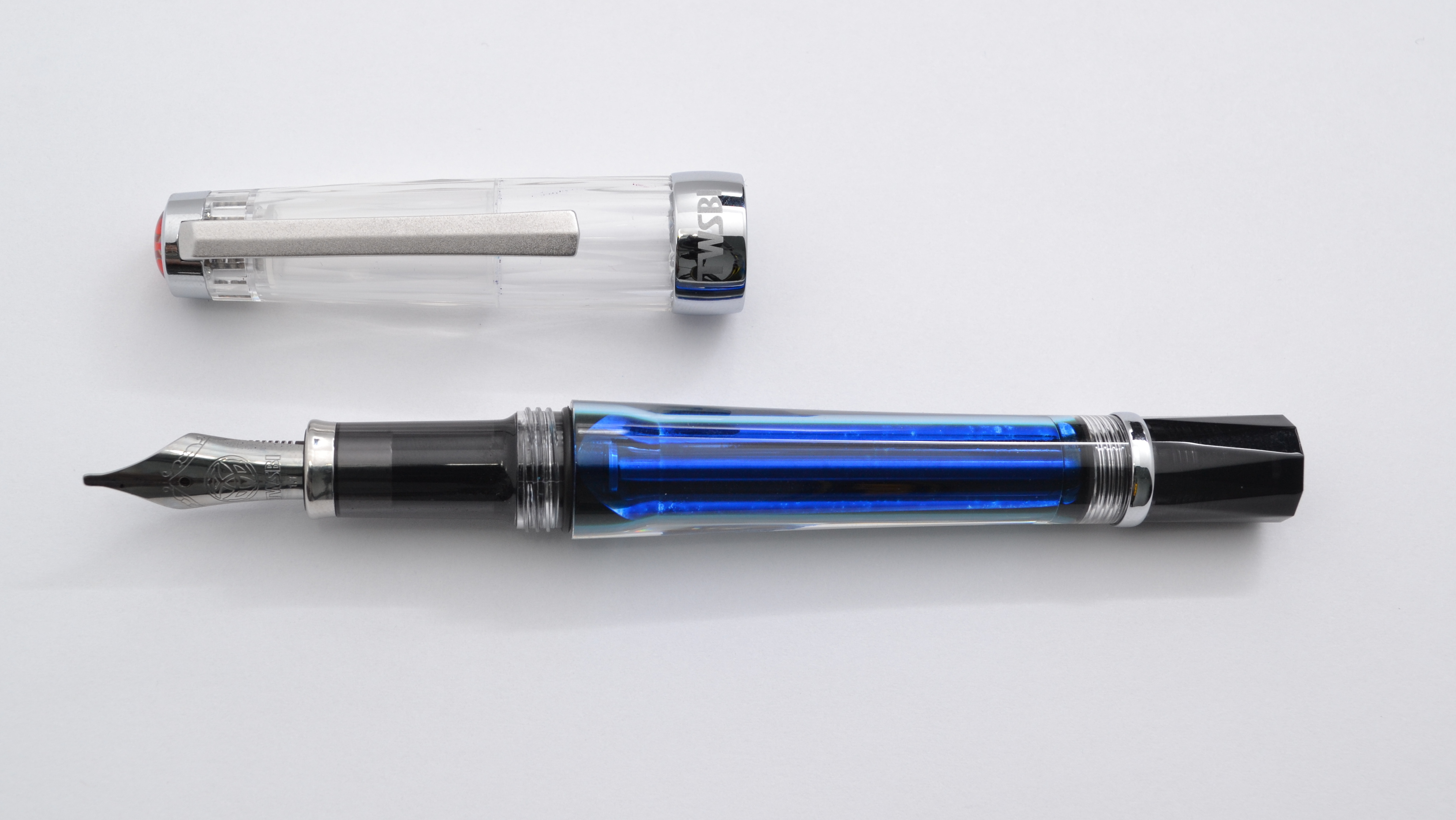
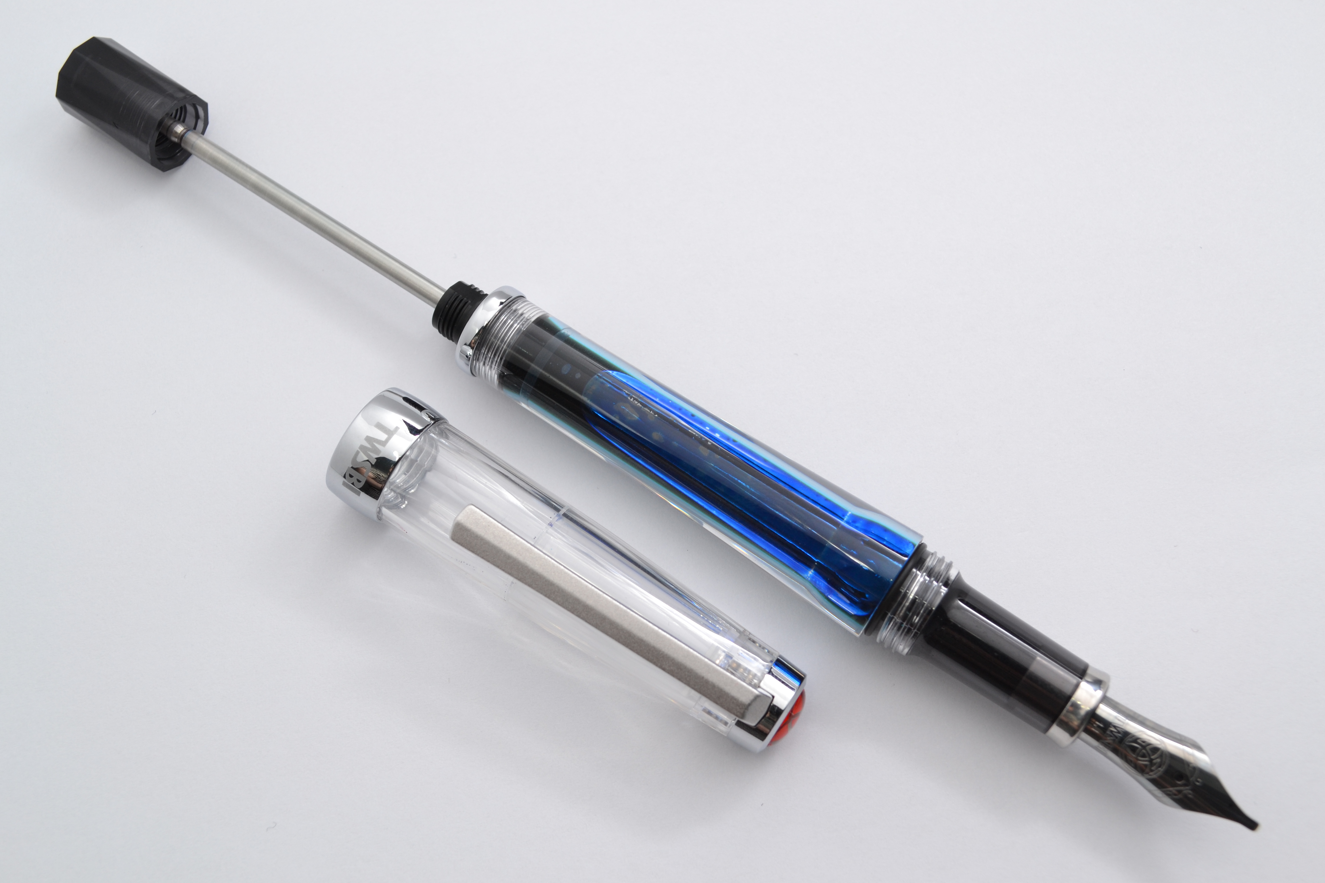
TWSBI is a Taiwanese fountain pen manufacturer that has been around for about half a decade now and for some reason they never really called my name. While in Taipei earlier this year I wandered into a fountain pen shop and walked out with a couple of TWSBIs, a Vac 700 and a Micarta.
When I picked up the Vac 700 for the first time I was impressed with how nice the pen felt. The body is made out of a laminated polycarbonate and compared to my other plastic and even celluloid pens it feels much nicer; more sturdy and more satisfying to interact with.
The design of the Vac is a bit of a pigs breakfast, mixing a bunch of different materials and shapes and yet somehow it actually looks pretty good (maybe not elegant but attractive in it’s own way). The polycarbonate is ultra clear and as a result the pen looks quite beautiful when filled with ink. The cap and the blind cap have a sort of diamond shaped faceting to them while the barrel is rounded with a slight taper to accommodate the vacuum mechanism.
The section and blind cap are made out of a translucent grey polycarbonate and all of the furniture except the clip is chrome. The clip has a very rough almost sandblasted aluminum look to it. It is rough to the touch but feels quite solid. The finial has a red jewel with the TWSBI logo. The cap band has big inelegant branding on it.
The vacuum filing system holds a good amount of ink and with some practice you can get about 2ml of ink into the body which is four times the capacity of your average converter. With the blind cap screwed down tight, air is shut off from the filing system making it airplane friendly. So far I have flow with it on eleven flights and can report that there have been no problems. It doesn’t leak and it works beautifully at altitude. The downside to the air shut off is that if you wish to write more than a couple of pages the blind cap needs to be unscrewed to keep the ink flowing.
The Vac 700 is about 14.5cm long and weighs a hefty 32.6 grams. The pen posts nicely but for my smaller hands it throws off the balance so I use it uncapped.
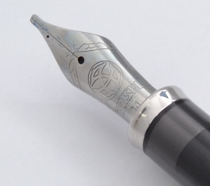
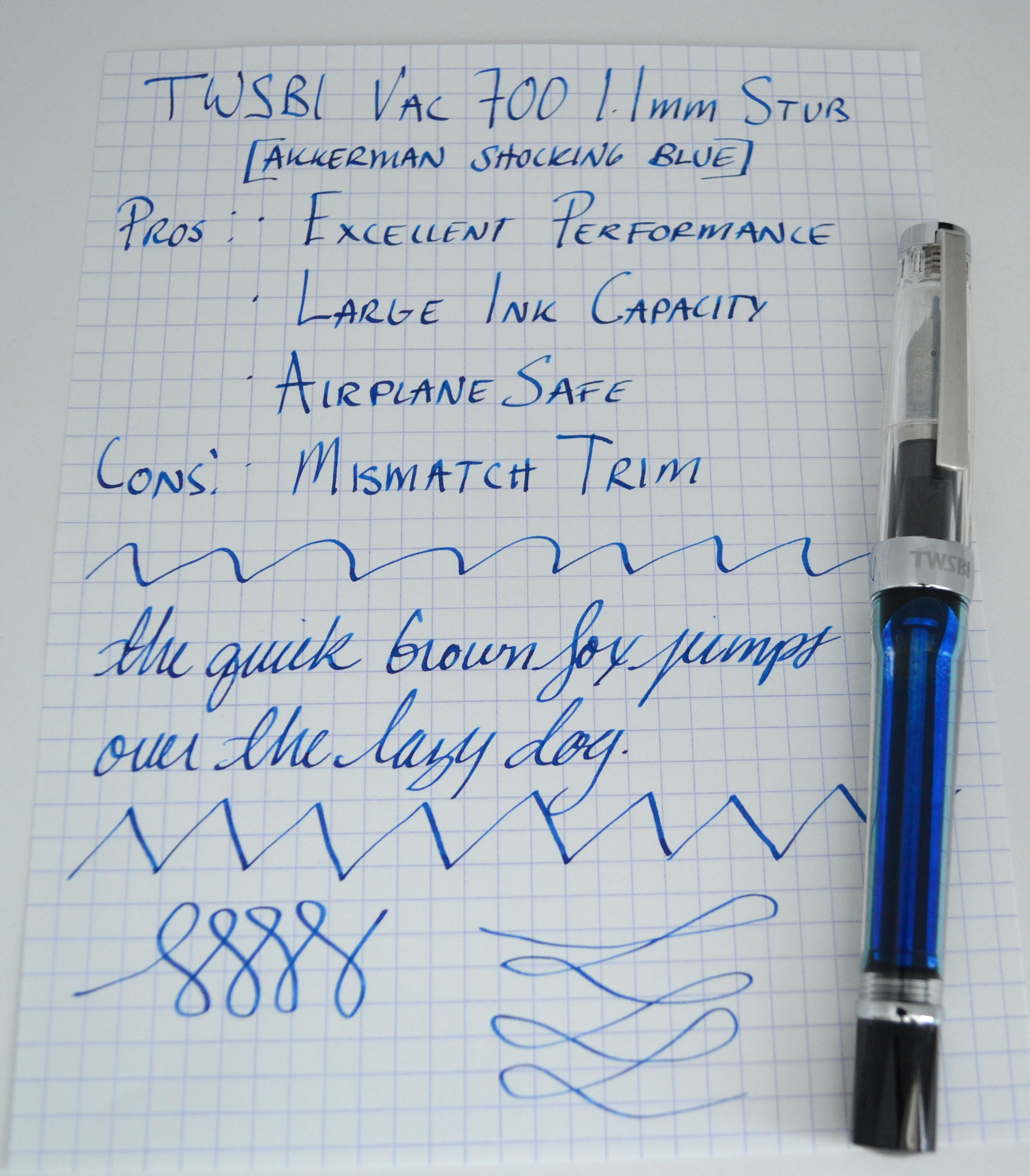
The large Jowo nib is nicely proportioned with the rest of the body. The 1.1mm stub point is a joy to use. No performance issues to speak of.
I LOVE this pen. This is my new favorite sub $100 pen that I have tried and I am hard pressed to think of a $200 pen that I like better.
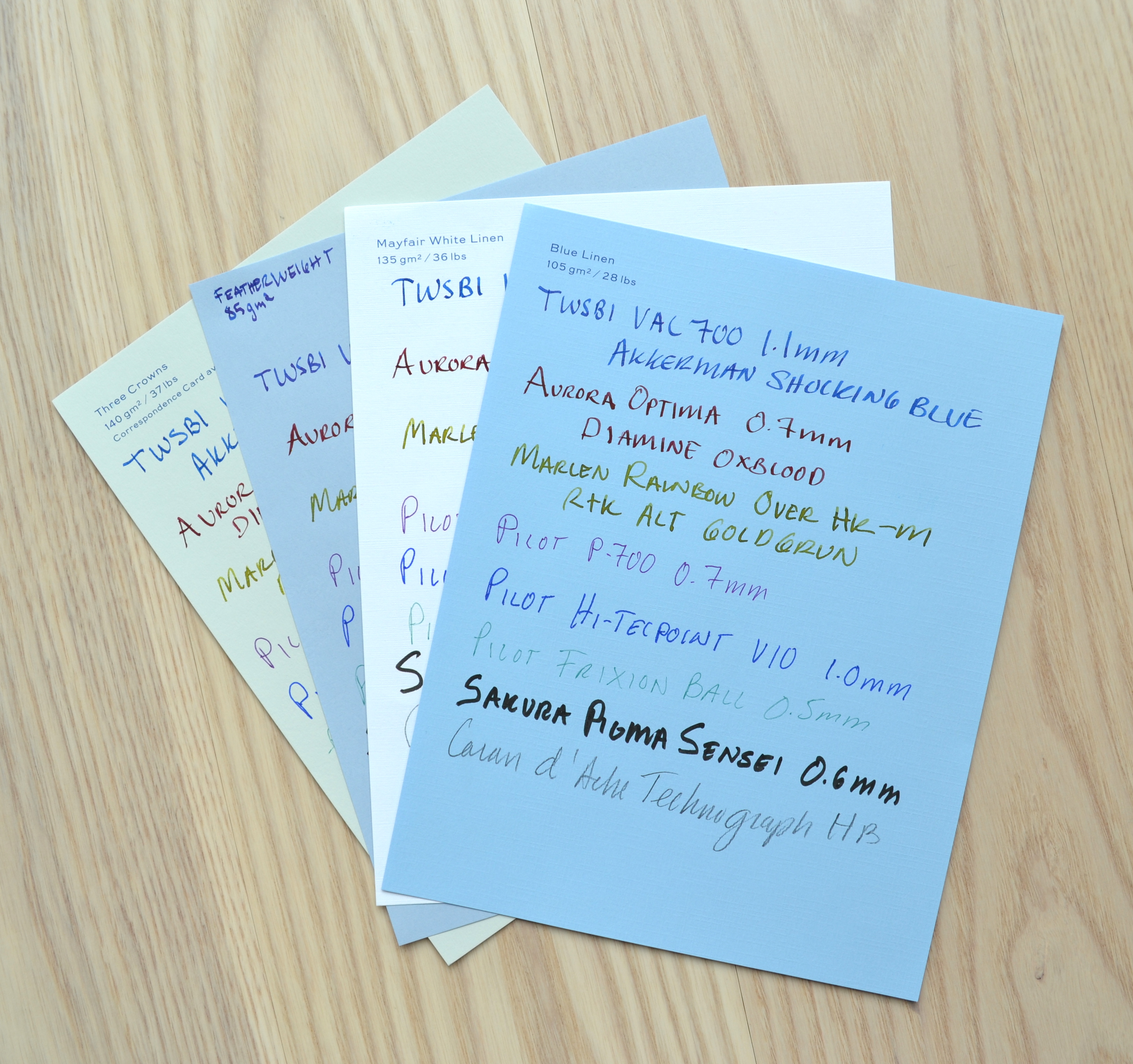
Out of all the Smythson writing papers my four favorites are the ones I find to be the most unique.
Three Crowns for it’s interesting but subtle color, Featherweight Blue for it’s beautiful watermark, and Mayfair White Linen and Blue Linen for their interesting finish. As I said at the begging of Part 1 all of Smythson’s papers are excellent and all are suitable for use with fountain pens.
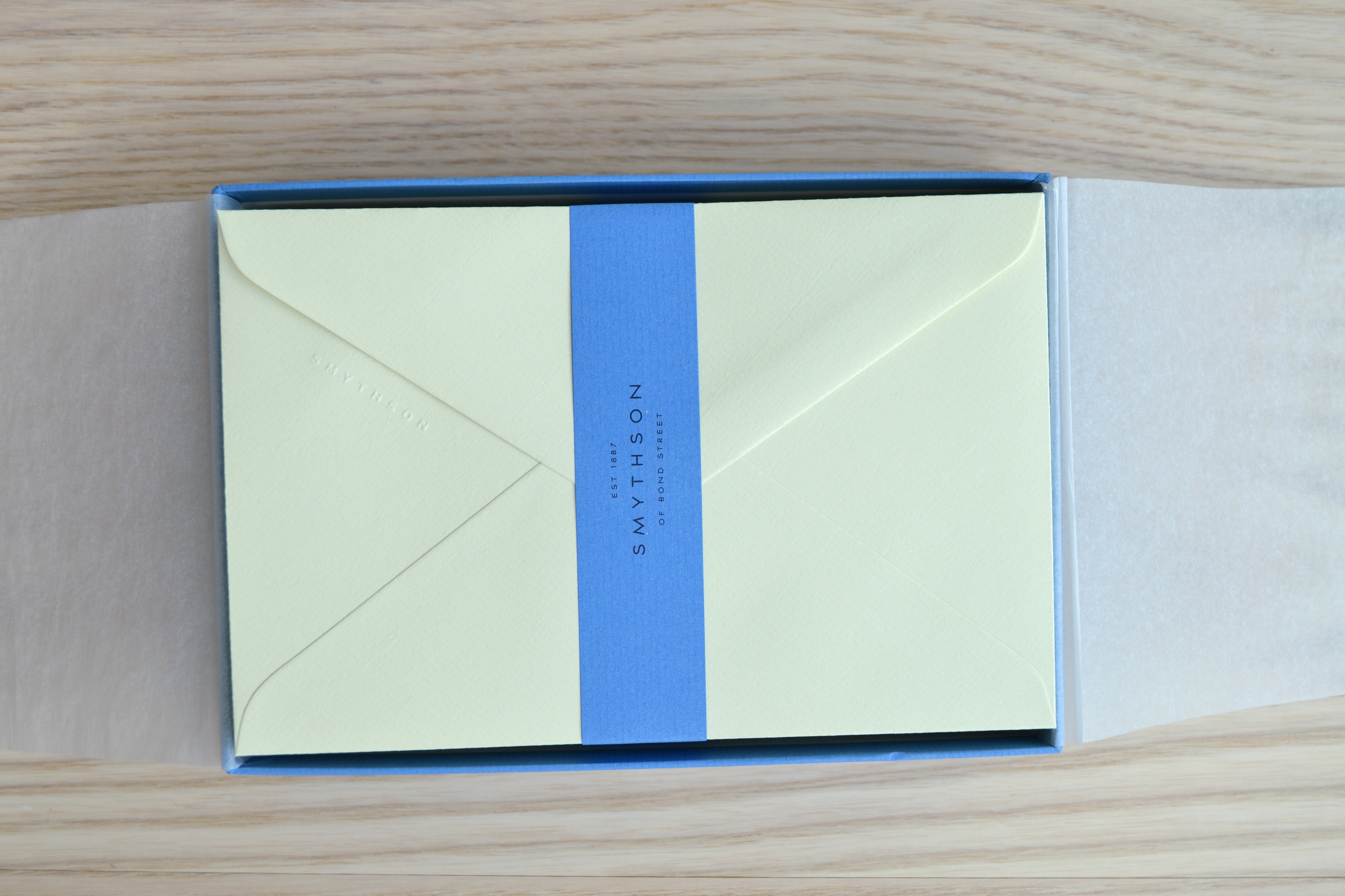
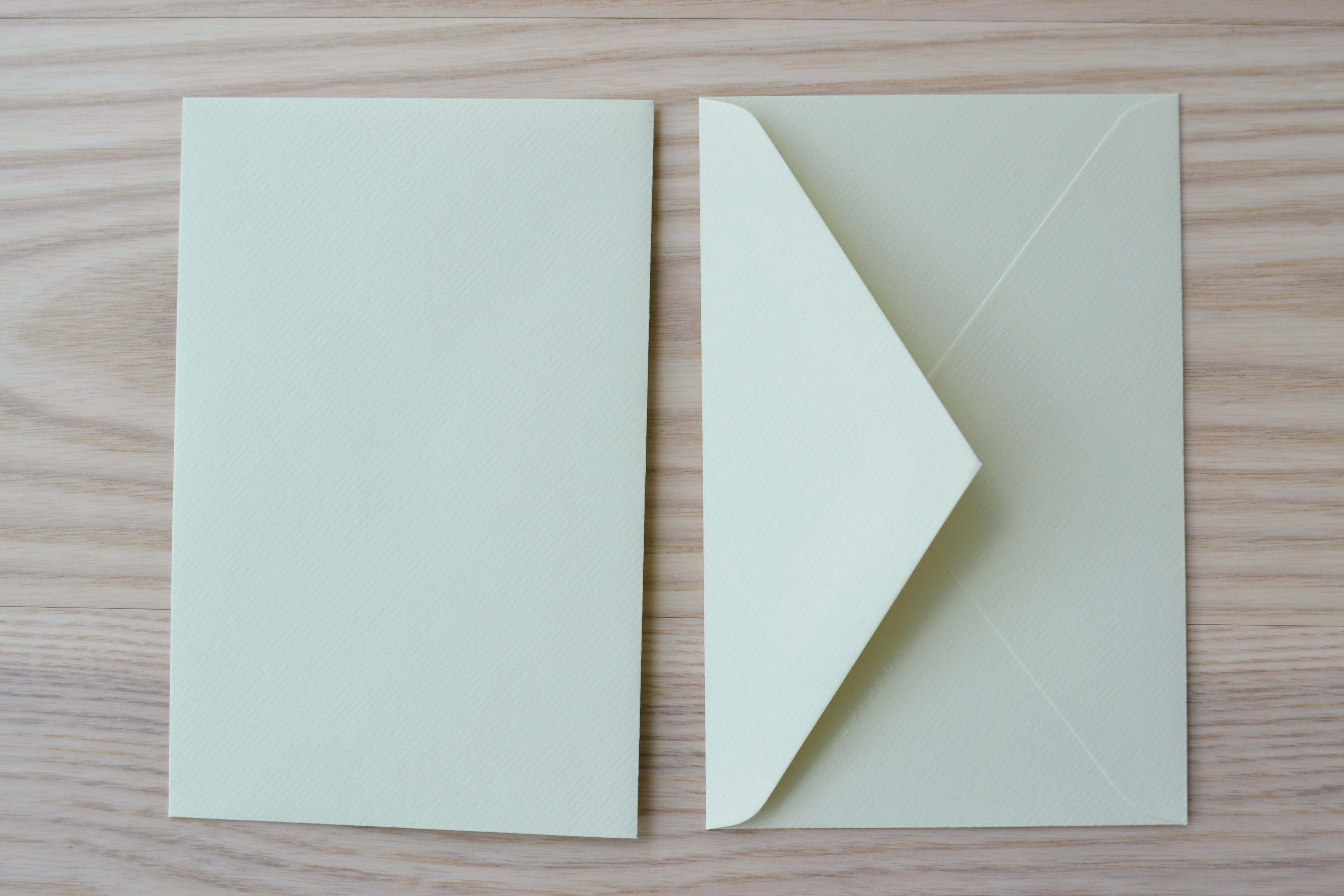
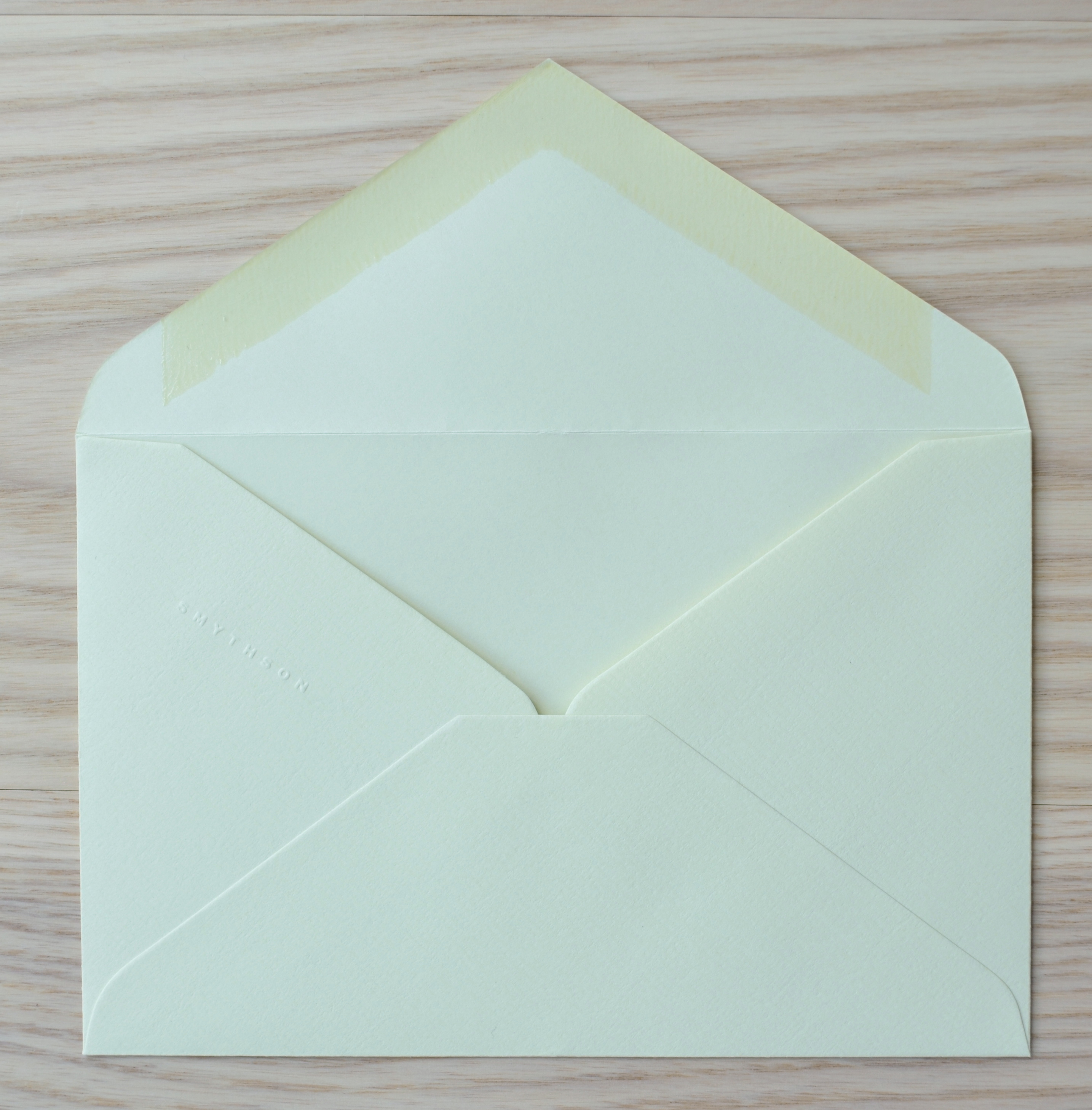
To compliment the writing sheets Smythson makes matching envelopes. Boxes of 25 (Kings size) go for $20.
The envelopes are made out of the same papers as the writing papers.
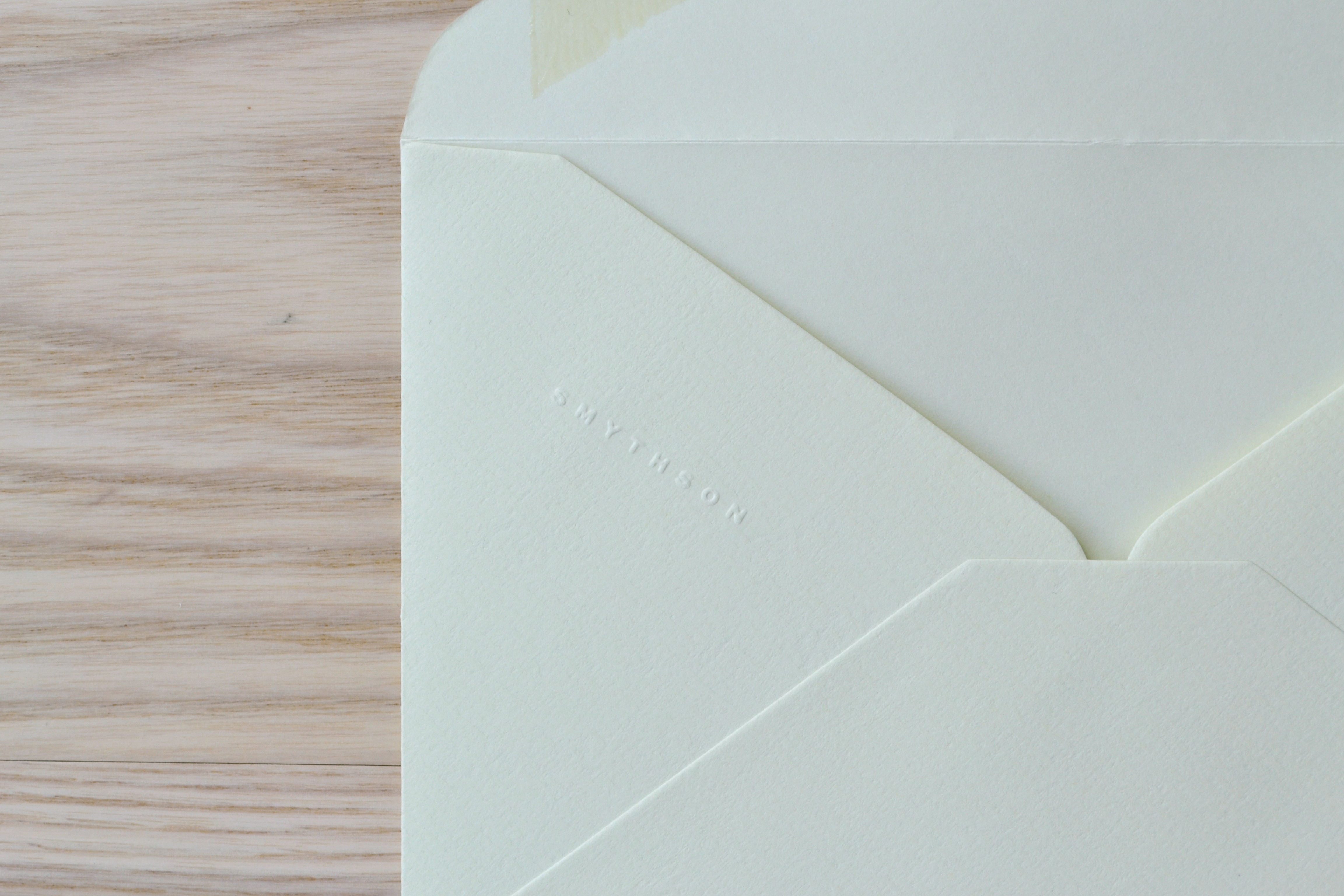
They are watermarked and are embossed with “SMYTHSON” along the flap closure.
The envelopes are unlined and have and adhesive that needs to be wetted. I prefer self seal envelopes like the ones Clairefontaine makes.
I don’t care too much about having a matching envelope as they are expensive and usually discarded.
Buyer’s Guide
I thought I would end this third post with a Smythson buying guide designed for US customers. Buying most of these writing papers in the US is not that straight forward.
There are three ways to go about acquiring Smythson paper:
1. Purchase prepackaged writing sheets and envelopes domestically (via Smythson.com or the New York store)
This way is the easiest but the paper choices are limited. Online you will be able to buy four standard papers (White Laid, Cream Wove, Nile Blue, Bond Street Blue) in Quarto (8″ x10″) and Kings (6.25″ x 8″) paper sizes. Packs of 50 in the Kings size cost $15 and 25 Kings envelopes are $20. Shipping is from the UK via DHL at a cost of $15.
At the New York store they carry one additional paper seasonally called Park Avenue Pink. This store also carries all of Smythson’s standard sizes: Duke (5.5″ x 7″), Kings (6.25″ x 8″), Imperial (7″ x 9″), Quarto (8″ x10″).
2. Purchase directly from Smythson UK (not recommended)
To do this call Smythson’s 1-800 number and ask to talk to a UK representative at a retail store. You will be put through to either the Bond Street or Sloane Street store in London. They carry the full range of Smythson papers prepackaged and though the cost is comparable (or better with the current exchange rates) the shipping cost is prohibitive such that you need to order a good volume for it to be worthwhile.
3. Purchase through the US Bespoke department (recommended)
Call the New York store and ask to speak to the Bespoke department. Tell them you want to order plain stationery. They can order the full range of the Smythson line in any quantity. You could buy 5 sheets or 1,000 (price breaks start at 250).
50 sheets in a Kings size is $18 and 50 Imperial sheets is $23. For the $18 you pay those 50 sheets don’t all have to be one paper you could do 10 sheets of 5 different papers and the cost would be the same.
The other benefit of ordering through the Bespoke department is that shipping is free, so even if it’s an extra $3 for 50 sheets you save by not having to pay $15 for shipping.
Lastly, there are nonstandard Smythson papers that can be purchased bespoke through their Color Plan line. These papers are considered a proper custom order and as a result have a longer lead time and a much higher price. I have not had the opportunity to sample any of these papers.
(Be sure you don’t miss Part 1 and please stay tuned for Part 3, including a US buyer’s guide)
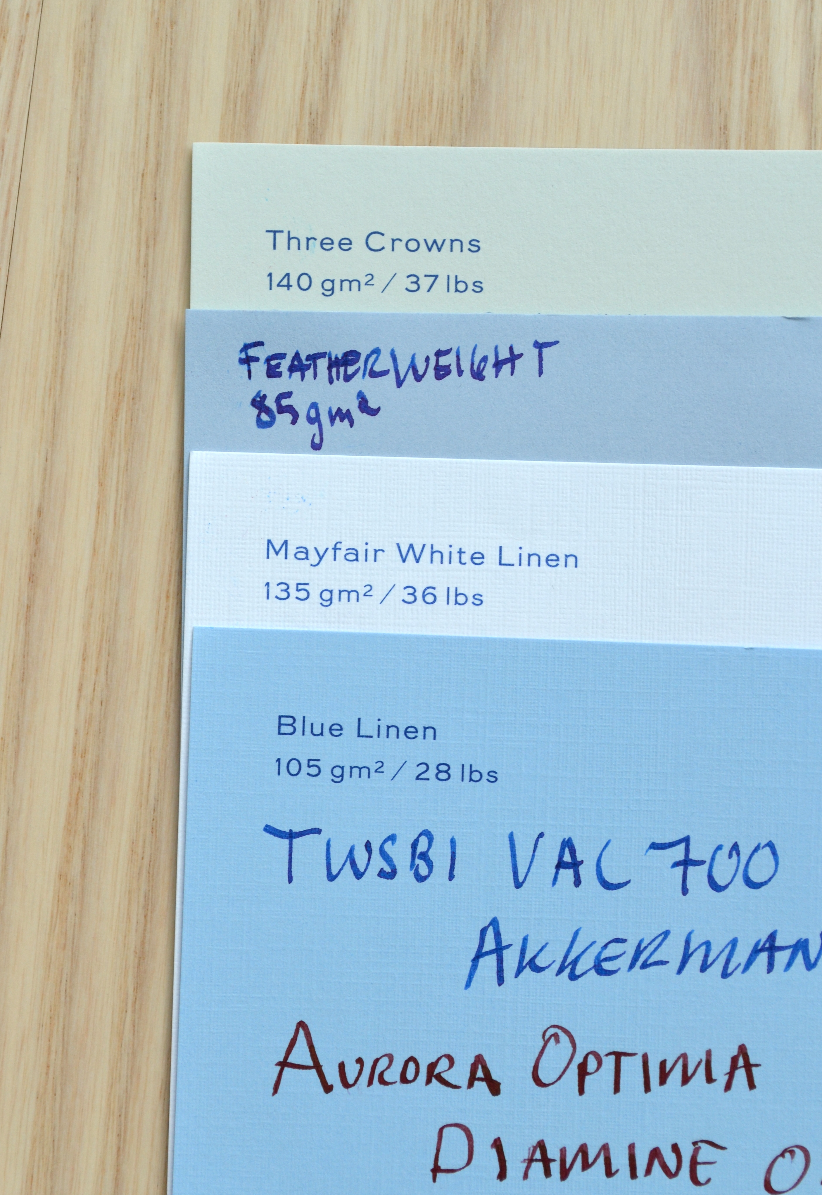
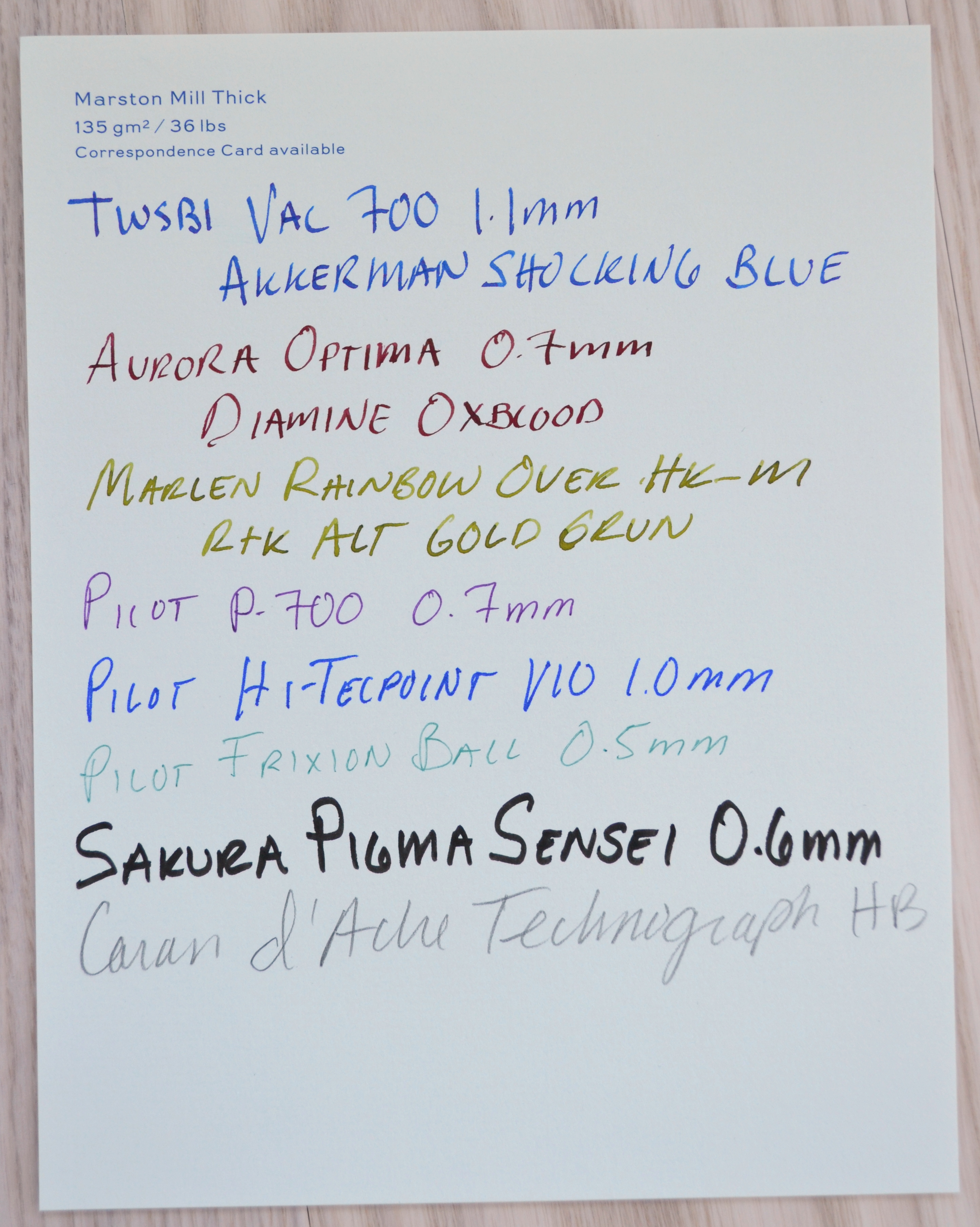
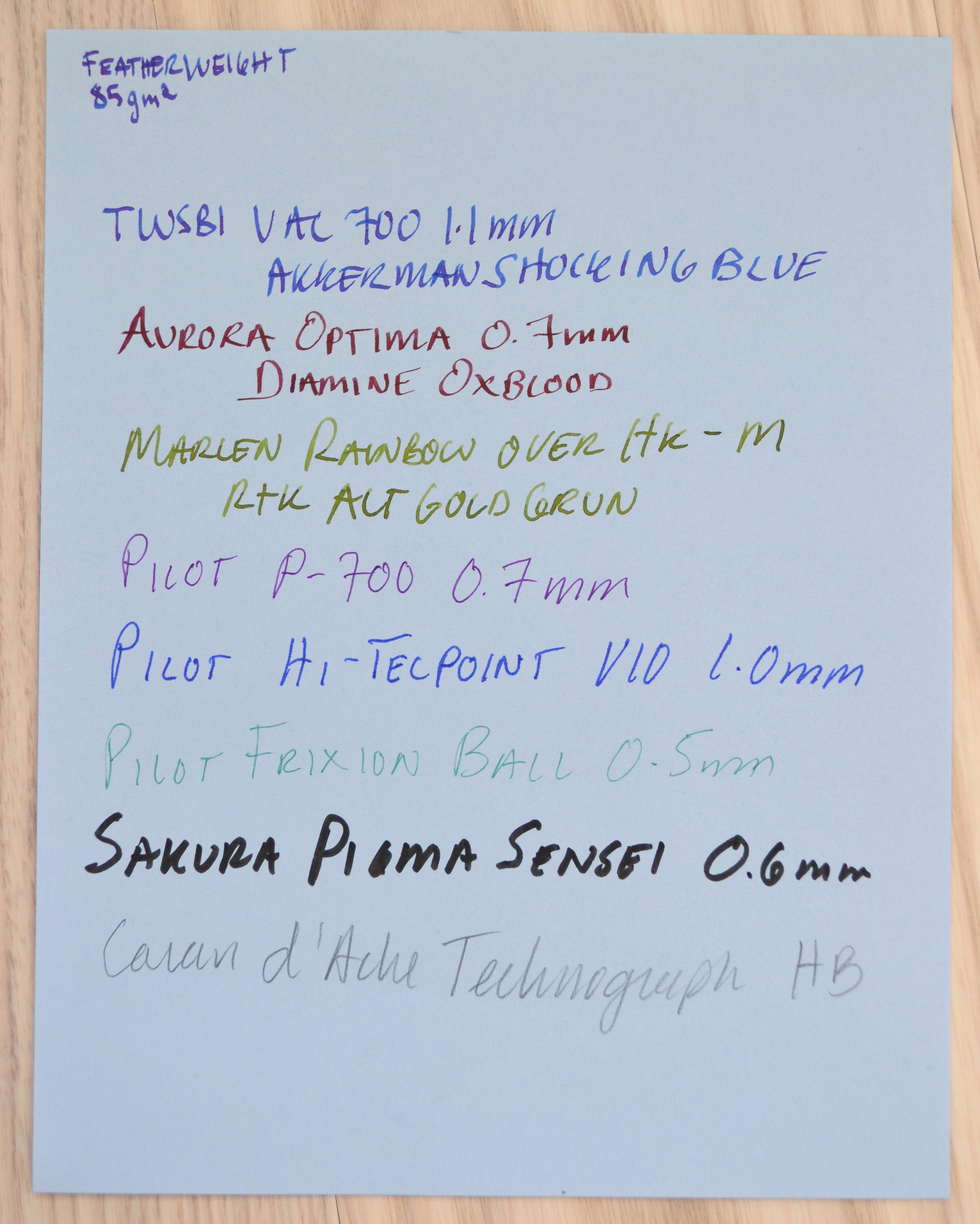
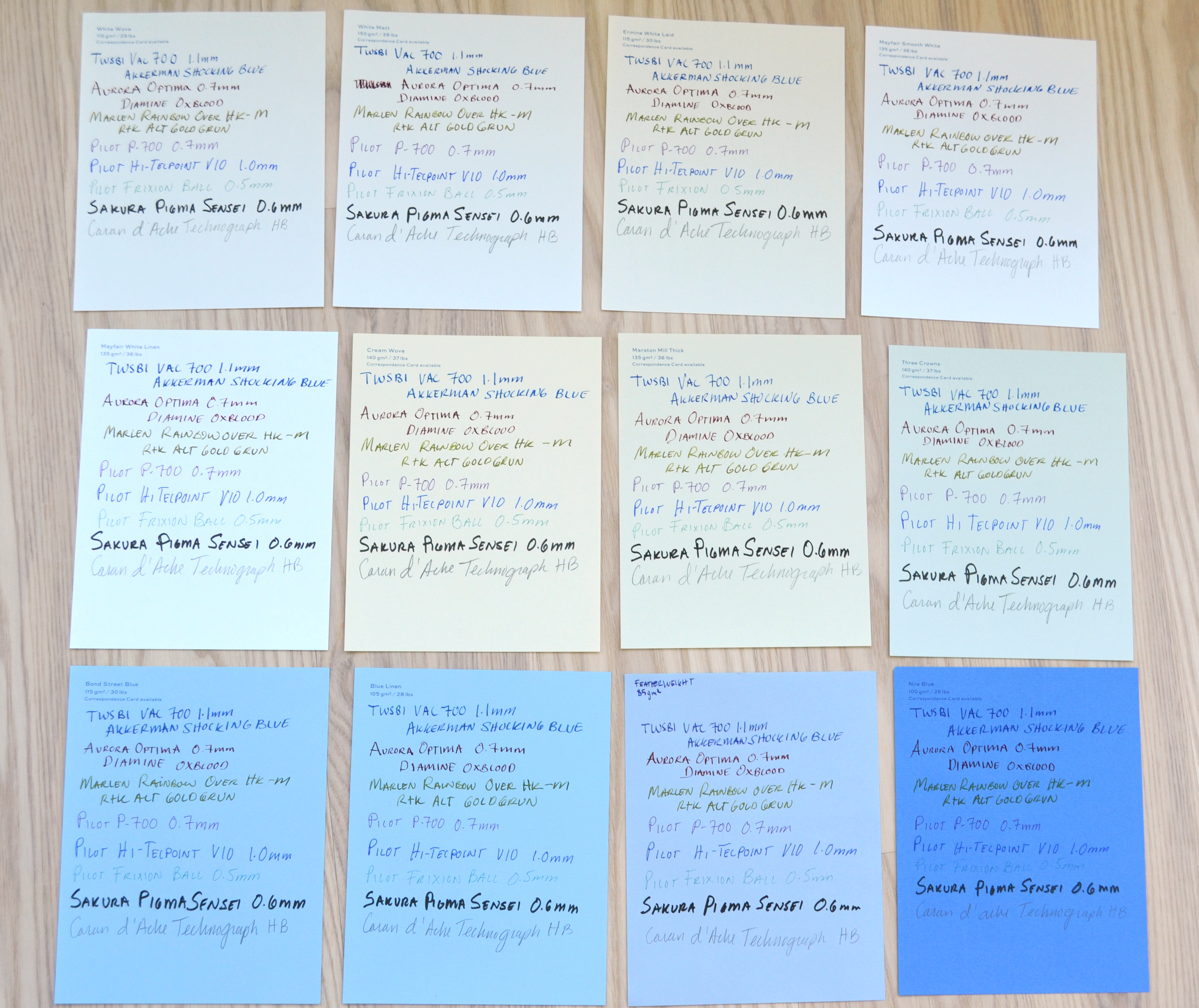
Marston Mill Thick (135 gsm / 36 lbs)
This is a thicker laid paper that is a light cream color with a touch of green in it. No bleed through no feathering and smooth on the back. Another excellent paper with a somewhat unusual color but it’s quite subtle.
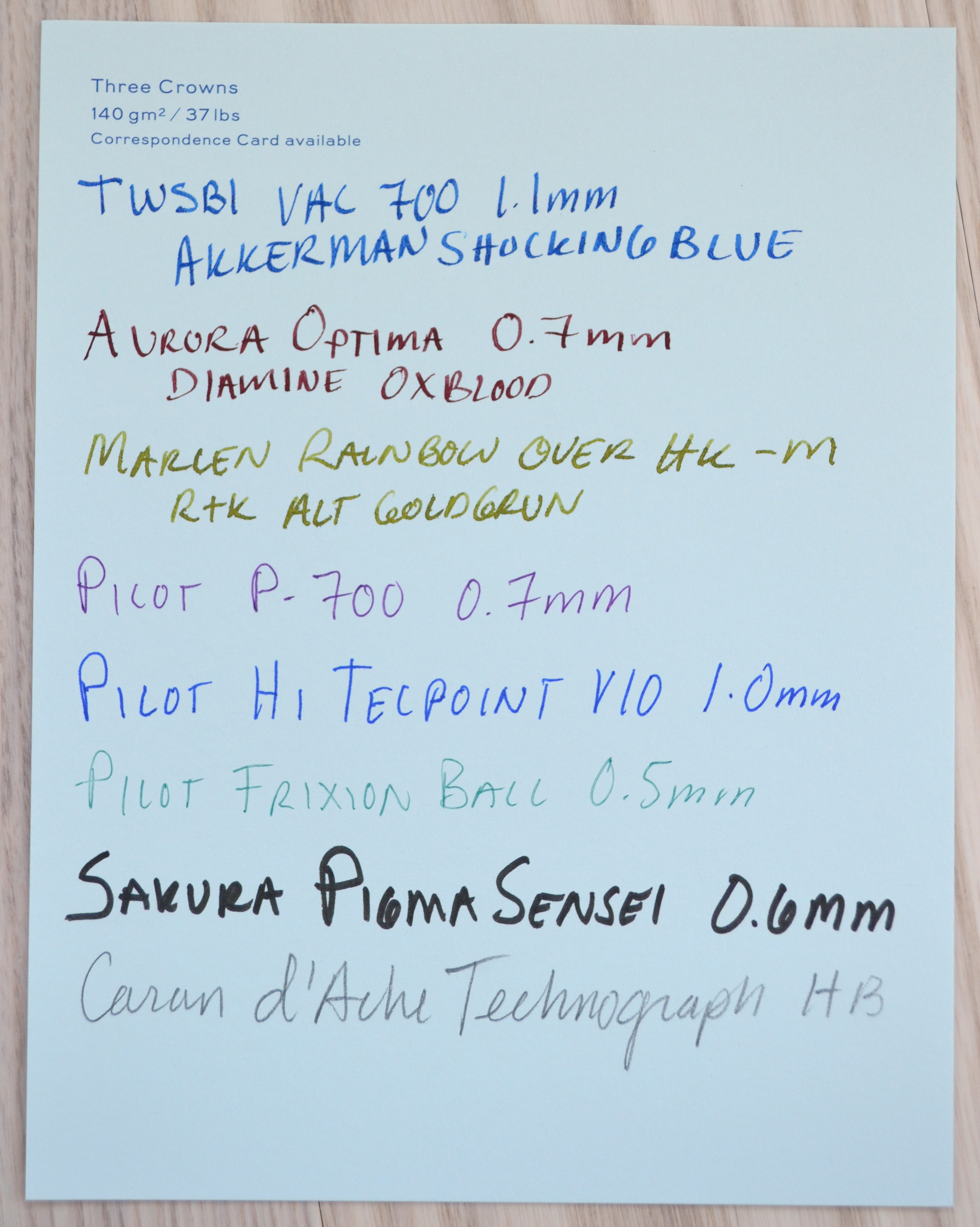
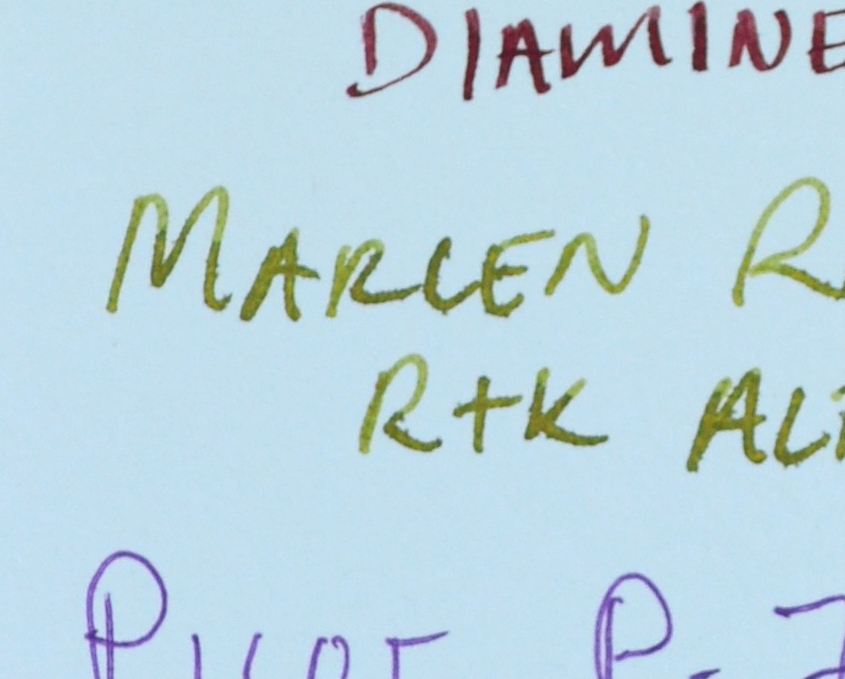
Three Crowns (140 gsm / 37 lbs)
This is a woven light mint colored paper. Compared to its counterpart, Cream Wove, I noticed some mild feathering with some of my juicier pens.
The feathering doesn’t put me off of this paper as it’s unique color.
Despite the minor feathering there was no bleed through.
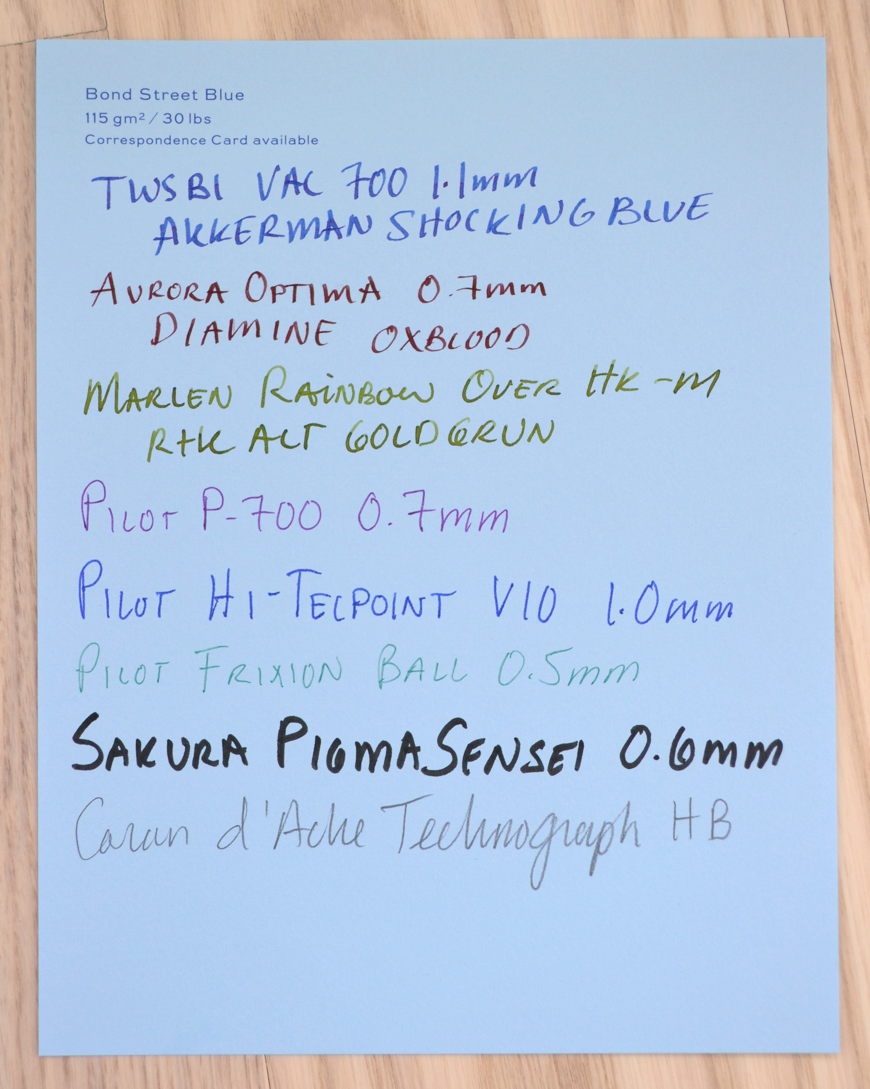
Bond Street Blue (115 gsm / 30 lbs)
There are four “standard” blues in Smythson’s line but Bond Street Blue is touted as their signature color. It is a very nice pale blue. Many luxury goods manufacturers have signature colors that are often denoted by their boxes: Hermes in orange, Cartier in dark red, Tiffany & Co. in robin’s egg blue, and Rolex in dark green, etc. Smythson boxes however are not Bond Street Blue they are the darker Nile Blue…oh well.
Bond Street Blue is a woven paper slightly heavier than White Wove. Excellent performance all around no bleeding or feathering.
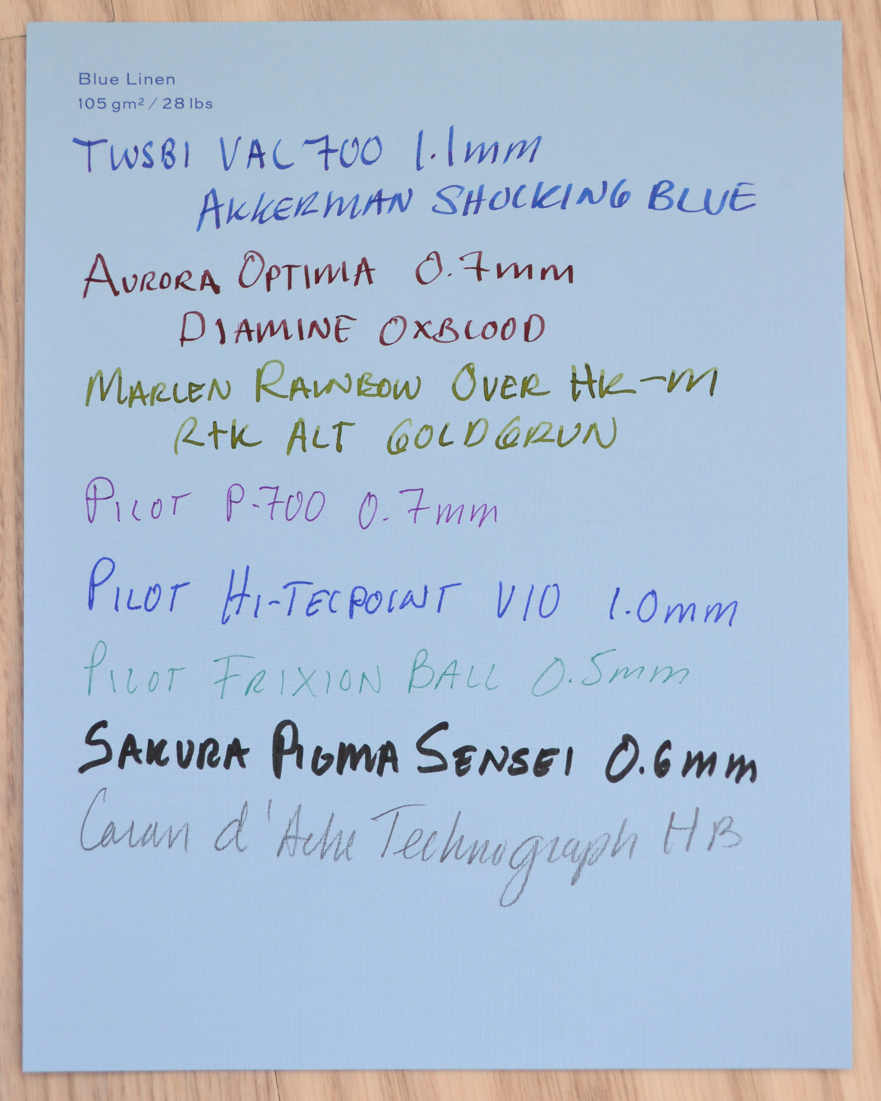
Blue Linen (105 gsm / 28 lbs)
Same finish as Mayfair White Linen but noticeably lighter in weight with the same feedback and feel.
No feathering or bleeding. The color is identical to the Bond Street Blue.
Featherweight Blue (85 gsm)
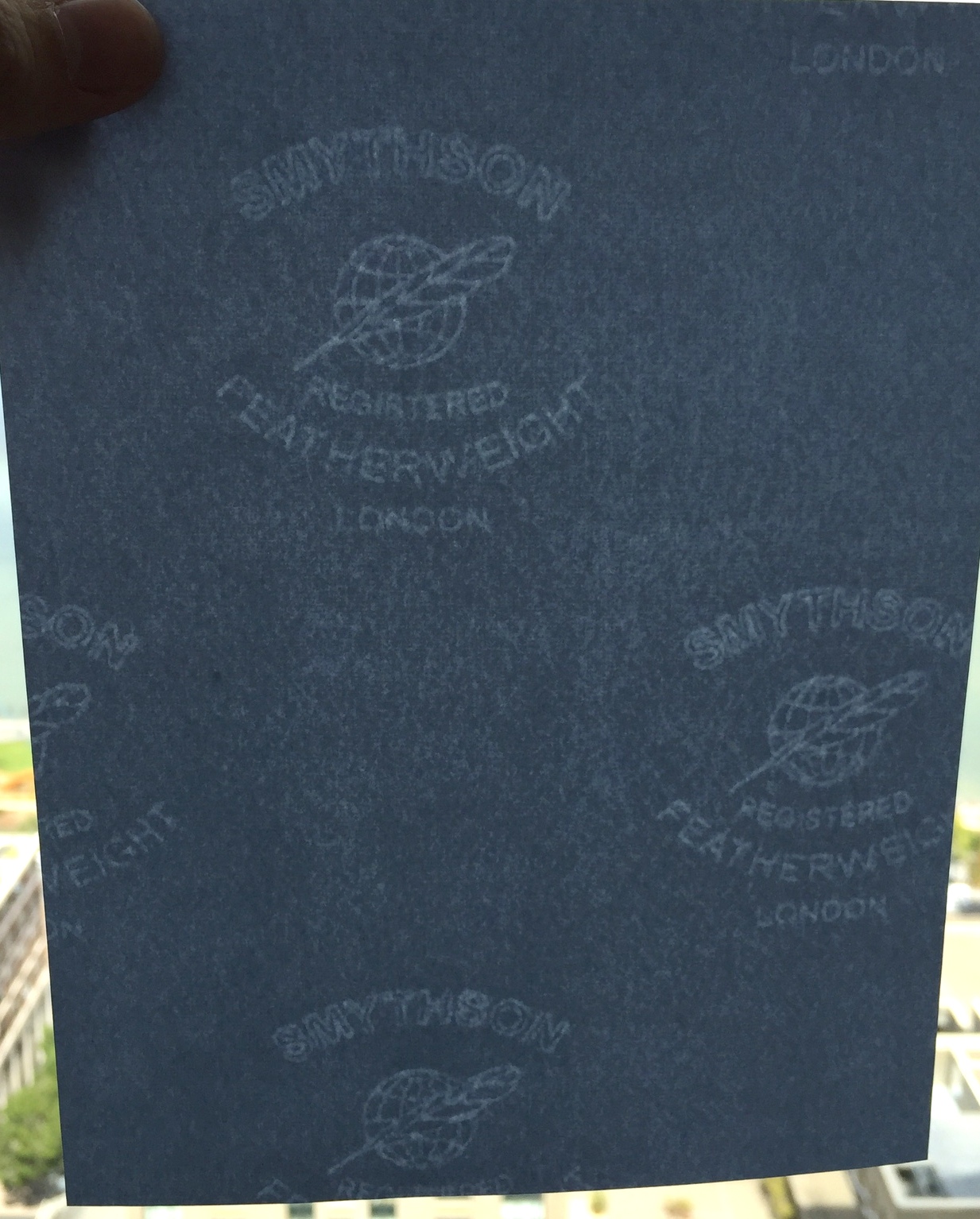
This is the paper that Smythson uses in their famous Panama diaries and in the majority of the organizers and books they sell. “Featherweight” paper is trademarked and even its unique watermark reads “REGISTERED”.
The featherweight watermarks are spaced much closer together than the standard Smythson watermarks as this paper was designed for use with much smaller paper formats.
The reason for all the fuss is that Featherweight allows you to get lots of absorbent fountain-pen-friendly-pages into a diary with minimal bulk. This is less important when we are talking about loose sheets but it is a lovely paper even in loose leaf form.
The color is a pale blue slightly lighter than that of Bond Street Blue. I have noticed some color variation with this paper and when I asked Smythson about it they replied that because it is”handmade” there is variation between runs.
In my experience some batches will be a bit darker but it is always a pale blue. There is no bleeding no feathering. Compared to the heavier wove papers Featherweight has a smoother texture. It has a nice feel too it without getting crinkly like Tomoe River paper (though to be fair Tomoe is 52 gsm). For my purposes I prefer Featherweight because I can write on both sides where TR has a bad case of ghosting.
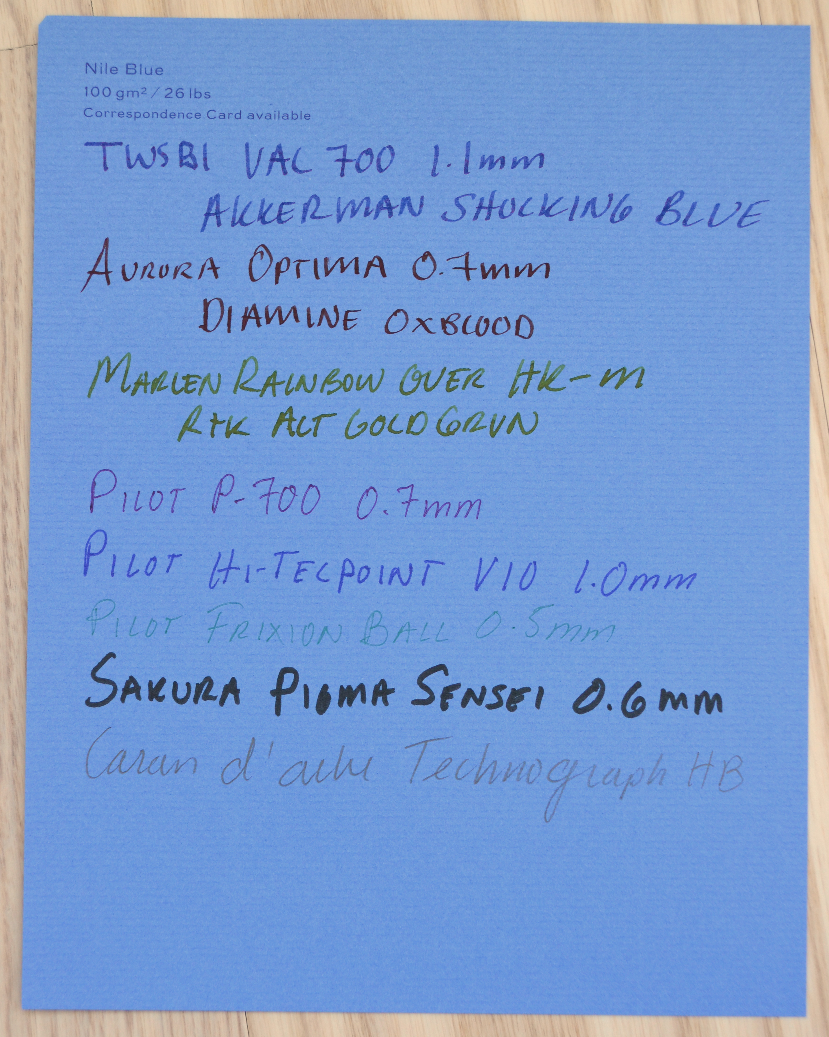
Nile Blue ( 100 gsm / 26 lbs)
Last but not least is Nile Blue (the color of the boxes). This is a laid paper in a much darker blue. Nile Blue is the lightest (in weight not color) of Smythson’s laid papers and despite this it performs as well as the thicker ones with no feathering and no bleed through. Because it is a darker paper you do start to lose the ink colors a bit. Out of all of the laid papers in Smythson’s line the ribbed texture is the most visually apparent with Nile Blue.
I will post Part 3 soon with a US Buyer’s guide and conclusion.
Smythson of Bond Street is a stationery and luxury goods manufacturer that holds three proper Royal Warrants.
The print is quite small but left to right are UK warrants for the Queen, the Duke of Edinburgh, and the Prince of Wales
Smythson’s focus these days appears to be on overpriced luxury leather products rather than the stationery that made them famous.
The good news is that Smythson still makes a lot of excellent papers. By my count there are fourteen different writing papers; that is far more than any of their competitors (namely the Wren Press, Dempsey & Caroll, and Crane & Co.).
I will be reviewing twelve different Smythson writing papers in a two three part review.
Part 1
The first six for Part 1
Per my understanding Smythson papers are all made in the United Kingdom out of 100% wood pulp. The absence of cotton or linen makes these papers highly suitable for use with fountain pens.
Cotton and linen papers are generally considered superior to ones made out of wood because they can last much longer. If you are signing important documents that you expect to be around for 500+ years then cotton is the way to go. If you want to maximize the joy of writing with fountain pens wood papers are far superior (and with some care can last as long as 200 years).
All of Smythson’s papers carry the watermark shown below (with the exception of one special paper that I will cover in Part 2).
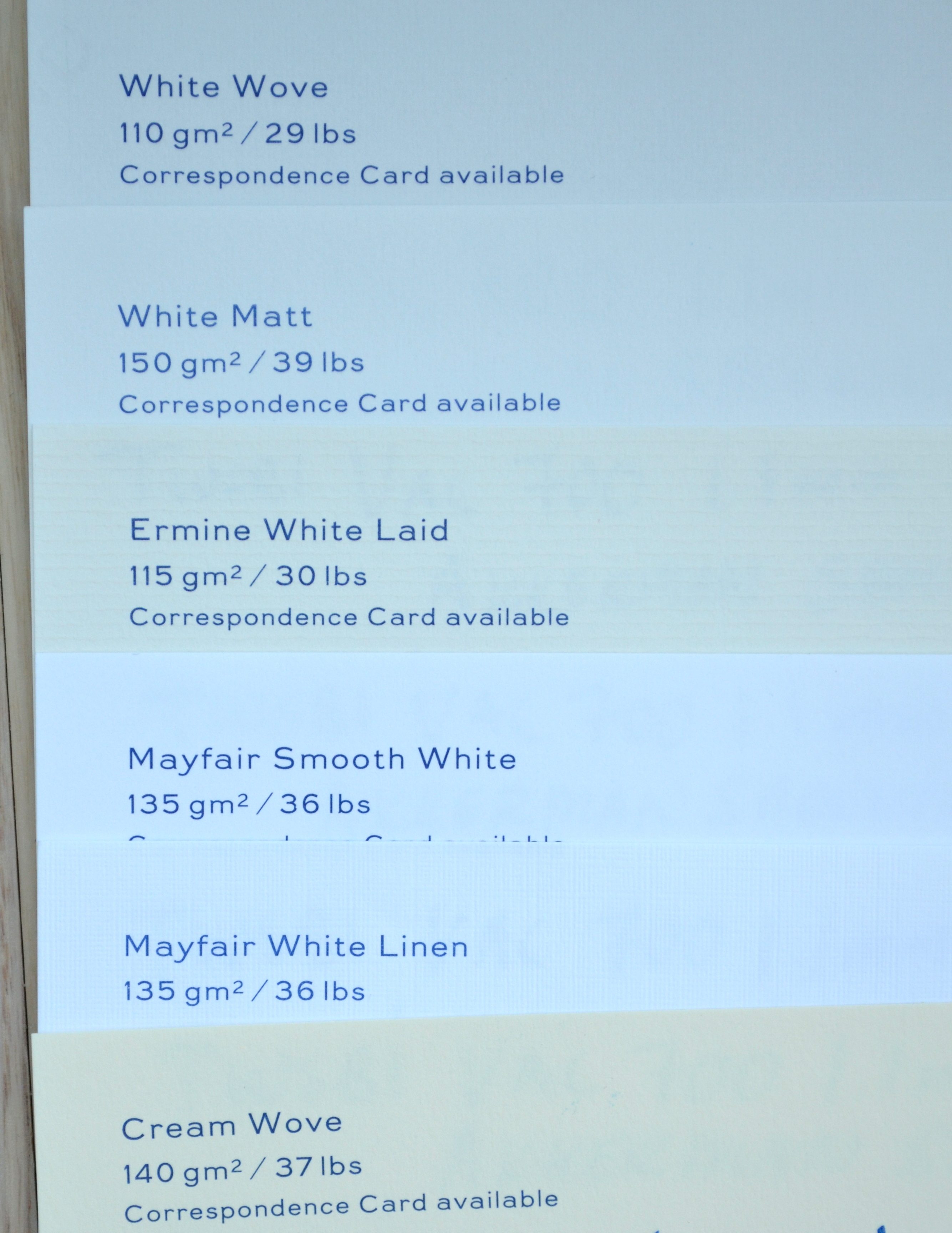
Because the paper is produced in a larger format than it is sold, most sheets do not have a complete watermark and this is especially true if you buy the Kings format that I prefer. Kings writing sheets are similar to A5 but are slightly taller and wider measuring W16 x H20.5 cm. Writing sheets are sold in packs of 50 for $15. All of the papers cost the same but most unfortunately most of them are not available in store or online. You will have to call Smythson and specifically request them ( I will discuss which ones these are later on).
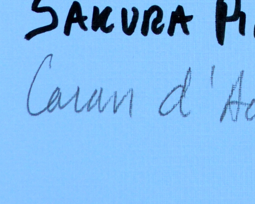
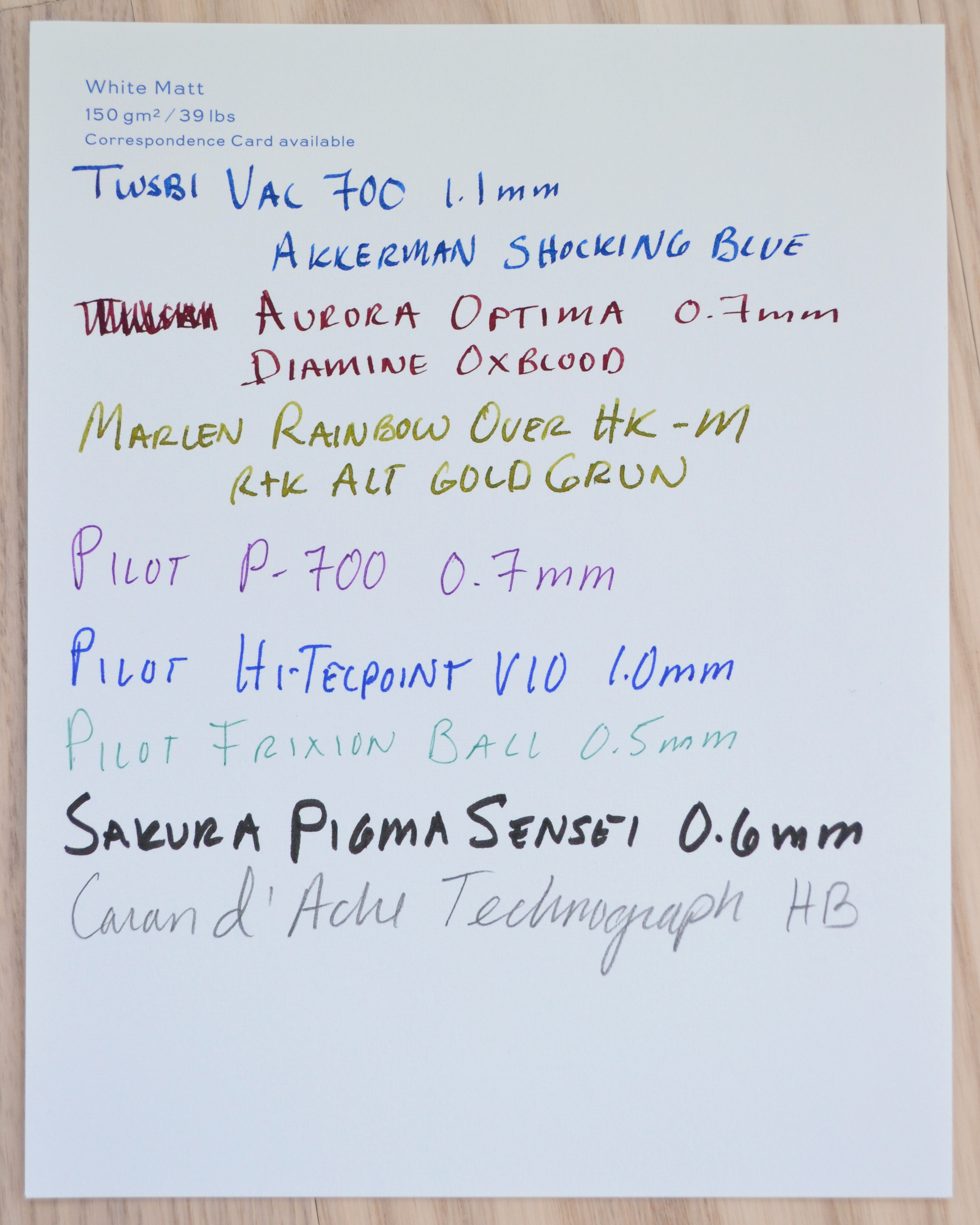
Also it should be noted that the sheets I have used here (with the exception of the Featherweight paper) are from a personalized stationery sampler and as such have the name of the paper and weight engraved on the top left corner.
Lastly, before we jump into the individual reviews, I am sorry to say that all twelve of these papers are wonderful and there isn’t one I wouldn’t recommend. It is a bit anticlimactic to read through this two part post to learn that they are all excellent but it is what it.
White Wove (110 gsm / 29lbs)
This paper is lightly textured and handles fountain pen ink very nicely. Feedback on this paper is very minor; pens glide nicely over the surface even though it’s not glass smooth. Minimal feathering and almost not bleed through. The back is ever so slightly smoother than the front and you can write on both sides no problem.
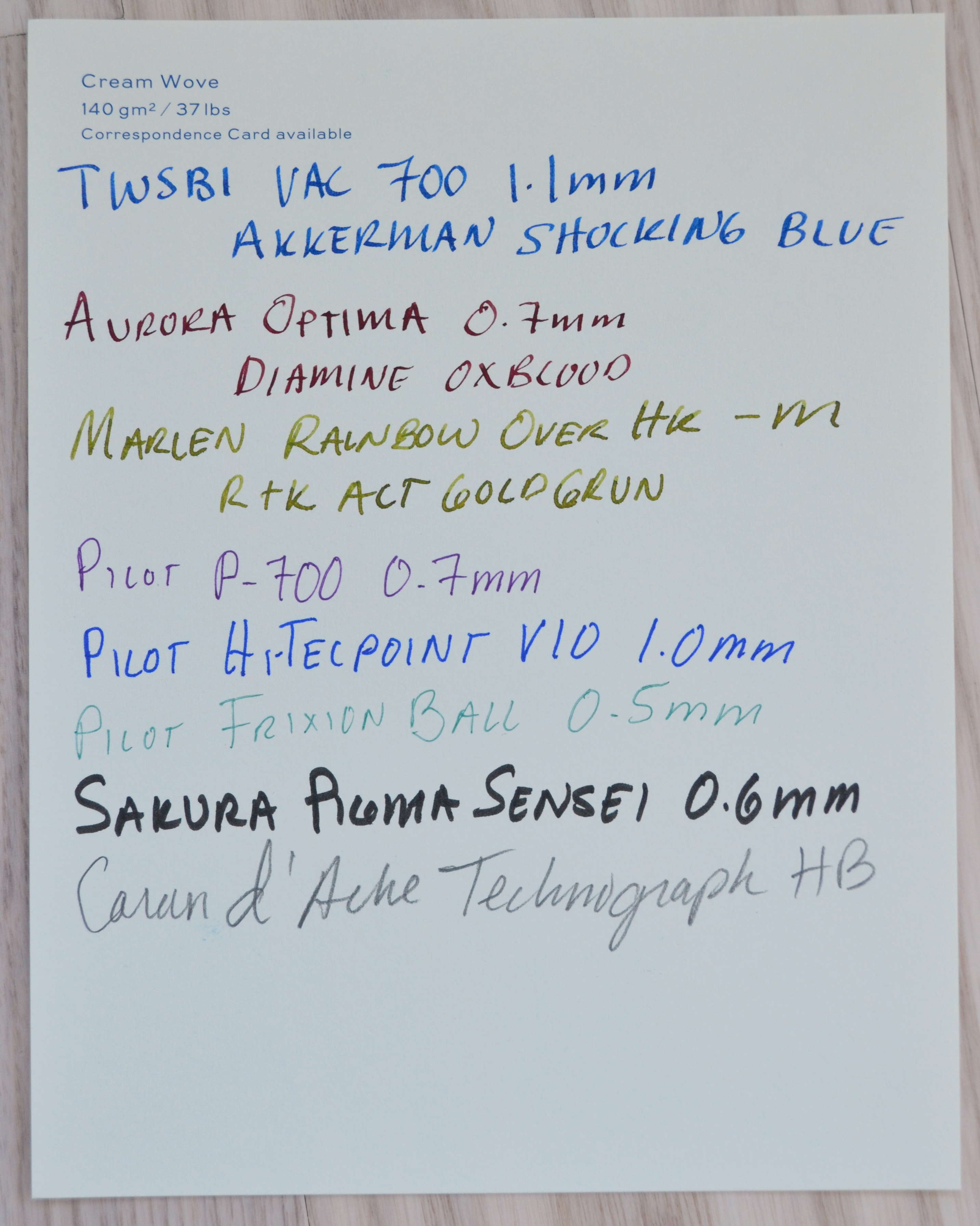
Cream Wove (140 gsm / 37 lbs)
Shot alone my camera tries to make this paper look very white so please see the pictures with multiple papers above to get a better sense of the actual color.
Similar texture as White Wove but thicker. To me the White Wove is a bit more elegant with a more delicate but sturdy feel. The performance is the same as White Wove though I so no bleed through at all.
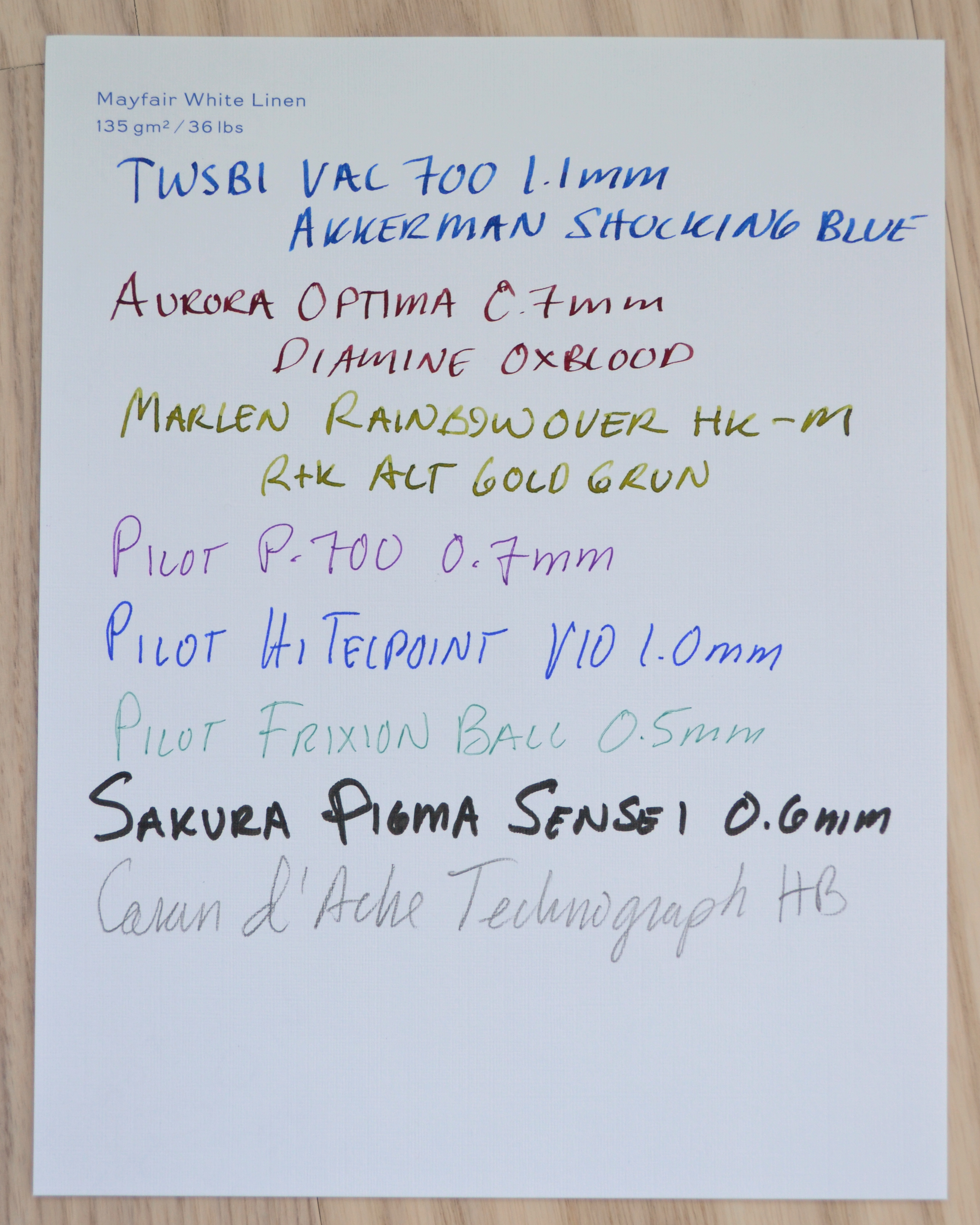
Mayfair White Linen (135 gsm / 36 lbs)
This paper and the Mayfair Smooth White are the whitest papers in the Smythson line. Despite being called White Linen this paper is 100% wood pulp and as a result it works beautifully with fountain pen ink unlike most papers made out of real linen. The gorgeous linen texture provides more feedback than the other finishes but still works very nicely with my pens.
I do make an effort though to hold the page while writing as nibs can grab. This paper has no bleed through and no feathering that I can see. The back of the page is much smoother than the front and you can write on both sides of the paper.
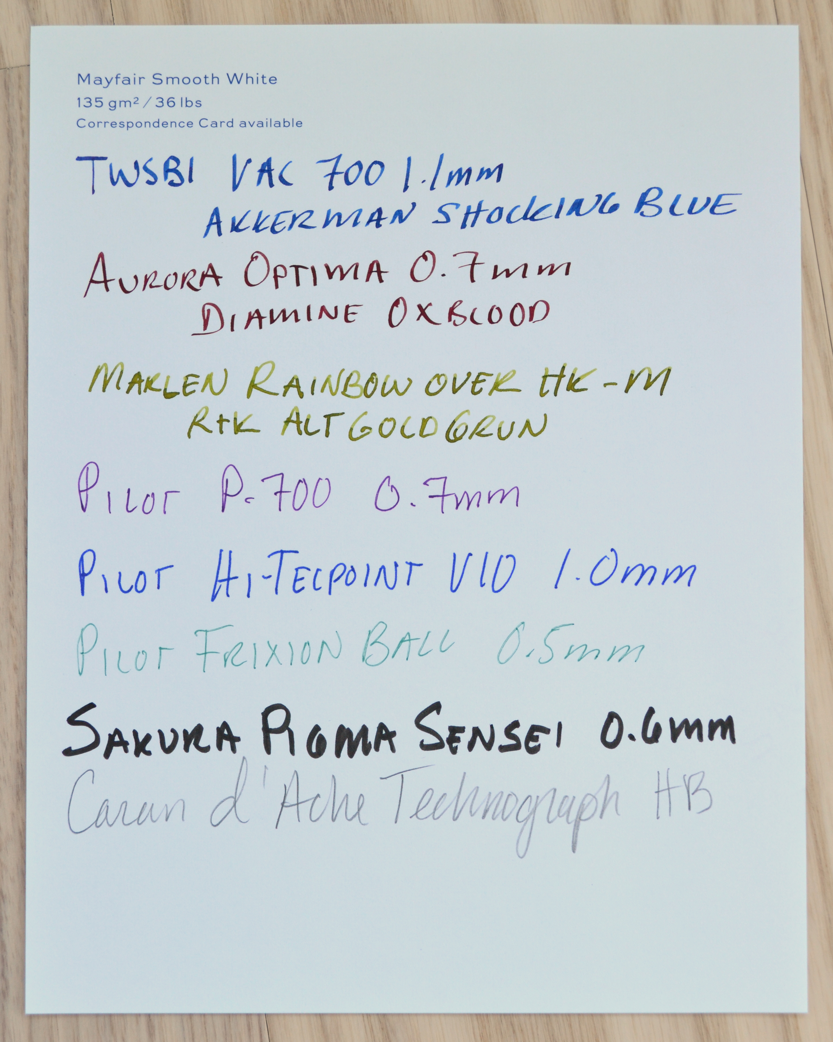
Mayfair Smooth White (135 gsm / 36 lbs)
Same color and weight as Mayfair White Linen but with a smooth finish. It is smoother than Rhodia’s 80 gsm paper and comparable to Clairefontaine’s 90gsm. In other words, this is on par with the smoothest paper on I own. Performance is excellent. No bleeding nor any noticeable feathering. I highly recommend this paper for finer scratchier nibs.
Ermine White Laid (115 gsm /30 lbs)
This paper is the most off white of the papers that Smythson calls “white”. Laid paper has a ribbed texture to it and is an older form of paper making. In most mills laid paper was superseded by wove paper. This paper is smooth on the back but you can write on both sides. This paper does not feather but because of the ribbed texture lines may look slightly less clean.
I saw no bleed through on this paper and overall it is the best performing laid paper I have ever owned. If you want to see what bad laid paper looks like see my review of Original Crown Mill’s laid paper.
White Matt (150 gsm / 39 lbs)
This is simply a heavier version of White Wove. The finish and color is exactly the same. I saw no bleed through once so ever on this paper where the White Wove had the slightest signs of spotting. This is a nice paper but I prefer the lighter White Wove.
As a general rule, I do not purchase ink while traveling. My reasoning is that if a $15 bottle of ink breaks in my luggage I would be out hundreds of dollars in ruined clothes. Yes, I broke my rule.
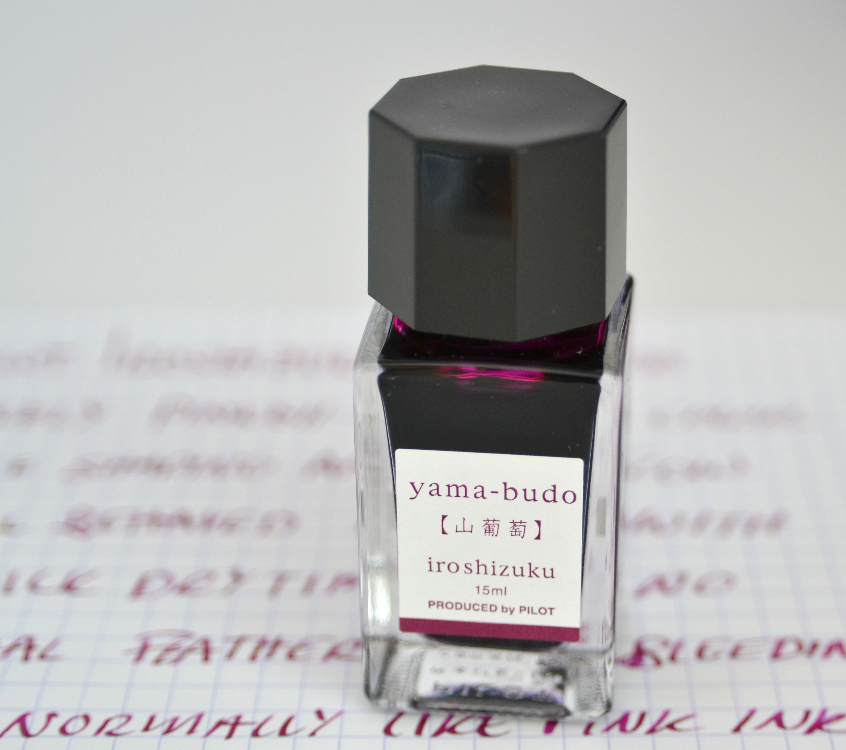
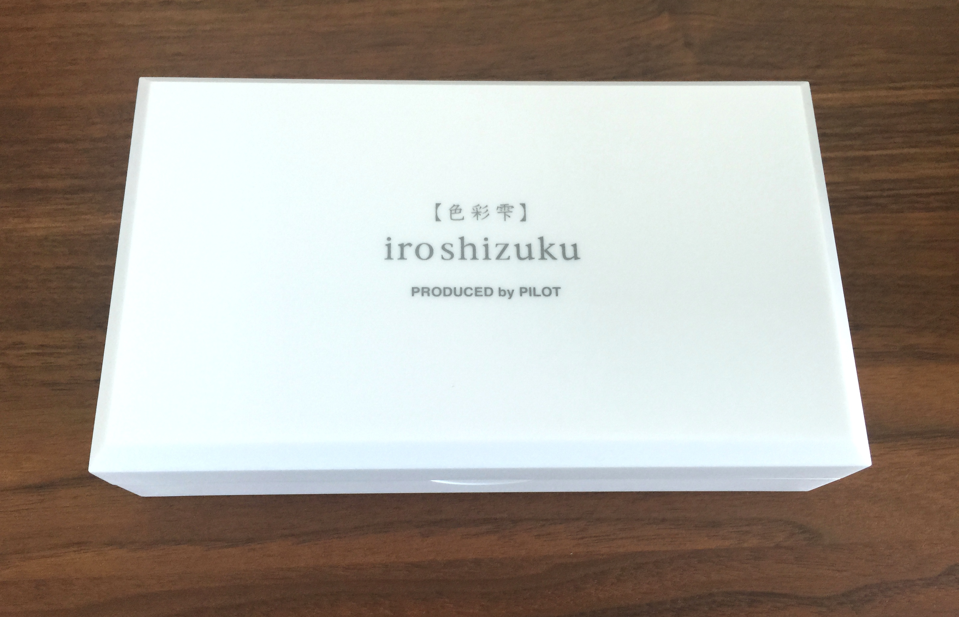
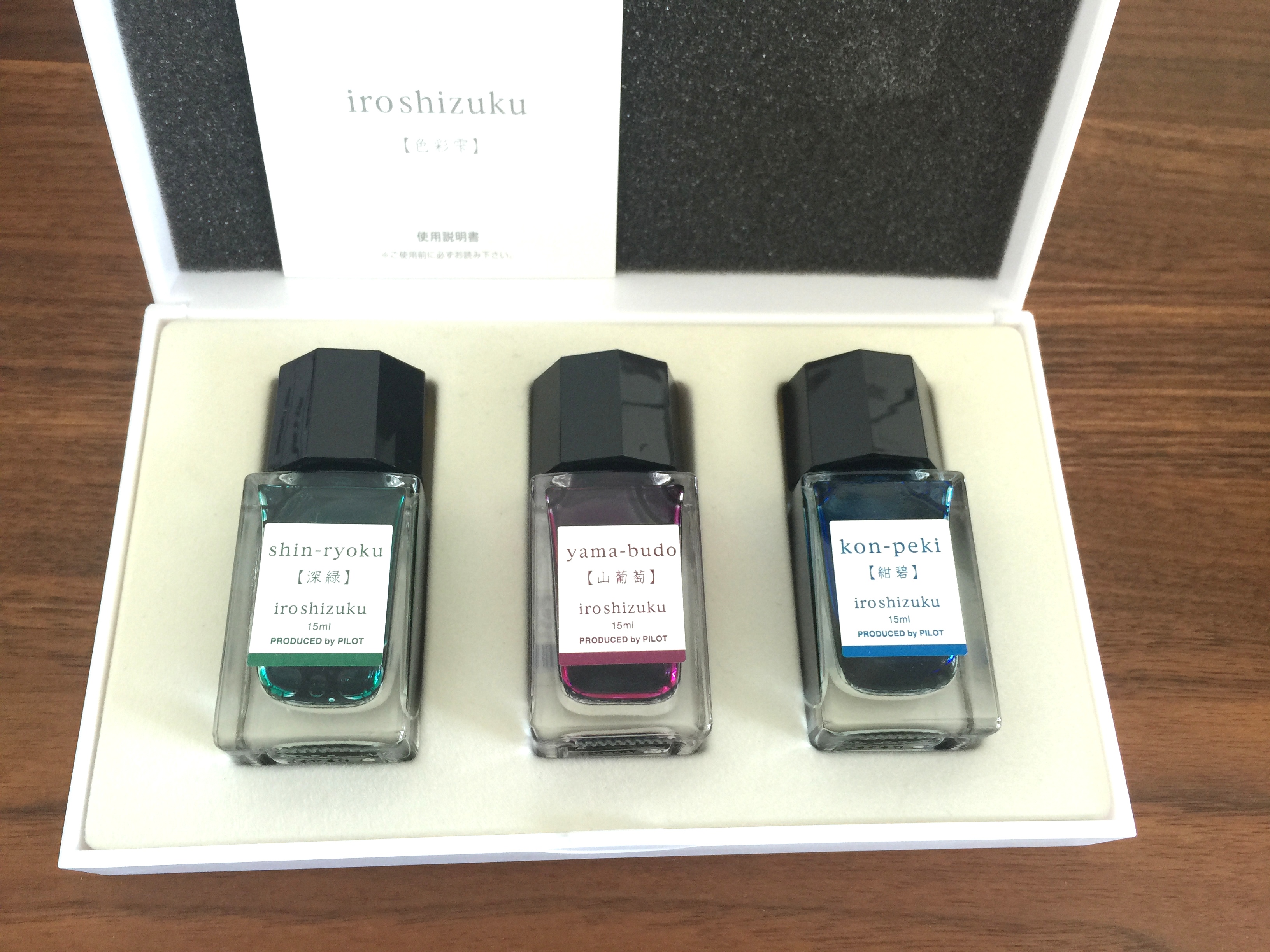
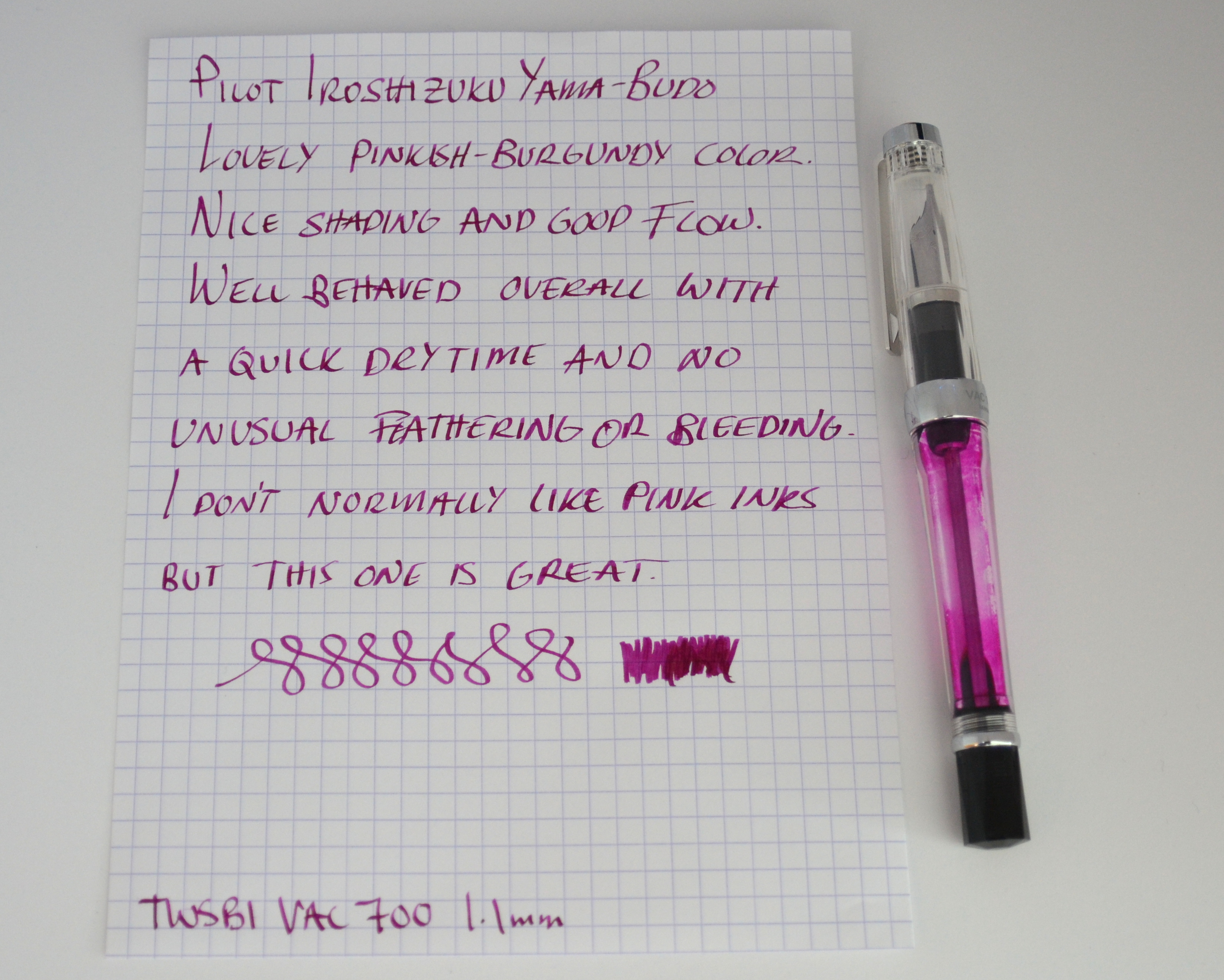
On my way out of Itoya in Tokyo (after buying some pens I didn’t need) I saw some well-packaged mini bottles of Iroshizuku in a lovely presentation box and that was that…I picked the three colors I wanted and here we are: The Pilot Iroshizuku Yama-Budo Fountain Pen Ink Review.
I wish all inks were packaged like this.
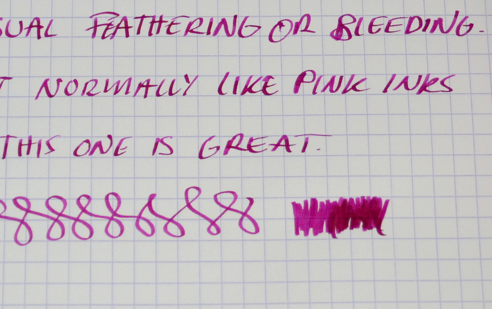
Yama-Budo in Japanese means “Crimson Glory Vine” and it is a pinkish burgundy color that I really like. Like all Iroshizuku inks, it performs beautifully, well-behaved with a good flow. This ink has really nice shading to it.
This ink isn’t really appropriate for a professional setting but it is a fun color that looks great in a demonstrator.
I am not sure I could go through a full-size 50ml bottle of this one but I feel confident that I will be able to make my way through 15ml.
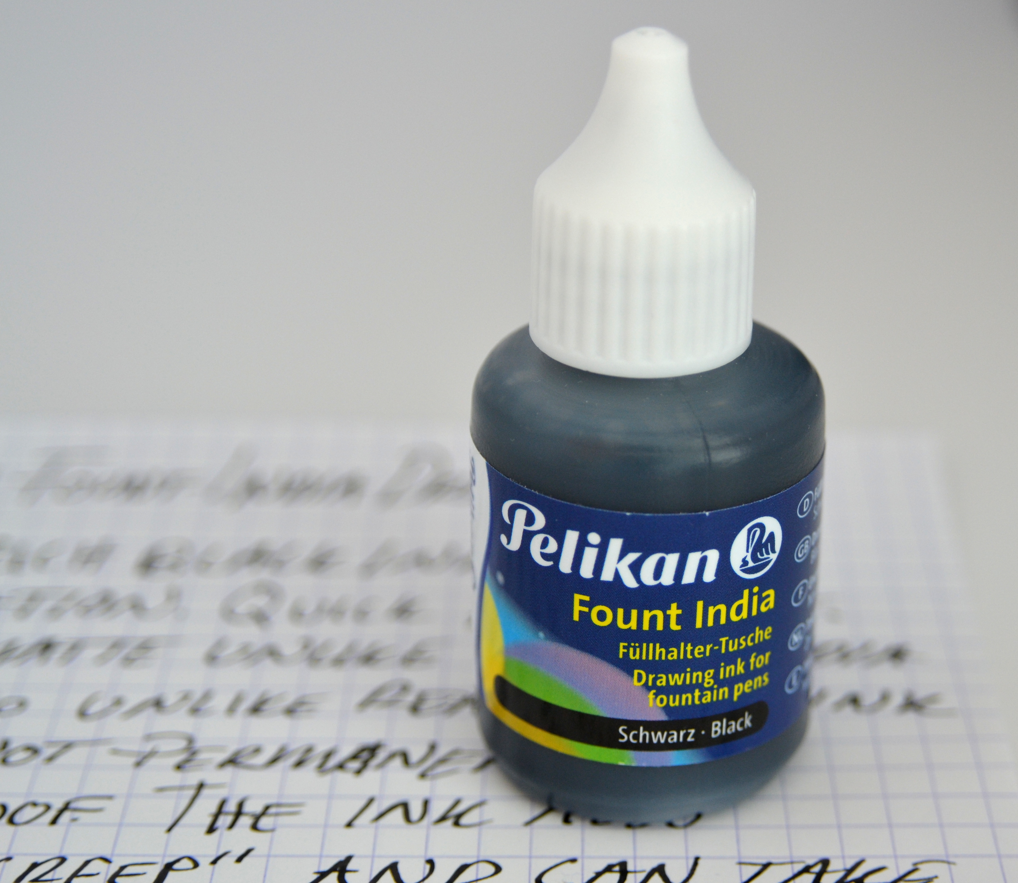
Pelikan Fount India ink is an oddball ink. India inks (most often) contain binding agents like shellac that provide permanent and waterproof characteristics and consequently make them unsuitable for use in fountain pens (NEVER put real India ink in a fountain pen).
By making an “India-style” ink for use in a fountain pen you have to forgo the binding agent and you are left with a non-waterproof and non-permanent ink. So, you may be asking, “what’s the point?”
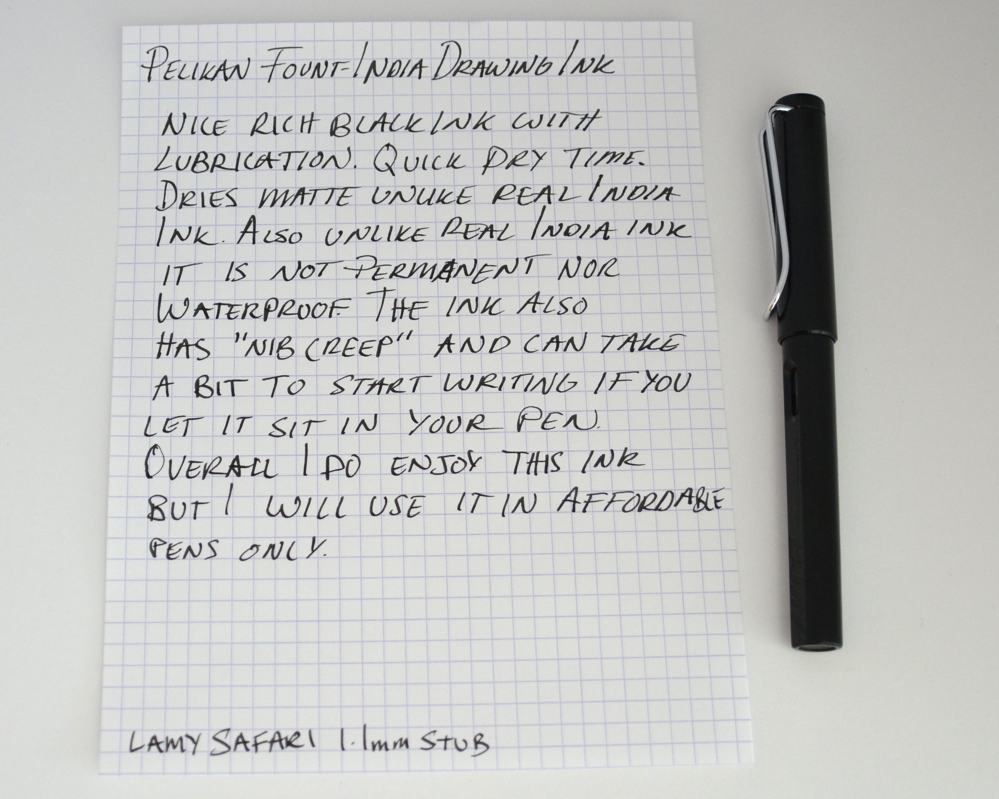
Unlike regular fountain pen ink, Fount India, has a thicker consistency that affords a very smooth lubricated feel on the paper. It is not the blackest fountain pen ink out there but it has a richness to it that few black inks can match.
It should be noted that unlike real India ink, Fount India dries matte and not glossy.
Because of it’s thicker consistency it can take a little bit to get the pen going after it has sat overnight but once it starts flowing the ink performs wonderfully. I have also noticed that this ink is especially prone to “nib creep”.
I really enjoy using this ink but I only use Fount India ink in my more affordable pens that are easy to dissemble as it is a bit harder to fully clean out. I have left the ink in my pens for three weeks without any consequences but I would urge caution when using a hybrid ink like this.
Fabriano is one of the oldest paper mills still operating in Europe and they produce a plethora of high quality papers. Medioevalis is the most affordable line stationery in their “prestige correspondence” range and it is the only one that can be easily bought in the United States.
Medioevalis comes in two colors, a cream, and a white, as well as various paper weights. There are numerous formats including ones specifically designed to be used with inkjet and laser printers.
The format I am reviewing is the A5 writing pad and envelopes. The pad is in the cream color and contains twenty-five A5 size sheets and one blotting page.
The blotting page is a really nice feature that most stationery writing pads omit.
The mold made paper is 120 g/m² and has a hand torn deckled edged. The sheets are “self-deckling” such that when removed the top edge has the same delicate deckled finish as the other edges.
Despite its textured finish this paper works very well with fountain pens. There is a minimal but pleasant amount of feedback and being made out of a wood pulp it accepts fountain pen ink quite nicely. The paper absorbs the fountain pen ink making for quick dry times. In my test there was no bleed and very minimal ghosting a feathering.
This paper is not watermarked and the envelopes are unlined.
I prefer self adhesive envelopes but these ones close up just fine.
This have been one of my favorite papers for several years now. The writing pad costs $9.50 and the envelopes are $10.99 for 25. At less than 50 cents a sheet you can’t really go wrong with this paper. I highly recommend it.
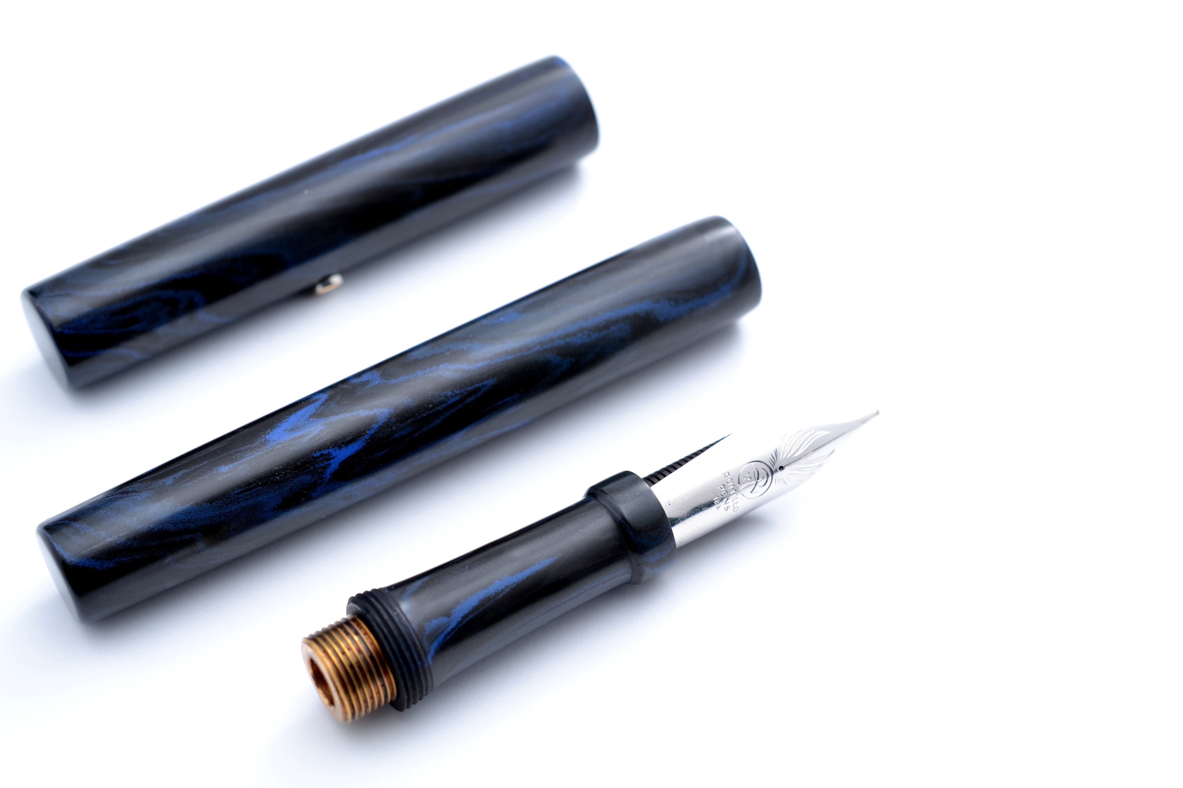
When I discovered the Romillo Pen brand last year I knew I had to have one. On the surface Romillo embodied my perfect pen; one with no frills, just a simple pen focused on writing pleasure through a giant hand-made nib.
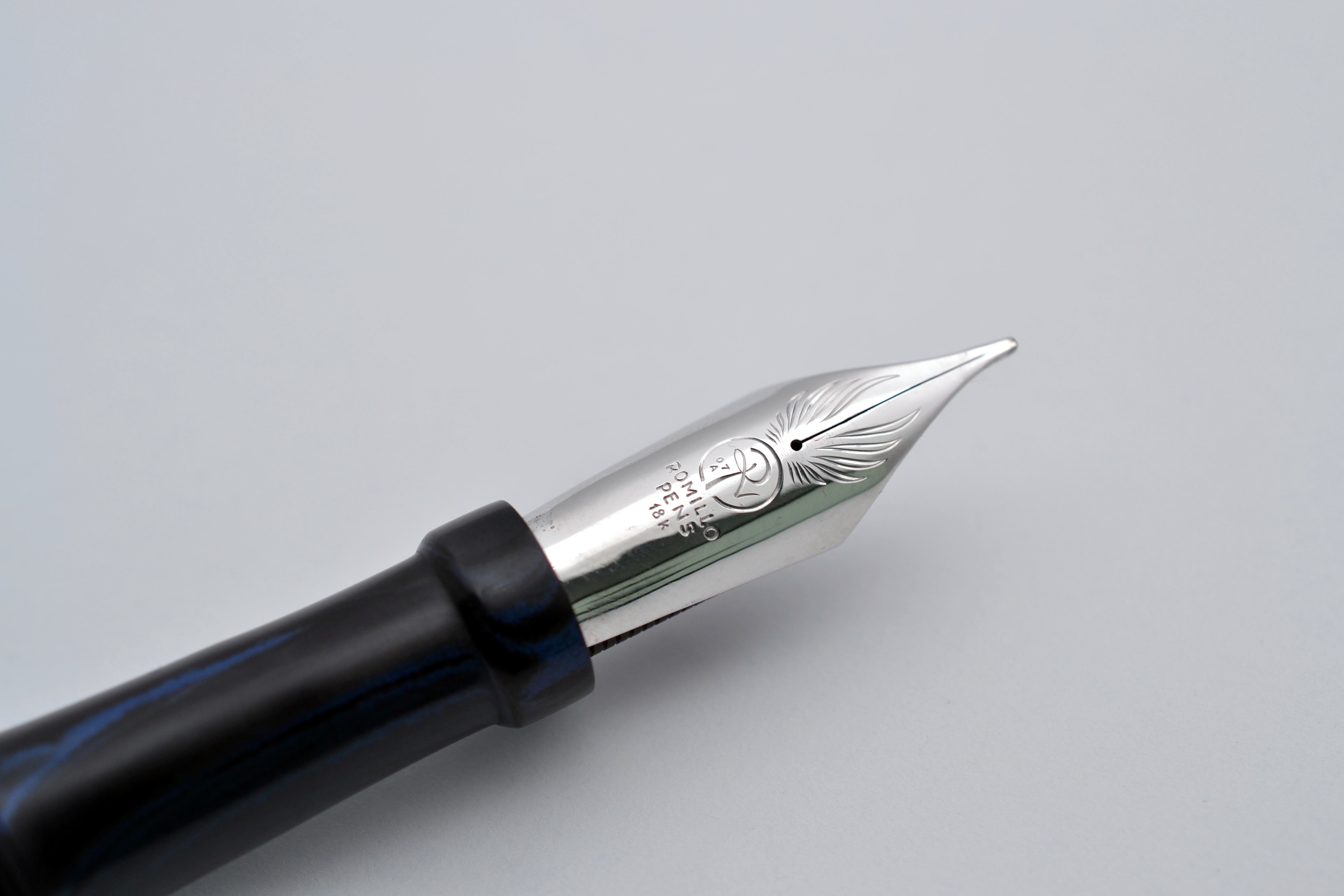
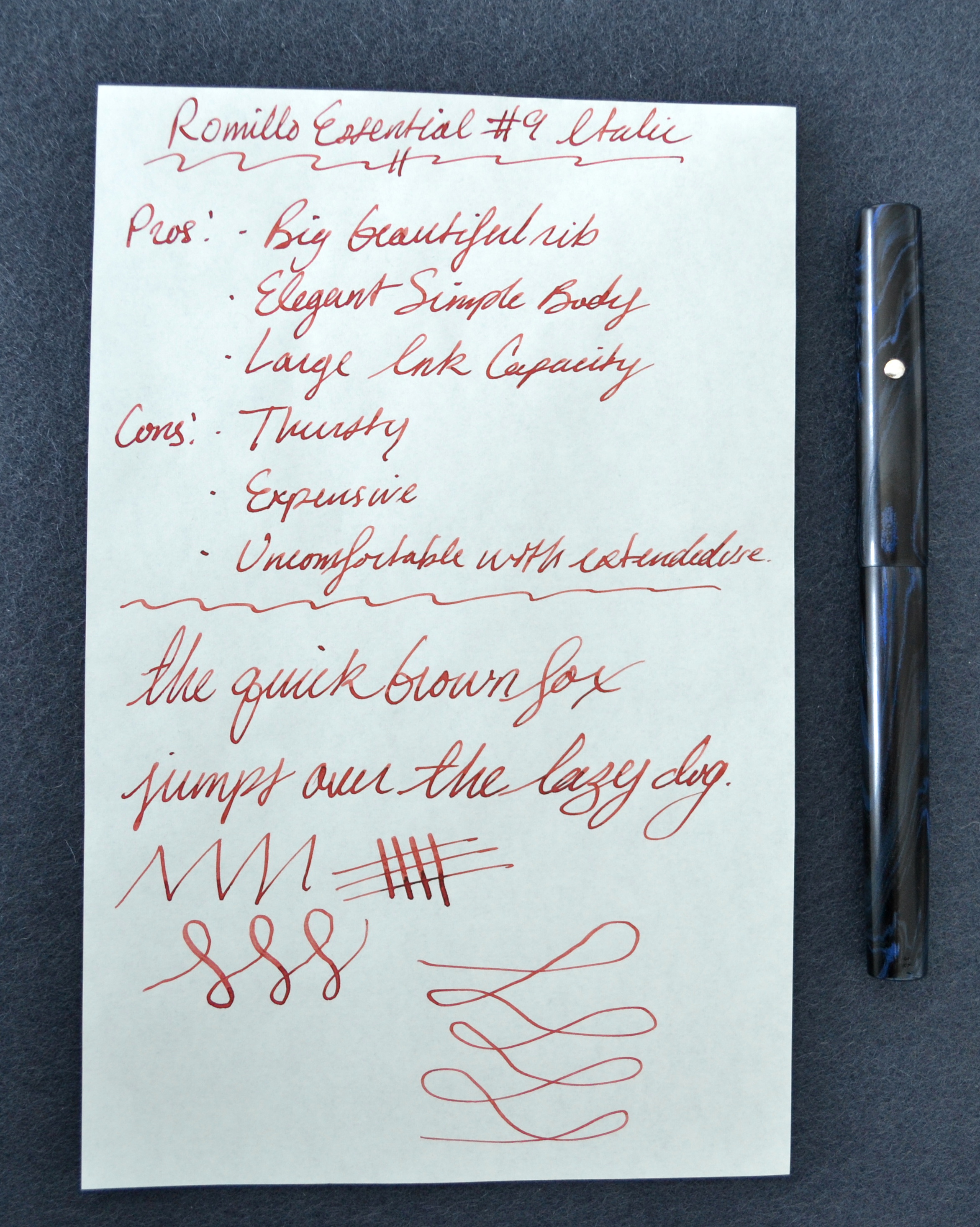
After some back and forth with the pen maker, Álvaro Romillo, I decided on an Essential #9 in blue/black hard rubber with a semi-flexible #9 italic nib with rhodium trim and a solid silver lentil.
The lead time was only 1 month and after half a year with this pen I am finally ready to review it.
Appearance
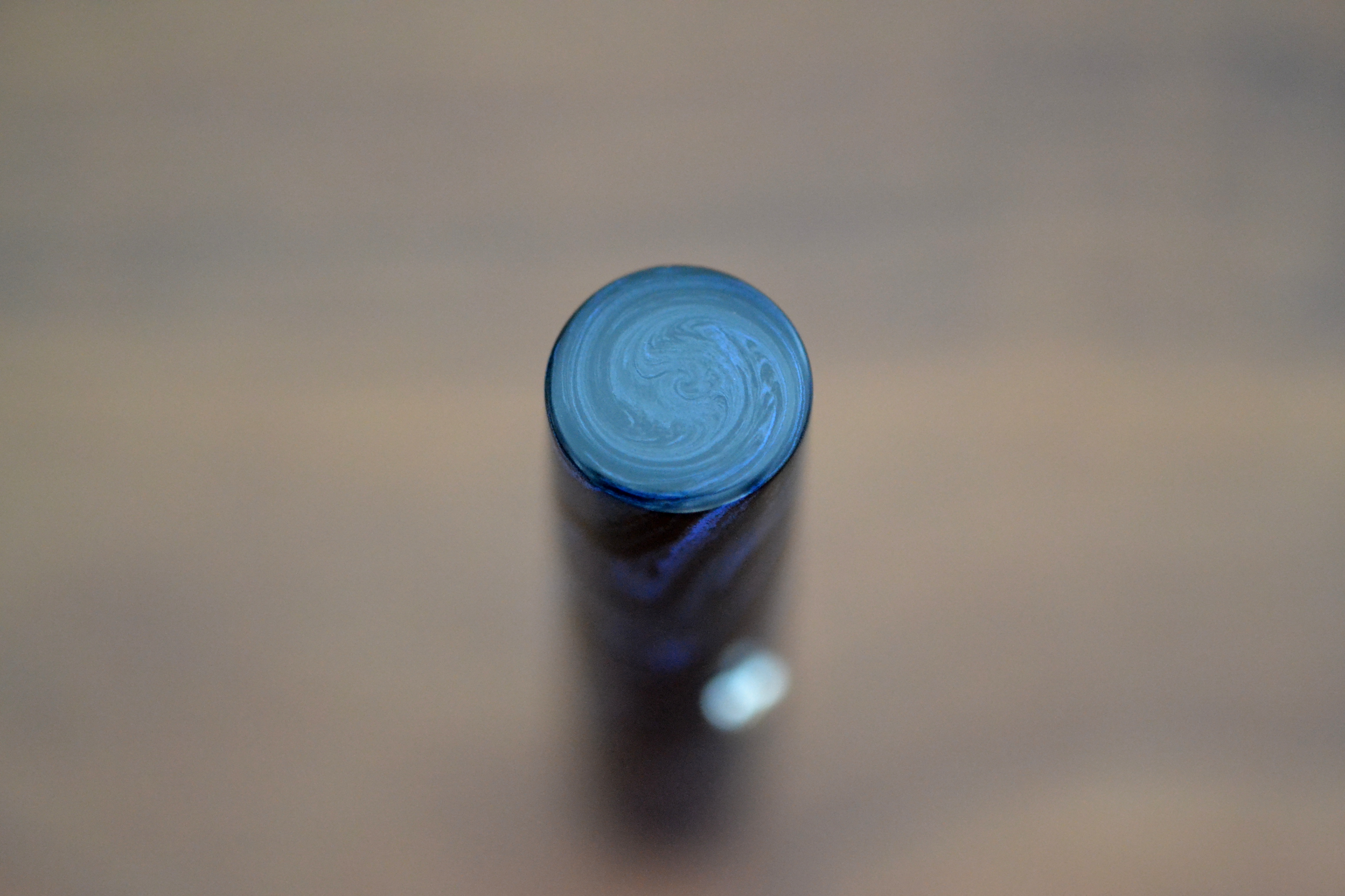
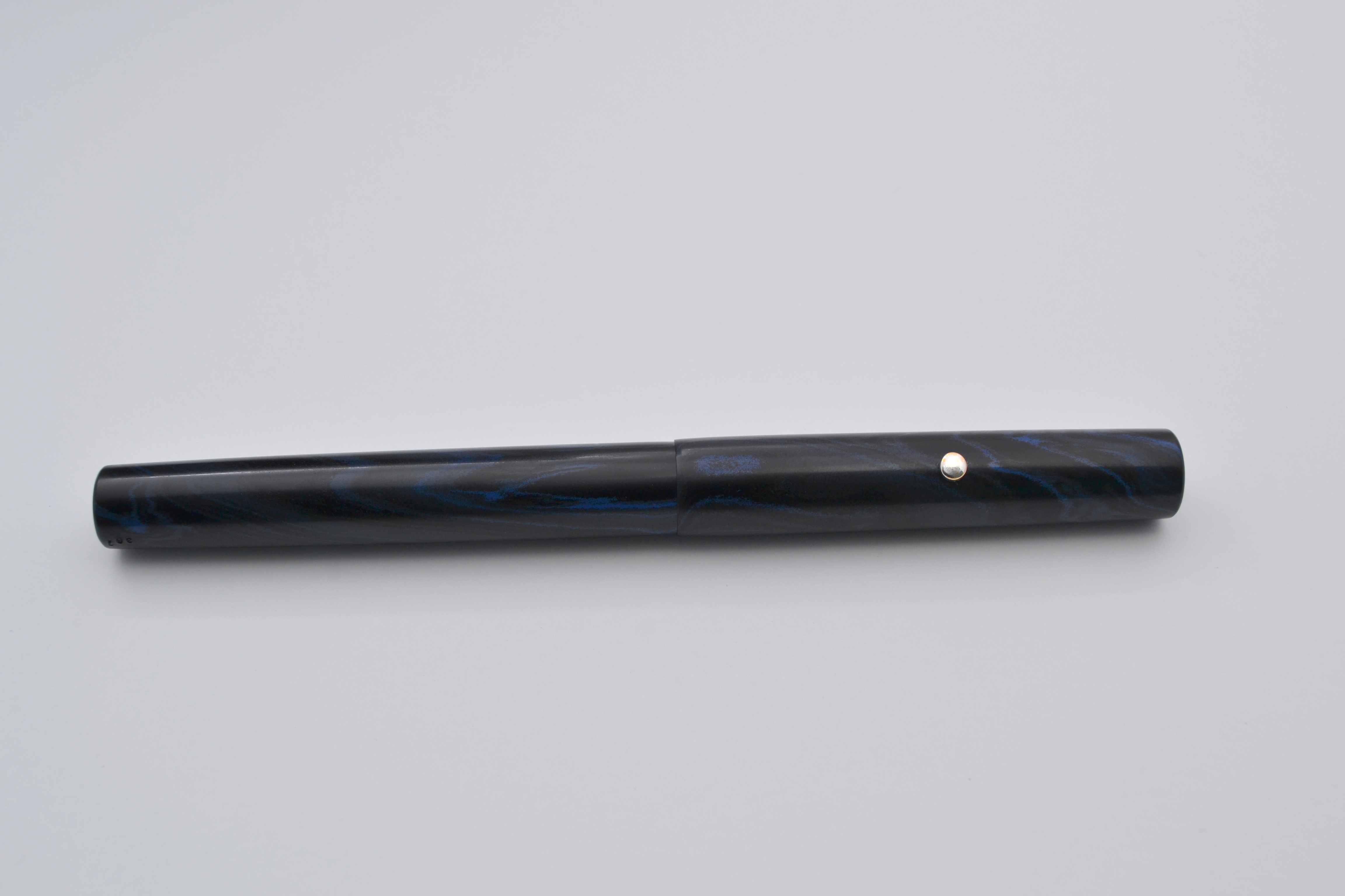
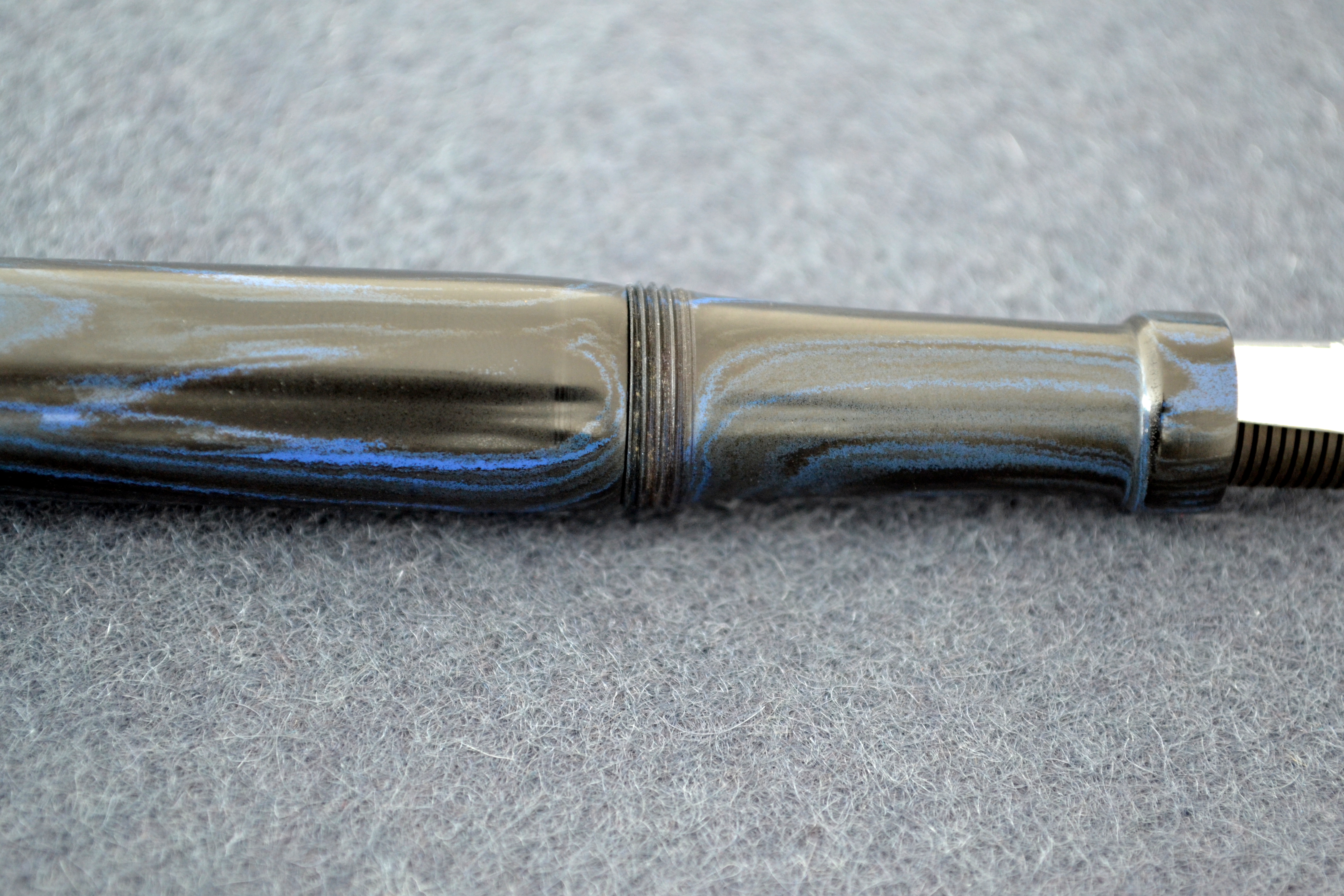
The design of the Essential is ultra simple, flat ends, slight taper on the cap and barrel, and a rhodium plated solid silver roller stopper. The blue and black mottled rubber has a nice semi-matte finish.
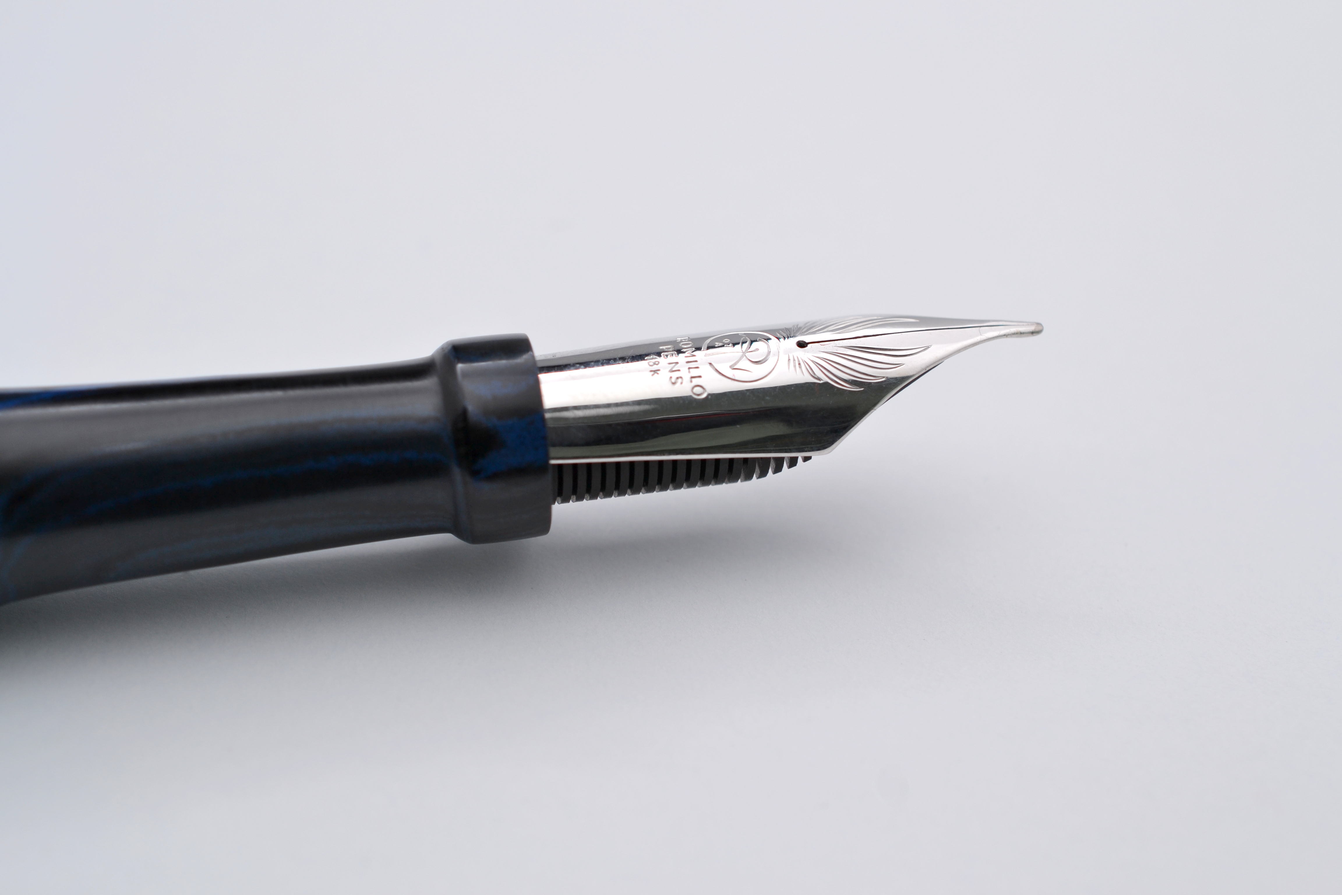
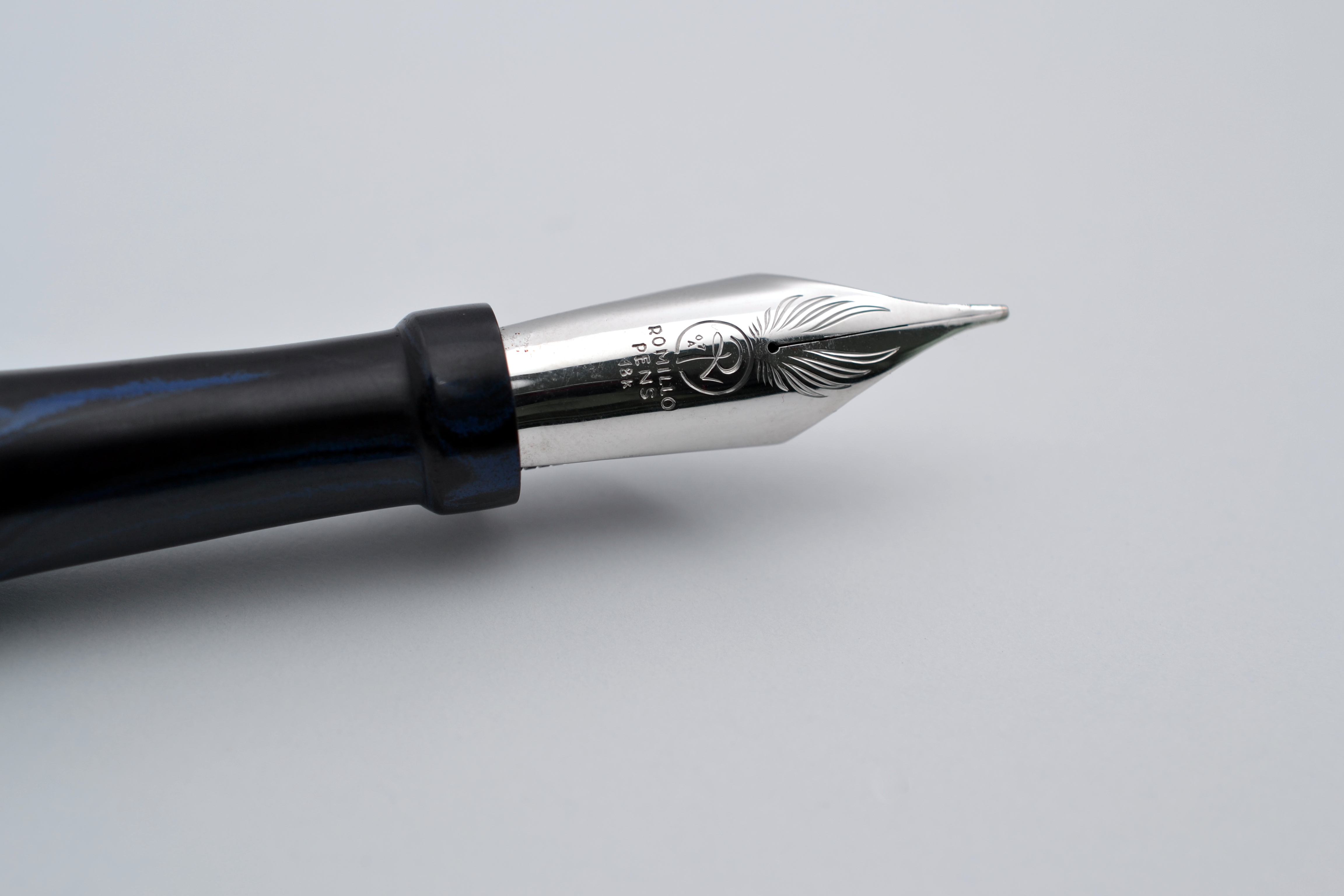
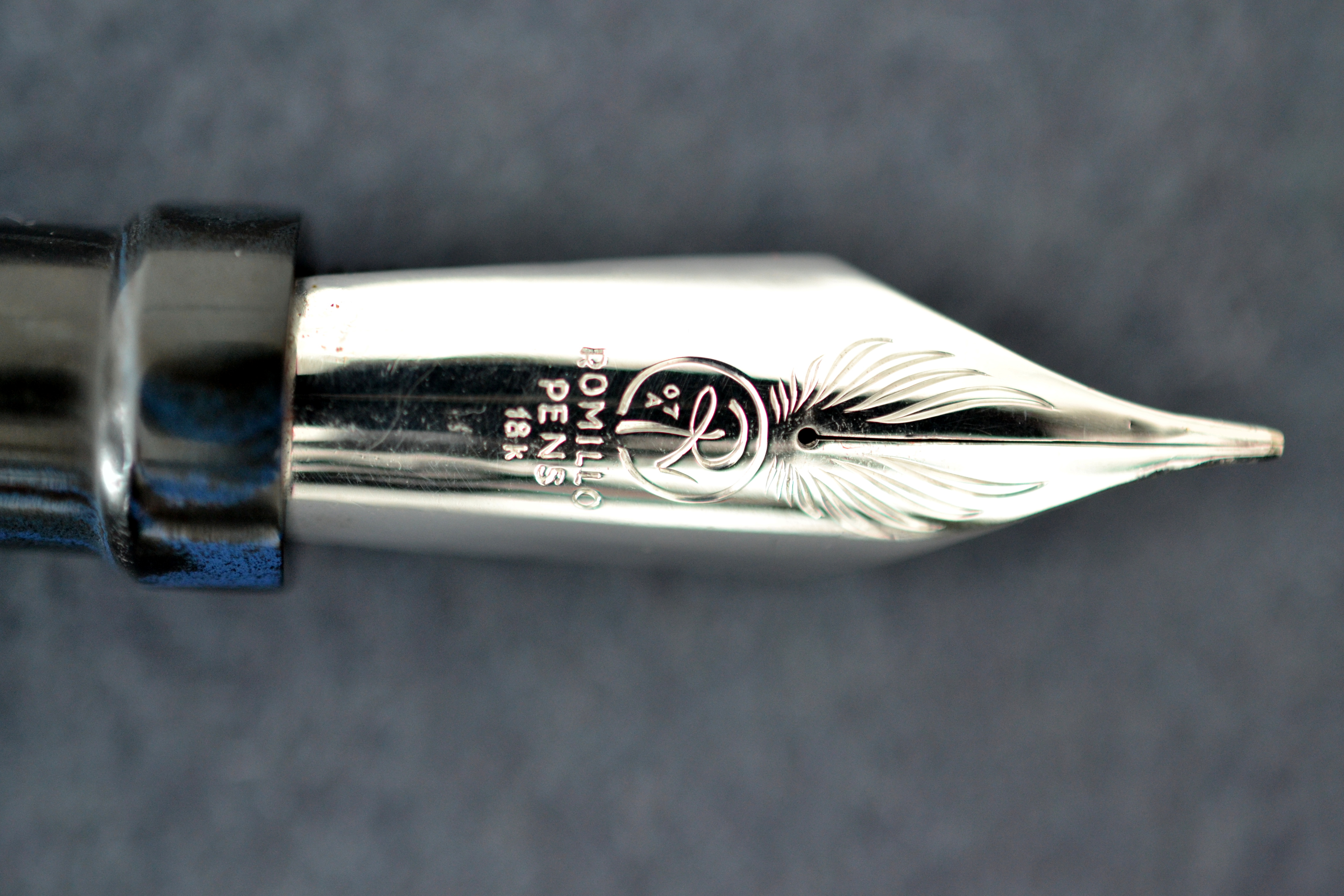
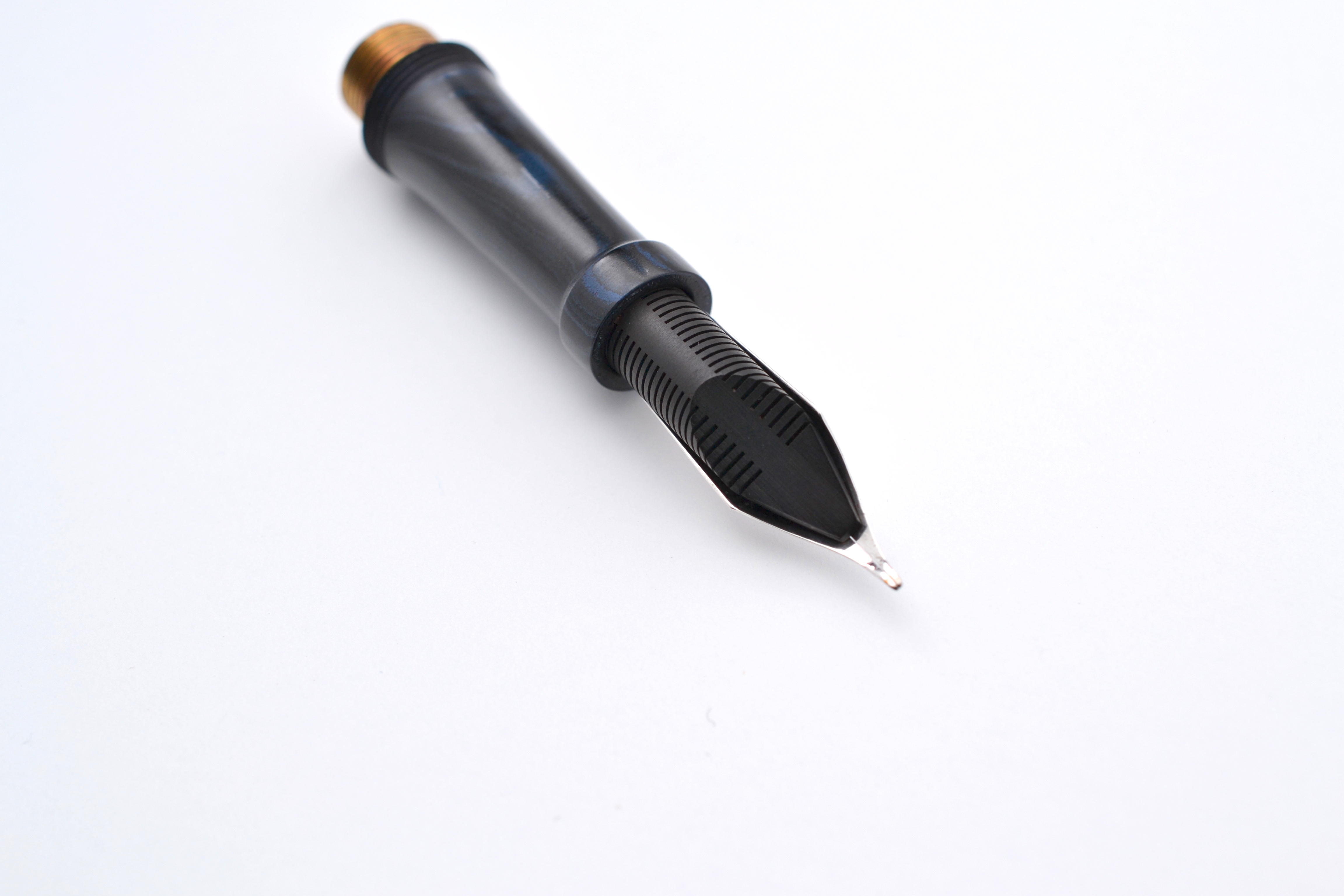
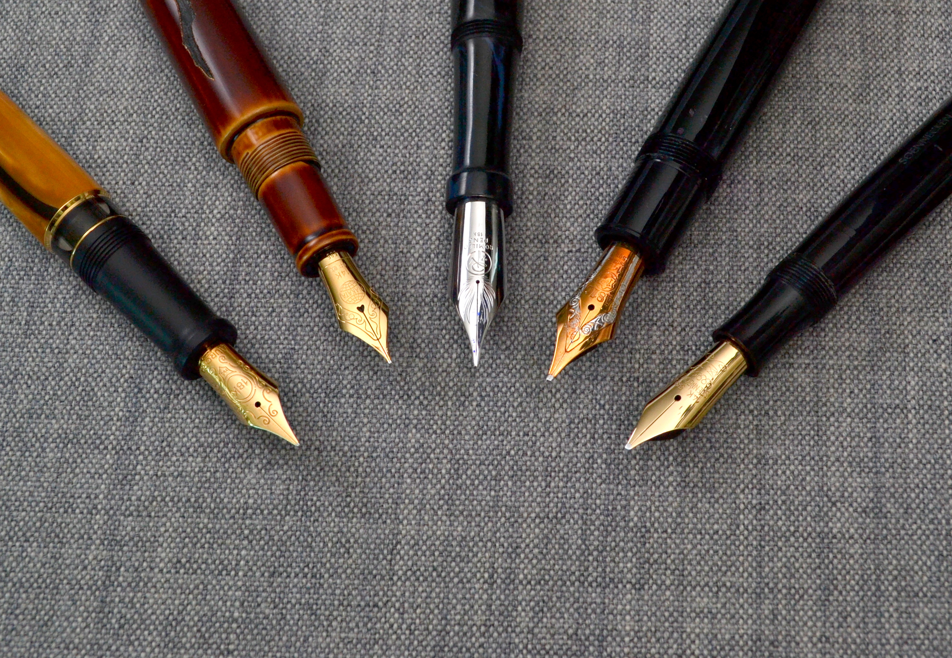
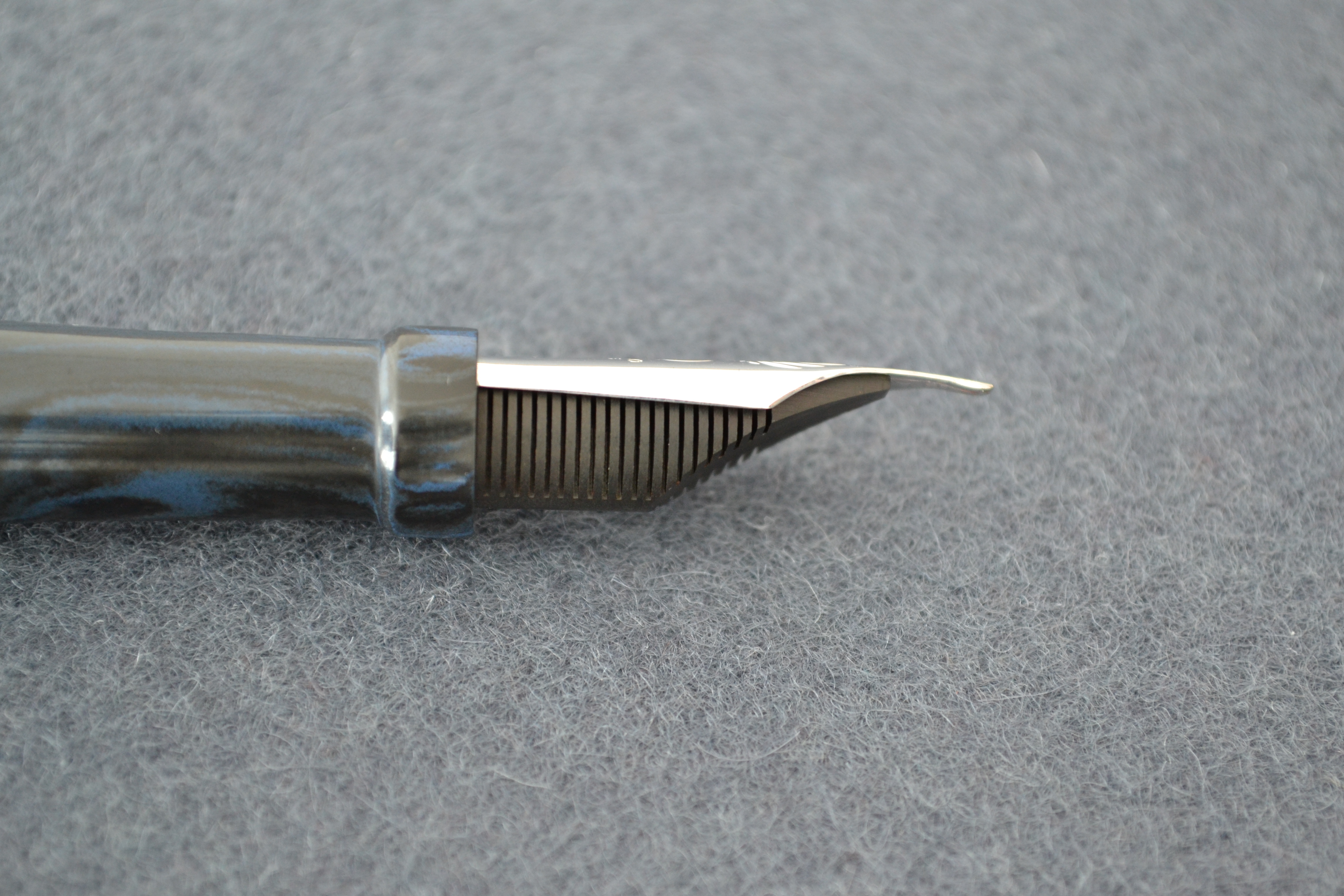
The rhodium plated 18kt gold nib is enormous and paired with the skinny the long skinny pen body it really stands out. The nib features hand engraved wings and the Romillo logo.
I am very fond of the Essential’s simple shape, it’s not flashy, it’s subtle.
Swirled mottled rubber on the top of the cap
Score: 5/5
Build Quality
The Essential is all hand made and this shows for better or worse. The fit and finish of hard rubber is excellent with not flaws that I could detect. It is a beautiful material.
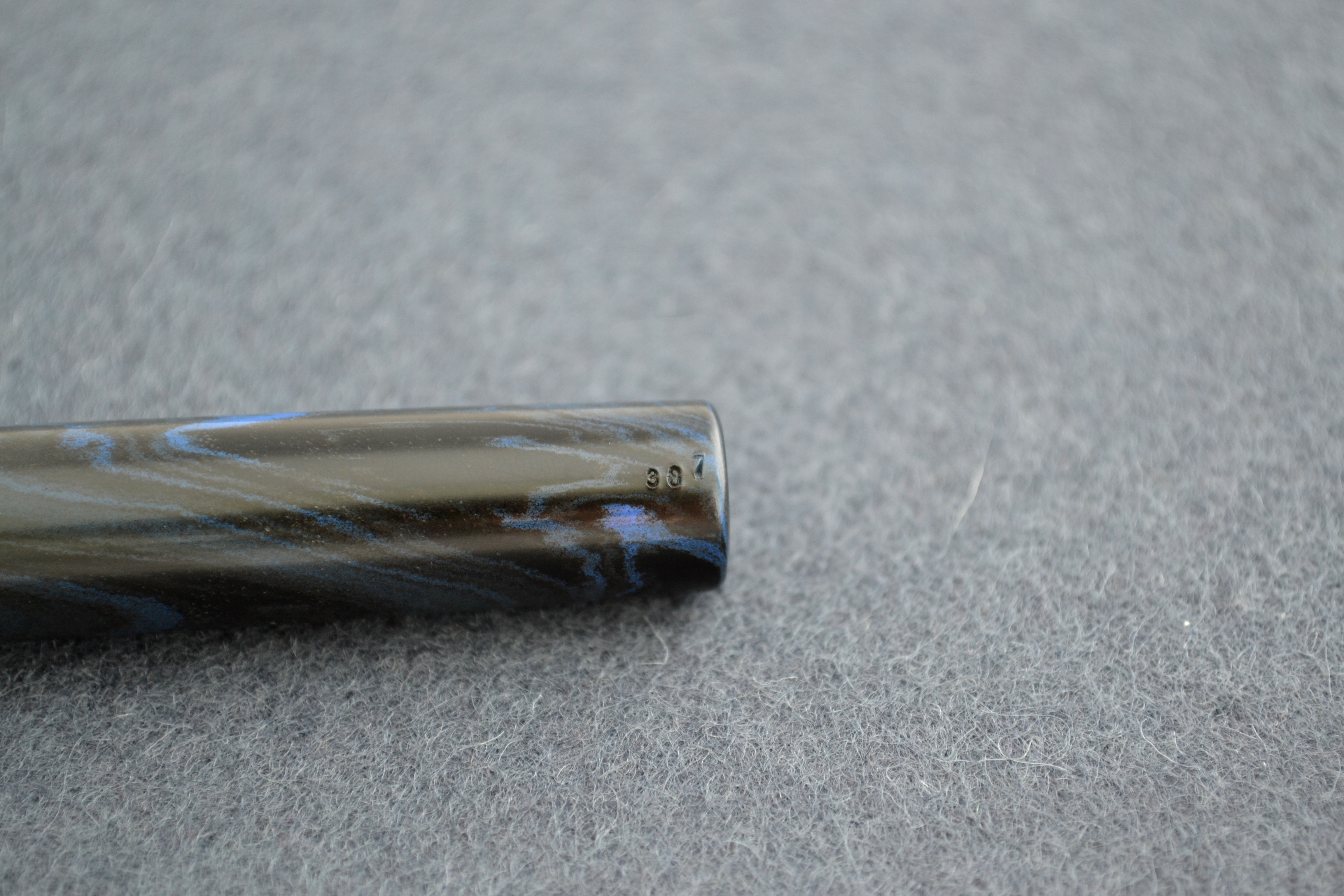
There is an engraved number on the end of the barrel that isn’t well aligned and while it does not bother me, I point it out simply because I have never seen a pen numbered in this (sloppy?) way.
My Essential is #387
The cap material is very thin but so far no issues to report.
The finish on the nib is not perfect. There is a dirty area on the left side at the base of the nib. It is some sort of flaw in the finish.
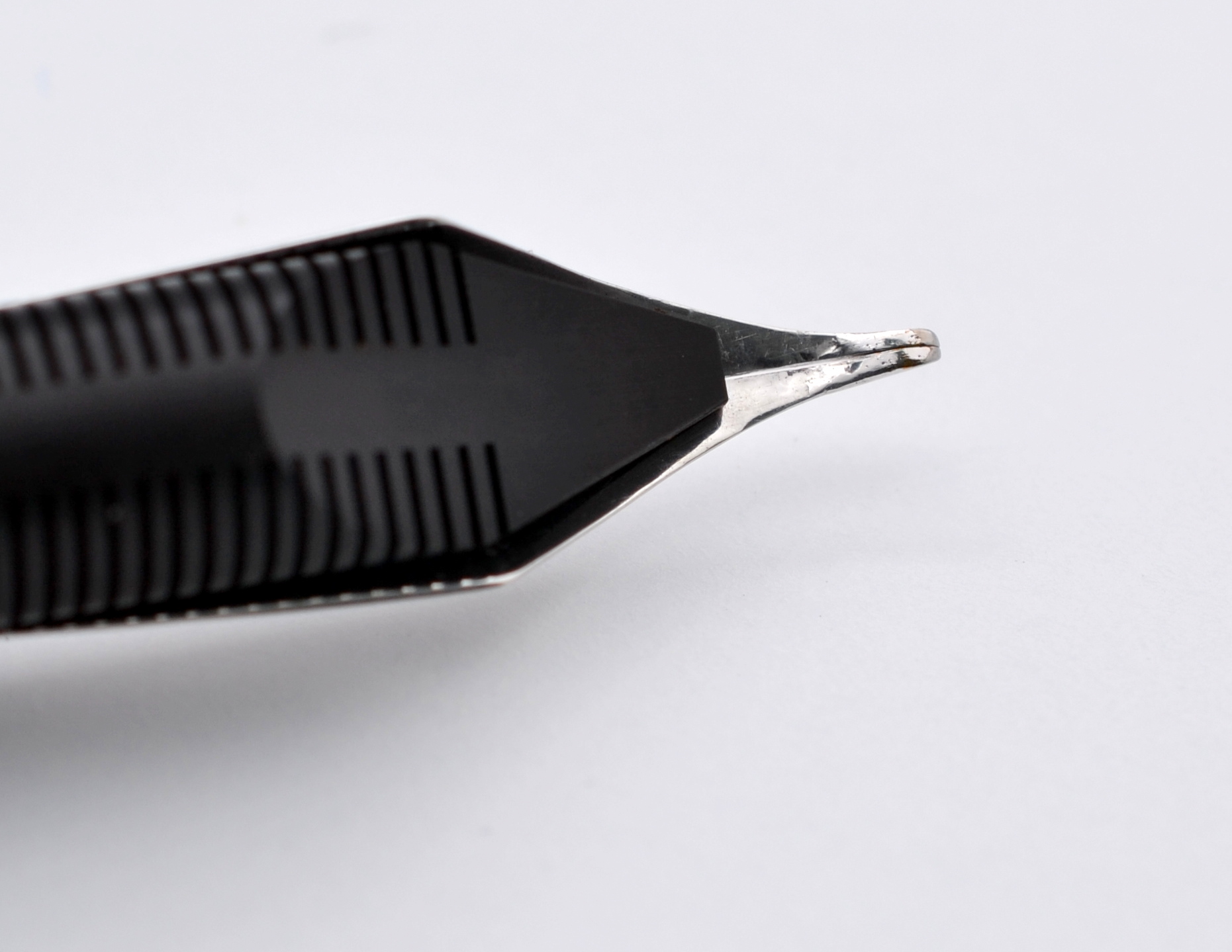
On the left tine if you look closely you can see what I am guessing is an air bubble in the rhodium finish. Neither of these imperfections are really noticeable. My fingerprint on the nib looks much worse than any of these flaws. If you turn the nib upside down you can see that the underside of the tines are badly finished. This flaw stands out the most.
Badly finished tines
There is a lot more handiwork that goes into making this nib than I have seen with other “handmade” pens. I suspect that these flaws are a byproduct of more manual processes. These imperfections could likely be avoided but the end result is still a beautiful and unique handmade nib.
When I think of the best fountain pens made today, I think of Japan and brands like Hakase, Nakaya, Ohashi-Do and Pilot/Namiki; while their nibs are of excellent quality they are all more or less based on a mass produced nib and that is where Romillo really stands out.
Score: 3/5
Size & Weight
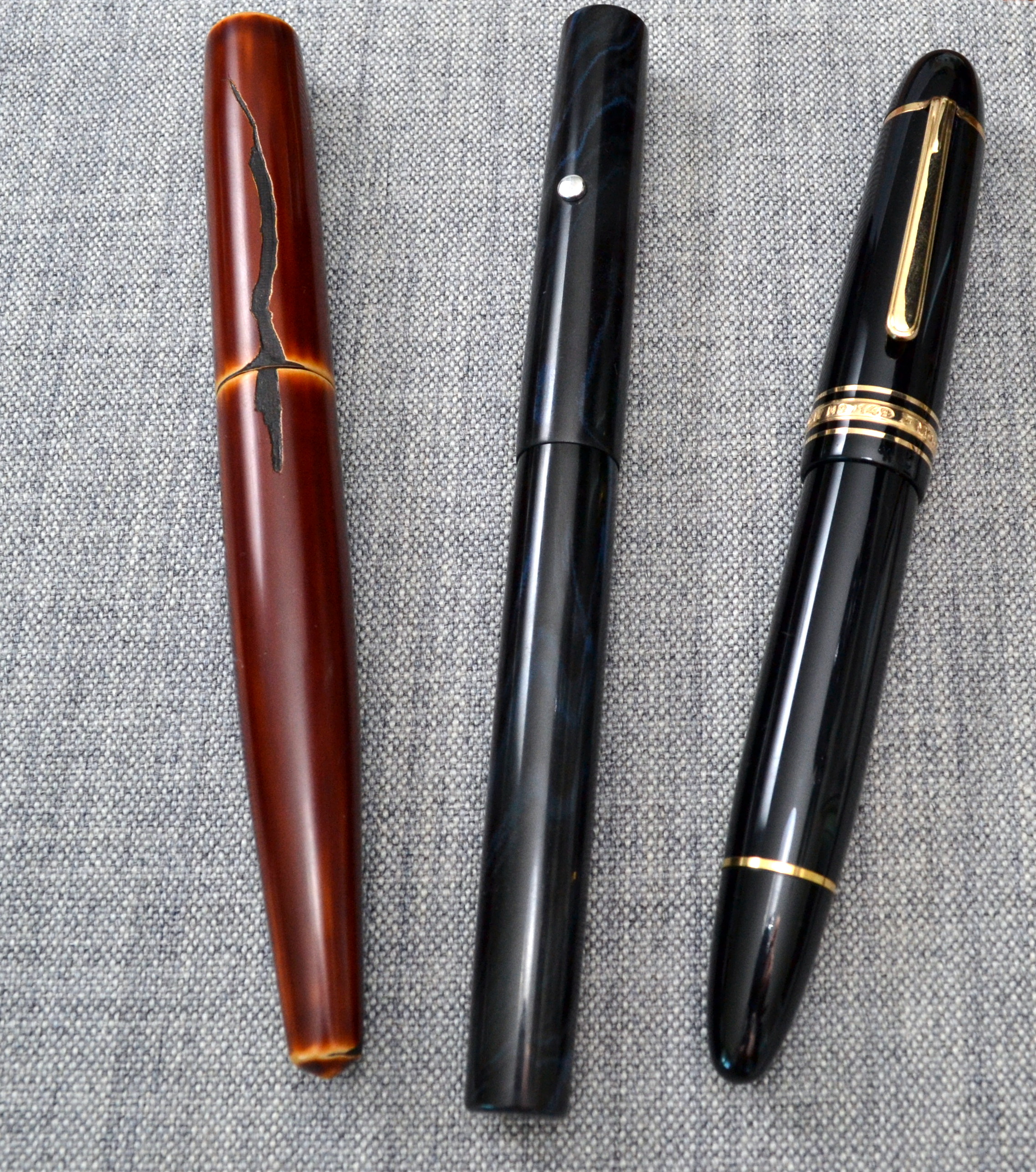
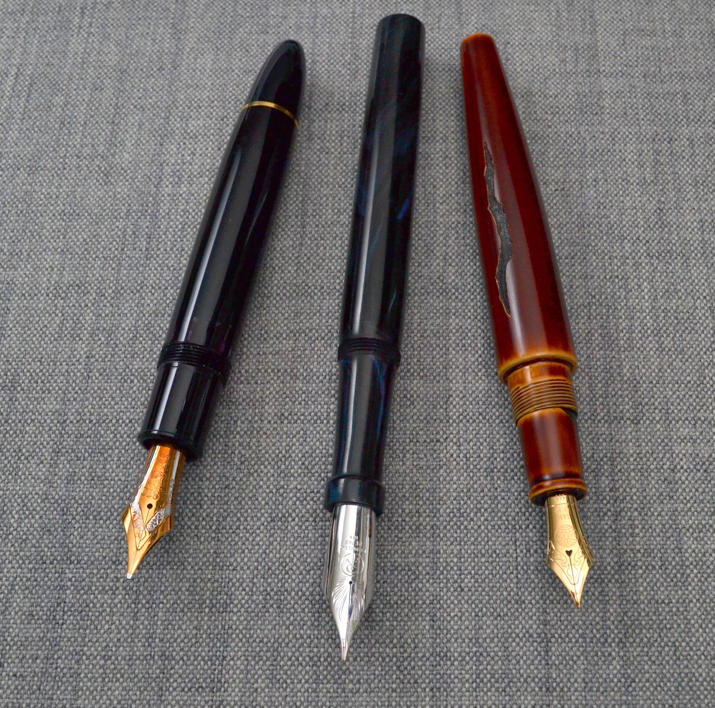
The Romillo Essential #9 can be ordered in a custom length for no additional fee. I went for the standard 153mm length (capped). The Essential is a very long pen. It’s longer than my Nakaya Naka-ai and my Montblanc 149, yet it is skinner than both of them. At it’s widest point its about 14mm.
Left to right: Nakaya Naka-ai, Romillo Essential #9, Montblanc 149
Uncapped the Essential measures just under 15mm. The pen can be posted but the cap doesn’t sit very far onto the back of the barrel.
The Essential weighs a 26 grams empty. Because of the brass threading it is not well balanced and makes for a nib heavy pen even when posted.
The nib is nearly 30mm long and I found “finger writing” to be quite uncomfortable with this pen. When I use my arms to write (as one should) I found no discomfort after 5 pages of writing.
Left to right: Aurora Afrika, Nakaya Naka-ai, Romillo Essential #9, Montblanc 149, Soennecken 1 Extra
If I were to do it again I would opt for the smaller #7 size nib as there are times when I do revert back to finger writing.
Score: 2/5
Performance
Performance is what a Romillo is supposed to be all about. My nib was setup to be a “semi-flexible” 0.7mm italic with a generous flow. First things first, it is not semi-flexible in the way that a vintage nib can be. The tines do spread with ease compared to a modern rigid nib but it is no where near as soft as a vintage nib.
A huge thirsty ebonite feed
In addition to the enormous nib there is an enormous feed and I found that when freshly filled it can take a little while to get going. Once it starts flowing there is no interruption in service and the pen performs beautifully.
Again, there is an issue with “finger writing”. The nib, like most italics, has a sweet spot but unlike other italics I have come across, the Romillo doesn’t provide the same sharp feedback, so initially, I found it difficult to get the pen writing properly without skipping.
If you write (again, as you should) with your arm and not your fingers the nib works flawlessly.
The biggest success of this pen is the nib, it feels like none other.
Score: 4/5
Filling System
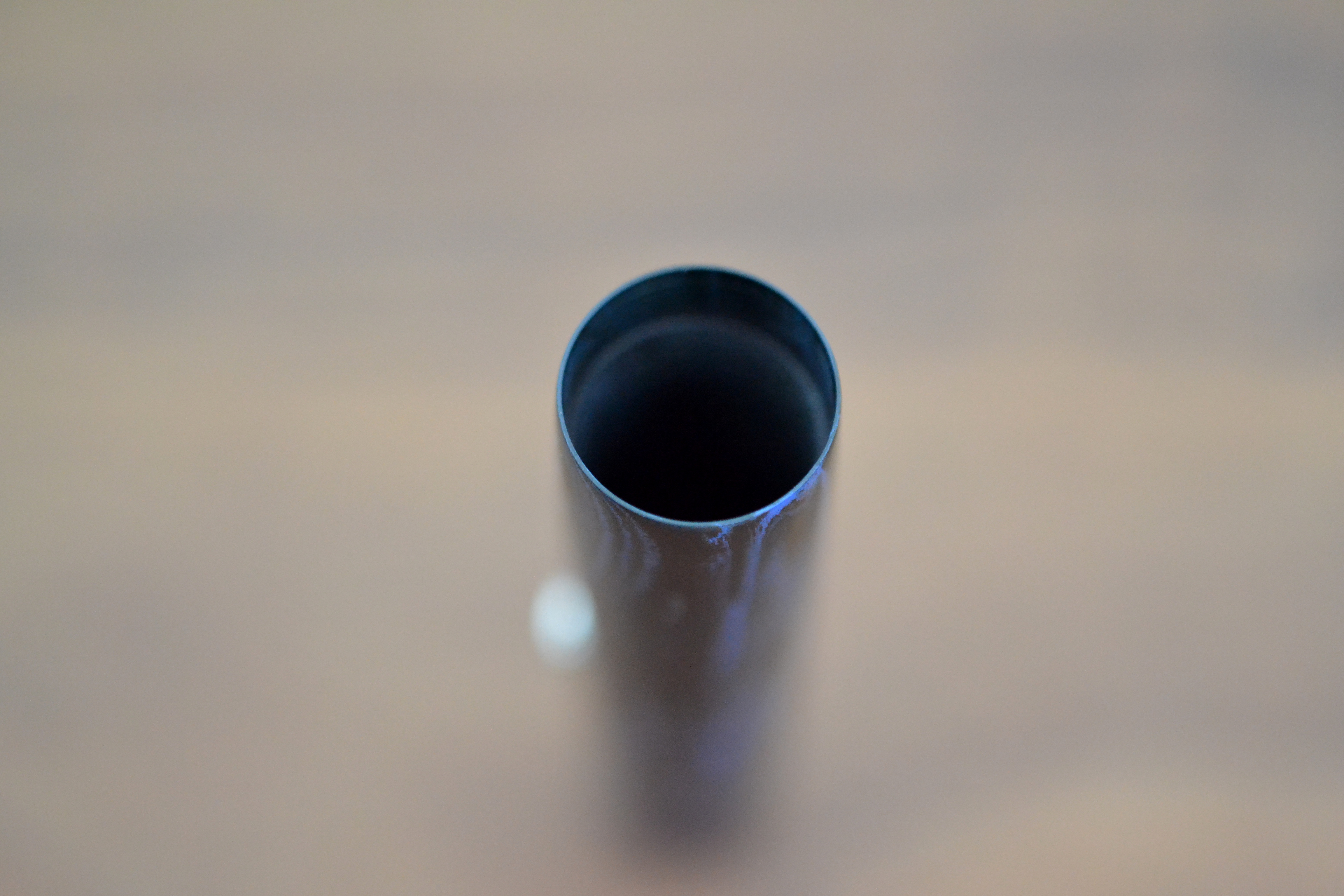
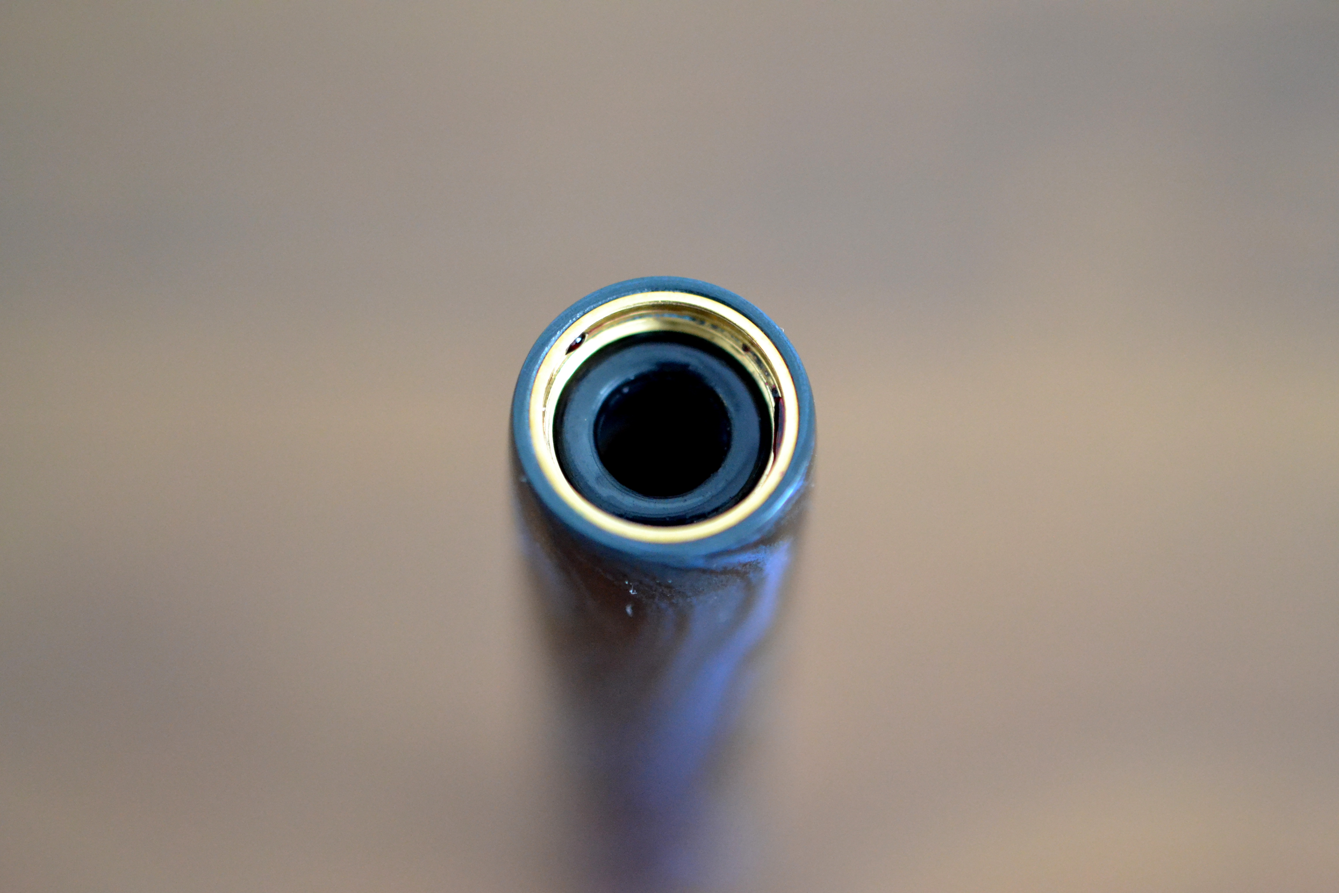
Pens fitted with #9 nibs are only offered as eyedroppers and I was told that was because a converter could not provide enough ink flow to the feed. The #9 is indeed very thirsty. The Essential has a large 2.1 ml ink capacity (roughly four times as much as a standard converter) and despite this I find myself having to refill this pen quite often.
Unlike other eyedroppers I have seen this one uses brass threading and a rubber o-ring to seal the pen.
Brass threading and O-ring
I don’t know if the brass will do anything to the ink or if the ink will do anything to brass but to me this is an unusual application of brass.
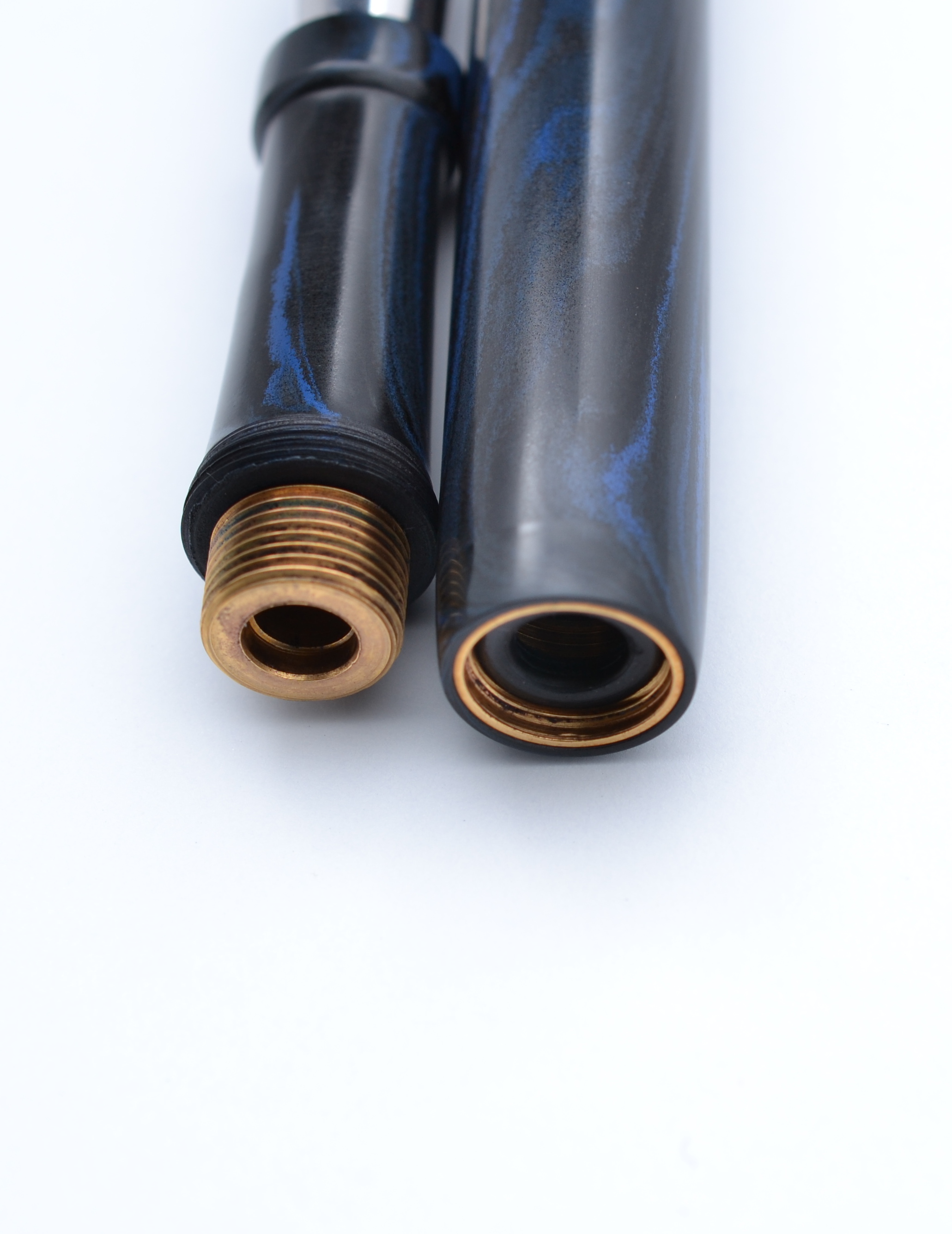
When filling this pen I recommend being conservative with the amount of ink you fill it with. 1.7ml is pretty safe. If you fill up to the O-ring you are going to have a mess on your hands as when the section is threaded in O-ring is pushed down approximately 5mm into the barrel.
The section in this picture is not fully screwed down
Lastly, it should be noted that screwing the section onto the barrel needs to be done with care. I found that the section needs to be quite tight on the barrel so I had to twist it on more tightly than other eyedroppers I have had to use.
Score: 2/5
Value
With shipping from Spain the Essential cost 965€, that is a whole lot of money for a pen. It is hard to call the Essential a value as there are pens that perform as well for much less money; what those pens will lack though is the personality and feel of a Romillo.
So how does it compare to the likes of my similarly priced Montblanc 149 and Nakaya?
Left to right: Montblanc 149, Romillo Essential #9, Nakaya Naka-ai
From a writing perspective the 149 is the closest. The 149 has an oversized nib and even larger ink capacity. The 14C OB nib on the 149 is softer, and being from the 1970s it has more of a vintage nib feel. The Nakaya shares a similar handmade feel to Romillo.
The Romillo is the least practical of these three pens because it’s the hardest to fill and runs out of ink the fastest. That said, no other bespoke pen maker that I am aware of makes their own nibs; that is reason enough to own one.
Score: 3/5
Bottom Line
The Essential #9 has a unique feel and enough charm to make you forgive its faults.