Pilot Custom 743 Falcon Fountain Pen Review

Pilot Custom 743 Falcon Fountain Pen

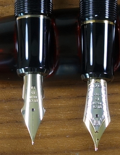
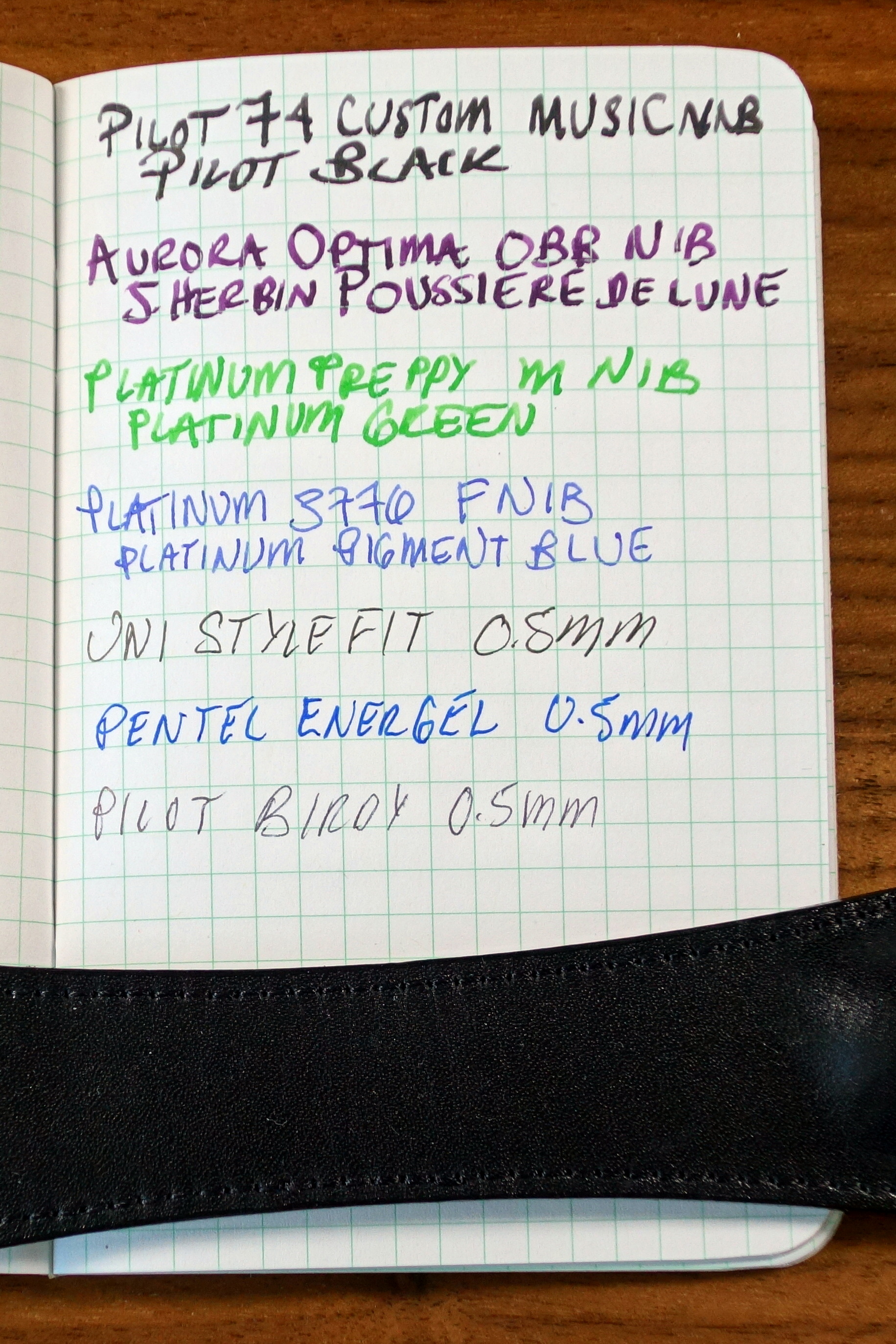
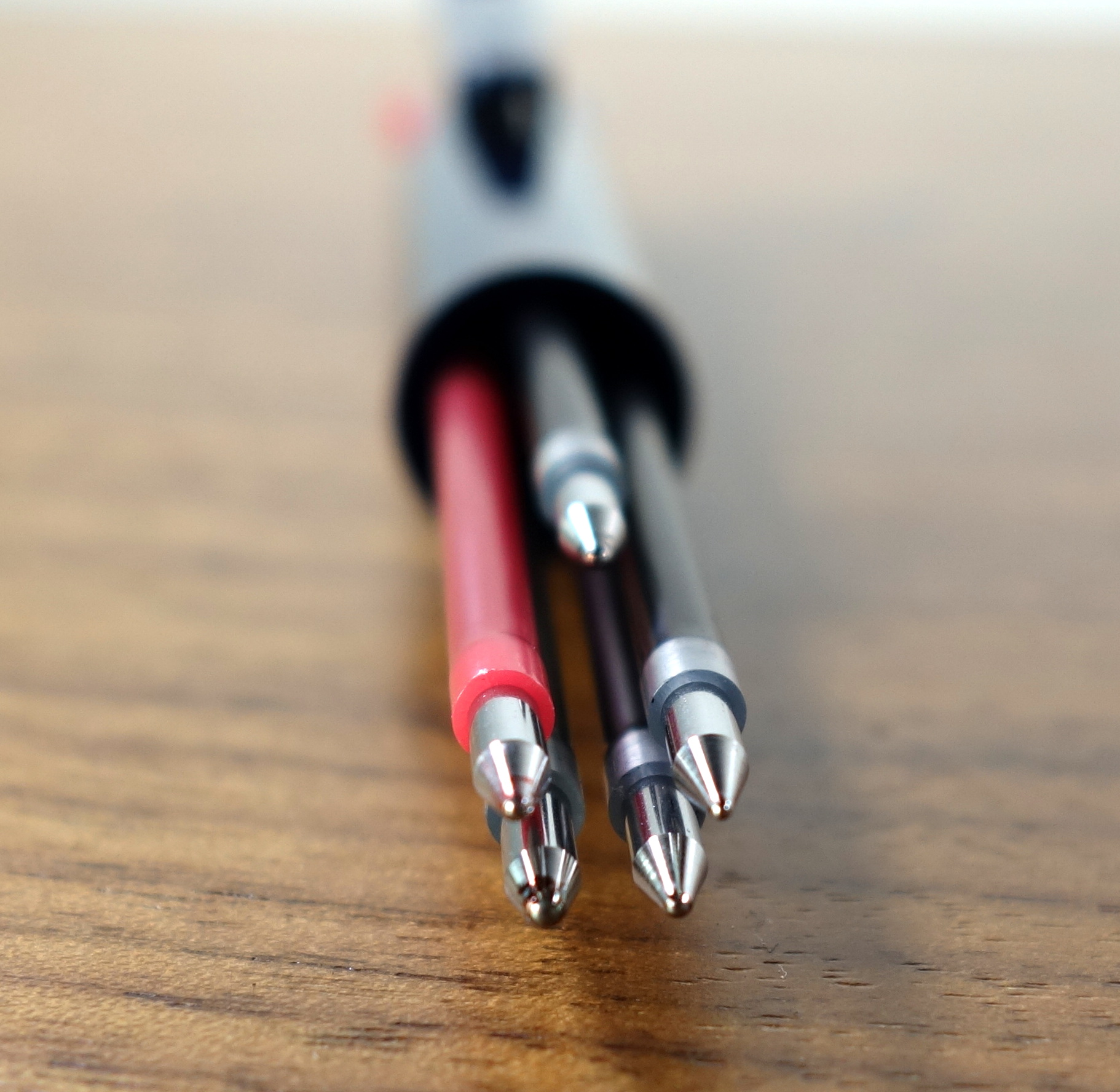
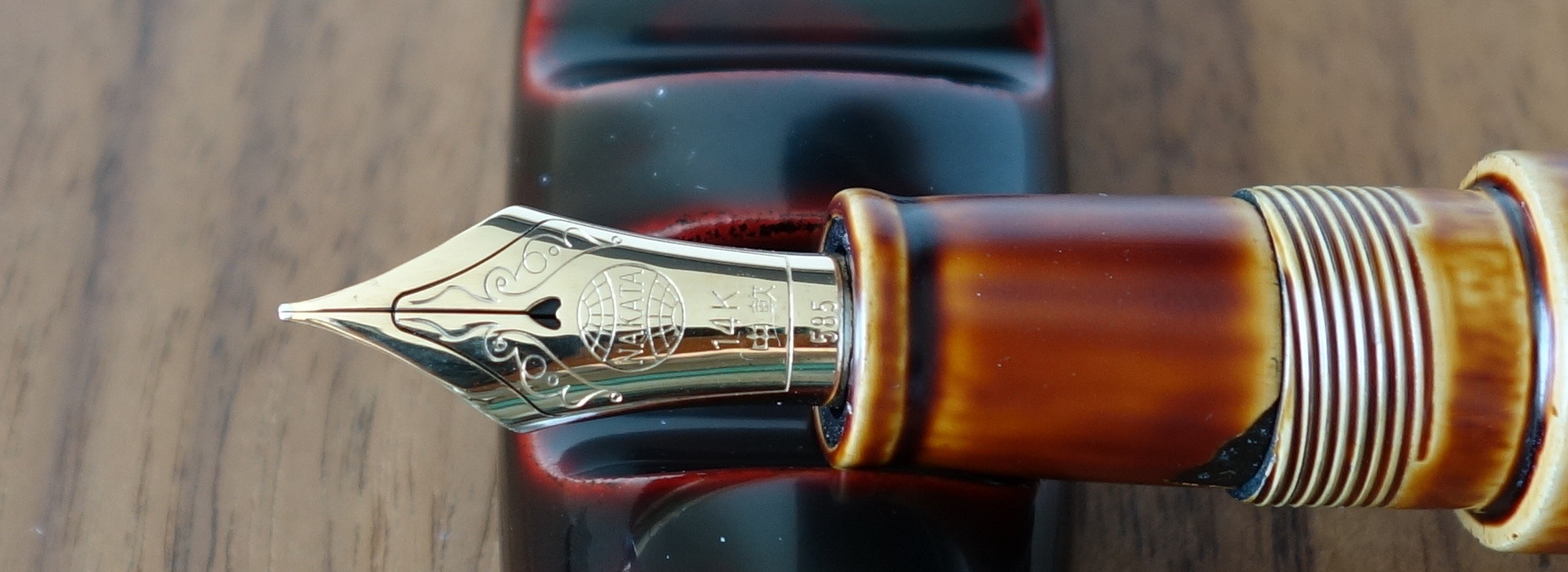
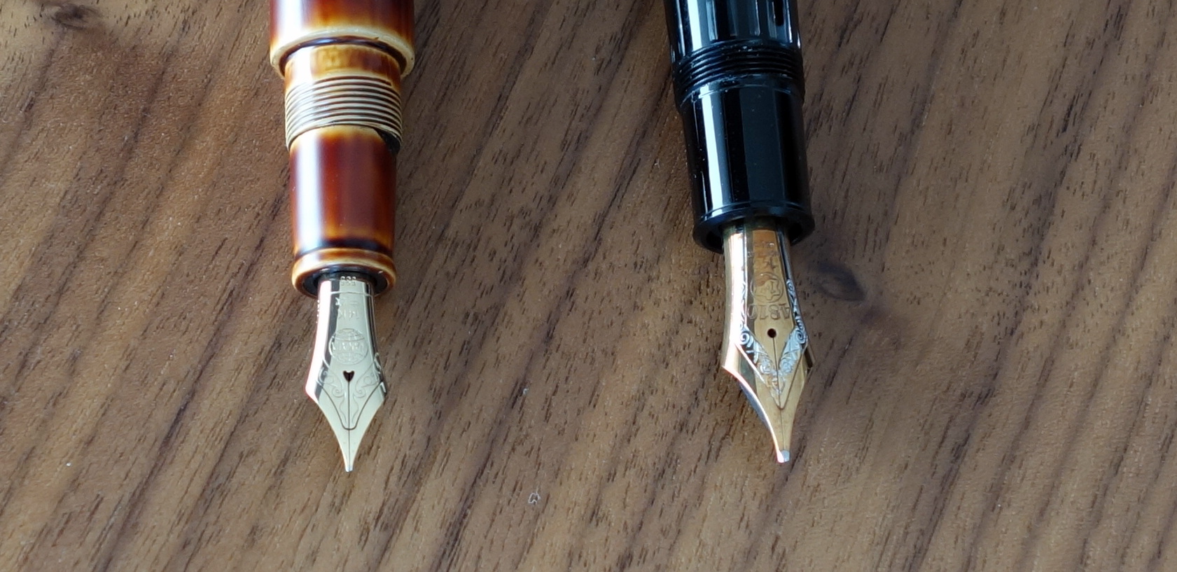
The Pilot Custom 743 is the only pen to use Pilot’s full line of #15 size nibs.  In the store I tried three of the more unusual nibs: a music nib, a Waverly nib and a falcon nib.   I ended up picking the falcon nib, which is a soft flexible nib.  
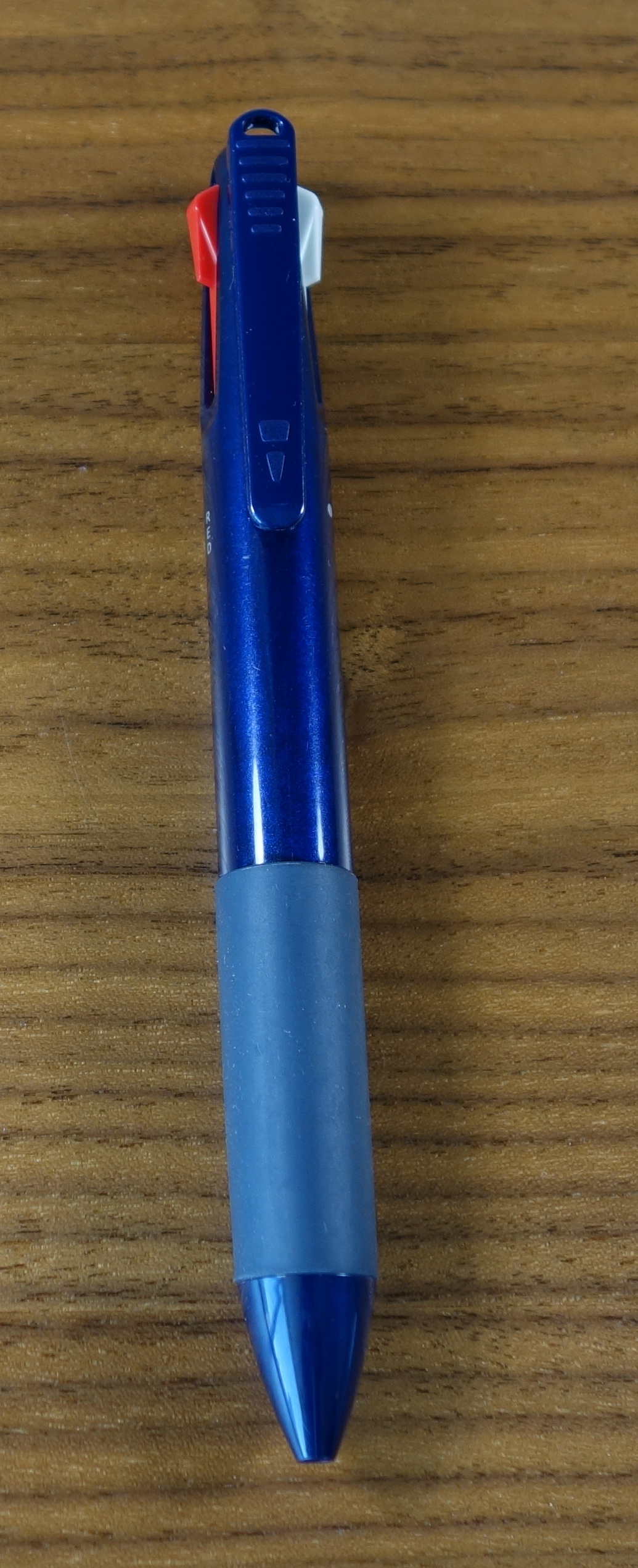
Appearance

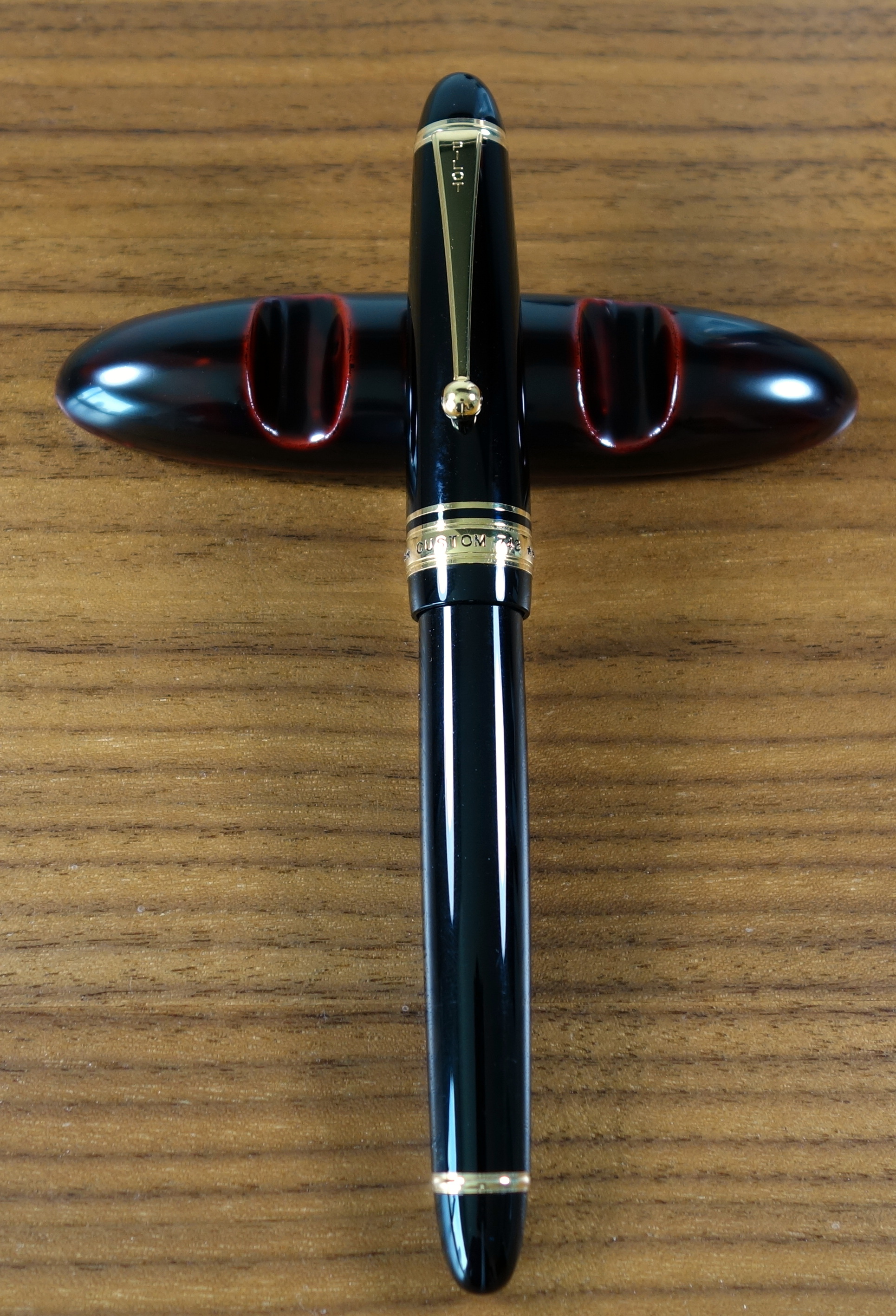
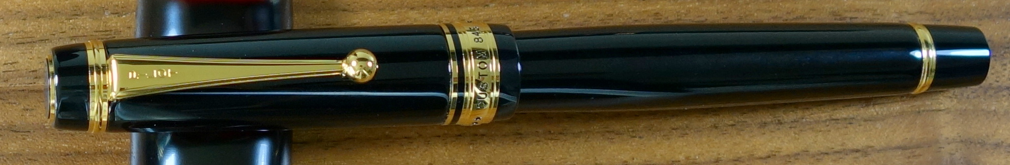
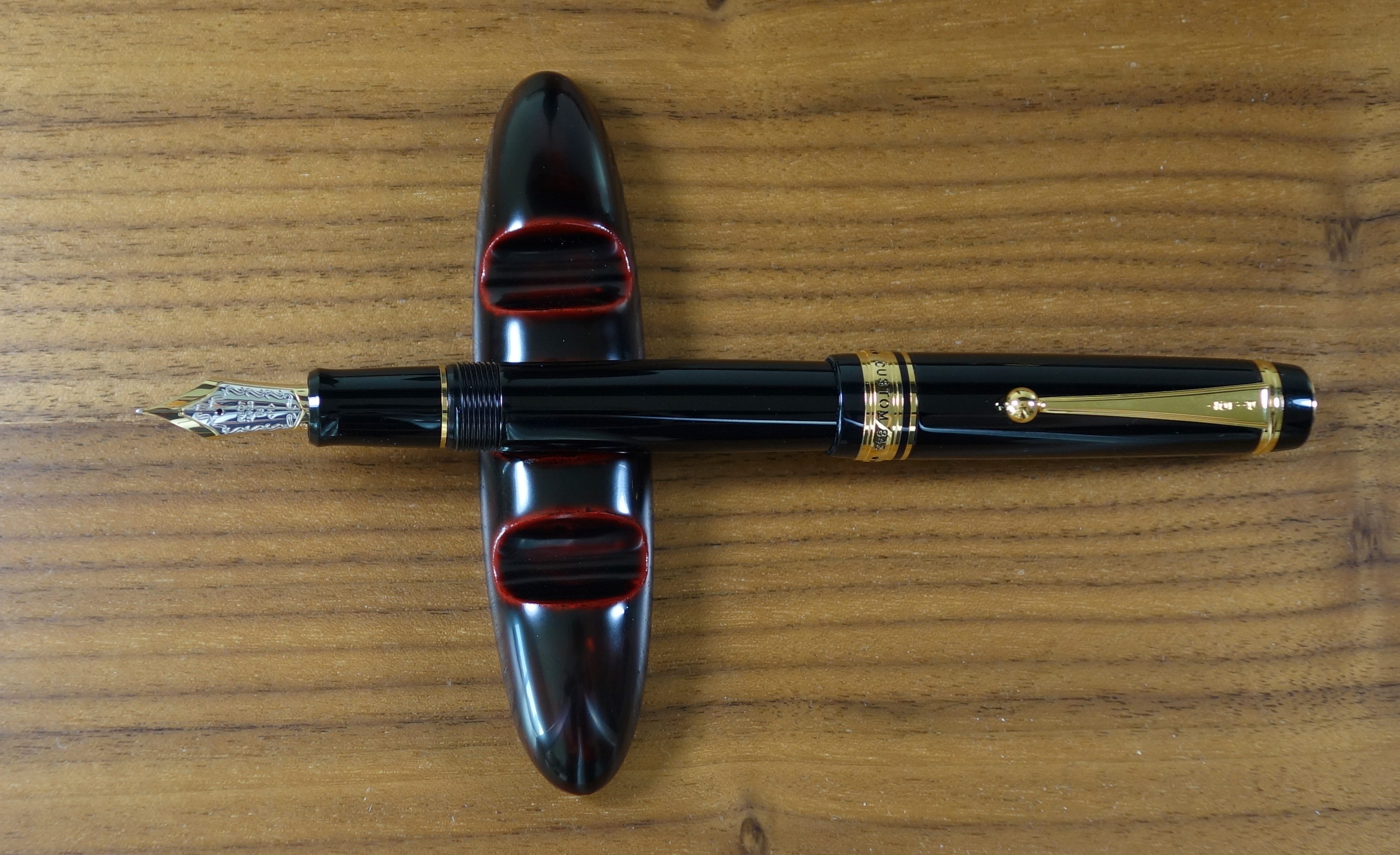
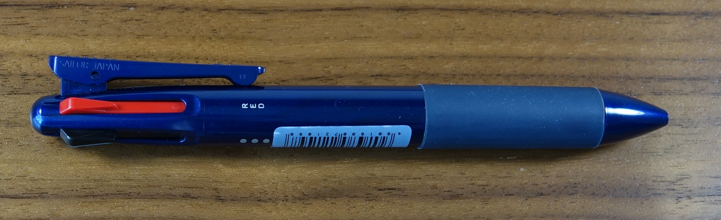
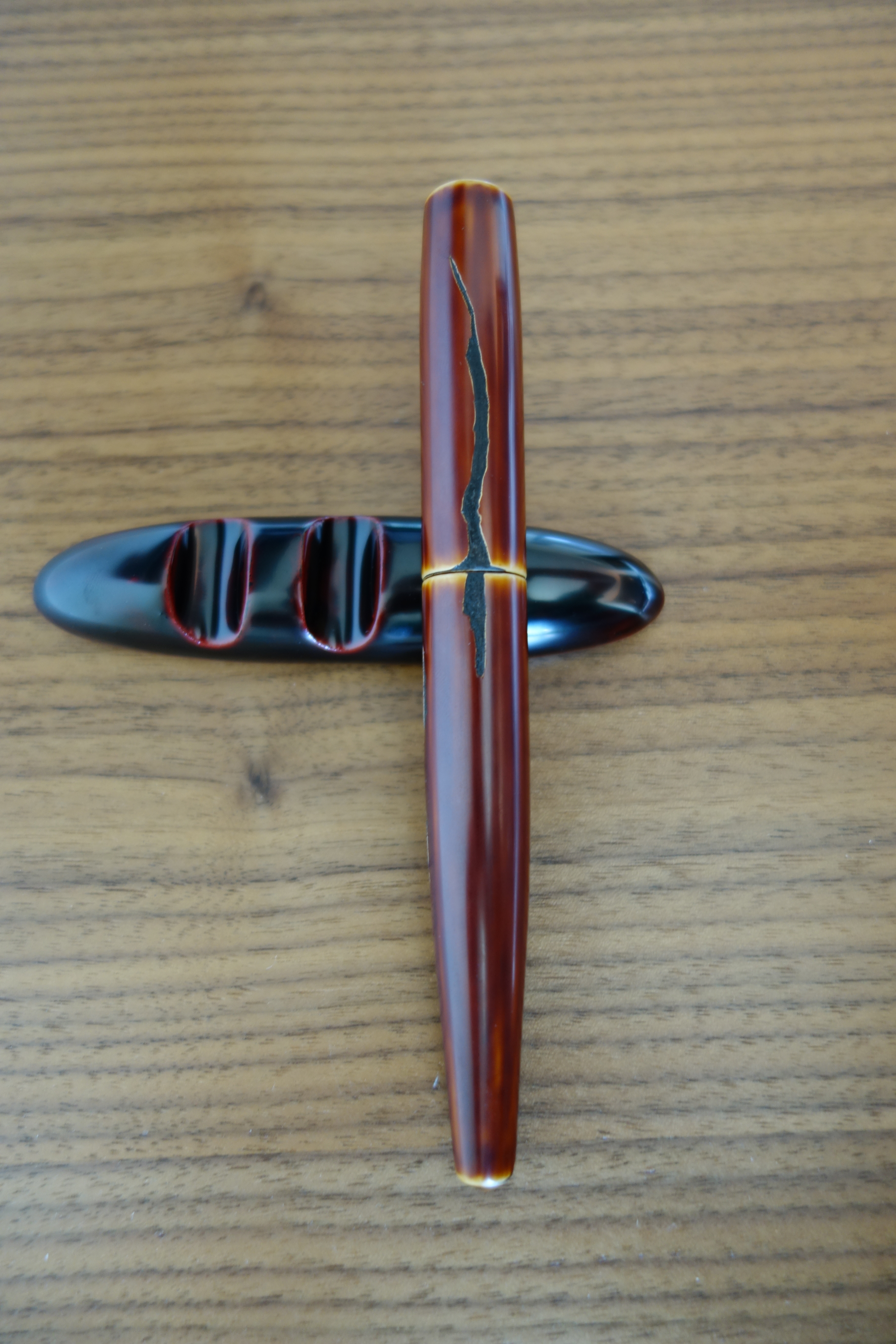
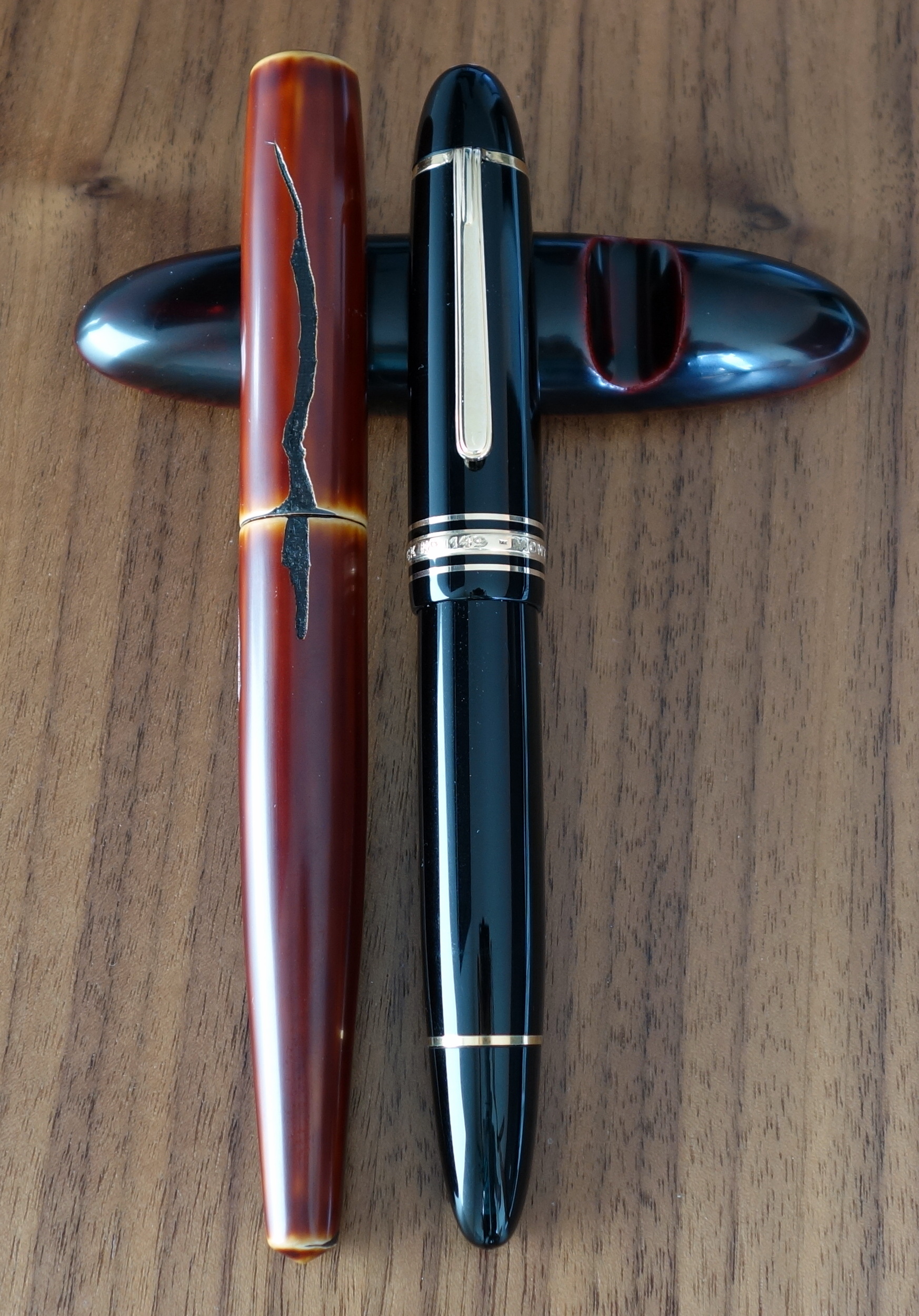
Like most pens in the Custom series, the 743 is a very traditional and classic looking executive pen with a black plastic body and yellow gold furniture.  The trim level is the same as you get on the Custom 823 and they look almost identical.  The trim ring on the bottom of the body is closer to the end of the pen than on the 823 (the 743 has vacuum mechanism to accommodate) but otherwise they look the same.

Pilot Custom 743 Falcon Fountain Pen

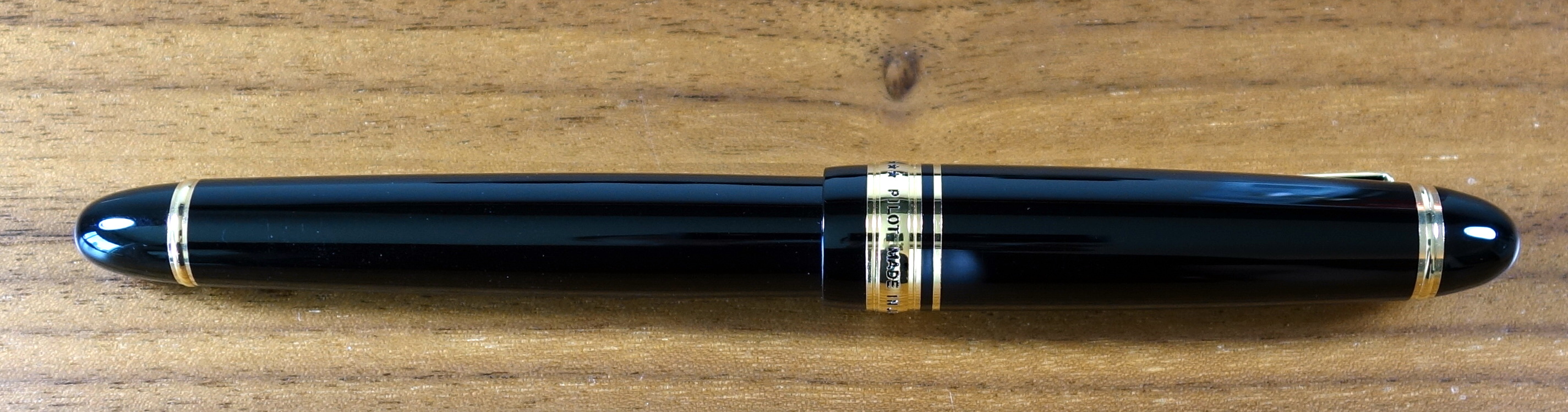
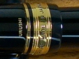
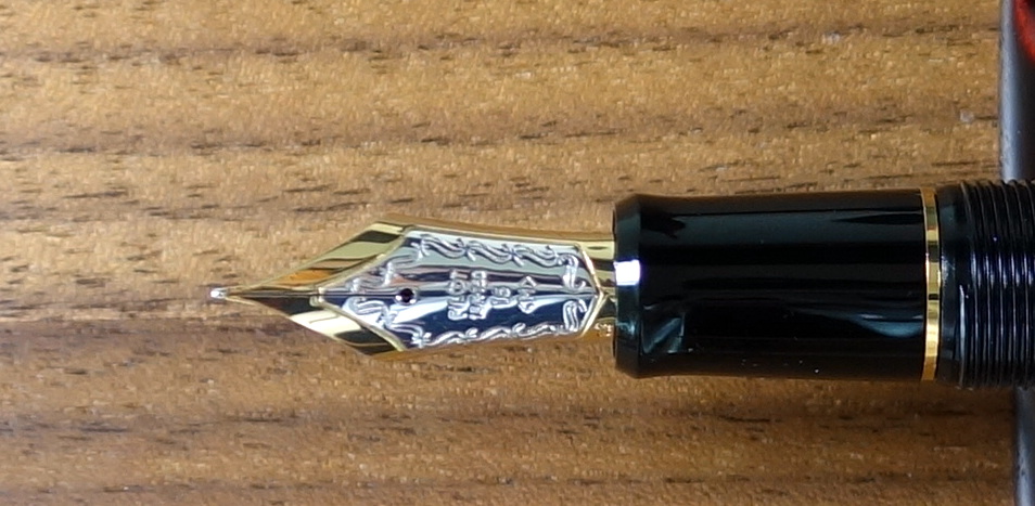
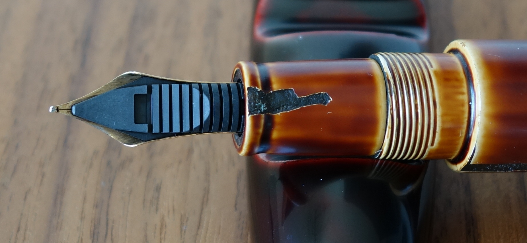
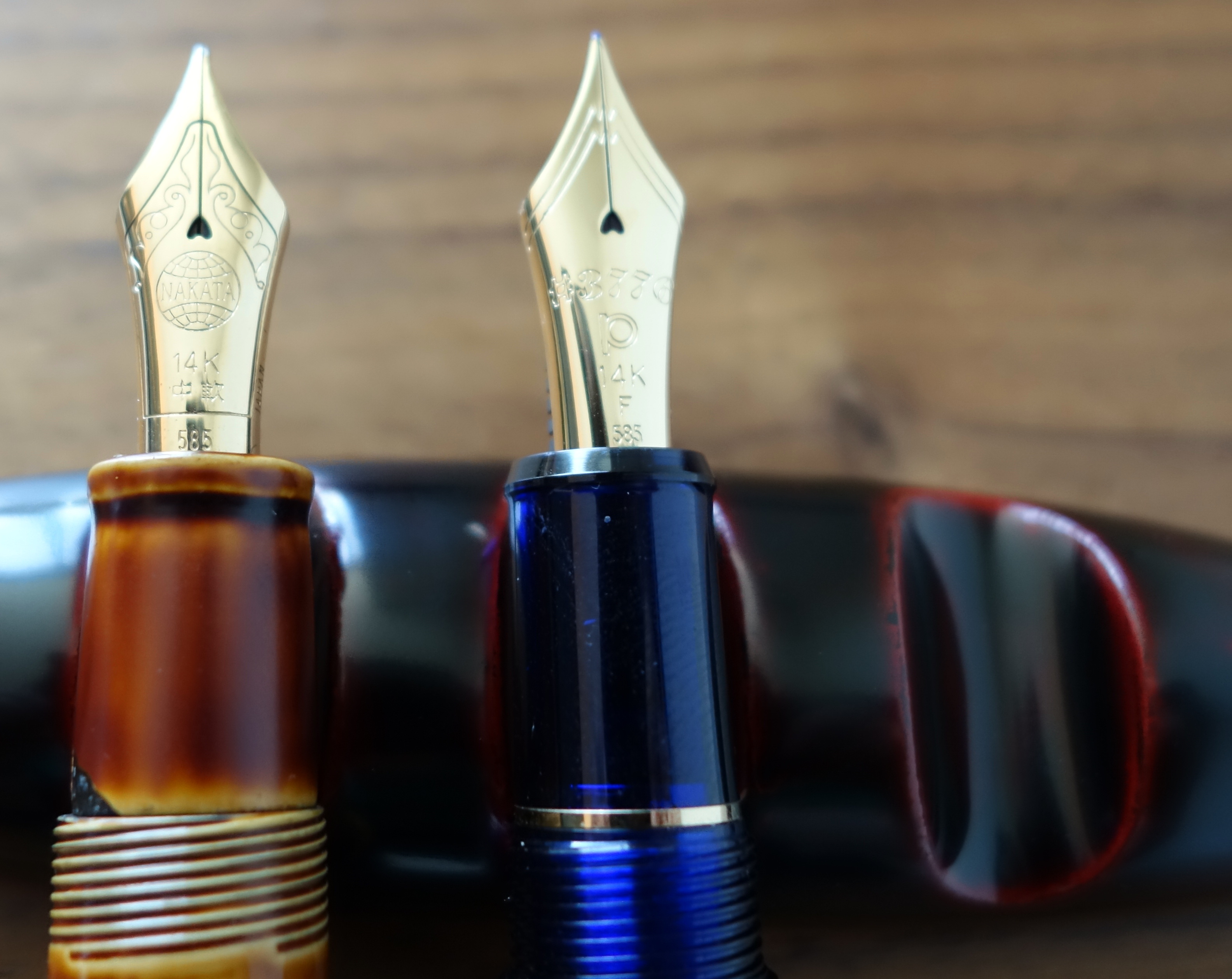
The cap has a rounded top with a clip that starts broad and narrows ending with a ball; this is the classic Pilot/Namiki clip and I think it looks great.  The gold band at the bottom of the cap reads “* * * CUSTOM 743 * * * PILOT MADE IN JAPAN”.  The letters are filled in with black (paint?) just as you would see on the Custom 845 and Custom 823.  The large 14ct gold #15 nib is plain, with no decoration to speak of.  The cuts on the sides of the nib help to increase flexibility and in my opinion make up for the lack of decoration.

Pilot Custom 743 Falcon Fountain Pen


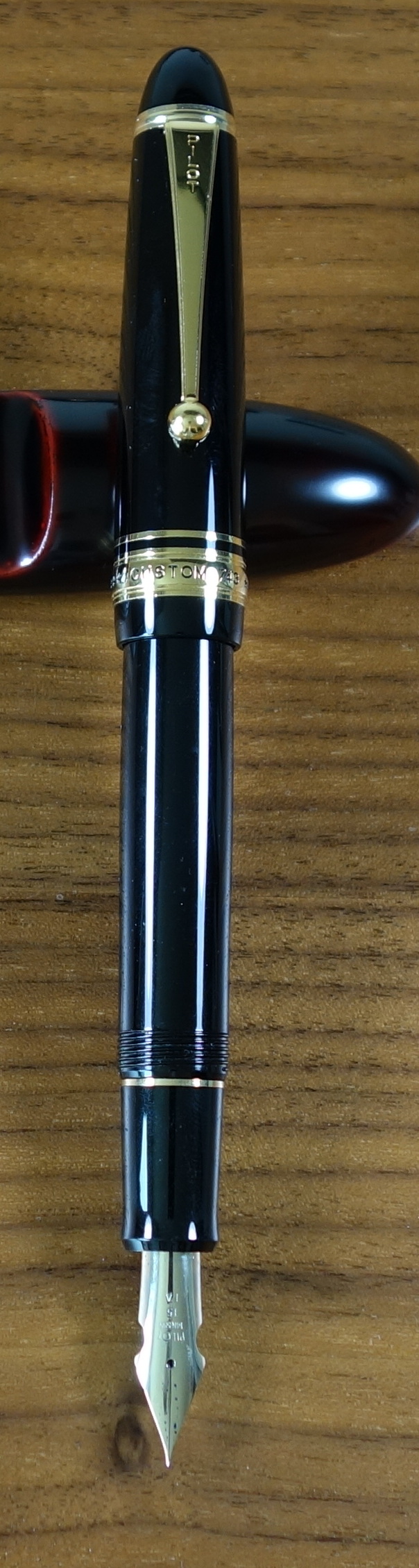
The gold trim is much more yellow in color than the 14ct gold nib.  This is quite apparent with the cap posted.   I would like to have seen the gold match a bit better but it’s not a big deal.

All things considered, the Custom 743 is a clean looking pen with no strangeness to its proportions.  It’s not going to score any points for originality but it’s a nice looking pen nonetheless. Score: 3/5

 Build Quality

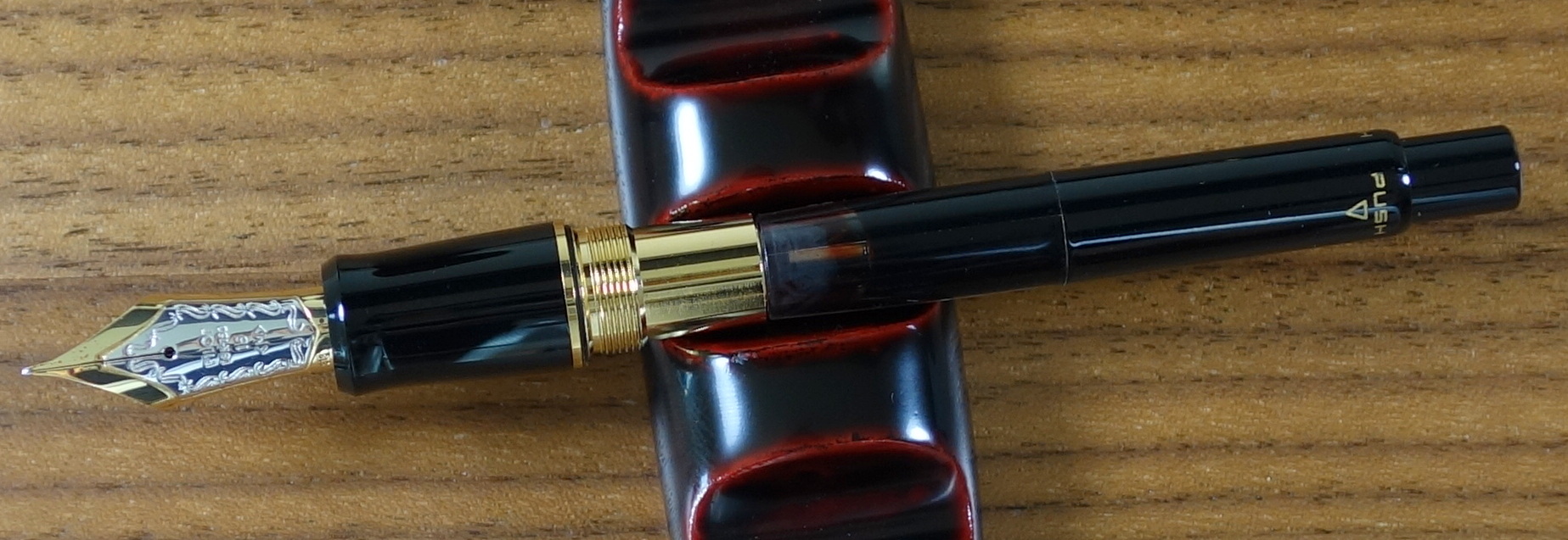
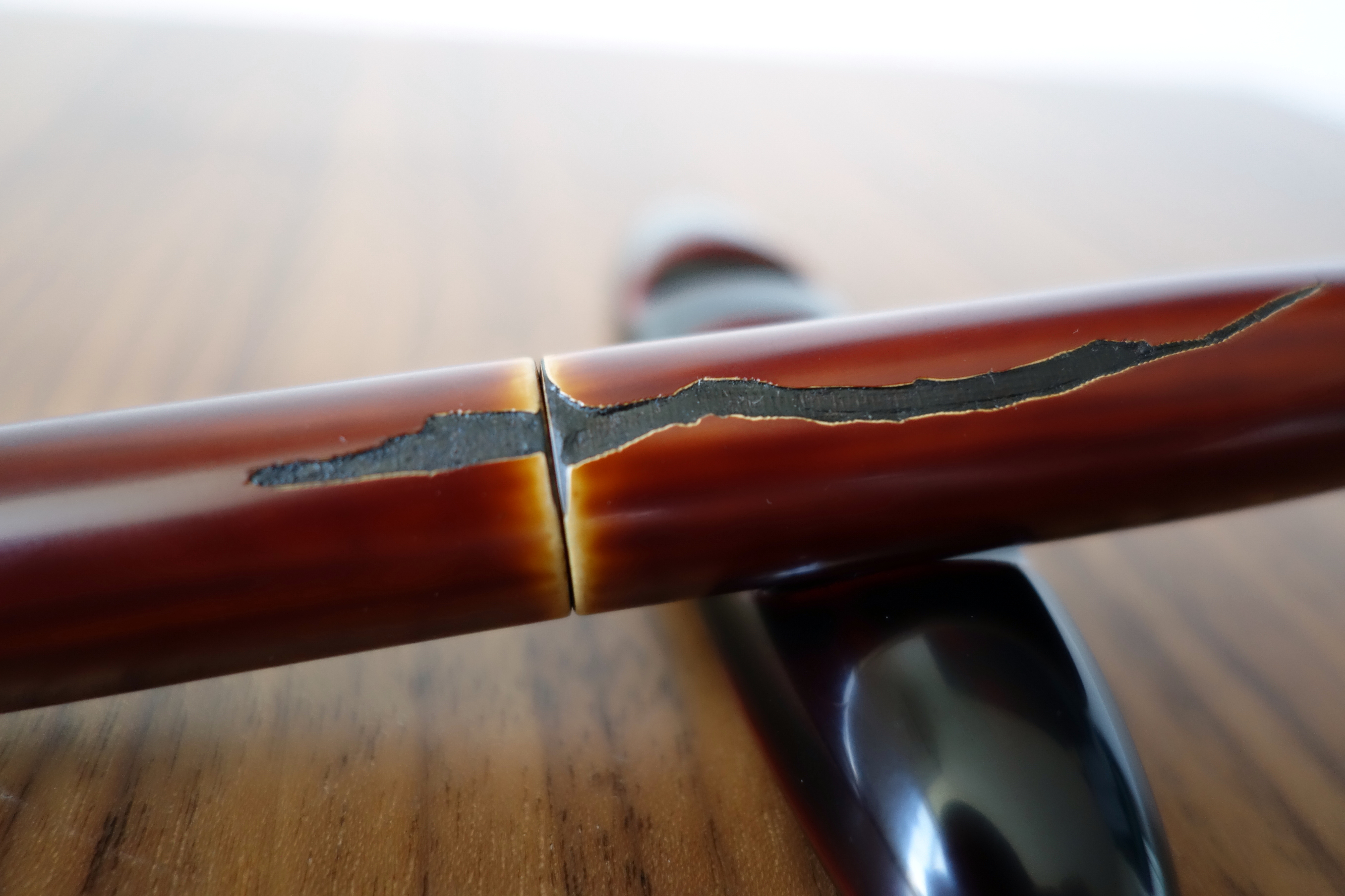
The build quality like most Pilot products is quite good.  The section (as on the Custom 845) has two big seams that just look cheap on a $300 pen.

Custom 845 with Custom 743.  Both have the same plastic section.
Custom 845 with Custom 743. Both have the same plastic section.

Unlike the Custom 845, the 743 also suffers from seams on the body as well. They are clearly defined in the threading on the body and then they disappear about a quarter of an inch in on the glossy part of the body.  You wouldn’t really notice any of this unless you are looking closely.  The fit and finish is otherwise quite good and I suspect this pen will last a long time.  Score: 2.5/5

Size & Weight

The Custom 743 measures about 5.9” capped and about 5.2” uncapped.  At its widest point it is about 0.6” and weighs about 25.6 grams with a converter full of ink.  Like the 845, the 743 is a good sized pen similar in girth to a Montblanc 146 but closer to the 149 in length. I find the 743 to be well balanced in my hand.  It looks quite long posted but it remains comfortable.  Score: 4/5

Performance


I think it is fair to say that this pen will not be for everyone.  I was lucky enough to try it in a store in Japan before I purchased it.  It would be a mistake to think you are getting a new pen that is going to write like a vintage flex pen; it does not and I haven’t seen a modern flex pen that does.

Compared to a vintage flex pen there is minimal flex when pressure is applied to the Falcon nib.

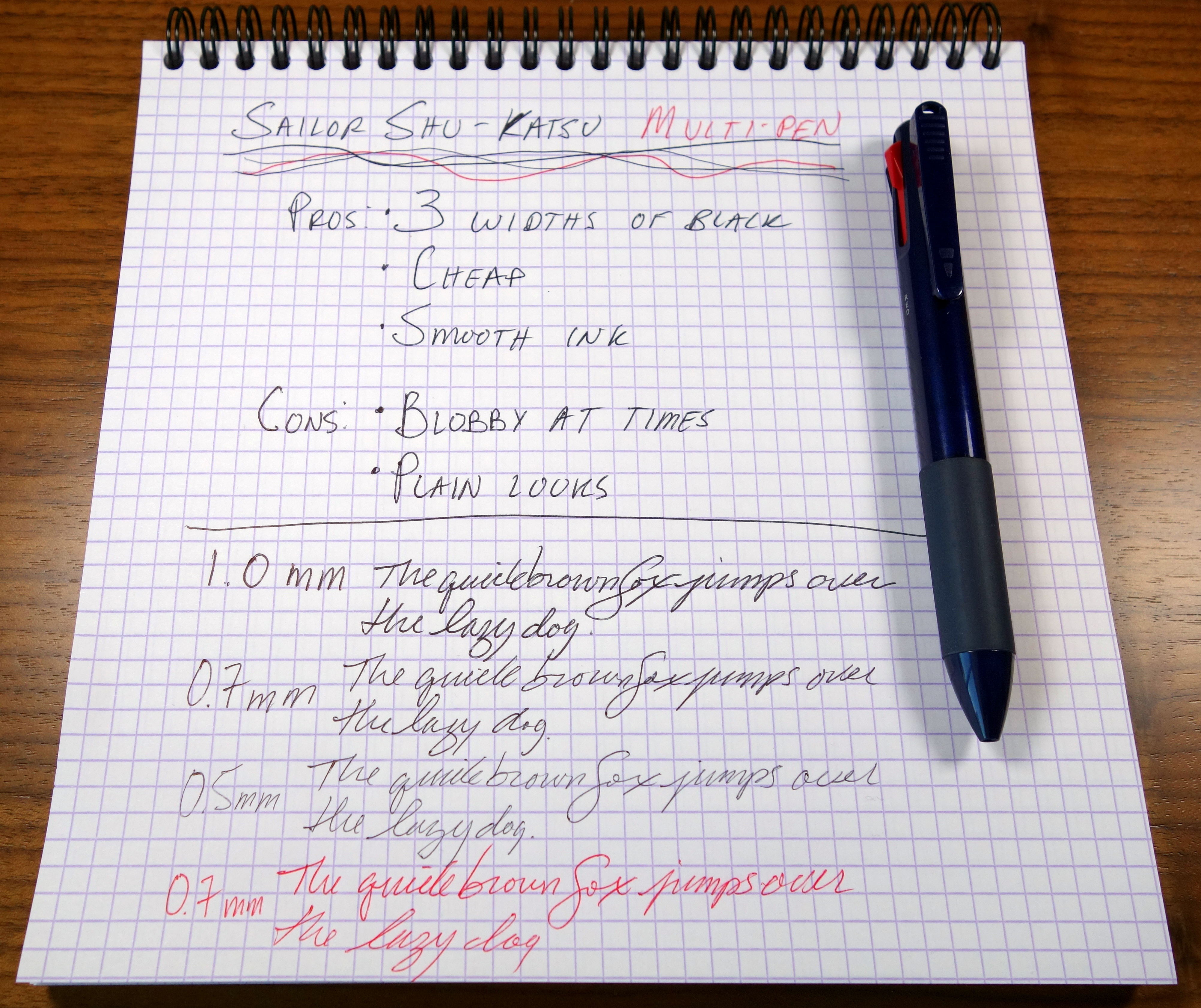
The falcon nib is a bit on the scratchy side, not unpleasantly so but there is a good amount of feedback.  With little or no pressure the nib writes with a pretty fine line, definitely an extra fine by western standards.

If apply some pressure you can get the line to become broad but this will require more force than you would need on most vintage flex pens.  I find that with nib flexed and writing slowly (as you should) the pen has a tendency to railroad by which I mean produce two thin parallel lines instead of one fat line.  The feed seems unable to keep up with the pen.

I have been experimenting with different inks and I have found Diamine inks to work the so far.  I tried Noodler’s Blue Eel as I thought that might help with the railroad situation but alas it performed the same as the Waterman and Pilot inks I tried.

The "no pressure" and "medium pressure" writing samples were written quickly at my normal pace.
The “no pressure” and “medium pressure” writing samples were written quickly at my normal pace and the “Pressure” sample was written slowly with the most pressure…notice all the railroad tracks.

In normal writing there are no real performance issues and I can get some nice (not huge) line variation with medium pressure without causing any problems but if you want to make extra extra fine lines and triple broad lines the Falcon nib isn’t going to cut it.  With a careful hand (sadly not something I possess) I have seen some beautiful western writing with the 743 Falcon.  Score: 2/5
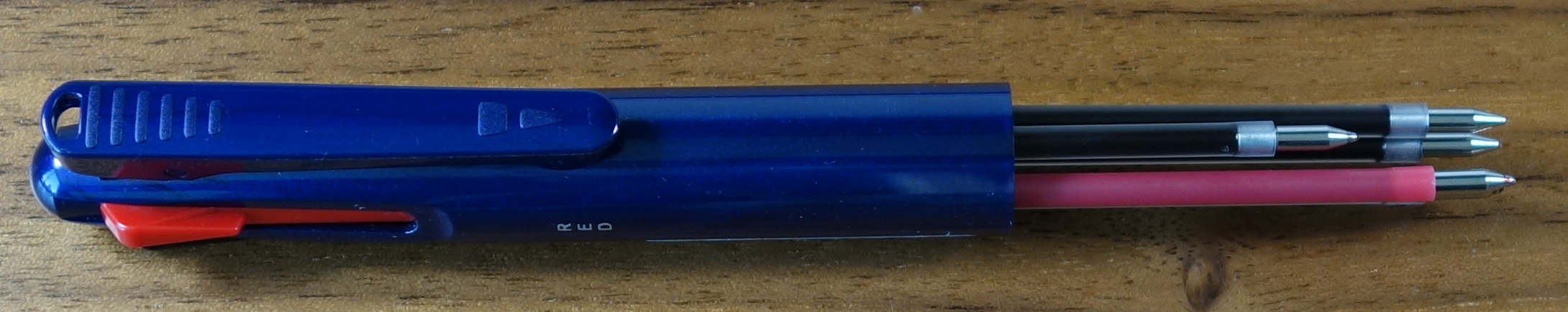
Filling System

The Custom 743 uses Pilot’s top-of-the-line Con-70 converter that is considered by many to be the best converter on the market.  It holds a good amount of ink and is quite easy to use.

Pilot Custom 743 Falcon Fountain Pen

The 743 has the standard metal Con-70 which is not quite as nice as the black one you get in the Pilot Custom 845 and most Namiki pens but the function is the same.  Score: 3.5/5

Value

I bought my Custom 743 in the low $200s, which I think is a pretty reasonable price for this pen.  The retail price is 30,000 Yen (approximately $295 USD) is pretty high.  If the pen had no seams and the gold trim matched the nib nicely I could easily justify a $300 price tag for the 743.  Score: 3/5

Bottom Line

The feed prevents the 743 Falcon from living up to its full potential as a “flex” pen.

Final Score 18/30


Montblanc Meisterstuck 90 Years Permanent Grey Fountain Pen Ink Review

Montblanc 90 Years Permanent Grey Ink


Montblanc 90 Years Permanent Grey Ink

To celebrate the 90th anniversary of the Meisterstück, Montblanc has released a limited edition Meisterstück 149 fountain pen and a permanent grey ink.  The ink comes in a retro bottle that reads: “This ink fulfils all the demands made on it by durable, good-working, Fountain Pen”.

Montblanc 90 Years Permanent Grey Ink


Montblanc 90 Years Permanent Grey Ink

I have never been a fan of grey inks in the past but when I saw the bottle in the store I had to try it.  The salesman was kind enough to let me dip the new 90th Years 149 fountain pen into a bottle of the Permanent Grey.  The ink looked great so I bought a bottle.

Montblanc 90 Years Permanent Grey Ink

The 90 Years Permanent Grey is a beautifully saturated almost black ink.  The flow is excellent, especially for a permanent ink.  Good saturation and shading.  The big downside I see to this ink is the dry time…it’s long….very long.  In my tests on Rhodia 80gsm paper it took approximately 75 seconds to fully dry.

The 90 Years Permanent Grey is a beautifully saturated almost black ink.  The flow is excellent, especially for a permanent ink.  Good saturation and shading.  The big downside I see to this ink is the dry time...it's long....very long.  In my tests on Rhodia 80gsm paper it took approximately 75 seconds to fully dry. 

(click the picture to enlarge)

To test the ink’s permanence I let the ink dry over night and with a few drops of water the ink remained well intact.  I believe most of Montblanc’s permanent inks have an ISO certification but I don’t see any mention of that on the packaging of the 90 Years Permanent Grey.

Montblanc 90 Years Permanent Grey Ink

If you like grey inks, this one is a must have.  The price is on the expensive side at $20 for 35ml but I think it’s worth it.

Uni Pure Malt Multi Pen + Pencil Review

Uni Pure Malt

The Uni Pure Malt is a multi-pen with two 0.7mm Uni Jetstream hybrid ballpoints (black + red) and a 0.7mm mechanical pencil.  If you are wondering what “Pure Malt” refers to, it’s the wooden grip which supposedly comes from the wood used in Japanese whiskey barrels.  The Pure Malt comes in a couple whiskey related colors (browns). I chose one with a champagne colored body and a dark wood grip that I think looks great together.  The barrel unfortunately has two seams and they go right down the middle of the plastic part of the body which is poor placement if you ask me.  The words “PURE” and “MALT” are split by the seam.

The bottom half of the pen appears to be made of metal and gives the pen its nice weight.

The Pure Malt weighs 22.6 grams and feels of good quality. It measures just under 6″ long and is about 0.6″ at the widest part of the barrel.  The Jetstream refills perform very well and are my favorite ballpoint style refills.  The lines are quite clean and dark by comparison to a standard ballpoint.  The point glides across with minimal resistance.

Uni Pure Malt

The mechanical pencil is deployed by pressing the clip down and to advance the lead you just click the clip in the down position.  The 0.7mm mechanical pencil works very well.  I picked up this pen in Japan for at the retail price of 1,000 Yen which is just under $10 USD and for that price I am really happy with the Pure Malt, in fact it is my favorite multi-pen I have come across in a long time.

Uni Pure Malt

Jac Zagoory Atlas Pen Holder Review

with Montblanc 149
with Montblanc 149

I love desk accessories and my Atlas pen holder by Jac Zagoory is one of my favorites.  Jac Zagoory Designs is famous for its whimsical pewter desk accessories that are all made in the USA.  Jac Zagoory is an avid pen (and watch) collector and he has even written a great little book on the subject called: Pen Passion a Cylindrical Obsession.

with Montblanc 149
with Montblanc 149

Jac Zagoory Atlas Pen Holder

The Atlas pen holder is one of his most popular designs and comes in a gold plate finish and a black finish in addition to the bare pewter finish. The pen goes in his hands where the globe normally would be.

Jac Zagoory Atlas Pen Holder


with Aurora Optima
with Aurora Optima

The holder measures 5″ wide x 3″ high x 5″ deep.  The shortest distance between his hands is  just over 4.5″.


with Pilot Vanishing Point

There is also a mini version of the Atlas which I have not seen in person but I suspect would be much better at holding smaller pens.

The Kaweco Sport is almost too small.

The detailing on the Atlas holder is decent but not as detailed as some of his other designs.  The standard pewter model that I have retails for $130 (street price closer to $100) and the black finish and gold plate models retail for $199 and $280, respectively.  They aren’t cheap but I do believe you are getting what you pay for with Jac Zagoory products.

Jac Zagoory Atlas Pen Holder
felt bottom and imprint

Overall, I really like the Atlas pen holder it is a real conversation starter and a nice place to rest your pen.

Pilot Custom 845 Urushi Fountain Pen Review

Pilot Custom 845 Urushi Fountain Pen

The Custom 845 is Pilot’s top of the line fountain pen (limited editions and Namiki branded pens not included).  The 845 retails for an eye-watering 500,000 YEN (approximately $495 USD) and has received some mixed reviews.  People have questioned whether it should command a price near an entry-level Nakaya.

What do you get for $500?

You get Pilot’s largest (Pilot branded) #15 nib in two tone 18kt gold with a large “gem” carved ebonite body and urushi lacquer finish.  You also get a black painted Con-70 converter and an upgraded box.

While in Japan I was able to play with a number of Pilot/Namiki pens and I ended up loving the Custom 845.  Now that I have had a few weeks to put it through its paces let’s see how it stacks up.


Appearance

The Custom 845 is a classic looking executive pen with a black body and yellow gold furniture.  The cap has a flat top with a clip that starts broad and narrows ending with a ball.

Pilot Custom 845 Urushi Fountain Pen

The gold band at the bottom of the cap reads “* * * CUSTOM 845 * * * PILOT MADE IN JAPAN”.  The letters are filled in with black (paint?) so they look nice and crisp.  The back of the cap has “URUSHI” in gold letters.

Pilot Custom 845 Urushi Fountain Pen

The large two-tone #15 nib looks great and features some nice scrollwork on the silver center.  I really like that Pilot puts a date stamp on these nibs.  The left bottom corner of the nib is stamped “813” which translates to August 2013.

Pilot Custom 845 Urushi Fountain Pen

It’s hard to look at a pen like this and not think about Montblanc.  The 845 with its flat top clearly isn’t a Meisterstück but it clearly is a Japanese take on a German style pen and that is definitely not a bad thing.

Score: 4/5


Build Quality

Many people, including myself, rave about Pilot’s build quality.  I hadn’t spent much time with the Custom line before these last three weeks and while I still maintain that Pilot builds exceptional quality pens I do have some issues with the Custom 845 and the Custom 743 (review to come later).

To start let’s talk about the body of the 845.  Above I said this pen has a lacquered ebonite body and it does….mostly, except for the section, the end of the body and the ends of the cap, which are plastic, or “resin” if that sounds more appetizing.

Custom 845 with Custom 743.  Both have the same plastic section.
Custom 743 with Custom 845. Both have the same plastic section.

The plastic parts are not painted with urushi lacquer but nonetheless they do blend together well.  The section has two visible seams and this to me is just wrong on a $500 pen.

Pilot Custom 845 Urushi Fountain Pen

To be fair these “issues” aren’t actual build quality problems but more an indication that this pen was built to a price.  If you could build this pen without plastic and paint the entire pen in lacquer why wouldn’t you?

Other than the seams the fit and finish are flawless.  The pen is sturdy and does not have the delicate feeling that a Nakaya has.  With the 845, Pilot took a very practical design and really brought it to the next level by adding multiple coats of urushi lacquer.  It is a wonderful pen to touch.

I compared the 845 to my Montblanc 149 and based on superficial fit and finish alone the Montblanc wins.  The engraving on the ring of the 149 to me looks nicer and the Montblanc has no seams on its body despite being made entirely out of plastic.


I suspect that in the long-term the Pilot will hold up better than a 149 as the lacquer is much more scratch resistant than plastic and I have seen real problems with Montblanc quality.  I have had plating issues with Montblancs as well as nib issues on brand new Montblanc pens; both things I have yet to see with any Pilot.

Score: 2.5/5

Size & Weight

The Custom 845 measures 5.7” capped and about 5.2” uncapped.  At its widest point it is about 0.6” and weighs about 28.8 grams.  The 845 is a good sized pen similar in girth to a 146 but closer to the 149 in length.

Pilot Custom 845 Urushi Fountain Pen
Montblanc 149 with the Custom 845

The 845 posts well and does have a good balance posted but for long writing sessions I prefer the 845 unposted.  I believe most people would find the 845 to be a comfortable pen.

Score: 4/5


Performance

Pilot Custom 845 Urushi Fountain Pen

I sampled the fine, medium and broad nibs and found that the medium to be my favorite.  Being Japanese, the medium is closer to a western fine.  The Pilot-made # 15 18kt gold nib writes beautifully.  I haven’t had any issues with skipping, hard starting or poor flow.  The nib is somewhat soft for a standard nib and it is ultra smooth and responsive.  It writes like a $500 pen should.  The feel is phenomenal; in fact I believe it’s the best writing stock round tipped nib I have come across on a modern pen.

Score: 5/5

Filling System

Pilot Custom 845 Urushi Fountain Pen

The Custom 845 uses Pilot’s famous Con-70 converter which is considered by many to be the best converter money can buy; despite this, the 845’s cartridge/converter filling system tends to receive some criticism as many people feel that the $200 cheaper Custom 823 offers more value with it’s vacuum filling system.

Pilot Custom 845 Urushi Fountain Pen

It is true that the vacuum filing system holds more ink and it is likely a more expensive mechanism but as a cartridge/converter lover the black Con-70 is pretty much perfect.  The Con-70 holds more ink than most converters and has a unique push button mechanism that you push four times to fill.

Score: 4/5


Value

The problem here is what do you compare the 845 to?  At $550 a Nakaya is a great value and I know that because there are a lot of similar pens to compare it to.

The 845 is different, it’s more usable, it’s more solid feeling than a Nakaya, to me it’s an urushi Montblanc sans the status and for someone who wants that there aren’t many alternatives in this price range.  I think $495 is about right for this pen.  You will be hard pressed to find another high quality urushi fountain pen for less money and while it’s hard to call the 845 a steal it’s also hard to call it overpriced.

My ratings for this pen have been pretty harsh but I would like to mention that when I bought this pen I tired a TON of pens at the store including much more expensive Namiki pens with #20 and #50 nibs as well as a number of Sailors and Platinum pens.  I liked the feel of the 845’s nib the best and I think I would pick the 845 again given the chance.

Score: 3/5

 Pilot Custom 845 Urushi Fountain Pen

Bottom Line

If a Montblanc and a Nakaya had a baby it would be the Pilot Custom 845.

Final Score 22.5/30

Calepino No 2 Pocket Notebooks Review

Calepino No 2 Pocket Notebook

Calepino appears to be the French equivalent of Field Notes.  Calepino focuses on small pocket notebooks with a simple core line of 100% French-made notebooks numbered one through four.  No 1 features a red striped cover with ruled paper, No 2, the version I purchased, has green stripes and grid paper, No 3 has blue stripes and blank paper and No 4 has grey stripes and a dot grid.

Calepino No 2 Pocket Notebook

Notebook numbers 1-4 come in packs of 3 for $13 compared with Field Notes’ 3 for $10. The No 2 measures 3.5″ x 5.5″, though up against a Field Notes, the No 2 is a hair shorter and a hair wider.  The page count is the same 48 pages.  So are they better than Field Notes?  Let’s find out!

Calepino No 2 Pocket Notebook

The Calepino notebooks come in very nicely branded box that features the same design and same cardboard as the notebook covers.  The inside of the box lists all the specs of notebooks much like on the back inside cover of a Field Notes.

Calepino No 2 Pocket Notebook

Calepino No 2 Pocket Notebook

The cardboard cover is much rougher than a standard Field Notes cover and is noticeably thicker.  The cardboard is made by a company in the Creuse area of France that has been making cardboard since 1927. The design is quite nice but I definitely prefer the simplicity of the Field Notes covers.  The Calepino has three fonts on the cover where Field Notes only has one.

Calepino No 2 Pocket Notebook

Inside the cover is a place for your personal information and a place for the start and finish date.

Calepino No 2 Pocket Notebook

The pages are made of a bright white recycled paper with a green grid.  The 5 x 5 mm grid is a bit larger than the 4.7 mm x 4.7mm grid found on a standard Field Notes.  I prefer the smaller grid and the light brown ink the Field Notes uses.

Field Notes on the left and Calepino on the right.

In my testing I found that the Calepino’s paper handled relatively well for a recycled paper.  It does bleed and feather a bit but overall it holds ink better than the standard Field Notes paper.  To my touch the Calepino paper is a bit rougher and it provides a bit more feedback when writing which I like.

Calepino No 2 Pocket Notebook

Calepino No 2 Pocket Notebook
Bleeding with fatter nibs but very minor ghosting.


Calepino No 2 Pocket Notebook
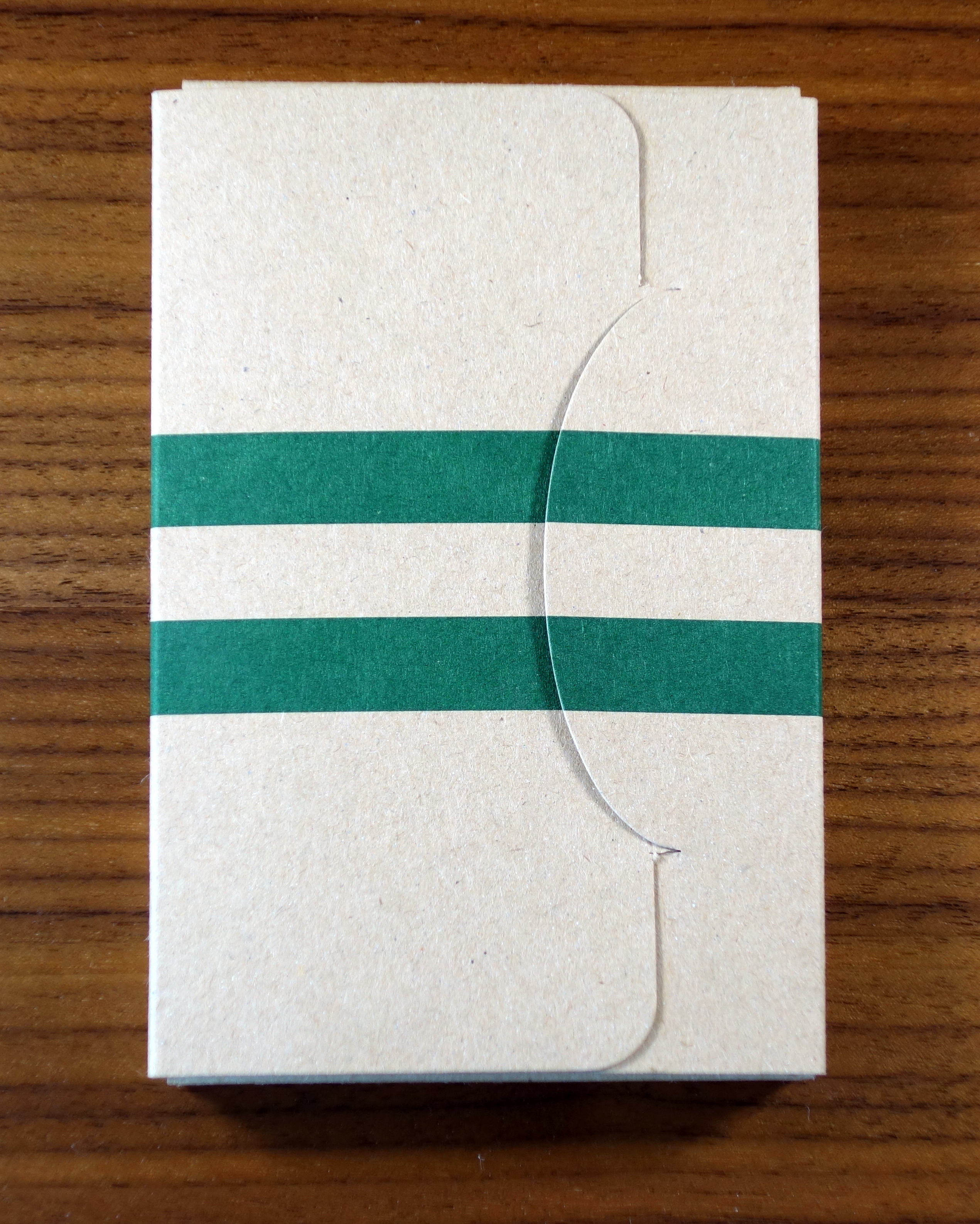
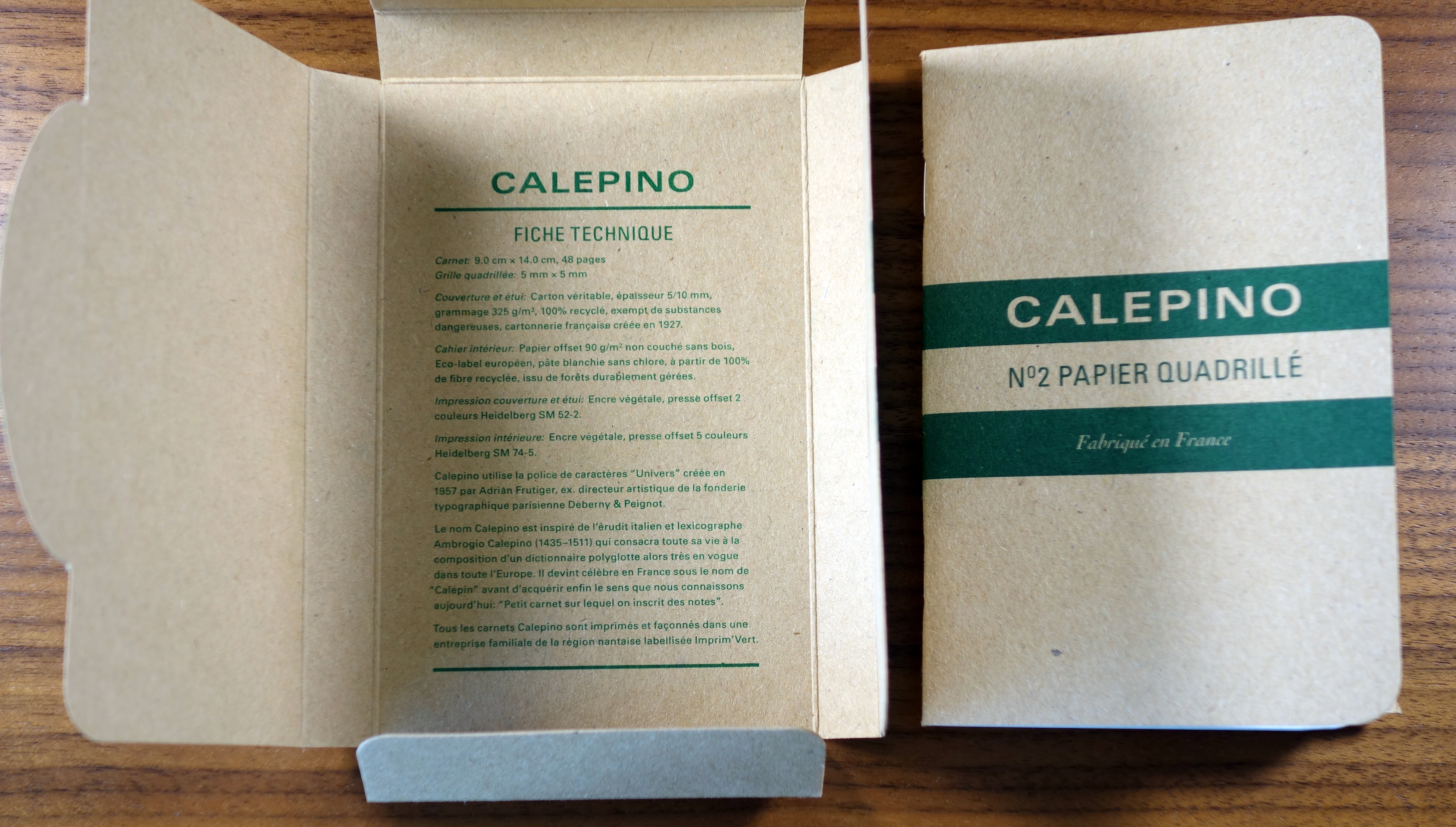
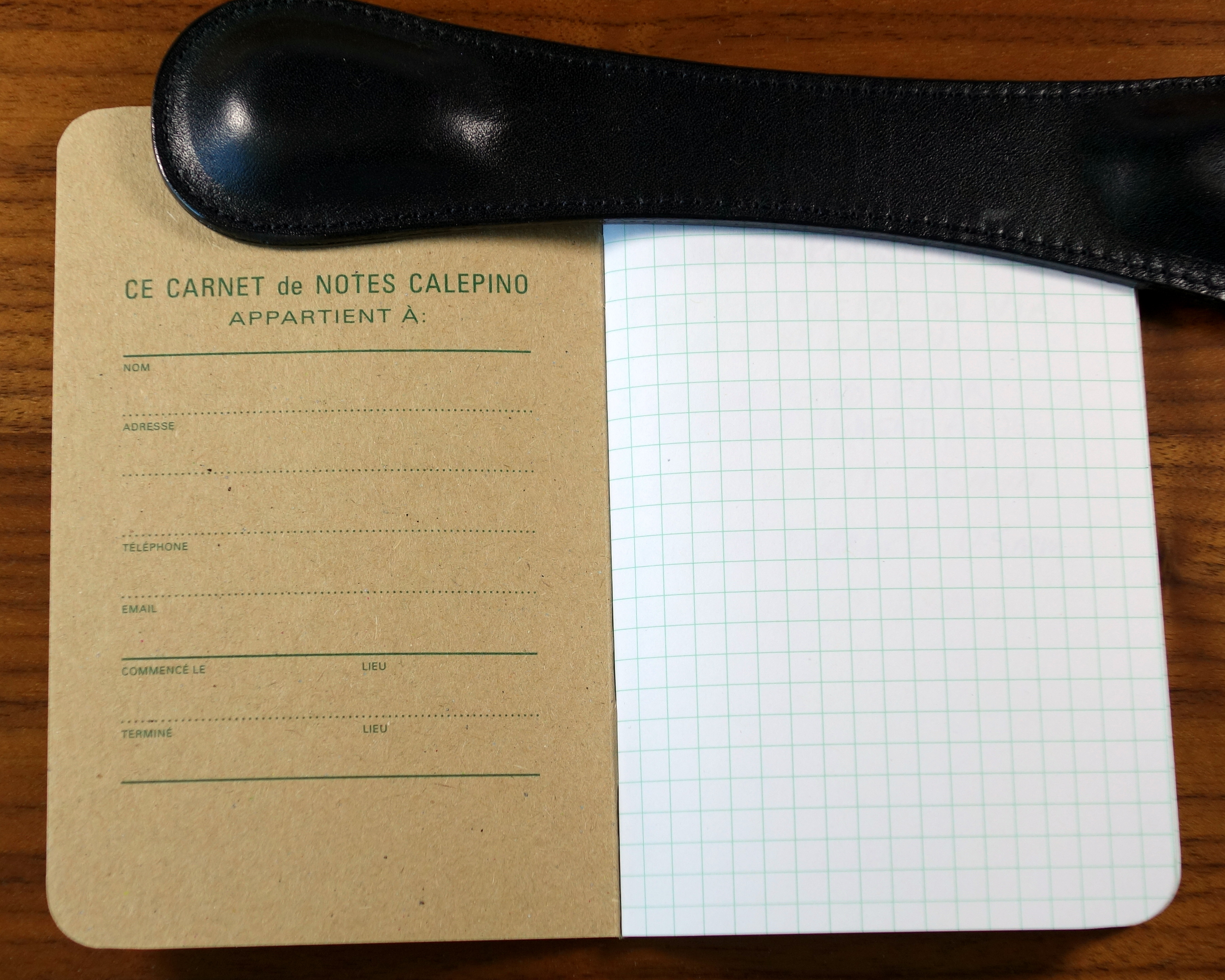
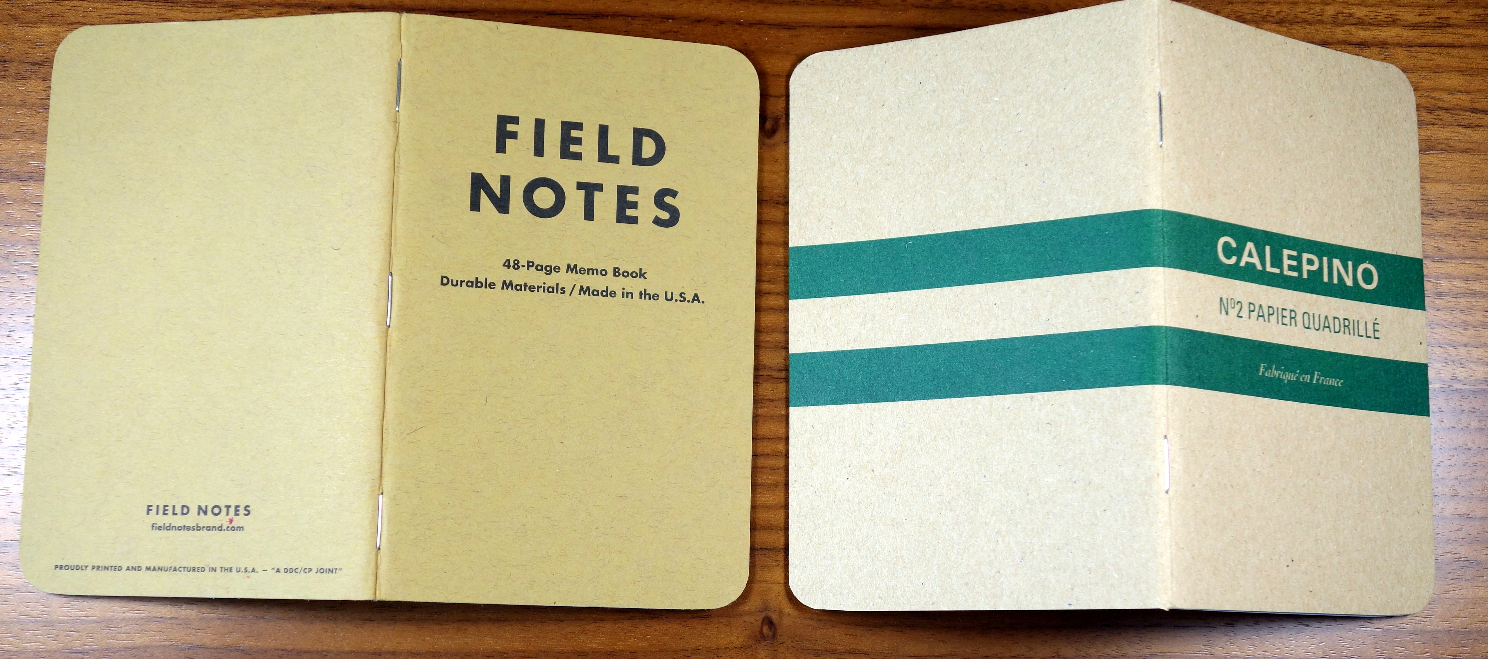
The Calepino is bound with two staples vs Field Notes’ three.  The back cover has a little blurb about the company (I hope you speak French) and a metric ruler.
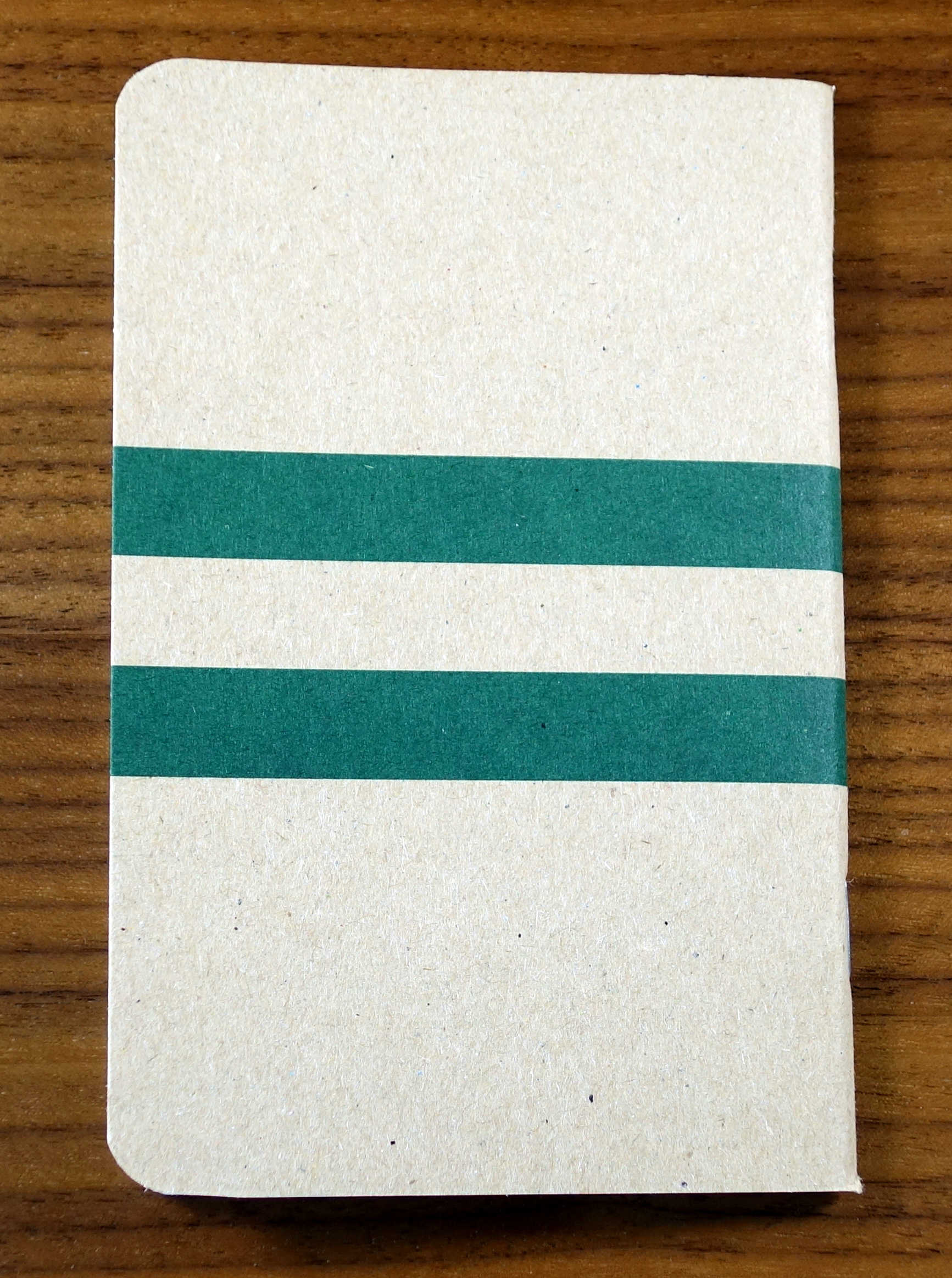
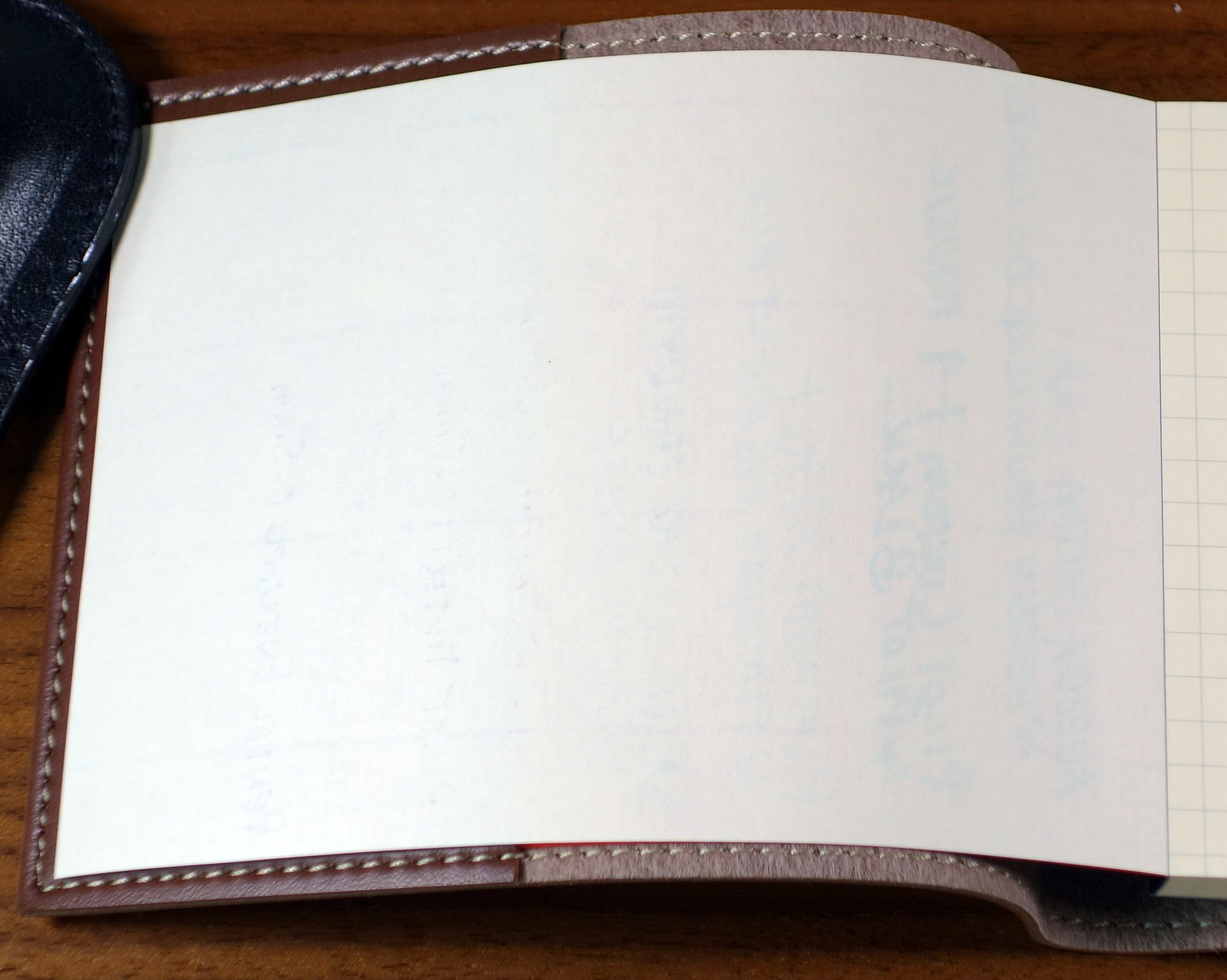
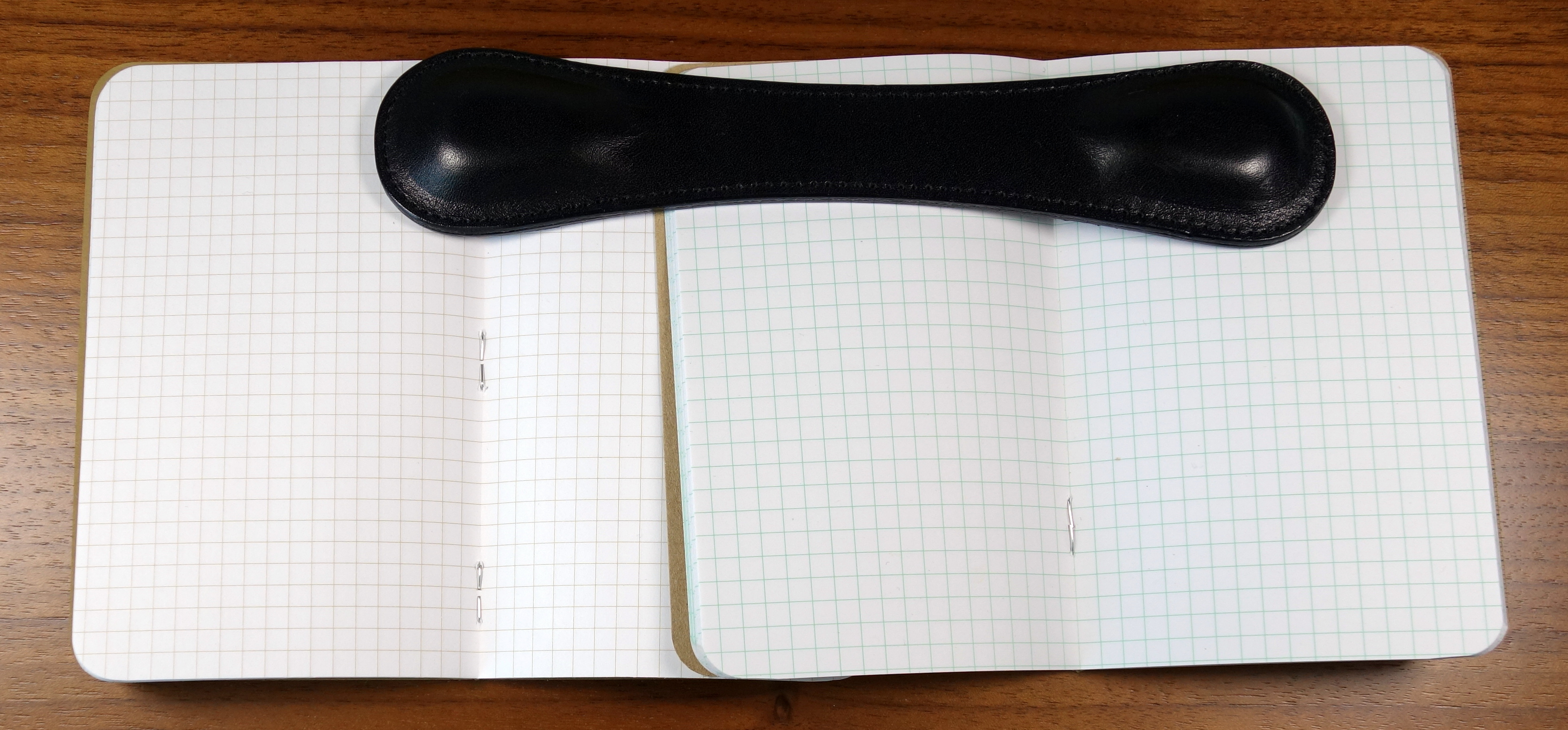
Calepino No 2 Pocket Notebook

I have been carrying around a Calepino for about a week now and I definitely like the notebook but I don’t like it better than Field Notes.  I fold my covers over when I am writing on a page and the Calepino is noticeably less pliable than a Field Notes notebook.  I can fold the cover over but its more difficult and the two staple binding does not do as nice a job of holding the pages in place.

Calepino No 2 Pocket Notebook

The Calepino offers better paper and better packaging than Field Notes but in the end I prefer the softer cover and overall look and feel of Field Notes.

The Calepino limited editions are quite interesting and I hope to get my hands on a set.  The Limited editions feature collaborations with artists and famous design houses.  What I particularly like is that the limited editions I have seen come in sets that include other limited edition items like pencils, pens, buttons and bookmarks.

Here are links to some great reviews of Calepino notebooks:

(I have no affiliation to the sites linked below)

Notebook Stories – Review: Calepino Notebook

Pens! Paper! Pencils! – Calepino notebooks review

LIFE Noble Memo Pad and Cover B7 Review


LIFE Noble Memo Pad

In recent years LIFE has become one of the most coveted brands of Japanese paper.  It is generally more difficult to track down than my favorites Midori and Maruman.  The prices of LIFE products in the US seem to be uncontrolled as they vary quite a bit and tend to be overpriced.

The product I will be reviewing is the B7 size LIFE Noble Memo Section pad and leatherette cover that I picked up on my recent trip to Japan.

LIFE Noble Memo Pad

The Memo pad features 100 cream colored sheets with a faint 5mm graph.  The graph is printed on one side only; the back of the page is blank.  The orange cover has a great vintage look to it with the black scrollwork boarder and raised gold and black “LIFE” letters.

LIFE Noble Memo Pad

This memo pad oozes quality.  Everything on it is tight and the taped binding is one of the best I have seen.  You can open up to the middle of the book and it will lay flat and then you can close it and you would have no idea that this book as ever been open.

LIFE Noble Memo Pad

The cream colored pages are very high quality.  If you look at the blank side of the paper you will see that is ribbed.  I tested the paper against Rhodia’s 80 GSM paper and found the dry time to be about equal.  The LIFE paper is a bit thicker and is more resistant to bleeding.  It took multiple strokes with my fat music nib to see any bleed. The grid lines seem to resist ink and while that doesn’t bother me it may bother some.

LIFE Noble Memo Pad

LIFE Noble Memo Pad
No bleed to speak of and minimal ghosting. If you look closely you can see the ribbing.

LIFE Noble Memo Pad

The cover is a brown leatherette that looks sorta like leather but definitely doesn’t feel like leather, that is to say anyone who touches it wont likely be fooled.

LIFE Noble Memo Pad

Pressed into the leatherette is “LIFE” and the same scroll work we saw on the paper cover.  The fit and finish like the notepad is immaculate with beautifully aligned stitching.  I have found that in addition to protecting the notepad the cover also helps keep the pad open when you are at the beginning of the pad.  I really wish they did this thing in leather.

LIFE Noble Memo Pad

So what about the price?  The notepad with notebook cover retails for 1,000 YEN which is just under $10 USD.  In the US, unfortunately, the prices are considerably higher.  I found the cover (no pad included) for $20 and I found the pad for $8.  To me even with the unusual high quality, $28 is too much money for a little notepad with a leatherette cover.  At $10 it’s still expensive but much easier to justify.

The best prices I have seen for LIFE products in the US are at:

Nanami Paper

I have no affiliation and no purchase experience with this store but their prices seem to be more in line with Japanese retail.


Sailor Shu-Katsu Multi-pen Review

Sailor Shu-Katsu

The Sailor Shu-Katsu is an unusual multi-pen that I purchased on my recent trip to Japan.  Most multi-pens that I have come across offer multiple colors and/or a mechanic pencil.  The Shu-Katsu has three black ballpoints in 0.5mm, 0.7mm and 1.0mm widths as well as a 0.7mm red ballpoint.

Sailor Shu-Katsu

When you unscrew the barrel you will notice that there are five, not four ballpoints.  There is an extra 0.7mm black ballpoint refill for when one of the other three black ballpoints runs low.

Sailor Shu-Katsu

The 0.5mm ballpoint is marked with one dot and a white button, the 0.7mm is marked with two dots and a grey button, and the 1.0mm is marked with 3 dots and a black button.

Sailor Shu-Katsu

Sailor Shu-Katsu

Sailor Shu-Katsu

There is a three ballpoint (four with the auxiliary) version that is all black (no red).  The Shu-Katsu comes in four different body colors: black, blue, light pink and light blue.  It’s a pretty unexciting looking pen if I am honest.  It’s very plain.  Sailor refers to the clip as an “axis” clip.  It is a quite large spring operated clip that you push the top of to open.  The clip feels strong and the pen overall feels very solid.

The Shu-Katsu measures 5.5″ long and just over half an inch wide.  It weighs approximately 16 grams It’s a fat pen, not something I would want to write for a long time with.

Sailor Shu-Katsu

The ink is smooth and the lines are pretty crisp for a ballpoint but I found the 0.7mm and 1.0mm to be a bit blobby on paper.


The Shu-Katsu costs 400 Yen which is just under $4 USD and at that price I think it is a pretty good value.  You get 5 smooth ballpoints for a little bit more than a Bic 4-Color.  The real question though, is do you need or want 3 different black ballpoints?  I don’t.  I would rather have 4 colors to chose from than 2.

Nakaya Naka-ai Negoro Shiro-tamenuri Fountain Pen Review

Nakaya Naka-ai Negoro

A Nakaya has been on my buy list for a few years now but because my taste in fountain pens has been moving towards vintage European pens it has taken a long time for my first Nakaya purchase to materialize.

Nakaya gets a lot of attention on pen forums and blogs and while the pens are clearly beautiful there is more to it than that; there is an x-factor to these pens.  Much like a handmade car, one has to use it in order to understand its real value.

I spent a lot of time on pen forums and on nibs.com (no affiliation) before selecting a Naka-ai Cigar Negoro Shiro-tamenuri.

Let’s attempt to explain the name: Nakaya is the brand which was the original name of the Platinum Company.  “Naka-ai” is the model name, which means “middle” in Japanese.  The Naka-ai is the result of a collaboration between Nakaya and John Mottishaw of Classic Fountain Pens Inc. (nibs.com).  “Cigar” refers to the pen’s cigar shape and lack of a clip; the version with the clip is called the “Writer”.  “Negoro” (couldn’t find the Japanese translation) refers to the weathered/cracked treatment applied to the pen. “Shiro-tamenuri” refers to the color and the clear urushi lacquer applied to the pen.


Appearance

The Naka-ai is really a work of art.  The many layers of Urushi lacquer give the golden brown color a lot of depth.   The “cracks” are hand engraved into the barrel and look beautifully weathered.  It takes over six months to make a Negoro model and it shows.  The lighter golden brown shows through near the edges of the cap and barrel as well as on the cracks and threading.  The long tapered shape of the Nakai-ai is beautiful and being a Cigar model it has no clip which offers a more uniquely Asian look than the more practical Writer model.

Nakaya Naka-ai Negoro

Under the cap is a big shapely 14k gold nib that features the Nakaya globe logo and some scrollwork.

Nakaya Naka-ai Negoro

The converter features Maki-e painted goldfish which not only makes the converter look like an aquarium full of ink but also really sets it apart from the cheap plain converters I am so accustomed to seeing.

Nakaya Naka-ai Negoro

The Naka-ai is easily the most exotic-looking and most beautiful pen in my collection.  I am not usually one for embellishments but the non-ostentatious look of the Negoro is fantastic.

Score: 5/5


Build Quality

The Naka-ai is clearly of a high quality but it has a very different feel to it than the high-end European pens I am used to handling.  To me it feels much more delicate.

It’s hard to explain; if it were a car it would be a handmade Bentley Mulsanne compared to a Montblanc 146 which would be more like a Mercedes S-Class, that is to say everything on the Naka-ai is gorgeous, but not made with the laser precision of the much less gorgeous Montblanc.

Nakaya Naka-ai Negoro

The feel of urushi lacquer is special…it almost has a moist or wet quality to it.  It’s wonderful to touch.  I believe that urushi lacquer is the same or at least very similar to the Chinese lacquer S.T. Dupont used to put on their pens.  I haven’t seen anyone test the flame resistant qualities of urushi though, so that special characteristic may only apply to Chinese lacquer.

Nakaya Naka-ai Negoro

The Naka-ai is designed to accommodate decoration on its body and as a result there is a lot of threading so that the design will always line up when capped. In practice though, I have found it to be difficult to properly line up the large crack (decoration) that spreads from the body to the cap.  When I use the Naka-ai regularly I can get the design to line up without too much thought but admittedly when I pick up the pen, not having used it for a week or two I find that it can take me 2-4 tries to get it correct.   I suppose this isn’t really a quality issue but it’s worth pointing out.

Everything on the Naka-ai fits tightly and there is no indication that this is anything less than an heirloom quality pen.

Score: 4/5


Size & Weight

Naka-ai next to Montblanc 149.

The Naka-ai measures a little over 6” capped and about 5.5” uncapped.  At its widest point it is about 0.7” and weighs about 27.5 grams.  It is definitely a large pen but not so big as to be uncomfortable for regular use.  Because of its excellent balance I can write with this pen for long periods of time.  The grip section is on the smaller side but I find it to be quite comfortable.  By comparison, the similarly sized Montblanc 149 section is too fat to be comfortable; I can jot down some quick notes but I wouldn’t write a letter with a 149.

Naka-ai and Montblanc 149 nib and section.

It should be noted that the Naka-ai is not designed to be posted.  If you get a cigar (clipless) model you will need a place for the cap so that it doesn’t roll off the table.  I started with a Nakaya 3 pen pillow but ended up opting for a Nakaya Desk Pen stand for my uncapped Nakaya. I leave the cap in the kimono case that comes with the pen.

Score: 3/5


Performance

A little background on the nib: I purchased my Nakaya from Classic Fountain Pens Inc (nibs.com) with a soft medium nib that I had modified to match the softness of the nib on my Montblanc 146 from the early 1950s (which was coincidently already at CFP for repairs).  I spoke with John Mottishaw on the phone and we decided that in addition to softening up the nib we would add a left foot oblique modification.

Nakaya Naka-ai Negoro

The 14kt gold nib writes beautifully.  It is soft and makes my writing look more distinctive.  I have had no issues with hard starting or skipping.  I have had my Nakaya for 5 months now and the performance has been excellent.

Nakaya Naka-ai Negoro

The softer nib makes for a little bit wetter writing experience; if you like a drier nib I wouldn’t recommend adding any flex.  Also, it should be pointed out that the modifications listed above make the nib less beginner friendly.  Being a Japanese medium the line is more equivalent to a western fine and when you add the oblique modification you have a more defined sweet spot than a regular ball-pointed nib or a wider oblique.

Nakaya Naka-ai Negoro

Score: 5/5


Filling System

As I have stated many times before, I am a big fan of converters and while they may not be as elaborate or as expensive to make as other types of fillers they are the easiest to use and keep clean.   Nakaya uses a very nice quality Platinum converter that holds a decent amount of ink.  I have both the standard Platinum converter and the special Nakaya goldfish Maki-e painted converter; both offer the exact same function but the painted one is a bit more special.

Nakaya Naka-ai Negoro

The Naka-ai will also take Platinum ink cartridges and can be fitted with an adapter that will allow you to use international short ink cartridges.

Score: 4/5


Value

Nakaya’s pricing has been going up over the last few years but comparable Urushi lacquer pens are (in most cases) at least $100 more expensive.  From the other Urushi lacquer pens I have seen in person (Danitrio, Platinum, Sailor, and Namiki) I truly believe that Nakaya gives you the most for your money without compromising on any important detail.

The Negoro version is an extra $350 over the standard Naka-ai  (in standard colors) and with my modifications and the Maki-e converter my pen was over $1,000, which is a lot of money for a pen, but to me this pen is a real work of art and priced quite fairly.

Naka-ai next to my Platinum 3776 Century Chartres Blue

I should point out that Nakaya uses Platinum nibs and it is possible to get the same nib on a much more affordable pen.  I have a Platinum 3776 Century with the same big 14kt gold nib (sans the modifications) and it performs superbly.

Score: 4/5


Bottom Line

The Nakaya Naka-ai is a beautiful work of art that lives up to the hype.

 Final Score 26/30


Score from First Day in Tokyo

Itoyas famous red paper clip sign out their temporary store location.
Itoya’s famous red paper clip sign out their temporary store location.

I have been in Tokyo for a few days now and it is amazing.  This is pen lovers paradise.  There are so many pen shops, it is truly unbelievable.  The first day I stopped by Itoya’s two stores in Ginza.  One is dedicated to fountain pens and art supplies and the other is dedicated to stationery and office pens.  Both stores are 5 stories each and the selection is just incredible.

K. Itoya, the fountain pen shop.  This is the second floor dedicated to Maki-e pens and limited editions.  They had tons of Maki-e pens from Namiki, Danitrio, Nakaya, Pelikan, and even Parker.
K. Itoya, the fountain pen shop. This is the second floor dedicated to Maki-e pens and limited editions. They had tons of Maki-e pens from Namiki, Sailor, Platinum, Danitrio, Nakaya, Pelikan, and even Parker.

I was a bit overwhelmed my first day so I did not buy a ton but I did find the Midori World Meister’s note Vol. 2 that I was not able to source in the USA.

Itoya Score


Down the street from Itoya is Euro-Box, a tiny shop that specializes in vintage European fountain pens.  The stores owner Eizo Fujii speaks English quite well and let me dip any pen that caught my eye.  He had an amazing selection of vintage Montblancs and Pelikans.  I looked a few of the Soenneckens he had but I couldn’t stay for long because it was incredibly hot humid in the store.  I am going to try and go back before I leave Japan because he had some very nice Montblanc 146s from the 1950’s that I would like to take a closer look at.

The store is located on the 4th floor of this dilapidated building  in a posh part of town next to the high end furniture store, IDC Otsuka (if you love modern European furniture like I do, IDC is a must see;  they have a beautiful selection of de Sede, Rolf Benz, and Poltrona Frau).

[It looks much worse inside]
[It looks much worse inside than out]
I also stopped by Pilot Pen Station a few blocks from Euro-Box.  Pilot Pen Station is Pilot’s HQ in Tokyo.  It features a small fountain pen history museum and cafe.  It’s not a brilliant museum but admission is free so there is nothing I can complain about.

Pilot Pen Station


That’s all I have for now.  I have been to a few more shops since my first day and spent plenty of money but I am hoping to escape Japan with a few dollars left in my bank account, so far it isn’t looking good.